[Editor’s Note: Paul is on his annual August break from site. Deputy editor Phil Hecken is in charge from now through the end of the month, although Paul is still on the clock over at ESPN and may be popping up here occasionally.]
By Phil Hecken
Follow @PhilHecken
You had to figure this was coming.
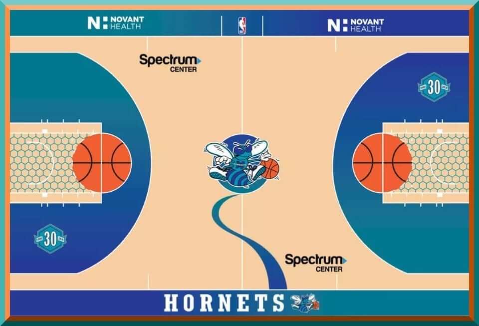
With “secondary” floors all the rage in the NBA now, and with the Charlotte Hornets unveiling throwback uniforms just a couple weeks ago, yesterday the team unveiled a new throwback court. In case you missed it, here’s a look at the retro unis the team will be sporting this season:
They followed that up with a new “retro” court they will use for “Classic Night” games, when they will break out the new (old) uniforms.
The Hornets are this year celebrating their “30th Season” — which is really the 30th Anniversary of the inaugural 1988-89 Hornets season — although the original Hornets moved to New Orleans and the “new” Hornets were born the Charlotte Bobcats several years later. While one can argue this is playing a bit fast and loose with the truth, it’s clear the team loves the name and the uniforms that first graced the courts 30 years ago.
According to the NBA, “The court is based on the design used at the Charlotte Coliseum from 1995-97 that features the classic Hornets logo at midcourt with a teal trail leading to the sideline, the free-throw lines as part of basketballs and a teal cell pattern within the free-throw lanes. The team used a similar design without the free-throw lane cell pattern from 1997-2002.”
Here’s the hype video:
HELLO BEAUTIFUL 😍
Here's the court we'll be using for our Classic Night games this season when our franchise celebrates the 30th Anniversary 🔥 #Hornets30 pic.twitter.com/7j0rN4Qvq8
— Charlotte Hornets (@hornets) August 7, 2018
The baselines have Charlotte Hornets in the classic Hornets font, with the sideline facing the TV cameras (the benches are on the opposite side) also saying Hornets. The original Hornets logo is at mid-court (with a teal-to-blue “S” shape design leading to the sideline). The keys will a honeycomb pattern inside them and within the three-point lines (with a teal-to-blue shading) is the secondary 30th Anniversary logo with the years “1988” and “2018” on either side.
The NBA/Hornets release also notes:
The Hornets will play on the classic court a minimum of six times during the 2018-19 season for “Classic Night” games, which will celebrate the history of the franchise and feature music and game presentation elements designed to take fans back to the Charlotte Coliseum of the late 1980s and 1990s. The “Classic Night” games will honor some of the organization’s all-time great players and feature giveaways, including bobbleheads and T-shirts, that highlight some of the top players and moments in Hornets history.
You didn’t think they weren’t going to turn this into a marketing opportunity did you? But hey, the fans clearly love this and with retro all the rage now, it’s actually a fine looking court to be paired with the throwback unis. By the way, the Hornets will also be hosting the 2019 NBA All-Star Game, perhaps coincidentally to be held on owner Michael Jordan’s 56th birthday (February 17th). Perhaps even more coincidentally, MJ was the leading scorer in the 1991 All Star Game, also held in Charlotte.
You may recall Charlotte was supposed to host the All Star Game a few years ago, but that was scrapped when politics and sports collided. But it’s all good now, right?
While the announcement is for the team to play on this court (and in the retro unis) a “minimum” of six times, I get the feeling they may be using it a bit more than that — especially if Nike is still calling the uni shots and needs to move more retro jerseys.
Whatever the motive — I love the throwback court and when coupled with the throwback unis, it will be a nice trip down memory lane. I never really liked the Alexander Julian designed unis when they were first released, but they grew on me over time. They’re still growing on me — a rare case when a trendy uni design in even trendier colors has actually somewhat stood the test of time. Or as they say, time teals all wounds.
Cleveland & MLB Unveil 2019 All Star Game Logo
Here is the 2019 MLB All Star Game logo. #MLBAllStar19 pic.twitter.com/dS1FzPKrAg
— Alex Hooper (@lexhooper) August 7, 2018
Yesterday afternoon, the Cleveland Indians and Major League Baseball released the logo for the 2019 All Star Game, which will be played in the same city where the Cuyahoga River caught fire where the Rock and Roll Hall of Fame is also located. So, playing off that theme, the ASG logo reflects that (good) bit of Cleveland mystique.
The Indians will be hosting their first All Star Game since 1997, when the ballpark was then known as Jacobs Field. If you’ve been following the issue of the removal of Chief Wahoo from the Indians uniforms, the move to give the ASG to Cleveland dovetails with the removal of the Chief from the unis. The team and MLB have indicated it is coincidental and there was no quid pro quo involved, but whatever the reason, the game returns to Cleveland next summer. The game will be played at Progressive I Call It Jacobs Field on July 9, and this will be the sixth time Cleveland has hosted the event (and the second All-Star game at the Jake), which will celebrate its 25th anniversary next year.
Naturally, there was a hype video involved:
Our city. Our game. Our logo.
Cleveland is ready to ROCK the 2019 All-Star Game. 🎸 pic.twitter.com/H6zy5o9s75
— Cleveland Indians (@Indians) August 7, 2018
And the logo itself:

“This is a very exciting time for our city and organization,” said Indians owner Paul Dolan in a statement. “Today’s logo unveil starts the countdown to 2019 All-Star Week festivities and is an invitation to baseball fans around the world to come visit our Rock N’ Roll city. With significant renovations over the last few years at Progressive Field, our ballpark truly is a crowned jewel and we look forward to putting on a great show for Major League Baseball.”
Our friend Chris Creamer over at SportsLogos dot net has a really good look at the logo and its various iterations, including what is very obviously a MasterCard advert conveniently embedded into some of the logos. Even without the word MasterCard, it’s as clear as day what the logo is. I guess we shouldn’t be surprised.
I don’t mind the guitar (and R&R HOF) theme so much, but maybe it’s getting a bit cliched for that city…
Client: We need a logo for something in Cleveland, it's a–
Designer: *starts drawing guitar* pic.twitter.com/JmxAZ8Lnp1— Strizzi (@juststrizzi) August 7, 2018
…but we all know the Rock and Roll roots run deep in this town, right lads?
The Ticker
By Alex Hider

Baseball News: Former Tigers P Mike Fiers was traded to the A’s on Monday, so during a postgame interview he taped over the Tigers logo on his cap and drew and A’s logo (from Mike Chamernik). … Mets P Noah Syndergaard is wearing the wrong cap with the team’s home jersey in a new Delta commercial (from Niko Goutakolis). … We’ve seen color-on-color, but how about pins-on-pins? The Phillies and Pirates did it at least once in the ’70s or ’80s (from Goat Jerseys). … Reds 3B coach Billy Hatcher has apparently been wearing a sticker on his helmet his number and mascot Rosie Red (from CJ). … Former Cardinals SS Ozzie Smith was wearing quite the jacket at the PGA Championship yesterday (from Phil). … This has probably been ticked before, but when the Padres nearly moved to DC in 1974, a Washington group made these uniform prototypes (from Noah Petro). … The Akron RubberDucks are selling these caps and T-shirts in advance of ’70s night this weekend. Could we see something similar on the field? (From Phil). … The Reading Fightin’ Phils will retire No. 21 for Roberto Clemente on Aug. 22 (from Phil). … The Buffalo Bisons will wear “Super Celery” jerseys this weekend. The jerseys are based on a wing-themed live mascot race the team holds. … The Brooklyn Cyclones will wear bagel uniforms for an upcoming game.

NFL News: The Rams and Saints will have male cheerleaders dancing on the sidelines this season. I wonder if they’ll be told when to change their underwear? Doubt it. … The Titans will debut their new unis on Thursday and wear white jerseys and navy pants (from Jim Wyatt). … This may have been ticked before, but the Dolphins have announced which jerseys they will wear for their home dates this season (from Bryce Starkey). … This new bobblehead of Saints RB Alvin Kamara has him in a jersey with a “toilet seat” collar, which the team stopped wearing a few seasons ago (from John Hendrix). … This blog post breaks down four teams that need a uni update.
College/High School Football News: Arizona State unveiled the white and GFGS versions of their new jersey set yesterday (from @Fresh_Prince80). … It appears that West Virginia QB Will Grier practices in a game day-cut jersey (from Jason Bernard). … Sun Prairie High School (Wisconsin) will wear First Responders jerseys for a game on Aug. 24.

Hockey News: The Canucks are allowing fans to pick which uniforms the team will wear as a throwback in 2019-2020 for their 50th season (from Steve May). … Here’s a list of all the number changes for the Carolina Hurricanes. … A classic offseason feature piece: What have Caps players put in the Stanley Cup?

NBA News: Hard to believe that it was 15 years ago that T.J. Ford wore ridiculously large shorts during his rookie photo shoot (from @LevityNYC). … This Sacramento Kings blog is down to the Elite Eight in a tournament to determine the best jerseys in team history.

Soccer News: The periods on Liverpool F Mo Salah’s jerseys are riding extremely high (from Moe Khan). … New uniforms for North Carolina (from James Gilbert).

Grab Bag: Sports idioms often leak into everyday American English, but do you know the origins of those common phrases? (NYT link) (from Ted Arnold). … New logo for UNC Greensboro. … Auburn’s marching band uniforms will have some minor changes this season (from Clint Richardson).
Low hanging fruit to bring up the Cuyahoga river fire. It wasn’t unique to Cleveland. It did become the onus for the formation of the EPA, so some good did come out of it. I’m surprised you didn’t shoehorn “mistake by the lake” in there.
not onus, origin. autocorrect.
“I’m surprised you didn’t shoehorn “mistake by the lake” in there.”
I thought about it. Also the link. But I figured the dead horsey had been beaten enough.
Not only was it a lazy reference, he misspelled it “Cayahoga”.
Shit. Now “fixed”
Cleveland was, and still is, the mistake by the lake.
I don’t mind the guitar (and R&R HOF) theme so much, but maybe it’s getting a bit cliched for that city…
So are burning river jokes…
The Buffalo Bill’s front office look ridiculous AF.
?
We’ve seen color-on-color, but how about pins-on-pins? The Phillies and Pirates did it at least once in the ’70s or ’80s (from Goat Jerseys).
1977. If you want other examples, look for road games where the Pirates wore white over white on the 1977 page on link.
Wow. Sacramento fans seem to have impressively bad taste.
Exactly what I was thinking. Both of those baby blue sets were so nice.
You know I’m voting for the Flying V as the throwback for the Canucks in 2019-20.
No contest there.
“Flying V” easily my choice also.
The Flying V would also be a nice alternative guitar design for the next time Cleveland designs a rock-n-roll themed logo.
The young lady who works at the coffee shop in my neighborhood was wearing a shirt yesterday that bore an UNCANNY resemblance to the Flying V. Seriously, almost perfect!
Needless to say, I opted NOT to ask her if I could take a photo.
I always liked the Flying Skate a lot more.
The Flying Skate is a great uniform, but we did just see it as a throwback in 2015-16.
link
Navy orca uniform – retired too recently and not iconic enough to be considered a throwback for 50th anniversary celebration.
Therefore, I did vote Flying V. It is a uniform I always hoped to see on the ice again but thought it would not be possible. The dream could be becoming a reality.
Are we still doing the Griffins Design Contest?
I just got contacted by them (I had written to them about this about a month ago) yesterday. They seem very amenable. I HOPE to have a big announcement tomorrow. I would have liked to have started this on August 1st, but it is what it is.
Great, I was just starting to wonder, thanks Phil!
“The periods on Liverpool F Mo Salah’s jerseys are riding extremely high”
That’s an intentional part of Liverpool’s font this season. It’s not really necessary, but then neither is Salah’s FIOB or most of the FIOB/FNOB/JrOB/something else variations seen in soccer.
Technically speaking, wouldn’t it be “period” rather than “periods”?
A helmet pictured on the miamidolphinsuniform.com link shows helmet numbers with blue borders, even though the jersey numbers ditched the blue.
Lots of extra snark and sarcasm from Phil today. Good for a morning chuckle.
“…our ballpark truly is a crowned jewel “? A “crown” jewel refers to one of the sparkly things that make the crown so special. What is a “crowned” jewel, one of those jewels wearing its own tiny crown? And does that crown have its own tiny jewels? Inception!
Comments like this keep me coming back to the UW comment section. Gold. Now if you’ll excuse me, I’m off to crown some jewels.
Electric guitars and Cleveland? Sorry it’s not a baseball match despite the R&R HoF. If the Chief doesn’t work MLB, mane leisure suits, white belts and shoes.
“Maybe leisure…”
The problem with the Mets two home caps is that they’re too similar.
Having 2 home caps is the problem ;)
The writers of the NY Times article on sports idioms does not appear to realize that the baseball term “wheelhouse” is a borrowed term. A “wheelhouse” is an alternate word for a “pilothose” which is “an enclosed structure on the deck of a ship from which it can be navigated.”
link
Phil,
49ers’ plans to honor Dwight Clark this season:
link
Detail of helmet decal:
link
“The team and MLB have indicated it is coincidental and there was no quid pro quo involved..”
Yeah and I have a beach house in Omaha to sell you…
Along the Missouri River, Carter Lake or Zorinsky Lake?
The article on the origins of phrases references West side grounds for “way out in left field. Funny thing the marker still says that but in these stupidly PC times they removed the text referring to why that term was used. Sorry you can’t mention the psychiatric hospital and the odd tings that were said, it never happened, got to erase historical reality.
Why don’t the Canucks give the option of their first two year unis in PROPER Vancouver colors of blue/green/white with the inverted V’s on the sleeves?!
So I went out on a limb and voted for the “V” Halloween jerseys over the other two choices. Hey, why not?
-Jet
I hear ya, but they probably wanted to switch it up for their 50th compared to the 40th.
They did wear the white version of the first two year unis for their 40th.
link
I really liked next year’s MLB ASG logo when I first saw it yesterday, after seeing it today though the neck on the guitar looks disproportionately small and I can’t shake it.
And no headstock.
Those new ASU uniforms are awful! Trying to incorporate the Arizona state flag is a complete miss. Especially the GFGS.
I wonder why the Dolphins have decided to use three of their aqua-jersey home games on their AFC East rivals so often even for afternoon games.
Regarding the 74 “Washington” Padres jersey – just a few years earlier fans in DC had a red and white Senators jersey made for Frank Howard that was also wishful thinking.
The Indians should partner with a local tribe and work on a secondary logo concept with them. Allowing them to work in good faith to restore the Indian’s name and fill the void for a logo.
Another note, are they going to allow the logo into the stadium?
Liverpool’s periods are stylized to be in the middle like this.
(Ticker – The periods on Liverpool F Mo Salah’s jerseys are riding extremely high.)