[Editor’s Note: Paul is on his annual August break from site. Deputy editor Phil Hecken is in charge from now through the end of the month, although Paul is still on the clock over at ESPN and may be popping up here occasionally.]
By Phil Hecken
Follow @PhilHecken
To not much fanfare, yesterday Adidas unveiled new uniforms for several schools. The uniforms themselves are not really “new,” they contain mostly tweaks, but the big news is that the uniforms are dropping the “tire tread” template in favor of a new style which first debuted during the 2018 U.S. Army All-American Bowl last winter. Lets dispense with the corporate-speak right away:
With an emphasis on full range of motion, fit, form and function, the Primeknit A1 Football Uniform redefines the compression silhouette and takes the innovation and design for football jerseys and pants to the next level.
A new body-mapping jersey design features an all-new ribbed knit pattern on the chest and shoulder pads to produce a refined fit, while knit engineered mesh channels feature Climacool technology to provide enhanced breathability and cooling zones. The development of a new innovative chevron pattern on the chest of the jersey aligns with a player’s shoulder pads and generates increased durability and protection for high-contact zones, while the inside of the jersey features silicon grip patterns on the shoulders to lock pads in place.
Most of the big schools (or at least the ones who didn’t earlier receive new/redesigned uniforms) in the Power 5 had small unveilings throughout the day, and most included a hype video of some sort. In no particular order (and unfortunately, most of the schools didn’t post many photos/stills), here are the teams that showed off the new style of uniforms:
Nebraska

Unfortunately, there were few closeups (but we did get the “three stripe life” symbol being flashed) but you can see the new patterns more closely in the video.


Got 'em seeing Red.
Tradition stays true in our new @adidasFBallUS Primeknit #A1 unis.#teamadidas x #GBR pic.twitter.com/YNCazhJzhI
— ❄️ Nebraska Football ❄️ (@HuskerFBNation) August 6, 2018
It’s tough to tell from the video/stills, but it looks like the red pants are now stripeless, whereas in previous years they had stripes. A bit more on that here.
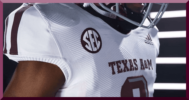
Texas A&M


Doesn’t look like any changes here — although now the Adidas logo appears to be on the butt of the pants.


Thumbs up, never cool down.
Aggies got the new @adidasFBallUS Primeknit #A1 heat.#teamadidas #GigEm pic.twitter.com/G99gbCJJNv
— Texas A&M Football (@AggieFootball) August 6, 2018
You can read more on these here.
Miami


Just three uni combos shown, but they’ll probably reuse the black “Miami Nights” uniform from last season (note the tire tread pattern on that). It remains to be seen, if indeed the uni is worn again, whether it will be in the new material/template.
.@adidasFBallUS bringin’ the 🔥🔥🔥!
The newest Primeknit #A1 uniform has officially arrived in all three colors. #AllAboutTheU | #teamadidas pic.twitter.com/zAjL8f5F7w
— Canes Football (@CanesFootball) August 6, 2018
There’s a bit more on that here.
Louisville


OK — that wing pattern on the white uniforms is new. L’ville has had a shitty shoulder cap stripe for a while now, but this one — I think I need to see it in action before I render a judgment. Also note the TV numbers are rotate towards the front of the uniform, rather than to the side. Like some other new Adidas unis this year, there is a subtle pattern in the print on the sides.


Handing out L’s all season.
Peep our new @adidasFBallUS Primeknit #A1 uni.#L1C4 #teamadidas pic.twitter.com/yb8zmKlwNb— LouisvilleFootball (@UofLFootball) August 6, 2018
A bit more on those unis here.
Kansas

You can get probably the best look at the pattern from looking at the Kansas jersey.


Interestingly (or at least a far as I could tell), KU didn’t do a hype video, but instead put out a graphic showing the finer points of the uniform:
A closer look at design elements in our new @adidasFBallUS Primeknit #A1 unis 👀⬇️ pic.twitter.com/pR5GAoLzgb
— Kansas Football (@KU_Football) August 6, 2018
Rutgers


Rutgers have a few changes this season — including new northwestern striping on the sleeve caps of the jersey, plus a partial NW stripe on the pants, which had been solid white. You can read more about those changes here.

 .
.
New Year, New Threads‼️😤🔥@adidasFballUS | PrimeKnit #A1 pic.twitter.com/LT6VcQLHym
— Rutgers Football (@RFootball) August 6, 2018
Here’s a bit more on those.
Arizona State

We’ve known these were coming for some time (plenty of leaks) but it was official yesterday. These are much cleaner than the previous iterations and there’s nothing wrong with that! Most notably these have the Arizona State flag sublimated into the uni. Not sure how visible this will be on game day, but up close it looks nice.


Fresh threads for the new season from @adidasFBallUS 🔥🔥🔥
Introducing our Primeknit #A1 uniforms.#teamadidas pic.twitter.com/PcY8J5BkyC
— Sun Devil Football (@ASUFootball) August 6, 2018
More info on that uni here.
Phew!
That’s a lot to absorb, but suffice it to say that — at least as far as the “look” of the unis go — every team who has switched to the new template should look a lot better on the field. Of course, we’ll need to see the unis in action (and it would have been nice if the schools themselves had identified any changes, especially the obvious ones) to render a final judgment, but based on the few photos and hype vids, these all look to be a vast improvement over the past generation of template. Miami especially looks good (if you recall, their tenure with Adidas began with the weird shoulder cap striping, bad fonts and even worse NOBs. All of that improved during the first season [a real rarity] when Adidas made changes mid-season to the uniforms). I’m really interested to see how Louisville’s uniforms turn out, as they had been one of the worst in football. But based on what was revealed yesterday, Saturdays this fall could be looking a LOT nicer!
Your thoughts?
Collectors Corner
By Brinke Guthrie
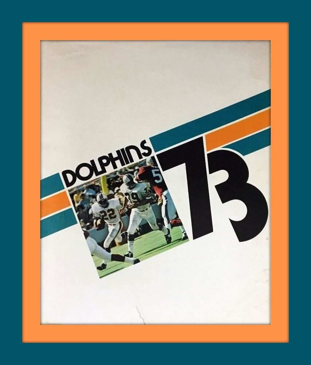
The Miami Dolphins 1973 season was almost as good as the previous 1972 season. OK, so they didn’t go undefeated as in 1972, (you can’t have everything) but 1973 did bring them another Super Bowl win, this time over the Vikings. The 1973 season is documented in this hardback book, appropriately titled “Dolphins 73.” The dust jacket shows some wear (don’t we all after 45 years) but the book itself looks to be in fine shape. Now for the rest of the week:
• WBEN Radio 930 sponsored this 1970s NBA Buffalo Braves glass.
• Here’s a bag of 1950s basketball players– a “ten man squad.” You can “run, pass and shoot with a moveable ball.”
• Here’s a set of mixed decade New York Yankees memorabilia; a bank and stein from the 1970s and a mug from 1990.
• And one more for the Bronx Bombers; 11 different bumper stickers in this lot, including one that says “Billy’s Back.”
• Jets WR Don Maynard was the obvious model for this 1970s Jets light switch wall plate.
• The SF Giants gave these away a few weeks back- “Battle of the Bay” snowglobes which show the Giants and the Oakland A’s- it has a 1989 World Series theme.
• Here we have a 1970s Chicago Bears helmet coat rack.
• I guess this 1970s Philadelphia Eagles Bill Bergey jersey was a promo item for “Aim toothpaste;” the tag on the hem says “Designed and tailored expressly for Aim toothpaste by Medalist Industries.” The seller also has a Rams McCutcheon jersey, too.
• This lot of four 1970s-1980s Sonic promo NFL plastic mugs includes theSaints, Oilers, Falcons, and Washington.
• Phil Esposito used to endorse all sorts of hockey stuff- here he is on the packaging (minus Bruins logo) for an “official” street hockey blade. (Street hockey sneakers, anyone?)

And now a few words from Paul: Hi there. First and foremost, let’s have a nice round of applause for Phil, who’s been doing a great job during the first week of my August break from the site. Kudos to him and to the rest of the Uni Watch team.
My thanks to the many of you who checked in with “Hope you’re feeling better” sentiments after I mentioned last week that I’d caught a nasty stomach bug. The good news is that while I’m not completely out of the woods yet, I am finally feeling a bit more like myself. The bad news is that things got significantly worse before they got better — so much worse that I had to go to the ER on Sunday. Have I mentioned that I’m moving in a few weeks? Ay-yi-yi.
Anyway: I have some news updates on a variety of fronts. One at time:
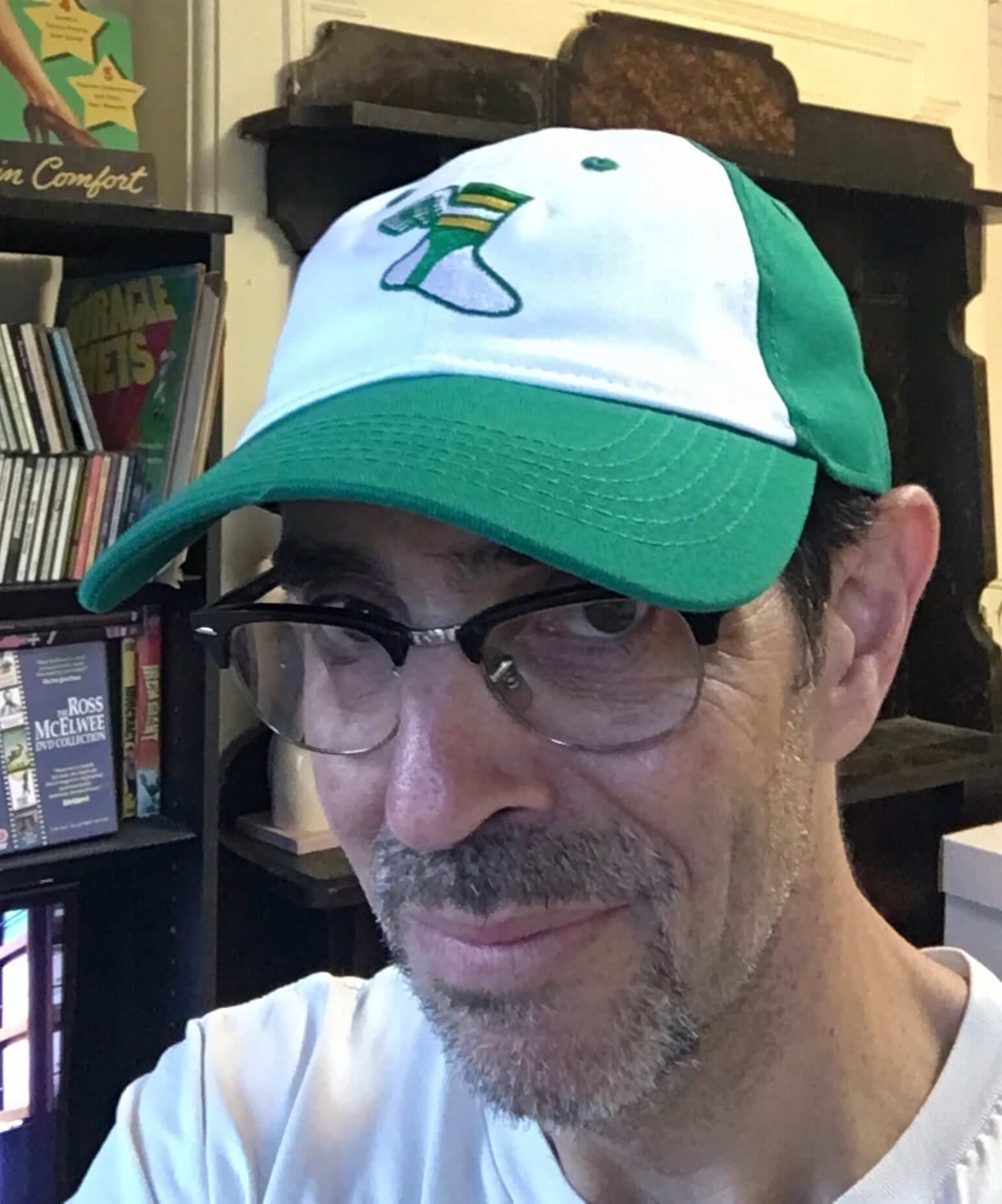
1. As you can see at left (and can click to enlarge), Uni Watch flex-fit alternate caps are starting to arrive in people’s homes — including mine. Looks great, feels great, and we have an update regarding the sizing: We had originally said, based on info from the factory, that the L/XL size was the equivalent of a fitted size 7 through 7-3/8. But now that the product has come in, the L/XL clearly stretches to the equivalent of a 7-5/8 (we checked this on several caps), so we’ve updated the product specs on the ordering page. I’m hoping this will put the cap in the “I can wear this after all!” range for more of you. You can order the cap here.
2. I have continued to add a couple of items to the Flickr set of things I’m selling before I move. Check that out here, and make me an offer if there’s anything you’re interested in.
3. Speaking of stuff I’m selling, for a variety of reasons I’ve decided to sell several hundred of my LPs and CDs. Some are rare and valuable; others are fairly common; all are very good music. I will sell these only in person, at my apartment. I’m having an open-house sale this Saturday, Aug. 11, but you can make arrangements for a private shopping session either before or after that date. Full details here.
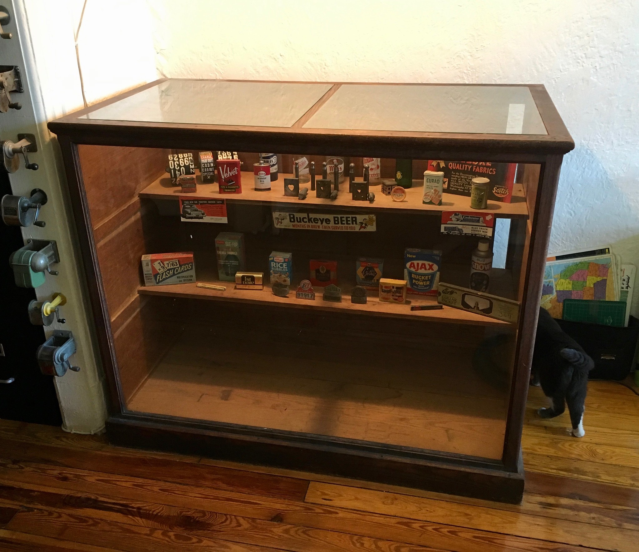
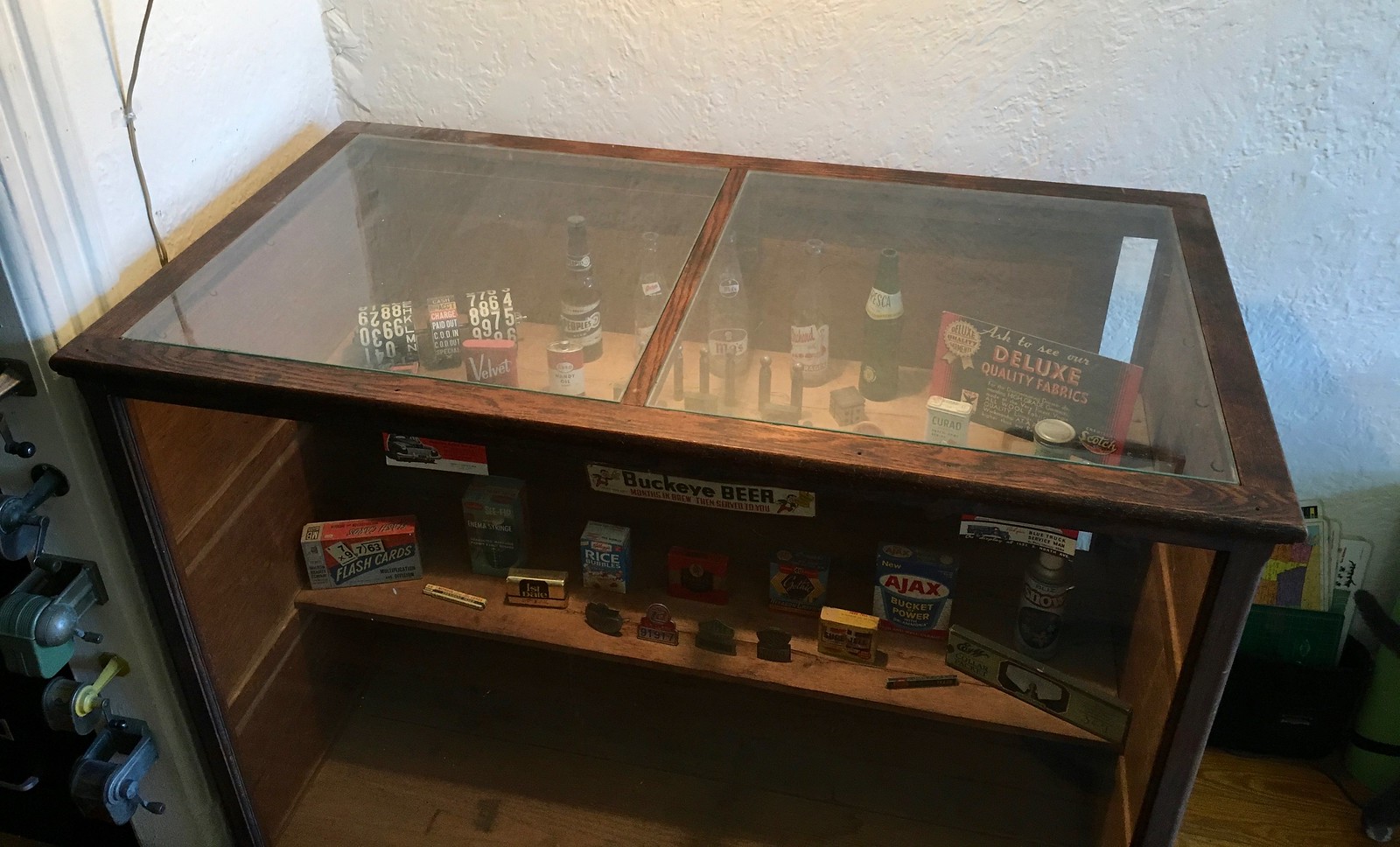
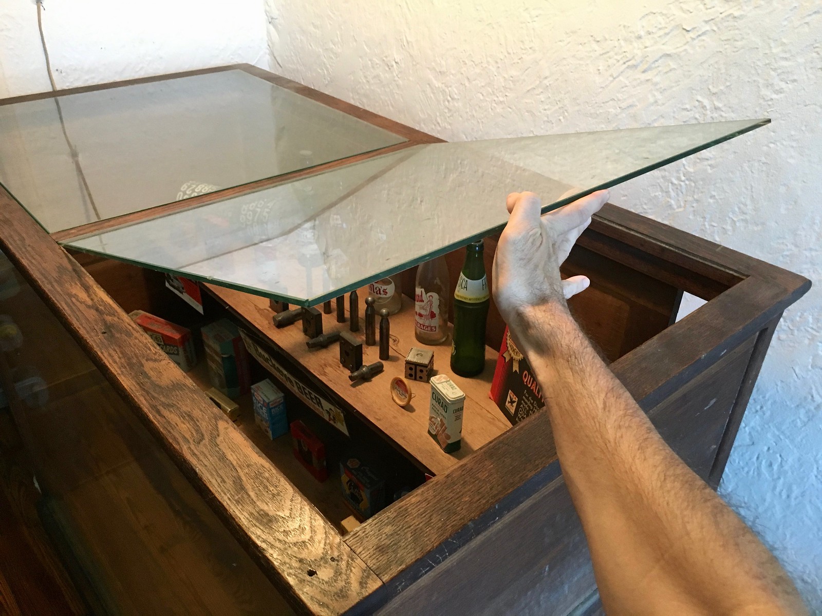
4. Finally, speaking (again) of things I’m selling, I’m getting a bit concerned about the fate of my beautiful antique display case, which will not fit in my new home. I’ve listed it everywhere (Craigslist, eBay, etc.), mentioned it to friends, contacted a few dealers, included it in the “Stuff I’m Selling” Flickr set, blah-blah-blah — haven’t had a nibble. It has to go somewhere by the end of August.
I understand that it may be too large for many households. It does have a big footprint (52″ wide, 28″ deep, 43″ high), but it also has big virtues: Wood and glass, with sliding wood doors in the back, two removable glass panes on top, and two movable interior shelves. Perfect for showcasing collectibles, heirlooms, etc.
I’ve been asking $350 for it, which I think is way less than it’s worth, but I’d consider any reasonable offer. My main concern is that I don’t want it to end up at the curb, because that’s just too sad to contemplate. If you’re interested, or if you have any questions or concerns, please let me know. Thanks. (For the four photos below, you can click to enlarge.)

That’s it. Thanks for listening. I’ll retreat back into the background now.
The Ticker
By Alex Hider

Baseball News: The 2018 Players Weekend caps have been released. Like last year, the caps are in highlighter colors. However, the caps have contrasting brims this year (thanks to all who shared). … Looks like the Rangers have come up with a final season logo for Globe Life Park, which will close following the 2019 season (from John V.). … According to Joe Erwin and Sean, the numbers on the jerseys of some of the Red Sox’s recent call-ups are riding low, as if some space was left for a nameplate. Of course, the Sox don’t wear NOBs on their home jerseys. … The Phillies honored the 2008 World Series champs before Sunday’s game. Lots of inconsistencies with the jerseys in the team photo, including font stroke width and jersey templates (from Jake Fayette and JLS). … Pirates players dressed up in NBA and WNBA jerseys for their road trip. Third baseman David Freese dressed as the ref — but wore a college ref’s uniform (from Brian Cox). … Reds 3B Eugenio Suárez likes to blow bubbles with bubblegum (WSJ link) — BIG bubbles. … This package of Rawlings mini-helmets mixed up the National and American Leagues (from Billy King). … The Omaha Storm Chasers wore uniforms based on the video game Fortnite last night (from Blake Cripps). … Not uni-related, but a nice move by the Indians, who replaced a fan’s tickets after she missed a game 52 years ago because of an accident (from Jason Hillyer). … The Brandywine Base Ball Club of West Chester will host a doubleheader of vintage base ball matches on Saturday, August 11th, 2018 at East Goshen Park (from Jim Dornberger).

Football News: Has anyone else seen products like this that allow teams to change shell colors on the cheap? (From Joe Nocella). … We have a couple of Canadian Junior Football League opening weekend notes from Wade Heidt: The Westshore Rebels at Langley Rams went col0r-on-color, and the Valley Huskers broke out new BFBS uniforms.

NFL News: Brian Dawkins’ Hall of Fame bust has a style inconsistency — all the dates on it are fully written out, except for the year he retired, 2011 (from @MWM145). … Lots of issues with the piece of art honoring Randy Moss’s Hall of Fame induction: The hairstyle on Moss’s bust is inaccurate, it shows him scoring in a jersey he never scored in and shows him celebrating in a purple end zone, which the Metrodome never had (from @jesseredacted). … Looks like Jags RB Leonard Fournette will continue to wear his LSU shoulder pads under his jersey this season (from Clint Richardson). … Frank McGuigan notes that TC from Magnum, P.I. wore Eagles and Falcons hats at different points during the shows run from 1980-88.
College Football News: There’s currently a shortage of new Georgia Tech Adidas merchandise, even though the team’s new football uniforms were just unveiled (from Mike McLaughlin). … Speaking of Tech, Steven Little mocked these uniforms before the Jackets unveiled their new set. … Looks like West Virginia has added yellow to the nose bumpers on their blue helmets. Last season, the nose bumpers on the navy helmets were black (from Brock Barwick). … With rumors swirling that Notre Dame may wear green against Michigan this year, this blog breaks down whether green brings the Irish luck (from Phil). … North Texas has quite a few uni combinations available this year (from Robert Botts). … By the looks of this photo, Monmouth will be wearing at least three different helmet colors this year (from Coach IV). … Southern Illinois has added white helmets to its rotation (from @mrmichael21). … New white lids for Georgetown (from Phil). … North Carolina will be using digital down markers on the sidelines this season (from James Gilbert). … Speaking of the Tar Heels, 13 players were suspended yesterday for selling their team-issued Jordan shoes. Of course, Jordan will get millions of free ad time from Tar Heel players this year, as their logo is on UNC’s jerseys.

Hockey News: When the Minnesota North Stars picked their color scheme in the mid-’60s, they took care not to choose colors too similar to other local teams or borrow schemes from prominent NHL teams (from @spellsgood).

Basketball News: This shooting sleeve has a mashup of the Warriors’ current and mid-2000s logos (from Dan Kennedy). … Shizz Alston Jr. will wear No. 10 at Temple, just like his dad, Rafer Alston, when he was at the school (from Michael MPH). … New floor for Minnesota’s Williams Arena (from Jeremy Formo). … A YMCA in Rockford, Illinois partnered with Rockf0rd Area Arts Council to make this wild Frank Lloyd Wright-inspired basketball court (from Jonathon Cain). … Repost: Pittsburgh Pirates players took a flight dressed up in NBA and WNBA jerseys recently. Third baseman David Freese dressed as the ref — but wore a college ref’s uniform (from Brian Cox).

Soccer News: Lots of minor changes for the Auburn women’s soccer uniforms (from Clint Richardson). … Real Madrid unveiled a new third jersey made entirely of ocean recycled plastic yesterday (from Jeff Eisenband).

Grab Bag: Australian rugby player David Pocock chooses not to promote brands, and spray-paints his cleats black to erase any potential advertising (from Jason Hillyer). … Staying on the rugby pitch, Northampton Saints of the English Premiership unveiled a new BFBS jersey — and Rugby Shirt Watch even gave Uni Watch a bit of a shoutout (from Adam Ingle). … Some NASCAR teams had been altering their paint schemes to obscure body modifications from the new scanner-based inspection process (from Chris H.). … Jim Vilk noticed some issues with the superscripts on the street signs near his home. … Newsday crossword puzzle on Sunday was titled “Arena Ad ventures.” A fun play, but remember: They’re all named wrong.
One very small item to note about David Freese’s referee uniform. He is dressed as a women’s college referee. Men’s college referees have a black side panel. Women’s college referees do not.
For the life of me I couldn’t understand why guitarist Little Steven would mock the GA Tech uniforms. Clearly I misread.
In any case, it should read “mocked up”.
Yeah, I was surprised when it said “mocked” because I didn’t understand how it was making fun of them. Anyway, Steven’s design is SO MUCH BETTER than the Adidas “stinger” stripes.
He wants them to return to the uniforms of their glory days.
I see what you did there.
Re: Yankees bumper stickers in Collectors Corner…
… “Stars IN Stripes”?
I assume it refers to Yankees players (stars) wearing pinstripes
Shizz Alston’s father was Levan Alston, not Rafer Alston. Neat to have him switch to the number his dad wore, nonetheless.
I’d been wondering whether Adidas was dropping their old template after the new Indiana jerseys lacked it. Overall I think it’s an improvement, though some of the little things like the Adidas logo on the buttock and the Louisville TV numbers are downgrades. Also, is there anything more painful to read than press releases about new uniforms and how much “lighter” they are? I’m sure there will be a dramatically noticeable spike in statistics now that the new jerseys allow more freedom of movement…
Agree with the “butt” logo. Why would they do that? Maybe the model put the pants on backwards? (We can hope.) Also, I think we’ve all had our fill of those press releases. They just seem unnecessary at this point.
I really like how, with the new template, Adidas has moved their logo from the collar to the shoulder. I always felt like the manufacture logo on the collar looked a bit little league or high school. Looks more professional this way.
I think the makers mark belongs below the neckline on the back of the jersey. If it is going to be somewhere visible, but it on the back like normal shirt tag.
Putting that little insect below the neckline shoves important things like the player’s name and number further downward.
If you’re going to have a maker’s logo, do what CCM used to do on hockey jerseys and have it at the bottom or some other out-of-thw-way place.
Regarding the Pro Football Hall of Fame dating system… Dawkins’ dates are actually consistent with their style. Usually, they use the four-two format for years (e.g. 1963-76 or 2003-11), but when dealing with those who stayed with the same team between 1999 and 2000, they go with the four-four format (e.g. 1996-2008), likely because 1996-08 would look awkward.
Correct, if it’s in the same Millenia, they will only use 2 numbers. but the 19 to 20 switch, they write out the entire number. Damn Y2K.
More on Auburn soccer’s uniform changes: link
I wouldn’t call the Northamption Saints new jersey’s BFBS. The club’s colors are black, green, and gold, and they’ve always had black in the jerseys as an accent color.
Shoutout to Jim Vilk!
Those signs have to be from Cuyahoga Falls, right? I grew up three or four blocks from those intersections.
I think randy moss wore that jetesey during his second stint with the Vikings
Correct, Randy Moss did wear that style of jersey with the Vikings during his four-game stint with them in 2010. But the point is that he didn’t wear that particular jersey style (the home purple) when he scored any of his touchdowns with Minnesota that year. He scored twice with the Vikings in those four games, but both were on the road while Moss was wearing his white jersey. Here’s his 2010 game log for your reference:
link
The GUD backs this up as well. link
Louisville’s uni also has a sublimated circle of stars on one of the sides (I forget which). It’s taken from the city of Louisville’s flag.
link
The image of Randy Moss is also inaccurate, because his bust in the image has a hairstyle inconsistent to what he went in with. The real bust has cornrows.
Big improvement for Arizona State, but I think we all know what would’ve made them even better…..ol’ Sparky.
It appears only one Pirate is wearing a WNBA uniform–for [team name/advertiser redacted].
Nice to see the 3-point line on the Frank Lloyd Wright court was rendered to reflect rules differences between men/women or high school/college. But either the half court is too large for 3-on-3 play, or not large enough for a full court, besides there being only one basket.
Randy Moss painting reminds me of when the Pro Football Hall of Fame would have not only a bust for each person enshrined, but also a drawing showing that person in action. They stopped making these “murals” a few years back; I wish there was some way in the Hall of Fame that visitors would be able to see these images.
Two Scottie Pippens is a sign the end of days is upon us for sure.
The new Adidas template is a major upgrade over the “tire tread” design (or, as I thought of it, the “link” look). That said, it could still stand some improvements.
The jersey numbers appear to precisely mimic the fabric patterns underneath them – diagonal twill-like ridges or micro-mesh, often with both on the same numeral. This creates a busy, visually unpleasing effect. It would have looked better if they had broken up the patterns with a smooth, plain finish on the numbers.
That said, the numbers are a bit of a mystery if you look at them up close. They have stitched, alternating color borders that make them look like they’re embroidered. But they way the underlying fabric pattern shows through on the numerals, it almost looks like they were screen-printed and then someone stitched the border around the screen printing. If they are applique numbers rather than screen-printing, I’ll concede that it’s an impressive design feature to match the fabric patterns between the numbers and the jerseys so perfectly.
Nebraska’s uniforms went from near-perfect to hideous in 1995 when they dropped the pants-stripes and went all shiny. After a few years, they realized their mistake and went back to the stripes. History is now repeating itself, with the stripes disappearing again. Yecch.
The article about the North Stars choosing colors that wouldn’t conflict with existing (and future, according to the article) teams was amusing.
Considering you only had 6 teams existing and five of them had either red or blue, or both, in their color scheme, how difficult was it to not use those colors? And there ultimately was a conflict as the Oakland Seals (pre-Finley) came in at the same time with green as their primary color with blue and white trim.
Yet, it’s still more baffling to me how 3 of the original 12 teams in the WHA had ORANGE as their primary dark color…
-Jet
Speaking of same colours and WHA. I am amused by the last season in 1978-79. 5 of the 7 teams wore a blue uniform. Almost half the teams blue with red trim.
link
Just me, or a bit odd that Rutgers – a B1G team – adds stripes named after another B1G team?
Shizz Alston’s father is Levan Alston
Ottawa Rough Riders in 1970 had TV numbers towards the front.
If you mean the front-facing TV numbers, it was more mid 1960s.
link
We can tell from looking at the Grey Cup games featuring Ottawa. They wore the front-facing TV numbers in 1966 Grey Cup.
link
However, the Rough Riders had changed to the more conventional TV numbers by the late 1960s. As seen in the 1968 Grey Cup:
link
Also 1969 Grey Cup:
link
If sleeve numbers can face that way, then there really is no excuse to keep using the silly term “TV numbers”, as they will be visible to other players facing them and not to TV cameras on the sidelines. Can we just call them “sleeve numbers” in all cases? That’s what they are. A “TV number” would be a numbered sticker on the side of a press box TV monitor.
A bit more about the Valley Huskers in the BC conference of the CJFL.
Though the new uniforms are black, would not necessarily classify as BFBS. It actually is kind of a throwback to earlier days of the Huskers wearing black uniforms.
link
Just more recently (like last few years) they had been wearing mono-green:
link
Also notable this year – The scarecrow’s hands show up on the logo with the head. Was just the scarecrow’s head on the uniforms last year. Barely noticeable but you can tell when comparing this photo with last year’s look linked above:
link
The headline of this post is confusing. Avoid the word “drops” in cases like this.
I got confused too. I thought Adidas would be “dropping” (as in, canceling plans to use) some hideous template they had been considering.
Tonight, there’s a Little League regional game featuring Oklahoma in the “beach blanket” jerseys and New Mexico wearing some black and green “rainbow guts.”
Staten Island’s Little League team has a pretty sweet uni
link
Never thought I’d see the words “best” and “Kansas” (without “State” immediately following) in the same sentence as it pertains to college football
As it pertains to your music sale, I seem to recall having seen in previous pictures that you have a fairly decent-sized collection, and I would imagine there’s definitely some cool and obscure stuff in there. Have you checked in to somehow posting the event on a site like Discogs to attract more prospective buyers? I admittedly only use the site for its expansive database and haven’t gotten a whole lot in to its Marketplace feature, but I would assume there’s some way to get the word out on there about your sale.
Glad to see someone came up with a workaround to the one helmet shell. It doesn’t seem ready for prime time yet but give it a couple of years and NFL teams can do full on throwbacks.
I’ve asked this before: any way that the helmets could be 100% covered with a decal that would mimic the old helmet? The helmet logos are replaced frequently, this would be no different than what NASCAR does with cars.