Click to enlarge
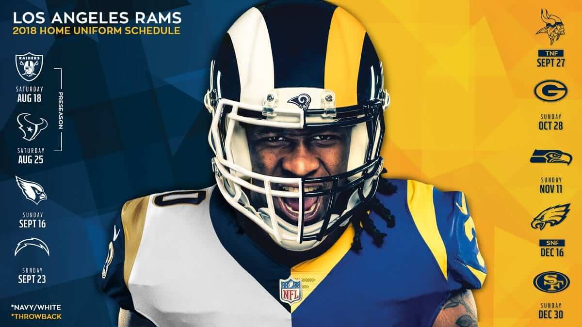
Paul here, pinch-hitting for Phil, who has this weekend off. Big news yesterday out of L.A., as the Rams announced that they’ll be wearing their royal/yellow throwbacks for an unprecedented five games this season. As you can see in the home jersey schedule outlined above, they’ll wear white for their first two home games (and also for their two preseason home games, but who really cares), and then the throwbacks for the remaining five home dates after that.
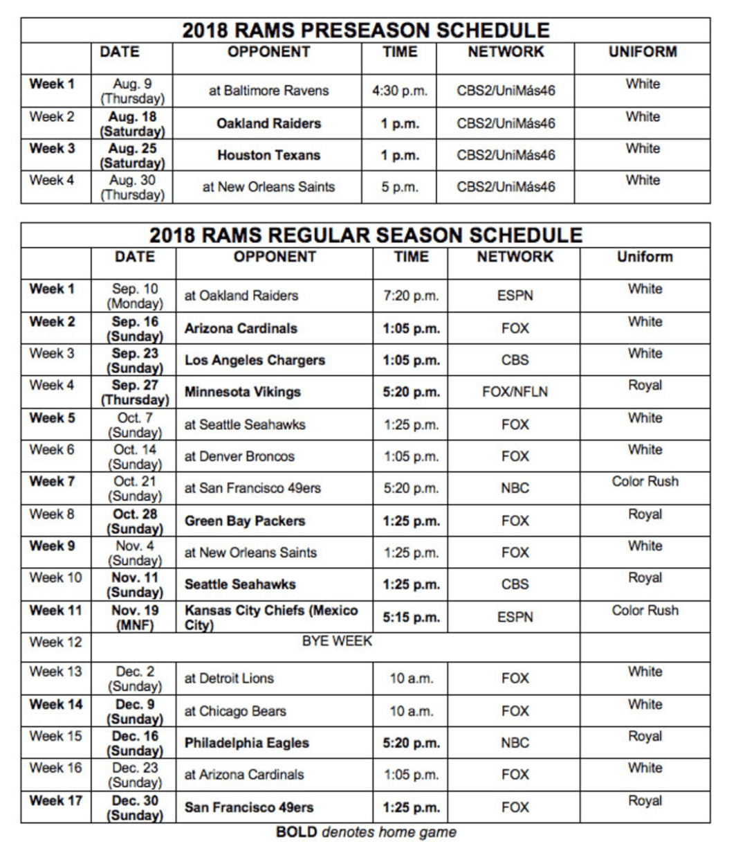
But what about their road games, and their additional “home” game being played in Mexico City? The team’s full 2018 uni schedule is outlined below (click to enlarge):

So for those nine additional games — eight on the road and the “home” date in Mexico City — they’ll wear white an additional seven times and the Rash twice. Which means we won’t have to see the brutal spectacle of the gold-trimmed navy jerseys with the white-accented helmets at all this season.
The Rams had already stated a month or two ago that their goal was to minimize wearing the navy this season, and ideally to eliminate it altogether. It’s interesting that their solution is to wear their throwbacks five times — something that ordinarily wouldn’t be permitted under NFL uni rules. In a statement, Rams COO Kevin Demoff said, “We appreciate the NFL working with us” on the uniform situation, which I gather is code for “Thanks for letting us swap out the navy for the throwback so we can get out of this clusterfuck we created for ourselves.” In any case, everyone seems to like the throwbacks (myself included), so this qualifies as good news.
Here are the obligatory answers to the questions that some of you are getting ready to ask:
• No, the throwback helmets do not violate the NFL’s one-shell rule because they will be the same helmets that the Rams usually wear, but with yellow horn decals and blue facemasks. Same shells, different accessories, which is within the rule’s guidelines. (For more on the one-shell rule, look here.)
• Yes, the Rams’ white jerseys will still have the gold accents. Nothing about the design of the white jerseys is changing. In fact, nothing about the design of any of the Rams’ uniform elements is changing. The only thing that’s changing is how often they’ll be wearing the throwbacks.
• Yes, the Rams will eventually get a full new uniform set — in 2020, to coincide with the opening of their new stadium. That’s been the plan all along.
Finally, it’s interesting to see the Rams unveiling their full-season uni schedule in late July. That’s the earliest I can recall such info ever being provided by an NFL team. The teams are supposed to finalize their uni schedules by this time (home teams are required to indicate whether they’ll be wearing color or white, and road teams then have to choose the opposite), but most teams don’t make that information public, and the handful of teams that do routinely publish their uni schedules usually wait until late August or early September to do so. The Rams going public with their uni schedule tells us that the uniform matchups for the entire NFL season have now been mapped out — we just don’t know what they look like yet. Here’s hoping more teams follow the Rams’ example, because there’s really no reason not to share this info with fans.
Mercury poisoning: Yesterday was the 19th anniversary of the Mets wearing their “Mercury Mets” uniforms as part of MLB’s 1999 futuristic-uni promotion. The video shown above, which originally ran during the pregame segment of that day’s broadcast, features short interviews with the Mets’ then-equipment manager Charlie Samuels, then-marketing director Kit Geis, and then-benchwarmer Matt Franco, all of whom discuss the uniforms. Priceless stuff.
(My thanks to @tubby34 and @BigAppleNYM for letting me know about this one.)

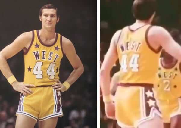
Friday Flashback reminder: In case you missed it on Friday, my latest Friday Flashback piece for ESPN takes a look at some uni-notable moments in Lakers history (including Jerry West wearing his name on the front and back of his All-Star jersey, shown above). Check it out here.

Even more cool stuff for sale: I’ve continued to add more photos of stuff that I’m trying to sell before I move in late August. You can see everything that’s currently available in this Flickr set, and I’ll continue to add a few more each day (and I’m also removing items as they sell).
Please click on the thumbnails to see larger versions and, more importantly, to read the descriptions of the items, which among other things indicate whether the item is something I’m willing to ship or if I’m only offering in-person pickup. (You can see even larger versions of each photo by clicking the download icon and choosing “View all sizes” from the resulting popup menu.)
If you’re interested in any of this stuff, please get in touch and make me an offer. I’ll continue to add more items to this photo set each day, so stay tuned. Thanks for listening.
The Ticker
By Anthony Emerson

Baseball News: The Braves’ Hall of Fame display for Chipper Jones features a “1995 road jersey” that’s clearly a fake. It includes the 1995 World Series patch and the team’s 30th-anniversary patch, but the jersey has the Majestic logo — a dead giveaway, because the Braves’ 1995 road jerseys were made by Russell Athletic. Also, it’s nice that they included a vertically arched NOB, but they did it with direct-sewn lettering instead of an era-appropriate nameplate. … Speaking of Hall of Fame inconsistency, MLB.com is selling an inaccurate Trevor Hoffman jersey. That jersey is the Pads’ 2012 design, and Hoffman retired in 2010 (from Patrick McCullough). … Also posted in the hockey section: there have been a bunch of really, really great minor league one-off jerseys and caps this season, but I think the Hartford YardGoats’ Whalers-inspired pullovers (complete with collar laces) take the cake. Absolute amazing. They first wore them last night and will wear them tonight and tomorrow night as well (thanks to Alex Smolokoff). … The bat boy for the Phillies during their visit to Great American Ball Park in Cincinnati wore two-in-ones (from Patrick O’Neil). … The American Association’s Gary SouthShore RailCats are donning throwbacks on Aug. 23 (from David M. Kerr and Steve Olson). … Another one also posted in the hockey section: Ohio University has publicized a concept image for hockey sweaters designed to look like the school’s baseball jerseys. … Artist Opie Otterstad unveiled his mural in honor of the Astros’ World Series championship (from Ignacio Salazar). … The next several items from the Iowa High Schol Baseball Tournament are from Kary Klismet: “Mason City Newman wears Northwestern stripes on the sleeves of their home jerseys. I’ve never seen that on a baseball jersey before.” … “The Wilton Beavers wear an eclectic mishmash of logos, including the Brewers’ old ball-in-glove, the Nationals’ script “W,” and their own stylized “B” with a beaver tail.” … “The Estherville Lincoln Central Midgets have rather unique caps.” … Centerville wears mismatched batting helmets, one of which sports an elaborate war bonnet design.”

Football News: The Jaguars have new uniforms this season, so it’s not surprising that they also have new practice gear (from Jackson Willis). … Here’s a nice side-by-side showing the slight changes to the Longhorns unis compared to last year’s (from @atxaggie07). … Also posted in the college basketball section: We’ve seen team logos stolen before, as well as the logos of professional sports leagues, but have we ever seen an NCAA athletic conference logo stolen before? Spotted in New England of all places, too (from Ciaran O’Donnell). … Justin C. Cliburn noticed a poached Georgia Tech logo on this sticker in Texas. He thinks it’s for a school, but doesn’t know for sure. Googling didn’t help. Anyone have any idea what the sticker is from? … Another one also posted in the college hoops section: Roger Williams University has unveiled a new athletics logo (from Joel Mathwig). … Tennessee is marking the 20th anniversary of their national championship with a new logo that incorporates the crystal egg trophy (from Lee Wilds).

Hockey News: Check out this old pic of Adam Oates wearing mismatched gloves during his tenure with the Capitals (from Michael Alper). … Cross-posted from the baseball section: There have been a bunch of really, really great minor league baseball one-off jerseys and caps this season, but I think the Hartford YardGoats’ Whalers-inspired pullovers (complete with neck laces) take the cake. Absolute amazing. They first wore them last night and will wear them tonight and tomorrow night as well (thanks to Alex Smolokoff). … Also cross-posted from the baseball section: Ohio University’s publicized a concept image for hockey sweaters designed to look like the school’s baseball jerseys. … USF has unveiled their new sweaters (from Kody Allenson).

College Hoops News: Also posted in the college basketball section: we’ve seen team logos stolen before, as well as the logos of professional sports leagues, but have we ever seen an NCAA athletic conference logo stolen before? Spotted in New England of all places, too (from Ciaran O’Donnell). … Another one cross-posted from the college hoops section: Roger Williams University has unveiled a new athletics logo (from Joel Mathwig).

Soccer News: Arsenal have unveiled their new third kit with several players modeling it around London — including goalkeeper Petr Čech. As a keeper, Čech will never wear this kit in an actual match, so a somewhat strange choice for Puma and Arsenal (from Moe Khan). … The greatest kit of all time? Bedale AFC is no stranger to wurst-inspired kits, having worn an all-sausage kit in 2016, but this season they’re going full hot-dog, complete with the greatest uni number font I’ve ever seen. Definitely among the greatest kits of all time (thanks to Greg Niforos). … New kits for Croatian side Osijek (from Ed Żelaski). … Also from Ed: The kit of a player on Wisła Krakow had all the ads, but was somehow missing the team’s actual crest. Disappointing, to say the least. … Yahoo Sports has produced a slideshow of the what they consider to be the worst kits across the top four leagues of English soccer. I agree with most of the choices, except for the inclusion of Manchester United’s away kit, which I actually really dig, even if it is too similar to Juventus’s away kit (from Kary Klismet). … New third shirt for Southampton (from Chris Morris).

Grab Bag: Major League Lacrosse’s Atlanta Blaze wore all-orange unis on Thursday night (from @LaxSportsNet). … Pitt has an awesome site where you can check out all the uniforms for each one of its sports teams. Click on the menu icon at top right, then click on “Future,” then click on “Our Look,” and then scroll down (from Mike Dias).
In the Baseball Ticker, the Ohio school name isn’t “the University of Ohio.” It’s “Ohio University.”
Fixed (in both places).
Compare Southampton’s first shirt (link) with the third shirt here. They’re both solid red on the back and the shorts and socks are also exactly the same.
Also, that’s actually Man United’s third shirt (the blue one) we’re talking about. It’s called the away kit in three different places (the Yahoo article, the Ticker itself, and Anthony’s linked tweet).
Panthers typically release their jersey schedule (or as they call it “jersey colors”) late July early August so we should see that this week if that routine continues
So the Bedale soccer players have hot dogs in their shorts, I mean on their shorts
The Arsenal goalkeeper Petr [note: not “Peter”] Čech could wear that third kit in a home match when the outfield players are wearing the primary kit.
Like I added on twitter yesterday, this was a common occurrence for Adam Oates. Don’t know why that wouldn’t add to the news, but you then again whether they cut the tape or not on a football helmet is all the buzz lately.
Was not* a common occurrence for Adam Oates.
I like the Rams uniforms
Isn’t the mercury mets only 19 years ago? 1999.
[Slaps forehead.] Yes. Fixed.
The Rams current situation is one of the strangest uni-related developments in a major league sport that I can remember.
Questions that I still have (that may have been answered here at some point in the past)…
– What is the logic behind the current NFL policy that jerseys cannot be changed without several years’ notice but apparently helmets can be changed at whim?
– Knowing that they were planning a complete uni change in a couple of years, why didn’t the Rams just keep the helmets with the “old gold” horns until then?
– Since teams can change helmet decals as long as they keep the same helmet shells, why don’t the Rams just apply the old gold decals for the few games when they have to wear the navy and gold jerseys?
The answer to your first question I suspect is that the jerseys are sold at retail unlike helmets and pants. It takes time to get new merchandise manufactured and distributed into the retail pipeline, and old inventory sold off, so it is not as efficient for the retailers to have to change designs too often. The answer to the next two questions is that the Rams and their LA fans associate the old gold color with their time in Saint Louis, and they want to be rid of that.
What is the logic behind the current NFL policy that jerseys cannot be changed without several years’ notice but apparently helmets can be changed at whim?
Helmets cannot be changed at whim. Teams are not permitted to have alternate helmets; they can only have different helmets designs that are part of a throwback or Rash uniform.
Your other questions are good ones. The Rams have really messed this up.
Paul: Yeah, maybe “at whim” was not exactly the right phrase to use there, but it does seem that either you can change your helmet design without having to adhere to the five-year rule, or the NFL granted the Rams an exception when they changed from the gold to white horns.
Special K: You’re probably right about those points, but aren’t manufacturers still making the navy/gold jerseys at least for newly acquired players to be sold at retail? For example, you can buy a Jared Goff jersey in the current style even though he never played in St. Louis.
Personally, I think the NFL should exempt teams who move cities from the five-year rule if they want to ditch connections to their old city with new uniforms.
The poached Georgia Tech logo in Texas is for the Gunter Tigers (small North Texas town).
Thanks!
The Wilton Beavers beaver-tale B is also stolen: It’s from the Portland Beavers excellent final uni set: link
If you’re going to steal, steal from the best, I guess.
The Mercury Mets always seemed off to me, compared to most of the rest of that project. Pretty much everyone else treated it as, “In the future, we’ll wear garish uniforms!” Except the Mets, who told their fans, “In the future, we’ll relocate away from New York!”
And not just to like Havana or something, but to the second-closest thing to Hell in the Solar System. (Popular Hell, not Dantean Hell, which would be more like the ice moons of Uranus. The Miranda Mets?)
Phil’s account of attending the Mercury Mets game from seven years ago yesterday is worth a read alongside watching the pregame video package: link
Roger Williams University’s old logo looks a lot like Marquette’s Golden Eagles logo from ’94 through ’04. link
Jeb Bush poached the SEC logo as well during his last campaign. Seeing that just made me angry.
Sunday Night Football, October 21:
Mayo vs Mustard
Niners in White vs Rams in Yellow
^ Paul, you think this might be subject to change (on the Rams part) if the league feels there’s not enough contrast between the home and road sides, and the Rams will have to wear royal an additional game (especially since they’re scheduled to wear royal the following week against Green Bay)?
The Indians are not selling Thome HoF with the correct era jersey either. They use their current home whites which I don’t believe Thome wore in his brief 2011 return. Those 90s home jerseys are so much more attractive than the current version.
That Chipper Jones uniform display irritated me way more than it should have. Whomever posted it on Twitter left out the trapezoid shaped rear belt tunnel, MLB logos on the rear neck line and belt tunnel and mismatched Majestic logos on the jersey and pants.
My favorite is the white with royal from the 1960s, followed by the royal and yellow. The question I have is will they be able to wear the throwback or color rush in the playoffs or Super Bowl? If they have home field advantage they could wear their white, but on a road game against say the Cowboys, or another team that elects to wear white, could put them in the navy uniforms for the first time all year. At least this season’s Super Bowl has the NFC as the home team, so they can wear white
“Mason City Newman wears Northwestern stripes on the sleeves of their home jerseys. I’ve never seen that on a baseball jersey before.”
The Oakland A’s in their glory years of the 1970’s wore sleeve stripes which had the appearance of Northwestern stripes. I always thought the A’s design was inspired by the then-popular 3-colored sleeve end, doubled.
Pass the Bucks arena