Click to enlarge
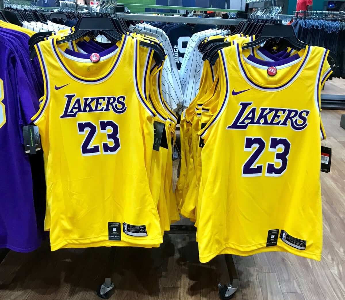
After a series of hints and leaks, we pretty much got confirmation yesterday of what the Lakers’ new jerseys will probably look like, as a photo from a Modell’s outlet showed the new merch for sale well in advance of next Monday’s official unveiling.
As earlier leaks and reports had suggested, the retail jerseys show the Lakers going back to the traditional scoop-neck collar (a big upgrade), eliminating the side panels (an even bigger upgrade), and going back to the old-school block-shadowed numbers.
Or are they? Let’s compare the original block-shadowed numbers from a game-used Magic Johnson jersey with the new ones from the Modell’s photo — old numbers on the left, new on the right (click to enlarge):
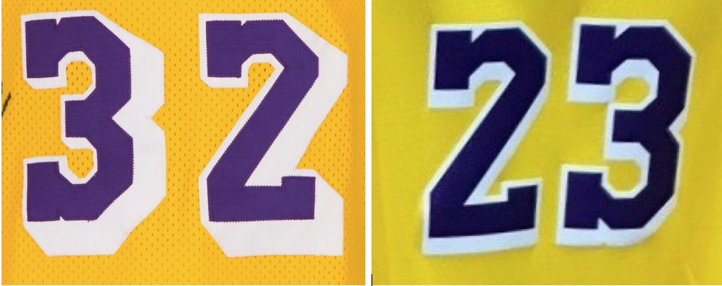
Leaving aside the color differences, which could be due to the lighting, there are significant differences in the numerals. The old numbers had deep block-shadowing that went down and to the right, while the new version is much less severe and just goes down — not to the right. Also, the top purple layer appears to be slightly less chunky. Personally, I prefer the old version (mostly, I confess, for reasons of nostalgia), but either version is an improvement over the flat numbers they’ve been wearing for the past two decades.
It’s also worth noting that the Magic-era jersey had the older, pre-1999 version of the Lakers’ wordmark, while the Modell’s jersey has modernized, cleaned-up version. If you’re not clear on the distinction, look here:
When the Lakers switched from the scoop collar to the wishbone collar in 1999, they also made subtle tweaks to their wordmark. Pre-'99 version on top, post-'99 version on bottom. pic.twitter.com/iPW3CaWNSb
— Paul Lukas (@UniWatch) July 24, 2018
So this new jersey — assuming the real thing matches the Modell’s photo, which is not yet a certainty — is sort of a hybrid, with some throwback elements, some holdover elements, and a new number style. Interesting!
Meanwhile, as long as we’re talking about the NBA: We’ve already known this for a while, but now it’s official — the Hornets will have white throwbacks this season.
More cool stuff for sale: I’ve added a bunch of additional photos of stuff that went unsold during last Saturday’s moving sale but that I’m still trying to sell. You can see everything that’s currently available here, and I’ll be adding photos of more items later today.
Please click on the thumbnails to see larger versions and, more importantly, to read the descriptions of the items, which among other things indicate whether the item is something I’m willing to ship or if I’m only offering in-person pickup. (You can see even larger versions of each photo by clicking the download icon and choosing “View all sizes” from the resulting popup menu.)
If you’re interested in any of this stuff, please get in touch and make me an offer. I’ll continue to add more items to this photo set each day, so stay tuned. Thanks for listening.
The Ticker
By Paul

Baseball News: Pink breast cancer jerseys next week for the Schaumburg Boomers (from Steve Johnston). … The Ogden Raptors will wear commemorative jerseys to mark the transcontinental railroad’s sesquicentennial (from Brice Wallace). … Here’s a mystery: Someone is leaving baseball cards in shopping carts at a Rochester-area Wegmans (from Joe Werner). … Very odd cap design for Venezuela in the Pan Am Games. … Remember when the Braves had red pullover BP jerseys in 1979? Right, me neither (from @tjctr). … The Midland RockHounds will wear Midland Angels throwbacks next month. … A new baseball league in South Australia has its first team: the Crushers. That refers to grape crushing, which in turn “references South Australia’s incredible and sophisticated wine region,” according to the press release (from Murral Conallin).

Football News: Some uni number changes for the Eagles (from Sam McKinley). … Texas fans are upset about photos that appeared to show the school’s burnt orange color looking more like Tennessee’s bright orange, but the team says it was just due to a filter being used on the photo. … UConn is bringing back their block-C helmet this season, and not a moment too soon. … New white uniforms for New Mexico State. … Arizona may have a throwback in the works (thanks, Phil). … Stanford appears to have added black outlining to the jersey numbers.

Soccer News: Looks like Wolves will have a sleeve advertiser, but we can’t see who it is, while it appears that Fulham will not have a sleeve advertiser (from Josh Hinton). … Bradley Wright-Phillips of the Red Bulls scored his 100th MLS goal and promptly removed his No. 99 jersey to reveal a No. 100 jersey that he was wearing underneath (from our own Alex Hider). … Starting this fall, Yokohama Tire — the jersey advertiser for Chelsea FC — will provide 11,000 jerseys to youth soccer players across America. So now thousands of kids who aren’t old enough to drive will be walking car tire billboards. Wonderful.

Grab Bag: There’s a rugby team out there with 18 uniform sponsors advertisers (from Alex Evans). … French cyclist Romain Bardet wore a retro-style helmet at the Tour de France. … Ooooh, check out this spectacular 100-year-old letterhead (big thanks to Michael Swanson). … Yesterday’s Tour de France stage started with the riders lined up in a grid according to their position in the standings, with each rider’s number placed on the ground in front of where he was supposed to line up. “Not sure if a grid like that has ever been used in the Tour before,” says our own Jamie Rathjen. “Usually everyone starts just in a big bunch and the officials have everyone ride non-competitively for a couple of kilometers before they officially start the stage. This stage was so short that they couldn’t do that, hence the grid.” … New logo and identity system for William & Mary athletics. … Delta Airlines, which introduced new uniforms about two months ago, is recycling the old uniforms into backpacks, totes, and messenger bags. … New logo set for UW-Green Bay (from Jeff Ash and Brian Kerhin).
Happy birthday to Ticker assistant Kris Gross. Enjoy your special day, Kris!
link for Venezuela item isn’t working
Should work now. Here’s the link: link
Still not working for me.
Hmmm. Changed it so that the image is now hosted on our site: link
Thanks. And – what are those, Venezuela?
Is it just me, or has the minor league baseball thing of commemorating stuff on jerseys, “playing as” types of food and such gotten out of hand?
ain’t just you sir
On the one hand, absolutely. Also, get off my lawn you damn kids!
On the other hand, we who follow athletic aesthetics closely see a forest of same-same, me-too promotions proliferating across a whole sport. “Not another too-cute-by-half Randomville Quirky Foods jersey.” For pretty much everyone else, including fans, players, and executives of any particular team, they see a couple of trees in isolation. “Hey, fun special event at the ballpark, and golly [name of quirky food] sure is delicious!” For us here, these are ubiquitous, everyday happenings. For “normal fans,” these are rare unicorns. Even when minor-league teams do promo jerseys more than once a week, as some now do, few fans will attend more than a couple of games in a season. If the home team is wearing quirky uniforms on the day a normal fan shows up at the ballpark, the fan experiences that as having shown up on a special-event day, not as the team wearing alternate uniforms every damn day.
I think changing the collar is a nice move for the Lakers, but the drop shadow numbers are not a good look. The flat letters are clearly more legible, particularly with the serif font the Lakers use. Last years set really did form their own legacy, they won 5 championships while wearing them.
6 (summer league 2017) ;)
Lakers old drop shadow, hands down.
– the “straight down” drop wasn’t a thing until the current Marlins’ uniforms… perhaps there was a reason for that. It looks more like a mistake than a conscious choice.
– the old drop shadow actually looked like it was supposed to be there.
– part of what I find endearing about the old drop shadow is how many mistakes there are! Look at the upper halves of the 2 and 3 – no shadow. Same for the negative spaces in their old 0s, 6s, 8s and 9s. For me, it was like the Yankees and Tigers mismatching their monograms for decades after people noticed.
Just for the record: It’s a block shadow, not a drop shadow.
When it’s connected to the top layer (as is the case with the Lakers), it’s a block shadow.
When it’s floating as an unconnected layer (link), it’s a drop shadow.
I stand corrected. Thanks for catching that.
Agree, be it drop or block shadow, I don’t think they work unless they are down AND to the right (or left). Just having the shadow down creates an odd appearance. Though it is far less of a problem with block shadow than drop shadow, but either way, still does look as good.
Gotta point to one of the best graphics ever created (by our own Scott MX Turner) to highlight the differences between drop and block shadow. This should always be our “go to” for such things:
link
I know better. I’ll do 5 Uni Watch-themed Hail Marys as penance.
Proofreading
Last item on soccer ticker is Yokohama
Also, but not important, in the soccer ticker, the Wolves sleeve advertiser is Coin Deal, the logo looks similar and, more importantly, they appear in the Wolves website next to the main advertiser and Adidas.
I think Wolves’ sleeve ad was already revealed if you want to see what it is. Couldn’t find a picture just now, which is probably for the best.
Re: the Yokohama shirts. Start ’em young, I guess…
Agree with Paul and others, earlier drop shadow is better. That said, still an upgrade from the post-’99 set (at least on the gold jersey; worried about the yellow numerals on the purple set).
My greatest concern– the shorts. All indications are they have gone away from the iconic side paneling, in favor of a generic/never before used “modern” striping. Bleh
Umm I think the South Australia Crushers might have gotten their logo for a certain Frontier League team
link
Oh, wow. That is a straight ripoff.
Wadduhyamean, it’s totally facing the other way, so it’s totally NOT like that other one!
And the C is from the Kane county cougars. What thievery!
Wow, nice catch on the Kane County thievery too.
link
Now they’ve revealed the next team name and logo: the Wasps. link
Another snarling anthropomorphic mascot. I wonder which team(s) they stole from for this one.
Found it: its the Sarnia Sting hockey team.
link
Which explains why it’s holding a bat like a hockey stick…
Or like a pool cue
Considering the fact that it is only a four team league that will be playing just a nine-game season (three games against each of the three other teams), Super League Baseball-Adelaide is probably a fairly low budget operation that thought they could get away with poaching a few logos from minor league or junior teams on the other side of the world without anybody noticing. But they didn’t count on Uni Watch!
The Australian Crushers baseball team logo was almost exactly what I expected and feared: a grape with a snarling face in the Brandiose style that has become ubiquitous in Minor League Baseball. I thought that the grapes were being crushed, not doing the crushing. It reminds me of the whale logo used by the Whalers. “Are we whales, or are we trying to catch whales?”
It’s also the same exact logo as the Lake Erie Crushers of the Frontier League:
link
If you are trying to go back to the original…go back to the original. The Lakers should restore their numbers and wordmark to the showtime era. The Knicks, the team I formerly rooted for, should restore their numbers and wordmark to the Willis Reed era, including vertically arched NOB (a perfect uni). The Steelers should return to block numbers (they are on their throwbacks this year!) The Mets, the team I unfortunately have to root for, should restore their script to 1962-1985 and fix some of their TV numbers that became out of balance during the drop shadow error. I guess it is nostaglia, but IMO they got uniforms mainly right in the 60s and early 70s…any subsequent tweaks are downgrades.
Steve D, I agree on all of your uni points, especially the Reed era Knicks uni. Just wondering, why did you give up on the Knicks but stick with the Mets? Both are hapless organizations run by despicable owners.
John I totally agree with you about the Knicks and Mets having despicable owners. (Knicks and Rangers have the same owners so its the same inept business practices on both teams. As a LONG SUFFERING Mets Jets and Rangers fan and having been all my life, its hard to drop the teams i live and die with. so the only satisfaction I get is at least having teams that look good on the field or on the ice. i could dump a girlfriend faster than changing my allegiance to another team. I could never root for the Yankees, Giants or Devils, Islanders, etc. Thats just how being a die hard fan is.
I get it and as horrible as the Knics have been under uber douche Dolan, I still pull for them. Just didn’t understand dumping the Knicks while sticking with the Mets.
I’m glad you asked this question John. There is no simple answer really. I was always a huge Knick fan and attended many historic games and playoffs games. It tore me apart when they lost. During the Isiah Thomas era, I lost interest a bit. Then when Jeremy Lin came on the scene, I went 100% back into it. I went to the game he scored 38 vs. Kobe. The Knicks fully played up Linsanity and the year after, he was gone. I liked the way he played. My heart gave out after 35 years of mainly suffering. The dysfunction of the organization makes it easy for me not to root for them. I did not pick another team to root for. The way basketball is played today, a lot of threes and dunks, is not exciting for me so I don’t feel I miss it. The way the Knicks play, I have never regretted giving them up.
As for the Mets, I do despise everything about the current ownership and the way they run the franchise. I believe they are as far away from possibly being a winning team than anytime in the last 40 years. They are just too much in my childhood memories to stop being a fan. I don’t go to games unless I get free tickets, so I try not to support them financially. Coming from a family of old Dodger fans, there is almost an expectation something is going to go wrong every year. It seems normal.
The cleaned-up “Lakers” wordmark is better overall, because of how the “A” nestles into the “L” and the “S” nestles into the “R”. But it bothers me how the purple parts of the first four letters and the last two letters are connected, but the serifs of the “R” don’t connect to the “E”. The more I look at it, the more it looks like “LAKE RS”.
The black outlines added to Stanford’s numbers are a huge downgrade. They’ve had that outline before, during the dark years of the mid-2000s, and it’s a far less clean look. Cardinal is a dark enough color to stand apart from white on its own.
Couldn’t agree more. Even if you like the look of the outline, you are unnecessarily messing with a classic uni.
Paul, doesn’t it look like the wordmark on the right jersey (in the two jerseys in the Modell’s picture) is different than the wordmark on the left jersey? It may just be a youth vs. adult template difference, but the wordmark on the right looks larger, and more slanted to the right.
Yes, and the numbers are different sizes on the two jerseys as well. As you said, I think this is just youth vs. adult.
Re the W&M wordmarks and logo, I think it’s a great set. Really happy to see an update that isn’t the Brandiose treatment.
I agree. The W&M design looks unique and memorable. It nestles somewhere in the sweet spot between whimsical and classic for me.
It was indeed the first time they did a grid start for the tour, but only for the top 20, everyone else started behind in a bunch. I think the goal was to have the main GC guys get involved in attacks right away, I don’t think it ended up happening that way, but it’s good that they’re trying to mix things up.
I’ve never seen gridded starts for amateur road races, but I do cyclocross and they do that (as a newbie and less accomplished racer I start near the back, hopefully this season I can move up in the rankings lol)
Good to see the Hornets bringing back the classic white jerseys.
It’s interesting how almost everybody seems to agree that the original Hornets’ uniforms are all-time classics, as being a Charlotte native I remember when they were unveiled and everybody, myself included, seemed to hate them.
Also noted at the end of the link was that the team is going to have a “classic court” design for the games where they wear the throwbacks.
I assume it will be this court:
link
And not this one, since the team no longer plays in the Charlotte Coliseum:
link
I’ve never been an NBA fan, so nostalgia isn’t an issue for me. Maybe that gives me a more unbiased perspective on the two different block shadows. In any case, I think the newer one looks much better and cleaner. The shadows are too deep on the old one, and the way they angle off the top of the “2” and “3” looks awkward.
I agree with your criticisms of the old block shadows. I think it would be best if it was a smaller shadow (like on the new ones), but extended to the lower right (like on the old ones), but got the angle right at the top (unlike the old ones).
Agreed. Also, the old Lakers block shadow look often seemed to have too much space between the numerals for double-digit numbers.
And when you get down to it, basketball jerseys almost always look better when the team name and the numbers are the same color.
I’m no photography expert, but I don’t know how a “filter” can make the Texas burnt orange look like bright orange. Should be interesting to see their uniforms this season. This messing with traditional colors really bugs me. My USC Trojans have had their cardinal red appear almost maroon in the past, and ASU maroon has looked more cardinal red at times. Same with Minnesota, where a few years ago when I would see them on tv I would do a double take thinking it might be USC. Both ASU and Minnesota have recently darkened up their maroon to properly reflect this color. And UCLA is probably the worst for not having a consistent blue. Before Under Armour recently took over at UCLA, Adidas had ucla in multiple shades of blue, from navy, almost a turquoise, to what was supposed to be their official “True Blue”. True Blue was a shade slightly darker than the light blue alternate the Chargers wear. Now Under Armour and UCLA are calling it “Powder Keg Blue”.
There was one shot where the orange was very bright and absolutely was a filtered shot. But there are photos of the last few seasons and the orange does look brighter than I remember as a kid, when it seemed to me to be almost brown. Still though, lighting has so much to do with it. I went back 20 years and it ranges from a medium orange to a very dark on the same player.
Venezuela wasn’t playing baseball in the Pan Am Games, but the first-ever Pan Am Under-23 baseball championships:
link
The Pan Am Games take place every four years. They were last held in 2015 in Toronto; they will take place in Lima in 2019.
Paul, earlier this spring you said a site update/redesign was going to happen, despite reconsideration of the paywall. Just curious – has the redesign been scrapped?
September, we hope.
I remember the Braves switching to this look for the 1980 season
link
Caption says Spring Training 1980, so the red pullovers were probably just for ST because they were definitely never worn in 1980.
AWESOME shot of the Chicago Blackhawks’ 2-year uni design (1935-36) with WHITE pants and BIZARRE sock stripes!!!
link
-Jet
Oooh, that’s a beauty. Thanks for sharing!
Unless that’s something in the background, does he have some sort of frills on the outside of his gloves? (This was a shot from a practice skate, obviously)
Has tassles on the gloves!
The white on the uniforms was cream
link
From Nov 1935: here’s what the uniform looks like straight on.
link
another picture from Jan 1936:
link
Thanks Will. In that second picture, doesn’t it look like the guy on the left, his left leg is AIRBRUSHED into the picture??
-Jet
Rangers Football Club wore their red, sponsor-less training kits tonight against Osijek in a Europa League match.
Presumably this is because their first and second kits (blue and white) clashed with Osijek’s blue and white kits and that the third orange kit is not yet available.
link
Rangers won 1-0, btw.
Lovely, I would always support Lakers, they are my favorite team
That article about baseball cards at Wegmans is interesting, but the claim in it that the Dale Murphy card is worth $250.00. That’s WAY off. The Murphy card in the accompanying picture can easily be found at card shows for about 10 cents. Even his rookie doesn’t go for that much.
Carp – link
Stock Mudcats – link
Clippers – link
Real Clippers – link
I don’t believe these people even tried to hide it lol