[Editor’s Note: Today we have a guest entry from Ross Bendik, who’s going to enlighten us about his very unusual uni-centric hobby. Enjoy. — PL]
By Ross Bendik
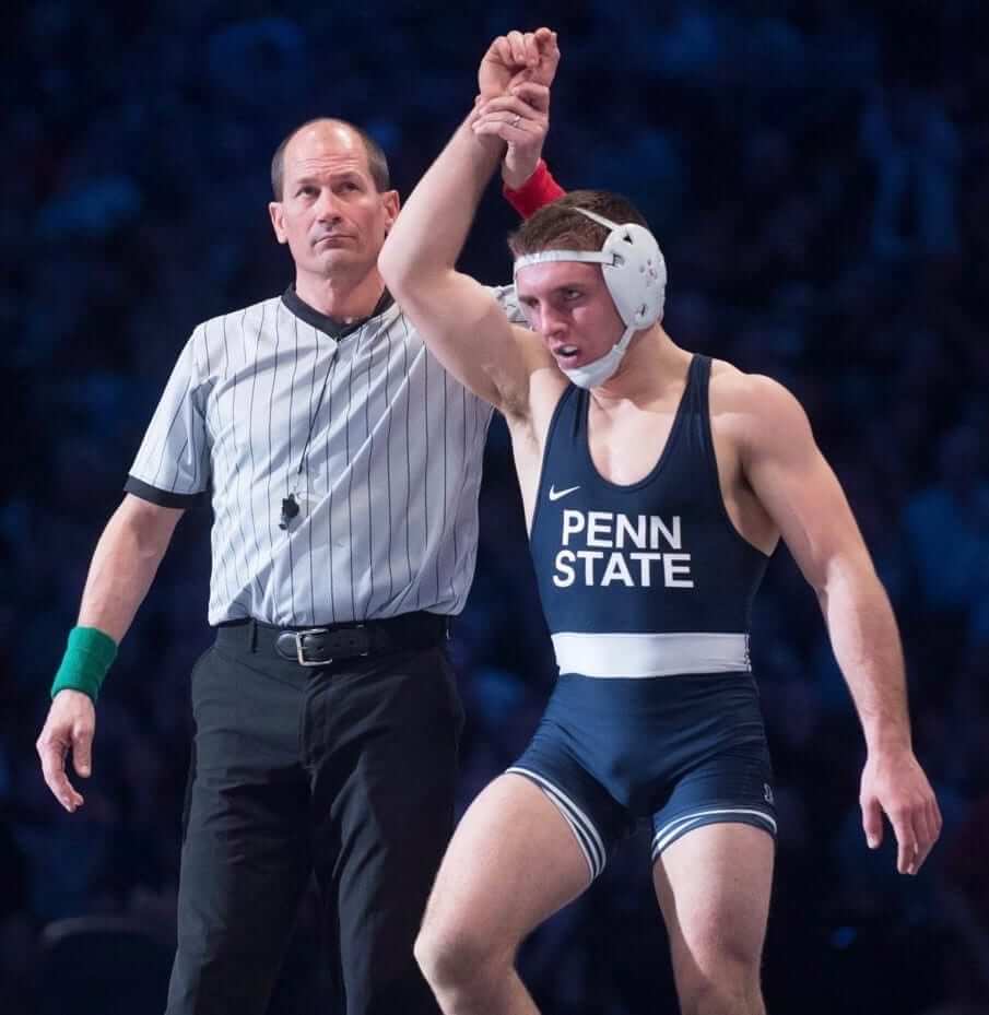
My father is a big fan of the aesthetics of sports uniforms. In the Uni Watch vernacular, he definitely Gets It™. From a very early age, I was always taught at least as much about uniform style as I was about game strategy. One of the core truths my father imparted to me is that Penn State has the best uniforms in college football. Since then, I have been all-in on traditional and minimalist uniforms, so much so that the football uniforms may have been a factor in my decision to attend Penn State.
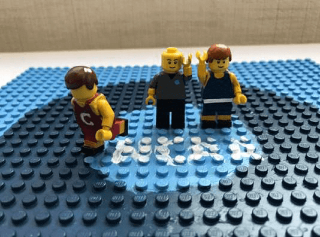
About a year ago I decided to introduce my young twin sons to my favorite sport — wrestling. They didn’t seem to be interested when I showed them live matches, so I tried a different tactic: I painted a few of their Lego minifigures like Penn State wrestlers. I am not a trained painter, so I was glad Penn State’s traditional and minimalist approach also applies to their wrestling singlets. Their uniform is one of the most iconic in NCAA wrestling:
I couldn’t do the lettering at such a small size, but it was easy enough to represent the rest of the design on a Lego minifig. Here’s one of the first ones I did (click to enlarge):
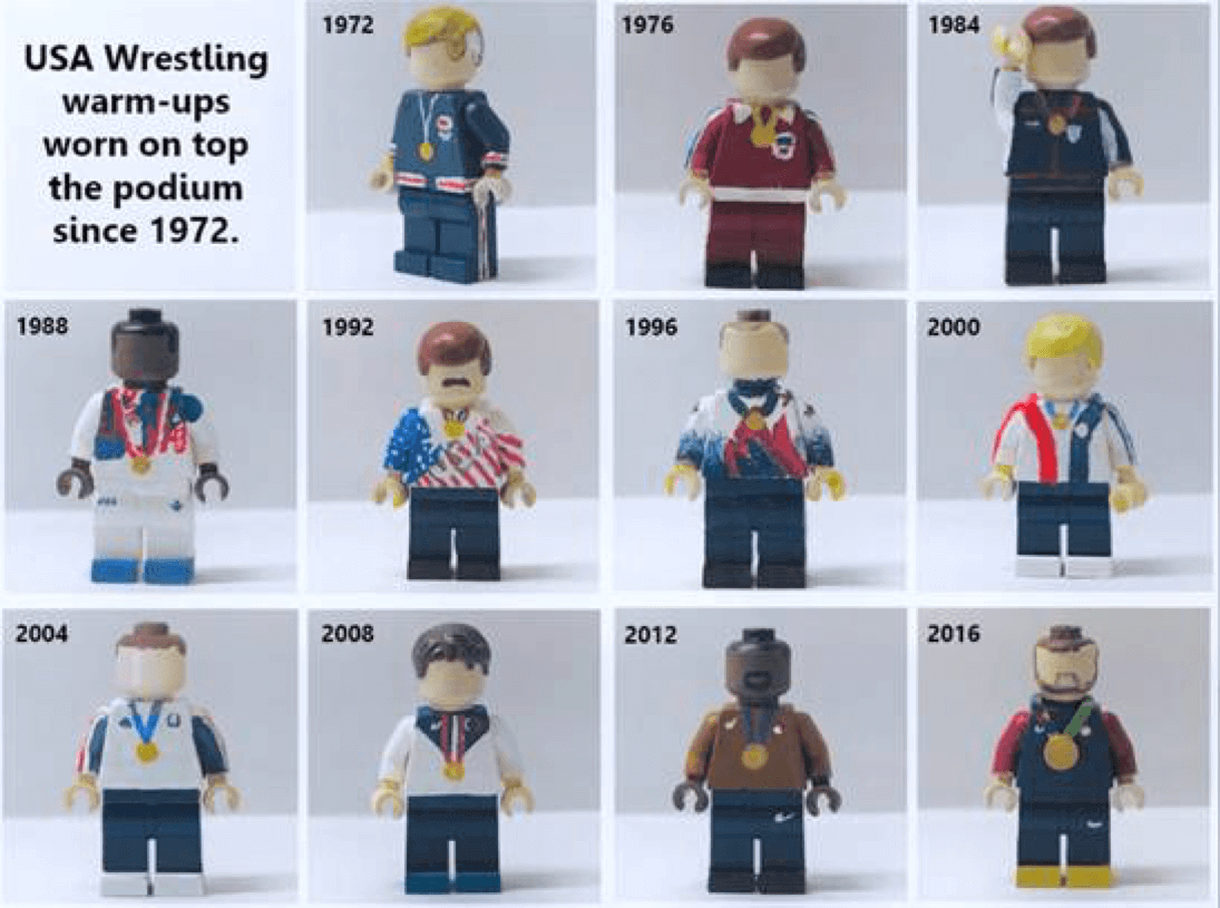
I posted a few photos of the custom wrestler Lego on Twitter. A handful of wrestling fans liked them, so I painted a few more. As I started to capture more and more wrestling dignitaries and legends, I became absorbed with the evolution of wrestling singlets and warm-ups — from the era of tights and robes to today’s event-specific singlets and custom shoes. I am still not necessarily a fan of the singlet as a uniform, nor can I imagine a scenario in which I would buy and wear socially an authentic throwback John Smith 1988 Olympic singlet (assuming singlets ever became readily available in the vintage sports apparel industry). Still, the visual history of the sport is pretty amazing. My current fascination is the warm-ups USA wrestlers wore on the podium for the 1988 Olympics (click to enlarge):
However, even as my painting skills improved (and I invested in better brushes), I was still challenged by the task of truly rendering a specific athlete at Lego minifig scale. I didn’t want to paint just “a wrestler” from a school; I wanted to capture a specific wrestler who’d be clearly recognizable by the wrestling community. That’s not so easy for my medium and subject matter because (a) I am not yet skilled enough to paint faces, (b) singlets don’t have numbers, and (c) I can’t use size to differentiate a lightweight from a heavyweight because all minifigs are the same size.
So I had to get to a Uni Watch-level analysis of details to find a way to capture a specific wrestler. While my traditional/minimalist preference typically frowns upon flashy personalization, my Lego art has become somewhat dependent upon it. I zero in on headgear tape patterns, knee pads, and shoes. I tracked the emergence of shooter sleeves. I watch for consistent sock choices, even though I typically can’t capture sock styles at minifig scale. I have even studied Rule 1, Sections 5 to 8 of the NCAA Wrestling Rules and Interpretations book to better understand personalization possibilities. Fortunately for my art, the rules allow for a lot of possibilities.
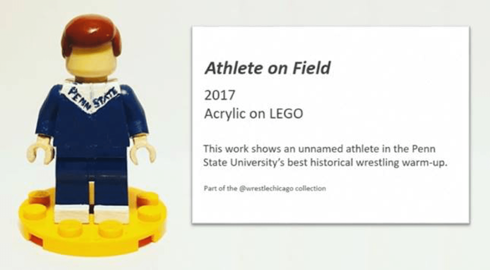
More than year in to this Lego painting journey, I’ve now begun to better appreciate the ways in which wrestlers have personalized their look. As I think about what I will teach my sons about sports styles as they grow older, I am still definitely going to pass down my preference for traditional and minimalist uniforms. However, I will encourage them to always have an understated way to personalize their look because someday, somewhere, someone may try to capture them in a work of art. Without personalization, they may just be cited as “Athlete on Field”:
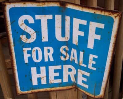
Cool stuff for sale: I’ve continued to add more photos of stuff that didn’t sell during last Saturday’s moving sale. You can see everything that’s currently available here.
Please click on the thumbnails to see larger versions and, more importantly, to read the descriptions of the items, which among other things indicate whether the item is something I’m willing to ship or if I’m only offering in-person pickup. (You can see even larger versions of each photo by clicking the download icon and choosing “View all sizes” from the resulting popup menu.)
If you’re interested in any of this stuff, please get in touch and make me an offer. I’ll continue to add more items to this photo set each day, so stay tuned. Thanks for listening.
The Ticker
By Paul

’Skins Watch: Did the Indians really trade Wahoo for the 2019 MLB All-Star Game? Maybe or maybe not, but this writer argues that everyone is better off either way (thanks, Phil). … Capitals RW T.J. Oshie took the Stanley Cup to his high school, Warroad High in Minnesota. “Their teams are called the Warriors and use a Native American for their logo, but there’s actually a reservation nearby and the wall behind everyone in the photo appears to have the team name — or something — translated into what may be Ojibwe/Chippewa,” says our own Jamie Rathjen. Anyone know more about that? … Ugh: The Boy Scouts apparently once had a patch based on the original version of Wahoo.

Baseball News: Good spot by Phil, who noticed that this 1939 photo of Senators pitcher Álex Carrasquel shows him wearing a jersey with a half-zipper, sort of like the zippered version of a henley pullover. Dressed to the Nines shows the ’39 Sens with full zippers, which appears to be what other players wore (last photo from BSmile). … The Lansing Lugnuts will play as the Lansing Mighty Wombats on Aug. 18 (from Ryan LeFevre). … Here’s a rare sight: Ty Cobb, third from right in the front row, in a Cleveland uniform. That’s from a charity all-star exhibition in 1911. Cobb forgot to bring his Tigers uni (from Mike Knapp). … The Harrisburg Senators will become the Harrisburg Hope tomorrow, to benefit a local Alzheimer’s charity (from Bryan Harper and Gary Bender). … “Year of the Dog”-themed jerseys upcoming for the El Paso Chihuahuas. … “Grease 40th-Anniversary Night” upcoming for the Potomac Nationals. … Pretty good piece on the evolution of celebrations after walk-off hits, which now tend to involve beating up the guy who got the game-winning hit. … Here’s an article about how Topps has balanced tradition and innovation in the evolving trading card industry. … A DC-area teen has a huge collection of Nats memorabilia. … The New Yorker’s weekly cartoon caption contest is baseball-themed this week. I’ve already submitted an entry. You should, too! … Here’s a 1939 newspaper article about the Pirates getting new uniforms for 1940 (great find by Jerry Wolper). … The Lakewood BlueClaws will become the Lakewood Bruce Claws for Bruce Springsteen Night this Saturday (from John McMunn). … Looks like new Mets call-up Jeff McNeil, who joined the big league club yesterday, doesn’t have the orange outlining on the lettering of his locker nameplate (good spot by Jim Brunetti). … Check out Reds speedster Billy Hamilton’s custom anti-drug-style wristbands (from our own Alex Hider).

Pro Football News: Former Bills QB Jim Kelly has donated a ton of personal memorabilia to the Pro Football Hall of Fame. … The Alliance of American Football — that’s one of the new pro leagues, set to debut in 2019 — will be outfitted by Starter (from Thomas Miller). … The NFL won’t let the Raiders sell Vegas apparel until they leave Oakland (thanks, Brinke). … Did you know Eagles QB Randall Cunningham had his own candy bar? I didn’t (but now I do, thanks to Michael MPH). … Titans players fanned out across Nashville the other day and surprised some fans by giving them season tickets and jerseys.
College Football News: Indiana is adding a memorial decal for former coach Bill Mallory (from Griffin Smith). … New uniforms for Hawaii (from Dork Nowitzki). … Brothers Andrew, David, and Michael Dowell will be wearing Nos. 5, 6, and 7 for Michigan State (from Mark Gaertner). … Looks like Iowa is going with the custom number font this season (from Dusty Kain and Bryan Stanford). … Looks like Arizona State is going with a more stripped-down look this season (from Broc Barwick). … Hmmm, is that a new matte helmet for Purdue, or is it just the lighting? (From Beutler.) … Marietta College has a grey field with navy end zones (from Clay Wynn). … This podcast discusses Ole Miss’s new all-white alternates.

Hockey News: Pretty cool video on the making of signs at the Maple Leafs’ arena (from @ImAnimated). … Here’s a fun piece on the 40th anniversary of the Canucks’ old flying-V uni design (from Wafflebored).

NBA/WNBA News: Further evidence that the Lakers may be bringing back the block-shadowed numbers when they unveil new uniforms next week (from @massaband). … New, less revealing outifts for the Bucks’ dancers (from @nemmrack). … Here’s a piece on how the WNBA has led the way when it comes to jersey sponsorships advertisements.

College Hoops News: Looks like Abilene Christian might be wearing throwbacks when they play Texas Tech on Dec. 15 (from Chris Mycoskie).

Soccer News: There’s a Twitter feed devoted to soccer teams as bands and vice-versa (from Rex Henry). … Swansea City is charging fans extra if they want the team’s kit ad to appear on their retail jerseys (from Josh Hinton). … Also from Josh: New third kit for AFC Bournemouth. … Leeds United legend Paul Madeley died on Monday. Over a career that lasted from 1964-81, he wore every starting outfield number — 2-11 (from Denis Hurley). … Juventus is selling a basketball jersey (from @tonyjuve10). … Pussy Riot members have been fined for illegally wearing police uniforms during the World Cup Finals.

Grab Bag: Dublin GAA — that’s a Gaelic football team — will add a children’s cancer charity’s logo to their jerseys for an upcoming game. … Lancashire cricketer Liam Livingstone batted while wearing a leg pad over his broken thumb the other day (from Jim Vilk). … New paint scheme for NASCAR driver Timmy Hill (from Mike Chamernik). … Speaking of auto racing, Don Schumacher Racing is making a major commitment to concussion research (from David Firestone). … The new season of Star Trek: Discovery will include a new uniform design. … Mysterious posters featuring three Adidas logos have been appearing throughout London. … Oooh, gotta love these old Aussie football team logos (from Jeremy Brahm). … The city of Cold Spring, Minn., is picking a new logo. … More and more women are working as umps and refs, but they’re having a hard time finding women’s officiating uniforms.
Great job Ross! Those details on those figures is incredible! I love it!
“Swansea City is charging fans extra if they want the team’s kit ad”
Some other teams (i.e., ones with betting ads) are taking the opposite approach and selling an ad-free “youth” version of their shirt that conveniently also comes in adult sizes.
Also, Bournemouth’s third shirt is useless (the second one is already white), but it looks like they don’t have a sleeve ad this year, so that’s good.
I remember MLS doing something like that back in the day before adidas had exclusivity. They had Pepsi has the sponsor on the back and you could pay extra for the Pepsi or sierra mist logo to appear.
link
In principle, teams should charge less for an ad-free version, passing along some of the ad revenue to fans who wear the admand make themselves a walking billboard. But as a potential retail consumer, I much prefer the practice of charging less for the ad-free version.
Sorry, “should charge less for an ad-bearing version” in the first sentence.
I would buy a Philadelphia Union kit and pay more not to have that awful BIMBO ad right in the middle of it.
4 more years..
Jamie – Regarding Bournemouth’s third kit being useless, I can see them wearing that at Newcastle to give a nice contrast to the game at St James’ Park. Or even wear it at St Mary’s when they take on Southampton. I think it’s a good look for a third.
Don’t think it’s bad (it’s good) but what I was getting at is those are the only two situations in the league where it could plausibly, actually, be needed.
Who knows who they might draw in the FA Cup or League Cup? Might come in handy there, too.
IIRC, Southampton has had to whip up a plain white top kit midway through the season in the past few years to cover for clashes with their red/white homes and black aways. Might be nice to have a thoughtful third ready to go before the season kicks off.
Tom, it’s certainly better than a neon third kit, which unfortunately seems to be soccer’s version of BFBS.
True. It’s better than Southampton’s “here’s a third kit to resolve a clash that everyone knew was coming but that we did nothing about, just so we can have a midseason release” approach.
I went to the Amex last year and Brighton charged extra for the JD Sports ad on the left sleeve (just as they did for the Premier League patch on the right sleeve)
Chris, just curious, did you buy the Premier League patch on the sleeve? Or were the sleeves plain?
The jersey came plain, but I bought the Premier League patch and the JD Sports patch as well as Bruno’s name/number on the back.
A plus to the Vancouver Canucks’ black Flying-V jersey, it looked intimidating from the back. Black with no hem stripes. No hem stripes not common on jerseys in those days:
link
The Canucks brought back black uniforms for one game a couple years back. They play at home this year on Halloween. Wouldn’t it be cool to see the Flying-V return for one night on Oct 31 to commemorate the 40th birthday? Too bad it would likely not happen.
One for ‘Scocer News’ – my team Southend United (English League One, i.e. two levels below the Premier League) will be featuring a cancer charity on their shirts this year…link
James,
Just curious, but do you know if this has anything to do with the English Football League’s new charity logo on the bottom of the numbers of the kits?
Sunday’s NASCAR race at Pocono will have Pennsylvania crossover appeal with Alex Bowman’s Philadelphia Eagles-themed #88, Timmy Hill’s LV Phantoms #66 paint scheme and Landon Cassill’s Lock Haven University-sponsored #00:
link
Iowa’s number font looks similar to the one Virginia will be using
Haven’t seen a better picture than those in the Ticker, but yeah, I think I see the same notches in the corner. Wonder what marketing-speak Nike will come up with for Iowa.
(The Iowa-UVa similarity is personally fitting, though, because those are my two teams in college sports.)
Are the banners hanging new too? The year font on the banners and the new jersey number font look to be identical.
Not sure about the banners, but it does look like the same font.
Also, I’m wrong: Iowa and UVa’s fonts look like they only somewhat resemble one another. The number 4, for example, is a lot different.
Cay Young, Kool-Aid peddler. I wonder if she knows the difference between a sponsor and advertiser. -C.
Nice job Ross. I was a HS wrestler myself, so I can appreciate your interest in wrestling uniforms. Is the 1992 figure supposed to be Bruce Baumgartner?
Okay, let me be the resident jerk… Painted toys? Seriously? Good grief what is this site becoming?
REYNOLDS! Where is that TPS report? It was supposed to be on my desk an hour ago. Now GET OUT OF HERE AND GET TO WORK!
Why not sit silently, and let those exact thoughts pass into and then out of your head, without actually typing them out?
What were you hoping to accomplish, besides being noted as the resident jerk?
Reynolds, what a jerk!
Happy?
Lee
I was not going to respond to this, hoping it was a bad joke, but as a long, long time reader, this post rubs me terribly wrong. (and my apologies to Paul if I am out of line)
Here is someone who connected with his father over uniform aesthetic, then found a way to connect to *his* children over it, and along the way discovered a uniform related passion, and took the time to share it with us.
That is *EXACTLY* what this blog is about.
For you to belittle his post in such a way is deplorable.
If you think he is just painting toys then you don’t “Get It”
That BSA patch is awesome. I want that.
@Reynolds…you’re not paying for this site, so you have no right to complain.
Also, what is the difference between a bobblehead, electric football players, or anything sports related on this site?
Quite often there is content I am not a fan of (such as today’s lede)…but variety keeps it fresh.
Don’t like it? Scroll down or wait for tomorrow! :)
Since it was brought up in this article, let me pose a question to the group:
At what point does a uniform cross the line from attractively minimalist to just plain boring?
Personally, I think the Penn St. football uniforms are definitely on the boring side, and since I’m primarily a hockey fan, I’ll also mention the Detroit Red Wings’ home uniforms as another example of a design that, to my eyes, is dull and uninteresting.
Thoughts?
I’d suggest an attractive minimalist uniform design doesn’t have much to it, but uses what little it has well, kind of like, they put thought into how it would look would with very little. Compared to a boring design, why doesn’t put thought into how the lack of elements will look as a whole as a design. The Raiders are a good example of minimalist design done right. The silver and black naturally look good together, and the silver helmet, black jersey, silver pants, and black socks provide an appealing aesthetic.
On the other hand the new Jaguars uniform just goes with less but it doesn’t all line up, it is less for the sake of less, not because it is aesthetically pleasing.
I’m going to offer a counter to the opinion voiced by Reynolds (the resident jerk): I’m fascinated by the unusual ways in which a person’s creativity can be expressed and the little things that inspire that creativity. I’m not a wresting fan and I’ve hated Penn State for my whole life (although I will admit that I prefer their plain football unis over, say, Oregon’s), but I read the entire story because it would never, ever have crossed my mind to paint Lego minifigs at all, let alone in wresting warm-ups.
This kind of uni-centric DIY story is one of the main attractions of Uni-Watch, IMO.
What she said.
I second this.
Thirded. Perfectly stated.
…If Reynolds had written his criticism in a constructive way with some valid points instead a of broad brush stroke, he may have had some validity to what he feels is a lackluster (or a continuing decline of quality of content with the comment “what is this site becoming”); but instead, he openly subjects himself to troll status and I will not oblige him to the name calling.
I don’t have an account so I’ll leave my New Yorker caption here:
“These throwback uniforms are getting out of hand.”
Regarding the Raiders potentially getting new logo for the move to Vegas, I wonder how the uniform design department will ruin this and feed the public with their company lines garbage
The article seems to speculate maybe they are working on a new logo. I would bet the farm there is no way the logo is changing. They are talking about merchandise that states Las Vegas Raiders. They have moved before and kept the same look. There is no way they can change anything.
Re: Scotiabank Arena signage…
I Still Call It The ACC
Too soon?
Well, it’ll never be a Naming Wrongs shirt.
link
That is a great article for all those who think they know it all with knowing the whole story.
Not everything it what it seems…I love the line about how “a lot of them weren’t around in 1989″…shows how uniformed and narrow-minded a lot of these organizations are.