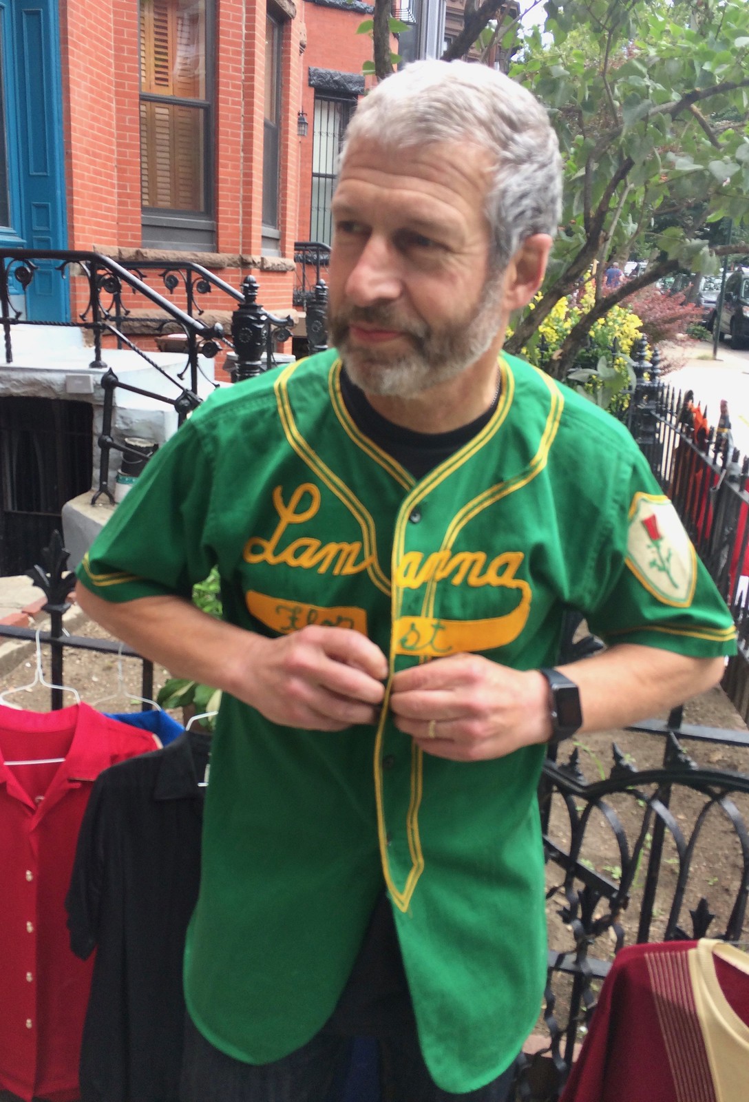
My moving sale on Saturday was a hectic, emotionally complicated event. On the one hand, I sold a ton of stuff (including the Lamanna Florist jersey shown above, which was one of several jerseys i was selling) and made a nice chunk of change that should cover my moving expenses. On the other hand, I spent many years gathering and curating these items, and it was hard to let go of some of them.
Lots of people asked me why I was getting rid of so many things. These are the answers I gave:
1. Some of the items simply wouldn’t work in my new apartment.
2. These things were never really mine. Someone else owned them before I did, and now someone else will own them after I did. The items cycled into my life and now they’ve cycled back out.
3. Most importantly, the items in my apartment were a strong expression of me, which was fine when I was living by myself, but now I’m going to be living with the Tugboat Captain, so I wanted to dial back the me factor. I’m keeping some of my stuff, but I also like her stuff, and I want there to be enough room for us to acquire new things that will be our stuff.
The whole day was super-duper-hectic, so I didn’t have a chance to take many photos, but there were three moments worth mentioning:
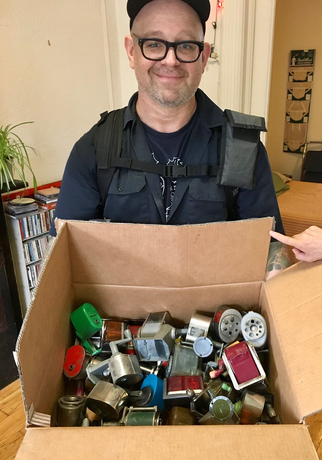
• I was selling all 38 of my pencil sharpeners. One person bought one of them — and then another guy bought all of the rest. He began by saying, “I’ll take six,” then moved up to nine, and ultimately said, “Okay, how much for the lot?” He even unscrewed all of them! I should have gotten a photo of him doing that, but instead I just got this not-very-good shot of him holding a box full of the sharpeners (click to enlarge):
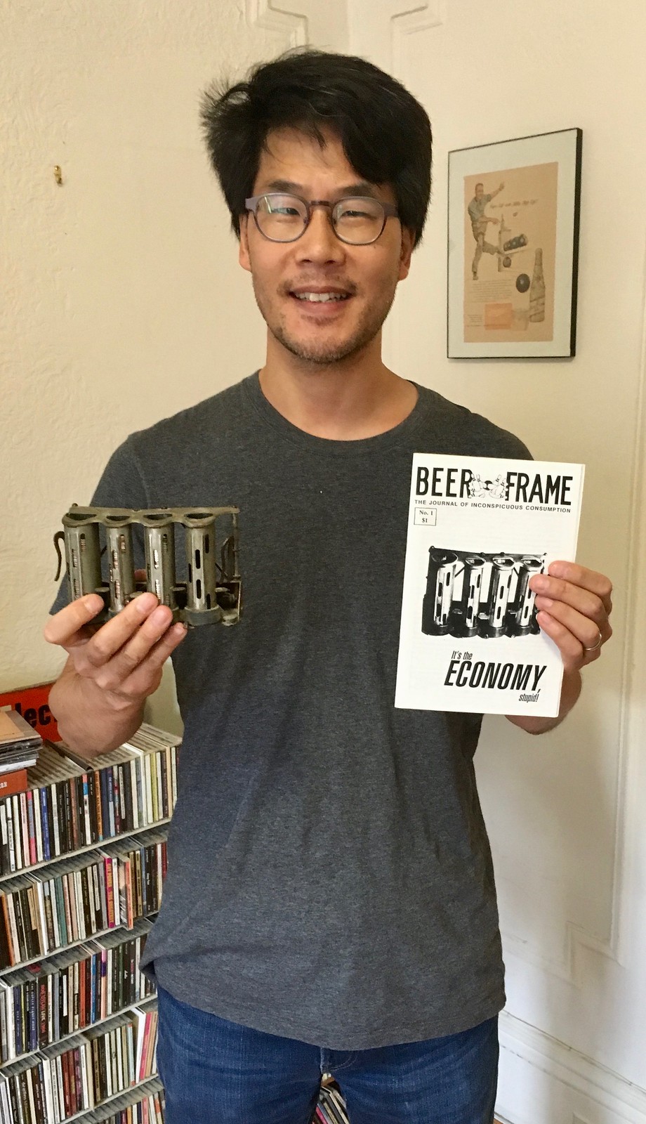
• Back in the fall of 1993 — almost 25 years ago — I published the first issue of my zine, Beer Frame: The Journal of Inconspicuous Consumption. The cover of that issue had a photo of a change-maker thingie, which I was selling. It was purchased by a Beer Frame fan named Eric who actually brought along a copy of issue No. 1, which led to this great photo (click to enlarge):
• I have — or rather had — a bunch of sports-themed pinup illustrations, which I was selling. My friend Josh, who I’ve known for years but who had never been in my home before, immediately noticed that one of the pinup illos matched one of his tattoos! Check this out:
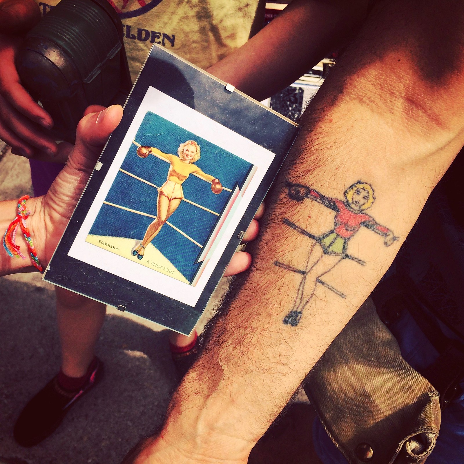
He has a lot of tats, so I never really noticed that one. He said it was just a flash tat that he got years ago, so that illustration must have really made the rounds. Anyway, having the illo match the tat seemed like fate, so I gave the illo to him for nothing.
There were lots of other fun and interesting moments, but it was all so frenzied that I didn’t document any of it. Sorry about that. By the end of the day, the Captain and I were worn out but happy (click to enlarge):

Lots and lots of Uni Watch readers showed up. It was great to meet all of you (or, in many cases, see you once again) — thanks for coming by and for helping to lighten my load.
Cool stuff for sale: There are a few things that didn’t sell that I’m going to show here on the site over the next few days, in the hopes that someone out there will want to take them off my hands, beginning with the following items:
1. This very cool eyeball poster (for all photos, click to enlarge):
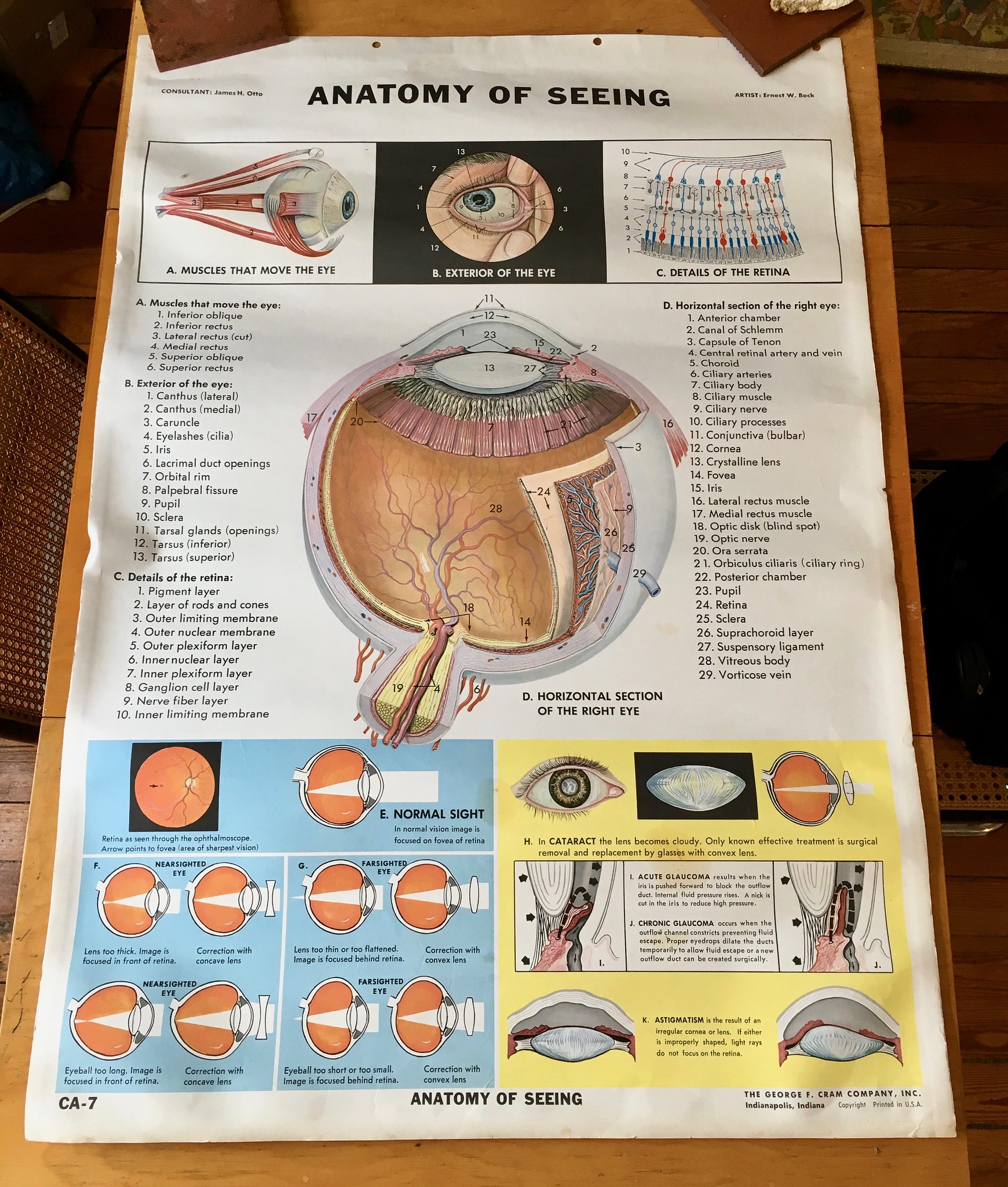
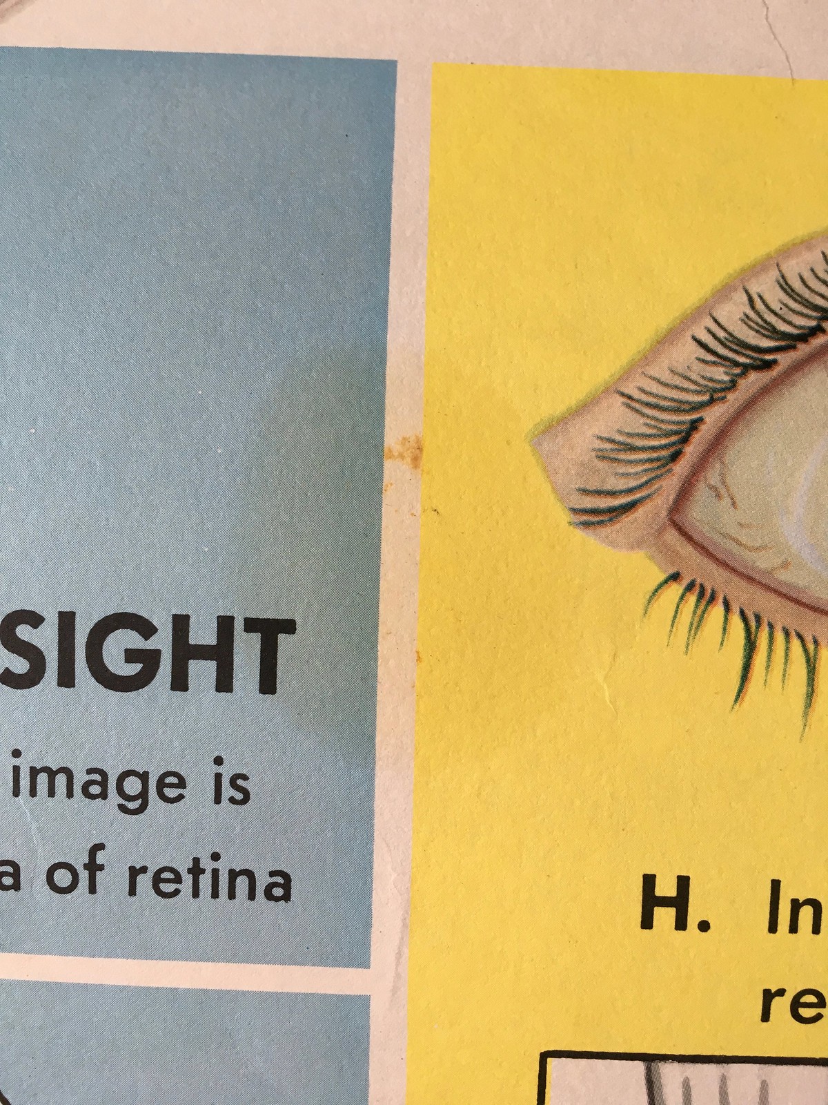
It’s 46″ long by 32″ wide. No sure how old it is. Generally speaking, it’s in very good shape, but there are some minor dings along the edges, and there are also two faint stains toward the lower portion:

There’s a separate design on the back, but that doesn’t seem nearly as interesting.
2. I have a sheet of gorgeous unused 1930s letterhead and three unused 1930s receipts from a Shell station in Iowa:
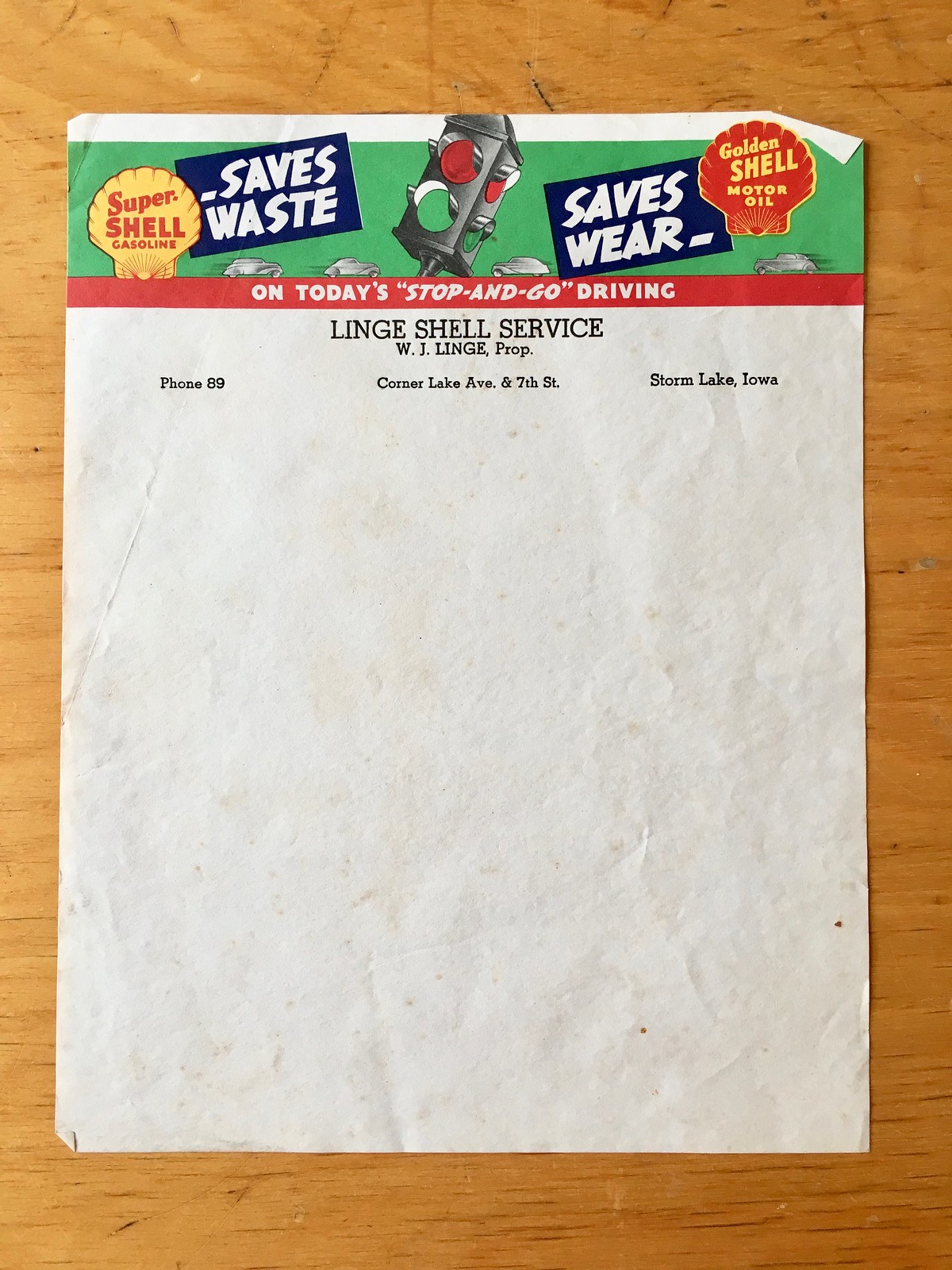
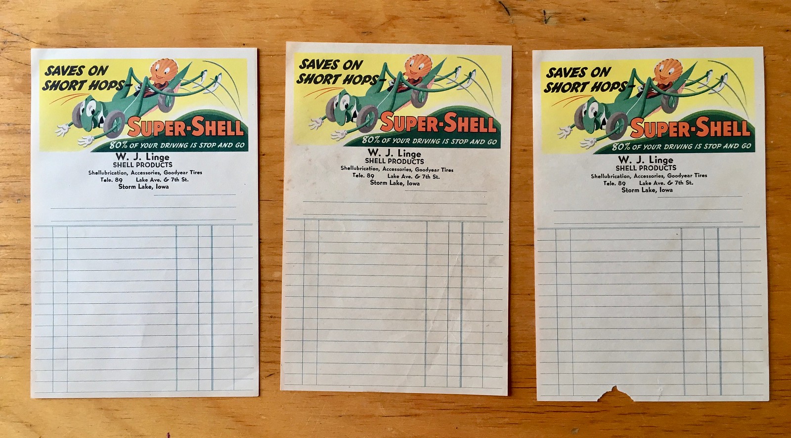
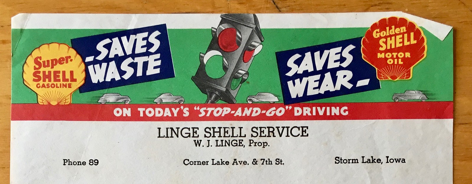
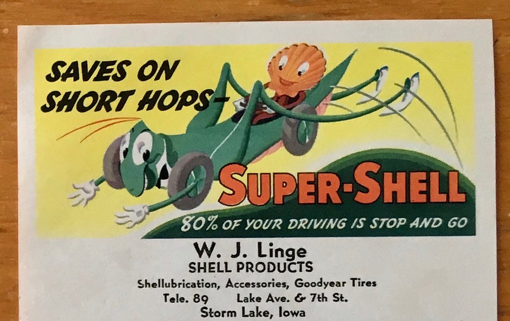
These items are available as a lot — I prefer not to break them up.
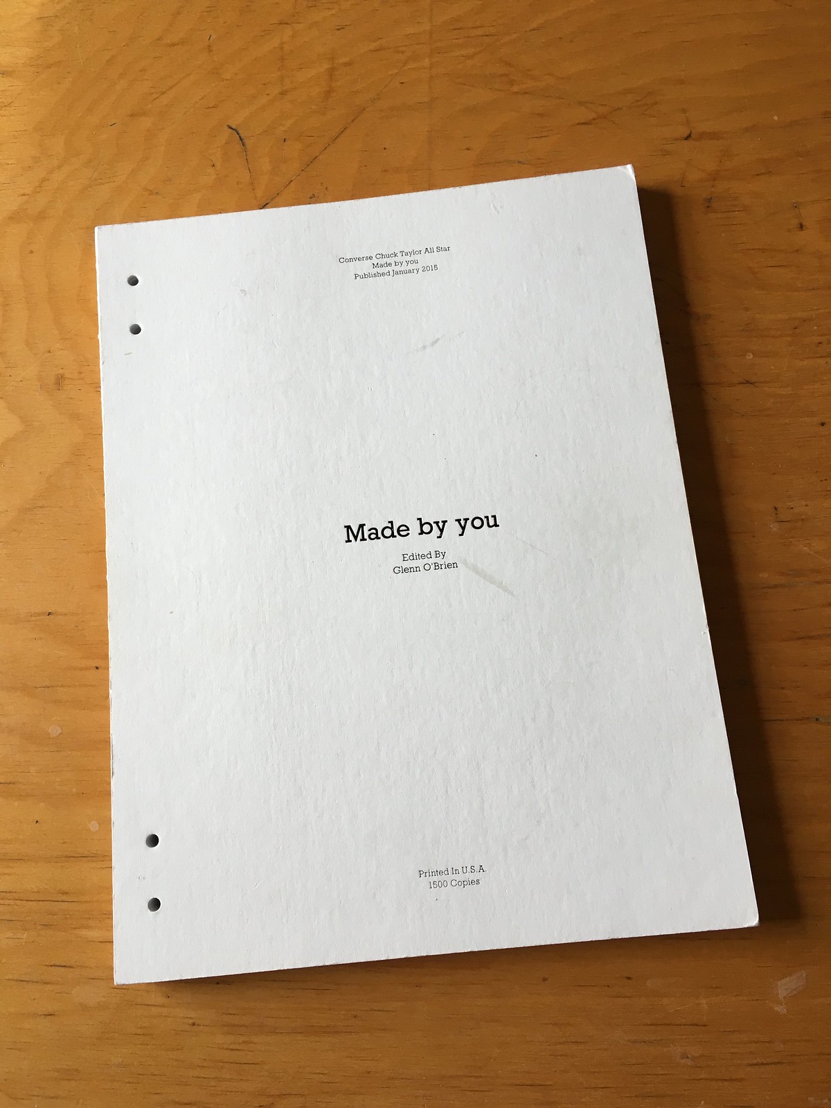
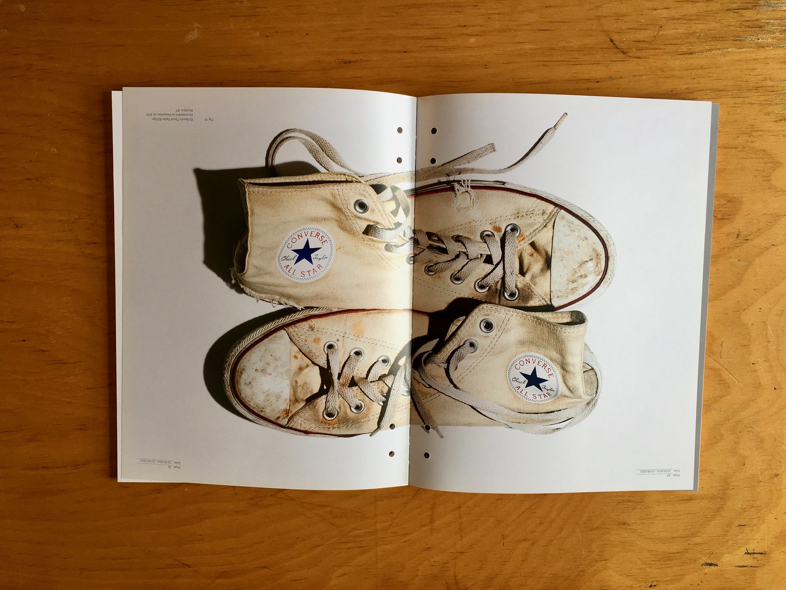
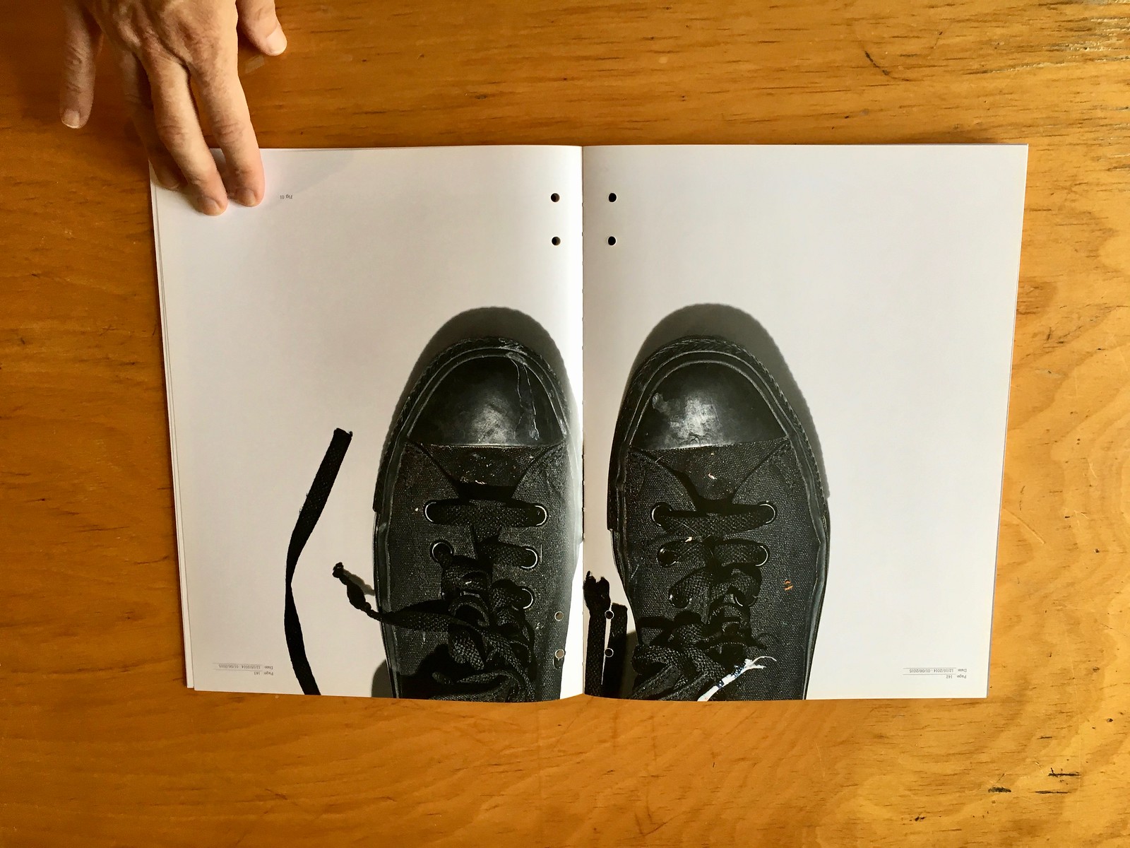
3. Attention sneakerheads and/or fans of M.I.A. and/or Patti Smith: In 2015, Converse put out a limited-edition book called Made by You, featuring exclusive interviews with assorted artists, musicians, and other creative types talking about their Converse sneakers and fashion/style in general. The book (a copy of which is in the permanent collection of the Metropolitan Museum of Art’s Costume Institute) was limited to 1500 copies. I have a copy that has a few scuffs on its cover but is otherwise in perfect shape.
The subjects interviewed in the book are Adam Selman, Eli Reed, Futura, Hanni El-Khatib, Humberto Leon, Jefferson Hack, Leo Fitzpatrick, M.I.A., and Patti Smith.
Here are some pics of my copy: Update: It’s been sold and is no longer available, but I’ll leave the photos up just so you can see.




I’m happy to ship those items. Then there are several additional items that I won’t ship but would sell to someone who’d be willing to pick them up, including all the items shown here.
If you’re interested in any of this stuff, please get in touch and make me an offer. Thanks for listening.
Actual uni-related content, how about that: The Mets recently signed their second round draft pick, pitcher Simeon Woods-Richardson, whose surname calls to mind our recent discussion on hyphenated NOBs. Woods-Richardson made his pro debut for the rookie-level Gulf Coast League Mets the other day and tweeted this photo of himself in his new uniform (click to enlarge):
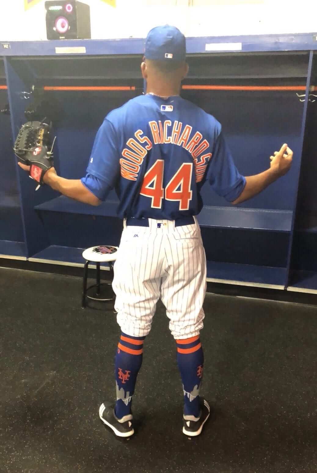
So that’s 15 letters plus the space. But it’s not supposed to be a space — it should be a hyphen. (If you look closely, you can see that the hyphen is included on the thumb of his glove.) Sigh — I know it’s a cliché, but the Mets really can’t do anything right.
(My thanks to Jim Brunetti for letting me know about this one.)
The Ticker
By Jamie Rathjen

Baseball News: Phillies 1B Carlos Santana was wearing stirrups with black sannies yesterday (from Justo Gutierrez). … The single-A Lexington Legends are commemorating the Kentucky Thoroughblades — an AHL team that played in Lexington from 1996-2001 — on Aug. 10 (from Josh Hinton). … The AA Bowie Baysox had “Orioles Pride Day” yesterday. The team wore their Orioles spring training jerseys with the numbers they had in the spring. However, some of the team’s players were acquired in the recent trade that sent Manny Machado to the Dodgers, so it’s unclear how they were assigned numbers (from Dave Raglin). … At the Central American and Caribbean Games in Barranquilla, Colombia, Cuba pitcher Freddy Álvarez appeared to be wearing a Velcro cap (from Andy Bronson). … Who’s the gent in the top hat? That’s the umpire at a vintage base ball game that Eric Bangman recently attended.

Football News: New uniform for South Florida (from multiple readers). Moe Khan points out that South Florida has now been outfitted by Nike, Under Armour, and Adidas in the past 12 years. “Has there been another major FBS program that has done the same in a short time span?” he asks. … Also, new uniforms for the FCS’s Eastern Illinois (from Craig Choate and Tyler McCluskey). … We already have a combination to be worn in the first week of the season: Ole Miss in all white vs. Texas Tech Sept. 1 in Houston (also from multiple readers). … Also posted in Grab Bag: The X Games were in Minneapolis this year and Moto X rider Jackson Strong (who’s Australian, by the way) had a Vikings-themed helmet (from Max Weintraub).

Hockey News: Also posted in baseball: The single-A Lexington Legends are commemorating the Kentucky Thoroughblades – an AHL team that played in Lexington from 1996-2001 – August 10 (from Josh Hinton). … With the Ducks’ third jerseys appearing on Saturday (more in yesterday’s entry), Eric Poole drew the team’s colored sweaters from the first 25 years of their existence.

Soccer News: New kits for German team Fortuna Düsseldorf (second kit), Italian team Udinese (third), English League One team Bristol Rovers (first and second), and Scottish teams Queen’s Park (first, including the back) and Stranraer (an Argentina-like second). … Some teams try to shoehorn contrived “local references” into their shirts (looking at you, Manchester United), but Fortuna’s shirt actually features the pattern from the walls in some stations of Düsseldorf’s subway. … Also posted in Grab Bag: the Nigerian cyclists at the African Youth Games in Algiers are wearing a kit based on everyone’s new favorite soccer shirt (from Craig Ackers). … The Columbus Crew wore flag-based numbers Saturday (thanks, Alex). … New English top-tier women’s team West Ham United – who somehow got a free pass up from the regional third tier because of league restructuring – are marking their debut by dropping “Ladies” from their name. Also doing so are league-mates Birmingham City. … Danny Garrison sent us some shirt concepts combining the Big Four teams from some American cities into a common design. They’re based on the idea that some big European teams, such as Real Madrid, Barcelona, Bayern Munich, etc., are actually sports clubs and have teams in other sports, such as basketball or handball, with the same logos and colors. … “Third kits are now ubiquitous in the Premier League, but they were still something of a rarity in the early 1990s, used only when needed,” says Denis Hurley. “However, in 1993-94, Sheffield Wednesday used four kits in the first six weeks of the season.”

Grab Bag: The Nigerian cyclists at the African Youth Games in Algiers are wearing a kit based on everyone’s new favorite soccer shirt (from Craig Ackers). … Here’s some of the kits on display at last weekend’s men’s and women’s rugby sevens World Cup in San Francisco, as well as the ongoing women’s field hockey World Cup in London. … The X Games were in Minneapolis this year and Moto X rider Jackson Strong (who’s Australian, by the way) had a Vikings-themed helmet (from Max Weintraub).
I’m a USF alum and have been a football season ticket member since ’08 and I’m not feeling the Bulls’ new uniforms. This kind of thing is exactly what I feared I would see yesterday once they jumped from Under Armour to adidas.
Foil numbers, tire tread print, and the team name on the pants. It must have taken Adidas five minutes to design these out of their “overused ideas” pile.
Nike and Under Armour produce their shares of hits and misses, but Adidas is the most consistently disappointing of the three design-wise. They’re the Taco Bell of uniform suppliers: every uniform contains some combination of the same 6-7 ingredients, with no real thought to a unique or coherent design.
Here’s further proof of what you’re talking about.
George Jenkins HS (Lakeland, Fla., east of USF) 2 years ago: link
Nevada this past weekend: link
The Bulls’ last Under Armour uniform design was at least distinctive to the program.
Piggybacking on this, fellow AAC member Cincinnati also ran the gambit of apparel suppliers. Nike until 07-08, Adidas from 08-09 until 14-15, and Under Armour 15-16-present.
There is no nice way to say this as a Phillies fan.
But I really hate how high santana wears his socks, its absurd. I would rather no sock shown at all any day then that clown look, socks/stirrups only look nice below the knee.
Precisely what I was coming to comment on… why haven’t these guys been taught how to properly blouse their pants? I grew up watching baseball in the 70s and 80s, and I still prefer the older style; pants end just below the knee, cuffed into the stirrups. Stirrups cover the lower leg, with a smidge, or none, of the sanitaries showing under. It’s not that difficult.
Yeah, that’s just way too high. It reminds me of football players who wear pants that don’t cover the knee, and this looks just as stupid.
PaulS: it seems that a lot of MLB players simply think that the long pants look better. I disagree, but I don’t think it’s a case where players simply don’t know how to wear the other style.
Rob S: I did just read that the NFL will require pants to cover the knees starting next season, and players who don’t conform to this could be told by refs to get off the field until the situation is corrected.
Looks like the sale went great!
I’m glad the pencil sharpeners found a good home. I vividly remember link (and the fact my pop had one just like many of those).
And a huge thanks to that one gentleman who purchased them en masse. My kids and I were on a mission to get one of those when we set out that morning and he generously sold us a sharpener of our choice from his new collection.
link – we also walked out with a few books, a
great wood labyrinth, a full size football, and my son negotiated with Paul for the guts to a parking meter.
Well worth the drive from Long Island to finally meet Paul and the Tugboat Captain face to face.
Better link to picture.
link
Interesting to see that one of the sale items was the book How the States Got Their Shapes, a personal favorite of mine. I really shouldn’t be surprised that the same people who share my interest in uniform design are also fascinated by topics such as the reasons the states’ borders are drawn the way they are.
My son was very excited about that too – it was fortuitous that the book was available because he asked me that exact question about a week or two ago.
He’s going to make an excellent UniWatcher and observer of the seemingly mundane.
Enjoyed meeting you and your family, Jay. Long overdue!
Have you also seen the tv series on the History Channel? Loved the showed, lots of interesting historical footnotes. I think there is definitely a link between geography and sports uniform enthusiasm, though I really don’t what causes it.
I say it every year… Adidas football uniforms are so cheap looking. The tread mark fabric and glossy fonts are horrible.
Those damn tire tread marks are exactly what I feared when I discovered that USF was jumping to adidas a few months ago. What an unsightly pattern!
I couldn’t agree more, Ryan. It’s a head-scratcher to me why Adidas still uses this jersey template. Granted, my sample-size might be a bit skewed (consisting largely of fellow Uni-Watchers), but I have heard nothing but disdain for these jerseys and not one word spoken in favor of them. Why does Adidas keep doubling down on something that everybody hates?
Pretty good job by Eric on those Ducks jerseys. As someone noted in response, the triangle background should be silver on the original eggplant jersey. It should also be silver on the jade Nike-era third. That was just the way they did it in the Mighty era – jade when the logo is on white, silver when the logo is on any other color.
Didn’t have a chance to visit the site yesterday, but I like the Ducks’ new third. I still wish hockey in general would get over those decorative collar laces once and for all. Their time and place was in the era of wool and durene jerseys where they were actually functional. After railing against them since the Rangers revived them 21 years ago, though, it seems like I’m the only one anymore who doesn’t like them on modern jerseys.
I don’t like the laces either Rob, especially on the new adidas jersey. At least on the Reebok Edge jersey, the neck closed a bit when you tightened the laces. They are even less tolerable on the adidas jersey. They just sit there dangling with no purpose.
I dislike them on the Adidas jersey. I dislike that players do not tie them. If laces went away once, please let them go away again.
Serious question: are you fixing or do you have to reimburse your landlord for all of the screw holes in the wood from the pencil sharpener display?
As someone who lives in a 100+ year old home, thinking about all those holes in my woodwork gives me anxiety!
It would be fair to say that there’s a lot of spackling in my near future.
Drip, drip, drip….
link
Sorry to hear that you may have some friends losing their jobs.
I truly wonder what “…a new direction for the paper, with an increased focus on breaking news, particularly stories about crime, civil justice and public responsibility.” really means.
We have ambulance chasing lawyers, will we now have ambulance chasing reporters?
Well ideally we always would have had reporters chasing after sirens, presumably that is where a lot of stories are. That isn’t the problem, it is more the instantaneous new cycle where many stories break before all the facts can be fully vetted, and misinformation about what happened comes out. It doesn’t help that many websites republish someone else’s tweet as breaking news and treat it as if it is a trusted news source.
As Paul has often lamented, the decline in paid-for content has reduced the quality of journalism, and our country is worse for it.
“The single-A Lexington Legends are commemorating the Kentucky Thoroughblades — an AHL team that played in Lexington from 1996-2001.”
Wow! Can you get any more ’90s than that old Thoroughblades fauxback jersey?! Teal? Check. Purple? Check. Blocky, asymmetrical, diagonal striping? Check. Over-muscled, anthropomorphic mascot? Check. Italicized wordmark that looks like it was pulled straight from clip art software? Check. Now if only the players would all wear mullets…
That jersey is the quintessential 1990s jersey. Has a lot of the elements you need.
Cincinnati? They wore Nike in the early 2000s, then adidas, and currently UA.
BTW, Liverpool FC wore purple instead of their customary red (they were designated the home team) in yesterday’s game against Borussia Dortmund, who wore their traditional colors.
That green florist jersey is beautiful. Does it have a number on the back?
Yes: link
I was sad to let it go, but the reality is that it was a little too large for me, and it was time for me to finally admit that to myself.
Woods-Richardson needs broader shoulders.
It would also appear in the picture there’s no hyphen on his jersey. So this appears not to be a HNOB, but a Dual Name on back (DNOB).
Go back and read the text more carefully, Tim! ;)
So it is a DNOB on the jersey! With a HNOB on the glove. Got it.
Too subtle for me.
Anytime I see a player with an unusually long NOB, I can’t help but think the team in question should use a smaller font instead of awkwardly attempting to fit the name on the back with their standard sized font.
Sure, it would cause a mismatch with the rest of the team, but a name that long is going to stand out in a mismatched way anyway.
Granted, I’ve long thought that especially in baseball there is really no need for NOB anyway. Heck, baseball has proven via the Jackie Robinson tribute games where everybody wears 42 that there is no need for numbers, either.
Several teams have used *compressed* fonts. Same point size, but more space-efficient.
Mr. Lukas, great meeting you again at the moving sale. Besides the couple of trinkets I went home with, what a thrill to meet & talk with The Captain, she’s terrific. Good luck to you both. Thanks again, Will
Will, it was a pleasure to meet you as well. Thanks so much for coming, and Let’s Go Mets!!
Not sure if I missed a previous post about this but August 24 the Clearwater Threshers become the Clearwater Beach Dogs. Jerseys are in the shop but I didn’t see a hat yet.
link