Photo by @BlandinoFlow; click to enlarge
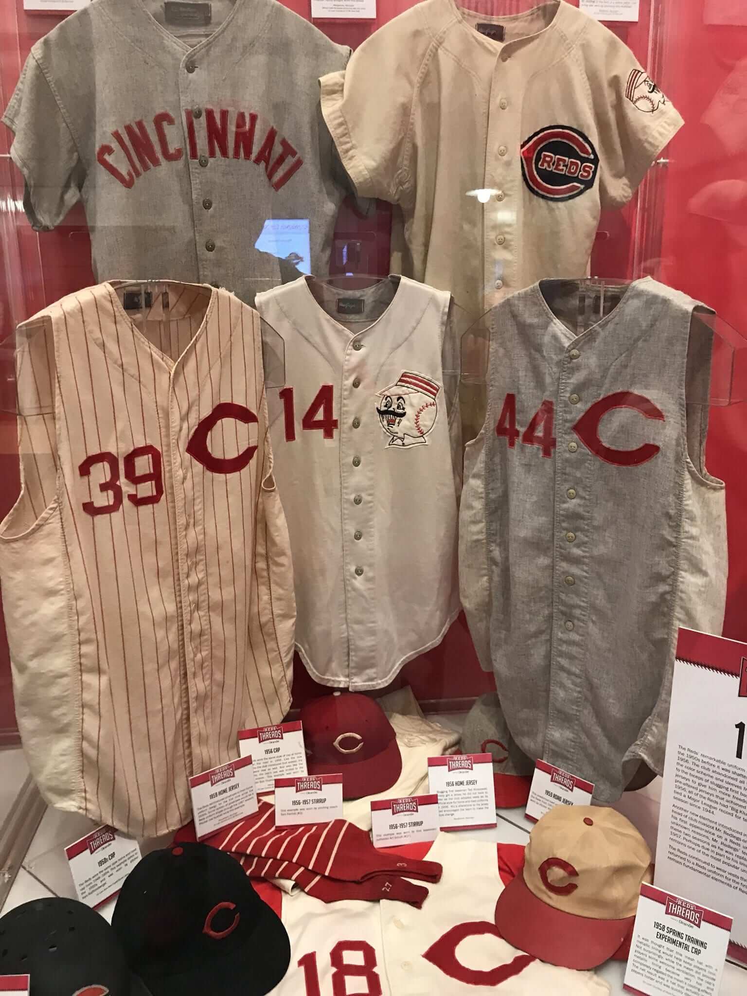
Twitter-er @BlandinoFlow visited the Reds Hall of Fame at the team’s stadium the other day and posted a bunch of photos from the Hall’s current uni-centric “Reds Threads” exhibit. One of those photos — the one shown above — caught my eye and ended up teaching me something new.
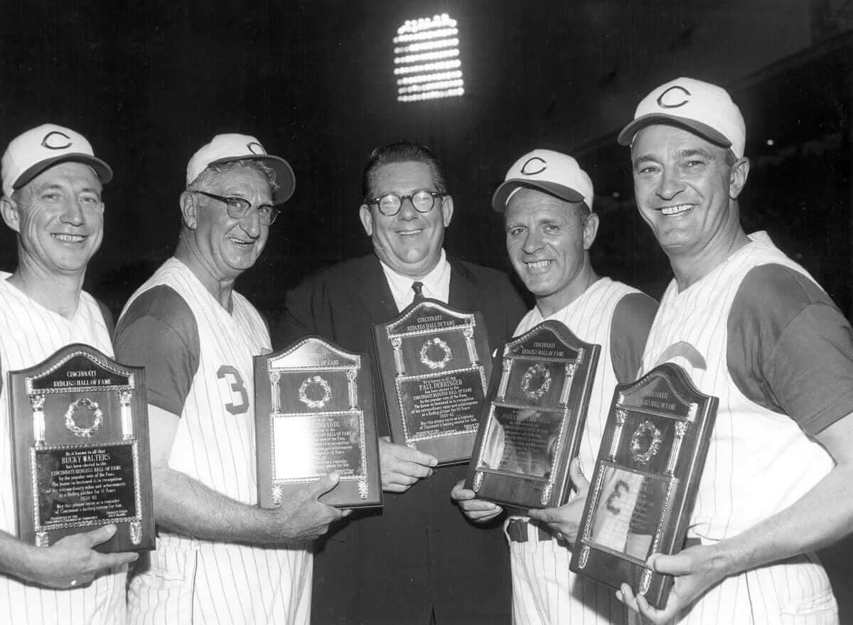
Look at the two vest jerseys at bottom-left (a 1959 home jersey) and bottom-right (1958 road). As you can see, they both appear to have side panels that are distinct from the fabric used on the fronts of the jerseys. I’d never noticed this in any old photos, and the side panels aren’t shown in Marc Okkonen’s mock-ups. How common were they?
The jerseys shown in the “Reds Threads” exhibit are from the collection of longtime MLB uniform collector/authenticator Dave Grob, so I got in touch with him and asked about the side panels. “The side panels are pretty standard for this period of Reds jerseys,” he responded. “They are actually a durene-type fabric.” Dave also sent along two old photos showing the side panels (click to enlarge):
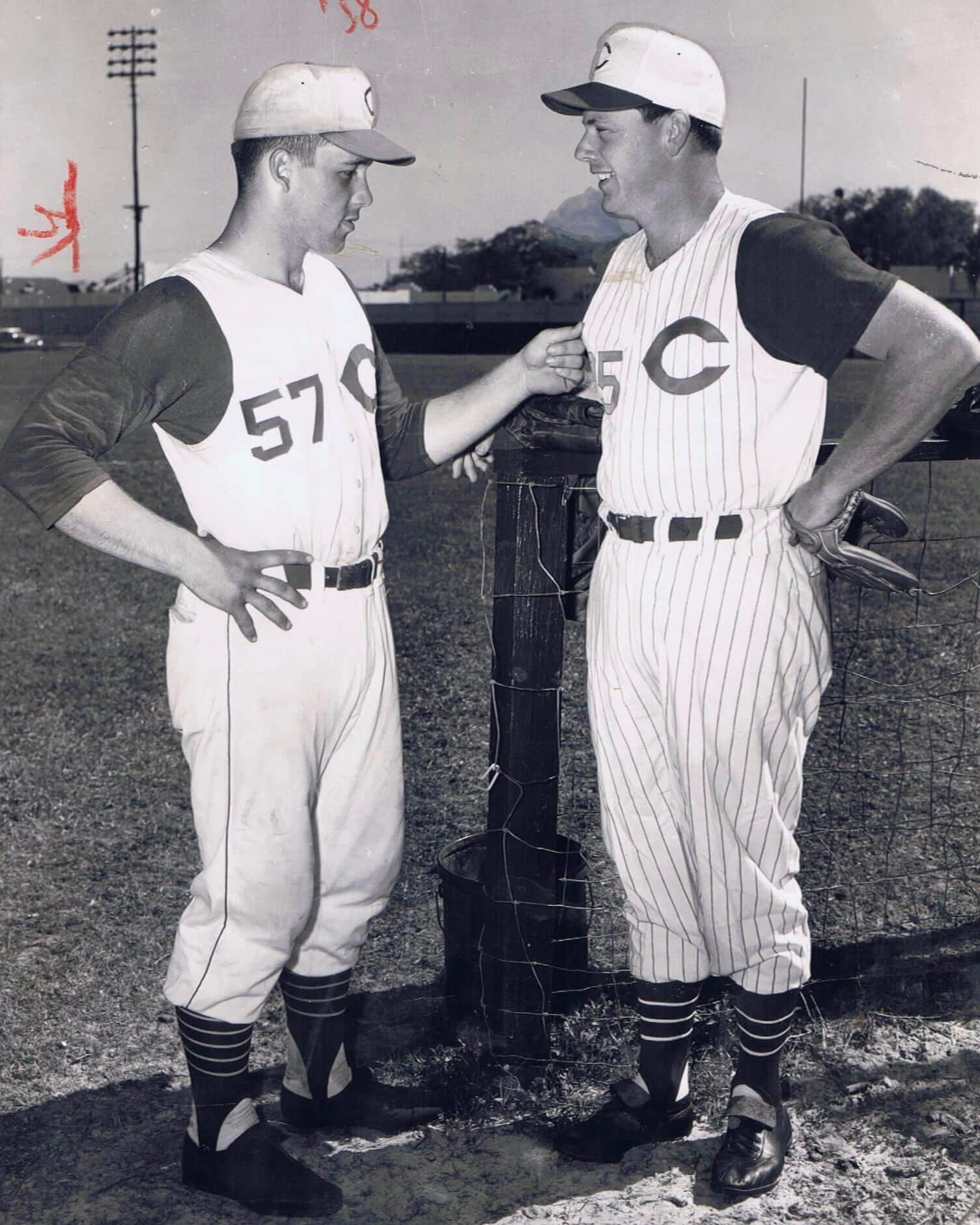
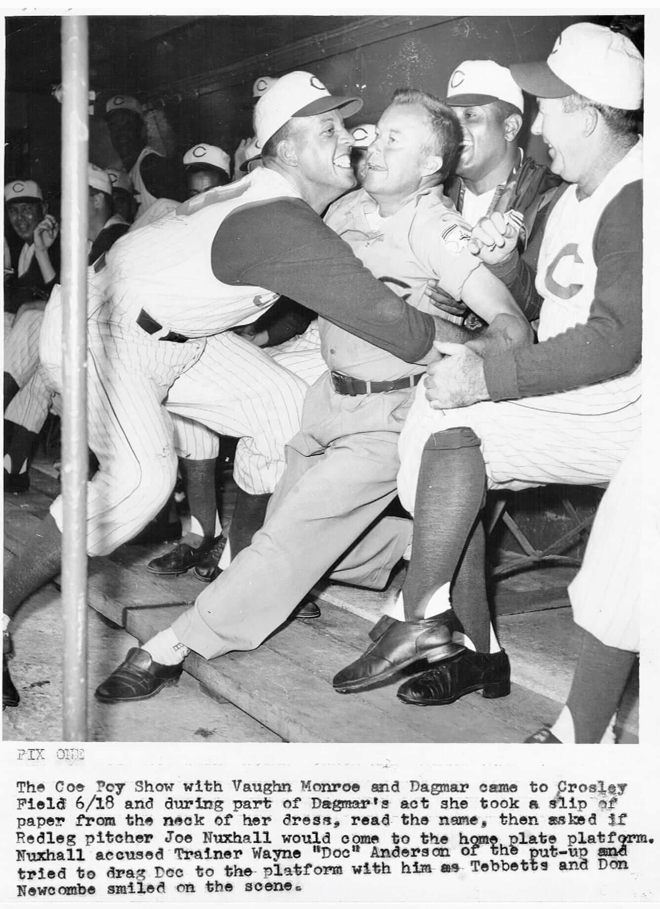
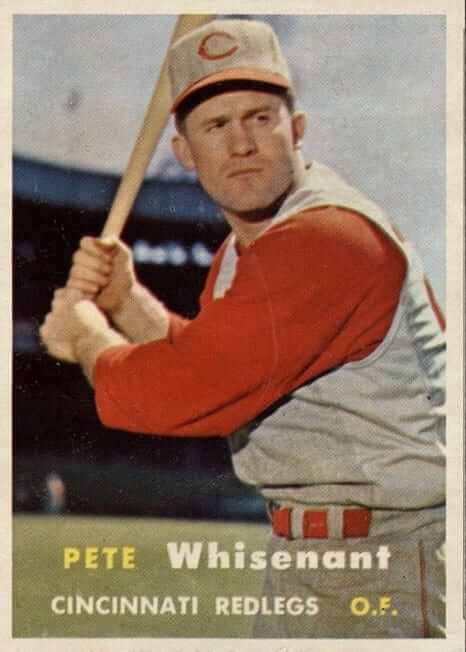
Interesting, right? Maybe some of you already knew about this, but it was all news to me — I’d somehow never noticed the side panels before. After hearing from Dave, I did a bit of digging and found a bunch of additional photos, all from the 1958-60 period (for some of these, you can click to enlarge):
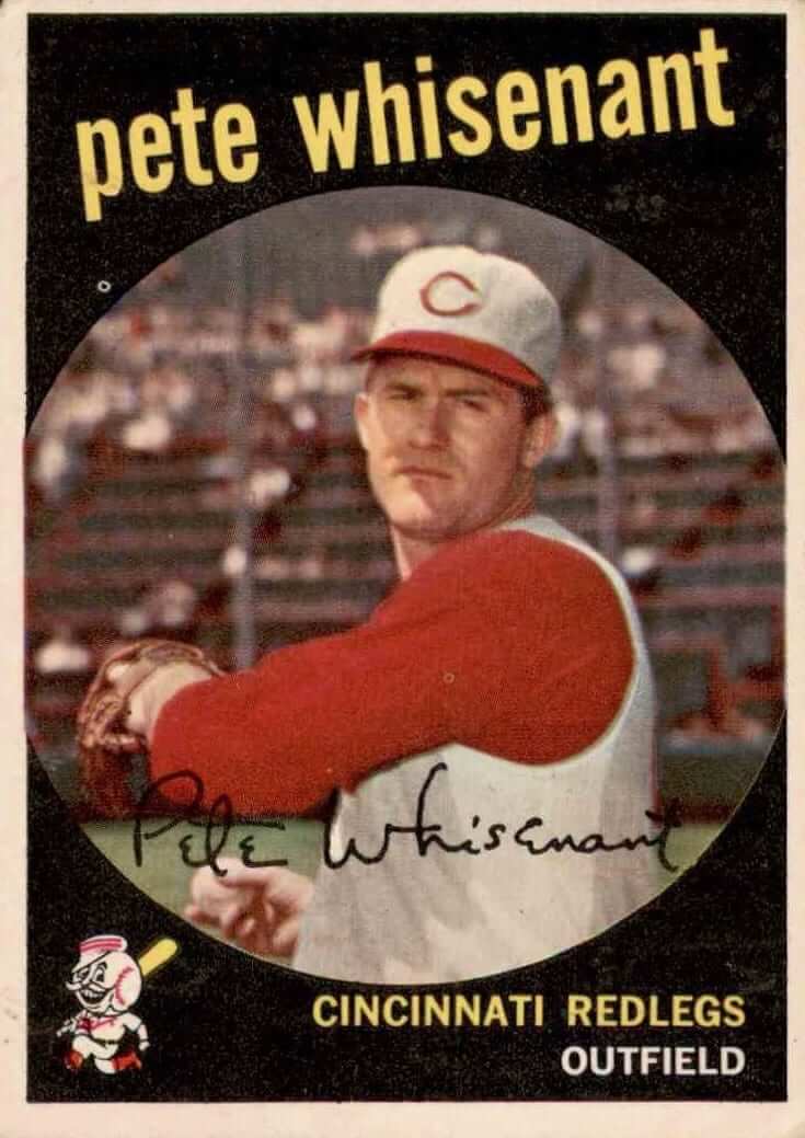
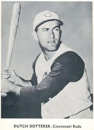
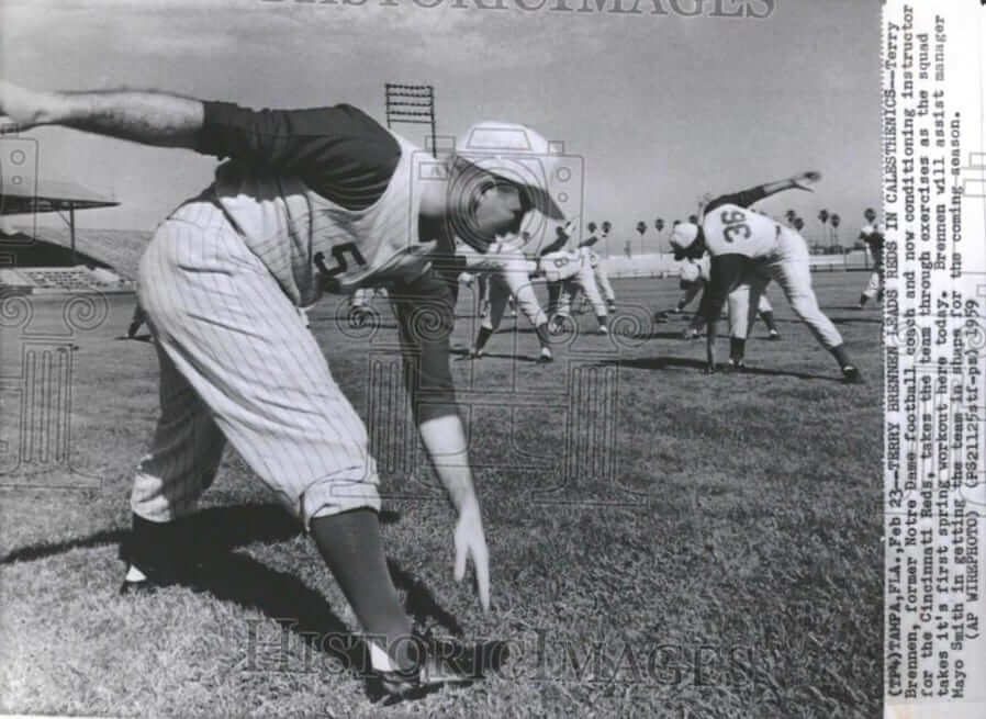
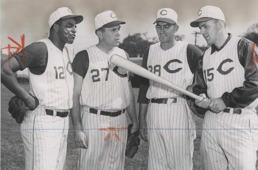
I asked Dave if any other teams had these same inserts on their vests. He said, “If you look, you will also see it on Indians road vests made by Rawlings in the 1960s.” So I went looking, and sure enough:
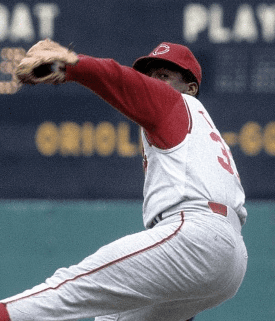
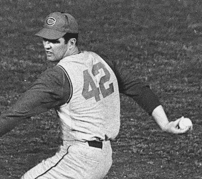
I don’t know how all of this escaped my notice before, but now I’m fascinated by it. Not sure why they’d do this just for vests and not for sleeved jerseys. In any case, it’s similar to the side panels that Majestic introduced a few years ago. At the time, we were all fretting about how the non-pinstriped inserts would look on pinstriped jerseys (something of particular concern to me as a Mets fan). Who knew there was historical precedent for it?
As I’ve mentioned several times over the past couple of years, the Majestic inserts have turned out to be pretty innocuous and don’t look so bad after all, mainly because they’re often blocked from view by the players’ arms. Maybe that’s why I never noticed the Reds’ inserts either. In any case, it’s always fun to learn something new, yes? Yes!
While we were corresponding, Dave also sent me a report he prepared for the Reds Hall of Fame on the accuracy of the Okkonen renderings of Cincinnati’s 1936-38 uniforms compared to the real thing. It’s fascinating stuff, which you can check out here.
Boomer Sooner: Oklahoma unveiled new football uniforms yesterday, becoming the third school to transition from Nike to Jordan. The design changes are small — a new chest lettering font for the home and road primaries (most people won’t even notice) and a more old-school look for the red and cream alternates. For all of the image pairs that follow, the old version is on the left, new on the right, and you can click to enlarge):
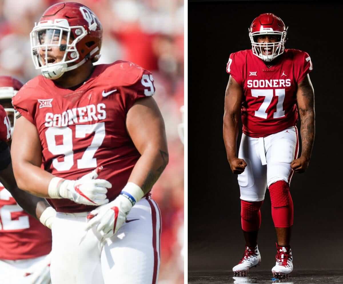
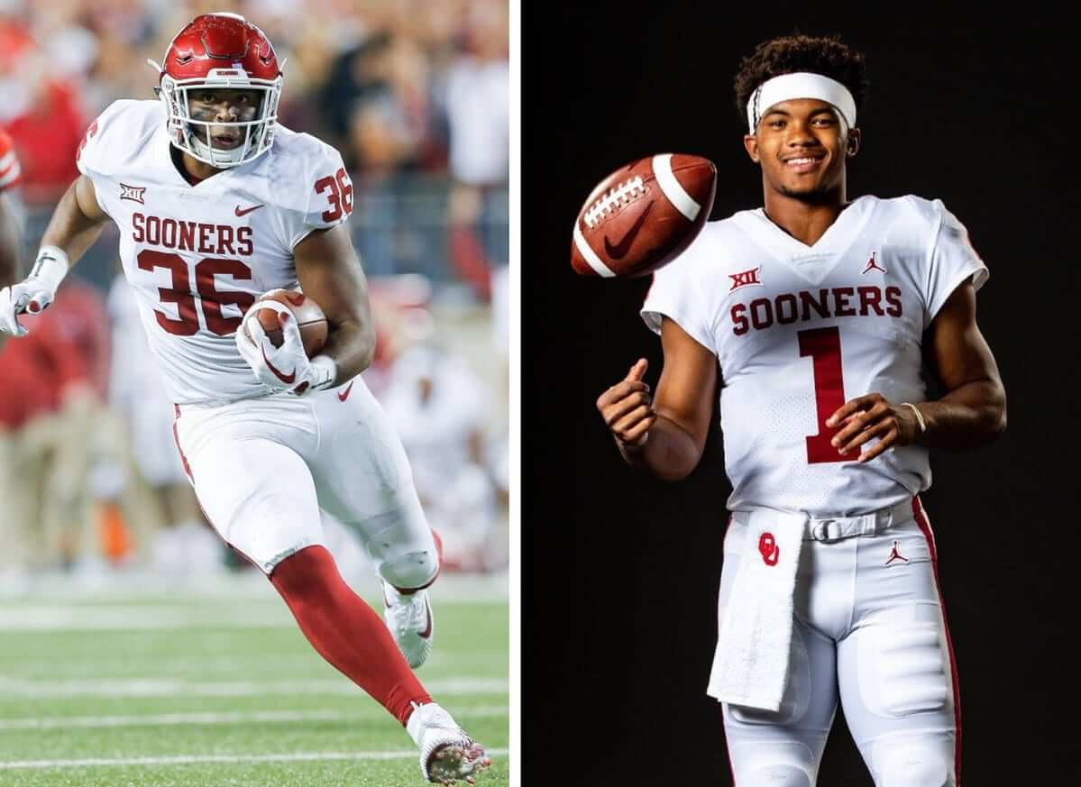
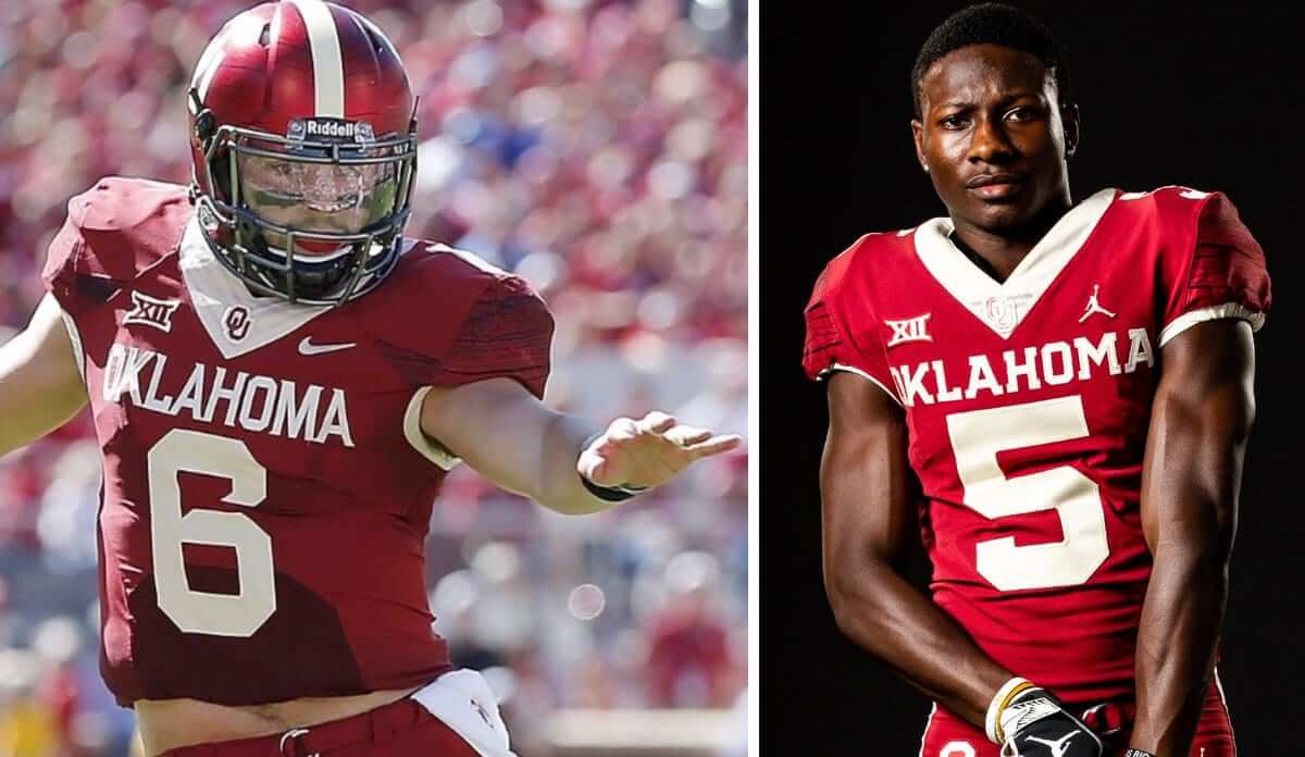
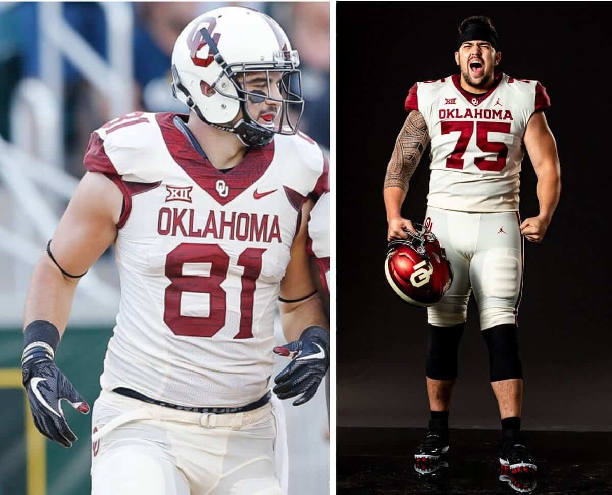
You can see lots of additional photos here.
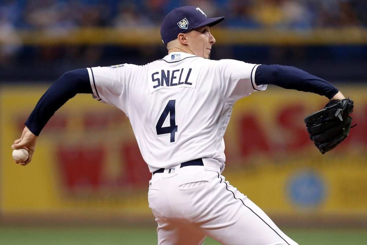
A good trivia question: Rays pitcher Blake Snell is having an outstanding season but was not selected for the American League All-Star squad. He might be added later as an alternate or an injury replacement, in which case we’d get to see his single-digit uni number in the Midsummer Classic.
That got me thinking: Who was the last single-digitized pitcher to appear in an MLB All-Star Game? When I posed that question yesterday on Twitter, nobody could come up with a good answer. Anyone..?
Collector’s Corner
By Brinke Guthrie
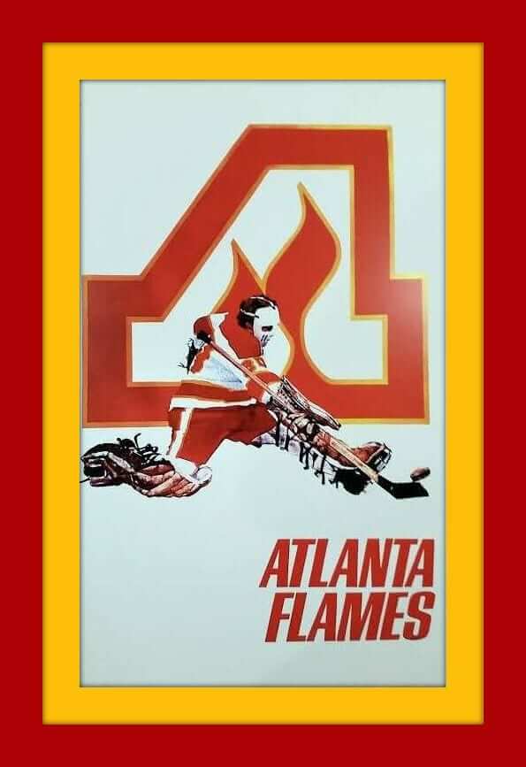
One of the truly great logos in pro sports history belonged to the Atlanta Flames. The whole way the flame just morphs up into the A is totally neat, and still holds up today. They played down south from 1972 until 1980, when they moved up to the Great White North to Calgary, where they remain to this day. The “Flame C” just doesn’t have the same artistic attraction for me. Here’s a really nice 1970s Flames poster featuring the original logo right up top.
Now for the rest of this week’s picks:
• When you look up “old school” in the dictionary, you’ll see this Cliff Engle Denver Broncos sweater. Dan Reeves not included.
• This 1970 Pirates Zippo lighter says “Bucco Power” on the front. Sold for $6.95, and now the seller wants … a little more than that.
• This 1970s St. Louis Football Cardinals stadium blanket and helmet plaque comes as a set.
• The World Hockey Association had some team with great logos, too, like the Stingers and the Racers, along with a cool league logo, which you can have on this decal.
• This 1970s Colorado Rockies (hockey) ski cap was a promo item sponsored by Coors.
• This set of late-1970s NFL mini-pennants comes uncut in a set.
• This 1970s glass features the logo of the NHL California Seals. I could never figure this logo out.
• Swingster was the maker of this 1970s Pittsburgh Steelers jacket. Nothing fancy, just a logo and some yellow trim — like the Stillers themselves.
• Another 1970s Swingster item, this time a navy blue jacket bearing the logo of the NFL Players Association.
• This 1970s S.F. Giants pennant shows a rather stern-looking ballplayer standing in the middle of Candlestick Park.
Seen an item on eBay that would be good for Collector’s Corner? Send any submissions here.

Friendly reminders: In case you missed it on Monday, there was some news that you’ll want to catch up on.
First, we’re currently running a new raffle for a bunch of old Kansas City Chiefs nameplates, which are being generously provided by a Uni Watch reader. Full details here.
Also from Monday, I provided a bunch of new details about my upcoming stoop/open-house sale, which will give you a chance to literally own a piece of Uni Watch HQ. Full details on that can be found here.
The Ticker
By Alex Hider

Baseball News: The year of the C-Flap continues, as the device will be featured on Cubs 2B Javy Baez’s bobblehead (from Jennifer Hayden). … Rangers SS Elvis Andrus lost his batting helmet logo last night (from Andrew Gordon and James Keith Clowers). … Sports psychologist Ken Ravizza died on Sunday, and Nats manager Dave Martinez paid tribute by writing his initials on his cap. Martinez worked closely with Ravizza when he was on the Cubs’ coaching staff (from John Muir). … The Orioles usually reserve orange jerseys for Saturdays, but they broke them out last night for the second game of a doubleheader (from Andrew Cosentino). … I love this: The Durham Bulls will wear Carolina Hurricanes-inspired jerseys on Aug. 23 that include hockey-style lace-up collars! (From William I. Wells and Thad McKinnon.) … Another hockey crossover: The St. Paul Saints paid homage to the St. Paul Fighting Saints, the former WHA hockey team, with caps and jerseys last night (from Al Gruwell). … More cross-sport shenanigans: The Akron RubberDucks will retire No. 23 in honor of native son LeBron James on July 23 (from Jim Vilk). … The Triple-A All-Star Game will be played in Columbus, and jerseys have a sublimated photo of the city skyline (from MV). … Zander Wiel of the Chattanooga Lookouts tore the pocket on his pants last night (from Clint Richardson). … No photos but the Charleston RiverDogs will wear purple and teal throwbacks jerseys on Wednesday.

Football News: Iowa State’s new jerseys — including a BFBS shirt — may have leaked on Twitter last night (from Sean and Sean Jankowski). … Michael Bialas spotted an autographed Packers helmet cart in Marshfield, Wisconsin. … Alan Zimmerman has completed his collection of the Browns’ infamous 1984 jerseys. … Back in the mid-1950s, at least two NFL players used tape to create crosses on the back of their helmets. It’s not clear if the crosses were an expression of Christianity or something else.

Hockey News: The Ducks will retire former LW Paul Kariya’s No. 9 jersey on Oct. 21, and will retire former D Scott Niedermayer’s No. 27 on Feb. 17. Neidermayer also had his number retired by the Devils and will be the eighth player in NHL history to have his number retired by at least two teams. … Speaking of the Ducks, they’re selling soccer jerseys in their team store (from Ryan). … Cross-listed from the baseball section: The Triple-A Durham Bulls will wear Hurricanes-inspired jerseys on Aug. 23 that include lace-up collars! (From William I. Wells and Thad McKinnon.) … Also from the baseball section: The St. Paul Saints, an independent minor league baseball team, paid homage to the St. Paul Fighting Saints, the former WHA team, with caps and jerseys last night (from Al Gruwell).

NBA News: The Sixers will have a new court design next season. … The Clippers are giving rookie Shai Gilgeous-Alexander a double-decker NOB for Summer League games (from Q). … The Dallas Morning News‘s architecture critic is asking Mark Cuban to get the Mavs new uniforms (from Alan Lewis and Dick Sully). … A young Kyrie Irving fan was shot in killed in New Orleans recently. At his wake, his family dressed him in an Irving BFBS jersey and displayed his body as if he were playing NBA 2K18 (from Mike Chamernik). … It appears Nike has toned down the yellow on the Lakers’ summer league uniforms. Could it be a preview of what’s to come for the new unis? (From Marlo Podfield.)

Soccer News: England plays best in World Cup matches when they wear red. Unfortunately for them, they’ll be wearing white on Wednesday in the semifinals (from Philip Brown). … One Australian man is taking on Nike and Adidas (WSJ link) by starting his own apparel company, serving lower-tier national teams in Africa (from Rob Walker). … \Liverpool’s third kit has reportedly leaked (from Moe Khan and Anthony Bardaro). … Another slew of kit releases from Josh Hinton: Home and change uniforms Aston Villa of the English Championship, change kits for Newcastle United of the EPL (also from Nicholas Wanzenried), away uniforms for Sheffield Wednesday of English League One (also from Jamie Rathjen) and three new kits of Torino of Italy’s Serie A. … More kit releases from our own Jamie Rathjen: New first kits for the Scottish Premiership’s Hamilton Academical and four new kits for Sunderland of English League One. … New jerseys for Slovenian club Olimpija Ljubljana (from Rok Grilec). … New uniforms for the University of Buffalo women’s team. … Cross-listed from the hockey section: The Anaheim Ducks are selling soccer jerseys in their team store (from Ryan). … In Russia, displaying the LGBT rainbow flag can get you arrested, so some activists created a “walking flag” by walking around Moscow in a series of different-colored soccer jerseys (from David Robins).

Grab Bag: There’s a company that’s making college-branded silicon wedding band replacements (from Kary Klismet). … Here’s a good behind-the-scenes look at Disneyland’s costume warehouse (from John Chapman).
I’m dealing with a family issue today, so I won’t have much presence, if any, in the comments or on social media. Play nice while I’m away, yes? Thanks. — Paul
Best thing the Calgary Flames did to their uniforms was re-adopt the Atlanta flaming A for their alternate captains.
I agree completely!
As a kid in the 70’s, it was the Atlanta Flames logo I tried to draw the most. Everything about the logo and colors seemed super cool.
Also, I remember the Flames had the flaming C for the captain for a short period of time. Did not last for long.
link
A few soccer ticker notes, which is good, because that means there’s a lot of stuff:
Sheffield should probably be clarified as Sheffield Wednesday, so that there isn’t confusion with Sheffield United. Also, Sheffield Wednesday play in the second tier (EFL Championship).
The red and white striped Sunderland kits are both the home kit, but with different socks. I’d venture that the solid black kit is the change/away strip, and the third, with black sleeves but a red pattern on the front, is the goalkeeper kit (noticed how it’s long-sleeved and the adidas stripes are longer than the others).
Also, not soccer related, but Kentucky basketball’s twitter showed video of practices and the players were wearing new practice jerseys, with no school name and the Jordan logo instead of the Swoosh (link)
Also-also, Sheffield F.C. (because you have to qualify it if you’re referring to United or Wednesday) are a different team that play at a much lower level (eighth tier).
Sorry, I should have clarified which is which for Sunderland. You’re right, though. The red shorts/socks appear to be an alternate combo so they don’t need to actually change as much.
Always got to one-up me, right, Jamie :)
On a serious note, it’s nice to have people to talk (comment?) soccer with on the site. I know soccer is not a priority, whether it be from the kit ads or the perceived “boring-ness” or whatever the reason may be, but I thoroughly enjoy that there are people on the site who not only know the difference between Sheffield Wednesday and Sheffield United, but that also care about it! (And that’s not a knock on any non-soccer guy on the site, just to clarify!)
Agreed!
Lee
Sorry, the way it was phrased reminded me of that.
Other stuff from today:
Newcastle’s kit is a throwback to 1995-96, but looks like the original had cream (!) shorts, not white. Come on, Puma.
Aston Villa’s kits are apparently supposed to be early-’80s throwbacks but in the sense of reminding one of them rather than trying to be a reproduction.
Interestingly, my eye was immediately drawn to the side panels on those Reds vests too, even before reading what the article was about. I had never noticed them before either! Crazy.
What is the trainer, “Doc” Anderson wearing? It looks like a long sleeve “Shirsey” with the Red wishbone C.
Regarding the Iowa State leak: For a brief second I thought, “I wonder what the thought was behind the design of those two tone numbers,” but then I took a second look at them and realized that whatever the school or Nike say about them will just be crap, which is an accurate way to describe how they look.
I appreciate the effort and thought that goes into making these unique fonts, but unless the new numbers improve the look of the uniform they should be kept simple. Flair for flairs sake hurts more than it helps.
As for a single digit pitcher, how about Atlee Hammaker of the Giants in the 1983 All Star Game? I remember that he wore number 7 back then…
This is correct, I believe. Had a pin on his cap. I remember that ASG clearly, and I don’t know why. Fred Lynn’s grand slam at Tiger Stadium.
The game was at Comiskey Park.
Hammaker’s only All-Star Game appearance was in 1983 (when he gave up the grand slam to Fred Lynn). He wore #14 that year. The only year Hammaker wore #7 was 1985.
Hammaker did indeed wear #14 in the link.
Joe Garagiola addresses the Croix de Candlestick pin at the 12:18 mark. And if you pause on one of the close-ups, it appears as though the logo on Hammaker’s cap is off-center to accommodate the pin location.
On the Oklahoma football red alternates, it looks like the OU collar logo is cream on cream. However, there are other images online where the OU logo is red on cream. My guess is the logo will be red.
link
Two observations about the new Oklahoma uniforms: first, the “N” in “Sooners” looks almost identical to the Nebraska “N”: link
And second, the number 4 in the new font is absolutely brutal – it looks like it’s been chopped off at the top: link
Direct comparison of the Nebraska N (left) and the Sooners N (right): link
When you say “Nebraska N”, this is the N I think of.
link
Right? Who would think of anything else when you mention “the Nebraska N”?
Lee
Well, have just one typeface, then…
OU’s new-for-new’s-sake font is a significant & unnecessary downgrade.
Implemented to discourage counterfeiting, if you ask me.
I keep seeing the “Jordan Brand” but I just think of it as same Nike merchandise. Is this wrong and/or do any of you think of Jordan separately and distinguish it as better/worse or different than Nike? Though I do believe Jordan was a great basketball player and his competitiveness is legendary it seems to be as a basketball executive/owner, he is irrelevant as Charlotte sucks year in and year out.
I love that Football Cardinals helmet plaque but 1-I would never buy a used blanket and 2-in one of the pictures the seller is standing on it with his bare feet. YIKES!
I am SO weary of minor league promotions messing with the jerseys. Star Wars, Hawaiian print, wacky tribute to military and camouflage…………….THOUGH I DID LIKE THE BRANNOCK DEVICE NIGHT!
That Packers golf cart is FANTASTIC!
Glad the Sixers got rid of that shit snake on the court. The previous logo was too busy and confusing.
In Honor of the kyrie irving fan shot and killed and then dressed up in Celtics gear, if I die either prop up my corpse in a Masters Jacket or a PURPLE AMNESTY UNIWATCH SHIRT! WHAT UNIWATCH RELATED OUTFIT DO YOU WANT YOUR CORPSE DISPLAYED IN AT YOUR WAKE?
I have no time for a retired number for any non-player of that team, so get out of here with the Akron minor league baseball team retiring a number for an athlete with fewer career minor league games than Michael Jordan. However, holy cow that special GOAT burger sounds delicious! Two beef patties, goat cheese, apple cider bacon jam, grilled onions, and blackberry bbq sauce…I’d expect that out of a Bobby Flay restaurant before a ballpark, and I mean that in the most complimentary way possible. Needless to say, I would eat that!
The answer I’m sure is on baseballreference.com. Just don’t have that kind of time!
I’ve seen that Reds underarm panel before.
link
Apparently it was incorporated to give Big Klu a little more room to swing the bat
link
link
Shouldn’t the Ducks soccer jersey have one star above the crest?
CB, stars in soccer kits are typically reserved for international play. MLS and USL (the top two American leagues) have stars, MLS has a very weird format, USL is standard, star for title. In Germany, it’s a star every five titles, and in England, there are no stars. It all depends on the league and the club.
I did a quick check of baseball-almanac.com and cannot find a single instance of a pitcher wearing a single-digit number pitching in the MLB All-Star Game. Hugh Mulcahy wore #9 for the Phillies in 1940 and was on the All-Star roster, but did not pitch in the game. Among the questions I have – I don’t believe any of the National League pitchers in the inaugural game in 1933 wore a single-digit number, but since the NL wore special “National League” uniforms and not their regular jerseys, I cannot be sure without a numerical roster, which I cannot easily find on the internet. My other question is regarding the 1934 game at the Polo Grounds. If you look at the film, it appears that the batters are wearing numbers attached to the backs of their jerseys with safety pins, with their numbers corresponding with their place in the batting order. What I have not seen is whether or not any of the pitchers wore #9. The game is famous for NL starter Carl Hubbell striking out five future Hall-of-Famers in a row. From the brief glimpses of Hubbell’s back I have seen, it appears he has #14 pinned to his back – he normally wore #11. You would think that if the starter didn’t get #9, none of the other pitchers did, but I cannot be sure.
Phillies pitcher Ken Raffensberger wore #7 for part the 1944 season:
link
He was credited as the winning pitcher in the ASG that year but it’s unclear when during the season he switched to #15.
The Soccer Jerseys worn in “A group of activists from Latin America wore their countries’ football jerseys and walked the streets of Moscow together forming an LGBT rainbow flag” are not all Latin American. the first one is of Spain and the Second is the Netherlands both of those are European. The other 4 in order are Brazil, Mexico, Argentina, and Colombia
Looks like they got it right the second time:
“In Russia, displaying the LGBT rainbow flag can get you arrested, so some activists created a “walking flag” by walking around Moscow in a series of different-colored soccer jerseys (from David Robins).”
It’s a great story, but why did it appear a second time? :)
“This 1970s S.F. Giants pennant shows a rather stern-looking ballplayer standing in the middle of Candlestick Park.”
At first glance, I immediately think Will Clark but it would have to be the late 1980s, not 1970s.
Obviously not Will Clark, but in no way do I think that is a 1970’s pennant, it very much says 1980’s to me.
Lee
PS- why doesn’t the Name, Email, Website form stay populated like it used to?
Its possible and pretty likely, the Durham Bulls jersey just has a sublimated lace up on it. I can’t imagine a pitcher would want the laces flapping around while pitching.
I find it hard to imagine hockey players actually wanting laces flapping around while skating, but it doesn’t seem to bother them – certainly not as much as it bothers me to look at them, anyway.
So, since you are moving out of Uni Watch HQ to the Tugboat Captain’s place, how are you going to refer to her/your place in the future? Uni Watch HQ again? Or something totally different?
#theBallAndChain
#SinCity
#Witch’sLair
#UniWitch
#LandLadyLay
Another possibility for the crosses on the football helmets is that they were memorials for someone who had died rather than a religious statement. Crosses have often been used in that context.
link
link
link
It will be interesting to see if Oklahoma ever flips their XII patch to honor their history in the Big 8.
I have always found it classy the Big 12 schools who were originally in the Big 8 have XII for 12 on one side of their field an IIX for 8 on the other side.
“The St. Paul Saints paid homage to the St. Paul Fighting Saints, the former WHA hockey team”
While they were based in St. Paul, they were never called the St. Paul Saints, they were always the Minnesota Fighting Saints.
Unless you’re referring to the St. Paul Saints of the Central Hockey League, which used Fighting Saints in promotional material.
In reference to Brinke’s “Collector’s Corner” comment on Tuesday, I am puzzled as to why and how anyone could find the old California Seals logo confusing. It’s a stylized seal holding a hockey stick, and a big C. I wasn’t an NHL fan when this was in active use, but I’ve loved this logo and all of its later variants since I first stumbled upon it/them. Incidentally, given that the “California Seals” name was discarded in favor of “Oakland Seals” during the first season, that glass (if authentic) should be pretty rare.