
Click to enlarge
At the beginning of every week, I edit Brinke Guthrie’s “Collector’s Corner” column, which runs on Tuesdays. As I click through his various eBay selections, I often find myself thinking, “Whoa, that’s really cool.” But it’s rare that I find myself thinking, “Whoa, I need to have that.”
That was the case, however, with an eBay listing for a batch of early-1970s letters that Brinke recently included in one of his columns. The letters were all from NFL teams and were addressed to a guy named Richard, who was desperately seeking a tryout to be an NFL kicker.
Brinke included this item because of all the gorgeous letterhead designs. I liked that aspect of the letters, but I was also interested in the contents of the letters themselves, most of which were of the “Thanks, but no thanks” variety. In short, this Richard guy had saved several years’ worth of rejection letters for many decades, and then either he or someone else had put them up for sale on eBay. That’s the kind of Permanent Record-type situation that pushes all of my buttons.
When I saw the eBay listing while editing Brinke’s column, I immediately purchased the letters myself (I explained to Brinke that he’d have to come up with a substitute item) and also asked the seller if he was Richard, or related to Richard. That led me down an interesting, complicated rabbit hole.
After eventually learning more about Richard and his family, I’ve decided to preserve their privacy by removing any identifying details about him. Aside from those redactions, however, I’m going to show you the letters, which provide a fascinating window into all sorts of things, including NFL communications from the early 1970s, how an aspiring player dealt with teams in the days before agents and the internet, and one such player’s persistent attempts to land an NFL gig despite a seemingly endless stream of rejection and disappointment. (And yes, the beautiful letterhead designs are a nice bonus.)
I have dozens of these letters — too many to show in one blog entry. We’ll look at nine of them today, beginning with the earliest one I have and proceeding in chronological order. In each case, you can click on the photo of the letter to see a larger version.
Jan. 8, 1971: Rejection letter from the Oilers
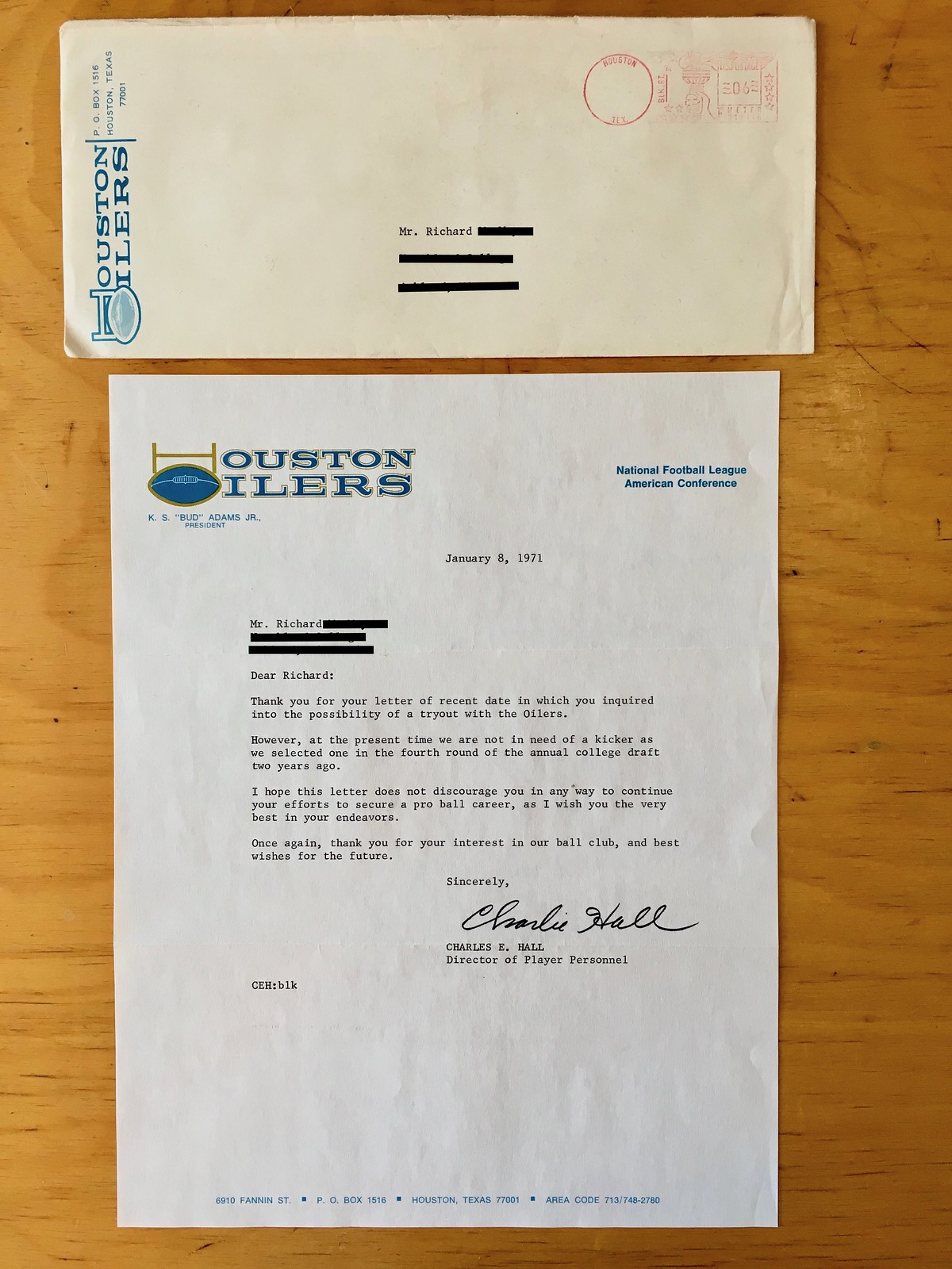
Dear Richard:
Thank you for your letter of recent date in which you inquired into the possibility of a tryout with the Oilers.
However, at the present time we are not in need of a kicker as we selected one in the fourth round of the annual college draft two years ago.
I hope this letter does not discourage you in any way to continue your efforts to secure a pro ball career, as I wish you the very best in your endeavors.
Once again, thank you for your interest in our ball club, and best wishes for the future.
Sincerely,
Charles E. Hall
Director of Player Personnel
Interesting color scheme on the letterhead, right? I don’t recall the Oilers ever using that shade of gold/bronz/etc. in their graphics.
Feb. 5, 1971: Rejection letter from the Browns
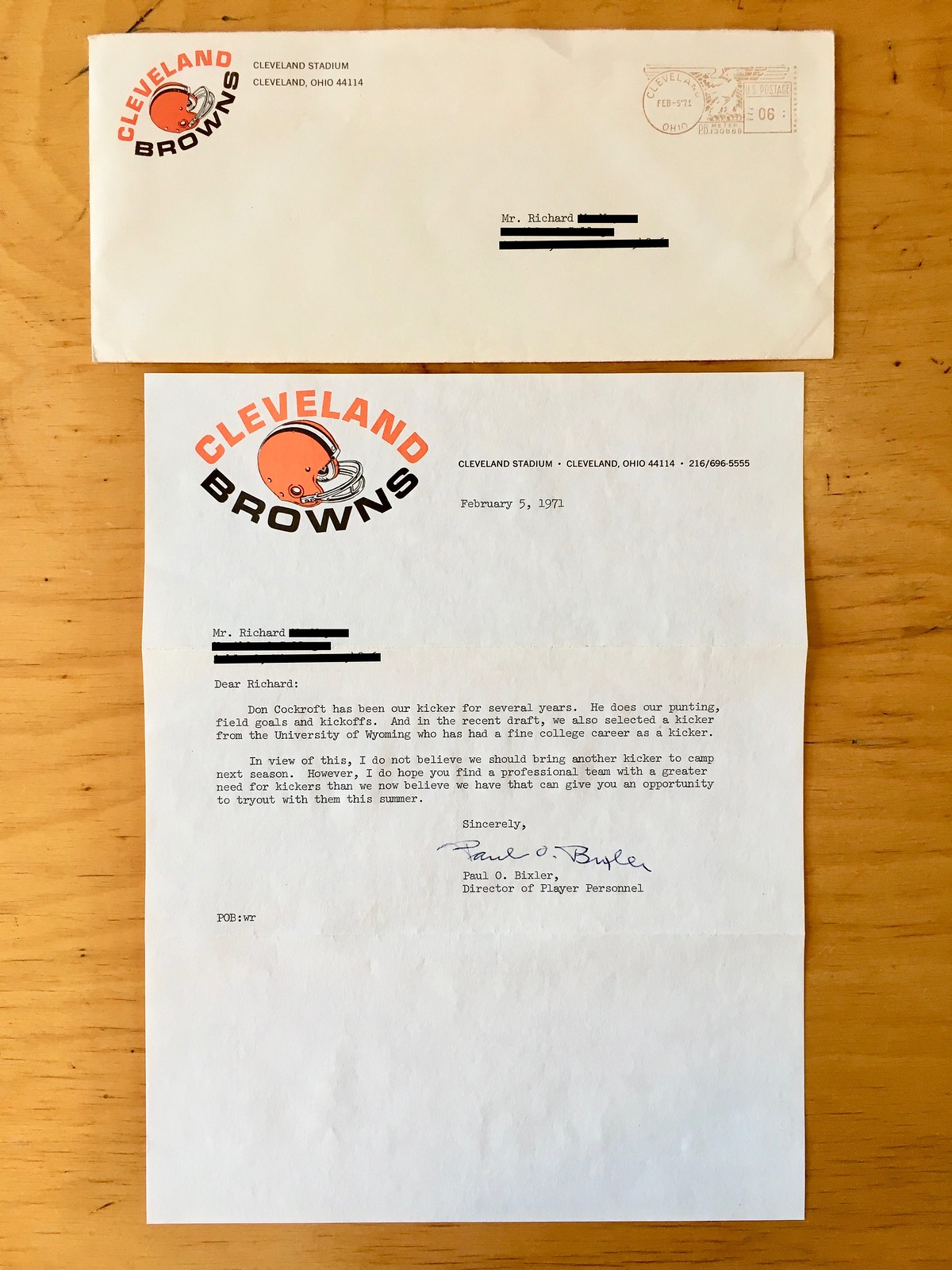
Dear Richard:
Don Cockroft has been our kicker for several years. He does our punting, field goals, and kickoffs. And in the recent draft, we also selected a kicker from the University of Wyoming who has had a fine college career as a kicker.
In view of this, I do not believe we should bring another kicker to camp next season. However, I do hope you find a professional team with a greater need for kickers than we now believe we have that can give you an opportunity to tryout with them this summer.
Sincerely,
Paul O. Bixler
Director of Player Personnel
Love the football-shaped lettering on the letterhead. Interesting to see how they positioned it at a different angle for the envelope.
March 16, 1971: Rejection letter from the Lions
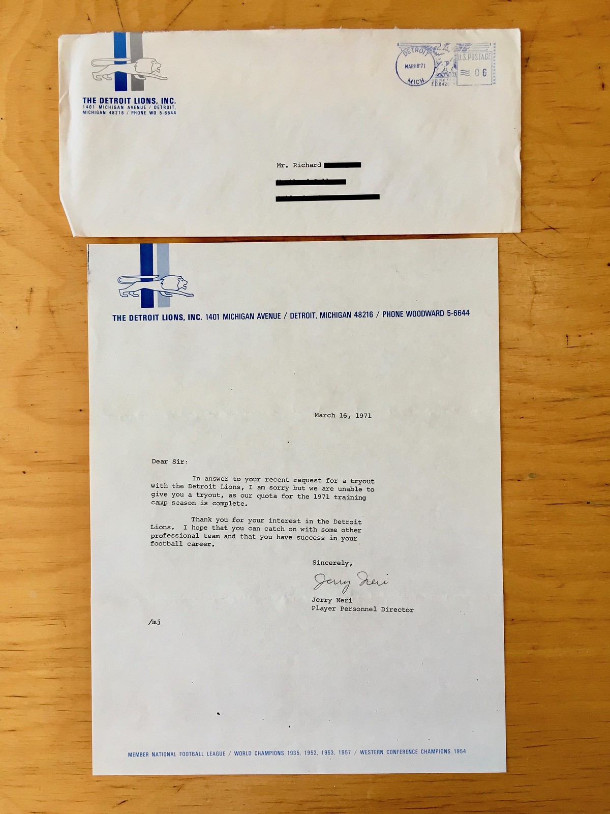
Dear Sir:
In answer to your recent request for a tryout with the Detroit Lions, I am sorry but we are unable to give you a tryout, as our quota for the 1971 training camp session is complete.
Thank you for your interest in the Detroit Lions. I hope that you can catch on with some other professional team and that you have success in your football career.
Sincerely,
Jerry Neri
Player Personnel Director
March 2, 1972 (date taken from postmark): Letter from the Saints
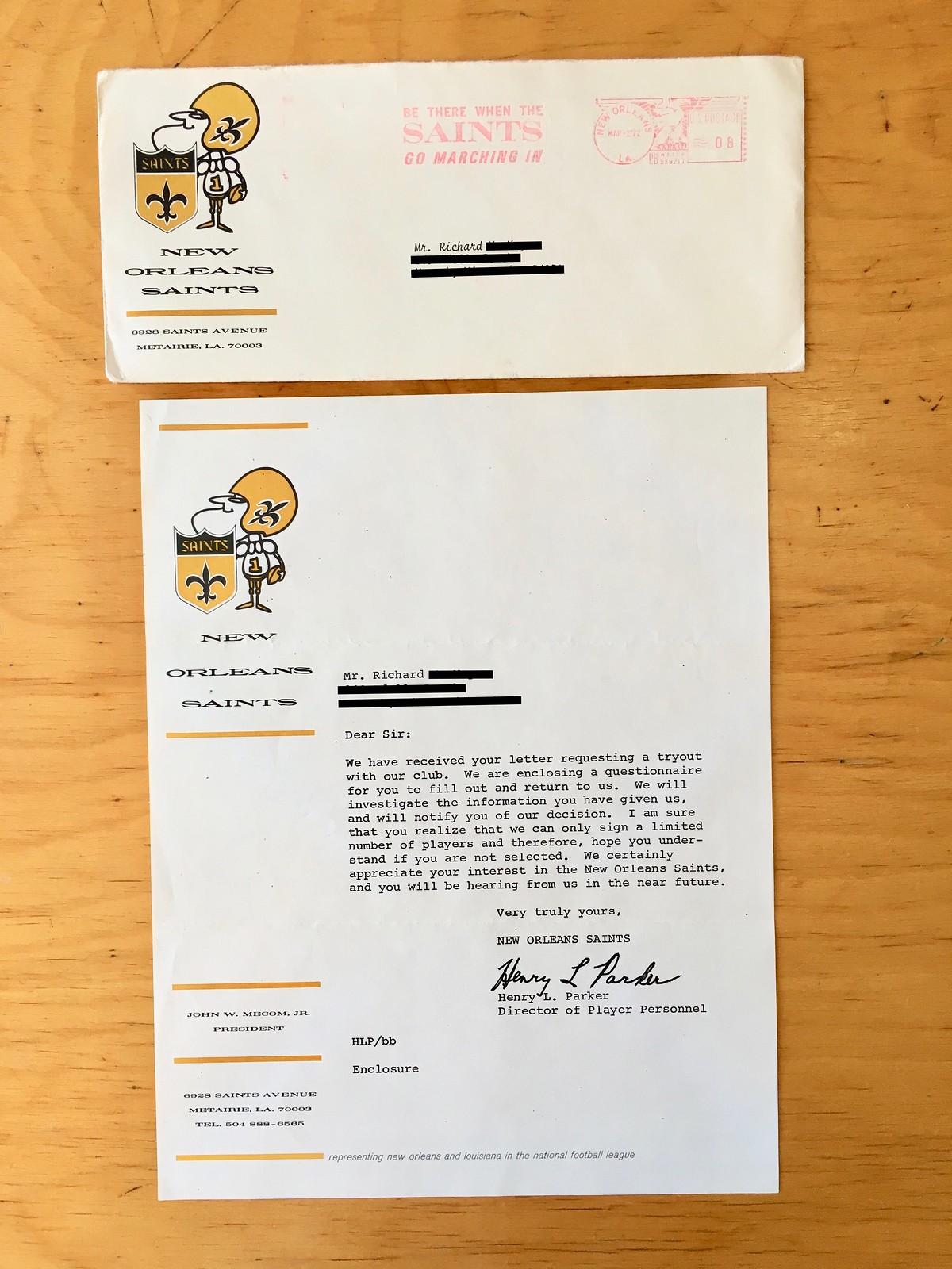
Dear Sir:
We have received your letter requesting a tryout with our club. We are enclosing a questionnaire for you to fill out and return to us. We will investigate the information you have given us, and will notify you of our decision. I am sure that you realize that we can only sign a limited number of players and therefore, hope you understand if you are not selected. We certainly appreciate your interest in the New Orleans Saints, and you will be hearing from us in the near future.
Very truly yours,
Henry L. Parker
Director of Player Personnel
Although this appears to be a form letter, it’s the first one that isn’t a flat-out rejection, so that counts as progress. The questionnaire referred to in the letter was no longer in the envelope, presumably because Richard filled it out and sent it back to the Saints.
Love the use of Sir Saint on the stationery. Also, I like how the Saints programmed a slogan into their postal meter — nice.
March 13, 1972 (date taken from postmark): Another rejection letter from the Lions
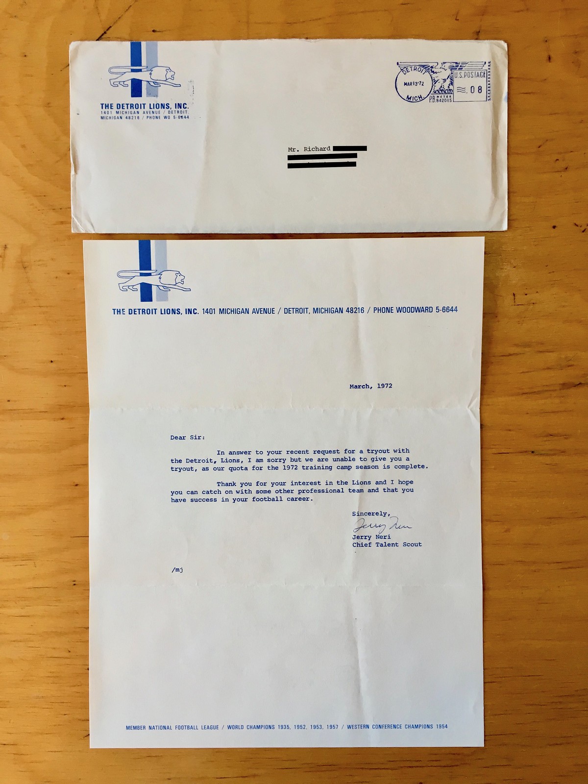
Dear Sir:
In answer to your recent request for a tryout with the Detroit Lions, I am sorry but we are unable to give you a tryout, as our quota for the 1972 training camp season is complete.
Thank you for your interest in the Lions and I hope you can catch on with some other professional team and that you have success in your football career.
Sincerely,
Jerry Neri
Chief Talent Scout
This is identical to the letter Richard received from the Lions a year earlier, except (a) the year has been updated, (b) the text is now printed in blue, instead of black, and (c) Jerry Neri has a new job title.
March 14, 1972: Rejection letter from the Cowboys
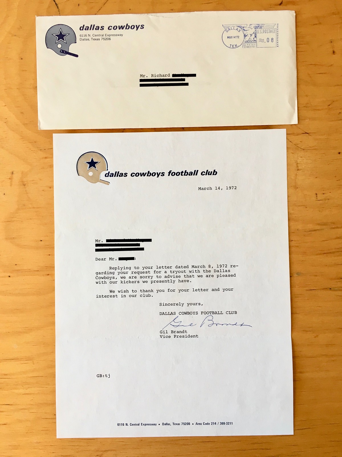
Dear Mr. REDACTED:
Replying to your letter dated March 8, 1972 regarding your request for a tryout with the Dallas Cowboys, we are sorry to advise that we are pleased with our kickers we presently have.
We wish to thank you for your letter and your interest in our club.
Sincerely yours,
Gil Brandt
Vice President
It’s a little hard to see in the photo, but the Cowboys helmet on the letterhead (but not on the envelope) is foil-stamped — very nice.
March 23, 1972: Rejection letter from the Falcons
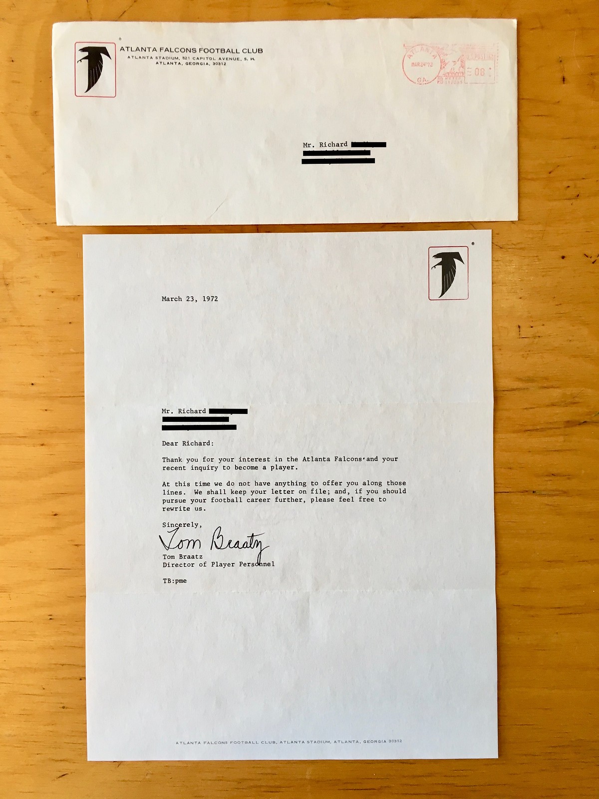
Dear Richard:
Thank you for your interest in the Atlanta Falcons and your recent inquiry to become a player.
At this time we do not have anything to offer you along those lines. We shall keep your letter on file; and, if you should pursue your football career further, please feel free to rewrite us.
Sincerely,
Tom Braatz
Director of Player Personnel
This is the first instance of a team basically telling Richard to stay in touch. That must have been at least vaguely encouraging — a small morsel of hope to grasp at.
April 3, 1972: Rejection letter from the Cardinals
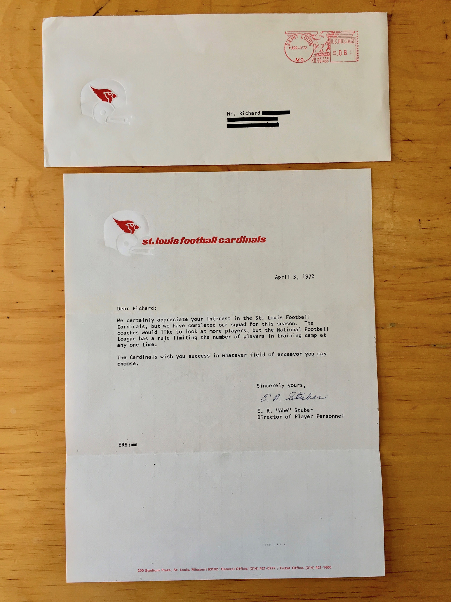
Dear Richard:
We certainly appreciate your interest in the St. Louis Football Cardinals, but we have completed our squad for this season. The coaches would like to look at more players, but the National Football League has a rule limiting the number of players in training camp at any one time.
The Cardinals wish you success in whatever field of endeavor you may choose.
Sincerely yours,
E. R. “Abe” Stuber
Director of Player Personnel
Man, that last line, about finding success “in whatever field of endeavor you may choose,” sure sounds like a not-so-subtle suggestion that Richard should consider setting his sights on something other than football. Ouch.
Meanwhile, note that there’s no return address on the front of the envelope. They did include it, however, on the back.
May 11, 1972: Letter from the Steelers
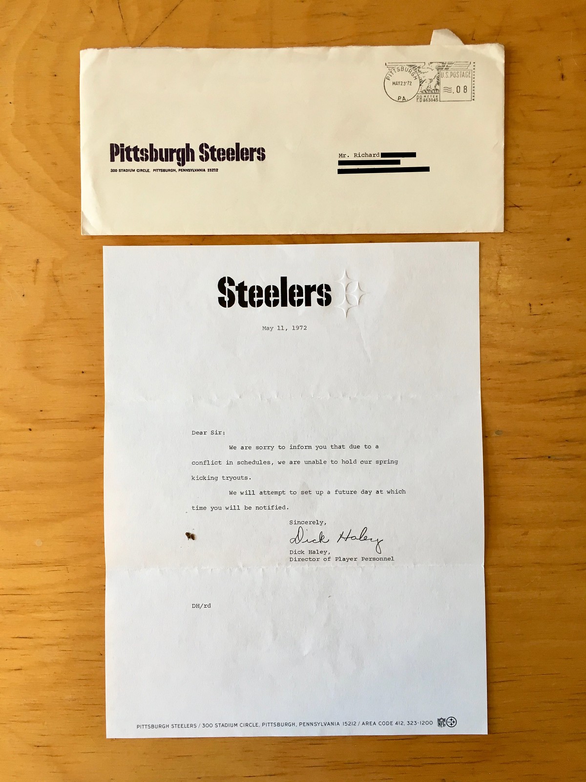
Dear Sir:
We are sorry to inform you that due to a conflict in schedules, we are unable to hold our spring kicking tryouts.
We will attempt to set up a future day at which time you will be notified.
Sincerely,
Dick Haley
Director of Player Personnel
It’s not clear when or how Richard had secured a tryout (there’s no other letter from the Steelers about that), but it must have been a crushing blow to have finally been accepted for a tryout and then be told that it was cancelled. Poor Richard!
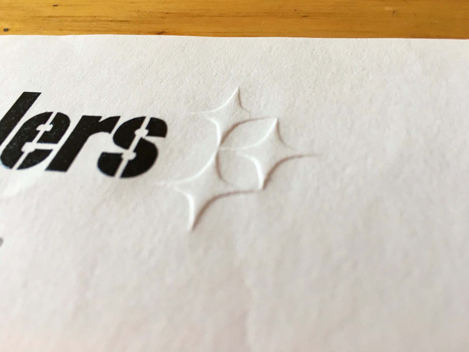
Meanwhile, here’s a closer look at the embossed hypocycloids on the letterhead:
I think that’s enough for today. But there’s a lot more where this came from — I’ll do another installment of these in the near future.
A few thoughts:
• I wish we could see the letters that Richard had sent to the teams. That would certainly add a lot to the story.
• It’s interesting to see that teams took the trouble to respond to apparently unsolicited tryout requests. I wonder how many such requests they typically received, and whether they routinely responded to all of them.
• We all deal with various forms of rejection — that’s part of life. But how many of us would save the documentation of our rejections, as Richard did? Was he a hyper-organized guy who meticulously saved everything in file cabinets? Did he treasure these letters because they constituted his closest brush with the NFL? Was he a masochist who tortured himself by re-reading the letters?
Whatever the answer is, the letters collectively paint a picture that’s almost theatrical, perhaps even operatic. I hope you find them as fascinating as I do.

Jersey hierarchy: Slovak cyclist Peter Sagan (shown at left in the photo above) won yesterday’s second stage of the Tour de France and also took over the overall lead, entitling him to the coveted yellow jersey. That created an odd situation, as explained by reader Bernie Langer:
As we all know, cyclists wear different jerseys to show their leads in stage races and ongoing titles (world champion, national champion, etc.). There’s a hierarchy: If you’re leading the Tour de France, you must wear the yellow jersey, even if you’re also the world champion. Peter Sagan, who won Sunday’s stage, currently has five different jerseys to wear (in order of priority): yellow jersey (Tour leader), rainbow jersey (world champion), green jersey (Tour sprint points leader), Slovakian national champion jersey, and his standard team jersey.
Sagan’s situation was even more interesting on Saturday, he came in second in the Tour’s first stage. The winner of the first stage by definition also leads the overall classification and the points classification. The second-place rider usually gets to “borrow” one of the lesser jerseys, wearing it since someone has to. Sagan came in second place in that first stage, but Marcel Kittel, who came in third, wore the green jersey the next stage. Sagan wore the world champion jersey, which apparently takes precedence over a borrowed lesser jersey of the Tour. Or, possibly, it’s up to the rider (I’ve heard both possibilities mentioned).
Lego-rific: Ross Bendik specializes in Lego depictions of wrestling scenes. I was talking with him yesterday about having him guest-write an entry about his Lego work, and he said he’d create “a Uni Watch Lego scene” for the occasion. I couldn’t really imagine what that would entail, but a few hours later he posted this photo on Twitter (click to enlarge):
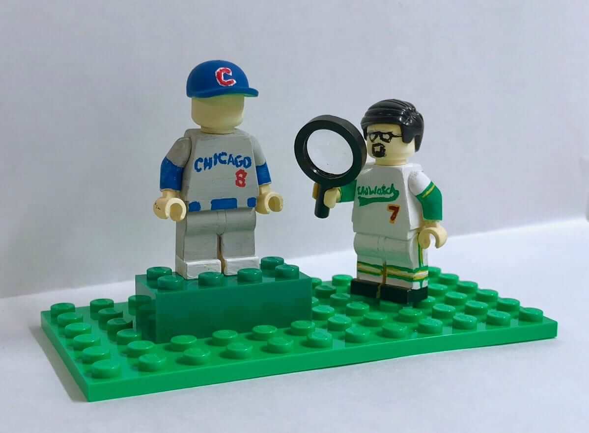
Is that hilarious or what? I thought my life was complete once I’d thrown out the first pitch at Brannock Device Night, but now that I’ve been rendered in Lego, my life is really complete.
My thanks to Ross for giving me “throwback” hair (it hasn’t been that thick in at least 20 years). My only nitpick: I’m left-handed, so there’s no way I’d ever carry the magnifying glass in my right hand. But hey, artistic license and all that.

New raffle: Reader Greg Mays has two dozen old nameplates from Kansas Chiefs jerseys, probably from the early 1990s. “The jerseys were given to my local college for practice gear, I think,” he says. “The nameplates were cut off. I’ve held onto them forever; I don’t know why. Now I’m throwing out a lot of stuff and I still can’t just trash them.” So Greg has generously offered to let me raffle them off to two lucky Uni Watch readers.
There are a dozen red nameplates and another dozen white. Greg says they must have been from preseason training camp jerseys, because many of the names never appeared on the Chiefs’ active roster (click to enlarge):
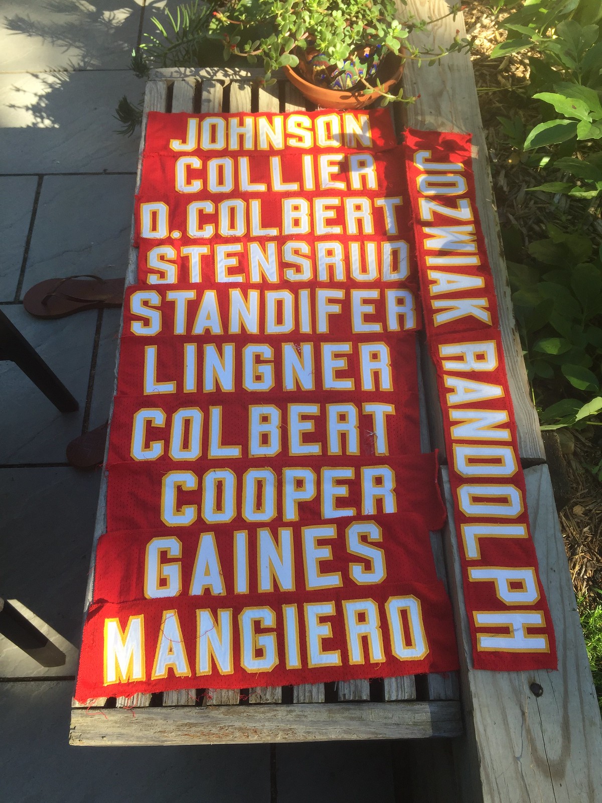
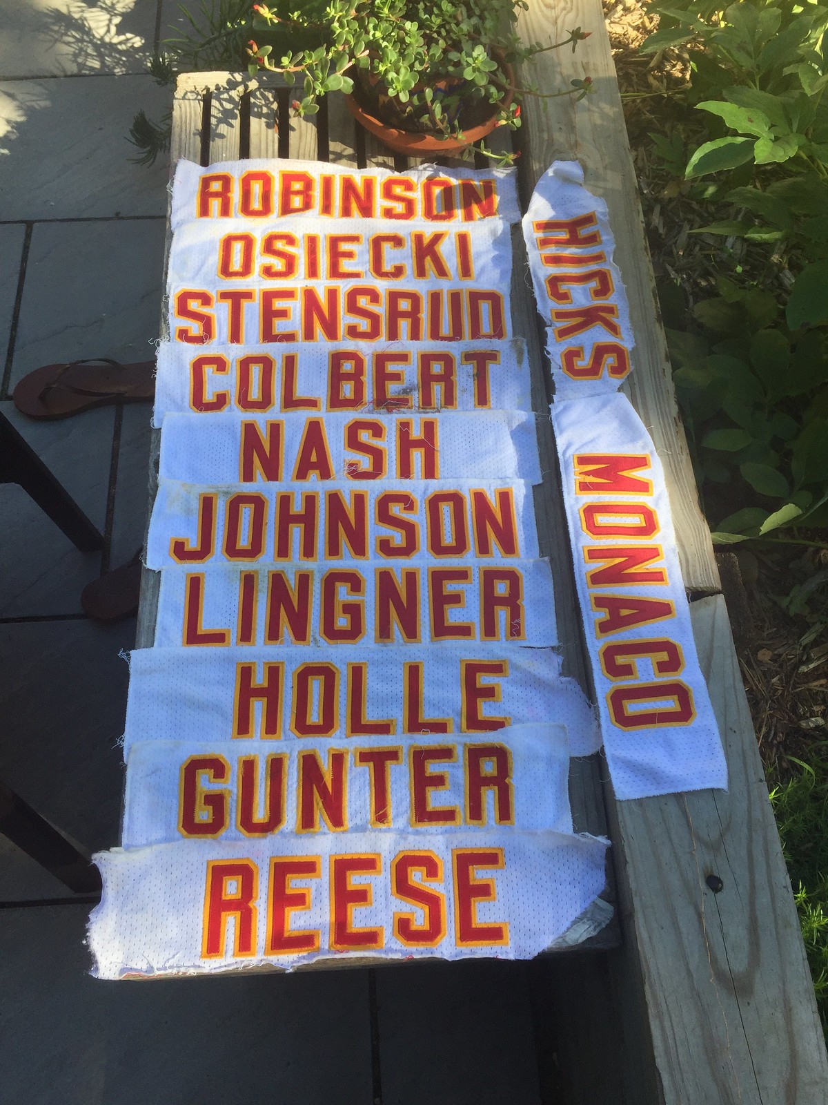
We will pick two winners. Each winner will get a random assortment of six red and six white.
To enter, send an email with your name and shipping info to the raffle address by this Friday, July 13, 7pm Eastern. One entry per person. I’ll announce the winners next Monday.

Stoop sale update: As I mentioned last week, I’ll be having an epic stoop/open-house sale on Saturday, July 21, starting at 10am (no early birds!), at 671 DeGraw St. in Brooklyn. I’ll have lots of cool stuff out on my front stoop, plus I’ll be selling tons of great collectibles literally off the walls of Uni Watch HQ, plus-plus I’ll have theoretical T-shirts for sale, some Todd Radom “Rain Check” prints, and more, whoop-whoop!
I’ve created a Facebook event page for the sale, which includes a post with about three dozen photos of collectibles I’ll be selling (and believe me, that’s just the tip of the iceberg). That page is available here. If you’re not into Facebook, you can see the same photos and descriptions in this Flickr set.
Although these photos don’t show any sports-related items, I will definitely have some sports-y stuff available, including lots of excellent sports-themed books, some footballs, some vintage jerseys, some stirrups, and more.
For those who may be wondering: Sorry, but I’m not willing to ship anything out of town. The whole point of this sale is to lighten my load and make my move easier, not to create extra tasks during a stressful time. Thanks for understanding. If you can’t make it but think there’s something you might want, send a friend to serve as your purchasing agent!
Click to enlarge
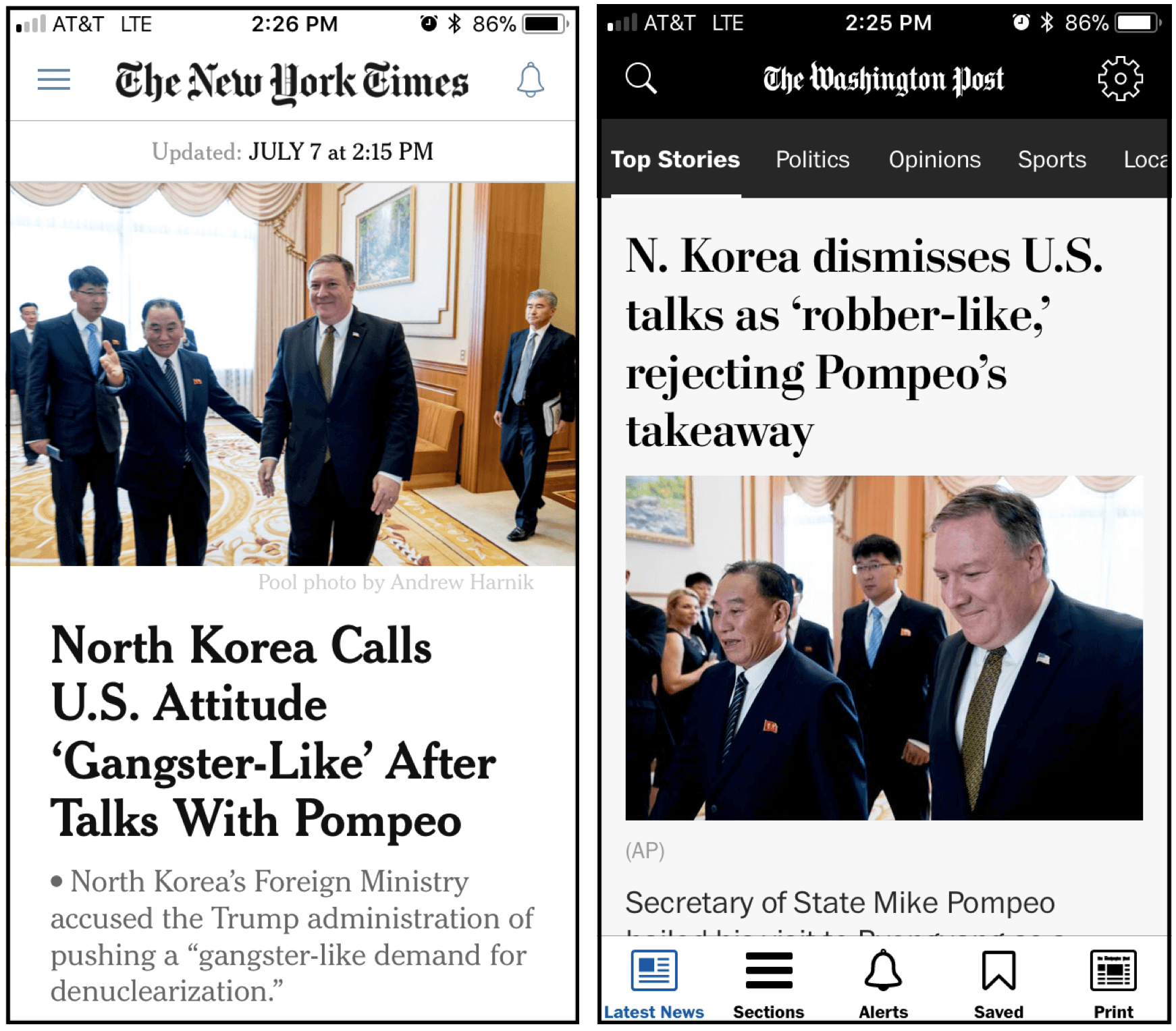
Lost in translation: At one point on Saturday I wanted to check the latest headlines, so I opened the New York Times and Washington Post apps on my phone. Both newspapers were leading with stories about Secretary of State Mike Pompeo’s latest negotiations with North Korea. But the two stories, while similar, had a key difference, which is evident in their headlines: The Post quoted the North Koreans describing the American diplomatic efforts as “robber-like,” while the Times had it as “gangster-like.”
I find this fascinating — not just because the two terms are not quite synonymous (“gangster-like” is clearly more pejorative, especially in a diplomatic context), but because it shows how translation can be such an imprecise art, and how language is such a tricky, multifaceted thing. That definitely comes into play in the sports world: Consider MLB, for example, where an increasing number of foreign-born players — Yoenis Céspedes, Shohei Ohtani, Aroldis Chapman, Bartolo Colón, and many more — speak to the English-language press only through interpreters. Just how accurate are the quotes that those interpreters give us, especially since two different interpreters can translate the same statement differently?
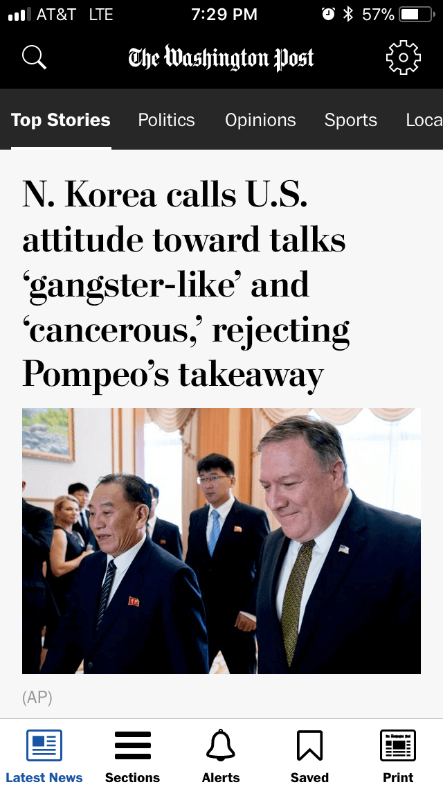
Interestingly, the Post changed its headline a few hours later:
The Ticker
By Jamie Rathjen

Baseball News: The d’Arnaud brothers — new Giants utility player Chase and Mets catcher Travis — are well known here at Uni Watch for an upside-down “P” sometimes substituting for the “d” in their NOBs, but Chase hopes the Giants might get it right (from @goingtopshelf). … Here are some jerseys for the upcoming Triple-A All-Star Game (from Jason Hillyer).

Hockey News: Swedish team Luleå HF has a new logo (from Matt Campbell). … New Senators G Mike McKenna is apparently interested in having fan-designed pads (from @TheGoalNet45). … Fantastic story about a German hockey team that was in such desperate financial straits that the owner struck a jersey-advertising deal with Libyan dictator Muammar Gaddafi (from Paul Friedmann).
.

Basketball News: Back in 2016, Paul did an entry about Seton Hall’s 1989-90 unitards. It turns out that reader Joe Martinelli has a game-used unitard from that set. “The player who wore it was Frantz Volcy,” he says. “I picked it up at an alumni silent auction after no one placed a bid on it cause it was so ‘different’ (read: ugly). The bottoms have a liner like running shorts. There’s a clear difference in feel between the bottom and top material. Looking at the washing instructions, it probably was a pain for the equipment manager.” … The Lakers are apparently making uniform alterations (from Jonathan Neal). … One of the ESPN announcers for their NBA summer league coverage was wearing a color-reversed league logo, if not an off-brand shirt (from multiple readers). … Looks like Vancouver is likely to get a new G-League D-League team affiliated with the Trail Blazers and to play in Langley, B.C. (from Wade Heidt). … The vintage scoreboard clock at the Kingston Armory in Kingston, Pa., which was the home of the nomadic (in a league sense) professional Wilkes-Barre Barons, still exists and is being repaired (from Art Savokinas).

Soccer News: A whole bunch of German teams released new kits, including Schalke 04 (second kit), 1. FC Nürnberg (second), Mainz 05 (left to right: second, first, third), Hannover 96 (left to right: second, first, third), 1. FC Kaiserslautern (second and first), and Dynamo Dresden (first). Also joining in were French teams Marseille (left to right: second, first, third), AS Saint-Étienne (left to right: third, first, GK, second), AS Monaco (first), and OGC Nice. Nice’s striped shirt is for home games, while the three solid shirts are to rotate for away games. Josh Hinton sent us Dutch team Feyenoord (second), Italian team Sampdoria (first-third and GK), and Mexican team Santos Laguna. … Josh also proposes the term “neon for neon’s sake,” as in those examples and this potential Huddersfield Town third shirt, in place of “BFBS,” which rarely occurs in soccer in the purposeless we’re-wearing-it-just-because sense that the term implies. “However, neon seems to be an overly-popular choice in away and third kits,” Josh says. … Speaking of neon: English seventh-tier side Gainsborough Trinity wore a very bright kit to support an underwear company that raises money to fight testicular cancer. The team usually wears dark blue and yellow. … If you were wondering what an England/Croatia World Cup semifinal would look like, the answer is England is wearing all white, which means Croatia will wear black and blue once again — sorry, Paul (from multiple readers). … New shirts for Pogoń Szczecin and Lech Poznań (from Ed Zelaski).

Grab Bag: A new book looks at the history of sneakers (NYT link) (from Tom Turner). … Here’s Canada’s championship ring from the 1978 World Lacrosse Championship, a famous upset victory over the U.S. (from @PhillyPartTwo). … England’s field hockey teams got new kits ahead of the women’s World Cup, beginning July 21 in London. … An annual Tour de France tradition is that the lucky person given No. 13, which this year is American rider Lawson Craddock, wears one of his two numbers upside down. … The Tour only features six national champions’ jerseys this year, as the current champions of prominent countries such as France, Italy, and the Netherlands are not participating. … The increased number of female political candidates in various U.S. elections this year has led to more colorful campaign sign designs. … It may be time for the city of Columbus, Ohio, to revise its flag design (from Jason Hillyer).
Re: the Peter Sagan sub-lede.
The UCI’s (cycling’s governing body) Twitter just posted a mock-up of Sagan wearing a yellow rainbow jersey, which would only make his situation a little less confusing.
link
Also, when I said “six national champions’ jerseys,” that doesn’t include Sagan’s Slovak champion or the world or European champion’s jerseys.
a legislative candidate in the recent primaries here in Colorado had horrible sign design: burnt orange with navy lettering in a range of mostly busy fonts. nearly impossible to read. the word Colorado and her first name were about all that was legible – nice to know you’re not running for something out-of-state! she lost.
I’m right-handed, but when I use a magnifying glass, I typically hold it with my left hand, especially if I need to manipulate whatever it is I’m magnifying.
Or, wouldn’t you need your left hand free to write with, if there was some important observation? I’m fairly ambidextrous but I write right-handed, so I would hold a microscope with my left.
Agreed. I’m a righty (except when I play pool – a story for another time) but handle a magnifying glass in my left.
I’m right-handed in everything, but mouse with my left hand to free my right for jotting down notes, etc.
The 1970 Steelers ended the season with a former soccer player as kicker, and it’s entirely possible they were planning to have a mass tryout day in 1971. It’s then possible that some conflict at Three Rivers caused that date to be changed, which is what the letter to Richard suggests. As I recall, they signed Roy Gerela near the end of training camp, and had their kicker for the next eight years.
Hi Paul,
I never really thought about this until recently, but as a lefty I would hold a magnifying glass with my right hand. I thought that was interesting, that even as a lefty’s we hold certain things in different hands. I wonder if this particular instance, if it’s an issue of which eye you prefer (I.e. holding itin a certain hand so that you can hold it up to your preferred eye) or if it’s just purely preference.
The unfortunate thing about Croatia’s distinctive red and white checkered shirts is that so many other teams wear either red or white (Or both). So Croatia would clash with either of England’s uniform sets. This has led to Croatia wearing the black set for all but one of their games so far.
Also, Croatia’s black/dark-blue checkers look fantastic on the field.
it’s almost become a tradition for Croatia to end up in blue at tournaments
If Croatia win the semi final, they should hope to play Les Bleus of France.
Great lead story. Especially love the Steeler’s embossed hypercycloids.
Great job on the Lego figure Ross!
the picture of the mirror you are selling made me think of this.
link
Lego Paul is awesome!
When you wrote that you redacted all identifying details I was worried that you actually colored over his name with a black Sharpie. I don’t know why I thought you would do that. You clearly appreciate history as much as I do and would never deface an archival document in that way. It was just a knee jerk reaction, I guess. I was relieved to see that you digitally blacked out his identity and kept the hard copies in their original state.
Oh, for sure — I’d never deface the originals!
And I don’t mind telling ya, doing all that digital redacting was a major pain in the ass that took a lot of time. Worth it, though!
Hahaha! Well played, Sir.
Love the lead story and looking forward to seeing more. What I find strangely satisfying in many of these letters is the use lower case letters in the team names (Dallas & St. Louis) as well as in other text (such as New Orleans'”representing new orleans and louisiana in the national football league”.
It’s more than just an “in your face” to my old grammar teachers reaction; there’s just something aesthetically pleasing about that.
Those NFL rejection letters were really great. Interesting (to me, at least) that both the Cowboys and Cardinals seemed to like all lower-case lettering for their letterhead designs. Look forward to seeing the rest of these letters. Nice job, Paul. :)
What is happening with the Cardinals envelope and letterhead…is it embossed and printed white? In the smaller picture it looked like a sticker, but in the larger version you can definitely see some dimension.
Yes, embossed.
Big Schalke fan here and, yes, Jamie’s brother. I don’t know why but I’m totally creeped out by Erwin the mascot. Something about the gigantic nose.
He was also involved in a hilarious incident last year where he showed Felix Zwayer a red card after a blown penalty decision…link
Good to hear from you, Nate. Are you older or younger than Jamie?
You may or may know we’re twins, but I’m older.
Ah, twins — I think he may have told me that before, but I had forgotten!
This reminds me that Schalke put some videos on Twitter a few months ago where Erwin ends up in St. Louis and is somehow buds with the Blues’ mascot, Louie. His face is all nose….
A few more notes on Lawson Craddock:
– During the Tour de France, he is wearing custom “Houston Strong” cycling shoes. The announcers said shoes will be auctioned off for Hurricane relief after the tour.
link
There’s also an auction going on now for a custom made pair.
link
– He suffered a pretty nasty crash Saturday during Stage 1 that resulted in a fractured scapula and a cut over his eye that required stitches.
link
During Stage 2, he swapped his race numbers so that the left number was upside down instead of the right.
Why would you jump to the guy being a masochist? That’s a strange implication to make when he may have just treasured that NFL teams wrote him back.
I didn’t “jump to” that conclusion; in fact, I didn’t conclude anything at all. I just presented it as one possibility among several.
That’s like a really worse case scenario and not something I’d want to be throwing around and branding people as given it’s multiple definitions.
But really only one definition that’s appropriate to the context and situation at hand. And how is that the worst-case scenario? Speaking from personal experience with family members who have saved odd things for various reasons, “because he was a hoarder” is a way worse possibie reason for having saved these letters than “because he was a masochist.”
These are really cool.
Interesting that the envelope and letterhead are marked “St Louis Football Cardinals.” The baseball team probably did not need to distinguish itself with a “Baseball” modifier.
Any other instances of this? I know the New York Giants often get referred to as the “New York Football Giants,” but did they ever use that in any official capacity? Even when the baseball Giants were in New York?
Dunno how “official” it is but there is/was a huge banner behind one of the end zones at MetLife stating “New York Football Giants”
I have a friend and former roommate who is from St Louis and he always referred to the football team as either the ‘football Cardinals’ or the ‘Big Red’. Any time he said ‘Cardinals’ I understood he was speaking of the baseball team.
Same here, Bob. The baseball team is the Cardinals, Cards, or Redbirds. The football team was often Big Red or Gridbirds in the sports pages.
What an interesting window into another time. Each of the letters was clearly produced on a typewriter (or at least that’s how it looks to me), so I’m imagining that the writer dictated this and then some secretary or assistant typed it up.
Exactly.
On each letter, below the signature along the left margin, you will see capitalized initials, a slash mark, then initials in lower case.
Capitalized initials for writer/dictator and lower case initials for whomever typed the letter.
Yes. I noticed that as well after I wrote my initial comment.
I loved the various styles used to format the letter (indent, no indent, etc.), as well as the differing formats of the actual letterhead and envelope.
Thanks for sharing the rejection letters.
I have a confession to make. Whenever old letterhead is featured on Uni Watch, I like to look up the address on google maps.
I like looking up the address of any letterhead that has a picture of the office/building on it, and hope that the building still exists. I am an archivist, meaning I work with historical letterhead all the time, and I look up the address every time I see it. I hope the same building is still standing, or if not, at least the same entity owning/leasing the same address. I absolutely LOVE old letterhead.
On a side note – my favorite piece of stationery in Richard’s collection is by far the Lions letterhead. Love that the lines reach all the way to the edge of the page.
Will you, at some point, be sharing any details of the “interesting, complicated rabbit hole” you went down, to the extent that would be possible without violating Richard’s privacy? At the very least, I’m interested to know if you made contact with Richard himself, or just friends and/or relatives? And I agree, this is a great “permanent record” type find. Thanks for sharing!
Unfortunately, all of that will remain private. Sorry.
My favorite thing from all of the letters is that on the Detroit letterhead they still use the old “Woodward 5-6644” phone number style. There isn’t even an area code included. I’ll have to look up when that quit being the standard for phone numbers. I always loved that as a kid.
There’s a whole Wikipedia page for it! link
All of my job rejection letters are digital. Still there on my computer. I’ve got 1000’s. Love the auto rejection letters, especially when you meet or exceed all of the stated prerequisites. Makes you wonder what the time and effort is all for. Some employment websites (like indeed) even keep stats for you. At least this guy had some nifty souvenirs from his rejections. Haha.
I’m wondering if the name STENSRUD on those KC Chiefs nameplates was a misspelled STENERUD, i.e. placekicker Jan Stenerud.
link
-Jet
Possibly this guy: link
The Durham Bulls will wear Carolina Hurricanes-style jerseys next month: link
Not sure if this has been mentioned over the past couple days, but two of the WC quarterfinal matches looked very similar: Brazil / Belgium & Sweden / England, with the only substantial difference being Brazil’s white socks vs. Sweden’s yellow.
I teach high school, and once had a student who got a rejection letter from NYU. (He got into all the other schools he applied to.) The NYU letter was boilerplate until the last paragraph, where it read something like “I didn’t get into my dream school either, I’m sure you’ll still be fine.” My student had a good attitude and said “Why does he think NYU was my dream school?!?”
I was also the yearbook adviser, and after that experience, tried to get my staff for several years to do a spread on college rejection letters. They were all horrified by the idea, and we never did that story.
This may seem strange, but I thought it was interesting how the teams formatted their phone numbers. Some specifically said, “Area Code.” Some had the three digits then a “/“ followed by the local number. The format wasn’t consistent from team to team. I saw that the St.Louis Cardinals formatted it like we most commonly do today: (123) 456-7890.
This is a very interesting find. Thanks for sharing it with us. Also, thanks to Mr. Richard Redacted for keeping these for so many years.
I find it interesting that the Falcons rejection letter has the Falcon facing to the left. We always hear about how the Falcon makes a letter F, but here it is backwards and would appear on the left side of the helmet.
I thought it was interesting that the Falcons logo was in the upper right corner of the letterhead instead of the upper left.
Yeah, and it wasn’t much of a letterhead. It just had the logo without any contact information.
Regarding “gangster” versus “robber,” I can attest from decades of reading North Korean press releases in their official English translations, Pyongyang uses the English word “gangster” to describe US government actions frequently. Not so much “robber,” which is usually used in the context of domestic dissidents. Given that context, the “robber” translation struck me as probably wrong, rather than interesting.