[Editor’s Note: Ticker assistant Alex Hider is back with another installment of his “Gone Too Soon” series. Enjoy. — PL]
By Alex Hider
Every time I took the court for CYO basketball in grade school, I always tried to do so with a sleeveless T-shirt underneath my team’s reversible tank-top jersey. I always tried to base my undershirt color on what color our team was wearing that day — blue most of the time, or white if we were playing another blue-clad school on the road.
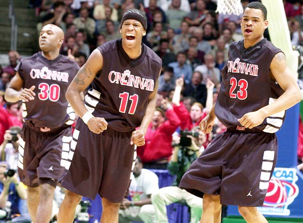
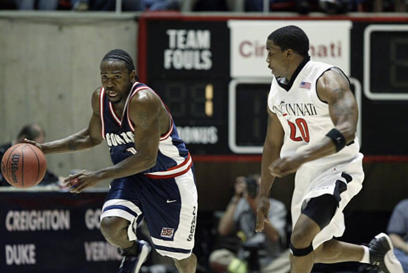
I didn’t wear a sleeveless T-shirt because it was comfortable, or because probably a dozen other kids had sweat into that jersey before me. I wore it because I wanted to look like one of Bob Huggins’s Cincinnati Bearcats.
The University of Cincinnati basketball teams of the late ’90s and early aughts never made it past the Sweet 16, but those teams had some of the biggest names in program history: Kenyon Martin, Jason Maxiell, Melvin Levett, Steve Logan, Leonard Stokes. In some ways, those teams played like the world’s best pickup team — they were going to hold the court, and they knew it. Think Levett hanging from the rim and Martin’s blocked shots flying three rows deep into the stands. Even when games were on the line, it seemed like they ran plays drawn up on the playground.
The Bearcats seemed to dress like a pickup team too — in a good way. Beginning in the 1997-98 season, Cincinnati began wearing jerseys with a wide shoulder cut, making it resemble more of a sleeveless T-shirt than a tank top. In an era where almost every team had the same jersey cut, it made Cincinnati look different and intimidating.

It turned out the sleeveless T-shirt look was ahead of its time. In 2007, Nike began outfitting a number schools with its “System of Dress” template that featured a wide shoulder cut.
The other defining feature of those jerseys were the simple block stripes on the side paneling and shorts. It was bold but simple design that really stood out — certainly inspired by barber stripes, but unique enough to stand on its own. Had it stuck around, I feel the block striping could have been up there with North Carolina’s argyle and Georgetown’s Kente cloth among college basketball’s best signature design elements.
The only poorly conceived element of the jerseys was the “tramp stamp” on the shorts — a “C-paw” logo placed squarely in the center of every player’s butt.
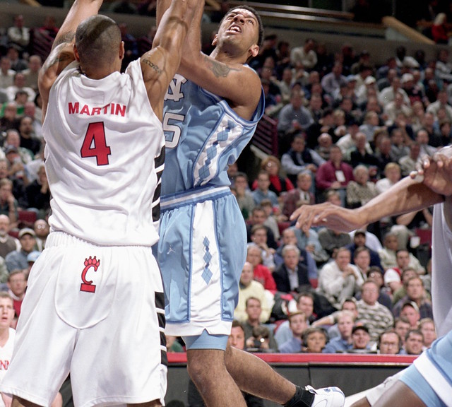
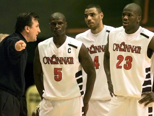
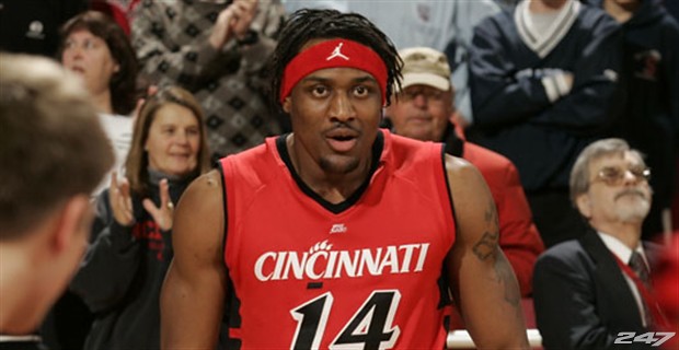
Cincinnati wore black, white, and occasionally red versions of the these uniforms for five seasons, from 1997-98 through 2001-02. Beginning in the 2002-03 season, the Bearcats added piping to the armholes of the jersey, which visually took away from the width of the shoulder cut. The ’02-03 jerseys also tapered the blocking down on the jerseys, and tapered it up on the shorts — a change that falls into the “It wasn’t broke, but they fixed it anyway” category. The new jerseys also removed the “tramp stamp,” and changed the wordmark color from red to black on the home jerseys and white on the road and alternate.
Everything changed in 2005. Following a few DUI arrests and a number of high-profile crimes committed by his players, Huggins resigned under pressure prior to the 2005-06 season. Because Jordan’s apparel contract was with Huggins and not the university, the writing was on the wall. The Bearcats stuck with the same template in ’05-06 — though with the school’s new wordmark and number font — before signing an agreement with Adidas the next season.
Since then, the Bearcats’ jerseys have fluctuated between unremarkable and eyesore. The team’s new logo and wordmark, described as “bolder” and “stronger” in its 2005 unveiling, looks like just about every other team’s. The current logo set lacks the character and uniqueness of the ‘90s wordmark.
Cincinnati has taken to wearing 1992-inspired jerseys as throwbacks as of late. I’ll take what I can get, but it’s still nothing like seeing those big sleeveless Ts on the Shoemaker Center court.
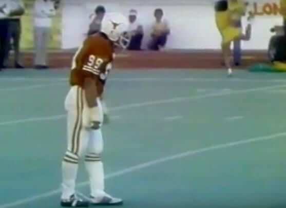
Tie one on: Reader Mike Barnes tweeted the screen shot shown above the other day. It shows Texas defensive lineman Steve McMichael, who would later go on to star with the Bears in the NFL, serving as a fill-in placekicker for the Longhorns in a 1977 game.
What interests me, although it’s a bit hard to see in the screen shot, is that McMichael had a shoelace tied from his front toe to the back of his calf. I know I’ve seen photos of that maneuver before — I’ve always assumed that it was designed to elevate the kicking toe slightly — but I’d never really thought about it until now.
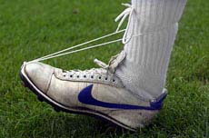
It’s a bizarre little setup, right? Obviously, there are no more straight-on kickers, so nobody would do this today (and even if they wanted to, I’m wondering if it’s even legal). I went looking for additional photos of it but only came up with the one shown at right. If anyone had additional pics of this phenomenon, or if you know anything else about it (is there a name for it?), or if you’ve ever done it yourself, please get in touch. Thanks.
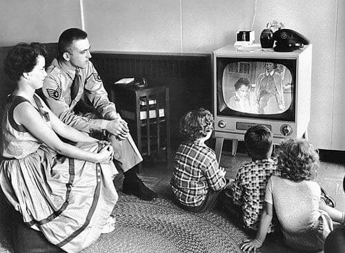
Must-see teevee: I’ll be “appearing” (i.e., doing a live phone interview) on the Cleveland-centric sports TV show Overtime next Wednesday, July 11, to discuss Cleveland uniforms and anything else the folks there want to talk about.
The show begins at 8pm Eastern and, I’m told, can be live-streamed on the TV station’s Facebook page. I’m told that my segment will run about 10 minutes, although I don’t yet know if it will be at the beginning of the show (I doubt it), the end of the show, or whatever. I’ll post more info next week when they firm up the time slot with me.
The Ticker
By Kris Gross

Baseball News: As part of the July 4 festivities on Wednesday, Yankees slugger Giancarlo Stanton wore two blue star socks, instead of one stars and one stripes. Anyone else go with this look? (From Ryan Farrar.) … New MLB inaugural season caps are available (from Ignacio Salazar). … You can hear our buddy Todd Radom discussing White Sox jersey history via podcast (from Dylan Bercu). … This man has collected 757 Red Sox bats (Boston Globe link) (from @jeffisrael25). … Bruce Menard has made an awesome discovery on eBay. If you’ve seen this Yankee Stadium vendor shirt, I bet you’ve never seen the pants to go with it! … A July 4 rainout between the San Antonio Missions and Northwest Arkansas Naturals caused a jersey matchup issue between the teams last night (from Jonathon Campbell). … The Greensboro Grasshoppers wore throwbacks to their Hornets days last night (from Patrick Wright). … The Drillers celebrated Tulsa with 918 Night last night (from Christopher Jones). … We have a missing NOB from last night’s Richmond Flying Squirrels game (from Ross White). … The Chiba Lotte Marines of the Japan Pacific League will three different uniforms on three straight days, beginning tonight (from @bigdaddy45_1969). … Cardinals C Yadier Molina was wearing a Jordan-branded chest protector last night. Have any other MLB catchers worn the jumpman? (From Greg U.) … Mets farmhand Tim Tebow is using a bat from spring training, when he had a different uni number. … The Diamondbacks wore 2007 throwbacks last night but had some inaccurate details. … Giants slugger Kevin Mitchell went NNOB in his debut with the team back in 1987. … Here’s a bizarre one: As Jesus Cruz of the Peroia Chiefs walked off the field yesterday, he grabbed a small bird that was fluttering nearby and put the bird on his cap (from Jason Hillyer).
College Football News: Geoff Collins, Temple’s head coach, provided a sneak peek at the school’s new uniforms with his Twitter header. The new set is expected to be officially unveiled on July 12 (from Anthony Lascio). … Did you know: Indiana RB Vaughn Dunbar was one of the first to wear a reflective face mask (from Quentin Tingle).

Hockey News: Here’s a really great research project: Someone on Reddit has put together a comprehensive list of NHL goalies who have worn unconventional numbers, which he defines as numbers other than 1 or 29 through 50 (from Thomas Foote).

Basketball News: With Austin Rivers choosing to wear No. 1, the Wizards will now have three guards wearing Nos. 1, 2, and 3 (WaPo link) (from Mike McLaughlin). … Long Beach State’s court is getting a makeover (from Jeremy Brahm).

Soccer News: Amidst reports that Cristiano Ronaldo is headed to Juventus, here’s a mashup of his old and new kits (from Griffin Smith). … New kits for Górnik Zabrze and Santos Laguna FC (from Ed Żelaski, Gar Nunce). … Here comes a bunch of news from Josh Hinton: New kits for Real Sociedad, Girona FC, Hamburger SV, and Levante. … Teams can no longer have ads for gambling in Italy. Here’s why that could never fly in the Premier League. … Have you ever wondered what your favorite bands would look like they had soccer crests? Wonder no more (from Derek Noll). … New kits for Hajduk Split and Millwall (from Ed Żelaski)

Grab Bag: Crossover alert! Tennis player John Isner wore a Masters hat at a press conference from Wimbledon (from Willard Kovacs). … We had a pastel-on-pastel matchup in T20 cricket. The teams are Surrey and Middlesex (from @koTenSixtySix). … Speaking of, check out this thread from the great Jim Vilk on a bunch of new Twenty20 jerseys. … Here’s a cool article that dives into a film about Canadian logos (from Joseph A. Bailey). … Why serve in the armed forces when you can just win a military hat at this claw game in New Jersey (from Mike Wissman). … Journalists at the Canton Repository wore black wristbands to honor those who died in last week’s Capital Gazette shootings (from Jim Vilk).
Well, New Era screwed up the Rockies, Blue Jays, and Expos “inaugural” caps. Colorado has the wrong logo (pretty sure they’ve never worn that logo on the cap, correct me if I’m wrong), and the Canadian teams are shown with solid blue caps, which Toronto didn’t introduce until 1989 and Montreal until 1992. The Jays should have the white-front caps, and the Expos should have the pinwheels!
The Houston inaugural cap for 1962 is an Astros cap which wasn’t until 1965. Are they burying their Colt .45 past?
My guess is, too many of their target market wouldn’t have the slightest idea who wore, or compunction to purchase, a black cap with “.45” on the front. Integrity and precision means nothing when there’s money to be made.
link
They do have a link However, there’s also this link.
New Era also messed up both Angels hats. First, the “CA” logo wasn’t used until 1965, which they state is the “original logo” in the description. Second, while they do have a hat with the correct 1961 logo, the design of the hat is missing a couple key features such as the halo at the top of the cap and the red bill.
Aside from those screwups, the Padres “SD” is way too big and fat, and the Mariners trident is too small. Pretty bad all aound.
I don’t think these caps were meant to be exact replicas of the inaugural year caps. They’re more like fashion caps with a solid appropriate color cap with the inaugural patch on the side and a cap logo to represent what was worn that year.
However, the complaints about the Astros and Angels caps are valid. It doesn’t make sense to put the inaugural year and then put a cap logo that didn’t exist until a few years after that. Point taken on the Rockies cap also.
Re: Goalie Numbers In my youth, Tony Esposito’s #35 seemed revolutionary. At the same time there was Ken Dryden’s #29, while others will no doubt prove me wrong, these were the first goalies who were both good and broke the 1 and 30 pattern for a sustained period of games.
I still find the forward who wears a low number (under 6), as odd/unique looking. Somewhat the equivalent of a pitcher wearing a single digit.
Tretiak wore #20 for the Soviet national team at about the same time. Always thought that was odd.
Number 39 did not make the list but seems appropriate as not really common that I can think of. Dan Cloutier wore #39 for a number of teams.
link
link
link
Wade
One more famous #39 goalie is Dominik Hasek.
Didn’t wear it when he started off in Chicago but did in Buffalo/Detroit/Ottawa.
Off the top of my head, Cristobal Huet, Mike Condon, and Pat Jablonski were all #39 for the Habs, Nikolai Khabibulin was #39 for most of his Blackhawks tenure, and Anders Lindbach was #39 for Nashville and Tampa Bay. Add them to Cloutier and Hasek, and I’m not sure it’s as uncommon as you’d think for #39 to go to a goalie.
Didn’t Rogie Vachon wear #40 for the Detroit Red Wings when he first arrived there in ’78? I seem to remember seeing a photo in The Hockey News back in the day and them mentioning it being the highest # ever used by a goalie at the time.
You can look that up yourself on hockey-reference.com, which lists the uni numbers that each player wore for each team.
Terry Sawchuk wore 24 for the Maple Leafs for a time in the ‘60’s before switching to the more conventional 30.
Yes he did, I was looking for that in the article as well. I guess NHL history prior to the 70s doesn’t matter to this article’s writer.
Re: the PL gambling ads article.
The PL isn’t even the worst; by my very quick count two-thirds of the English Championship (16/24) have gambling ads. The Scottish Premiership has roughly the same percentage as the PL as of last season (5.5/12, the half coming from one team having it on one kit but not the other).
It’s gross.
Also, there’s no “new” in “New Levante” and the pastel/pastel matchup in T20 cricket is Surrey/Middlesex.
I’m equally as disturbed by payday loan ads.
Jesus Cruz …grabbed a small bird that was fluttering nearby and put the bird on his cap
“PUT A BIRD ON IT!”
Mongo’s little shoelace trick was really common among high school kickers when I was a kid. So was getting linemen to placekick. The kicker on my team when I was a senior was our all-state nose guard.
Edmonton Eskimos PK Dave Cutler used it (though it could be tape?):
link
link
It’s ironic that at one point, Nike/Jordan had shoulder straps wide enough to almost resemble a cutoff T-shirt… but now they have eliminated so much fabric on their current cut that they can barely squeeze an NOB between the shoulders. Cutoffs > racerbacks. Just do it, Nike.
Oh, but heaven forbid modern players have to wear a few extra ounces of fabric that could slow them down!
It’s not stolen valor if you won it.
As someone old enough to have been a straight-on kicker in high school, I can tell you that tying up the toe like that would be a big help – one of the keys to kicking that way is locking your ankle at 90 degrees, which that guarantees. That tactic is illegal in the NFL (link); I don’t know if it’s still legal in college, as it was in the 70s.
Steve Crumley at UGA kicked this way in the late 1980s, complete with shoelace.
link
When I kicked in high school in Precambrian times, I used a slightly different setup, drilled holes in top left and top right of square toed kicking shoe, threaded a shoe lace through them and then had a piece of leather with two holes I put in back of upper ankle and threaded shoe lace through them and then tied in front. It obviously helped greatly with getting lift, but the good straight-on kickers did not need it, they were able to set ankle without that clumsy setup. I found this site – link – still selling the square toed shoe. But their shoe has a lot more rise in front of shoe then I remember in the past, that would make the shoelace contraption unnecessary even for poor kickers.
San Antonio FC of the United Soccer League unveiled a red kit JUly 4.
link
Wait a minute, the Greensboro Grasshoppers threw back to their Hornets days, by wearing Home white pinstripe jerseys with grey road pants? Who thought that would work?
Yeah, I don’t get the logic of this. And some players in the dugout appear to be wearing green Grasshoppers jerseys, rather than the pinstriped Hornets jerseys?
Loved those Cincinnati unis! We begged our coach to get us those for our senior year. We had something kind similar-ish, but they weren’t as awesome as those. I too wore a cut off under my jersey to try to emulate that look. as a team we thought those dudes were awesome. They had the cool uniforms, the newest Jordan’s, and they played with swagger. I thought it was so cool, and I still think it is.
ah I remember those initial Jordan UC unis well. They sold some Jordan UC stuff at Huggin’s restaurant, the “Huggs-Inn”which was conveniently located across the st from my apt in the Hyde Park area of Cincinnati. Pick up a hoodie and some chicken wings.
(U.C. CCM ’84, btw)
Cam Bedrosian of the Angels also went with the two star socks look for July 4th. I’ll see if I can find a picture.
Back in the ‘90s, 1995-1998 to be exact, everyone on our high school teams wore sleeveless shirts under our basketball jerseys. The shirt color had to match the primary jersey color. At the time it was a combination to soak up sweat and to mitigate the itchy-ness of the mesh & trim.
Speaking of oddball numbers.
Columbus Clippers baseball team had two pitchers with single digit numbers the other night.
Ryan Merritt- #1
Tyler Olsen – #8
Both are on rehab assignment from Cleveland Indians
Re: Stanton’s Stars Socks
He didn’t wear 2 star socks, but Archie Bradley did wear 2 stripes socks in the game on the 3rd.
link
Fellow Diamondbacks reliever Joey Krehbiel wore two star socks in the game on the 4th (I believe the Arizona broadcast team even pointed this out while he was pitching). He went low-cuffed though in his MLB debut on the 2nd.
As I was the center for my HS Football team, I was also the long snapper so spent a lot of time with our straight on kicker (who was also our QB). As he had to change shoes quickly to kick extra points, he had a strap that he used, rather than a shoelace, much like seen here link
As to why, the straight on kicker uses a pendulum motion. Tying the toe so that it arches back is a way to better get the toe in line with the motion of the pendulum. When it’s not tied back, there’s a much larger chance of you not transferring the force of the toe correctly as part of the motion.
I see a “new Lakers jersey identity” is being advertised on the big merch site.
Returning to Showtime jerseys?