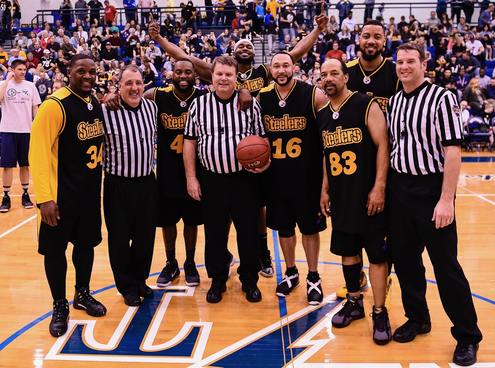
For all of today’s photos, click to enlarge
[Editor’s Note: Today we have a guest entry from reader/photographer Mark Palczewski, who recently had an up-close view of some interesting uniforms. Enjoy. — PL]
By Mark Palczewski
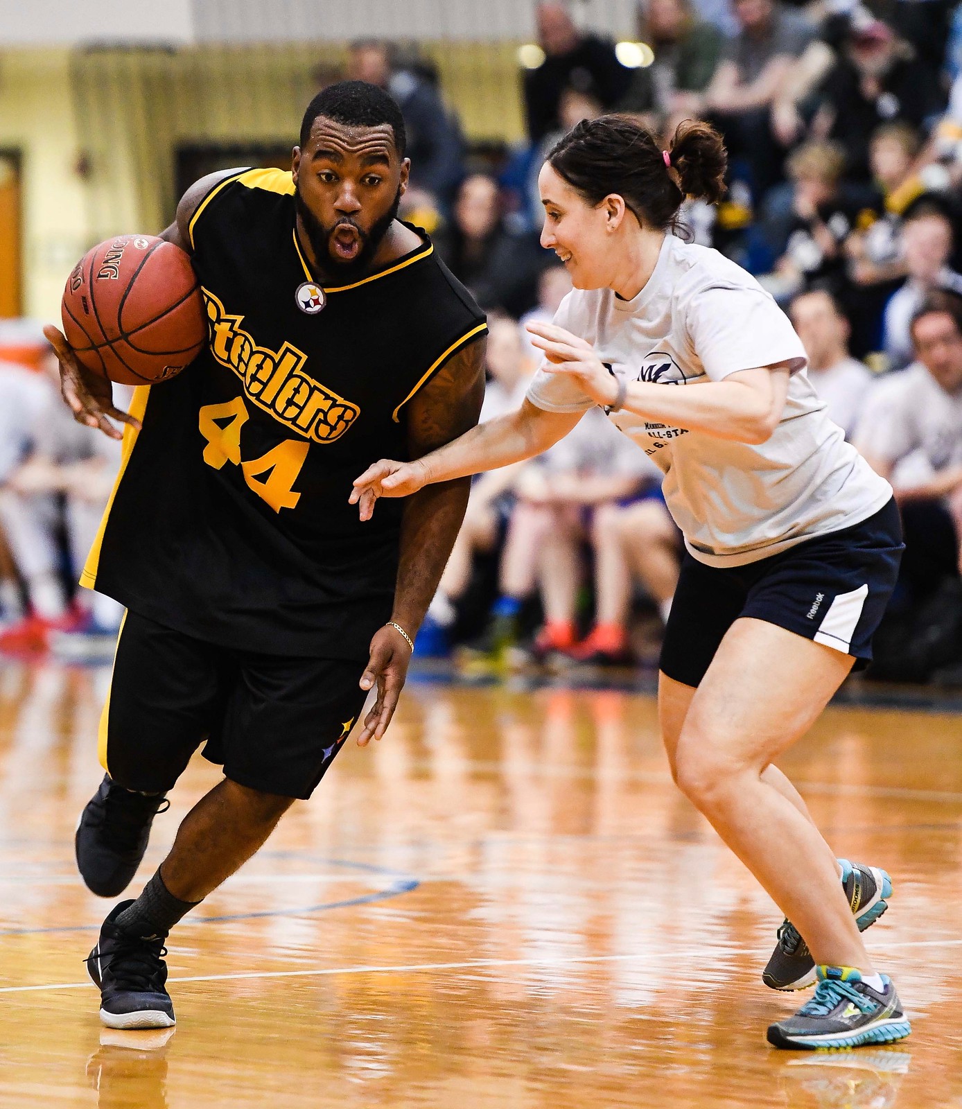
I’m a sports photographer based in central Pennsylvania. Back in April, I worked a fundraiser basketball game between the Pittsburgh Steelers basketball team, which is called the Steelers Footballers, and an “all-star” team of teachers, coaches, and alumni from Manheim Township High School in Lancaster, Pennsylvania.
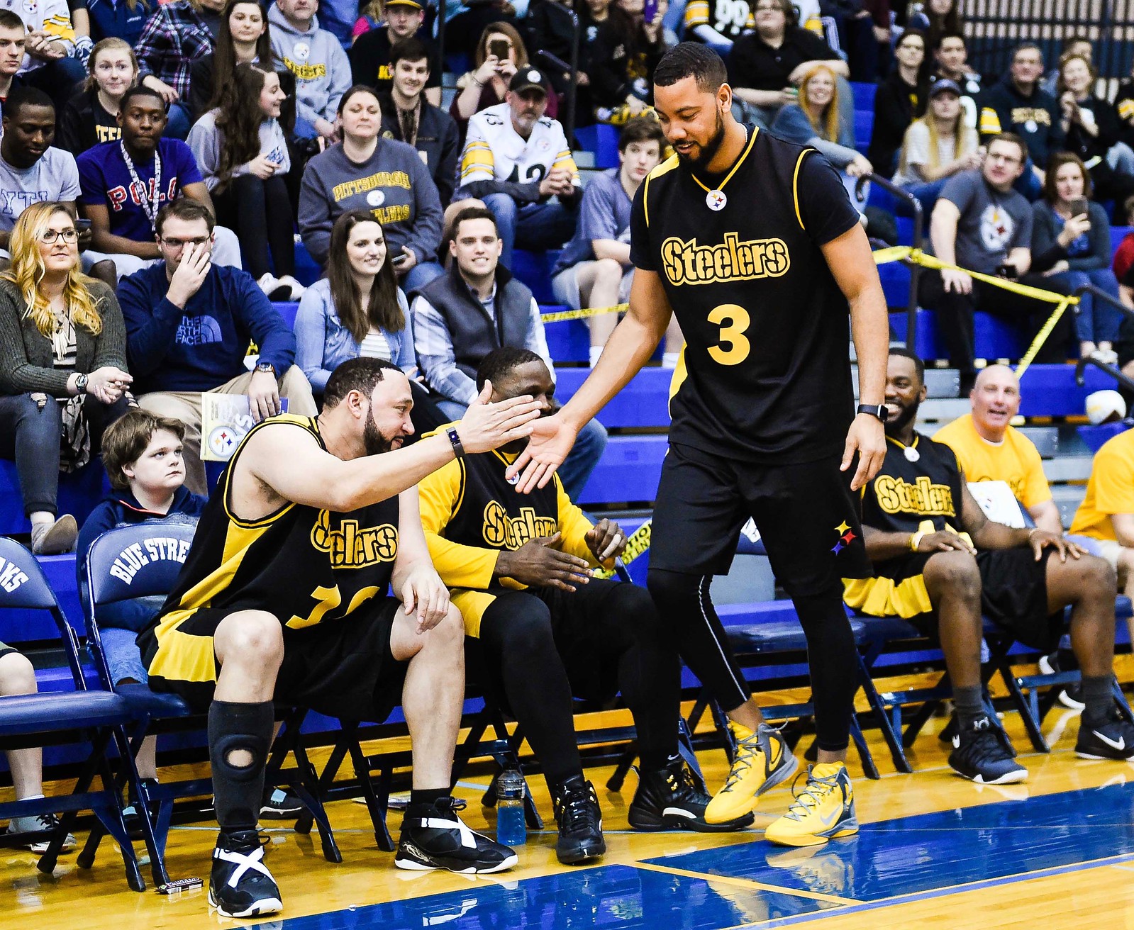
The Steelers team consisted of a mix of alumni and current NFL players. Some of them wore their NFL uniform numbers, and others did not. In the photo shown above, for example, No. 34 on the left side of the photo is linebacker Arthur Moats, who wears No. 55 on the gridiron. That’s former quarterback Charlie Batch wearing No. 16 — the same number he wore for the Steelers. Next to him is former wide receiver Louis Lipps, wearing his familiar No. 83.
The Steelers’ jerseys featured the team’s wordmark on the front with the helmet logo, minus the word “Steelers,” at the neckline and piping on one shoulder and down one side:
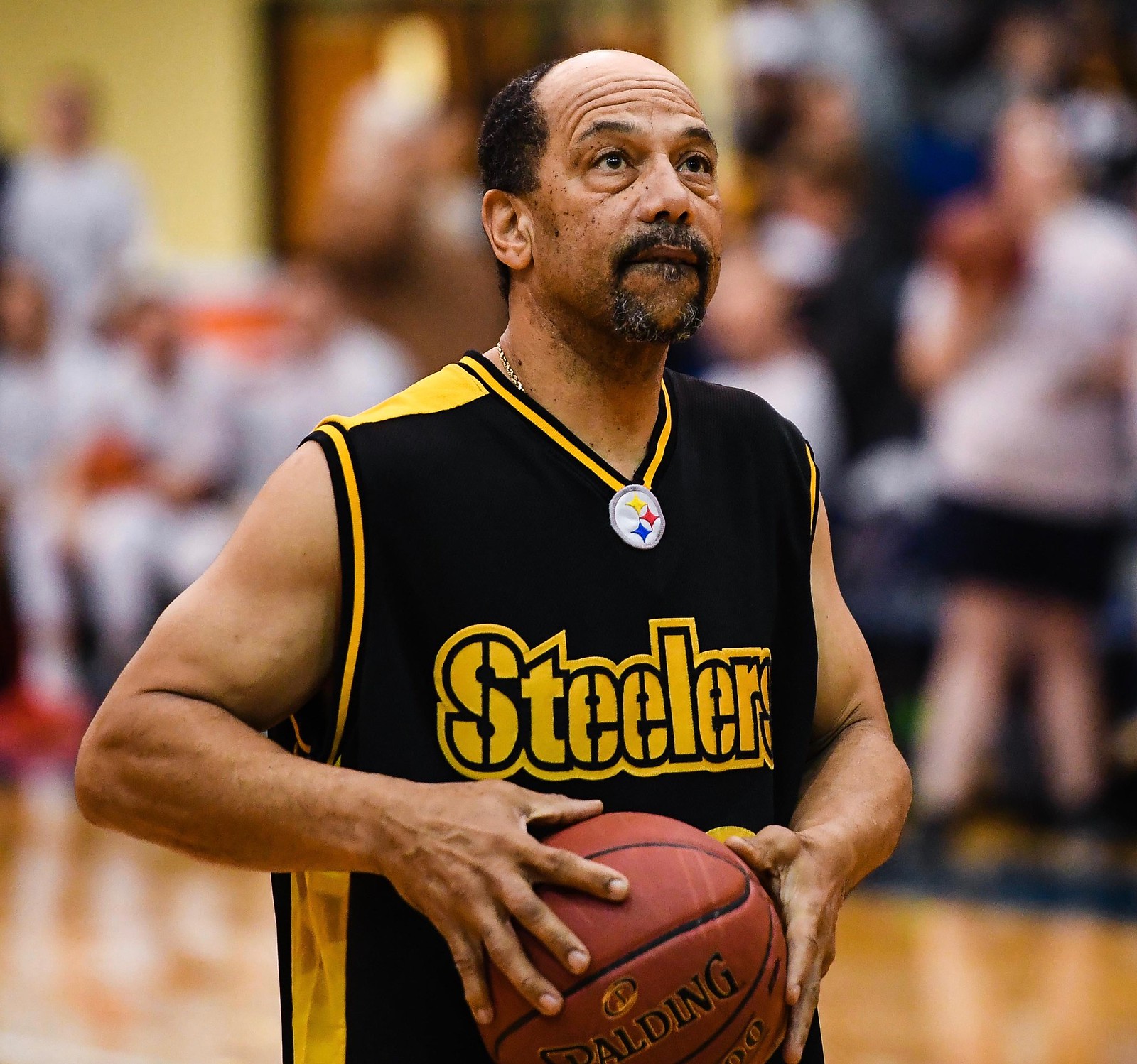
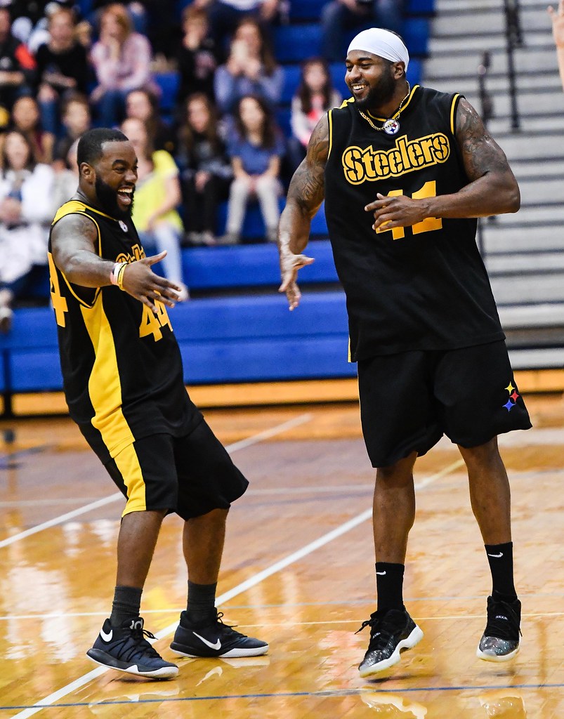
On the back of the jersey, everyone went NNOB and had the team’s tri-colored hypocycloids below the rear collar — except for linebacker Keith Kelsey (No. 44), whose hypocycloids were missing, as you can see in this photo of him alongside Batch and linebacker Farrington Huguenin (No. 41):

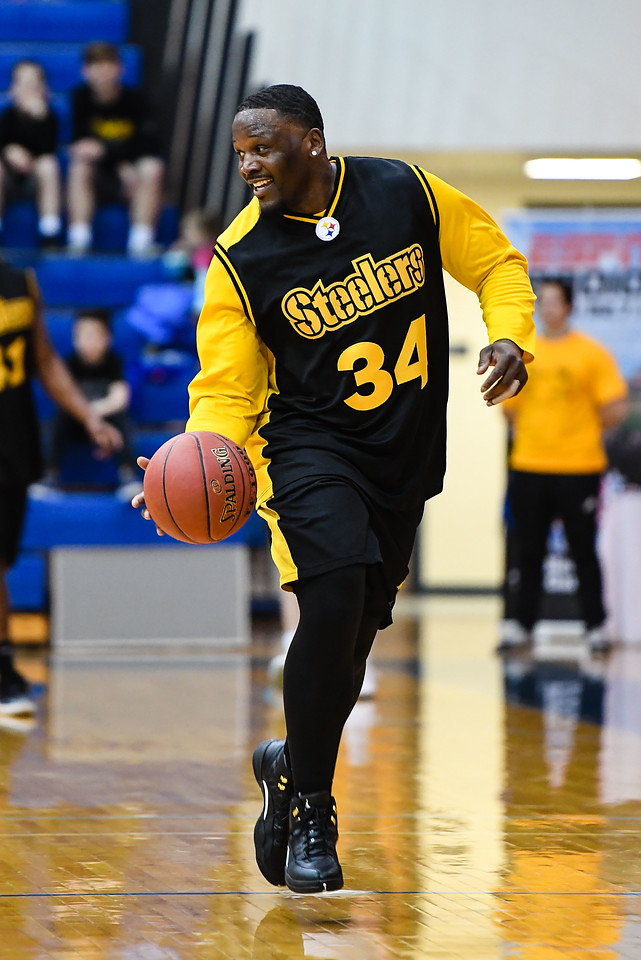
Most players just wore the jersey and shorts. But Moats wore a long-sleeved yellow shirt under his jersey and black tights under his shorts:
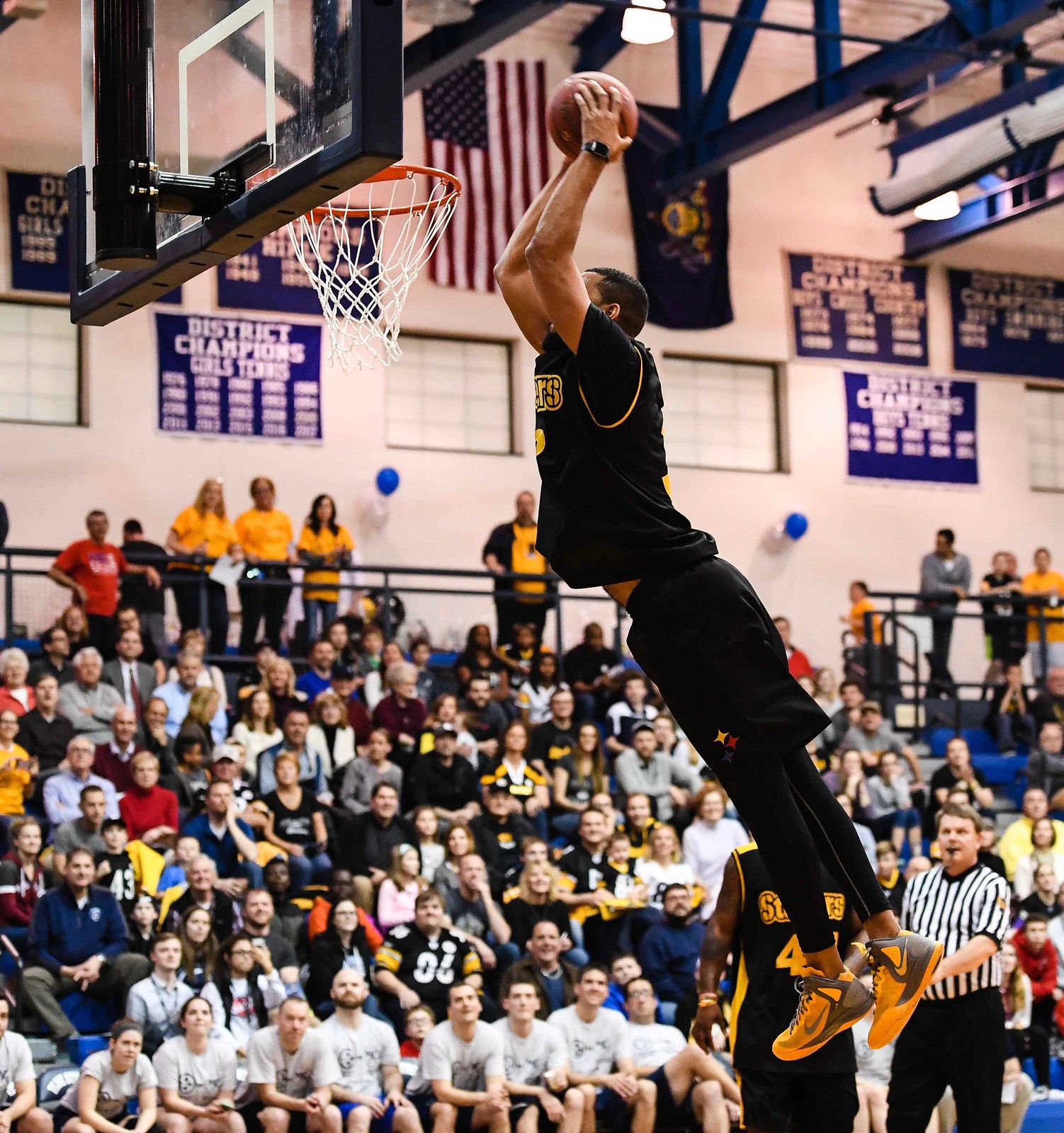
Another player with some added accessories was wide receiver Wes Lyons, who wore a black T-shirt under his jersey, black tights, and a wristwatch — all of which apparently helped him dunk:
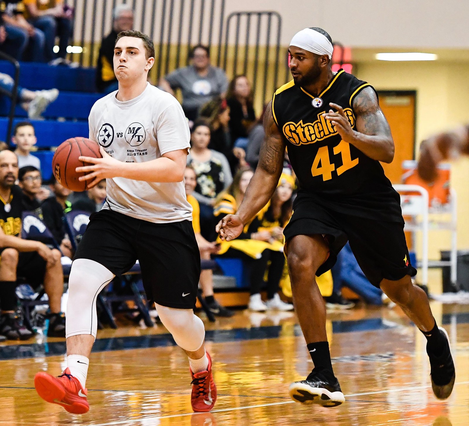
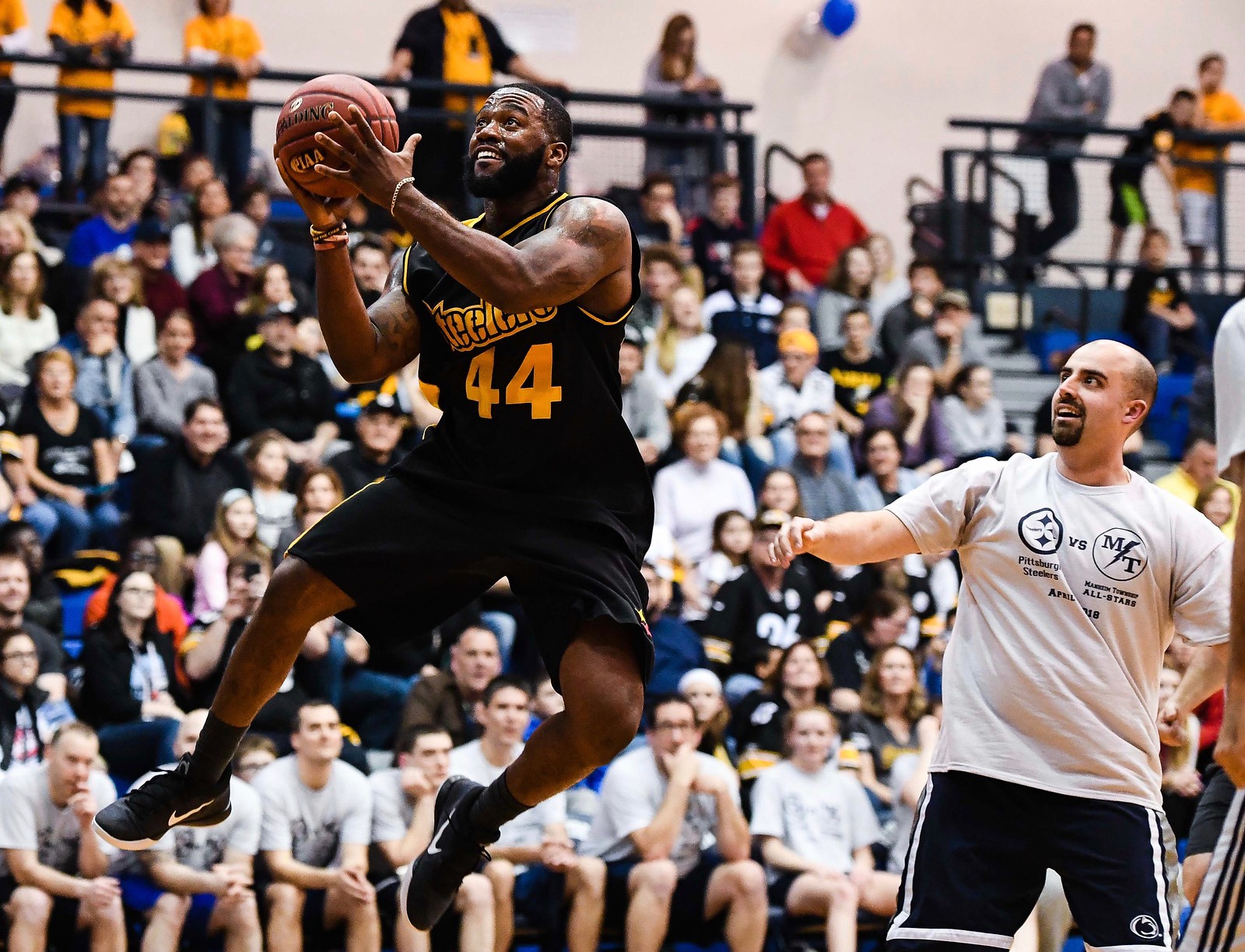
As for the Manheim Township All-Stars, they just wore T-shirts and an assortment of black shorts:
———
Paul here. Great stuff from Mark — big thanks to him for generously sharing his work with us. If you want to see more of his sports photography, check out his website and Instagram feed.
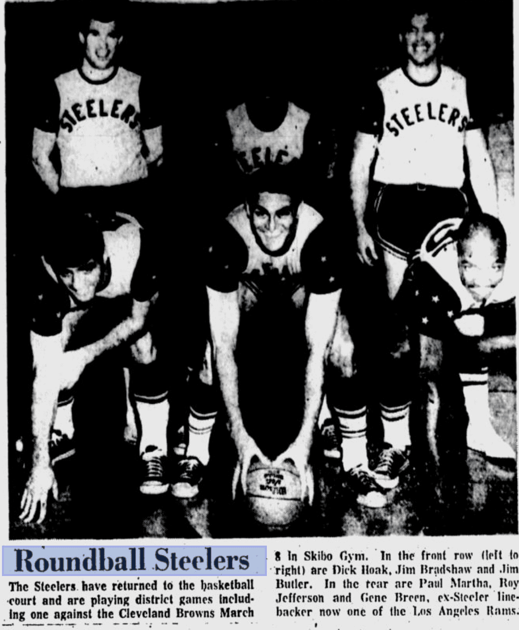
Update, 8am: Reader/researcher Jerry Wolper just sent me this 1968 newspaper photo showing how the Steelers’ basketball uniforms looked 50 years ago:
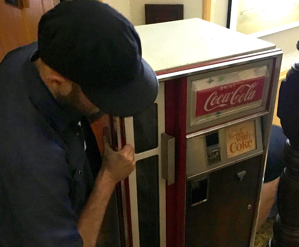
And so the purge begins: Two workers came to Uni Watch HQ last night and took my 1967 Coke machine down the stairs and out the door — the first step in what will be my Summer of Unloading Lots of Stuff.
I found the Coke machine at a flea market upstate in 2007. I’ve enjoyed owning it, and now it’s time to let someone else enjoy it. It still works, but it sucks a lot of juice — more than I can justify using — so I’ve rarely plugged it in over the past dozen years or so. I sold it to a local pizza joint, where it will get used. I’m happy about that.
I have a lot more deaccessioning to do before I can move in with the Tugboat Captain in two months. At some point in July I’ll have a big stoop sale, which will feature a lot of cool items, some of them uni-related. Details to follow once I settle on a date.
The Ticker
By Paul

Baseball News: Rays P Sergio Romo wore a cap that appears to show Felix the Cat flipping the bird during a postgame interview two nights ago (from Rand Martin). … The Vancouver Canadians wore Molson-themed throwbacks the other day (from Wade Heidt). … Pall bearers at the funeral of a 15-year-old Yankees fan in the Bronx wore Yankees jerseys — with NOBs. … Here’s the latest article about MLBers’ increasing use of the C-Flap. It mentions that Phillies OF Rhys Hoskins, who’s been wearing flaps on both sides of his helmet, will eventually shed one of them after his fractured jaw heals a bit more (from Tom Turner). … Cubs 2B Tommy La Stella was listed as just “Stela” on the Dodger Stadium scoreboard last night (from Max Wagner).

NFL/CFL News: The NFL’s new helmet-contact rule could lead to the end of the three-point stance. … All CFL teams are wearing helmet decals this week for the Humboldt crash victims and survivors (from Moe Khan). … In 1984, the Browns tried changing the numbers on their brown home jerseys from white to orange, but that ended up causing legibility problems, so the orange-numbered style was worn only in the preseason. Here’s video showing one of those preseason games (great find by Alan Zimmerman).
College and High School Football News: New helmets for Virginia. “It’s the same basic design, so unless the stripes are changing (it’s hard to see in the picture), all that’s new is the number font and perhaps one new helmet sticker — the ‘earned not given’ one — while the other stickers were moved around,” says our own Jamie Rathjen. … New helmet design for Fort Scott Community College (from Parker Kubiak and Andy Otto). … Missouri tweeted a graphic showing the team’s helmet history, along with a hint that a new design may be coming soon (from Steve Johnston). … Michigan LB Tim Schulte, who played for the Wolverines in the 1980s, had FNOB. Fellow LB Todd Schulte, who was also on the roster, presumably did as well. … Michigan DL Mike Hammerstein also went FNOB in the 1980s (from Mike Altese). … Brad Eenhuis was doing some research on the now-defunct Klemme High School in Iowa and discovered that the 1970 junior high football team wore white helmets with shamrock decals in an unusual arrangment. Here’s another shot. … Here’s our best look so far at Virginia Tech’s new white jerseys. “The maroon part of the collar looks really bizarre,” says Andrew Cosentino.

Hockey News: Hurricanes owner Tom Dundon said during a radio interview that the team will wear Hartford Whalers throwbacks this season. I followed up on that with a team spokesman, who said he had “no details to confirm yet” (from Steve Dodell). … Stars C Tyler Seguin has chairs painted to look like each jersey he’s worn during his career (from Jeff Israel). … Very nice new jerseys for Henry Sibley High School in Minnesota (from Ryan Nelson-Cain). … The Wild are giving season ticket holders a chance to see some alternate jerseys for upcoming seasons (from Alex Westad).

NBA News: With the Bucks’ new arena almost completed, here’s a slideshow with dozens of photos showing the interior and exterior of the new facility.

Soccer News: All of these are from Josh Hinton: New away kit for Huddersfield Town of the Premier League. … New fifth-anniversary kit for Sacramento Republic FC of the USL. … New away kit for AS Roma. … Manchester United’s new home kit has leaked.

Grab Bag: With Wales in the grip of a heat wave, schools are rethinking their uniform policies. … Police officers Greater Sudbury, Canada, can march in the town’s upcoming Pride Parade as long as they don’t wear their uniforms. … You can vote on the design of a new California license plate that encourages bicycling (from Matt Shevin).
Link to the Browns’ pre-season video is broken.
Dammit. I guess they took it down. Now removed from Ticker.
New link found, Ticker item now restored!
Here’s the video: link
RE: Browns Unis.
Not as much a legibility problem as VISIBILITY. We’ve been to the upper deck at old Stadium; on a good day, the numbers are difficult to distinguish. These colors make it even tougher.
Ditto for: red/black, black/red, black/blue, blue/black, etc.
Following that link leads to a message on a blank TV screen:
“Sorry. Because of its privacy settings, this video cannot be played here.”
The Vancouver Canadians throwbacks were homage to what the team wore in the 1980s, when the Triple-A Vancouver Canadians existed. They were owned by Molson Breweries, so they basically looked like a walking Molson Canadian beer label:
link
link
Back in the 1980s, Molson’s mandate was as owner was to bring a Major League team to Vancouver, back in a time when BC Place Stadium was state-of-the-art enough to house MLB. Here is an article from 1984 about that:
link
Scratch one off my bucket list. I made the uni-watch ticker!
Paul, I’d never heard the word “deaccession” before you used it a couple times this week, but somehow it’s perfect for your situation.
Everyone always tells me that my apartment “looks like a museum” (including the pizza guy who bought my Coke machine), so deaccessioning seems like the right term.
RE: Hurricanes as Whalers. I can’t recall one of the recent relocation teams (Coyotes, Avalanche, Canes, etc) wearing a throwback to their old identity in their original city. As great as it will be to see the Whalers uniforms again, never seems right to see a team throwing back to the city they abandoned, especially if the city never got a new team to replace them. It is part of your history and all, but seems like rubbing salt in the wounds.
Imagine the Ravens dressing as the Browns, had Cleveland never been given a new franchise.
Or has it been long enough that it’s okay, a la the Pistons dressing up as Fort Wayne?
the Lakers don’t have any problem wearing the powder blue MPLS from the Mikan era.
Is there a statute of limitations?
Yeah, the Titans have also shown up as the Oilers. I’m not sure, as I am not from a jilted fan base, how long you go before it is “appropriate” to start throwing back. In the case of the Titans and Lakers, their old cities now have new teams, so that seems less insulting? Also, I’d say the Lakers are a little different, in that they remained the Lakers after relocating. Even though though the throwbacks you speak of have MLPS on them. I tend to think when you move AND change your nickname you are making a clean break from your time in other cities. You may always say you were established back when you were in the original city, and claim the championships and great players from those days, but when you change you nickname, that identity seems to be retired. Maybe some readers from Hartford or other jilted markets could weigh in.
Have the Orioles ever done a throwback as the St Louis Browns?
That would be an interesting one. I think the Cardinals could do a Browns throwback, even though they were not even in the same league.
“Have the Orioles ever done a throwback as the St Louis Browns?”
Once in early 2000’s:
link
Greg nails it: “their old cities now have new teams”
Hartford or Quebec NHL, Seattle NBA, Montreal MLB. No
Minneapolis Lakers, Houston Oilers, Minnesota North Stars. OK
The year all of the old AFL teams wore throwbacks there were a few, for example the Chiefs wore Dallas Texans uniforms.
… and love the words “stoop sale” vs “yard sale” out here west of NY.
Will the pencil sharpeners survive the purge?
Probably not. Are you interested in them?
Very surprised there was no mention of the font on the Steelers basketball uniforms!
They should have used their classic font in white.
Klemme High School ..helmets with shamrock decals in an unusual arrangement. Here’s another shot. …
Do I see a disembodied helmet flying through the air in the 2nd photo?
The Huddersfield Town away kits are curious. I immediately thought they were AFC Bournemouth. Have the Terriers had the black/red stripes of the Cherries in the past, or is this a new look?
They wore red and black stripes as a change kit in 1971, when they were in the top flight. It should be noted that red and black stripes for Bournemouth is a relatively recent phenomenon.
AFCB in Red/Black stripes may be a recent phenomenon, but seeing as their foray into the top flight for the past 4 years has been in those stripes, it seems strange for another recent promoted smaller club to use the same scheme, even if only on their away/change kit.
It’ll make me do a double take every time Huddersfield wears that top.
Who did that Missouri helmet chart? The top row looks like bike helmets.
I got to see the Steelers basketball team play at my high school around 1989 or 1990. Didn’t get any pictures (smartphones were a few decades away from being a “thing”, and didn’t have a film camera at the time either!), but the players signed autographs at some point in the evening, and I got autographs from Bryan Hinkle, Louis Lipps, Dwayne Woodruff, and a young Dermontti Dawson and Greg Lloyd. I still have these autographs. My friend and I were sitting close to the floor, and my friend caught a towel that one of the players tossed into the stands as they were leaving the floor. He managed to get a few autographs on the towel as the players left the building, then took it to training camp the next summer and got a ton more.
Was it a Terrible Towel?
No, just a plain, white towel. One of the players was using it as a “sweat towel” on the bench. In fact, I remember my friend (we were about 13 at the time) being excited about the fact that the towel was soaked with genuine Steeler sweat (which also presented some difficulties in getting a sharpie to work on the towel right away)! And since this was in the era before so much logo creep (corporate feces), it didn’t even have a Gatorade or other such logo.
TYPO: “Cubs 2B Tommy La Stella was listed as just “Stela” on the Dodger Stadium scoreboard last night (from Max Wagner).”
It actually said “Stella”
Marlon Brando could not be reached for comment.
He coulda been a contender.
link
Or Elaine Benes
I wonder what Sorda had to say about that.
I hope the Hurricanes wear green when they throw back as the Whalers.
A Whalers jersey in the Hurricanes’ colors may be a bridge too far.
I think a Hurricanes jersey in Whalers colors would be more likely.
My university American football team used the Hurricanes logo in green and black in the early 2000s.
Didn’t make it any more aesthetically pleasing, though.
I had a few of my players attend a camp last weekend at the University of Virginia. I’m not a UVa fan, but we live 75 minutes away and it’s a good camp, so I didn’t even realize they switched up their stripes. I wish I would’ve taken a picture because they had several of the new white helmets on display.
They’re metallic white with an asymmetrical matte-finished stripe–Orange on the right and navy on the left, with a thin white stripe dividing the two. Our coaching staff thought it looked pretty sharp.
You can see the stripes in our entry from April when the uniforms were first released:
link
The story of the boy in the Bronx killed is terrible..he was stabbed to death by gang members, who apparently thought it was somebody else. Awful, the Yankees jerseys were a great tribute.
Also, I think the orange numbers on the brown jerseys looked awesome, bummer they didn’t keep them
The jerseys look absolutely superb in-hand.
If they were unreadable from the stands, the Browns deserve a great deal of credit for addressing the problem.
I like how the shapes on the Steelers helmets are always referred to as hypocycloids instead of just stars. However we could be more specific by referring to them as link. An astroid is a four pointed hypocycloid. Not to be confused with an asteroid.
Did you call Mike and Frank from American Pickers to help you de-clutterize? ;-)
Paul – If you don’t mind me asking, how much did the Coke machine sell for, and do you remember what you originally paid for it? Of course I understand if you aren’t comfortable divulging that info. She’s a beauty, though!
When I bought it, it was priced at $650, but I negotiated for 10% off, so I paid $585.
Sold it for $1,000.
If the Hurricanes wear green Whalers uniforms, would it not be best around St. Patrick’s Day? Need to work it so that the opponent would be an old Adams Division foe, like the Bruins.
The College World Series is playing it’s third and final game tonight, and even though Oregon State is the designated home team and is batting in the bottom of each inning, the Beavers are in grey tonight. Arkansas, the visiting team, is wearing cream home uniforms. Weird.
Although the prognostication is that Hoskins will shed the right side C-flap, I wouldn’t be surprised if he kept both. Before getting injured, Hoskins was in a slump and some Philly fans were calling for him to get benched. Since he has returned, he has been en fuego as he just bashed another home run tonight. That means half his season total of home runs have come with the double C-flap. And most of us know how superstitious baseball players are. Time will tell.