By Phil Hecken
Follow @PhilHecken
Yesterday evening, the Carolina Hurricanes and Arizona Coyotes both unveiled new (old) third sweaters, the first of many for the 2018-19 NHL season. As you’re all (hopefully) aware, almost every team had only a home and road jersey last season, due to adidas’ taking over the NHL uniform contract from Reebok (the only exceptions were teams who played Winter Classic or Stadium Series games). Most of the teams will get a new third this season. The ‘canes and ‘yotes chose to go old school (or as old school as the WHL-NHL franchises in their new homes can get). The Carolina Hurricanes were born as the New England (later Hartford) Whalers and moved to NC in 1997. The Arizona Coyotes were born as the Winnipeg Jets and moved to Arizona in 1996 (they were ‘originally’ the Phoenix Coyotes, later changing to Arizona). And there is an NHL franchise currently located in Winnipeg, called the Jets, who were born as the Atlanta Thrashers. Confused yet?
Don’t be. Franchises in the NHL seem to move more frequently than in other sports, but both of these two teams (Coyotes and Hurricanes) have been in their homes since the mid-90s, and basically disavowed all their previous uni histories after moving, so for all intents and purposes, we can consider them “new” to the league (if you consider 20+ years in the league new). With that small bit of history, both teams unveiled their new third jerseys last evening and both drew upon the past for inspiration.
Let’s start with the Hurricanes.

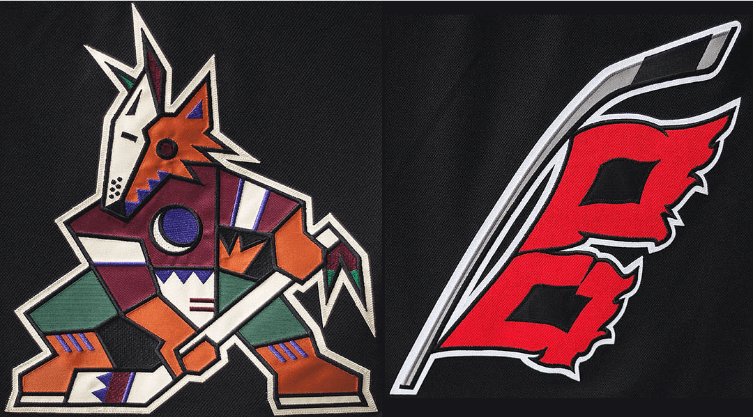
That’s the new third. If it looks somewhat familiar, that’s because it is. If you check out this article on the Carolina Hurricanes uni history (it’s a good read, and covers everything from the Whalers onward), you’ll note they first introduced a black alternate jersey in 2008. That jersey was also black, but featured one red/black square flag on a hockey stick (a single flag like that indicates a storm warning, not a hurricane warning). While that may have “looked” better, it was technically inaccurate (and the amateur meterologist in me cringed when it was introduced). They’ve now remedied that. The new jersey also rid itself of the gray and black hem, near the base of the jersey, replacing that and the red stripe with a single (thicker) red band. The gray was also removed from the sleeves and socks. It’s a much better look. But there’s not a whole lot of difference between the two, and that is intentional. Let’s take a few more looks at the new details before I hand you some corporate speak.


That’s a lot of stuff right there. Probably the coolest detail is the negative space North Carolina within the two hurricane flags (nicely shown graphically by Chris Creamer). I love the updated (correct) use of the double flag to indicate a Hurricane Warning, and I like that the gray has been ditched. The corporate speak notes,
The Hurricanes and adidas collaborated to produce a new-look for the team to accompany the Hurricanes’ home/away core and the new ‘Take Warning’ jersey already has opponents and fans on red alert.
In full partnership with the Carolina creative team, adidas adopted an in-house design from the Hurricanes and fabricated the third jersey with best-in-class innovation and technology. The jersey has a black base and features a brand-new hurricane warning logo created by the team. Storm grey shoulder yokes and heathered red striping on the arms and base of the jersey are signature to the third jersey, as well. The ‘Take Warning’ sweater was inspired by a previously-worn third jersey that the Hurricanes used for many seasons, but with a modern twist.
Additional design elements include third jersey-exclusive shoulder patches and hidden tonal warning flag detailing that borders the inner neckline. The primary Hurricanes crest logo that is featured front-and-center of both home and away uniforms makes an appearance on the right shoulder of the third jersey. The left shoulder patch is a thematic grey interpretation of the North Carolina flag joining the Canes to their home and giving the jersey a sense of state pride.
Some additional looks:


You can see more photos here.
Oh, you wouldn’t want me to end this without the obligatory hype video, would you? Of course not…
Back In Black. #TakeWarning pic.twitter.com/6AIHwjhzSL
— Carolina Hurricanes (@NHLCanes) June 22, 2018
Moments after these jerseys were unveiled, Paul had his own review. You can read that here. (You can also check out Paul’s Friday Flashback, which looks at 10 notable designs in NHL third jersey history. Both are must reads.
The Coyotes of Arizona went back in their 20 year uni history for their third, and (depending upon your tastes and perspective) they crushed it. That’s because they’re bringing back the “Kachina” jersey, otherwise known as the Peyote Coyote. If you folks know me, you know I’m not much of a jersey (owning) guy, but I love me some Peyote (that’s from, I want to say 2009, at a Uni Watch gathering). Might have been the last time I wore it in public. But I still love the design. Well, the team has brought the black version back!
Unlike the Hurricanes, who brought back a third jersey based on a third jersey introduced a decade ago, the Coyotes went waaaay back in their history to bring back what was their first ever jersey that they donned when they moved from Winnipeg to Phoenix. It was beloved (and hated) by many. And now it’s back.
Here’s a few looks:


The team has already declared they will wear this third jersey for all Saturday home games. They’ll also wear it on November 23 for “Black Friday” when the Coyotes take on the Colorado Avalanche.
You can see a few more photos in this album.
Oh yeah, the obligatory hype video…
We wanted to create the most beautiful jersey in the world.
Then we realized, the most beautiful jersey in the world was already created.
Introducing our official @adidashockey third jerseys: pic.twitter.com/Ku9RHXLBSH
— Arizona Coyotes (@ArizonaCoyotes) June 22, 2018
And just a bit from the press release:
The Coyotes and adidas collaborated to reintroduce the throwback, 90s-inspired, fan-favorite third jersey and the team will wear the black Kachina jerseys at home for all 13 “Kachina Saturday” home games at Gila River Arena during the 2018-19 season and on Nov. 23 for “Black Friday” when the Coyotes take on the Colorado Avalanche. The Coyotes will wear the black Kachina jerseys for the club’s home opener against the Anaheim Ducks on Saturday, October 6.
“We’re thrilled to make our black Kachina jersey the official third jersey of the Arizona Coyotes,” said Coyotes’ Owner, Chairman and Governor Andrew Barroway. “These are iconic jerseys that are beloved by our fans and players. We’re excited to have our players wear these great jerseys 14 times this season and hope that our fans will enjoy wearing these classic jerseys for many years to come.”
The Coyotes wore the original black Kachina jerseys for all road games from 1996 – 2003. During that time, the team reached the playoffs in five of their first six seasons in the Valley. The Coyotes reintroduced the popular black Kachina jersey for the first time in 12 years on March 5, 2015 for Throwback Night when Arizona hosted the Vancouver Canucks. This marked the first time that the Coyotes wore a throwback jersey in an NHL game. Since 2015, the Coyotes have worn the black Kachina jersey four times at Gila River Arena (Nov 27, 2015; Feb 20, 2016; Nov 25, 2016 and Feb 18, 2017).
I’m digging both new thirds. The Hurricanes got rid of the worst elements from their former black jersey (and added some nice new elements), and of course, I LOVE LOVE LOVE the Peyote Coyote. So far, so good — two down and a lot more to go, but if teams stay on these courses, we’ll be seeing some mighty fine third jerseys for the 2018-19 season!
Your thoughts?
[Thanks to Paul Lukas and Paul Murphy for their assistance with this.]


Braves Throw It Back To Honor The King
The Atlanta Braves are in the midst of Hank Aaron week, honoring the greatness of the man and the player, and last evening in an awesome tribute, the team wore the 1974 uniforms worn by Aaron when he broke Babe Ruth’s home run record — they’ll also wear them again today. I’ve already opined that those uniforms are arguably the team’s signature uni (though they only wore that exact style for two seasons, and a similar style for a total of four years, including the two in last evening’s style). If you take a look at that section of the article, you’ll note all the details of that uni.
Here’s how the great Bill Henderson details the 74-75 set:

How’d they do? Awesome.

It’s not a particularly difficult jersey to replicate, though the raglan sleeves might pose some problems. NNOBs and the proper fonts were all nailed, as were the feather-on-sleeve design:

They nailed the front script and number as well, and guys even went so far as to wear hosiery (including many in stirrups!)

This team, man. They are special. A two-out, two-RBI double for who other than Charlie Culberson gives the #Braves a 3-1 lead over the Orioles in the 8th. @FOXSportsBraves pic.twitter.com/smOZSONah1
— Kelsey Wingert (@KelsWingert) June 23, 2018
The team nailed the cap as well, although it’s particularly jarring to see that beautiful royal/white cap sullied with the New Era logo. And of course, for the guys who chose to wear their pants like pajamas, the pristine look was … less than pristine:

Still, it was a great look (and fans were treated to a bunch of extra innings of free baseball to enjoy them even more as well) and one the team really needs to bring back more often (like, maybe ditch the red and navy alternates and consider wearing these????). Guys who get dirty really looked good:

The team didn’t skimp on the helmets either, outfitting everyone with a period appropriate dome:
Ozzie Walks. ➡️ Freddie Doubles. ➡️ Nick gets an intentional pass.
The @Braves are in business with the bases loaded in the 8️⃣th inning. #Braves | #ChopOn pic.twitter.com/LxQ71jQnsk
— FOX Sports: Braves (@FOXSportsBraves) June 23, 2018
I can’t get enough of these.
Johan Camargo ties it up with a 2️⃣🅱️ that brings home Dansby Swanson.
The Comeback @Braves strike again. #Braves | #ChopOn pic.twitter.com/I4tmJUViNw
— FOX Sports: Braves (@FOXSportsBraves) June 23, 2018
We’ll get another chance to see them again today too!
Put That Chain Stitched UW Logo…
…on a Varsity Jacket!
In case you missed it, yesterday, Paul posted a picture of a drop-dead gorgeous chain-stitched version of the UW winged stirrup logo. How beautiful is that?
Anyway, my buddy Jimmy Corcoran took it upon himself to see how that might look if it were rendered unto a green and gold varsity jacket. I have to say, the results speak for themselves:

Jimmy adds, “I wasn’t kidding, this patch looks great on a varsity jacket, maybe even a number on the sleeve to mark the years that Uni watch has been around too.”
Good lord, someone find a way to offer that for sale.
The Ticker
By Anthony Emerson

Baseball News: The Brewers are wearing this patch all weekend in honor of Davey Nelson. They’re also renaming a portion of Miller Park in honor of Nelson (from Megan Brown and @SoCalMindset). … The Brewers’ scoreboard featured a subtle rainbow for the team’s Pride Night (from @brianspeaksnow). … Uni Watch reader Ray Hund writes in: “Published in 2007, The Baseball Chronicle: A Year-By-Year History Of Major League Baseball, is a fun read. As the title states, it takes the reader on a year-by-year journey through the history of MLB with lots of photos and stats. Fun stuff. What makes it even more enjoyable — and a kind of uni-test — is discovering how many of the photos do not coincide with the year. I’ve attached only a few of the many anomalies for you.” … Last week I mentioned how much I love independent baseball. But these Darth Sidious jerseys for the New Jersey Jackals’ Star Wars Night are having me really, really love independent baseball (from John Cerone). … Speaking of Star Wars-themed jerseys, the Mahoning Valley Scrappers (Short Season Single-A affiliates of Cleveland) wore some last night. Check out the stirrups on the guy on the left! (from Robert Hayes). … Garret Morris received a New Era Angels cap with a rather disconcerting mistake. Listen, we just moved the Astros to the AL West, we can’t be moving the Angels to the NL West! … The Single-A Stockton Ports Caballos de Stockton unis looked nice on the field last evening (from Brad Friedman). … Here’s a look at the Springfield Cardinals Margaritaville Night unis they wore last night (from @theTeej_13). … The Single-A Fort Wayne TinCaps are double-dipping on the one-off jerseys this weekend: last night, they wore these The Incredibles-themed jerseys for superhero night (from Blake Harper), and tonight they’re wearing and auctioning off these pink jerseys to raise money for the Vera Bradley Foundation for Breast Cancer (thanks, Phil). … The PCL’s Omaha StormChasers flashed back to 1999 and their brief dalliance with the name “Golden Spikes” last evening. … Also posted in the soccer section: the Double-A Akron RubberDucks wore Cleveland Force-inspired jerseys last evening. The Force were a team in the 1980s in the old Major Indoor Soccer League (from Jim Vilk). … Check out how the A’s organized themselves in their 1981 team photo: alternating gold and green jerseys! Also note that Billy Martin is in a white A’s cap in the inset (from the always excellent @BSmile). … Here’s a weird one: Mississippi State players have taken to wearing bananas on their heads in lieu of traditional rally caps. The practice is spreading to the fans (from Kary Klismet). … Also from Kary: some gorgeous unis in this album of the College World Series.

NFL/CFL News: Something called Mineral Wells Pro Wrestling out of Texas has poached the Rams logo for a title belt. Now, why there’s a ram on their title belt remains to be seen (from Brian Forosisky). … Mexico’s helmet for next month’s U19 American Football World Championship has been revealed, and it’s a beaut (from @cesarcu52). … To further reinforce an already lumberjack-y aesthetic (they saw off a piece of a log every time they score a touchdown), the Ottawa RedBlacks have added plaid padding to their goalposts (from Wade Heidt).

Hockey News: Also posted in the NBA section: Las Vegas native and Wizards draftee Troy Brown Jr. wore a Golden Knights jersey to his draft party. Funny that he got drafted by a team that shares an arena with the team that beat Vegas in the Stanley Cup (from Kary Klismet). … A good riff on a classic look: Mark Richter‘s friend’s rec-league hockey team out of Winston-Salem, N.C., has taken the Maple Leafs logo and replaced the, uh, maple-leafy parts with tobacco leaves, and added a camel, a reference to Camel Cigarettes, whose parent company RJ Reynolds was founded in Winston-Salem. … Speaking of rec-league hockey, Harvey Lee‘s team, Army of Darkness, (awesome name) just got new jerseys, but Harvey’s had a PWFIOB — that’s parentheses-with-first-initial-on-back. “When my captain submitted the names via spreadsheet, he included my first initial with parenthesis. I may have just coined PWFIOB,” says Harvey. Here’s the front of the jersey.

NBA News: The Hornets’ draftees already have their numbers: Miles Bridges will wear No. 0 and Devonte Graham will wear No. 4 (from William I. Wells). … Cross-posted from the hockey section: Las Vegas native and Wizards draftee Troy Brown Jr. wore a Golden Knights jersey to his draft party. Funny that he got drafted by a team that shares an arena with the team that beat Vegas in the Stanley Cup (from Kary Klismet). … All Big3 teams are wearing memorial patches for Rasual Butler, who died along with his wife in a drunk driving incident in California in January (from @loneranger158). … A day after creating a minor(?) controversy for her choice of jacket, First Lady Melania Trump inexplicably wore a mid-90s NBA jacket that featured the logos of every NBA team at the time (from Joel Mendelson).

Soccer News: Portsmouth FC have launched their new home kit (from Josh Hinton and Ed Żelaski). … Barcelona’s new away kit has been leaked. … Scottish side Motherwell released their new home and away kits yesterday. Note that the maroon away kit features an embroidered MFC, rather than the club’s current crest (from Ed Żelaski). … The next leaks and releases are all from Josh Hinton: Beşiktaş have had their new third kit leaked to FootyHeadlines. … Bristol City’s home kit was launched yesterday, revealing a new advertiser. Also note that the kit is being made in-house, rather than from a supplier like Nike or Adidas. Bristol did the same thing last year. … Queens Park Rangers’ home and away kits have been released. … Ever wonder what language refs use when speaking to players from different countries? Wonder no more (from Kary Klismet). … When TSN tweeted about Brazil’s 2-0 victory over Costa Rica, they made several errors in the attached images. Most notably: they included a picture of Philippe Coutinho instead of Neymar despite mentioning Neymar in the tweet! (from @conor411). … FIFA is applying its byzantine kit rules quite arbitrarily during this World Cup according to Josh Hinton, particularly in regards to teams that primarily wear red against teams that primarily wear yellow. Josh says “[FIFA] allowed Brazil and Switzerland to wear their primary kits for their earlier match. Then, they demanded Australia and Denmark to change to away kits because of the kit clash. They upheld that standard in Brazil vs Costa Rica, which would’ve been yellow v red but was instead blue v white, and are now ignoring it for Belgium-Tunisia” tomorrow. This isn’t the first World Cup where something like this has happened. Remember, the same thing happened between traditionally-orange-clad Netherlands and traditionally-red-clad Spain in 2014? … Tampa Bay Rowdies keeper Akira Fitzgerald wore a baseball cap on the pitch during yesterday’s game, as the sun was shining right in his eyes in the second half (from @Swshbclr). … Cross-posted from the baseball section: the Double-A Akron RubberDucks wore Cleveland Force-inspired jerseys last evening. The Force were a team in the 1980s in the old Major Indoor Soccer League (from Jim Vilk).

Grab Bag: The NCAA has recommended a uniform rule change for men’s and women’s track and field teams, which would require all participants from a single team to wear a matching uniform and require school logos and school colors on one-piece body suits (from James Gilbert). … Not sports related, but the soon-to-open Hard Rock Hotel & Casino in Atlantic City has installed a giant guitar on their sign, complete with a glaring misspelling (from @phillyparttwo). … New court for Provo (Ut.) High (from Jordan Fischer).
The Hurricane’s jersey is FANTASTIC!
Coyote’s jersey is more or less, a throwback… Interesting that the team says they wanted to create the most beautiful jersey in the world, but then realized it was already created. – Isn’t that a back handed way of saying their current set isn’t all that great? Seriously if the Peyote Coyote sweater is so fab, then why was it ditched in the first place?
Darth Maul
If you takeaway the grey shoulders, the rest of the new Hurricanes’ third uniform reminded me of the early 1990s Ottawa Senators’ duds.
link
There is precedence for a DC athlete wearing a Golden Knights jersey; he has not hit his weight since the Stanley Cup finals began.
The original Jets and Whalers were WHA franchises, not WHL. I’m hoping CGY brings back their ‘80’s third today. I wish they’d go back full time to it, and their white 80’s home (now would be away). The Black in their color scheme has long out-lived its trendiness.
Yes, it’s Darth Maul.
Love that Braves uniform too. Would’ve been nice if the Orioles had played along and worn throwbacks from that time as well.
Sidious is emperor palpatine
Def darth maul
i love that hurricanes design. that should be their main look
that az coyote jersey looks like thase ugly xmas sweater trash things people wear ironically in december
that nba melania trump is photoshopped like a motherscratcher. did u even look at her arms vs her hands?
funny!
Not sure why the Canes would go with really dark gray/graphite on a black jersey. Not sure why they would minimize the storm flag striping to the inside of the collar. Those two minor beefs aside, love them. And always loved the Peyote Coyote.
My reaction exactly. If I were a fan of either team, I’d be super thrilled to see my team in either sweater. But that Yotes design always makes me think of insanity peppers, not peyote.
Hockey:
The Hurricanes’ design is great, but I’m going to agree with Paul that the supposed NC outline in the middle of the flags isn’t really happening for me. It’s such a small thing.
The Coyotes are going to get all the attention, though.
Soccer:
“Note that the maroon away kit features an embroidered MFC, rather than the club’s current crest”
The initials are a throwback to the late ’60s/early ’70s.
Also, wouldn’t say FIFA’s kit rules are byzantine, just not transparent. The only solid rule they mention in the tournament regulations is that they’ll try to have each team wear its first-choice kit at least once in the group stage.
Re: the plaid goalpost pads for the Ottawa Redblacks. Here is some footage with better looks at the posts in the highlight package of their home opener at TD Place Stadium vs. Saskatchewan.
Can get a good look at 5:09 mark and throughout.
link
Sorry – this is it:
link
That’s definitely a fake Melania photo in the NBA jacket
That Melania Trump photo looks insanely fake!
Yeah, you gotta zoom in to see the sleeves and neck.
Paul tweeted out the new NCAA track uniform rule.
Hurricanes. Cool front logo. It’s a little different from circles and shields, which are dominant shapes. I miss their old number font though. The current one reminds me of the Portland Trail Blazers, and this new graphite on black with red just reinforces that. Finally, I’m not crazy over stealth blacked out logos, and it’s especially bullshit to black out a flag. I would have given it a B…got some good stuff but not fully baked, IMO.
Coyotes. It’s wacky. I’m not sure I ever liked it, but I love that it’s back because I’m a 90’s kid and it makes me feel young again.
Coyotes continued, forgot to mention one thing. Interesting that in this reproduction, the shoulder patch just says Coyotes. It clearly can’t say Phoenix anymore, but I personally would have written in Arizona to fill the space. As is now, it looks empty up close.
I did find a website that let’s you design your own varsity jacket. It looks like they’re ~$75 with a minimum of 25 ordered though. I found others but, a lot of them wouldn’t do green with yellow sleeves.
link
As a St. Louisian, I feel like the NFL relocates more franchises. I’m sure Oaklanders would agree.
I haven’t done the math yet, but I’m sure many of us will.
Relocations to different CMSAs since 1/1/75 are even
NFL: Cardinals; Rams x 2; Browns/Ravens; Oilers/Titans; Colts; Raiders x2; Chargers
NHL: Scouts/Rockies/Devils; Seals/Barons; Flames; Whalers/Canes; Nordiques/Avs; Jets/Yotes; Thrashers/Jets; (North) Stars
but NFL has another in the oven
I don’t have the time to tally it up right now, but I think that the NBA might have more relocations than the NHL and NFL, even if we just look at the period from 1975 to present. I’m batting this solely on looking at the spreadsheet that was shared the other day for the piece on the NBA draft caps.
If we are using 1975 as an arbitrary cutoff to represent “modern era” moves the NBA has had 8 teams relocate. Buffalo to San Diego, New Orleans to Utah, San Diego to LA, Kansas City to Sacramento, Vancouver to Memphis, Charlotte to New Orleans, Seattle to Oklahoma City, and New Jersey to Brooklyn.
I don’t know why I took the whole hockey teams move comment as a shot at the NHL, it probably wasn’t. However, NHL teams don’t actually relocate more than the other major leagues and I feel this needs stating.
One of the benefits of club soccer’s promotion/relegation is that club relocations are rare, at least for most Western Europe countries. I can only think one high profile relocation for England (Wimbledon to Milton Keynes) as opposed to the litany of American relocations.
Mineral Wells wrestling probably poached the Rams logo because the high school teams are called Rams. It’s in school colors. Another school down the road in Brock poached the Eagles logo as well but it’s in blue and yellow.
Is the Melania Trump picture supposed to be satire? Because it’s not even a particularly good photoshop..
I’ve noticed President Trump often (always?) wears a necktie that falls well below his belt buckle. Personally, I have the end of the tie stop at or just above the belt buckle.
Anyone else have a preference?
RE: soccer languages
I’ve watched a lot of wrestling, and you can sometimes hear guys calling the match, what moves come next, etc. What happens when you have an English speaker and, say, a Japanese wrestler in the same match? They call it in Spanish, since most Americans and Canadians (even some British) wrestlers have spent time in Mexico wrestling for various promotions. In the case of Japanese wrestlers, they usually spend time on “excursions” where they learn new styles and techniques and often find themselves in Mexico. It becomes a common language most guys know and can use to communicate.
WHa, not WHL, Phil.
Love both the canes and Yotes unis. Also it’s Darth Maul, not Sidious.