Click to enlarge
Last Friday’s Ticker had an item about Puma moving to re-enter the American basketball market. There was more news about that yesterday, as Puma signed more NBA prospects to endorsement deals, announced a lifetime contract for former NBA great Walt “Clyde” Frazier, and hired Jay-Z as the brand’s creative director.
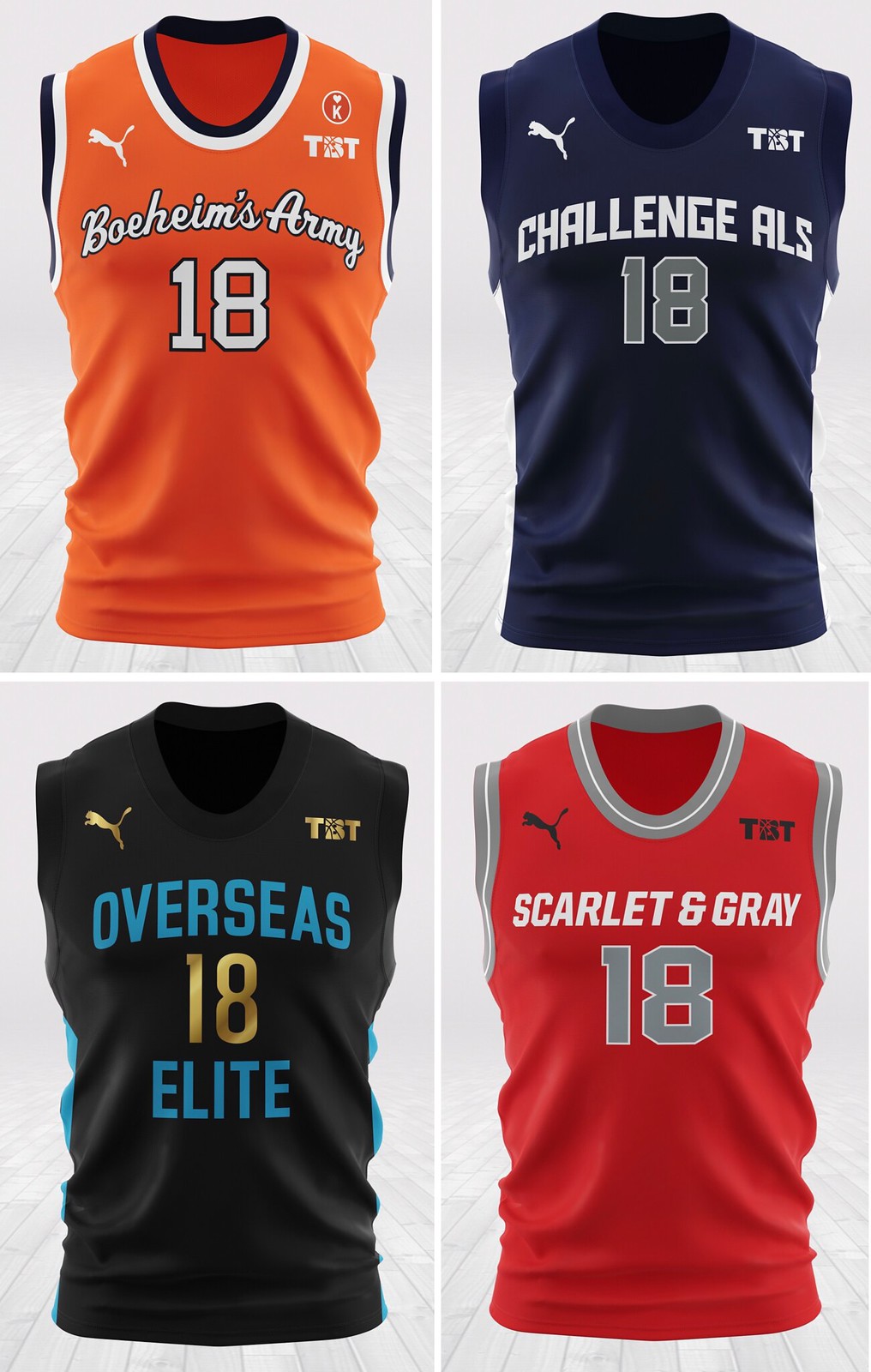
Now there’s still more evidence of Puma’s resurgence, as a source has provided me with four of the jersey designs for this year’s edition of The Basketball Tournament, the $2 million winner-take-all summer basketball event now entering its fifth season. In the past, TBT uniforms did not carry a maker’s mark, but this year’s jerseys, as you can see above, are Puma-branded. (It’s worth remembering that Puma outfitted about one-third of the NFL in 1999 and 2000, but they’ve been largely absent from the American uni scene since then.)
Some quick notes about these four jerseys (clockwise from top left):
• Boeheim’s Army is a Syracuse alumni team — hence the team name and the orange-driven color scheme.
• Team Challenge ALS is playing to raise awareness for ALS research on behalf of team GM and player Sean Marshall’s college roommate, Pete Frates, the former Boston College baseball player who initiated the Ice Bucket Challenge. Last year, the entire team wore “Frates” NOBs. This year, each player is playing for a specific person suffering from ALS, and they will have that person’s name on the back of their jersey.
• The Scarlet and Gray is an Ohio State alum squad, as you can tell from the team name and color scheme.
• Overseas Elite is the three-time defending TBT champion. Their jerseys look like leftovers from the Jacksonville Jaguars’ recently discarded set.
The Basketball Tournament tips off on June 29.
Click to enlarge
Collector’s Corner
By Brinke Guthrie
Time for another edition of Collector’s Corner, but first — an apology. Due to me messing up some Gmail filters, I was not seeing the Collector’s Corner email submissions. I thought, “Gee, no one has any?” I just happened to come across some from last week (which are included in today’s column), but goodness knows how many I missed. My apologies!
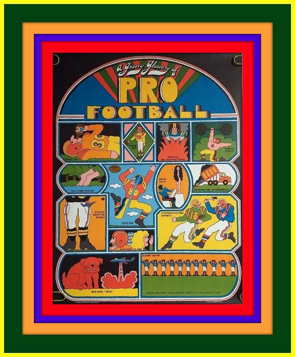
Okay, so starting off, we have this “Groovy Glossary of Pro Football” poster. The artist was Lionel Kalish Rapp Studios, and the seller calls it a “vintage headshop poster.” (Kids, ask your parents.)
Now let’s run down the rest of this week’s picks:
• Speaking of groovy, this 1973 Detroit Tigers yearbook is fairly trippy, wouldn’t you say?
• Will Scheibler sent along a nice-looking Winnipeg Blue Bombers hand-knit wool sweater and a vintage 1970s CFL thermal cup decorated with team logos.
• Bill Erdek sent in a CCM hockey jersey for Vincent Lecavalier, #44 of the L.A. Kings that just shows the NHL shield on the front.
• From Jon Solomonson, a 1993 N.Y. Jets “coat of arms” shield pin.
• Here’s a 1960s Green Bay Packers seat cushion for you to use at the Frozen Tundra.
• This 1960s New York Giants Ballantine Beer light-up sign is in great condition.
• Frank Gifford offers his analysis on who’s going to win it all on the gridiron with his 1968 NFL-AFL Football Guide.
• The Washington Capitals offered these “Stick It To ’Em” promo stickers back in the 1970s.
• This 1960s Red Sox vinyl lunchbox comes with a “wide mouth thermo bottle that keeps liquids or foods hot or cold.”
• Here’s a 1970s POP display (looks like the Steelers on there) full of L.A. Rams rings.
Seen an item on eBay that would be good for Collector’s Corner? Send any submissions here.
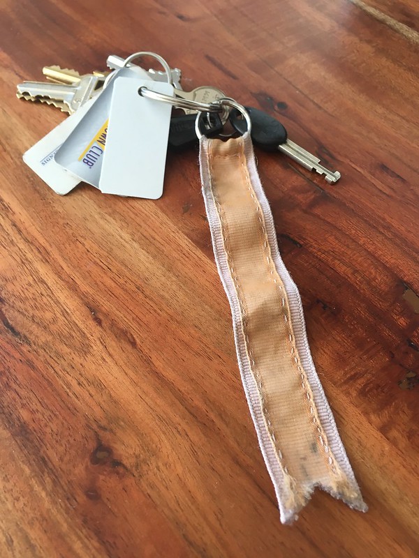
KRC update: The latest installment of Key Ring Chronicles is about a very personally significant pink and orange ribbon. Check it out here.
The Ticker
By Alex Hider

Baseball News: Marlins 2018 draft pick Osiris Johnson was wearing an old cap with the larger, pre-2018 “M” logo at last night’s game (from Travis). … The Schaumburg Boomers of the Frontier League will wear Ferris Bueller’s Day Off jerseys on June 28 (from Steve Johnston). … The Potomac Nationals of the Carolina League will give away this bobblehead of Victor Robles on June 23. … The jersey Babe Ruth wore the day the Yankees retired his number is currently on display at the Baseball Hall of Fame (from Rich Mueller). … Here’s another website that tracks the caps and jerseys worn by every MLB team (from @Greg1MB). … Albert, Florida’s gator mascot, wore LeBron James’s infamous suit with shorts look to the College World Series yesterday (from Jorge Cruz).

Football News: It appears Saints QB Drew Brees will wear a new helmet style this year. The Saints also used an old helmet design in the QB challenge logo (from Russell Goutierez). … Looks like we have 49ers head coach Kyle Shanahan to thank for the team’s new throwback uniforms (from Brinke). … The Colts will wear white at home for their preseason opener in August (from Phil). … Now that’s a jersey tear. That’s former Rams RB Les Josephson, who had his jersey torn all the way off in a game in 1967 (from Bill Kellick). … Angelo Giaquinto was at the Pro Football Hall of Fame and noticed Matt Ryan’s Super Bowl jersey was missing a sleeve logo. … Blake Fox spotted a boat named Philly Special that included a diagram of the play that resulted in Eagles QB Nick Foles catching a TD pass in this year’s Super Bowl. … Pro Football Journal spotted some number inconsistencies among Washington’s jerseys back in the day. … The ACC Tracker has been updated to include the jerseys worn during 2018 spring games. … An Illinois high school will no longer use the Patriots’ “Flying Elvis” logo. The school had run a big anti-plagiarism initiative, which led several students to point out that the school’s logo was essentially plagiarized (from Scott Holland).

NBA News: The NBA is auctioning off the jersey Cavs G J.R. Smith wore when he committed his Game 1 blunder during The Finals this year. As of Monday evening, bidding was above $7,500 (from Mike Chamernik and Rich Mueller).

College Hoops News: IPFW is now simply known as Purdue Fort Wayne. As a result, their basketball team will now be referred to as the Purdue Fort Wayne Mastodons, and have a new court to go along with the change. They previously were just called the Fort Wayne Mastodons.

Soccer News: South Korea’s coach had his players switch jerseys in a friendly against Sweden earlier this year in order to confuse the Swedes as they prepared for a World Cup matchup (from Mike Chamernik). … Ever wonder why referees check players’ underwear before the start of a soccer match? It’s simply to make sure the undershorts match the color of the shorts (from Kary Klismet and Brinke). … This video shows the evolution of World Cup uniforms (from Phil). … MLS officially unveiled the 2018 All-Star Game jerseys yesterday (from our own Jamie Rathjen). … New first and second kits for Scottish Championship team Partick Thistle (also from Jamie Rathjen). … New away kits for Aberdeen of the Scottish Premiership (also also from Jamie Rathjen). … New away kit for Brentford (from Adam Crocker).

Grab Bag: Auburn University teams wore a combined 46 uniforms across all sports during the 2017-18 athletic season. Clint Richardson has the recap over on Auburn Uniform Database. … The Vancouver Stealth of the National Lacrosse League have been sold to new owners, who will change the team’s name and uniforms and move into a new arena (from Wade Heidt). … England’s oldest branding is that of Lyle’s Golden Syrup, whose logo contains a dead, rotting lion’s carcass (from James Gilbert).

What Paul did last night: I usually use this space to tell you about fun stuff that I’ve done, but last night was no fun. I went to a bar in the East Village to meet up with an old friend — someone I’ve known for more than 30 years. We hugged when we sat down and again when we parted a few hours later, but in between we talked about the distance that had grown between us and how one of us could no longer find it within himself to call the other one his friend. By the end of the night, we had said good-bye for the final time.
It doesn’t matter which one of us was upset with the other, or why. What matters is that we had a shared past but could no longer find a shared language for the present, or for the future. There was a lot of respect running in both directions, and I believe we both truly listened to each other, but in the end it was clear that the gap between us had grown so wide as to be unbridgeable. That’s not how either of us wanted it to be, but that’s the reality of how it had become. It sucked.
As I walked back to the subway, I got caught in the rain. I didn’t care. I came home, dried off, and watched the Mets win. I didn’t care about that either.
Life is hard sometimes. I’m trying to learn from it.
While I am sorry to hear of your friendship no longer continuing, I am impressed how well it sounds like both of you conducted yourselves.
Articles like that are just as important as all the cool uniform ones, I truly hope you and your former friend move on and hopefully remember only the good times you shared.
Good people like yourself are why I still have hope for humanity.
Love the site, and though we have never met, I consider you a friendly voice and a good person.
Couldn’t agree with you more, Bart. Paul shares a great deal with us and I, too, appreciate the candid and heart-felt scenario he mentioned. Paul, you are a good person all around.
today’s lead reminded me of the BIG3 league and that it is starting soon. Any uniform changes there in their second season?
I attended Stevenson High School in the early 90’s and at that point they were leveraging the Pat Patriot logo for football but changed the colors to green and gold. Always wondered if/when they’d get away from the Flying Elvis. Good for them.
Good for them, indeed. I had to laugh when I clicked on the link and saw the game photo accompanying the article. The opponents are wearing copies of the Buccaneers uniforms which are an even greater example of plagiarism.
The local high school where I live, in another Chicago suburb, uses the Philadelphia Eagles logo, but in blue and yellow. I’m tempted to send them a copy of this article, but I doubt they’d listen to me. I’m not an alum of the school, nor are my preschool aged children going to be attending there for quite some time.
It’s a bit disappointing that students were left out of the design process.
Administration’s reaction to the students observation: allocate thousands (even though financial resources there don’t seem to be lacking) to pay a design firm for an exclusive logo…essentially, a letter of the alphabet.
I wonder how much it will cost to replace the logo on the gym floor, etc…
Just my $.02.
I’m sorry that you had a rough night, but you have even more of my respect for the way that you handled it. We live in an increasingly digital world and very few times to we sit down face to face to try and work things out.
On to the sports stuff.
That last line in the Stevenson HS story is kind of a bummer. It’s almost like they’re conceding that the unis suck and they could be better.
Given that it has the old-style NHL shield, that Lecavalier jersey would have to be from before the 2005-06 season. Possibly an unused All-Star prototype? Maybe this is what they would’ve worn in the 2004 game in Minnesota had they not gone with the retro, Wild-colored design?
And he was #4 with the Lightning for 13 years.
Even stranger, the NHL shield as shown is the old one that was rendered in black with orange; to my knowledge, the NHL never used that color combination with that shield.
“as Puma signed more NBA prospect”
should be plural
as Puma signed more NBA prospects
Got it.
What a great way to handle the friendship ending. Usually one or both just fade away and you think about the person one day and wonder what happened to him/her. A clean break is better.
Weird moment on an ESPN article yesterday. They’re running a Photoshop gallery of potential landing places for John Tavares. I couldn’t figure out why the Rangers Photoshop looked so bizarre (Besides seeing Tavares in a Rangers jersey…) until it hit me. They put him in blue gloves with red fingers. Rangers gloves are red with blue fingers. Small difference, but man it looks weird.
Photoshopped Tavares:
link
Real Rangers gloves
link
RE: some number inconsistencies among Washington’s jerseys
Look also at the spacing on #18 (Sam Wyche) compared to Billy Kilmer’s #17
I think “plagiarism” may not be the exact word the school is looking for in their logo change edict.
The NFL won’t combat junior or high school leagues using NFL logos. That’s been noted here before.
The school is clearly promoting original thought and ideas, so the logo change is a great one in that respect.
I have a hundred old friends that probably need to have that talk with me–and probably should have years ago.
Here is the link missing for the Vancouver Stealth ticker item. The team has been purchased by Canucks Sports & Entertainment. Will be moving from the ‘burbs in Langley into Rogers Arena downtown. Good chance the new uniforms could be blue and green?
link
Thanks, now added.
“The jersey Babe Ruth wore the day the Yankees retired his number is currently on display at the Baseball Hall of Fame (from Rich Mueller)”
This is a fantastic article! I always assumed the Yankees had the jersey made for Ruth for this occasion. I would’ve never guessed it was from Pride of the Yankees.
Appreciate your retelling of the end of a once friendship. I’ve got to do the same with someone who I knew 40 years ago as a friend, but not in the last 30 could I say we were friends. It’s occupying space I need to clear. Thanks for the push.
So sorry to hear that things didn’t work out between you and your old friend, Paul; it isn’t every day that you actually come to the end of a friendship on apparently peaceful terms.
Brentford used to have the most obvious crest, with references to their home uniform (red and white stripes), their nickname (bees and beehive), their location (swords and crown), and “Football Club”. Seeing them using the Cleveland Browns colors made me wonder if Randy Lerner was going to give owning a soccer team another try.
Lyle’s Golden Syrup has to be one of the grossest logos of all time, bees forming honey in a lion’s carcass. People must have stronger stomachs for this sort of branding back then.
For those who are unfamiliar, the bees forming honey inside the lion’s carcass is a reference to a story in the Bible involving Samson. It is in the book of Judges, chapters 14-15.
link
Puma was also an official outfitter for a handful of NBA teams into the mid 2000s before league wide exclusive apparel deals with Adidas kicked them out, along with Champion, Nike, and Reebok. I miss those days when teams could have more individual looks and weren’t shoehorned into universal templates.
Interesting about Puma re-entering the NBA market…could NFL, MLB and tennis be next? Puma Clyde III was the official shoe of Mariemont HS back in the mid 70s. This was prior to Nike moving in. “What are those…Nikes?” (as in “Mikes.”)
Thanks Paul for sharing your difficult moment. I moved from Southern California to Arizona in 1990, and it’s been difficult keeping some friends. Not out of any animus, but really just lack of effort. Not that I’m blaming my friends or myself, but it just happens over time. It takes an effort, and we are lately trying to reconnect.
Also, are those Abe Froman Sausage King jerseys going to be available online to order?
FYI…Sadly they will not be selling the jerseys, but will be auctioning them off.
Paul – Thanks for today’s Keychain Chronicles link. The story made me smile and provided a nice contrast to your account of last night.
Yes, I enjoyed the Key Ring Chronicles today, too. I usually do enjoy them. Thanks, Paul, for bringing them to us.
Key Ring Chronicles- duh.
Ha — so many people default to the term “key chain” instead of “key ring.” It’s interesting to see!
Paul,
Your Get Out More section sure sounded like a tough decision. I sometimes have a feeling I might have one or two of those conversations in the future. I hope not, but like you said, life can be tough sometimes. Thanks for sharing. Hope today is a little bit easier.
Paul-
Ending a friendship with such respect and care is very brave. Social media has made it easier to keep up with people but also lessened the urgency to have one-on-one communication. (Not saying that is necessarily applicable to your situation.)
I turn 41 this summer and feel many of my friendships evolving. Some becoming richer, others fading away. It has been difficult to accept we have different companions for different stages of the journey.
All the best.
It’s sad how sometimes people grow apart. Hopefully saying goodbye to one friend will bring a new friend into our lives
Love the site, but just as a small fact check on an item in the baseball ticker:
Victor Robles does not currently play for the Nationals. He played 13 games for them last season as a September call up, but he’s on the AAA Syracuse Chiefs and currently has a serious elbow injury and has been out since April. The bit in the ticker reads like he’s currently on the Nats roster, that’s all.
GOt it.
In Japan some high schools let anyone who wants to play a sport be on the team (there are no “cuts”), and so there are soccer teams with link (For 500 yen plus shipping, which is what the auciton is up to as I type this, you can have those jerseys.)
Check out the strange stripes on this LA Kings player’s skates…
link
-Jet
Puma also supplied the CFL uniforms in the early 2000s decade.
Yep, starting in 2000. Prior to that, Starter was making the jerseys in late 1990s.
Had a quick look again. Puma had half the CFL teams in 2000 (Calgary, Hamilton, Montreal, Winnipeg) with Adidas having the other half.
Puma was supplying all teams 2001 to 2003. Reebok took over supplying the league in 2004.
Puma has a fairly large presence in international soccer.
Paul, thanks for sharing. Part of the meaning and enjoyment of reading about your travels and cooking endeavors is that you don’t lead us to believe that things are always rainbows and butterflies.
Your comment that you didn’t care about watching the Mets win gave me a melancholy smile. I had a relationship end last summer and when I got home I didn’t know what to do with myself. So I went outside and, with my mind occupied, trimmed all my shrubs. When I was finished, three hours had passed and I had beautiful greenery. But I barely remembered doing any of it.
Proofreading:
In Illinois high school will no longer use the Patriots’ “Flying Elvis” logo.
Got it.
Hey, about Lyle’s Golden Syrup: The logo is a reference to a Bible verse, in which Solomon gives a riddle to the Philistines: “Out of the eater comes something to eat; out of the strong comes something sweet”. Makes sense, as the riddle is based on Solomon’s experience as a young lad, where he killed a lion, and returned to the carcass to find a beehive full of honey inside of the carcass.
Therefore, the logo depicts a dead lion swarming with bees.
Seems somebody already pointed that out. Well, I got ninja’d.
I had that Groovy Glossary poster back in the 70s.
Man, I’m old. Thanks for the “flashback”.
Glad you liked it. I always try and make the lead something that is visually appealing, and when I saw all the colors, I thought “that one will do.”
“It’s what happens to friends. You’ll find long before you reach my age you will have made more friends than you have time to keep. I had 50 good friends when I was at Colgate. Seven were killed in World War II; but the others over the years, I kept in touch with about 10. I didn’t lose touch with the rest of them because we no longer liked each other. We lost touch because there isn’t time enough in life to be friends with everyone you feel friendly towards. Our lives diverged.”
Wow. Clyde Frazier, JayZee, and some made-up basketball tournament. There’s a brand I need to be associated with. Good luck, Puma.
(full disclosure, I used to wear Puma tennis shoes and was very happy with them.)
Apropos of nothing…
Watching the Padres-Athletics game from Petco. I know the Padres get a lot of grief on this site for avoiding the “classic” brown and yellow, but there’s a pleasing simplicity to tonight’s matchup.
Padres in a full white uniform, navy headspoon, navy pinstripe on trousers, navy hat with white interlocking SD, roman Padres wordmark on chest, interlocking SD on sleeve.
Athletics in all-grey, no stripe on pants, dark green hat with matching bill, dark green lettering with yellow outlines, script Oakland on the chest and number on lower left of front. Elephant logo on sleeve.
No overthinking the problem. Yeah, we’d like to see more stirrup, and the Padres wordmark is a bit of a funky font, but after the searing my eyeballs took on Fathers Day, this was a balm for the Uni-soul.
I’m late to this, but am I the only person reading it who doesn’t figure it’s about Paul cutting ties with a friend because the guy likes Trump?