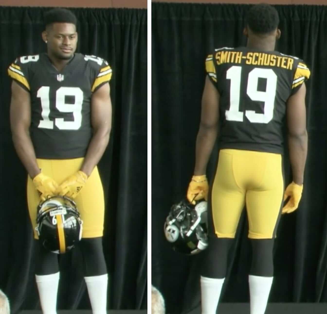
The Steelers unveiled their new throwback yesterday. As had been expected, it’s a late-1970s design, which means that only changes are the block typography and the removal of the logo patch on the chest. Everything else is the same as their current primary look. I had my say in this ESPN piece, which was published yesterday afternoon.
Here’s a side-by-side comparison of the team’s primary home uniform and the new throwback:
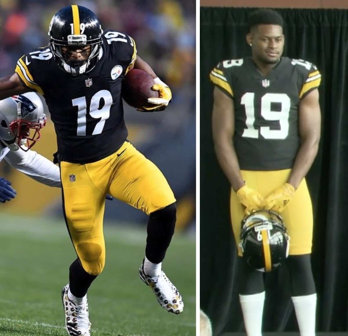
A few additional thoughts:
• I’ve never really minded the Steelers’ current primary number font. I think it nicely mirrors Pittsburgh’s transition from an industrial city to a post-industrial city, and the sleek numerals seem more in keeping with the athleticism of modern football (as opposed to the “three yards and a cloud of dust” style of the block numeral era). I also think the current NOB font is really nice.
All of that said, however, I have to admit that I felt a few pangs of nostalgia when I saw the new throwbacks. It’s a very strong look.
• As I mentioned in my ESPN piece, I wish they’d resurrect the Batman design as a throwback. But I wonder if that’s feasible with Nike’s current template. The jerseys have no seams, so how do you build in the yellow fabric panel? Sublimation might work, I suppose. Still, it seems like a tough fit for modern uniform tailoring.
• At the press conference, team owner Art Rooney II said the uniform would be honoring the 40th anniversaries of the team’s victories in Super Bowls XIII and XIV, meaning that the throwback will be worn at least this season and next season. I asked a team rep if it would also be worn beyond those two years. He said he wasn’t sure but would try to find out. (I’m assuming they’ll wear them for at least five years, just as they did with the bumblebees.)
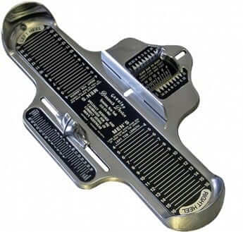
Tattoo you (and you and you and you): Just before I left for Utah, I ordered a bunch of Brannock Device temporary tattoos (same design as my real tattoo). They were waiting for me when I got home two nights ago, and I’ll be giving them out to people who come by our party at tonight’s Syracuse Chiefs game.
For those planning to attend: Gametime is 6:35pm. I’ll be throwing out the first pitch shortly before then. We’ll have a gathering space at the end of the third base concourse. Phil and I will be there for most of the game, and SportsLogos.net poobah Chris Creamer is driving down from Toronto for the game as well, so just buy a regular game ticket and come by whenever you like. I’m told that the space is right next to a concession stand and a beer cart. Even better, it’s “$1 Dogs and $2 Beers Night.”
Looking forward to it. See you there!
The Ticker
By Paul

Baseball News: MLB is taking some heat over the lack of transparency regarding proceeds from Memorial Day merch. … There’s going to be a new Jackie Robinson museum opening in NYC next year, and they’re currently looking to hire a curator and an education director (from Mark Ribbing). … Good article on the increasing use of C-flaps in MLB (thanks, Phil). … You can cast your vote to help name the new Texas League franchise in Amarillo. … Grateful Dead-themed jerseys upcoming for the Lakewood Blue Claws (from John Cerone). … Good story on the Trenton Thunder’s “Trenton Pork Roll” Friday uniforms (from Jason Hillyer). … The annual Rickwood Classic took place yesterday, as the Birmgingham Barons and Chattanooga Lookouts wore 1950s throwbacks (from Roger Kirk). … Flag-desecration jerseys upcoming for the Fort Wayne TinCaps (blame Blake Harper). … For reasons that aren’t clear, at least to me, Cubs OF Albert Almora Jr. wore a West Virginia football helmet in the dugout last night (from Griffin Smith).

NFL News: Love this shot of former Giants coach Bill Parcells with his “B.P.” initials on his sweatpants (from Bill Kellick, who also sent along an old shot of his childhood bedroom, which had a serious Sears/NFL theme going on). … Browns rookie DB Denzel Ward, who was drafted out of Ohio State, was wearing Buckeyes gloves at OTAs yesterday (from Erin Ford).
College Football News: In case you hadn’t heard, a new NCAA rule limits the number of coaches who can wear headsets on the sidelines this year, and coaches aren’t happy about it. … Cross-listed from the baseball section: For reasons that aren’t clear, at least to me, Chicago Cubs OF Albert Almora Jr. wore a West Virginia football helmet in the dugout last night (from Griffin Smith).

Basketball News: Here are the uniform pairings and warmups and shooting shirts for the NBA Finals. … Meanwhile, regarding the court design: Two months ago it was reported that the new NBA Finals logo, including an ad for YouTube TV, would appear on the court, but it looks like it’ll actually be on the sidelines, where ads have appeared in the past (from Jeff Mangurten). … Warriors F Kevin Durant has his shoes fall off more often than any player in NBA history (from Mike Chamernik). … The last two active players to have worn a Sonics uniform — Kevin Durant and Jeff Green — will be facing off in this year’s NBA Finals (from Mark Ribbing). … New court design for FAU (from Jake Elman).

Soccer News: FC Cincinnati is getting a name change (from Marcelo Triunfo). … Nike outfitted the most teams in the 2014 World Cup, but this year the top outfitter is Adidas. … Here’s another ranking of World Cup jerseys (from Charles George). … And yet another World Cup ranking. … If you want to see all the World Cup jerseys side-by-side, look here (from Josh Hinton). … New kits for English Championship team Ipswich Town (from our own Jamie Rathjen). … Also from Jamie: “It appears that the NOB font for the English Football League (2nd-4th tiers) was updated to optionally include the logo for the mental health charity Mind, which is a small squiggle (maybe a flower?) extending from the first letter of the player’s name. Seems to be up to each team to decide whether to use it. The logo also appears on the top of each number.” … There’s a new book covering the uniform histories of 20 top teams (from @ScottyBeats86). … Nike is upset about an influx of counterfeit Nigerian soccer jerseys.

Grab Bag: The U. of Nevada, which had been outfitted by Nike, is switching to Adidas (from Damon Herschenson). … Swedish cycling apparel maker POC has added ceramic protection to its cycling gear. … New logo for the upcoming Avengers 4 movie and also for John Wick 3. … New logo for the South African cell service Cell C. … Here’s the lowdown on the catsuit that Serena Williams is wearing at the French Open (thanks, Brinke). … Speaking of Serena, she has a new fashion apparel line. … Did you know that the U.S. Postal Service is now selling scratch-and-sniff stamps? I didn’t! Only problem is that nobody actually mails letters anymore (from Max Weintraub). … Amazon has given Whole Foods employees blue “Prime”-branded apparel (thanks, Brinke). … Students at a San Diego school are studying for the SATs by wearing vocabulary-centric uniforms. … Justify, who is going for the Triple Crown in next weekend’s Belmont Stakes, is changing to a new silks design. “Has that ever happened before from one Triple Crown race to the next?” asks Jonathan Horowitz. Good question — anyone..?
On the road again (again): By the time most of you read this, I’ll be on my way to Syracuse, where I have a busy itinerary. Looking forward to seeing lots of you there tonight, and then I’m heading back home tomorrow. Apologies in advance for not being available to respond to comments or emails — between my recent vacation and the Syracuse trip, this has been a busy stretch. We should get back to normal next week. — Paul
Dang. I have a DIY baseball jersey I was hoping to wear to the game tonight, but it’s not done yet.
No swoosh on the throwback jersey?
You should be able to see it on the shoulders in the front view picture.
Have a safe trip, can’t wait to see some footage from tonight. I’m very disappointed I’m unable to make it up to see the first pitch! ugh!
I guess the Steelers throwback makes it easy for the swoosh. Just slap an NFL logo on the Iowa Hawkeyes unis that are already produced.
not really, since the hawkeyes jersey has its two full white stripes on each sleeve but they inexplicably can’t reproduce the same thing with the steelers jersey
i still wonder why, maybe it’s because of the steelers seamstress…
The current Hawkeyes font, and the throwback Steelers font are not the same. Sorry.
Lee
Remember Hayden Fry copied from Pittsburgh not vice-versa!
The Steelers’ Futura Bold Condensed Oblique numbers have never bugged me, but what has bugged me is the logo on the upper left chest. Having the logo there just clutters up the jersey, so in that respect, the throwback is a better look.
I’ve never been bothered by the numbers either, probably because the helmets have had numbers in this font for a long time, at least dating back to the year of these throwbacks, as we see on the helmet. I wouldn’t mind seeing the Futura font in non-italic, though. Italic fonts look ok in auto racing where the car is moving, but weird on standing-up=straight athletes.
Ditto here. The numbers are good, modern but not crazy. The logo patch, as with the Jets and Jags is just cluttered and out of place.
I think the logo makes sense for the Steelers. Since there logo is only on the right side of the helmet, they balance it out with the logo on the left side of the jersey.
Now for the Jags new unis it’s too much, but is there for retail. Without the Jags helmet you can’t tell it’s a Jags jersey.
Loving the Steelers throwbacks. I guess I always preferred the block numerals. The current font always struck me as cheaply done and thats why, to me, the block looks so much better.
$1 dogs and $2 beer PLUS Chris Creamer? Wow. It’s like a US / Canada summit!
Ditto on the block numbers.
Is it the lighting or is the black not so black? If you squint, it almost looks like the Packers.
Seriously? A “throwback” that 90% of the population won’t even recognize is different from the regular uniform? Granted, I like it better as I’ve never liked the racing style numerals they sport now, but still, give us a little more. Perhaps the larger side logo and gray facemask from the early 70’s – just honor those teams instead.
Chalk this up to a whole lot of nothing.
Anything to get the Steelers out of those stupid numbers they wear now is a good thing – even if it is only for a few games.
Do you feel the same way about the Chicago Bears, which is virtually the same number font, and is often lauded as the best football uniform?
The Bears font is no where near the Steelers, aside from the rounded numbers. The Steelers’ “19” in today’s post above illustrates two of the major differences. The 1 has a serif, where the Bears are sans-serif. The 9 stops at the bottom, where the Bears continues to swoop upward. Also, the Bears have an outline on the numbers.
“no where near” – who has a number font that looks any closer?
Sorry but I agree with Paul here- Steelers current number font is unique and looks good. Their current set is fantastic, even the color rush.
Another issue with the Batman design in today’s uniform – not sure how the nameplate would have worked or looked if the Steelers went with it.
The Steelers shop has already prepared Batman jerseys with NOBs; they’re link
Cool – thanks Mark! I was thinking that the yellow did not go so far down on the back when looking at the uniform on Gridiron Database, but it would fit all within the yellow.
Sounds like a uni enthusiasts dream tonight. Wish I could make it up there. Hope everyone has a blast!
“I’ve never really minded the Steelers’ current primary number font. I think it nicely mirrors Pittsburgh’s transition from an industrial city to a post-industrial city…”
that sounds right out of a Nike style-guide…
Agree. I rolled my eyes at that one.
Maybe Nike should’ve just gone ahead and made black one of the Cavaliers colors, as they’ve been wearing those uniforms more than either of their actual team colored sets.
Unfortunately black is now an official color. They really need to pick either navy blue or black. I prefer the navy, but their primary logo is now the black shield with the “C”. Or just dump both and go with the wine and gold, like their white uniforms.
The Steelers number font thing is interesting in the sense that when they changed it to the italicized font it took a few years to get used to it, but once I got used to it, it clearly is the better font.
And then when I saw the throwback with the block font now it looks kind of bland…
I really wish sports teams would drop the BFBS. Especially if it’s not in their main color scheme. For the majority of them it’s a horrible look.
Regarding the Parcells photo…. In one of my earliest uni-watching awakenings, I remember wondering why the Giants facemask on that jacket was RED instead of white… Such an oddball mistake!
I am still searching for a color photo.
Hope this link works:
link
THere it is!! Thanks ChrisH!
Have fun in Syracuse, Paul – the Chiefs (er, Devices) play in a nice ballpark. I have fond memories there, and I’m sorry to miss the game tonight!
Maybe Almora Jr. wasn’t comfortable with the C Flap.
Almora seems to have been trolling Pittsburgh fans. Pitt and West Virginia are big rivals in football.
As a longtime SAT teacher and tutor, I hate to see middle schools worrying about the SAT. And the SAT eliminated vocabulary questions a few years ago.
i still wonder why nike can’t fix those white sleeve stripes on the steelers uniforms though, this is so annoying to me, especially since they’re doing it right with the hawkeyes jerseys
As a Steeler fan from the 1970s, I am so happy this iconic look is back. It should be worn every game. My favorite font quirk on the Sand-Knit font is how the small two has no bottom serif…a look worn by the Steelers, Packers, Raiders, Browns, UNC Basketball and others over the years.
link
From a photo I saw of a replica being sold, they are being true to that quirk.
link
If this is true what John Sabol tweeted, then I’m surprised that Golden State would wear their grey “Statement” uniform twice and not wear their blue uniforms at all. Not a fan of these “The Town” uniforms, and in the future when people look back at these games, they are going to wonder what the Warriors were thinking wearing these. They’ll probably only wear them once, since I doubt there will be a seventh game.
Forget the future, I am thinking right now what are the Warriors thinking wearing these. No blue uniform? In the Finals? It is a shame.
MLB Memorial Day Merch:
MLB entities have enough money to make the donations without selling merchandise. Wear a black arm band or poppy and write a check to the charity.
Melanie LeGrande Vice President of Social Responsibility:
“What we’ve done here is… improved our communication…the way we should be promoting our products, the way we should be communicating how we spend our charitable proceeds from the products.”
For the MLB it is not about charity it is about promoting and selling products. It is time to put an end to this.
Please don’t blame me and no hate mail lol. It feels pretty cool to now be a published contributor to this wonderful blog. One more thing checked off the ole bucket list. Thanks!
Speaking on the Amarillo team names…
They’re all pretty bad. While I don’t mind MiLB kitsch at all, the choices are all extremely TEXAS and it hurts. A return to the Gold Sox wouldn’t be a bad idea given the alternatives…
How about the Amarillo Armadillos?
Are the choices really even all that Texas-y? They’re all insipid in a way that doesn’t at all jibe with my experiences of Texas and Texans. I mean, even the most anodyne, “Long Haulers,” is basically redundant. Given the context, there’s no chance they’d be confused with short haulers. People brew things other than beer, but Milwaukee doesn’t have to specify that they’re the “Beer Brewers” for people to understand the name. And “Sod Poodles,” good lord. For one thing, I don’t believe for an instant that this actually ever was common nickname for prairie dogs. But even if every pioneer rancher’s dinner table was replete with mentions of “sod poodles,” if Amarillo wants to build an identity around prairie dogs, why not call the team the Prairie Dogs? They’d be the only team in the sport with the name, and people would actually understand it. The more straightforward name would actually free the team to get more cutesy with its visual identity, if that’s where they want to go – and it’s clear from the styles of the nickname options that they do.
These fake “name the team” contests usually have at least one not-terrible option. Amrillo’s is the first one I’ve seen where I’ve been unable to find even a single nickname worth voting for. Since Gold Sox isn’t an option, the next-best choice is hoping that someone in, say, Flagstaff buys the team and relocates it away from Amarillo quickly.
Amarillo probably can’t (or wouldn’t) use Prairie Dogs because a 1990s team in the Texas-Louisiana League used that nickname while playing in Abilene. Amarillo was in that league at the same time using the nickname Dillas, which essentially eliminates that and Armadillos as potential nicknames.
Yeah those are all beyond terrible. The panhandle is my part of the world and I’ve never in my life heard of a sod poodle.
So no one thought of Armadillo? Rattlers even?
They’re very Texas if by very Texas you mean thought up by the marketing staff of Texas Roadhouse
I want to vote for Gold Sox.
Not sure if anyone pointed this out, but, apparently, Morocco is not at all happy with Adidas and it’s not entirely clear what they’ll actually be wearing at the 2018 World Cup.
link
Interesting, Brian. I’ve not seen this yet, but I know most soccer fans are fed up with the recent trend of Adidas, Nike, and Puma making all the kits look basically the same (whether it be “straight outta the catalogue” or just very similar templates/designs) and this doesn’t surprise me.
The same way that the NBA All-Star Game was white vs. black — is this Nike basically telling the Cavs/Warriors to have every game as white vs. (nearly in the Warriors’ case) black?
I think the Cavs will try and wear their black uniforms every game if they can.
Sorry – mid afternoon brain cramp: The Cavs WOULD trying and wear their black uniforms every game if they COULD.
Jamie,
Since you seem to know more about the EFL than I do (mostly because I don’t have a club to follow, so I care more about the PL and USL) do you know what was the little person thingy in the numbers this year?
At the top of the numbers:
link
Yeah, it’s for another charity, Prostate Cancer UK.
Now that I think of it, not sure what’s going to happen to that one because obviously the Mind logo is going in the same place (but hasn’t been announced yet as far as I can see).
Alright, thanks! And yeah, that’s a good question; keep one of the two or have both…
Seeing the great Steeler throwback uni reminded me of how back in the 1970’s the Steelers, Packers, Dolphins and Redskins all had the same jersey template. Block numbers with the exact same sleeve stripe design.
Except they weren’t – every uni had block letters back in the day (except the Bears) so by that logic you could also say the Lions, Bills and Broncos had the same template. Redskins only wore 2 stripes and the other teams had different but similar ish stripe patterns.
Here’s a look at the home kits for the upcoming World Cup.
link
Steelers throwback – You mean, what their regular unis should have been all along? Up yours, swooshee…
I agree. It always bothered me that an iconic team like the Steelers switched to such a novelty number font.
Great to see the Rickwood Classic return. Interesting that the Barons wore road jerseys and the Lookouts wore home jerseys for the game.