
[Editor’s Note: Paul is on vacation until tomorrow, but he left this entry to run today. Enjoy.]
There are lots of books out there about cycling jerseys. The latest one is The Art of the Cycling Jersey: Iconic Cycle Wear, Past and Present, by Chris Sidwells (who’s a very prolific author on biking-related topics), and it’s one of the best that I’ve seen, with informative text and excellent visuals.
Let’s take a look, shall we? Here are some highlights:
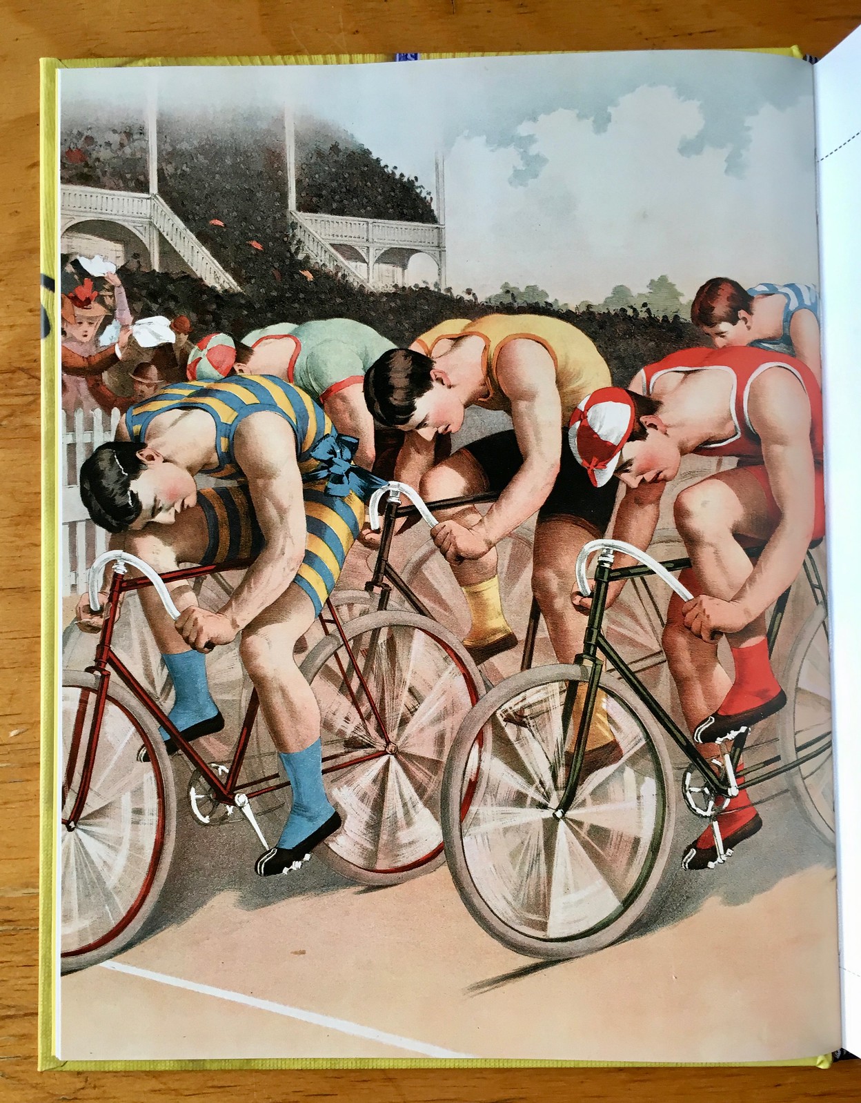
• As you’d expect, there are lots of photos, which we’ll get to in a second. But there are all several very cool cycling-centric paintings and posters. I particularly liked these two (for all photos, you can click to enlarge):

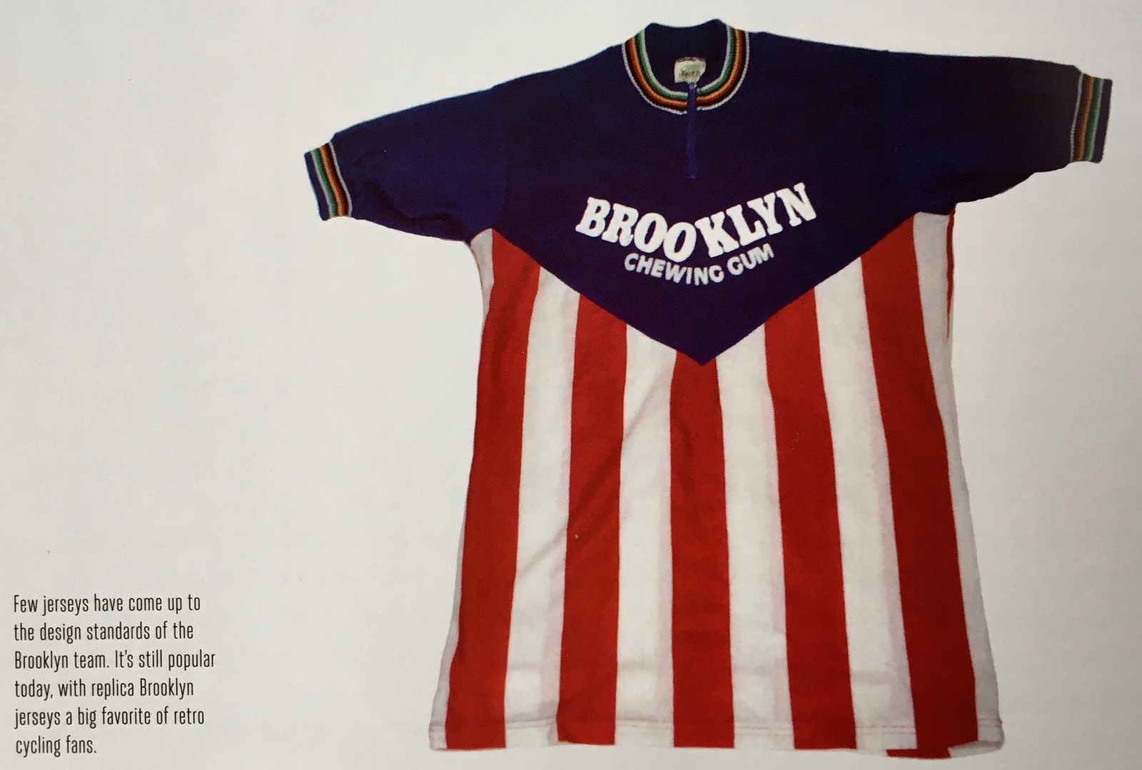
• Over the years, many people have sent me packs of Brooklyn gum, which is actually made in Italy. They also sponsored a cycling team, as you can see in this next jersey. I often see people wearing repros of this one during my daily bike rides in Prospect Park:
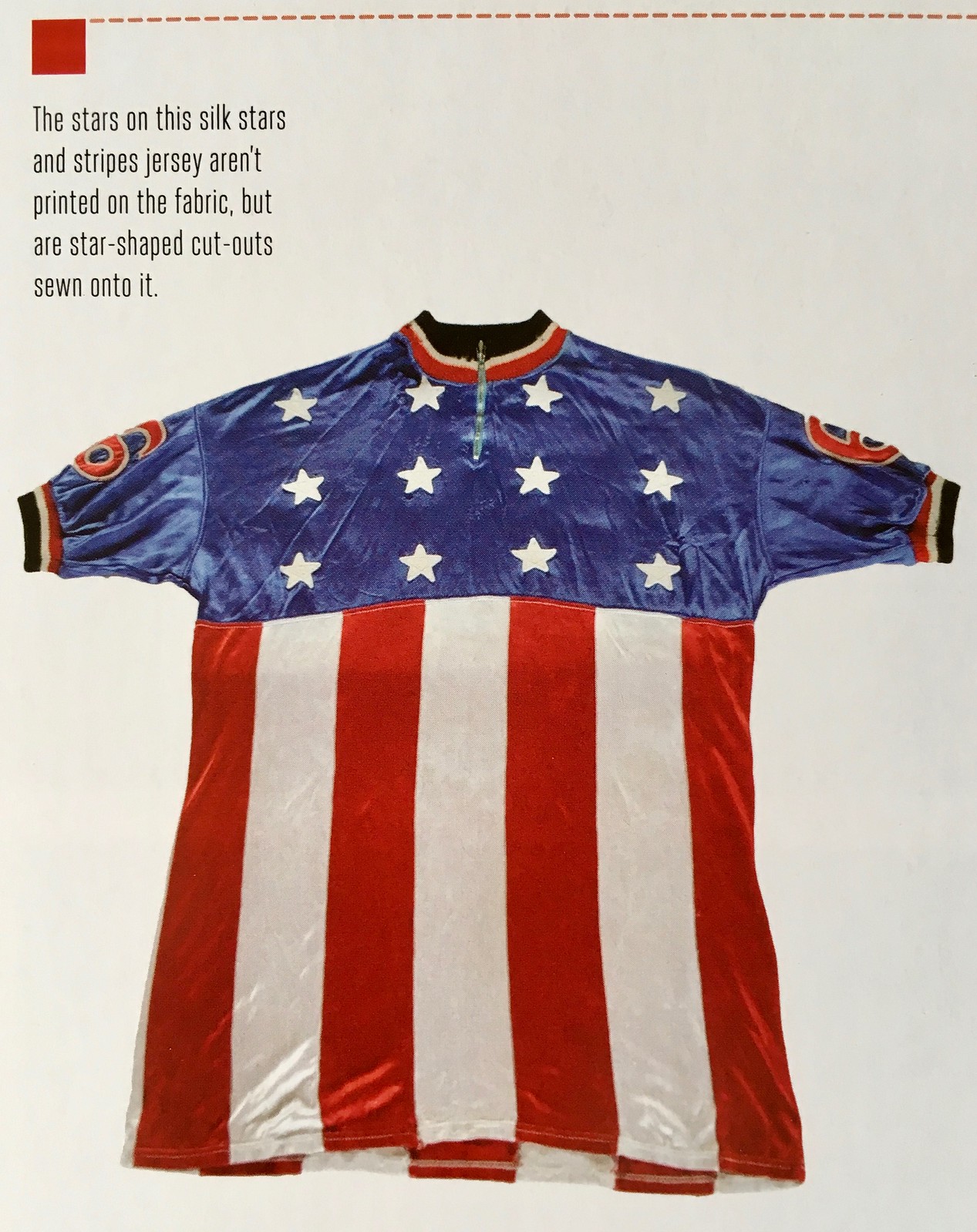
• The Brooklyn jersey’s flag-based motif is taken a step further in this spectacular star-spangled design:
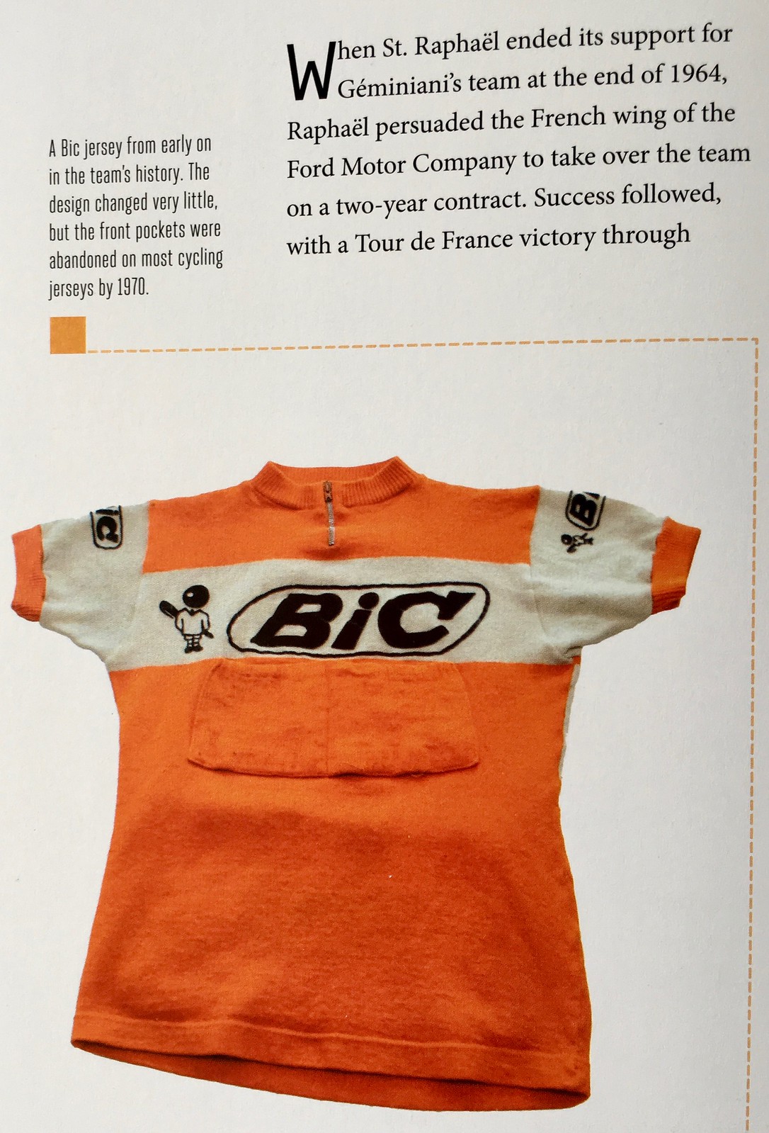
• Bic has been a big name in cycling for decades, but I still find it amusing to see the old Bic mascot character on a jersey:
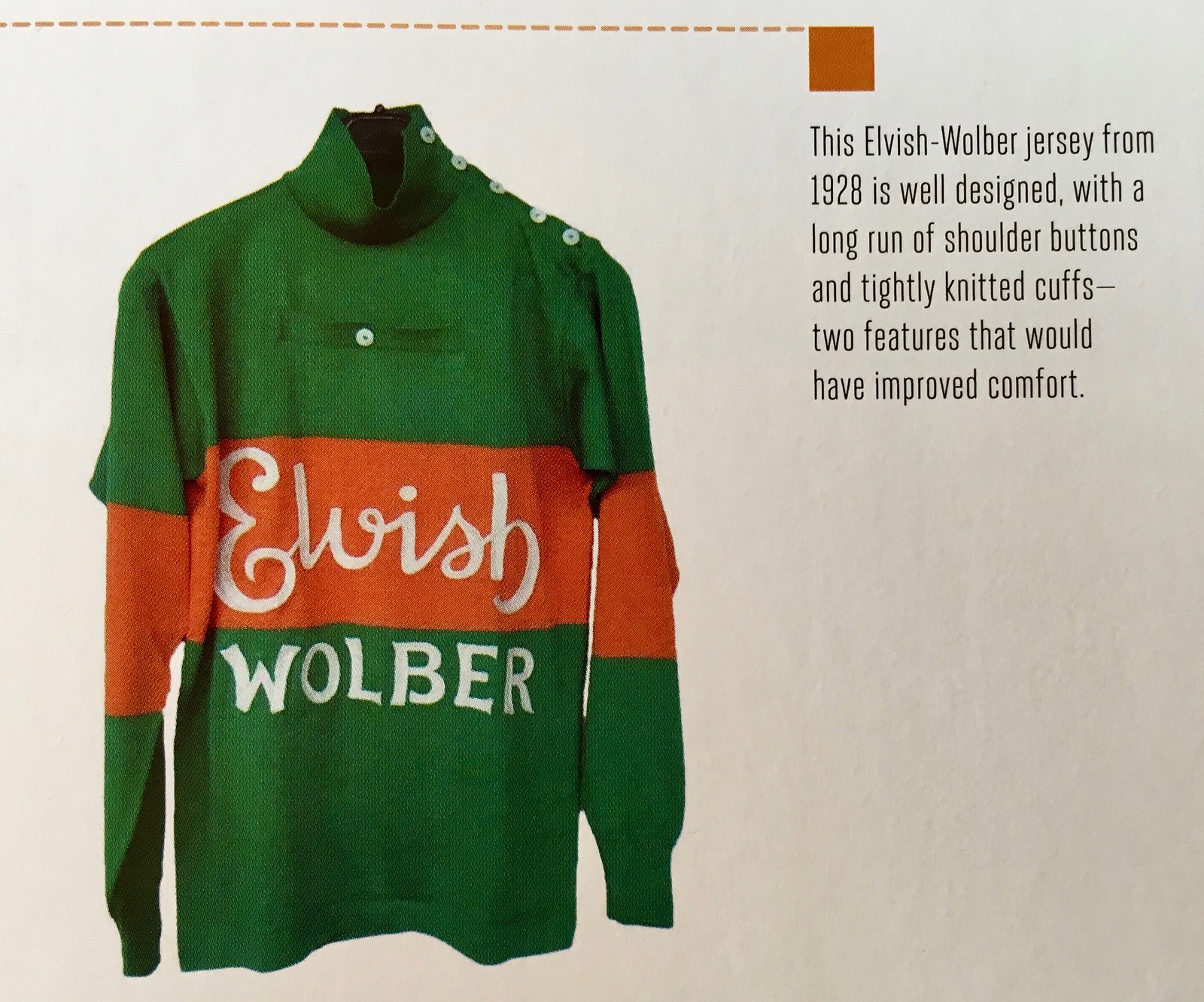
• Whoa, check out the button placement on this next jersey — seems like something our resident DIY genius, Wafflebored, would come up with, no?
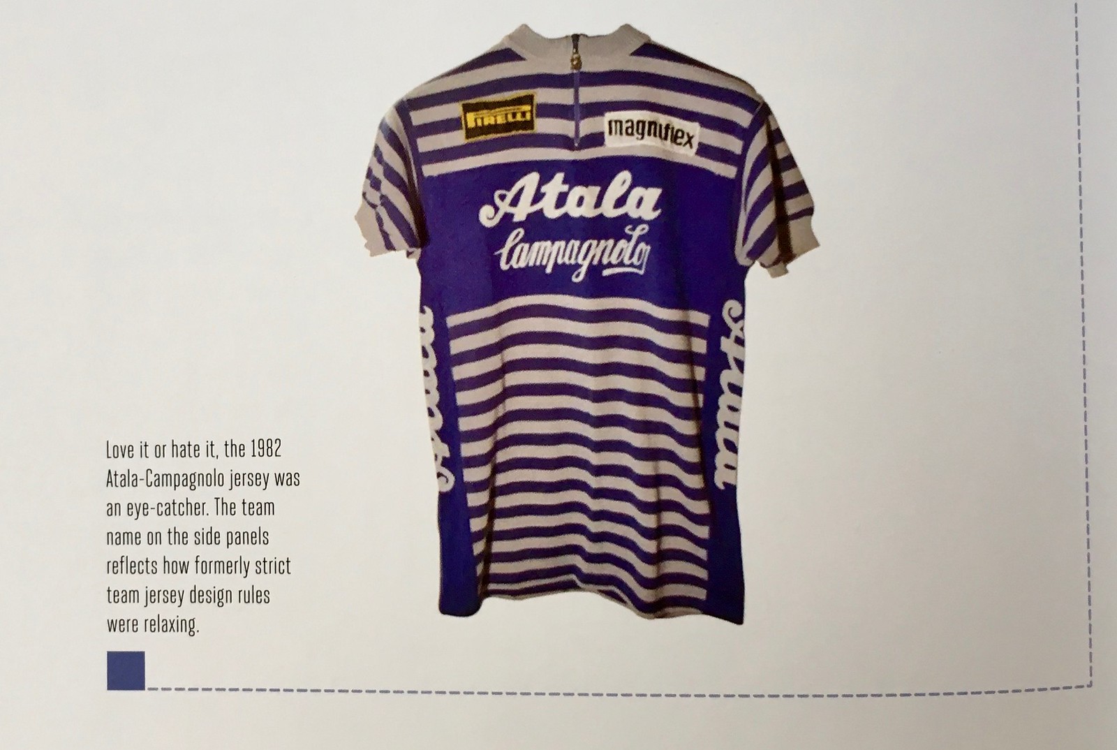
• Interesting photo caption on this next one, as the author notes, “The team name on the side panels reflects how formerly strict team jersey design rules were relaxing.” Sounds similar to what we might say about team names running up the sides of football pants (among other newfangled developments), right?
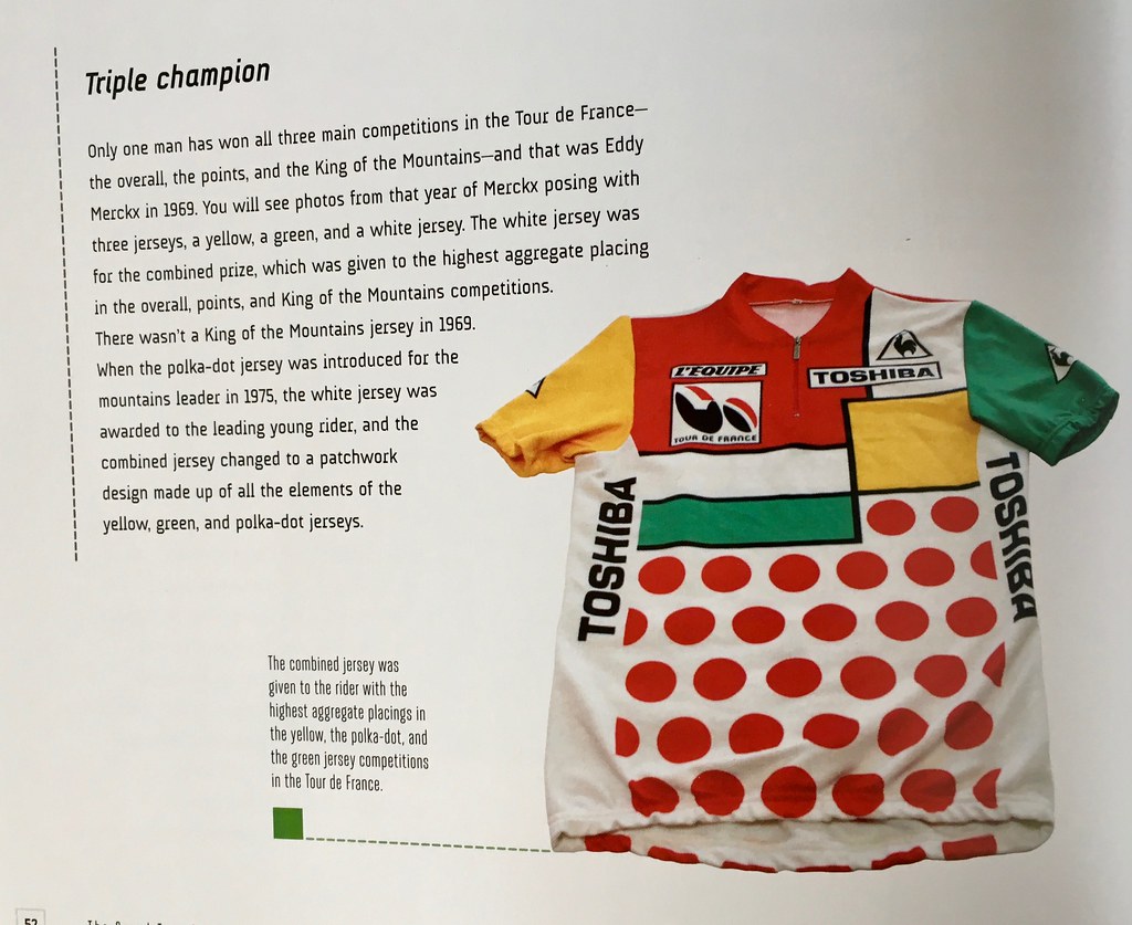
• This next one is ridiculously busy, but I still like it. It’s the caption explains, it’s a “combined jersey,” given to the rider with the highest aggregate scores in the Tour de France’s gold, green, and polka dot jersey rankings. The effect is a bit like polka dots on a Mondrian painting.
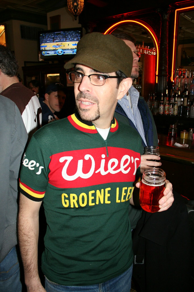
• One final note: As most of you know, I tend not to buy or wear jerseys, except for the occasional vintage find. A rare exception came in 2009, when I came across a website selling beautiful reproductions of old wool cycling jerseys. I bought one and wore it to a Uni Watch gathering in Pittsburgh later that year. I’ve almost never worn it since then because, as it turns out, there are very few situations that call for a short-sleeved wool sweater (on any given day, it’s usually either too hot to wear wool or too cold to wear short sleeves), but I still love the design, and I was happy to see the original jersey featured in this book. Here’s a shot of me wearing the repro jersey at the 2009 Pittsburgh party, followed by the jersey’s profile in the book:
Want to see more? There are additional photos here, and the book is available for purchase here.
Uni Watch News Ticker
By Phil
[Note: Several of these items came in over the weekend, so apologies if they’re “old” — PH]

Baseball News: On Memorial Day, a youth baseball team from Fairfield, OH, wore names of soldiers killed in action in a game (from Brian Henke). … Was it superstition or a Nats socks mixup? Douglas Adams notes “Looks like Gio Gonzalez missed the memo on the green socks.” … Nice looking Tequila Sunrise uni from Grand Ledge High School in Michigan (good spot by Scott Norman). … Check out this beautiful vintage Expos cap with the 125th anniversary pin in French (from Allen Yelent). … The Yankees’ AAA minor league team (the Scranton/Wilkes Barre RailRiders) have two holiday jerseys: The blue ones were worn for Memorial Day, and the red one will be worn for July 4th (from Michael Slesinski). … Saturday’s broadcast of the Ole Miss – Texas A&M game included some in-depth commentary on the Rebels’ powder blue uniforms and why they always wear them for night games instead of their road grays (from Kary Klismet). … Attention to detail! As they have done for the past several years, the Milwaukee Brewers adapt their helmet decal to the “special” occasion being celebrated by MLB (from Tom Ekstrand). … The Louisville Bats (AAA-Reds) became the Louisville Mashers for a night (from Josh Hinton). Here’s a few more good links. … The Phillies did not have sleeve numbers on their home Memorial Day unis, but they did on the road version (from Frank McGuigan). [Probably because their cream alts don’t have them either — PH]. … While inside he newly renovated Pirates Fanatics clubhouse store yesterday, Noah Kastroll spotted these Antonio Brown “crossover” jerseys. … Here’s a neat guide (by jersey), of the Men’s College Series matchups (from Chris Mycoskie and also Rex Henry). … Yesterday, White Sox hurler Hector Santiago wore a signed Memorial Day jersey (good spot by Mark Johnson). … Whoa! Check out the awesome unis (and especially the jerseys) for the 3rd Transportation Military Railway System Baseball Team, 1952 (from GOAT Jerseys). … What’s your verdict on this PawSox patriotic jersey? JBJ.Bandwagon has a definite opinion. … In this article from the Daily News, it notes last year MLB was criticized for a lack of transparency with regard to the camo uniforms. … This year they’re making things more transparent (from Tim Dunn). … British artist Andy Brown (who I’ve featured on Uni Watch several times), scored a nice article on how he “captures essence of baseball through paintings.” … Because they played a double header yesterday, the Mets and Braves wore their regular unis in the second half of the twin bill (from Glen Matthews). …(CROSSOVER) Rex and Rob Ryan were at Sunday’s OKC Dodgers/Nashville Sounds game. Rex wearing an old Sounds jersey and Rob wearing a Roberto Clemente jersey, from Alex Freedman (also posted in football). … There’s a Texas Rangers Two Tone Batting Helmet on sale eBay. John Leftwich notes, “Not the seller or affiliated with the seller just know you has some mention of this in articles around when they were worn!” Hard to believe this is from 2009. The helmet was scrapped before the season began.

NFL News: Interesting observation from Stephen Willeford who writes, “Was reading Peter Kings’ MMQB and say this picture from Carson Palmers’ office (?). There’s an autographed Aikman jersey with the body of the Cowboys road jersey circa 83-95 and the sleeves of the current road jersey.” He asks, “Have you ever seen anything like this? You would think a guy like Carson Palmer would be able to get a real jersey from the source, not an obviously fake jersey done by a collectible store.” … (CROSSOVER) Rex and Rob Ryan were at Sunday’s OKC Dodgers/Nashville Sounds game. Rex wearing an old Sounds jersey and Rob wearing a Roberto Clemente jersey, from Alex Freedman (also posted in baseball). … While the Steelers are expected to unveil a new third uniform this week, original reports (and thoughts) are that it will be the “Batman” jersey worn for two seasons. However, it may be that the team will wear unis from 1979. … You know something has gotta be out of whack if Todd Radom asks, “Is this a headline from The Onion?” Well, you be the judge. No, it’s true.
College Football News: Here’s a really bad interesting article listing the author’s 30 best college football jerseys. When I tweeted that, it got a lot of varied opinions of the list, most of which were not good.

Hockey News: Here’s a look at the Stanley Cup Finals Patch on the Vegas Golden Knights (from Al N. Kreit). … Absolutely no surprise here, but next season NHL teams will have third sweaters. … “Maybe I’m crazy but isn’t the use of the Blackhawks crest in conjunction with the American flag tone deaf?” writes Marc-Louis Paprzyca. … The Arizona Coyotes’ official third jersey will be revealed on 6/22 (from ticker-er emeritus Mike Chamernik).

NBA News: Now that his Cavs are (again) in the NBA Finals, Jimmer Vilk “Had this glass for a month and just realized the Cavs logo next to the Arby’s logo is from the wrong era.” … Speaking of those Cavs, here are larger and clearer views of the 2018 NBA Finals uniform patch (from Conrad Burry). … The Mavericks gave Justin Timberlake his own take on the logo (from Griffin Smith).

Soccer News: Here’s a bunch on new kit news, and each of the following four items comes from Josh Hinton: Valencia’s 2018-19 home kit has leaked; Benfica’s 2018-19 home kit has leaked; Here’s a good recap on FC Koln’s SEVEN kits during 2017-18 season; and, Chivas Guadalajara’s 2018-19 away kit has leaked. … The NWSL’s Chicago Red Stars wore NNOB warm-up shirts with rainbow numbers (from our own Jamie Rathjen). … More from Josh Hinton: a look at the boots worn in the Champions League Final between Real Madrid and Liverpool. Also from Josh, the USL has a new ball that will be used for the remainder of the 2018 season as well as the entirety of 2019. … Fulham and Aston Villa today wore special SkyBet Championship patches Sunday in the SkyBet Championship Playoff Final. The League One and Two Playoff Finals also featured it (Josh again). … “I know we recently had the British comic strip Roy of the Rovers in the Ticker because it’s being rebooted and the strip’s team, Melchester Rovers, got a new logo,” writes Jamie. “A picture of the new Roy Race (the main character) came out and you can see that Melchester’s kit quite clearly carries Hummel branding.”

Grab Bag: Even though most New Yorkers don’t have easy access to a pool or the beach, it doesn’t stop them from wearing flip-flops (sigh). Here’s an article on Flip Flops for the Greater Good (from Tommy Turner). … The Victoria Shamrocks are wearing new uniforms in the Western Lacrosse Association (WLA) this season. “The white uniforms were worn at their home opener against Burnaby Saturday night,” writes Wade Heidt. “The new uniforms feature black numbers and a bit of silver trim. Secondary “VS” logo makes its appearance on the uniforms now, on the shoulders and on the shorts.” Here’s what they wore for comparison. … An Elementary school in Sylvania, OH changed its nickname from Indians to Cardinals (from Tom Konecny). … Just in time for his trip home from Utah today, Delta Airlines will debut new purpleplum uniforms. … Johnny Canucklehead asks, “OK, need more info. Is Basilashvili trying to start a tennis player numbers trend?” … Tennis player Ken Nishikori will be wearing these two UNIQLO shirts during the French Open (from Blake Fox).
Collector’s Corner can be seen on the Uni Watch Facebook page today- it will return to this space next week.
Thanks to everyone for your patience this past week and change. Paul will return to his regular Uni Watching duties tomorrow.
Peace!
–Phil
Thanks for filling in, Phil.
Thanks, Jerry. Hope everything was OK the past week-ish. Cheers!
He was actually Philling in…
FYI, The article for the “Flip Flops for the Greater Good” only links to a lacrosse picture.
Thanks, fixed.
Proofreading:
Check out this beautiful vintage Expos cap with the 25th anniversary pin in French (from Allen Yelent)
Should be 125th anniversary
The Phillies did not have sleeve numbers on their home Memorial Day unis, but they did on the road version (from Frank McGuigan).
Link goes to Louisville Bats/Mashers Twitter entry.
Gah. Thanks. Should be fixed now.
Another bad link:
Now that his Cavs are (again) in the NBA Finals, Jimmer Vilk “Had this glass for a month and just realized the Cavs logo next to the Arby’s logo is from the wrong era.
Doesn’t have a proper URL; looks like the text was put in for the link instead.
link – link (good thing I looked up his Twitter feed)
Fixed.
Interesting to see the “combined” Mondrian-like jersey. It has Toshiba as a sponsor; they also sponsored the La Vie Claire team, with the iconic more overtly Mondrian inspired jersey: link
Re: the combined jersey.
The book is glossing over some stuff. The jersey only existed for a few years (1984-1989) and it includes a red patch for a red jersey awarded at the time for an intermediate (i.e., not at the end of a stage) sprints classification.
The combination classification existed on and off in the 60s and 70s, but without a jersey (or, as mentioned, with the white jersey).
Also, here’s the 2009 entry where Paul was tipped off about the jersey (which is pretty cool) he’s wearing in that picture: link
The link for 3rd Transportation Military Railway System Baseball Team, 1952 is wonky
Link should be:
link
Regarding the Aikman jersey, it would be more appropriate (and FAR more likely) to say that it’s a modern (1996 or later) jersey with the older-style number than it would be to say they put modern sleeves on an older jersey. Just think about that for a moment.
It’s also possible (maybe not likely, but it is within the realm of possibility) that it was a prototype that never hit the field, possibly a preseason version that was never worn due to the Cowboys’ preference for their white jersey.
Aside from the silver numbers, another oddity about that jersey is that the NOB is sans-serif. The Cowboys have used serifs on their NOBs since 1982.
Roy of the Rovers also has a shirt sponsor – The Totally Football Show podcast – link
If that’s true about the Steelers 3rd jersey, that will be likely one of the more subtlely different 3rd jersey in existence.
Forget our esthetics point of view and keep in mind the main objective of a 3rd jersey is to pump merchandise sales, the Steelers would be making a daring decision. i.e. The Batman uni from a merchandise sales perspective I have to believe would be the better choice?
For the lacrosse fans out there, the new Victoria Shamrocks uniforms are a downgrade in my opinion. The old Under Armour jersey was superior.
If they were going to change, one of my favourite looks they should have considered was their old just green and white uniform, featuring the jersey number in the shamrock on the chest:
link
However, new ones better than those old green and brown uniforms, as modelled here by former Syracuse lacrosse star Gary Gait when he played for the Shamrocks. Strange colour scheme (was it supposed to be bronze?) and 1990s design:
link
Yes to the jerseys in the first link, the old design with the number in the shamrock was so good. I also have fond memories of the old Payless era uniforms that were orange and grey.
New design is ok but not great.
I can’t wait to see alternate jerseys return to the NHL. That means I get to see the Lightning wear black again, which is a great thing!
Flyers in all black again?
Not a great thing.
The Flyers’ last proper alternate was orange with cream accents, so maybe that one returns instead.
RE: the Nats and the red socks with the “support the troops” unis, Tanner Roark did the same thing earlier in the weekend at Miami.
link
“Here’s a neat guide (by jersey), of the Women’s College Series matchups”
Link is actually a graphic of the Men’s College World Series match ups.
Can any cycling enthusiasts explain why cyclist wear “team” jerseys so often when they are just out for practice/fun rides? Do they simply have so many of them that they can wear them out for all of their practice rides? Is part of the deal with their advertisers that they are supposed to wear them any time they take their bike out?
I’ve always found it odd, and wondered why they aren’t just wearing regular training gear on their rides.
Professional riders are basically obligated to wear their team kit while out on the bike. Per this link, “Jobs are hard to come by in this industry. And no one would be foolish enough to jeopardise a life of sacrifice for something as silly as not wearing the items issued to them.”
link
One quirk that happens at the end of each year is that a rider will sign on to a new team for the following calendar year and start to train with that new team, but until end of the contract with the old team will have to keep wearing the old kit.
Thanks. Are there that many professional riders out there? I was more referring to people who seem to be part of a local team/club. They certainly aren’t professional in the sense that this is their job. Perhaps it is just a team pride thing when you are part of these groups?
You mean regular joes wearing, say, team sky jerseys? That’s seen as pretty dorky. What people will wear if they belong to a club is wear their club kit, it’s more about generating goodwill for the club/sponsor shop, and it’s generally pretty good quality stuff that costs less than retail
Thank Phil. That was what I was wondering. I kind of figured it had something to do with wanting to show some love for their sponsors and/or a club pride thing.
Wearing a pro team jersey, when you’re just a fan or amateur, is called “being a poseur”, and is pretty frowned upon by serious recreational cyclists. The greatest offense is wearing the world champion rainbow jersey or even having the stripes on your sleeves – big no-no. In California, wearing a California flag jersey will get frowns as that is the jersey for the winner of the Tour of California. It’s kind of like wearing an exact replica Super Bowl ring – you could buy it, but you didn’t earn it.
Interesting glove worn by #17 in the ticker post, very sleak. Is that the trend in lacrosse?
Meant this to be commected to Wade’s post
Yep – lacrosse gloves have become smaller and sleek. Similar to hockey gloves but even smaller and more like a form-fitting glove on the hand.
The gloves in the photo you mentioned are produced by Under Armour. Good looking gloves and now many feature the team logo. Here is a close up of the gloves produced by Under Armour for a fellow WLA team, the Coquitlam Adanacs, featuring the team logo:
link
“Nice looking Tequila Sunrise uni from Grand Ledge High School in Michigan (good spot by Scott Norman)”
Actually, they look horrible because the manufacturer apparently doesn’t know how to search Google to look at any of the thousands of Astros uniforms from the 1970s and get the striping right. If the number is split between the white space at the top and the stripes (or, in this case, the number is almost completely in the white space), then you’ve got too much white space at the top. This shouldn’t be hard, and yet almost all of the manufacturers get it wrong.
As an Astros fan, I would love to see teams wear this style at all levels, but not if the manufacturers are going to screw it up more often than they get it right.
Re NBA: Yikes… link
As aesthetically bland as the new NBA Finals typography is, cutting off a letter that can make it look like another letter as a result is just poor design in and of itself. And that’s not even considering the current political climate surrounding that particular organization that’s being inadvertently referenced as the result of that poor design choice.
And that’s all I’m going to say about that.
Absolutely love that World B. Free glass/jar.
1 of 4 glasses.
link
link
Those are just beautiful. I’d forgotten all about Campy Russell.
Proofreading – last item in the ticker, the tennis player’s name is Kei Nishikori, not Ken Nishikori.
Anyone else getting really intrusive ads today? Hidden videos a couple of times!
what’s wrong with flip flops? I never go to the beach either, but everyone in Florida wears them (figuratively) all the time.
I didn’t agree with many of the choices in the linked “20 best college football jerseys” article, but was pleasantly surprised to see the Carolina Blue home jersey of the UNC Tar Heels at #1.
It is perfect, and yes I’m biased as hell. :-)