[Editor’s Note: Paul is on vacation until May 30, but Ticker assistant Alex Hider is back today with the latest installment of his “Gone Too Soon” series. Enjoy.]
By Alex Hider
It’s 2003. Barry Bonds, a suspected steroid user, will win the third of his four consecutive National League MVP awards. Roger Clemens, a steroid user, will strike out 192 batters as a 40-year-old. Sammy Sosa, a steroid user, will be ejected from a game in June for corking his bat. Eric Gagne, a steroid user, will go 55-for-55 in save opportunities and win the National League Cy Young Award.
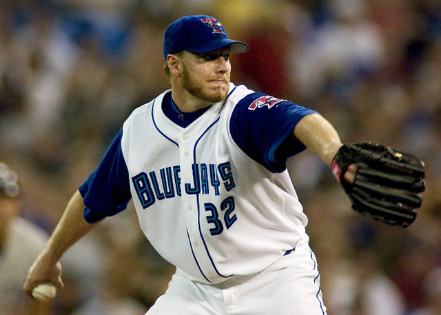
And the Toronto Blue Jays will introduce T-Bird — clearly a steroid user — as their new primary logo.
The Blue Jays first began using the brawny bird in 2000 on their spring training and batting practice caps. The logo appeared on a rather clunky alternate jersey with contrast-colored sleeves in 2001 and 2002 (it wasn’t a vest; the sleeves blue sleeves were part of the jersey), and it finally took center stage as the Blue Jays’ primary logo for one season in 2003.
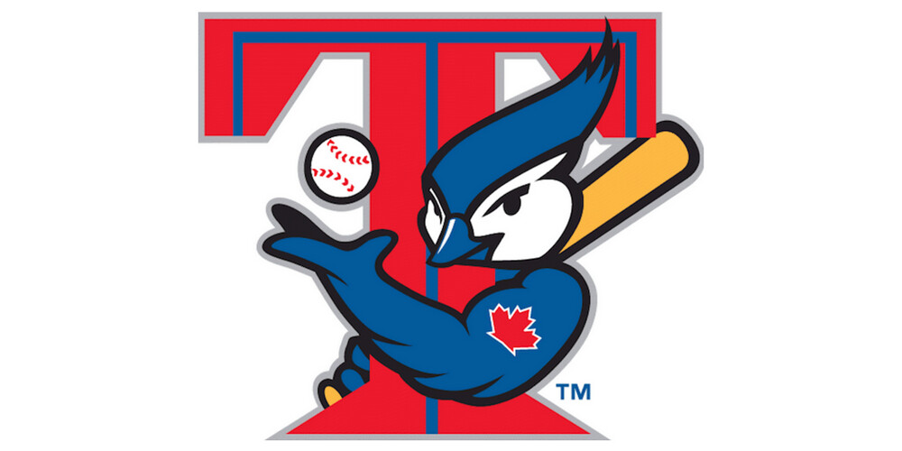
If there’s a sports logo that better represents the era in which it was used, it’s news to me. The huge biceps, the Popeye-like maple leaf tattoo, the “Yeah, I’m juicing, who gives a fuck?” smirk. Even the feathered hair coif reminds me a bit of Brett Boone’s frosted tips. The only things that could make the T-Bird logo more 2003 would be a Mark McGwire goatee and a pair of cargo shorts.
Sure, it’s a cartoonish, silly, and over-the-top logo. But in a league where 85 percent of the caps contain nothing more than a few ornate letters, it was a breath of fresh air.
The addition of the T-Bird logo improved what was already a solid set. The lettering made heavy use of inlining — a Blue Jays staple. The sky blue/royal lettering worked especially well on the white home jerseys — even better, in my opinion, than their current blue-and-white lettering (gasp!).
The light blue really pops against the white jersey and the royal blue outlining.
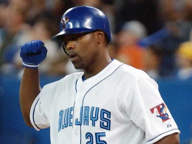
The 2003 Blue Jays also continued the team’s late-’90s push to include red, especially on the team’s blue softball top. The blue jerseys included a red headspoon, red outlining on the lettering and numbers, and a red-billed cap. The lettering could have been punched up a bit with light blue inlining, but it is what it is.

The addition of red was very au courant at the time, with the Pirates, the NBA’s Sonics, and others also adding red to their palate in the late ’90s.
I know the use of red is controversial among Blue Jays fans — many feel it should be reserved for the Maple Leaf and Canada Day. But red or no red, the 2003 set was the last splash of color Jays fans would get for almost a decade. Toronto would switch to their drab BFBS and GFGS J-Bird set in 2004, which would remain in place until their unveiled their current, gorgeous threads in 2012.
Playing in a stacked division with the Red Sox and Yankees, the 2003 Blue Jays finished 10 games above .500 but missed the playoffs. Still, the late, great Roy Halladay won his only American League Cy Young Award that year, thereby ensuring that the T-Bird unis would hold a lasting place in Jays lore.
The 2003 baseball season was one of the most bizarre and beautiful in baseball history. It brought us Bartman, Boone, and one of the biggest upsets in World Series history. It’s only appropriate that the MLB’s most eccentric modern logo lived its entire life as the Jays primary logo in that 2003 season.
It’s probably unlikely we’ll ever see the T-Bird in an MLB game ever again— the Jays’ current set is universally beloved, and today’s steroid testing procedures is much too rigorous. But a number of teams have revived old logos in recent years for use on batting practice caps. What better way to get Josh Donaldson jacked for BP than with a jacked logo?
The Ticker
By Jamie Rathjen

Baseball News: The Class A Lansing Lugnuts had a jersey giveaway with an advertiser-on-back (thanks, Kris). … The Royals also had a jersey giveaway for Lou Piniella Day (from Matt Shevin). … Dodgers catcher Yasmani Grandal was wearing some kind of rainbow-tinted visor on his helmet yesterday, which Nationals TV analyst F.P. Santangelo believed was to protect from overhead sunlight. … Reader Kary Klismet caught some uniform commentary from the announcers on a Creighton/California game. Unfortunately, they didn’t mention the Cal player’s stirrups, but they did mention his team’s half-striped pants. … Also posted in the Grab Bag: Mike Wissman was at the Preakness Stakes and noticed that it looks like some of the grandstand seats have the Dodgers logo on the side and may have been recycled from Dodgers Stadium. Anyone know more? … Steve Johnston says that White Sox fans who check in at the stadium a certain number of times with the MLB Ballpark app receive giveaways, one of which was a colorized poster of the 1901 AL champions. … The AAA Albuquerque Isotopes had an elaborate grass pattern yesterday (from Dan Pfeifer). … Reader Ray Hund found this vintage United Airlines/baseball poster.

Football News: Several readers sent in more observations on this picture of NFL rookies from yesterday’s Ticker: Patriots running back Sony Michel is wearing No. 1 because the team hasn’t assigned uniform numbers yet. Also, the interior lines in the Buccaneers’ number font are missing from running back Ronald Jones’s No. 27, and Saints wide receiver Tre’Quan Smith is wearing an older jersey with the two-tone collar. … On the same subject, pictures of Broncos rookies on the team’s Instagram page feature the Flywire collar, which led Phillip Allen to wonder if the Broncos are going back to that style. Several readers noticed that teams like the 49ers and the Giants posted equivalent pictures that also featured the Flywire collar, which also led them to ask “is team X going to wear the Flywire collar in 2018?” I’m not sure we’re able to answer that with Paul not here. … The CFL’s Saskatchewan Roughriders added “Humboldt Strong” to the back of their helmets for training camp (from Moe Khan).

Hockey News: Reader Mike Engle tells us that the Stanley Cup-winning team won’t wear black helmets for the first time since the Hurricanes in 2006. The Golden Knights’ helmets are white and the greyish color of their home jerseys and the Capitals and Lightning both wear blue and white helmets. … Vermont’s women’s team has numbers in the center of the collar (from @OlegKvasha). … Canucks center Adam Gaudette played in a charity game in his hometown of Taunton, Mass., but wore his white Canucks helmet with the game’s uniform (from Jordan Mayblum). … Also posted in football: the CFL’s Saskatchewan Roughriders added “Humboldt Strong” to the back of their helmets for training camp (from Moe Khan).

Soccer News: New kit/shirt roundup: for national teams, there’s Denmark (first and second shirts), Senegal (first), Canada (first), New Zealand (first), the Netherlands (first and second), and China (first and second, which is probably the pick of the bunch here). For clubs, there’s the NWSL’s Houston Dash (second kit), Spanish team Valencia (second, worn at home) and their opponents yesterday, relegated Deportivo de La Coruña (third), French team SM Caen (first), English League One team Rotherham United (first), and Scottish Championship team Dundee United (first). … Josh Hinton has for us a look back at all the 2014 World Cup shirts. … The New England Revolution became yet another MLS team to change at home, but unlike the other teams doing so, they don’t have a new second kit this season. … Hibernian and Celtic’s women’s teams both changed in the Scottish Women’s Premier League Cup final, just as their male counterparts did when meeting in the men’s League Cup last fall. … New York City FC striker David Villa was honored for his 400th goal as a professional with not just a NYCFC No. 400 shirt, but also shirts of his former teams and Spain with each shirt featuring the number of goals he scored for the team in all competitions.

Grab Bag: Reader Mike Wissman was at the Preakness Stakes and noticed that it looks like some of the grandstand seats at Pimlico have the Dodgers logo on the side and may have been recycled from Dodgers Stadium. Anyone know more? … Geoffrey Miller made a great Uni Watch-inspired paint scheme for this week’s edition of his iRacing league, which is at Charlotte ahead of the Coca-Cola 600 (hence the UW “Pandering” shirt theme).
Dodgers seats at Washington State? link
Great post Alex, it was a real fun read.
I can’t find it quickly, but Uni Watch once raised – and eventually solved – a similar question of LA logo seats at RFK Stadum in Washington, DC. The resolution, as I recall, is that a seat manufacturer used the crossed LA logo as its maker’s mark, which explains the proliferation of LA-logo seats across facilities built or renovated in the 1960s and 70s. However, at least one collegiate stadum claims to have purchased used Dodgers seats during a renovation of Dodger Stadium.
Would that be Washington State (see comment above) or another?
What a memory! September 2010: link
Look at that 2010 scorebug…perfect!
Typo right off the bat….pretty sure Paul will be back on May 30th.
I’m guessing you mean hair quaff instead of hair coif.
Even if Paul is out of town, there must be someone reading this who can do the old “thanks, fixed.”
Yeah, I can.
Thanks, fixed.
Red Wings won the Cup in 2008, no black helmet.
Exactly. Although I think they meant that 2006 was the last time neither team had a black helmet.
Actually, good catch. Thanks. I was thinking about the eventual winner and forgot about Detroit. I was not thinking about the eventual black-free matchup, but that is true also because Detroit went against Pittsburgh and before that, it was Ottawa and Anaheim. You two are both right and I am completely wrong.
To expand on the color helmet topic:
Going back to the 1974 Finals (the earliest where I can confirm from online video at the moment that both teams had at least one player wearing a helmet), black has been the most dominant color, with 46 teams appearing in the Finals with them, and 21 winners. In second place with 27 finalists and 16 Cup winners is blue (including navy, and including whichever team comes out of the East this year). Red is a distant third with just 10 appearances and 6 wins. The Minnesota North Stars gave us the only two appearances of green helmets to date, both losses. And the Golden Knights’ gray will join the 2017 Predators’ golden yellow and the 2003 Mighty Ducks’ eggplant purple as single-year (to date) dark helmet colors.
However, black wasn’t always as dominant. Blue dominated up until the Panthers’ loss in 1996; shades of blue accounted for 22 finalists, and all 16 wins to date, with the Rangers being the most recent Cup winner with blue helmets in 1994. Black was a close second with 19 finalists, but only 6 winners, and no winners between the 1975 Flyers and 1991 Penguins. After 1996, however, black has dominated with 15 winners, and the other five winners in that time having all been red.
Now, as for the helmets actually worn in Cup-clinching games by the winning teams (again, 1974-2017 inclusive), white dominates with 23 instances. Black is second with 11, then blue with six, and finally, red with three.
Excellent classic Uni Watch post, Rob S! Hats off to you, sir. (Or should that be helmets off?)
As a traditionalist who thinks baseball caps should have a stylized letter rather than a logo, I really liked it when Toronto switched to that cap, even if I wasn’t a big fan of that particular design. I’ve always thought Toronto would look much better if they just used their signature, inline T on the cap. Maybe an updated version of the steroid bird as a secondary logo for them.
Strongly dislike that Jays logo: it is more akin to a minor league or kiddie fan club logo. As long as it has the more traditional jay head with maple leaf on the cap, no other objections to the rest of the uniform!
I feel the same way.
To me, that logo looks like something you’d see at a theme park that wasn’t authorized to use copyrighted logos.
Paul’s on vacation until June 30….I guess he’ll miss Brannock Device Night ;)
The note preceding today’s entry says Paul will be gon until June 30th. He’s due back May 30th. Not June.
Grandal
link
Man I really miss the Sonics. Didn’t like the red jersey though.
Darrin Fletcher’s catcher’s helmet still had the old logo, not Roidbird.
Further to the Saskatchewan Roughriders wearing “Humboldt Strong” on the helmet back bumper in training camp, the Riders will be holding a practice and barbecue lunch in Humboldt on June 3.
link
RE: NFL rookie photo…..
Just my OCD or eye for design, but I hate the fact that they have 5 helmets centered in the front, but the 5 players they reprsent are NOT centered in their row.
AAaaagh!!
Great lede, Alex! 2003 was my favorite year for baseball.
If there’s a sports logo that better represents the era in which it was used, it’s news to me.
This will get me going down a rabbit hole. Maybe the mid-1970s Denver Nuggets…
link
… or any logo from the 1970s WHA
link
Man, the socks, shoes and basketball in that Nuggets logo — I think you may have me beat there!
I think the Philadelphia/Baltimore Stars are fairly quintessential 80s.
link
Fantastic. It’s like they just found out about gradients.
I’m going to be frank and say that 13 year old me absolutely adored the red-splashed Pirates.
Never cared much for it, myself, but I was closer to 23 when it happened.
It’s kind of funny how many times the Pirates have changed their pirate mascot logo. link; link; link; link (actually dating back to link); link.
As a general rule, I never liked the Pirates with red. But for some reason that I don’t think I’ll ever be able to explain/articulate, I loved this monstrosity:
link
Red as an accent to the black and yellow wasn’t awful, but in the context of it being the Pittsburgh Pirates, and the city having black and yellow across the board, it was a misstep. If they were say, the Indianapolis Pirates, I would have been on board with adding red as an accent color.
With the Saints and Seahawks also having flywire collars in that photo, I am assuming they must have a set of old jerseys or something they use for that photo shoot. I highly doubt that many teams would take a step backwards. If so, that may explain Paul’s vacation.
Grandal has been wearing that visor since day one of the season. Nothing new… just move along.
Hasn’t been mentioned here before and not everyone’s a Dodgers fan.
At the rookie photo shoot, both Dolphins players are wearing the old uniform set with the navy stripes and faded orange. Did the team send them the uniforms or is this something the NFL just pulls out of their closet for them to wear?
Here is Mike Gesicki’s premier card shot:
link
The 2003 World Series was an upset? That’s news to me.
Yeah, us Cubs fans were real upset!
WOW! Similar to the Cleveland Browns phantom “CB” helmet, does that United Airlines poster contain a phantom Milwaukee Brewers hat that we’ve never seen before? (Fourth row, last one.) It appears to be a navy cap with a red “M”.
Not that I always trust Wikipedia, but from Wikipedia: “The first Brewers uniforms were “hand-me-downs” from the Seattle Pilots. Because the move to Milwaukee received final approval less than a week before the start of the season, there was no time to order new uniforms. Selig had originally planned to change the Brewers’ colors to navy blue and red in honor of the minor league American Association’s Milwaukee Brewers, but was forced to simply remove the Seattle markings from the Pilots’ blue-and-gold uniforms and sew “BREWERS” on the front.”
So, although they didn’t have time to order navy and red uniforms, did they quickly create a navy and red cap? Is that cap from the poster airbrushed? With such a short window, how could that cap possibly have ended up on this poster?
If this topic was covered in previous years, I must have missed it. Any thoughts anyone? And have we seen any examples anywhere of phanton navy and red Brewers apparel?
This poster would be from 1970, so I think your theory on the Brewers cap is correct. Also of note: The Oakland A’s hat isn’t correct for 1970 (the ’69 cap was solid green with a letter A; in ’70 the cap had a yellow brim with a letter A and apostrophe s.) Did they try to airbrush ths “‘s” onto the ’69 cap? Also, why aren’t Kansas City and San Diego displayed on the poster?
“…why aren’t Kansas City and San Diego displayed on the poster?”
I think the then-owner of the Padres owned or held interest in an competing airline; later, Ray Kroc entered into the charter airline business:
link
The Royals may have had an arrangement with mid-west based Ozark Airlines.
It’s possible Bud Selig had prototype hats ready to go, but then had to scrap them to get hats that matched the Pilots uniforms since he had less than a week of turnaround from finally closing on his purchase of the club, to Opening Day.
Of course, they would’ve had Selig’s desired new uniforms in time if the sale had gone through the previous fall. But Washington’s two U.S. senators conspired to force the Pilots to try to find a local buyer, until the team was finally forced to declare bankruptcy in the midst of spring training.
Not a fan of the 2003 Blue Jays set. Feels ‘minor league’ish’ to me. It’s hard to improve on the white paneled front cap (with the original logo) look. Not a Jays fan and I still wore that cap through 4 years of college. Thought it just looked good… Even their modernized recreation of that original logo isn’t as good. Oh well. – and seriously? RED??? They’re the *BLUE* Jays. The Canadian flag reference is a flimsy reason to add a color. What’s next? The Mariners adding bright green to match Washington’s state flag?
I never liked those Jays uniforms, though what came after them was colorless and infinitely worse (though if the link had been real…). The number “4” looks particularly weird and trying to do the NOBs in the full two/three layers didn’t work.
I think they had the best look at the very beginning, with that distinctive number font and lots of powder blue. Just stick with that.
Discarding the argument for removing NOBs altogether, I generally prefer single-color NOBs just because they look so much cleaner than their multilayer counterparts.
I also was never too crazy for that 1997-2003 Blue Jays font. It seems like they tried to merge concepts from their original font onto a modernized version of Futura Display. It just never felt right to me, but it was still better than the Gray Jays that came after it, and the weird decision to have the numbers on those jerseys in the Crillee font.
The Revs wore their change jersey at home for a Support The Troops event held the past few years where the jerseys are auctioned off after the game. They included special/patriotic-colored names and numbers that were nearly impossible to see on TV. Not sure why they couldn’t use the blue jersey.
I was at the game and they were difficult to read. It was also raining so that may have had an effect. Maybe they had excess stock from Adidas as they wanted to burn them? Most of the blue teams in MLS opt for the light sky blue instead of the navy the Revs wear so they don’t need to wear the change kit as often. Columbus wore yellow so there was no clash.
Oh, I didn’t even see the numbers, but boy are they kind of bizarre.
link
Totally random: link!
Hmmmm… Might that actually be a Cincinnati Bearcats warmup?
No USA Soccer uniform updates for the World Cup?
Oh wait…
Ha ha, I’m sure you think that’s hilarious. Regardless, the USA 2018 kits were released in March…
I follow a real sport. USA Rugby.
The Deportivo La Coruna is an interesting one. I don’t know if it’s commonly known, but they are in a region called Galicia and they actually have their own language distinct from Spanish (I’m not a linguist, but I think there are academic arguments about whether it’s really it’s own language or if it’s a hybrid of Portuguese and Castilian Spanish). My parents are from a village bordering Portugal and Galicia, and communicating is pretty seamless for folks in those areas. Another interesting note is that highway signs will often include both Castilian and Galician location names (La Coruna in Castilian and A Corunha in Galician, which is how Portuguese would write it as well)
Yup, that’s a Galicia-themed shirt where the blue sash is made up of the words of the Galician anthem.
More from the NFLPA Rookie Premiere: DJ Chark in the new Jags helmet but the old uniforms.
link
Looking at the mlb.com schedule for tomorrow link and noticed all the logos had the ™ or ® symbols except San Diego. All the logos are cap logos (?) except the Cubs, which is the jersey logo. But the logo they have has the ™ symbol instead of the ® symbol that is found on the jerseys. I think Paul might’ve covered the Cubs logo having the ® symbol before…
I never knew about those unis, and I like them. Great read, Alex!