Two big NFL teases yesterday, as various media outlets reported that the Steelers and 49ers will both be unveiling new additions to their wardrobes in the near future.
Let’s start with the Steelers, who will unveil their new throwback look on May 30 at 2:30pm. We’ve known for quite a while now that the team would be adding a new retro look to replace their bumblebee throwbacks, and now we’ll finally find out if they’ll be going with the Batman design (which I’m definitely hoping for) or something else.
The 49ers news is more of a surprise, because I hadn’t heard anything about them tinkering with their uni set this year. But according to SB Nation’s 49ers blog, the team will be adding a new alternate uni for 2018. While no unveiling date has been confirmed, the team’s annual State of the Franchise event on the night of May 23 — that’s next Wednesday — is a strong possibility.
What might this new design look like? As noted in the SB Nation report, 49ers wideout Marquise Goodwin tweeted a photo of himself earlier this year that had been Photoshopped to create a mono-white uniform, so that’s one possibility. I know a lot of fans would also welcome a return to the throwbacks that were worn in 1994. But hey, we all remember what happened the last time the Niners unveiled a new design. Here’s hoping they come up with something better this time around.
Click to enlarge
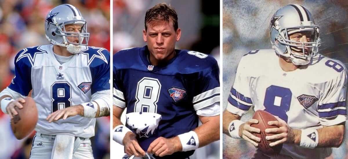
How low can he go: Check out these three 1994 shots of Cowboys quarterback Troy Aikman in three different jerseys — all with the NFL diamond anniversary patch riding v-e-r-y low.
I watched a lot of football that season, but I have no memory of Aikman wearing the patch like that. I only learned about it last night, when Twitterer @atxaggie07 pointed me toward a tweet from fellow Twitterer @rcb05, who said:
I was meant to be a uniform nerd because I remember the fact that Troy Aikman’s 75th-anniversary patch [being] lower than everyone else’s always really bothered me. (He had them put it lower because he used that part of the jersey to wipe his face.)
Then subsequently, I got this authentic jersey for Christmas that year, and the fact that the patch wasn’t lower like it was his on-field jersey bothered me further.
That’s pretty awesome. Nearly 20 years of writing about uniforms and I’m pretty sure this is the first time I’ve ever heard that about Aikman’s patch.
I believe the Cowboys wore only one other jersey patch during Aikman’s career: the Tom Landry memorial patch, which appeared in 2000. Did Aikman wear that one lower than everyone else too? Nope. Maybe he’d come up with a new face-wiping routine by then.
Click to enlarge
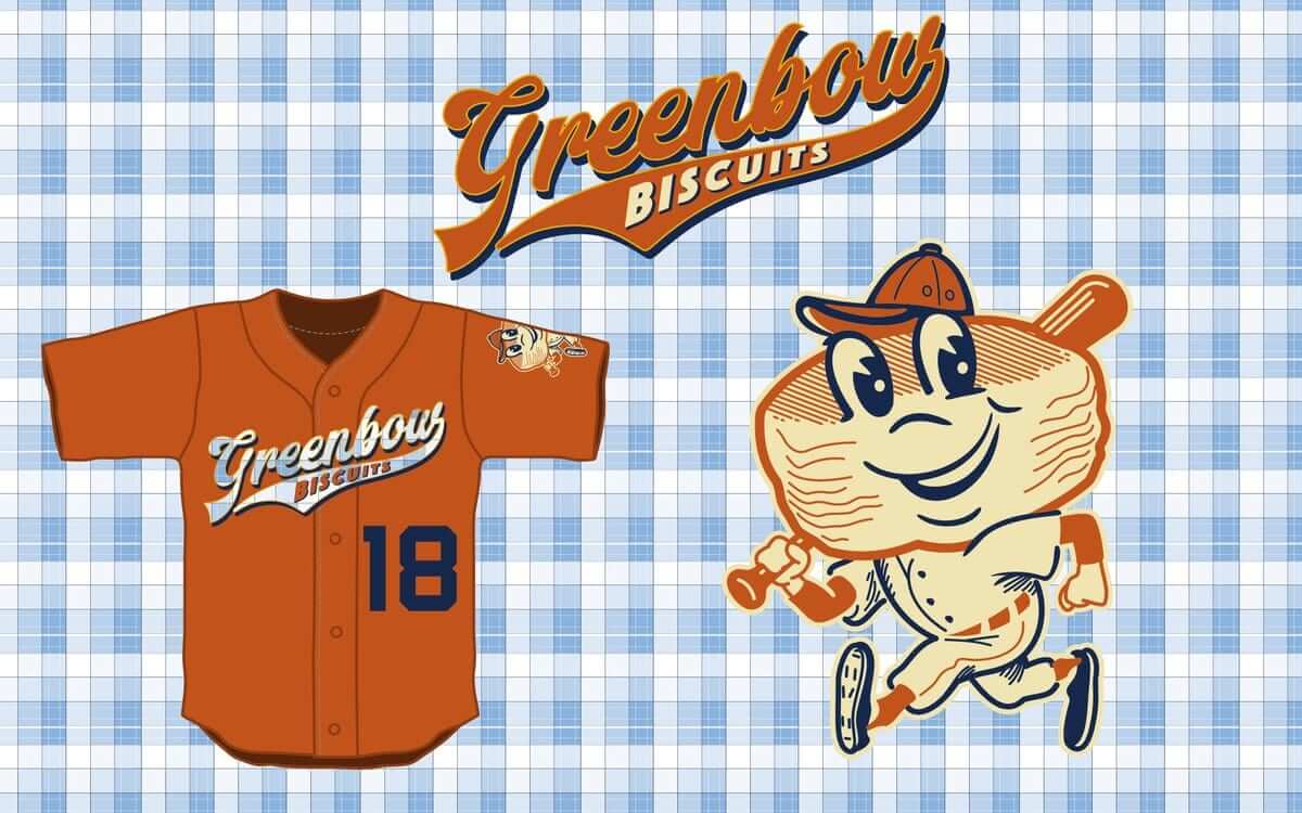
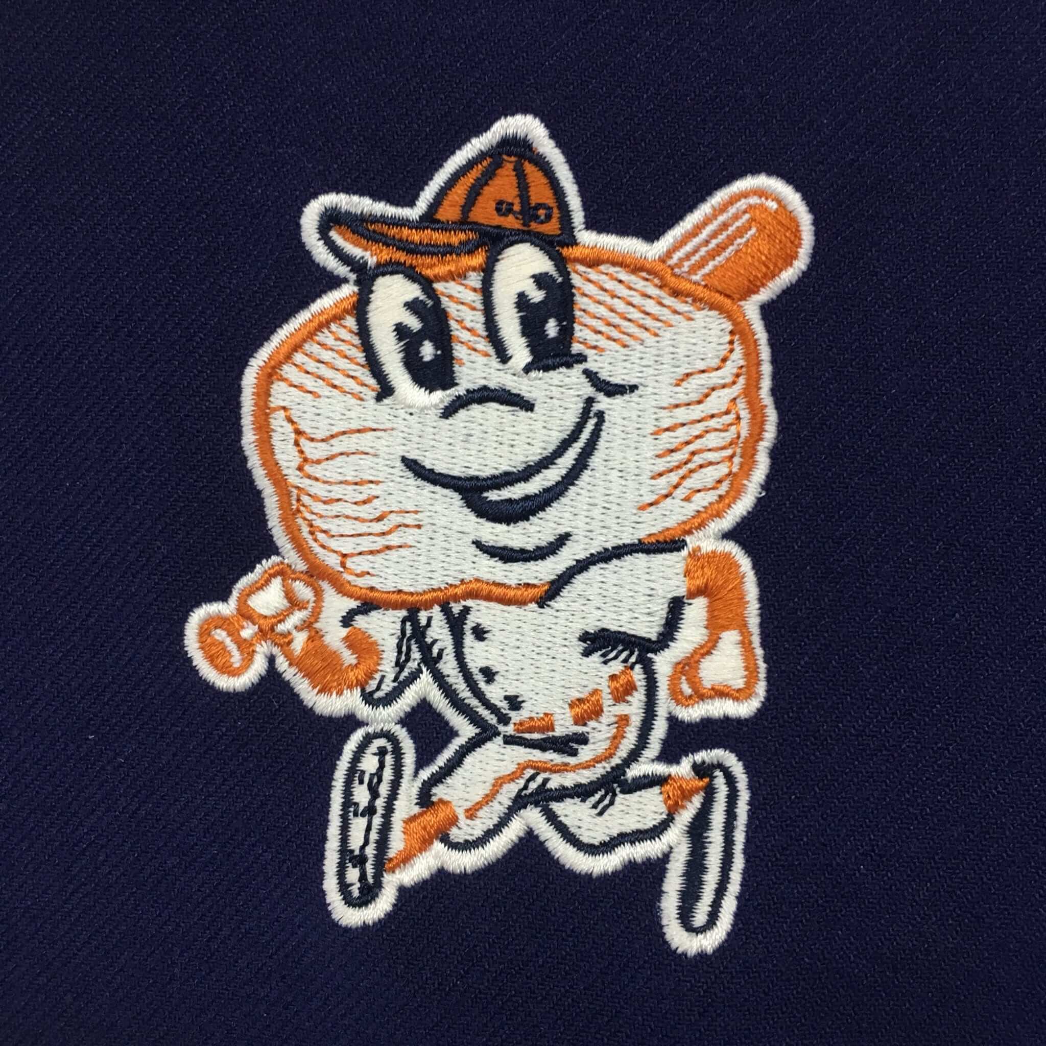
Tasty: What’s even better than the Montgomery Biscuits’ anthropomorphized biscuit mascot? I used to think the answer was “Not a goddamn thing!,” but it turns out that the answer is actually “The Montgomery Biscuits’ new fauxback anthropomorphized biscuit mascot, that’s what!” That’s him up above, as part of a one-day fauxback makeover that the team will be doing on June 1. Man, is that hot-cha-cha or what? True, he doesn’t have a butter pat for a tongue like the standard mascot does. On the other hand, however, he has stirrups! Let’s call it a wash.
The promotion apparently has something to do with some movie that I’ve never cared about, but forget about that and just feast your eyes on how awesome that biscuit fella looks when rendered in embroidery (click to enlarge):
Credit where it’s due: The Brandiose guys have taken their share of flak on this website, but they totally nailed this one. Standing O.
Purp Walk recap: Big thanks to everyone who made Purple Amnesty Day so much fun yesterday. We sold a boatload of caps (71), stickers (19), and memberships (16), all of which was nice, but what I really liked was seeing how many people participated in their own way by tweeting photos of purple-clad teams, or wearing purple clothing, or even dyeing their hair purple!
I love that my admittedly eccentric antipathy for a particular color has spawned its own little subculture. It feels like one of the real triumphs of the Uni Watch community. Thanks again.
The Ticker
By Anthony Emerson

Baseball News: Oakland’s Matt Chapman had his Mother’s Day pink ribbon patch on his jersey last night. The A’s last wore the green alternate jerseys on Mother’s Day. Another look here, and an image of Chapman on the bench with his ribbon-less teammates here (from Richard Paloma and @ThatBabyIsGone). … Check out Manny Machado’s bat knob decals (from @SuperMonicaco). … USA Today ranked the 27 “ugliest” uniforms in MLB history. Some of their choices are a bit odd, to say the least (thanks, Phil). … The Buffalo Bisons will become the Buffalo Wings on June 14-17 (from Nick Veronica). … The Hartford YardGoats went with pink jerseys for breast cancer awareness last night (from Ben Teaford). … The Altoona Curve wore jerseys designed to look like doctors’ coats over scrubs for Medical Professionals Night (from Yancy Yeater). … The Worcester Bravehearts are asking fans to vote on which iconic Worcester business the team will honor via uniform: George’s Coney Island Hot Dogs or Table Talk Pies (thanks, Phil). … Tolman High in Pawtucket, R.I., wore 1988 throwbacks against rivals Shea (from Anthony Gonsalves). … New Era has come out with a line of caps from the 1999 futuristic uni series. It’s not clear if there are plans for them to be worn on the field (from Ben Dodds). … The Peoria Journal Star is trying to determine the best high school baseball uniform in central Illinois. … Last night’s Orioles/Red Sox game was a make-up for the rained-out Patriots Day game, but the Sox did not wear their “Boston Strong” alternates that they would have worn on the holiday (from Kevin McLaughlin). … White Sox coach Daryl Boston was using a whistle in the dugout to position outfielders and recognize good plays, but he’s now been told to scrap the whistle (from Mike Chamernik).

NFL News: This photo of Saints DL Cam Jordan holding onto a strand of Lions RB Ameer Abdullah’s jersey was named the best action photo of the 2017-18 NFL season by the Pro Football Hall of Fame (from Mike Chamernik). … The Ravens are reducing the price of concessions in an attempt to combat low attendance (from Andrew Cosentino).

Hockey News: Swedish gold against Latvian burgundy in the World Championships made for one pretty color-vs.-color matchup (from Tim Roberts). … Toronto Marlies G Garrett Sparks’s new mask features a tribute to the late Humboldt Broncos goalie Parker Tobin (from Will Leslie). … Here are some thoughts on what a Devils alternate jersey might look like for next season (from Phil).

NBA News: Some of the new NBA Draft caps appear to have patches on the side (from Moe Khan). Conrad Burry, however, can confirm that the Grizzlies hat in the photo is not the actual Grizzlies draft cap. … So, Nike is selling an “authentic” ’98 Michael Jordan Bulls jersey, but of course it includes a maker’s mark. It’s probably “authentic” to 2018 specifications rather than 1998, but still, talk about logo creep (from Josh Jablonski).

College/High School Hoops News: Whoa, check out this gorgeous DePaul jersey from the 1950s! (From Joe Flynn.) … Beautiful art on this high school basketball schedule from 1967 (from Tanner Liby).

Soccer News: An eventful week for the red half of Madrid: Atlético Madrid won the Europa League on Wednesday and on Thursday had both their new home and road kits leaked to FootyHeadlines. … Portuguese champions FC Porto have had their new kits leaked (from Josh Hinton). … Werder Bremen has signed a kit deal with Umbro (from Josh Hinton). … It’s new kit season, so get ready: German side St Pauli released their new kits yesterday. The kits include a small rainbow flag motif on the back. … Serbia has released its 2018 World Cup kits. I feel like I should hate that font, but I actually kind of love it. … Inter Milan released some gorgeous new home kits on Thursday. … Liverpool will have a new font for their non-Premier League matches. Note the way the period in Mohammed Salah’s NOB has become an interpunct in this font. … Juventus fans have started a change.org petition to get the club to stop placing its Jeep advertising logo on a black patch, breaking up the club’s famous black-and-white stripes. … Senegal released its 2018 World Cup clash kit, and it features a very nice sublimated lion design, using a traditional art style. One of the best of the World Cup. … “During the World Cup next month, I’ll be running a kit tracker that will include the outfits worn by goalkeepers and match officials,” says Denis Hurley. “Ahead of that, I’m providing retrospective looks at the 1970 and 1990 World Cups. For 1970, here’s part one and part two, with more to follow over the weekend.”

Grab Bag: I’m still calling it Kemper (from Chris Murphy). … Reader Kevin Rask designed a football helmet for a handful of non-football teams, including the Lakers, Warriors and Yankees. … MLL’s Denver Outlaws have five different helmets for their military appreciation night (from Zeke Perez Jr). … French rugby club Stade Français have released their new, completely insane kits (from Eric Bangeman). … Also from Eric, Gloucester Rugby recently changed their logo, and now the club is offering to cover the price of changing tattoos with the old logo. … US curler Matt Hamilton used his gold medal as a ball marker during a golf tournament (from Kary Klismet). … Fans of burgers and beer will pleased to learn that Google has fixed major design issues with its burger and beer emojis (from @wahlberglines). … Ahead of tomorrow’s royal wedding, Mental Floss published an article on the “uniform” rules the royals abide by (from @wahlberglines).
On the road again: I haven’t had a vacation — a real vacation, not just a glorified long weekend — in well over a year. That will change beginning on Sunday, when the Tugboat Captain and I head off on a 10-day adventure in the Mountain West region. Phil will be in charge of the site while I’m away (thanks, buddy), and content has already been lined up to run during my absence.
I’ll return to the site on May 30 (the Wednesday after Memorial Day). And then the day after that I have to head up to Syracuse for the Brannock promotion. So it’s going to be a busy couple of weeks!
Enjoy your late May, including the holiday weekend. See you back here in a bit. — Paul
Happy travels!
You ran the same ad about the “Turn Ahead The Clock” New Era hats showing up on Lids a few months ago. What is interesting is that I wonder if they are exclusive to Lids as they don’t show up on MLB’s or New Era’s online shops.
thats odd because Lids does N.E’s online commerce
I checked both sites and nothing… only site selling them is Lids
Belated congratulations on your anniversary–Enjoy your vacation!
The USA Today “ugly uniform” list is terrible (had to get that out of the way), but it appears the Mariners’ first baseman (David Segui) is wearing his cap backwards during a game. Not sure I’ve ever seen that during game action (aside from catchers, of course).
I know most lists always have something people will disagree with, but yea, especially towards the end it gets really questionable, who thinks the Phillies light blue uniforms are ugly? (Especially since usually the all maroon uniform they wore only once is widely considered their ugliest) Also I find it lazy when the tatc jerseys take up more than 1 spot.
Hank Aaron’s Braves is where I stopped. If some dope at USA Today thinks those are ugly, he should have been demoted to the Want Ads or the “Life” section that nobody reads :)
The Mariners did wear their hats backwards as part of the TATC game.
Yeah, that was a disappointing list, but so many of them are.
It really is an atrociously lazy example of intern-authored, click-bait snark. Just when was it that McDonald’s sported a brown and gold color scheme?
I disagree with the Astros’, Pilots’, Expos’ and Phillies’ placement on the list and including TATC unis is just plain lazy. The Giants’ uni is not their greatest but it is by no means ugly. I think they intentionally try to piss people off so they send the click bait link to their friends. Same thing with Rolling Stone’s greatest bands, songs, guitarists, etc.
Kinda catty to go that far out of your way to avoid the name of the movie in the piece about the Montgomery Biscuits. If anything, you drew more attention to it. It’s your world and your site and all, but you can simply report the facts by adding the name of the movie. You’re not giving any free publicity to a movie that came out in 1994 that everyone has heard of.
My thought process was:
1) I don’t care about the movie, so I just won’t mention it.
2) But if I don’t mention it, I’ll get a ton of people mentioning “It’s for [movie title] Night!” in the comments, which will be annoying.
3) So I’ll mention that it’s for a movie, but I don’t care about the movie and the movie is beside the point (the biscuit is the point!), so I’ll say that, and hopefully that’ll nip the whole thing in the bud.
But I didn’t anticipate that someone would find this to be “catty.” Ah, well — best-laid plans and all that.
No worries, just how it read to me.
Enjoy the trip, cannot wait to get back out that way.
Are those Puma soccer numbers growing on you? The ones Serbia is using are the same ones you disliked on the Italy kits. Puma has gone backward with each of their last 2 “base fonts”.
And yet if you did just mention that it was Forrest Gump, you wouldn’t have had to make a comment with 3 reasons why you just couldn’t be bothered to mention the movie (kinda makes you come off not in a positive way)
Also I think the headline to todays article should read “unveil alt uniforms” in my opinion as just saying unveil new uniforms, is kinda misleading and kinda click bait,
-ish in my opinion. Anyways, enjoy your vacation Paul!
Also I think the headline to todays article should read “unveil alt uniforms” in my opinion as just saying unveil new uniforms, is kinda misleading and kinda click bait
You are seriously out of your mind, Eddie. Like, seriously. Maybe you’re the one who needs the vacation more than I do!
If making a simple suggestion makes me out of my mind, then by golly, guess I’m insane!
Are you referring to “Forrest Gump?”
agreed
Not only does the Biscuit-man look awesome, the 50’s-60’s table cloth plaid background is also awesome. I thought I was sitting at my Grandmothers table for breakfast! Where’s the bacon?
Montgomery should drop that hot mess standard mascot and at full speed make the throwback beauty the only one used. It checks off all the boxes.
I don’t buy a whole lot of jerseys or t-shirts, but I would definitely get a Montgomery Biscuit throw-back shirt.
Have a great vacation, Paul. Nothing like getting out where the stars start at the horizon.
Paul – perhaps when you come back from vacation you can run a story on OT Sports and their specialty jerseys that they make for the MILB.
Working on that now, in fact, as part of an article about the Brannock promotion in Syracuse. It’ll run on ESPN in early June.
Man the biscuit logo is awesome. Surprised you didn’t go into more on the Buffalo Wings design. They really did a great job with the design on that one, far better than 99% of the food gimmicks that the minors do.
Got my member card yesterday, thanks for the prompt work! Well done!!!
Speaking of the 49ers’ 1994 throwbacks, around the same time Rutgers started wearing link (I don’t remember seeing those black pants, though) and they looked absolutely awesome.
In 1996-97 they even had a beautiful curved number font (which has been used a lot in the NCAA; can’t find a photo), but then they went to a block font that looks much more 49er-ish.
They (and the Niners) never should have gone away from these. The numbers have shadows, but there’s no other clutter on the uniform so the shadows don’t make it look too busy. (Compare what the 49ers wore right after this, with shadows but also with a gold layer on the numbers, and three-layer NOBs — too busy.) I really hope this is what the 49ers are going back to.
Re: Liverpool’s font.
For some reason, it drives me totally insane that five PL teams – the Manchester teams, Arsenal, Chelsea, and Liverpool – use custom fonts for cup games, while every other team uses the (perfectly good) PL font. It’s just another thing to unveil every year, when there’s already three kits, warm-up shirts, etc. – you know, merch.
Also, nobody tell Paul this entry reminded me he was going on vacation. Have a great one!
Every time someone refers to “PL teams,” it throws me, because those are my initials!
Ha! I hadn’t thought of that. Very true!
I don’t mind the different number font. That new LFC non-PL font is fantastic. Why should a team be beholden to a specific league’s identifying mark when that team is not playing a game in said league? It’s a way for a club to show something other than what is required during league matches.
Funny thing about this past season is Tottenham used a unique font (same as their logo’s wordmark font) in a couple of Champions League games, but mostly stuck with the PL throughout the European and domestic cup competitions.
It’s nothing new. In looking that linked Museum of Jerseys site for the WC ’70 item, there was a recent article about Arsenal’s adidas years. One part of the post was Arsenal changing fonts for Cup games more than two decades ago.
Yeah, THFC’s European font has lasted about 10 years (and three different manufacturers). Their reasoning for using that font is roughly that European games should be as special as possible, which is why they wear mono-white as well.
I’m not opposed to the idea of switching fonts in general, but in the cups it’s only those five teams and it feels like the others aren’t included.
Also, THFC used their normal European font for the white shirts in the CL, and the Nike font from this season for their purple third shirts. So that’s three fonts in one season.
“I’m not opposed to the idea of switching fonts in general, but in the cups it’s only those five teams and it feels like the others aren’t included.”
There is nothing stopping other teams from ironing on some different fonts. Leicester City did it. link
If Leicester did so, then why not Burnley next year? I hope they come up with something outrageous for their Europa League fun.
The most Burnley thing to do would to wear their standard PL, Premier League, not Paul Lukas ;) font with the PL sleeve patch and the Golf Crash sleeve ad instead of the Europa League patch/UEFA Respect patch.
I meant domestic cups. I know every English team in European competition is going to get its own font, as with that Leicester example. That’s fine with me because it includes every team involved.
Watch the 49ers unveil something ghastly like a set of red pants or a gold jersey. I’m hoping for throwbacks (with stripes back on the socks!).
A gold jersey wouldn’t be bad as long as the pants are not gold.
It has to be throwbacks for the 49ers similar to the ones worn in 1994. Trying anything else could be a huge mess.
Like you said, scared they could unveil both a gold jersey AND red pants worn together in a third uniform. Though I would bet they are not changing the helmet decals to this for the thirds:
link
Nice to see the effing Mercury Mets not</u< represented in the New Era "Turn Ahead the Clock" batch. Let's not mention that again.
Paul, speaking of NFL alternate news: Any idea what’s going on with the Jets? A couple of players have been teasing, at the very least, a uniform tweak. Is there an alternate in the works for this year? I assume they’re do for a redesign soon, considering the current set is 20 years old and they’re heading into a new QB era. Hearing anything?
Haven’t heard anything more than you have. Asked the team about the social media teases; got no response.
Thanks much!
*due for a redesign soon.
I’ve said it before and I’ll say it again: the Jets do NOT need new uniforms and are not “due for a redesign soon”.
It’s different for New York teams than for other markets. Note that every major New York team is currently wearing essentially the same design it wore in 1965 (except the Islanders, who didn’t exist until 1972 and currently have essentially the same design they had in 1973, and the Nets, who are a different story entirely).
New York teams have traditionally not done well changing their “classic” looks to something more “modern” or markedly different, which almost never last (see: 1975 Giants, 1976 Rangers, 1993 Mets, 1995 Islanders). The Jets’ 1978 redesign is an exception, but even that is a very conservative uniform, moreso even than its predecessor.
In addition, notwithstanding the current drought the Jets were semi-perennial playoff contenders in this uniform from 1998-2010, which they never were before except for a couple of much-shorter periods (1968-69, 1981-86).
If they were in any other city I might agree that the Jets might be due for a change. I can’t see them breaking with all of the other New York teams, let alone reversing the long-running trend of New York teams bringing back classic looks.
The only changes I want to see from the Jets are:
– Get the green right; I don’t care if it’s hunter or kelly, but get it right.
– Eliminate the green pants and white socks.
– Maybe change the logo from oval to football-shaped, like the 1965-77 version.
I would still prefer them to get the stripes right. They haven’t looked right to me since Nike took over.
Agree. What does that even mean, due for a redesign? Find a look that works and keep it. That’s the very essence of the term “uniform”. Besides any team with proper block font numbers had it right anyway. I agree with ditching the green pants, especially with the green jersey. White helmets do not work with mono dark jerseys and pants. Maybe with the white jersey,but teams don’t have sense enough to not wear them mono,so take them out of the closet.
RE: Aikman’s 75th anniversary patch.
The reason it was low on the jersey was established, but as I recall, he wanted it on the right hand side of the jersey, and the league disallowed this. I don’t recall if he actually wore a jersey in a game with the patch on the right hand side, or if the Cowboys reached out to the league first to see if this was acceptable.
He said it was too high and scratched his face so they moved it to the right side. The NFL said no because it was not uniform then if he was the only one with it on the right side so they dropped it down on the left side.
“This photo of Saints DL Cam Jordan holding onto a strand of Lions RB Ameer Abdullah’s jersey …”
It’s actually his undershirt that is being stretched. Can you imagine if actual jerseys stretched (or unraveled) like that??!!
“Kevin Rask designed a football helmet for a handful of non-football teams,…”
Hey, most of these are pretty good!!
I’m curious to how the Yanks’ pinstripes would actually look from all angles though.
Nice job. He gets it!!
“Reader Kevin Rask designed a football helmet for a handful of non-football teams”
I really like the SF Giants and A’s, but the Lakers using the old Minneapolis colors and lettering, along with the Angels using colors and logo that is their most unforgettable, is disappointing.
For me there too much red on that Dodgers treatment…could have limited its’ use to the rear helmet numbers.
Still, a solid effort overall.
And he used Black for the Mets helmet…ARGH. Make that black blue and now we are on to something
I guess, they call it the “Batman design” because Robin had the yellow cape?
It’s Bangeman, not Bangerman. :)
I’ve never heard “is that hot-cha-cha or what?” used so casually… or ever, for that matter.
The only thing better than an anthropomorphized biscuit would be an anthropomorphized concrete donut (or 2/3 of one).. as in, Shea RI high school is missing out big-time if their nickname isn’t “Stadium.”
The are known as the Raiders.
Giving brandoise credit for tracing an old reds logo?
I thought it was the McDonald’s guy.
link
link
Combo!
Yea, sadly they did use the adobe illustrator tracing function to trace the old reds logo. Compare the left hand and both stirrups with the old reds logo.
I knew it! Angels in the Outfield came out in 1994!
Jumping in regarding the Turn Ahead The Clock caps…
Those were designed by Lids as part of their “Retro Classic” series. They’re not on-fields, rather just custom remakes and imaginings of teams that did not participate in the actual TATC games.
Cap-wise, there are a few bones to pick with the series. The Retro Classic series (and other caps with that moniker” are notorious for some teams having inaccuracies. Example: the San Diego Padres TATC “Retro Classic” uses the 2004 interlocking SD rather than the older 90s SD, which would have been correct for 1999.
As an FC Porto fan, I’m disappointed in the away jersey, primary and 3rd seem solid. Overall I thought they had a better set in this past season. I just hope someday they try to do something similar to this with the dragon integrated into the shirt design link
Not sure if Porto qualified for Europe, but UEFA probably wouldn’t allow it. Shame, because it’s not a bad kit, as far as third kits go…
Apparently they wore a heavily modified version – mostly blue with orange sleeves, unless this is a different kit – in a Champions League game that season against Rosenborg.
link
wow, interesting, and as much as I’ve followed soccer, had no idea that type of design wasn’t allowed in uefa competition.
I actually have this shirt, it’s one of the only soccer shirts I have (my parents got me a NB porto one the last time they went there), but it’s comically oversized for me
My dad was born and raised in Worcester. I doubt either of those businesses existed when he was there, but I’d like to think he would’ve considered the hot dog (We ate hot dogs every Saturday night), but ultimately would’ve voted for the pie.
Actually I just read the articles and both George’s Coney Island Hot Dogs and Table Talk Pies preceded my dad. Still, I think he would’ve voted for pie.
Can you imagine if the New York Jets played the Tennessee Titans in a throwback game wearing their 1961 unis and they referred to the Titans as the “Oilers” (after the Houston Oilers) and the Jets as the “Titans” (after the New York Titans)?
The Jets would be the Titans and the Titans would be the Oilers and who would know who the hell the announcers were referring to when they mentioned the Titans, right?
Way too confusing. Even the NFL wouldn’t venture something so insane.
So with the Buffalo Bisons temporarily becoming the “Wings”, why would they choose a homestand when they’re playing a team actually commonly referred to as the Wings…the Rochester Red Wings?
When the radio announcers say “going into the top of the eighth, the Wings lead 5-4,” who is actually leading the Wings (“Plates”) or the Bisons (“Wings”)?
Help. I’m not smart enough to watch baseball anymore.
You had thirteen other potential opponents, couldn’t you have become the Wings when you weren’t actually playing a team called the Wings?
why would they choose a homestand when they’re playing a team actually commonly referred to as the Wings…the Rochester Red Wings?
Doug, I believe the plan is for the Red Wings to play as the Plates (short for garbage plate, a Rochester food specialty) that night, creating a Western New York food fight. Wings vs. Plates!
I know I know!
I’m just too old to figure out if the Wings hitting an inside-the-park home run is a good thing or a bad thing!
Titans/Oilers and Jets/Titans did face each other in a throwback uniforms in 2009:
link
“In Week 3 of the NFL season, the 2-0 New York Jets met up with the 0-2 Tennessee Titans. As a part of the AFL Legacy program, both teams wore one of their classic jerseys from back in the day. The Titans wore a uniform from when they were the Houston Oilers, and the Jets wore a uniform from back when they were the New York Titans. CBS’ announcing crew had originally been told to address the teams by their former names, which would have been confusing since both teams were at one point the Titans. As such, Greg Gumbel and Dan Dierdorf just called them by their current names — a wise choice.”
I guess I spoke too soon. Looks like the NFL was crazy enough to
venture into something so insane!
I think I have PAD hangover. I’m noticing purple shirts, signage, etc. wherever I go today.
Love the Buffalo Wings. They got it just right, with the meaty wing and a bit of celery
Here’s the thing: I know we’ve talked about this on Uni-Watch before, there are three parts to the wing. The drumette, the flat and the tip. Buffalo wings are usually either drumette or flat, the tip is thrown out. The preference for “drumette” versus “flat” is a great debate among wing connoisseurs, with each side insisting that their preferred piece is the perfect wing.
All of which is to say: I wonder how much thought went into picking the drumette over the flat for the logo, and whether any fans of the flat are saying “I’d never wear that”.
I was at a concert last night and noticed the bass player actually had what I believe is the “Turn ahead the clock”White Sox hat
The Biscuits logo looks great in cap form too
link
It’s a shame that they don’t have my size.
I love this site so much
Lieutenant Dan!
Not sure if Apex was still Cowgirls uniform manufacturer in 94, but when they were, Aikman refused to wear their uniforms and insisted on wearing the old Russell uniforms with the labels switched. My wife sourced uniforms for Apex and told me this. I’ll have to ask her if she had the 75th anniversary patch put on too low to spite him!
Paul have a great vacation and will see you after Memorial Day. I had a request that might tie into 2018 World Cup.
I’m interested in why national team kits have numbers on the front but most of the domestic teams don’t?
Additionally the different number fonts that teams use for different competitions? For example the EPL has one font for Liverpool but a different one for Champions League
I will be at the 49ers State of The Franchise on the 23rd so will try to get photos if there is anything. I talked with a manager at the team store at Levi’s Stadium on day 2 of the Draft and he said there would not be any Nike Elite jerseys available until late June. NFLshop.com only had a few sizes of the new Vapor jerseys last year and have not had any since about December.