Hello there! Welcome to the 2018 edition of Uni Watch’s Purple Amnesty Day — or as I now like to call it, the Purp Walk. Today is the 12th anniversary of the first entry ever posted on this website, which by longstanding tradition is the one day of the year when I grudgingly acknowledge the world’s most accursed color.
People sometimes say I have “purplephobia.” But as I always explain, that’s not accurate, because “phobia” means fear. I don’t fear purple; I loathe purple. If anything, purple should fear me.
What makes me hate purple so much? Short answer: a near-bottomless reservoir of good taste. Longer answer: I actually think purple in nature is quite nice — violets, plums, eggplants. But purple as a human-imposed design element has always struck me as tasteless and tacky (well, almost always). It’s the diva of colors, the Celine Dion of colors — loud, grandiose, never content to do just enough when it can do way too much.
But do I think teams like the Vikings, Rockies, LSU, and other purple-clad teams should stop wearing purple? Honestly, no. They chose their colors and now they’re stuck with them that’s part of who they are. Today — and only today — I salute those teams and their fans.
As usual, Purple Amnesty Day has three components:
1. Obviously, the site looks a bit different today, and so does my Twitter page and the Uni Watch Facebook page. I find all of this more than a little distressing (imagine your eyeballs being gouged with rusty barbed wire), but I’m trying to tell myself that it’s therapeutic or something. Assuming I don’t slit my wrists in desperation at some point today, everything will revert back to normal at midnight. And not a moment too soon.
2. As always, this is the one day of the year when I’ll accept Uni Watch membership card orders with purple-inclusive designs. So if you’ve been waiting for the opportunity to order a card with a Ravens, Northwestern, or Lakers motif, now’s your chance. At midnight Eastern time tonight, the door will slam shut and you’ll have to wait until next year’s Purp Walk.
3. For the fourth consecutive year, we have a special piece of purple merchandise. This year it’s this excellent snapback cap that comes with a custom hangtag — and the hangtag is actually a peelable vinyl sticker (click to enlarge):
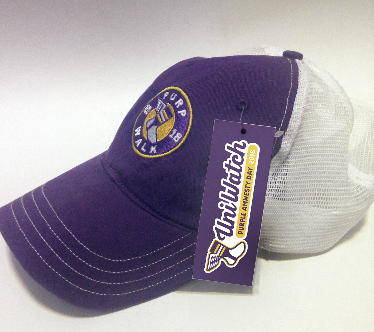
It’s hard to see there, but the purple part is the tag, and the white outline of the script is where you can peel the sticker.
Pretty cool, right? The cap is $26.99, and we’re also offering the sticker by itself for $3.99 (just in case anyone wants to get in on the Purp Walk fun but isn’t into caps). You can order them here until midnight Eastern tonight, and then they’re gone for good.
Finally, amidst all the purple silliness, it’s worth remembering that Purple Amnesty Day is the site’s anniversary, and that anniversary belongs to all of us. Here’s to 12 years of daily posts!
(Big thanks to Bryan for cap and sticker designs. Thanks also to membership card designer Scott M.X. Turner, who came up with the term “Purp Walk” back in 2015, and to reader Tim Cox, who came up with the whole idea of Purple Amnesty Day back in 2010.)
Click to enlarge
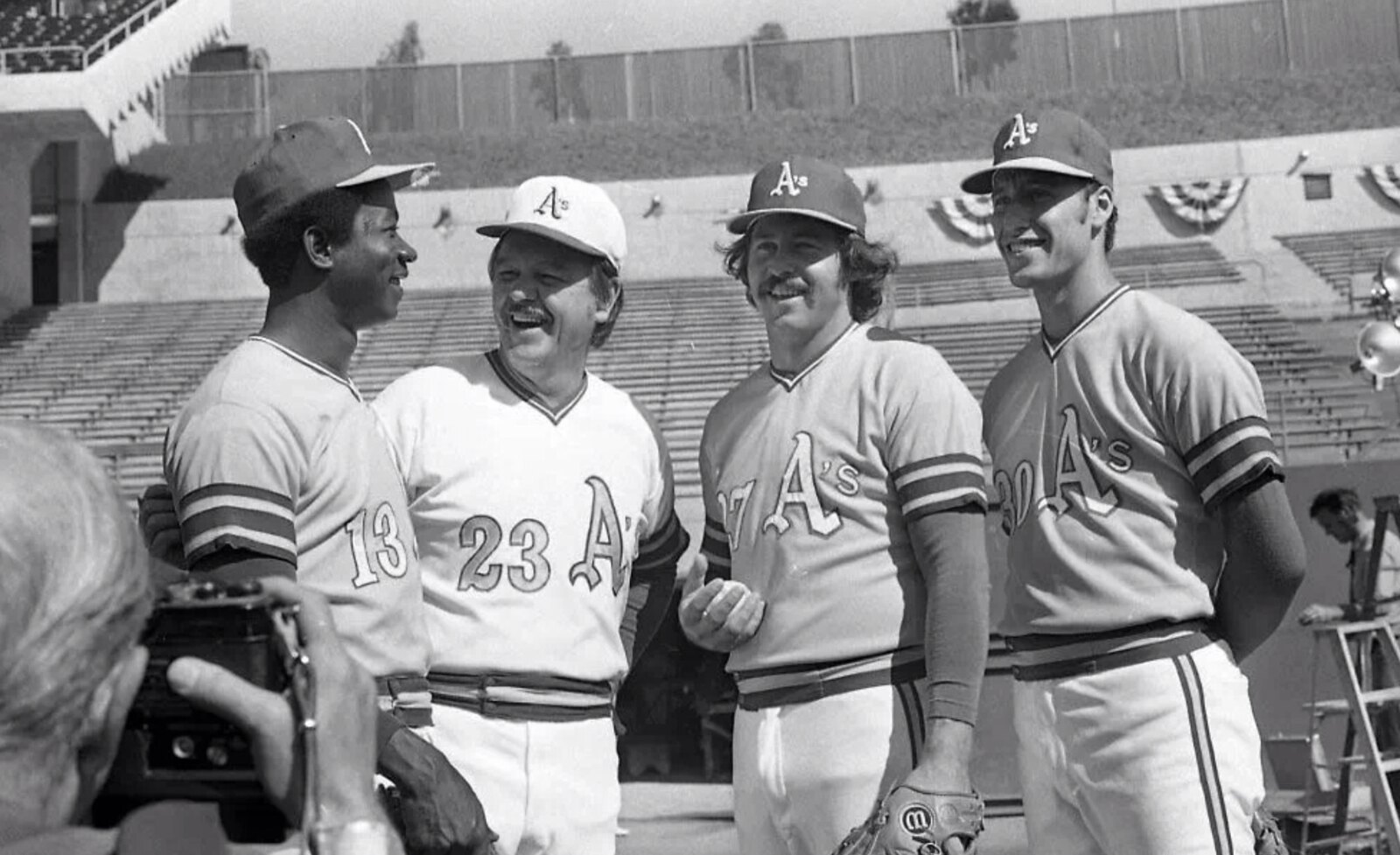
A’s history mystery: The photo shown above was sent my way yesterday by longtime reader Ferdinand Cesarano. As you can see, it shows A’s skipper Dick Williams wearing the team’s white jersey while pitchers Blue Moon Odom, Catfish Hunter, and Ken Holtzman were all wearing the gold jerseys. (Williams is also wearing a white cap, but that was standard for the team’s manager and coaches at the time.)
We know that the photo is from 1972, because that’s the only year from that era that the A’s wore front jersey numbers. I’ll let Ferdinand pick it up from there:
We have seen A’s players wear non-matching uniforms at All-Star Games. But we know that this photo is not from the 1972 All-Star Game because (a) Odom was not on the ’72 All-Star team and (b) the A’s didn’t add front numbers to their ’72 jerseys until after the All-Star game. This is confirmed by this shot from the player introductions.
My guess (with no evidence to support it) is that the photo is from a press conference announcing the addition of those front numbers.
Interesting guess, although uniform unveilings were very low-key in those days, and I have a hard time believing that a midseason addition of front jersey numbers would have merited a presser. Also, note the bunting in the background, which suggests that this was probably either Opening Day or a playoff or World Series game (although none of that would explain why the manager and players were wearing different jerseys). Knowing the location might shed some light on the situation, but I don’t recognize the stadium. Anyone..?
Update: Reader/commenter Dan Sliwinski has solved the mystery. The photo was taken at the Oakland Coliseum when the A’s were doing a team portrait following their 1972 World Series victory. That explains the bunting. Here’s the full team portrait, which shows some players wearing green, others wearing gold, and the coaches and skipper wearing white:
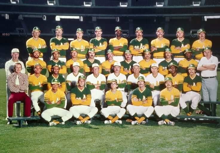
In this larger version, you can see the bunting in the background.
Good work, Dan!
Click to enlarge
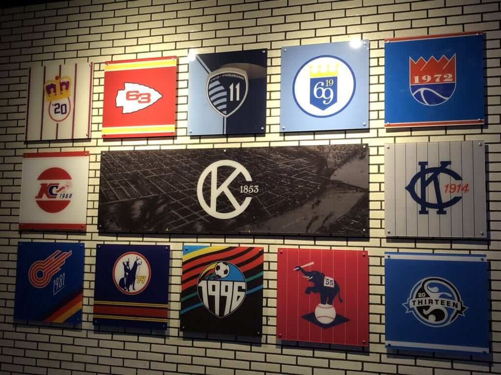
Stands for “kinda cool”: So apparently there’s this big sports bar and gaming center in Kansas City called No Other Pub, which is owned by the soccer team Sporting KC. And on the wall they have the artwork you see above, which shows the logos for various KC teams, but modified to show the years they were founded. I like!
The logos are the work of Chad Reynolds, who’s Sporting KC’s creative director. Good stuff.
(My thanks to reader Zack Remmers for letting me know about this one.)
Click to enlarge
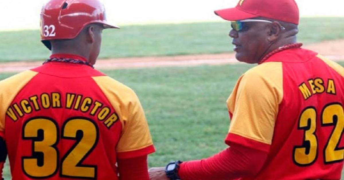
To the Victor Victor go the spoils: The No. 32 on the right is Victor Mesa, one of the greatest ballplayers ever to play in Cuba, who’s now a coach. On the left is one of his sons, Victor Victor Mesa — not to be confused with his similarly named other son, Victor Mesa Jr. (Both sons are reportedly on their way to play in America.)
As you can see, Victor Victor wears — well, what shall we call it? FMOB (first, middle on back)? Or would this simply qualify as a nickNOB? Something else? Or should we just skip the whole debate since they probably won’t let him wear that in the States?
I hope I’m wrong about that last part, because it would be awesome to see him wearing Victor Victor. It’d be a win-win — literally!
(My thanks to Eric Abneri for this one.)
Cap update: I promise not to post every single photo I receive of people wearing their Uni Watch caps, but I wanted to show you this one from reader Tom Jackson, if only because his shirt is arguably even cooler than the cap:
Received my @UniWatch cap from @EbbetsVintage today. It is glorious. pic.twitter.com/DWkHfYWXB3
— Tom Jackson (@tomj_52387) May 16, 2018
Nice, right? As you probably know by now, we’ve sold out of the fitted sizes, but you can still get an adjustable cap with a handsome leather strap and a burnished metal buckle by ordering here.
Duh: I’m supposed to be a pretty observant guy. And most of the time, I am. But somehow I’ve gone nearly 18 years — until last night — without really noticing what it says on my kitchen stove. Check it out (click to enlarge):
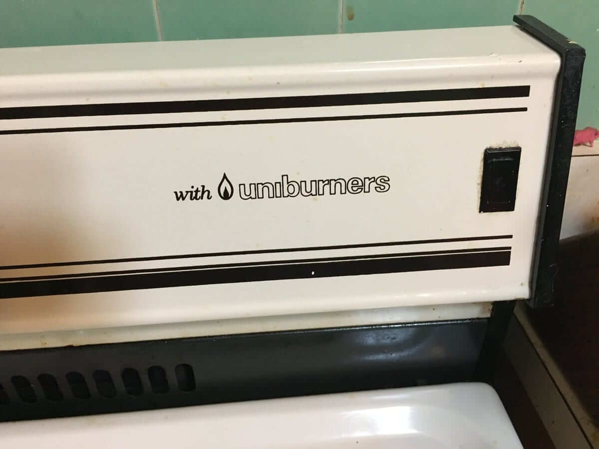
I’m sure I read that little notation countless times over the years, but it never really registered until last night. How is that even possible? A good reminder that details are often right under our noses without our realizing it.
The Ticker
By Paul

’Skins Watch: A Colorado high school whose teams are called the Indians has reached out to the local Arapaho tribe and involved them in revising the school’s logo. The tribe in turn has given its blessing to the school’s team name and iconography, and has even held powwows at the school (thanks, Phil). … Yesterday’s Ticker had a link to a new basketball court design for North Dakota. As you can see, it has “North Dakota” at center court, rather than the school’s new “Fighting Hawks” team name. That point, it turns out, is the crux of a nasty spat between UND prexy Mark Kennedy and the Engelstad Family Foundation, which is a major UND donor. The short version is that Kennedy thinks the Foundation is resisting the use of the Fighting Hawks name at center court as a way to protest the scrapping of the old Fighting Sioux name. For the long version, check out this fascinating piece based on emails obtained via a public records request. Excellent reporting, and fascinating reading (big thanks to Greg Enkers).

Baseball News: The Rangers’ latest college-themed cap is for Baylor (from Ignacio Salazar). … Here’s a fun SI piece on some of the uniform regulations in MLB’s collective bargaining agreement with the players’ union (thanks, Phil). … … Gross: The Mets put out this sort of Mad Libs-ish thing for kids that basically teaches them to spend money at the ballpark. … Speaking of the Mets, they used the wrong Canadian flag on their scoreboard while playing the Canadian national anthem prior to Tuesday night’s game against the Blue Jays. … New tropical plant-themed jerseys for the Chiba Lotte Marines. … The Frederick Keys will wear Washington Capitals-themed jerseys tomorrow (from @ColonelWill). … New Mets reliever Buddy Baumann, temporarily added to the roster because Jerry Blevins is on paternity leave, wore some nifty stirrups in his debut with the team yesterday. … A youth hockey league in Orlando, Fla., uses MLB-themed jerseys (from Marc Mandin). … The Rockies’ season tickets have a pretty cool augmented reality feature (from @Techanas_Spade). … We’ve seen eye-black, eye-blue, eye-pink, and lots of other colors, but I think this might be the first time I’ve seen eye-yellow.

NFL News: Pro tennis player Bethanie Mattek-Sands, who’s a big Packers fan, received an autographed helmet from Green Bay QB Aaron Rodgers. … The Ravens have added a new videoboard to their stadium (from Andrew Cosentino). … The Bills will retire Thurman Thomas’s No. 34 on Oct. 29. Rumors that they plan to give him a helmet and then misplace it just prior to the ceremony are almost completely untrue (thanks, Phil).
College Football News: NC State will honor the jerseys of two former athletes, including football player Bradley Chubb. Any future Wolfpack players who wear his No. 9 will wear a patch.

Hockey News: The Lightning have an official jeweler who makes the team’s bling. … Cross-listed from the baseball section: The Frederick Keys — that’s a minor league baseball team — will wear Washington Capitals-themed jerseys tomorrow (from @ColonelWill). … Also from the baseball section: A youth hockey league in Orlando, Fla., uses MLB-themed jerseys (from Marc Mandin). … Some Chicago-area union locals for ironworkers and pipefitters use Blackhawks-themed logos (from Pat Finley).

NBA News: Rockets F Gerald Green got the team’s logo braided into his hair (from WB Young). … Green also did an interview about his love of jerseys (from Ignacio Salazar). … My ESPN.com colleague Zach Lowe’s article on the NBA draft lottery included the following: “Sign I am old: I got annoyed noticing even the black briefcase in which the lottery balls are carried into the drawing room has branding — State Farm– emblazoned on it” (from Mike Chamernik). … Retired NBAer Baron Davis ranked the various jerseys he wore during his career (from Rex Henry). … There’s no “i” in “team,” but there is in “Nike”: According to this Instagram post, a key consideration in the 2017 redesign of the Cavs’ uniforms was making sure the “2” and the “3” looked good together. Good thing, since LeBron’s gonna play for the Cavs for a long ti — uh, never mind (from Don Lehman). … Still more Gerald Green news: He wore a Robert Horry jersey to last night’s game against the Warriors (from Ignacio Salazar). … Looks like former 76ers star Billy Cunningham’s NOB was AWOL during this 1970 game (from Eric Griffith).

College Hoops News: Cross-listed from the college football section: NC State will honor the jerseys of two former athletes, including basketball player T.J. Warren. His No. 24 will now hang from the rafters.

Soccer News: Louisville City FC wore their away kit (white and gold hoops) vs. Long Island RoughRiders in the second round of the US Open Cup on Wednesday, despite being the home team (from Josh Hinton).

Grab Bag: Here’s a video interview with sneaker customizer Billy Hobbs of True Blue Customs. “He has done a lot of work with University of Kentucky players,” says Jeremy Baker. … Cross listed from the NFL section: Pro tennis player Bethanie Mattek-Sands, who’s a big Packers fan, received an autographed helmet from Green Bay QB Aaron Rodgers. … Buses in Dublin, Ireland, are changing to a new color. … Some packages were stolen from New Jersey porches last week by thieves wearing FedEx uniforms. … New logo for the New Orleans tourism bureau. … Students on Prince Edward Island in the Canadian Maritimes have been wearing rugby jerseys in memory of a high school rugby player who died during a recent match. … The U.S. Patent and Trademark Office has ruled in favor of a Florida pizzeria whose logo looks a lot like the highway markers on New Jersey’s Garden State Parkway. … New logo for the Hippodrome 3R harness racing track in Quebec. …NASCAR and Camping World have expanded their agreement to provide Gander Outdoors naming rights to the NASCAR Camping World Truck Series, which as of 2019 will be known as the NASCAR Gander Outdoors Truck Series (from David Firestone). … Postgame jersey swapping has never been a thing in cricket, but that might be changing.
The Iroquois National lacrosse teams, all of them from youth to box/indoor, wear purple. Why? Because purple is the color of Hiawatha’s Wampum, on which the Haudenosaunee flag is based on.
They own it, because it means more.
I’d never heard that before, thank you for sharing.
Did the Haudenosaunee have a way of making purple that was unknown to the West and Asia? As people know, purple was the hardest color to make in most of the world until the 19th century.
(I hope they did; it would be inspiring.)
The wampum beads were from shells.
link
-Quite the effort by the Mets to go out and find the proposed Canadian flag with the 13 point maple leaf. Prompted me to go back and take a look at the proposed flags before the new (current) one was unveiled in 1965.
Well, could have been worse – like during the World Series in Atlanta:
link
-I have many caps that I wear. A number feature green (part due to my love of the Saskatchewan Roughriders and the Vancouver Canucks), so I did not get a green Uni Watch hat. Of all of my hats, I was missing a purple one, until tonight! Looking forward to seeing my Purp Walk hat arrive.
In the US all previous official flags can still be used as official flags. This was to prevent the need to buy a new flag every time a new state was added.
I’m not sure if Canada has a similar statute.
I’m pretty sure that the erroneous flag in question was never an official Canadian flag. The current Canadian flag was adopted in 1965 and has not been altered since.
Back in 1964, here were the 3 finalists for the Canadian flag:
link
The 13-point maple leaf flag was selected from the finalists, but it never made it to being the official flag and had some revision.
After flag committee input, the maple leaf was changed to an 11-point leaf. They decided to simplify the leaf so that it could be recreated easier and 13 was deemed an unlucky number. So we ended up with the 11-point leaf.
I got into following the NFL due to the Vikings uniforms.
Purple People Eaters, you know.
Amen to that!
Same era, but for me it was Fran Tarkenton. Still a Vikings fan, despite living in the SF bay area for 40 years now!
Lee
PS- love today’s purple colored links!
I ordered the hat – I absolutely love the look. I’d wear a similar one in green of course, too, and if you ever really wanted to one in burgundy with the athletic gold and green accents, I would probably get in on that too… Just saying.
MLB recognizes/sells merchandise for so many holidays that I’m imagining a scenario where it embraces Purple Amnesty Day. Bright purple hats for all the teams. Except Cleveland, as it would forgo the purple cap and simply use a very tasteful lavender-skinned Chief Wahoo on the front. For one day, the Cincinnati Reds would become the Cincinnati Purples. Teams in a weather delay would be required to play “Purple Rain” on a continuous loop. MLB’s 24-hour corporate sponsor ;) would be Purple Squirrel.
Somewhere in the distance, if you listened very carefully, Paul could be heard singing, “they’re coming to take me away ho-ho, hee-hee, ha-haaa…”
I’m afraid you’re on to something.
Your lips to God’s ears!
I own a purple LA Dodgers cap! I bought it in 2010 when my college team the purple-clad TCU Horned Frogs played in the Rose Bowl. I thought it was a great way to rep both my favorite teams!
The A’s multi-colored uni photo is from the World Series championship team photo. That is the Coliseum and in the photo you posted and in this photo, you can see the bunting.
link
Awesome — nice job in solving the mystery! I’ll add that to the text.
Thanks for providing the solution!
It looks like Oakland Coliseum in the A’s photo…..the bleachers look similar and the planted trees above the seats (albeit there are only a few trees).
“MLB’s 24-hour corporate sponsor ;) would be Purple Squirrel.”
What about Purplebricks.com, the online real estate agent? I’ve been seeing their TV ads which feature the voice of the late Adam West.
I would love to see Ackerman Jewelers have to make Stanley Cup title rings for the Lightning in a few weeks!
I wouldn’t
link
I’ve been the link about the new basketball court design for North Dakota, and I’m amused by the contention that the court must have the new Fighting Hawk at center court, instead of just “NORTH DAKOTA”. Part of it mentions the financial harm that would occur if this was not implemented. And I’m also amused that they still call it The Betty Engelstad SIOUX Center. [new T-shirt design alert?]
North Dakota should have gone the way of the University of Illinois Illini and not get a new mascot.
I find the whole UND situation annoying, even though as an outside observer I have no stake in it myself, because there are ways that it could’ve been resolved without so much acrimony.
The Standing Rock council could’ve let their people vote whether or not to approve the school’s continued use of the Fighting Sioux mascot. They didn’t, though, and rejected it outright. This has always bugged me as a case of the few dictating to the many, and I would feel more satisfaction over the situation if they had held a vote, even if that vote sided with the council and thus forced the school to have to change its nickname anyway.
UND could’ve stood up to Engelstad when he offered the donation, and told him that his terms weren’t acceptable. If he could see the way the NCAA winds were blowing and was positioning himself to stand against the trend, they should’ve been able to see it and realize that wouldn’t be fair to them to be forced to retain the name as a condition of his “gift”. I obviously don’t know what that deal went through, but if I’d been in charge at UND and had those terms offered, I’d have taken them to the NCAA to see what they had to say.
Of course, Engelstad could’ve been less of a jerk about it, and at the very least given UND an out to change the nickname after he was gone. But then again, this is the same guy who once had a secret Nazi memorabilia room in his Vegas hotel, and thought that holding birthday parties for Hitler was a good way to raise his employees’ morale.
even if there was a tribal vote and it was to remove the mascot, that would have still been “the few dictating to the many”, same as every time this comes up for any team name.
The “few dictating to the many” is actually the basis of representative democracy. In Washington, there are 535 people (House Reps and Senators) who “dictate” to us what happens. NCAA member schools elected officers and executives who “dictated” the policy of scrapping Native mascots unless the local tribe gave permission. And so on.
Nobody ever has a problem with this until something is “dictated” that they don’t agree with.
The most obvious UND solution has been staring the school in the face all along: If you don’t like the NCAA rules, keep your team name and drop out of the NCAA. Simple.
Yeah, you’re right about that.
The Strasburg HS arrangement with the Arapaho tribe is very similar to a roughly 25 year old arrangement between the tribe and the much larger Arapahoe HS in the extreme southern exurbs of the Denver area.
Indeed. That arrangement is mentioned briefly at the end of the segment. These arrangements are beneficial and educational for all the parties.
The approach stands in rather stark contrast to Eaton, another rural high school in Colorado. The small school in northeastern Colorado has dug in is heels on the use of what may be the link this side of Cleveland, despite widespread criticism and even a an effort led by link to discuss retiring it.
The KC team logo artwork actually features Sporting KC twice – the “1996” one as the Wiz and the “11” one as Sporting KC.
No international shipping on the Purp Walk caps :-(
Oh, I thought Bryan was going to add that. Hold on — let me check.
Which country are you in?
Thanks for sorting this Paul and Bryan! Looking forward to repping UniWatch in the UK!
Hmmm… “Uniburners” on the eve of Purp Walk. How ironically serendipitous of you.
Membership card ordered! Purple amnesty day forever!
I despise purple as much as you Paul but the Purp Walk merchandise is such a great tradition to celebrate the annual birthday that I always get the offers. Got my hat ordered along with the Uni-Watch Ebbets hat. Happy birthday Uni-Watch!
Happy Birthday Uni-Watch! I can’t wait to get my Purp Walk hat and then wear my purp walk shirt from last year and then have Paul NOT post my picture on the blog. I feel discriminated against :)
Happy Anniversary Uni Watch! Thanks Paul and crew for all the interesting factoids, observations, trip logs and all the other ingredients that make this wonderful site possible.
Happy Anniversary Paul – thanks for another great year of Uni Watch – Cheers!
Happy anniversary Paul! Proud to be a huge Purpetrator (have the sticker from last year’s Purp Walk on my car and I can’t wait to add this one), and I just bought the hat, even thought I have way too many hats that I never wear :P
While I hate that you hate purple, I love that it’s the focus of the site for one day a year! Here’s to many more years of my favorite website.
Not only is it the focus one day a year, it’s also how we celebrate the site’s birthday – it’s one of the many charming things about this place.
“Purpetrator” — ooh, that’s good (and a natural outgrowth of “Purp Walk,” obviously, but it hadn’t occurred to me before). I like!
One could even take it a step further and say, “Purple-traitor.”
Purpetrator is great though I am just a perpetrator this one day a year but this purp walks.
Happy 12th anniversary to the site! And that makes me think of the old link. One Two Three Four Five, Six Seven Eight Nine Ten, Eleven Twelve!
Wow, already two Purp Walk cards up in the Gallery! That’s pretty quick work!
Just went through the Gallery to look back at past PW cards, and one I didn’t see is an 80s Los Angeles Kings design. I’m half-tempted to request one myself just so there is one (maybe with Dave Taylor’s 18, or a what-if purple-and-gold Gretzky), but unfortunately I don’t have the disposable income to spare until next month.
(Part of me still kind of wants a link card just for the giggles, but link, I think that would just be too ridiculous.)
Wow, already two Purp Walk cards up in the Gallery! That’s pretty quick work!
Those cards were ordered at the stroke of midnight. I sent them to Scott Turner, who lives in Seattle, where it was only 9pm, so he got to work on them and had them waiting for me when I woke up this morning, at which point I added them to the gallery. Trying to stay ahead of the wave!
Only because today is today….
JMU! JMU!
link
Can’t believe it’s been 12 years already. I still remember how excited I was that there would be daily posts!
Here’s to another dozen or three.
I can’t believe it’s ONLY been 12 years. Seems like it’s been longer (in a good way). Congrats, Paul, and thanks for all your hard work.
Just saw on Twitter that today’s link – it was 35 years ago today that the New York Islanders completed a sweep of the up-and-coming Edmonton Oilers to win their fourth Stanley Cup. The Oilers would come back and dethrone the Isles in 1984, establishing their own dynasty of sorts, though the Calgary Flames would thwart the Oilers’ attempts to win three in a row twice. To date, the Isles are the last team to win the Cup more than twice in a row. In fact, the Oilers, Penguins, and Red Wings are the only teams since the Isles to even go back to back!
And, adding to that from a uni perspective, the Isles dynasty unis are, in my opinion, the best they ever had. In fact, those other back-to-back teams I mentioned did so almost exclusively in their best uniforms. I say “almost” because the 2016 Penguins hoisted the Cup in San Jose wearing those awful Edge jerseys with the flat Vegas gold trim (though thankfully for the last time).
It didn’t escape my attention somebody didn’t like the white sleeve cuffs on the Islanders’ blue sweaters; they kept monkeying with the striping. Speaking of sleeve cuffs, I thought it odd the Oilers put orange ones on their blue jerseys when the home cuffs were white.
A good reminder that the NHL season used to end at a reasonable time of year.
Congratulations on the anniversary, Paul!
Happy Anniversary to Paul and Happy Purple Amnesty Day to all!
I’m celebrating by wearing my 2005 Calder Cup Finals T-Shirt (much more faded than this example):
link
The Phantoms dumped the purple when they moved to Allentown, and that’s when I dumped my rooting interest in them.
PURPLE REIGN!
It is a shame they had to move out a Philly. That was certainly a good thing going in the Spectrum. More family friendly pricing, and quality hockey in town that loves hockey. I suppose the indoor bars (avoiding using the name of the evil corporate sponsor) are a nice place to hang out, but I wish they just renovated the Spectrum and used it as a smaller event venue alongside the WF Center.
It’s not opening day 1972. The A’s did start with the mustaches until around mid-season
Someone was apparently in such a rush to post his comment that he didn’t read to the end of that section!
Happy Anniversary and Purp Day.
I wouldn’t be caught dead in anything purple, but as far as sports go having one purple team in each league is always a nice way to bring some uniqueness to uniforms, not to mention purple and yellow go pretty darn well together for uniforms.
Congrats on 12 years! LONG LIVE PURPLE ON 5/17
Happy anniversary Paul and a big thank you to everyone who, through contributions or comments, adds color to the site everyday, especially those who help make this splendid celebration of a color I love (Geaux Tigers) such a fun anniversary! I have my cap ordered and am hoping it fits my big dome as well as the shirts and everything else Uni-Watch I’ve purchased has.
Larga vida púrpura amensty día!
Purple rain, purple rain
Purple rain, purple rain
Purple rain, purple rain
I only wanted to see you
Bathing in the purple rain
I grew up around Greenville, NC, so ECU Pirates were big. Maybe that’s why I always liked the color purple (though I’m not an ECU fan, particularily).
Chicago also has a song from their first album, “South California Purples”…
link
Jet
All the hyperlinks in purple today too. Nice subtle touch there, barely noticeable since links go purple after they have read anyway (in default browser settings).
There are 195 countries in the world today, exactly two use purple on its flag.
link
link
One as part of a rainbow, one as part of a bird’s plumage.
IMO You’re in good company rejecting purple as a design colour.
The lack of purple on national flags is not a matter of taste, but of the historical scarcity and expense of purple dye. For centuries, replicating the color purple on cloth was extremely difficult and costly. The only way to do it was by using a dye created from the secretions of a rare sea snail found in the Mediterranean Sea around the ancient Phoenician city of Tyre in modern-day Lebanaon.
This dye, known as Tyrian purple, created a reddish-purple shade that we would now think of as probably more closely resembling burgundy. It was valued at roughly three times its weight in gold, so only royalty could afford to own it. And it was for too expensive to place on widely-used objects like flags.
By the time synthetic purple dye became available in the mid- to late 1800s, most countries had already adopted flags that are still in use today. And purple is starting to show up on a lot of link (particularly in Japan) so we may see more purple flags yet.
This is true, its more complicated than I’m suggesting.
I disagree that “most countries had already adopted flags that are still in use today”. A very large number of countries in existence today were founded after decolonization in the 1950s and after purple dyes became widely available.
Its not just about taste, but taste plays a role.
“A very large number of countries in existence today were founded after decolonization in the 1950s and after purple dyes became widely available.”
True enough, and I knew that I was glossing over a long and involved vexillological history with that particular sentence. I would still contend, however, that a lot of the colors on flags adopted in the post-colonial era have roots in symbology that often dates back many generations, when purple wasn’t available for use in national or cultural expression. I’m not saying taste plays no role, but history still plays a much bigger role.
Agreed.
“People sometimes say I have ‘purplephobia.’ But as I always explain, that’s not accurate, because “phobia” means fear. I don’t fear purple; I loathe purple. If anything, purple should fear me.”
Actually, it is accurate to call your aversion to purple a “phobia.” A phobia is not only a fear of something, but also be a strong aversion to or dislike of something, as the following dictionary entries all attest:
link
link (see definition of “-phobia”)
link
link
Indeed, link..69i57j69i60l2.3775j0j7&sourceid=chrome&ie=UTF-8a lists one of your chosen descriptors – “loathing” – as a synonym for “phobia.” So while you may not fear purple, that doesn’t mean you aren’t purplephobic.
12 years huh… that means I have shared about 2700 bowls of cereal with you! Morning routine you know.
Here’s to at least another 2700 bowls!
Lee
Ha – that is indeed a lot of cereal! Thanks for reading, Lee. May your breakfast never get soggy!
Happy 12 years, Paul! Time really flies when you find yourself with with a daily obsession of studying athletic aesthetics, as I can personally attest. May the obsession continue for many more!
Paul do you have any information about the Steelers or Niners new alternate uniforms?
If I may, a new Steelers throwback will be unveiled May 30.
Harry Connick Jr. should rightfully offer to perform the national anthem at the Bills game during which Thurman Thomas’s number is retired, since it is widely believed that a member of Connick’s road crew moved Thomas’s helmet prior to his singing of the national anthem at Super Bowl XXVI.
link
Paul, I had futsal practice today and wore my link jersey to celebrate the color of royalty and of Japan’s eternal capital — some day we shall get you to appreciate it!
Long live purple!
Vivat purpura!
Murasaki banzai!
Very nice, Mark!
But isn’t that number riding a bit high?
;)
Mine actually doesn’t have that needless advertiser (a well-known video game company based in Kyoto) above the number, so mine is perfect! (And I even like the color :)
Purple Amnesty Day comes at a great time to celebrate that 5-0 win vs Long Island in the US Open Cup last night! Vamos los morados!
link
I don’t think it’s an accident that you had the “uni-burners” revelation on Purple Amnesty Day…
-Jet
I wish all major league teams would have their managers and coaches wear different colored caps than the field players, a la the Oakland A’s. Just a cool look…
-Jet
The Yankees briefly did this during spring training back in the 90s. Coaches and manager wore white caps with a blue bill and squatchee. I thought it was pretty neat. I still have that cap around here somewhere.
Several teams have done it during spring training. To my knowledge, though, only the A’s during the regular season.
Happy Anniversary, Paul.
re: the Victor Victor uniforms, all I can think about is this:
link
Sent this in for Ticker consideration but want to post it here: The trailer for the new Magnum, PI is out, and it seems like the new Magnum, played by Jay Hernandez, is too cool for Selleck’s on-field 5950 Tigers cap. He has to wear a low-crown, unstructured Tigers cap.
link
As someone who looks like I’m wearing a stovepipe hat in those high-crown 5950s, I am all right with this.
As the annual Purp Walk begins to draw to a close, I have to give Paul kudos for taking a color he despises and turning it into an annual fun event. The proverbial making lemonade out of lemons. All us purpetrators appreciate (credit to Lindsay for this word).
Thanks, James. I have to say, if you had told me years ago that I’d be holding an annual celebration of this particular color, I’d have said you were nuts! But it’s fun for me just like it is for you. A true Uni Watch community event!
Happy 12th anniversary, Paul! Thank you for all of the great content you, Phil and the rest of your team has provided us with and will continue to provide us with.
Great detective work by Dan to solve the A’s mystery. One question Paul…why did you assume the photo was taken after the World Series win? Whenever I see team photos of World Series winners, like my favorite below, I assume they took them probably at the beginning of the playoffs. (The Mets shot is definitely before the WS due to the patch configuration).
link
I never really thought about when postseason team portraits were taken. I always figured that they were sort of a victory lap after the team won the title, but I can see that doing it at the outset of the postseason (or the outset of the World Series, or whatever) would make more sense. Thanks for schooling me on that, Steve!
Looking at the photo again, in keeping with the A’s theme of white for coaches, how cool was it for the Mets to give their training staff white versions of their iconic varsity jacket? Wonder if they took that idea from another team, possibly NY Giants? Rabbit hole alert.
Looks like the 1964 Phillies did this as well
link
Happy Anniversary!
The U.S. Patent and Trademark Office has ruled in favor of a Florida pizzeria whose logo looks a lot like the highway markers on New Jersey’s Garden State Parkway.
As well they should. Anything taxpayer-funded is in the public domain, right?
That’s what I always thought, Jim. But here in NYC, the MTA (Metropolitan Transportation Commission), which is the municipal agency that runs the subways, has trademarked some of its subway iconography and polices the trademarks pretty aggressively:
link
It is a sad day when the one time that you don’t check Uni-Watch first thing in the morning, and endure a busy day and fail to check in until 11:53 Central Time . . . and it was Purple Amnesty Day. Dammit.
:(
I remember that A’s team photo on a Topps card when I was a kid. I thought the multi-uni team picture was the best thing ever!