Click to enlarge
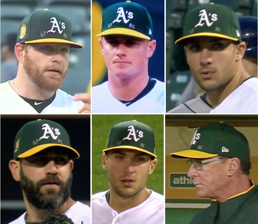
A’s outfielder Stephen Piscotty’s mother, Gretchen Piscotty, died of ALS on Sunday night. It was the second time in less than two weeks that an Oakland player’s mom had passed away. The first death came on April 23, when reliever Yusmeiro Petit lost his mother, Rubia.
The A’s memorialized both women on their caps last night, as all uniformed personnel had two sets of initials inscribed on their headwear — “GP” for Gretchen Piscotty and “RC” for Rubia. (I’ve been told that her surname was not the same as Petit’s, but I haven’t been able to determine what it was.)
Cap inscriptions seem to wax and wane over time. As I recall it, the trend first caught on in 1998 and ’99, just as I was starting to write about uniforms. In particular, many Venezuelan players wore “14,” the uniform number of their countryman Andrés Galarraga, who was undergoing treatment for cancer at the time, and many players began adding the uni numbers of teammates who were on the disabled list — a sort of “Get Well Soon” memo.
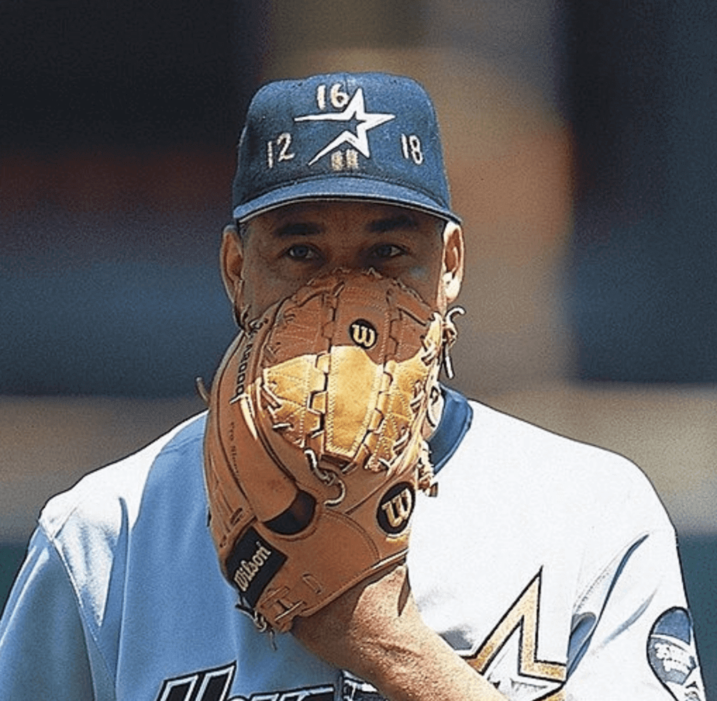
These inscriptions were usually tucked off to the side of the cap, in the spot where the edge of the brim meets the crown. But a few players preferred more conspicuous displays, most notably Astros pitcher Jose Lima, whose headwear stylings, like everything else about him, were a bit over the top:

The commissioner’s office eventually put a stop to that by banning the inscriptions (I think during the 1999 season, but don’t quote me on that), and caps remained inscription-free for a while, although every now and then you’d see someone going rogue by tributing or memorializing someone with a handwritten number or pair of initials. One such cap — the one that Royals pitcher Yordano Ventura wore during Game Six of the 2014 World Series, with a big “RIP O.T #18” memorial for Cardinals outfielder Oscar Taveras, who had died a few days earlier — is now in the Hall of Fame. (It kills me that he left off the second period in Taveras’s initials.)
Most cap inscriptions have been done by individual players, not on a team-wide basis. And a team-wide dual memorial, like what the A’s did last night, may be unprecedented. Technically, it was a uniform violation, although the team-wide aspect probably works in their favor (if everyone’s wearing it, then it’s truly uniform), and I’m sure they’d get off with just a warning at most anyway. Who wants to penalize someone for saluting two dead moms?
Since the inscriptions are typically made with Sharpies, which are permanent markers, the initials won’t just fade away. It’ll be interesting to see how many A’s players are still wearing the same caps tonight.
(My thanks to Richard Paloma for bringing last night’s A’s caps to my attention.)

Click to enlarge
Collector’s Corner
By Brinke Guthrie
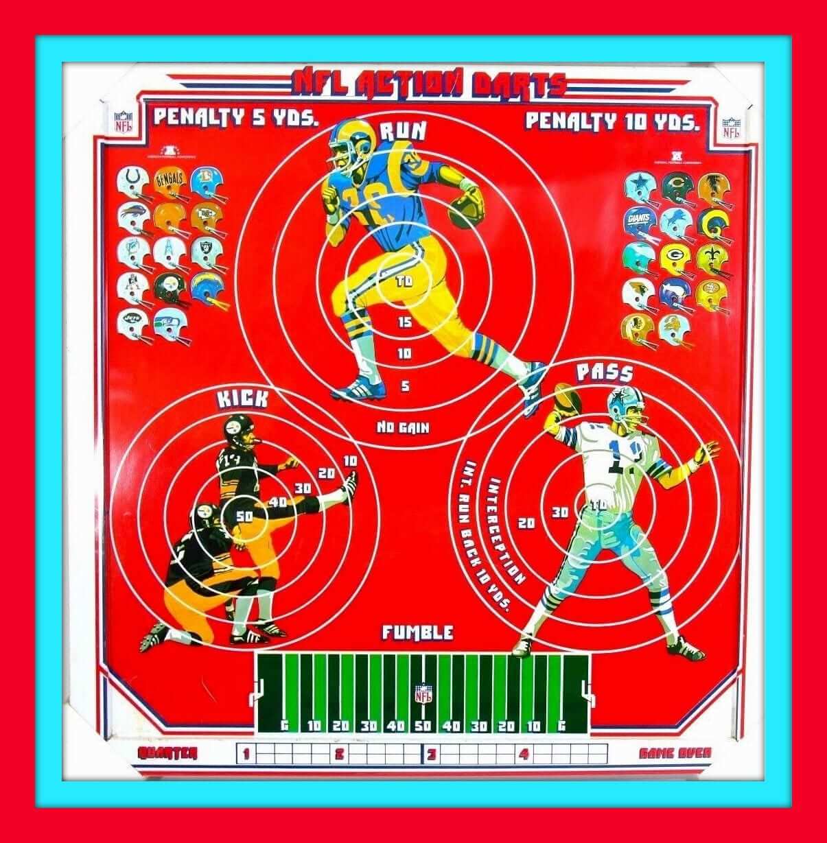
Here’s one of those “Been doing this for years now and never seen it before” items: NFL Action Darts from Tudor Electric Football. Guess they were trying to do a little brand extension with this, eh? That’s most certainly Roger Staubach on there, and maybe Roy Gerela kicking the field goal. It looks like you got the NFL style on one side and a regular dart board design on the back. Earl Shores of The Unforgettable Buzz, have you seen this one before?
Now for the rest of this week’s picks:
• Bullpen buggies were back in the news last week, as the Arizona Diamondbacks rolled theirs out for the first time. Here’s more on these retro baseball buggies, and you can get a 1970s New York Yankees one right here — MOC (or Mint on Card as they say). And hey, got my Giants one right here!
• Here’s a 1970s Lions helmet buggy, MOC!
• I would be willing to go out on a limb here and say this Steelers Super Bowl XIV shirt was not officially licensed. (Tip to bootleggers: Put the helmet logo on the other side next time.)
• One more for the Stillers: This nice-looking 1970s desk lamp.
• And one more desk lamp! This one has Kra-Lite stamped on the shell of the 1970s L.A. Rams.
• This early-1970s Boston Bruins patch doesn’t even say “Bruins” or “NHL.” Hmmmm.
• Check out this nice-looking 1970s St. Louis Football Cardinals blanket and helmet plaque set!
• If you want to sharpen your skates like the NHL pros, you’ll want this 1970s “hone stone.”
• Take a look at this 1970s K.C. Royals desk set, complete with a Louisville Slugger pen/pencil combo.
• Sticking with the Royals, you can get your thermal mug in different colors — navy or yellow. (And let’s add powder blue, too.)
• And from reader Stephen in DC, here’s an old wire photo showing comedian Jerry Lewis in a Houston Astros uniform. Look at that star on his stirrup!
Seen an item on eBay that would be good for Collector’s Corner? Send any submissions here.

Click to enlarge
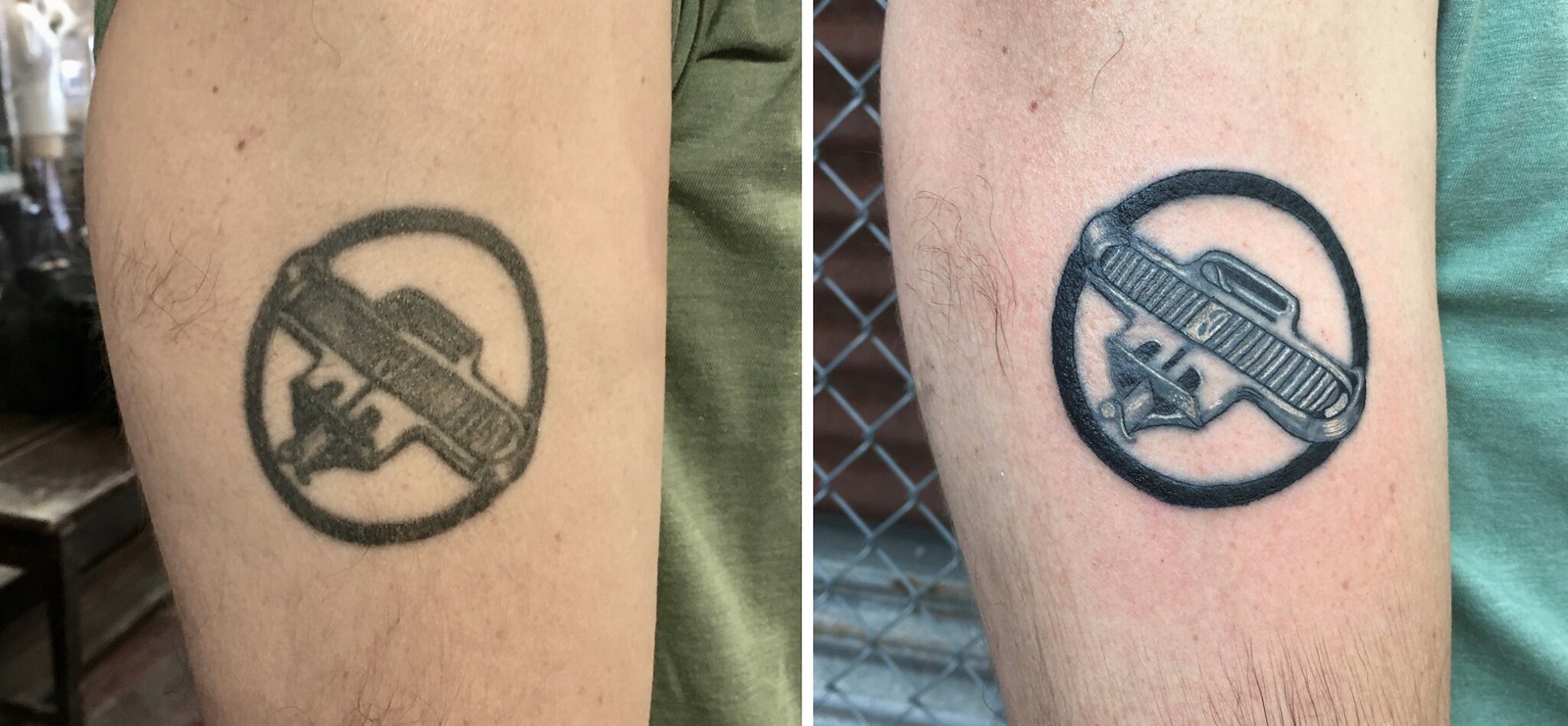
Brannock update (literally): It’s been a little over 15 years since I got my Brannock Device tattoo, and it had started to fade and blur a bit. So with my upcoming gig to throw out the first pitch at the Syracuse Chiefs’ Brannock Device Night fast approaching, I thought I’d better get the tat touched up a bit. You can see the before and after shots above.
Not bad, right? Maybe not perfect, but I like the addition of white and grey ink (the original was just black). Should be healed in time for the game.
Now I just have to make sure I throw something close to a strike.
The Ticker
By Alex Hider

Baseball News: Cards 2B Kolten Wong has been wearing a sleeve of the Kanaka Maoli Flag — sometimes called the “native Hawaiian flag” — in support of the people dealing with natural disasters in Hawaii. Wong grew up in Hawaii (from Mike Chamernik). … Yankees SS Didi Gregorious got kicked in the head while covering second base on Friday. He got the day off Saturday to recover and wore a helmet while on the bench (from Ryan Bower). … A’s LF Khris Davis wore two-in-ones on Friday. Those side stripes don’t extend down nearly far enough (from Mike Davie). … The Angels will give away Orange Coast College caps for OCC Night on May 12 (from Ignacio). … Right city, wrong team: D.J. Miller spotted this poster in San Diego’s little Italy that mistakenly used the Kansas City Chiefs logo instead of the Royals logo. … The Orix Buffaloes of Japan’s NPB will wear their their 1980s Hankyu Braves powder blue throwbacks again on May 27 at a game in Kyoto, where the Braves used to play some of their games (from @bigdaddy45_1969). … Former Cardinals IF Mike Ramsey wore his batting helmet backwards in his 1981 Topps card (from Arthur J. Savokinas). … Lots of good color shots of the 1969 Mets in this clip of Miracle In New York: The Story of the ‘69 Mets. The doc was originally released in 2009 (from Phil). … Speaking of the Big Apple in ’69, here’s a good look inside the Yankees locker room that season (from Ray Hund). … Also from Ray: Not sure if we’ve seen this before, but the Reds had an actual Big Red Machine! Looks like it was used to clean the Riverfront Astroturf in the 1970s. … The Minisink Valley High School (New York) softball team wears some nice white, striped stirrups over dark sanis (from Tom Faggione). … Hunter is a teacher at Sheffield Elementary in Virginia, and the school’s official T-shirt bears a striking resemblance to the Tigers’ old logo. … The Las Vegas 51s have unveiled a new logo to mark the final season of their stadium (from @MaxMetalFriar). … A 1963 Sandy Koufax jersey has set the record for the highest price ever paid for a piece of Dodgers memorabilia.

NFL News: Bears rookie LB Roquan Smith had his car broken into recently. Among the items stolen were his helmet and three jerseys he wore while at Georgia, as well as his Bears-issued iPad (from Brinke). … Nike has filed a trademark for this personal logo for Giants WR Odell Beckham Jr. … Cross-listed from the baseball section: D.J. Miller spotted this poster in San Diego’s little Italy that mistakenly used the Chiefs logo instead of the Kansas City Royals logo. … Mike Barnes sent along an awesome photo of a Dolphins-themed carved coconut that he picked up in Miami in the 1970s. … Pro Football Journal pointed out some number size inconsistencies on some players on the Bears’ 1980 team.
College Football News: This ACC blog ran down a few ideas for potential throwback unis. Which ones did they miss? (From Phil.) … University of the Incarnate Word in San Antonio, an FCS program, is getting new FieldTurf with red camouflage end zones (from James Gilbert).

Hockey News: The Pacific Junior Hockey League’s newest team will be the White Rock Whalers, who will use a modified version of the old Hartford Whalers’ logo (from Brock Jackson). … Former Caps G Don Beaupre used to have a great mask featuring the U.S. capitol dome.

Basketball News: I think we’ve ticked this LeBron James Sprite commercial before, but it’s weird to see him wearing No. 12 in any uniform, let alone a baseball uniform (from Dylan Darling). … New logo for Maryland basketball’s 100th season (from Matt Shevin).

Soccer News: Lots of stuff from Josh Hinton: Bayern Munich’s home uniform for next season has reportedly leaked. … Longtime Real Madrid supporter Rafael Nadal is under scrutiny for wearing an Atlético Madrid jersey as a scarf during the Atletico-Arsenal Europa League semifinal. … Finally, cool move by Man City, who projected a congratulations message for all its players on buildings in their hometowns around the world (thanks Josh). … This Twitter account tweets photos of some terrific hand-painted tabletop soccer kits, from the Premier League to the fourth-division US clubs (from Ryan).

Grab Bag: The University of Wisconsin is putting on Bucky on Parade, a series of 85 individually decorated Bucky the Badger statues located throughout campus (from Tim Mazurkiewicz). … We may have ticked this before, but comedian Bob Hope had a custom golf cart modeled after his face (from Eric Stangel). … Here’s a feature on Max Nelson, who started his own line of baseball caps, Hood Rat (from Tom Turner).
Had that NFL Dart game as a kid…lots of fun! I believe it was produced in 1977. They flipped conferences for Tampa Bay and Seattle but put the Seahawks in the the AFC Central instead of the AFC West.
I think I can figure out how to play football with this dartboard, but did it come with actual rules? And did you play with regular darts, or special ones that did not put holes in the board?
Aside from putting the Seahawks in the AFC Central, I’m a little bothered that the helmets are aligned East-Central-West from left to right, instead of the more obvious West-Central-East.
@Mangler – The board was magnetic. The darts were foam and had square magnets on the end. Made it safe but the foam was only glued to the darts so it was very easy to pull the foam from the magnet. There were actual rules.
I remember players from multiple teams writing some form of DK/57/DK57 on their hats when Darryl Kile died in 2002.
“It kills me that he left off the second period in Taveras’s initials.” – Perhaps “It kills me” is a poor choice of words in a sentence about two deceased pitchers…
*players, not pitchers
Seconded…this kind of struck me as unfortunate as well.
Agreed. Poor choice of words.
“Tip to bootleggers: Put the [Steelers] helmet logo on the other side next time.”
AND…the hypercycloids are at the END of the word “Steelers”. (but I get what you were trying to do)
You mean hypocycloids?
Probably.
Someone needs to tell Incarnate Word that camo has jumped the shark.
Agreed.
Plus repeated patterns really catch my eye, and I don’t like that either.
Don Beaupre had the mask featuring the US Capitol dome while playing in US capital.
He kept the mask idea afloat while playing in Canada’s capital later in his career. Some may remember his Ottawa Senators mask featured the Centre Block of the Canadian parliament buildings.
link
A nitpick – in the item about the sign in San Diego’s Little Italy, I believe “Right team, wrong city” should actually be “Right city, wrong team”
Thanks. Fixed.
Re the ACC football throwback unis article: Nothing for Wake or Tech? I’ll suggest the link togs for the Deacs and link for the bugs.
In the ACC football throwback, while a true ACC throwback wouldn’t include Syracuse, how about the 1959 National Championship Ernie Davis kit (link)
I’m guessing the Orangemen’s opponent in that photo is Pitt?
No, it is West Virginia. The movie “The Express” had WV playing Syracuse in those unis.
Surprised to see Vancouver-area junior B hockey on the site today. My uncle was co-owner of the original White Rock Whalers in the ’80s. Back then their uniforms were the Chicago Blackhawks design, and my uncle hired a Haida artist to create a killer whale logo. It was a great uniform.
Can you show us a photo?
Can’t find anything out there. Junior B hockey from 30 years ago is pretty obscure stuff.
The reborn White Rock Whalers logo appears to be influenced by the Juan de Fuca Whalers minor lacrosse logo over on Vancouver Island:
link
link
Of note, the old Juan de Fuca Whalers Junior A hockey team (BCJHL) used to use this as a logo in the 1980s:
link
That UMD logo is surprising because it instantly reminds me of the trim from the Nike designed uniforms of the early 2000’s. Can’t believe Under Armour OK’d that.
Those early 2000’s unis were a some of the best for them IMO.
link
The coconut is pretty awesome. Good find!
When they played at the Vet, the Phillies also had a turf machine similar to the Big Red Machine. It was used to vacuum the water from the turf after a rain storm. Kind of like a baseball Zamboni.
I think the water used to get dumped into drains which were in-play in left field.
The one at the Vet was painted Philly’s city colors of yellow and blue:
link
“August 1, 1971 — St. Louis scores three in the top of the 12th at Veterans Stadium when it the game is halted by rain. The Zamboni machine, used to vacuum the water from the artificial playing surface, breaks down. Cardinals file a protest and the NL rules a 3–3 suspended game, to be completed prior to the regular game on September 7. When the game resumed, Phillies score three in their 12th to tie before St. Louis wins in 13, 9–6.”
The Cardinals also had one in red and white:
link
The pictured “Big Red Machine II” was a modified Zamboni used to remove water from the astroturf at Riverfront. It is preserved and displayed in the “Machine Room” at Great American Ballpark.
link
Paul,
Did the same person/artist that did your original tattoo do the refresh?
No. The original shop no longer exists.
Just curious. I have a few super-old tats that are in dire need of refresh, cover-up, or whatever. I’m 3000 miles from the folks who did mine. They’re all probably dead too!
I still had the reference art that the original artist used, so that helped. I also brought an actual Brannock Device to the shop (which amused the artist although he said it was “overkill”). If you have original reference art, or at least photos of your tat when it was new, thought would probably go a long way toward a successful re-inking.
Hi Paul, love the refresh. Just interested/curious in how the refresh brought out the “white” spaces that had already filled in with color over time? How is that possible? Did they explain how they are able to do that? Thanks!
First tat only used black ink; the refresh job used some white and grey ink in addition to black.
“Mother’s Day Comes Early” seems like an odd choice for the entry title seeing as though the first photo and two paragraphs are about how two baseball players just lost their mothers, right before Mother’s Day.
They saluted two mothers on their caps. Headline seems straightforward enough.
Re: Hood Hat – not feeling need to put “Long Island” on a “Montauk” cap or “Los Angeles” on a “Malibu” cap… I know, Free advice you don’t need.
North Carolina State University has unveiled a new custom font for all of their athletic teams. I’m not really thrilled with the italics and angular cuts, especially on the ‘P’ and ‘A’ which will always been seen in ‘WOLFPACK’.
link
From the six photos in the lede, it looks like the same person (I’d assume an equipment manager) hand lettered the initials on all of the A’s hats. Has that ever been the case before? Seems like it’s usually each individual player writing on his own hat
Yeah, that apparently goes with the team-wide engagement.
The “Big Red Machine” was used syphon water from the turf after rain delays.
“The University of Wisconsin is putting on Bucky on Parade, a series of 85 individually decorated Bucky the Badger statues located throughout campus.”
This is a straight poach of the University of Iowa’s “link” events from link and link. Same concept, surprisingly similar statues (allowing for the differences in the mascots) and essentially the same name. I’m remembering something about imitation being the sincerest form of flattery or something…
Or it’s the same thing as Peanuts on Parade in St. Paul starting in 2000, or the Cows on Parade in Chicago in 1999, or Lions on Parade in Zurisch in 1986.
Don’t flatter Iowa too much here… it was hardly the first.
link
Oh please. This trend kicked off in the United States in 1999 when Chicago did the Cows on Parade all around the city. That in itself was an idea taken from a town in Switzerland that had done it.
I live in Denver and remember the cow sculptures, but having seen both, the mascot thing has a different vibe. Sure, maybe Iowa borrowed its idea liberally from these other sources, but I still say they at least put their own spin on the concept. Wisconsin’s version is less “borrowing liberally” and more a straight copy, right down to the name and the layout of the website.
So I stand by my original post. Perhaps Iowa wasn’t the first, but it’s pretty obvious they’re where Wisconsin got their idea.
In Wisconsin, there have been sturgeon in Sturgeon Bay, butterflies in Green Bay, lions in Oshkosh, different kinds of lions in Appleton, multiple things in Racine, cows across the state in 2006 (link). Again, giving too much credit to Iowa for something UW people have seen across their own backyard.
If you bother to look at the Bucky on Parade and Herky on Parade websites, there’s no denying how similar they are. Your link to the Wisconsin Cow Parade simply reinforces my earlier point. Wisconsin isn’t copying ideas from some Madison cow parade website from 2006, they’re copying Iowa. You may ignore the evidence if you wish, but that doesn’t change the fact that it’s there.
Two words for thought about that first pitch, Paul:
BABA BOOEY
Roy Gerela kicking, Terry Hanratty holding
Matt Harvey follow-up: He’s been traded to the Reds, who already have a No. 33 (Jesse Winker).
Interesting that Jose Lima is mentioned and pictured in a post about memorials and no one has noted that Lima himself died in 2010.