[Editor’s Note: Today we have a very special guest entry from Chris Callan, who’s going to tell us about his incredible bobblehead-restoration work. Enjoy. — PL]
By Chris Callan
Bobblehead dolls, or “nodders,” have been an interest of mine for years now. I had a couple of them when I was a kid, but I didn’t start collecting them until 2001, when my hometown St. Louis Cardinals added them as part of their stadium giveaway promotions. My first one was for my favorite player (and the team’s current manager), Mike Matheny. Although I’ve missed a few along the way, I’ve tried to keep up with the Cardinals’ stadium giveaways since.
After the first few years collecting the these stadium giveaways, my focus widened a bit, and I began going after some of the vintage bobbleheads. Unlike today’s giveaways, these 1960s dolls were made of papier-mâché, not resin, and are much more susceptible to being damaged. Finding one that has survived the past 55-plus years unscathed is pretty rare. Therefore, a vintage bobblehead in excellent condition will command a premium price, which makes collecting them a bit more of a challenge for the average fan on a budget.
About five years ago, I stumbled across a vintage Cardinals mascot bobblehead on eBay for only $25. The price reflected the very poor condition of the doll, which had numerous chips, cracks, faded paint, and 50 years’ worth of dirt. My initial reaction was to pass, but then it occurred to me: “Hey, I’m a professional artist, and capable with a brush — why not try to fix it up myself?” So that’s exactly what I did. I won the doll without a bidding war and set out to fix it up.
First I had to give it a good cleaning, and then address damage that needed repair. Cracks, dents, and chips had to be filled in and sanded down smooth. I used modeling compound and plastic wood filler for this. Next came repainting, trying to match as closely as possible to the original colors (although in this case I turned the gold base green). Once all the paint was dry, I replaced the original uniform decals with ones that I had created on my computer and printed on water-slide decal paper. Here are some before/after shots [for all photos in this entry, you can click to enlarge]:
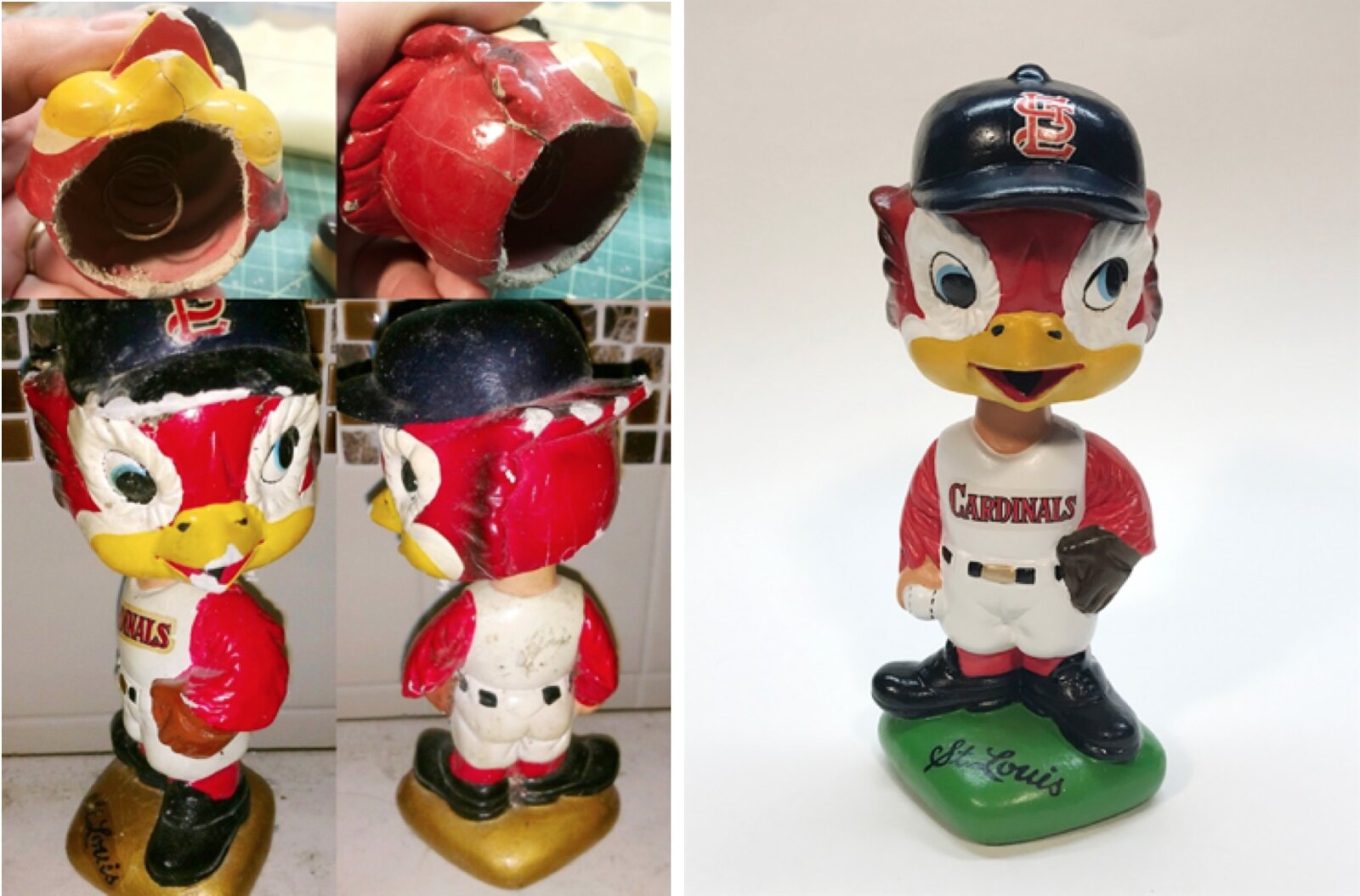
It would be fair to say that there was a bit of a learning curve with this first attempt, but I was still pleased with the results, and it went straight into my collection.
Having completed this experiment, I did the same thing with another vintage Cardinals doll, and then another. Realizing how much I enjoyed this process, I started searching for other damaged vintage nodders, which I fixed up and resold on eBay (making it clear that they were restored and not original). I also started to receive requests from collectors. As I went, the projects all seemed to fall into one of three categories:
1. Restorations: Taking a damaged/deteriorated vintage doll and bringing it back to its original condition/appearance.
2. Replicas: Taking an original vintage doll and making it look like another vintage manufactured doll (usually one that is more scarce, and more valuable).
3. Customs: Converting a vintage doll into a unique, one-of-a-kind creation never before made.
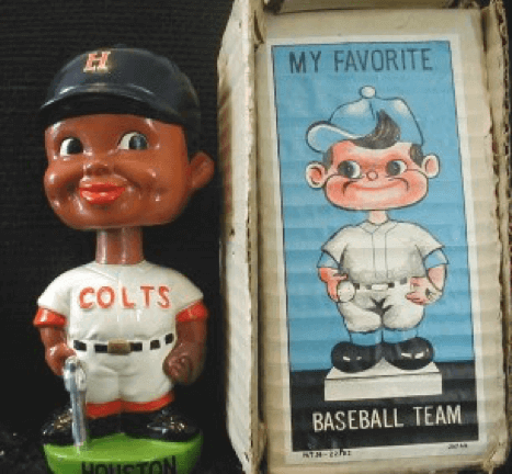
One replica project I did a while back was to try to create a Houston Colt .45s bobblehead featuring a black player, which is one of the scarcest, most sought-after nodders in the hobby, often selling for prices in the thousands. In addition, the first edition of Houston Colts dolls showed the player holding a pistol. This was changed to a glove and bat in subsequent releases, making the pistol dolls even more desirable. Here’s an example of one of those dolls:
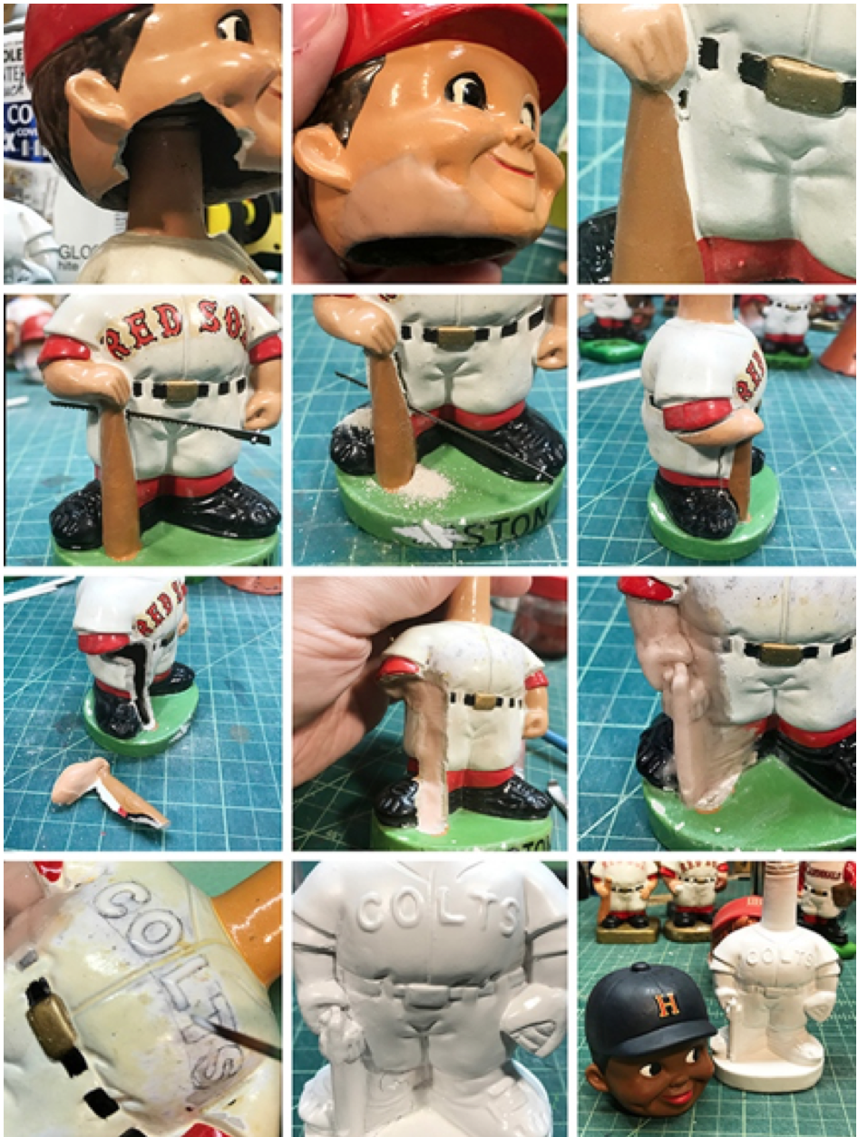
The primary challenge I faced with re-creating this bobblehead was establishing a starting point. Acquiring an original Colts doll to use as my base — even one in poor condition — was not easy, or affordable. So instead I chose to modify a more common bat/ball vintage doll, adding the pistol myself. This required some additional sculpting to achieve the right form. The bat had to be removed and replaced with a pistol; the chest lettering had to be raised; and some variations in the facial features also needed to be addressed.
Here are some photos showing the modification process, followed by the finished product:
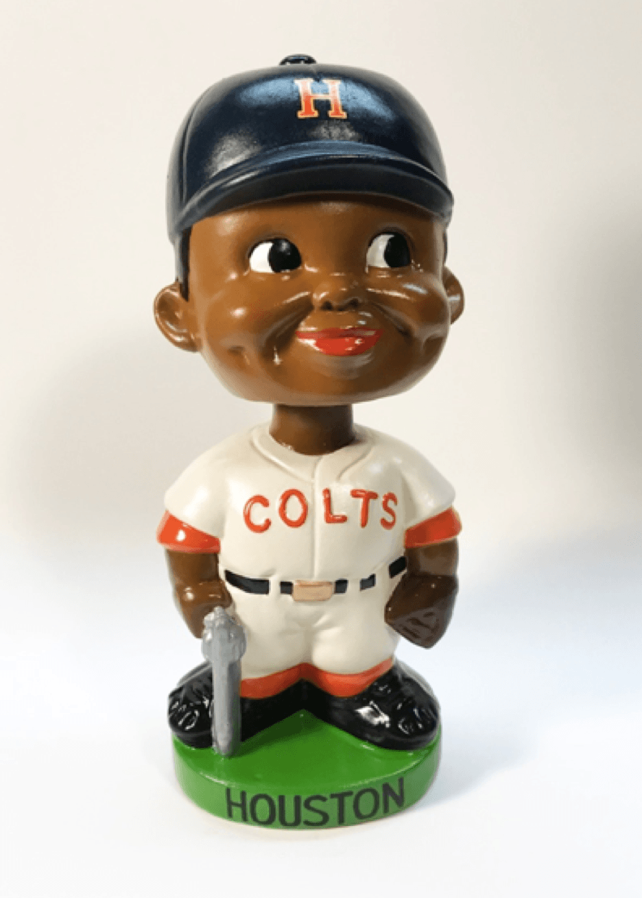
I had no intention of deceiving someone into thinking they were getting an original Colts doll. When I posted it on eBay, I included a detailed description of the work that was done, along with progress photos. My goal was to provide an opportunity for a collector who would otherwise have no chance of owning an original Colts doll, at a fraction of the cost.
I received a lot of very positive feedback, but I also heard from serious collectors who were concerned about how a replica could be misrepresented down the line. Even if I was being honest and upfront, the next guy might not be. These concerns seemed valid, and I didn’t want to do anything to harm the hobby, so I decided not do any more replica projects. Since then, I have stuck to straightforward restorations, and custom projects that can’t be confused with an original production doll.
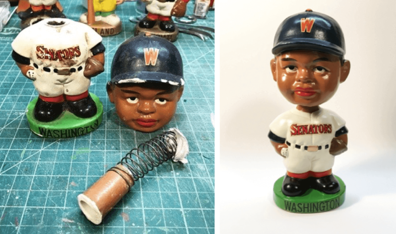
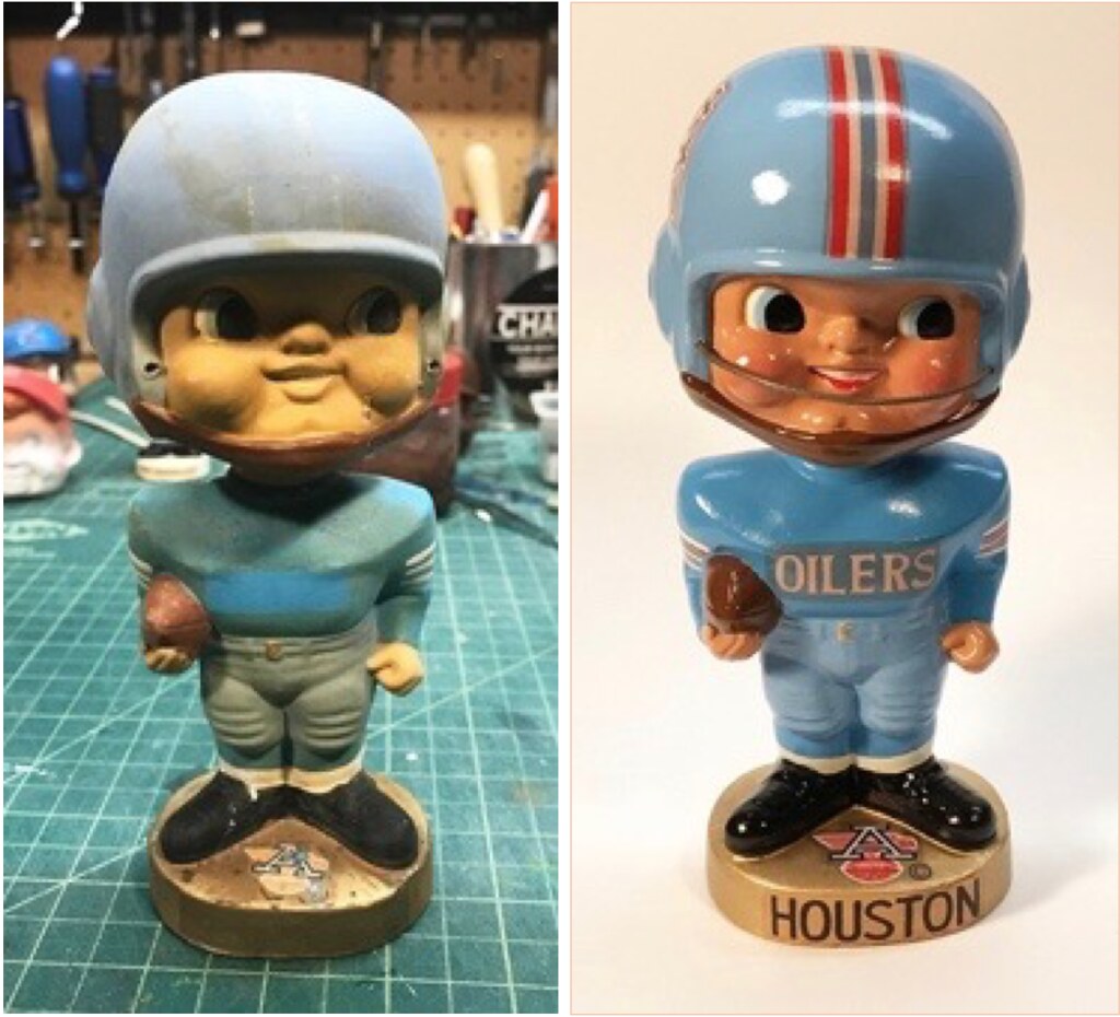
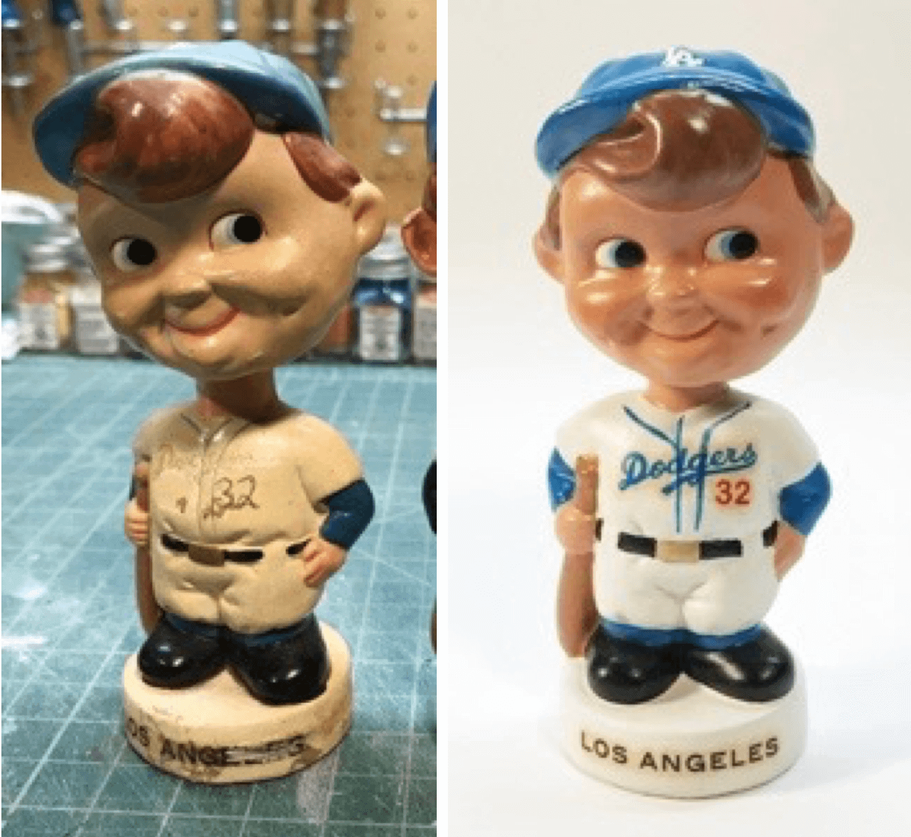
Here are some before and after pictures of a few of the restoration projects I have done — a Washington Senator, a Houston Oiler, and a Los Angeles Dodger:
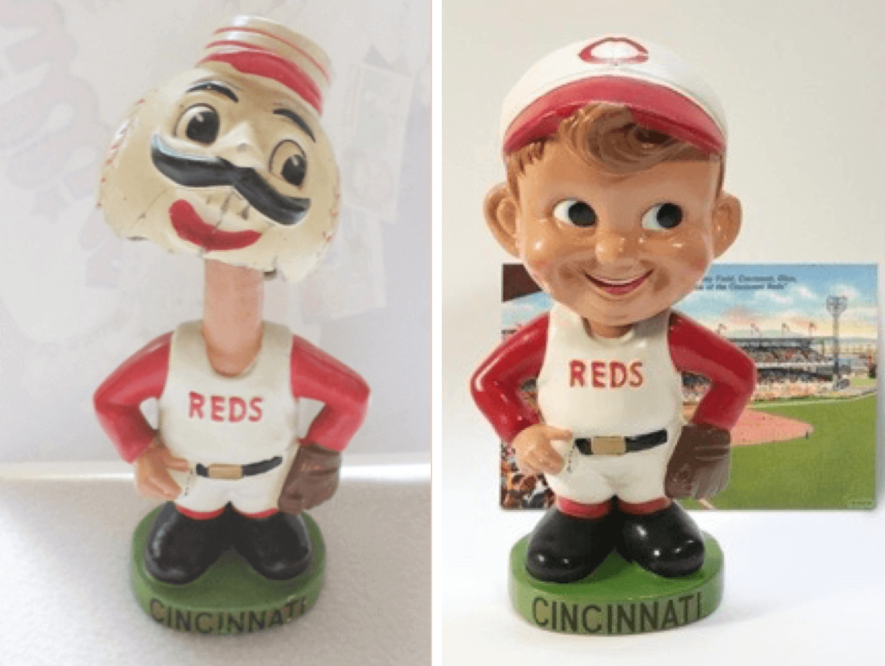
And here’s a custom job I created — a Mr. Redlegs doll that I turned into a Reds boy. (There were no Reds boy bobblheads produced in the 1960s, so this would never be mistaken for an original production piece.)
My most recent project a Willie Mays mini-bobblehead. A few popular player dolls, including Mays, were rendered as full-size dolls, but Mays was never made as a mini. I had to sculpt the head completely from scratch, using a full-size Mays doll as a guide.
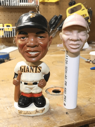
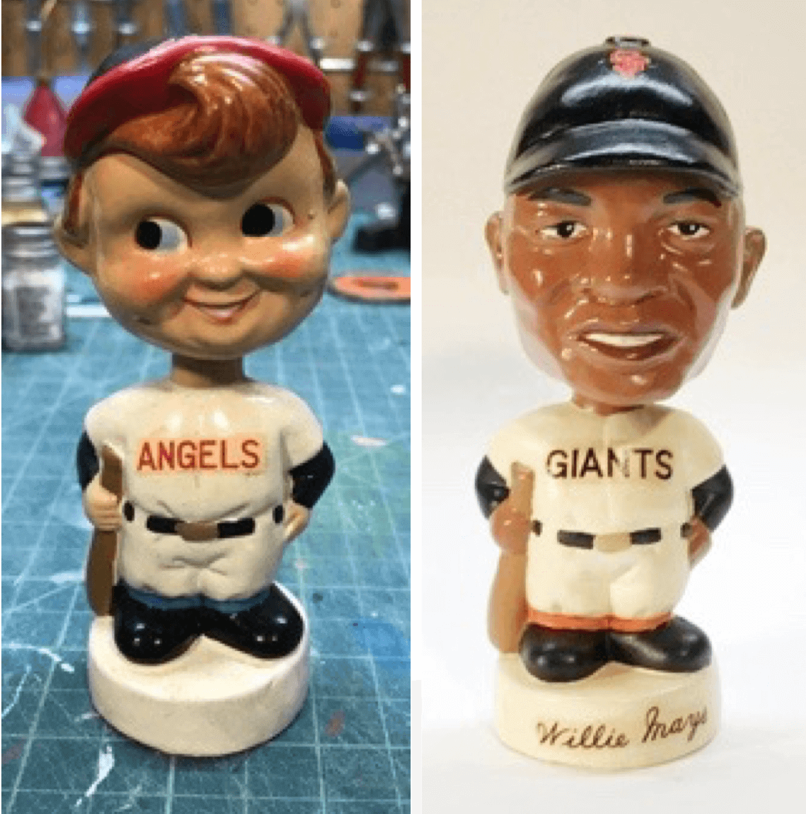
I continue to receive special requests from collectors. The majority tend to be restorations, but the custom projects are probably the most enjoyable! It’s very rewarding to take something that has deteriorated and bring it back to life, making it beautiful and desirable once again.
———
Paul here. Is that some great stuff or what? Big thanks to Chris for sharing his expertise with us.
And there’s more: A week or so after Chris sent all of this content to me, I received a package in the mail from him. Here’s what was inside (click to enlarge):
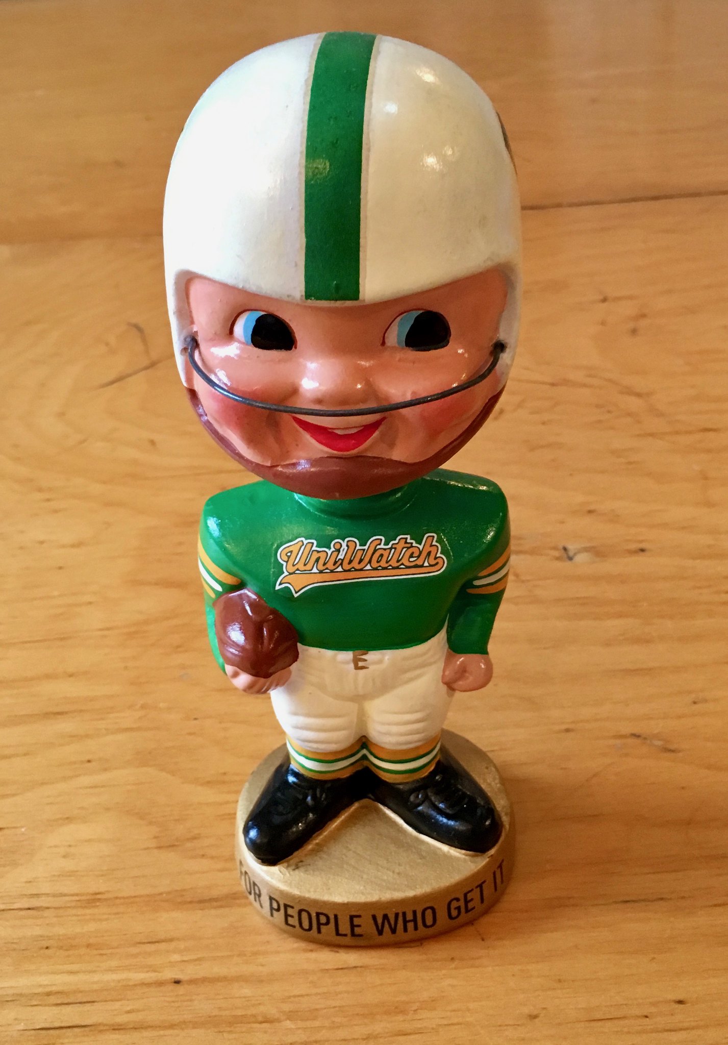
Pretty cool, right? For the helmet logo, Chris created a variation on the Uni Watch “winged stirrup,” transforming it into a winged football sock:
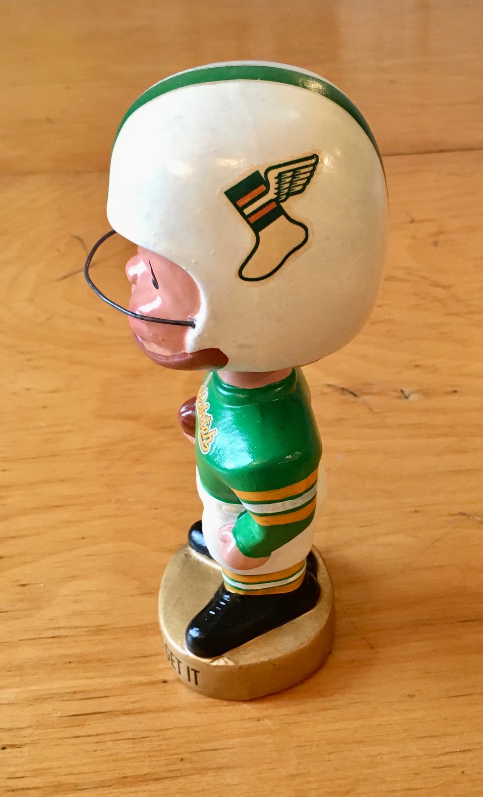
Like the rest of Chris’s bobbles, this one started out as something else. Here’s the original. (Also, it’s worth noting that this isn’t the first Uni Watch bobblehead. Comrade Robert Marshall created a series of Uni Watch bobbles back in 2009, and those were custom-cast from scratch, not repurposed vintage dolls. One of the all-time great DIY projects!)
If you’re interested in commissioning Chris to do some bobblehead work for you, you can contact him here. And you can see a bunch of his work by going to eBay and searching on his eBay name, crc-customs.
Click to enlarge
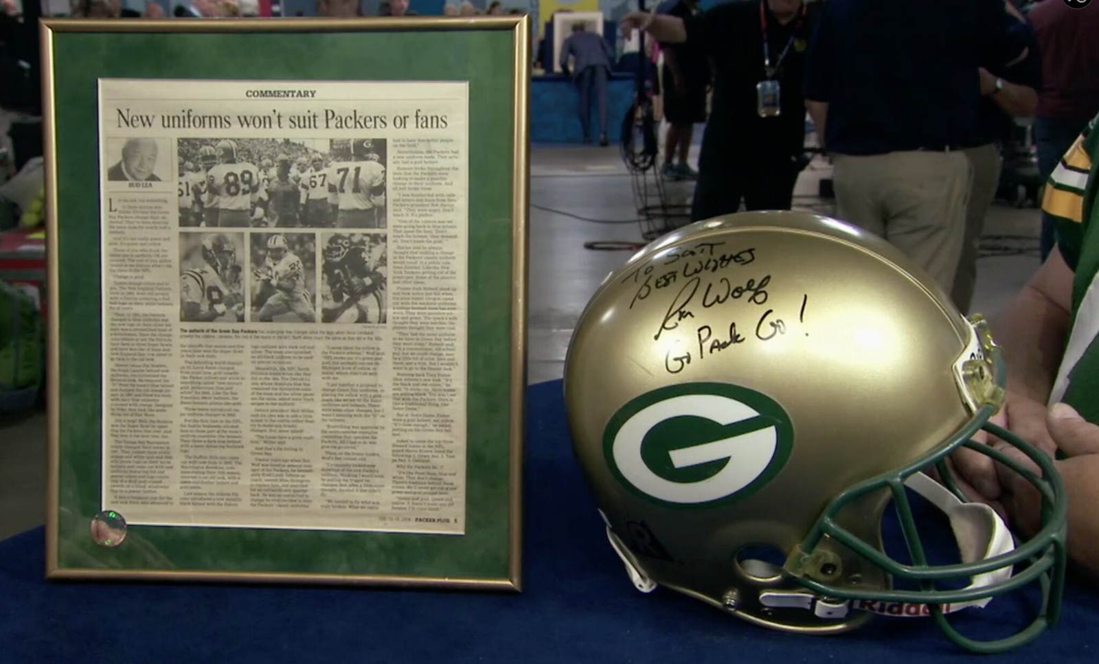
But no Paul Hornung betting slips or Brett Favre painkiller prescriptions: The PBS show Antiques Roadshow recently made a stop in Green Bay, and naturally some people showed up with Packers memorabilia. Of particular interest to us from a uni-related perspective is the helmet shown above — a prototype of the gold helmet design that Packers GM Ron Wolf wanted to introduce in 1993 as part of a new uniform design. Wolf even got then-scout and future Packers GM Ted Thompson to model the new uniform but eventually backed off on the uni-redesign plan.
The guy who brought in the helmet to Antiques Roadshow said he got it at a thrift shop for $25. He later got Wolf to autograph it.
Another person brought in a big helmet-shaped sign that her father stole from Lambeau Field during the celebration/melee following the Packers’ victory in the Ice Bowl. She later got it signed by former Ice Bowlers Jerry Kramer and Doug Hart.
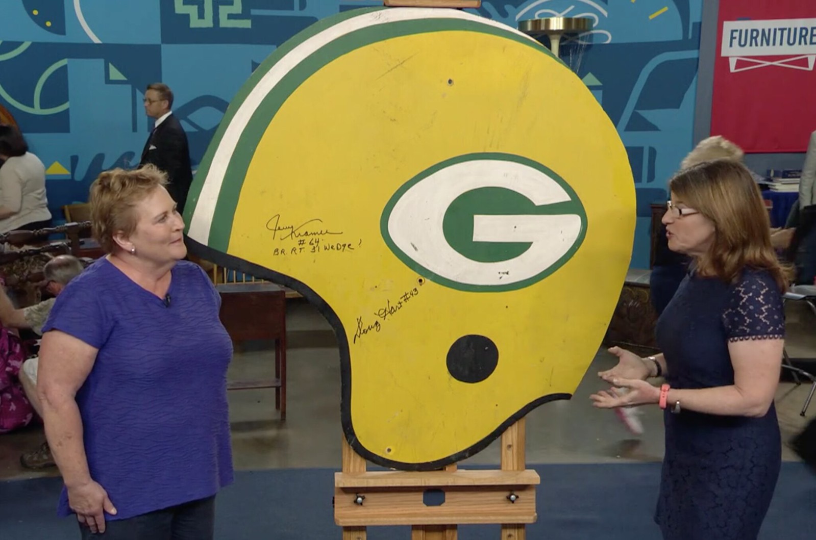
You can see the full Antiques Roadshow episode here. The segment with the Ice Bowl sign comes up at the 1:05 mark, and the helmet prototype appears at 29:29.
(My thanks to Miles Cliatt for letting me know about this one, and to Don Stein for the Ted Thompson factoid.)
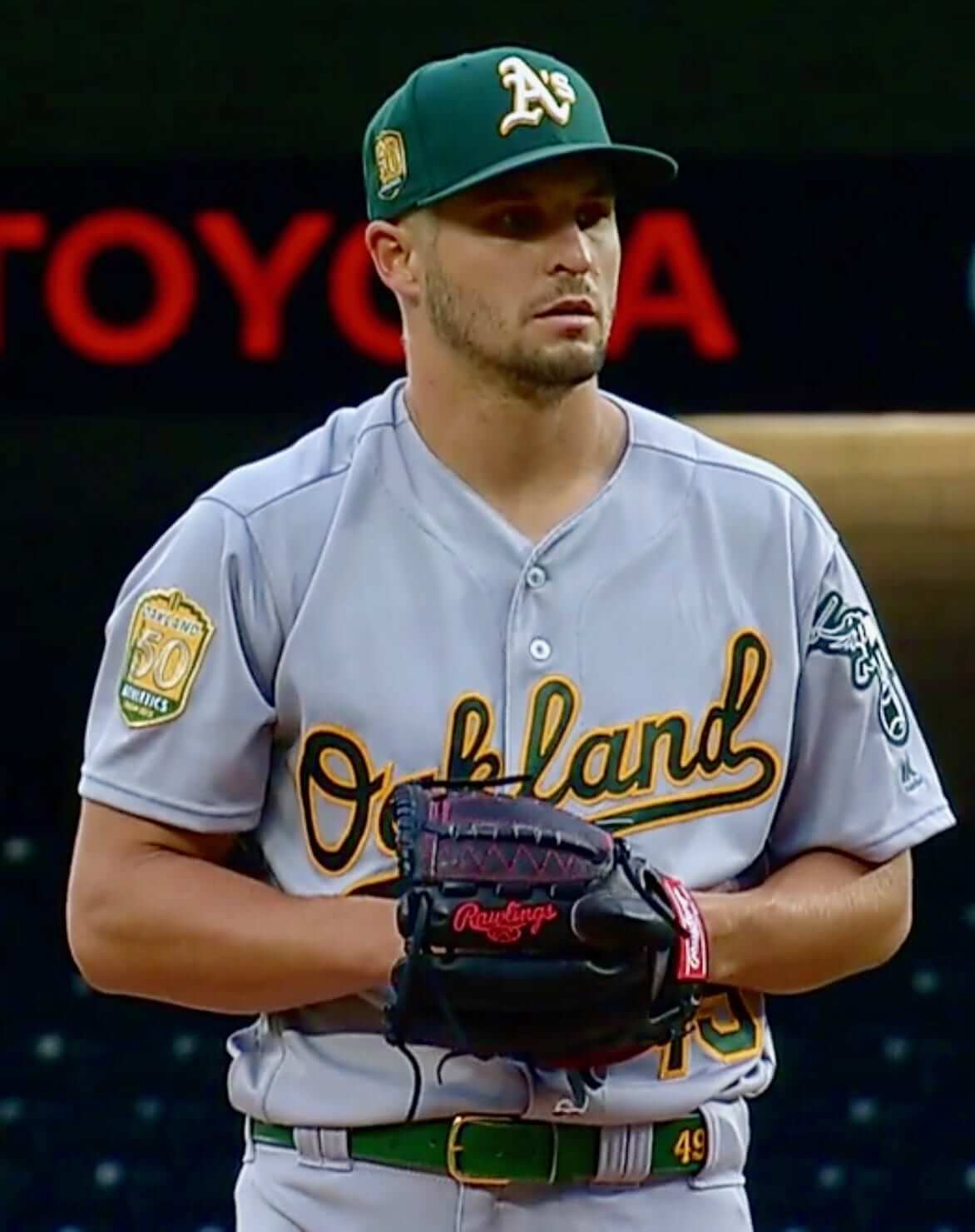
It’s officially a trend: Last week I noted that Mets players Noah Syndergaard and Yoenis Céspedes were wearing uni-numbered belts. Last night A’s starter Kendall Graveman was doing likewise. So this is definitely a thing.
Belts are the most overlooked part of an MLB uniform. I know that the ones with the slightly larger, flashier buckle are made by Mizuno, but I have no idea who makes the more standard-looking ones. I’ll try to find out today.
Does anyone collect MLB belts? I did a search on “game-used MLB belt” (which was complicated significantly by the existence of Giants first baseman Brandon Belt) and came up with two auction listings: one for a belt and cap once worn by former Mets reliever Scott Schoenweis, which sold for $31.67, and another for a lot of six belts worn by Hall of Famer Barry Larkin, which sold for $179.25. (It’s not clear why Larkin saved a bunch of belts from various stages of his career. Hmmmmm.)
About the only time an MLB belt gets any attention is when it breaks. Articles about the future of the baseball uniform often mention that the belt is an antiquated accessory that needs to go. And of course it did go in the 1970s and ’80s, as many teams switched to elastic-waistbanded pants. But by 1993, they’d all switched back to belted pants, and pants have remained belted in the quarter-century since then. So belts are a fixture, if a rather inconspicuous one. Which is why I’m all geeked out about these uni-numbered belts — it’s the first real change in this uniform element in a generation.
(My thanks to @justin_sr for letting me know about Kendall Graves’s belt last night.)
Click to enlarge
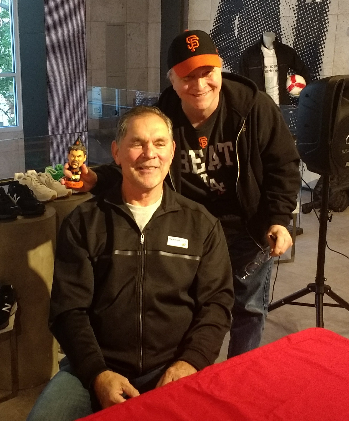
Two Giants in their field: Who’s that posing with Giants skipper Bruce Bochy, while holding a Bochy gnome figurine? It’s none other than our own “Collector’s Corner” columnist and diehard Giants fan Brinke Guthrie, who got to meet Bochy last night when he made an appearance at a San Francisco sneaker shop. Looking good, Brinke!

Raffle reminder: In case you missed it earlier this week, our friends at Ebbets Field Flannels are raffling off a super-cool Santurce Cangrejeros T-shirt. Full details here.
While we’re at it: As you may have noticed, Ebbets is currently running an ad in our right-hand sidebar, and they’re also partnering with us to create and sell the first Uni Watch cap, which should be available in mid-May. They have great stuff — please consider them, and the rest of our advertisers, for your shopping needs. Thanks.
The Ticker
By Paul

’Skins Watch: A high school in Turners Falls, Mass., whose teams had previously been called the Indians, is asking students and residents to vote on a new team name. The voting runs from now through May 16.

Baseball News: What, no anniversary patch? The Phillie Phanatic made his debut 40 years ago yesterday. … I haven’t heard anything about the D-backs’ bullpen cart since the beginning of the season, when it was reported that most relievers were declining to use it. Also, the Tigers were reportedly introducing a cart, but I haven’t heard anything more about that either. Has the whole project been quietly shelved? … Why were the Expos and White Sox playing each other, and why were they both wearing road uniforms? That photo’s from the 1970 Hall of Fame Game (from Chris Mayberry). … The New Orleans Baby Cakes will become the CrawDaddys for one game on May 1. … Highly touted Braves prospect Ronald Acuña Jr., who was just called up, has a tilde and JROB on his jersey (from Richard Grossman). … Peoria Richwoods High School in Illinois has striking green uniforms with white pinstripes, similar to the Cubs’ old reverse-pinstriped powder blue road uniforms (from Ben Zoss). … After the Houston Rockets won their NBA playoff game last night, Rockets G Gerald Green wore a Nolan Ryan Astros tequila sunrise jersey (from Ignacio Salazar). … Several readers have noticed that the Blue Jays now have uni numbers on the back of their sweatshirt/pullover thingies. Does any other team do that? … Speaking of new pullovers, the umpires appear to have a new design with a grey shoulder yoke. Or at least I think it’s new — a few people have told me it actually debuted last year, although I don’t recall seeing it until now.

Pro Football News: “I work for a wine and spirits chain in Florida and we are always getting promo items that vendors hope we will sell,” says Jon Solomonson. “This Broncos koozie caught my eye. They aren’t shown on the manufacturer’s website yet.” … The 2019 Grey Cup will be played in Calgary (from Wade Heidt). … The Titans have been working out with their new helmets and practice jerseys. Not liking that new number font. Lots of additional photos are in a gallery that you can access by scrolling down on this page (from Nathan Dearman). … The Vikings are holding a “garage sale,” in which they’ll be selling off lots of team gear. … Buncha good stuff from Pro Football Journal, including shots of Bears P Bobby Joe Green going without a facemask in 1970 and Bears QB Bobby Douglass with a serious rear-jersey tear.
College Football News: New uniforms for ECU. Additional info here. … In a related item, it looks like Adidas jerseys will no longer have the tire tread pattern.

Hockey News: It’s a little hard to see, but former Boston Celtics coach Tommy Heinsohn was on hand for last night’s Bruins playoff game, and the team gave him a Bruins jersey with green uni numbers (from Lance Harris).

Basketball News: Cross-listed from the hockey section: It’s a little hard to see, but former Celtics coach Tommy Heinsohn was on hand for last night’s Boston Bruins playoff game, and the team gave him a Bruins jersey with green uni numbers (from Lance Harris). … Here’s the backstory on the logo for the Augusta 706ers, a new team in the ABA. … Cross-listed from the baseball section: After the Rockets won their NBA playoff game last night, G Gerald Green wore a Nolan Ryan Houston Astros tequila sunrise jersey (from Ignacio Salazar).

Soccer News: AC Milan’s new kit has leaked, and so has Borussia Mönchengladbach’s (from Josh Hinton). … So has Corinthians’ (from Ed Zelaski). … So has Bayern Munich’s. … Speaking of, uni leaks seem to be much more common in soccer than in other sports. Anyone know why that is? … Real Madrid star Cristiano Ronaldo sent a signed shirt to Manchester United forward Marcus Rashford. … The new MASL team in Orlando will be called the SeaWolves (from Jim Vilk). … New kit for Dundee United (Josh Hinton again).

Grab Bag: Wyoming athletics, which had been outfitted by Nike, is switching to Adidas (from @WyoNationBlog). … The West Virginia Dept. of Agriculture is encouraging people to vote on a new “West Virginia Grown” logo. … New city flag for Reno (from Manzell B). … New logo design for TV station WMAZ in Macon, Ga. … The American Pecan Council has unveiled a new logo and slogan.
Happy Birthday to Comrade Robert Marshall, head of the Uni Watch Stirrups Club and an all-around swell guy. Love ya, Moose — big hugs to you on your special day.
The Brett Favre painkiller prescription reference is quite rude and ignorant.
A little before my time, but I agree.
“West Virginia Grown” link is no good
Fixed.
“Uni leaks seem to be much more common in soccer than in other sports.”
So there’s probably a couple reasons why.
1. Literally hundreds, if not upwards of a thousand, kits will come out this summer, so it’s just sheer volume.
2. This one website (Footy Headlines) apparently collects as many leaks as it can (though keep in mind it’s not immediately clear where they get them).
3. Of course, retail drives the rest of this.
I think the soccer leaks are partially due to the fact that almost every team gets at least one new uniform a year, if not two or three. The unveiling of the new kit becomes part of the routine so just like anything you want to see it as soon as you can.
The Tigers have a bullpen cart. Nobody wants to use it though: link
I saw a more recent article than that, but I can’t find it now…
Why were the Expos and White Sox playing each other, and why were they both wearing road uniforms? That photo’s from the 1970 Hall of Fame Game (from Chris Mayberry).
Both links go to the same image.
Fixed. Second link is now this:
link
Indeed, new football kits are given to every team every year, with a few exceptions. Also, Dundee Utd is their away kit
Terrific story today! Thanks to Chris for sharing his work and to Paul for publishing it for us. I particularly enjoyed the in-progress photos of Chris’s work – though I don’t mean to take any praise away from the text of the article, which was well written and fun to read.
I understand why collectors would worry and complain about replicas. And to a large degree I agree with them when it comes to things I collect. But the fundamental principle animating such objections is a desire to defend and perpetuate scarcity. That is an ignoble value, and if one happens to follow any of the faiths of the Bible, it is a sinful mindset. As long as the replica differs in some unalterable way from the original – say, a different base shape or sculpted number or engraving under the base – then the concern about future fraud is fully satisfied. I hope that in the long run, Chris is not permanently dissuaded from replica projects if the fancy strikes him. That black gun-toting Colts bobber is too awesome to be scarce!
PS: I mean nothing in the above as criticism of Chris’s thoughtful response to the collector objections he received.
I agree with what you said about collectors trying to keep market prices high for what they’re trying to sell. As long as what you’re putting out there has a dramatic difference to the original product then press on.
I agree! The replicas are true artistry at work and it would be a shame to stop. I would just engrave your initials into the bottom side or something else that can’t be changed so there is no doubt that you created it. If you do enough of them, your replicas may one day be as valuable!
Guys-
Thanks for the very thoughtful comments and response. I appreciate all of the kind words, and that you took the time to share them.
RS, thanks for your thoughts. As a Christian myself, I do subscribe to the principles taught in the Bible, and want to be sure not to contribute to any behavior which could be deemed as deceitful/dishonest. With the replicas, there is just a pretty large “gray” area, so it seemed wise for me to just distance myself completely than to try to navigate. But I will say, the replicas are a TON of fun to make!
Memal/Joe- I do make every effort to make my customs stand apart from the rest. And I do engrave each and every one on the base with my initials. But even then, there have been some who taken one of my customs and REMOVED/COVERED my initial, then representing it as an original. For example:
link
(I do not work with this seller any longer due to his questionable practices.)
For now, I’ll just continue to focus on the custom and restoration work. Plenty of possibilities there still!
Chris
Great work Chris! I love your attention to detail and everything you did on the Colt .45 bobblehead you showcased. I was just thinking the other day about how I miss seeing Robert Marshall’s art, happy birthday comrade and hope all is going well with you!
That Favre joke was uncalled for. Paul, you’re better than that.
Geez. Lighten up, Francis.
Seeing the Titans practice gear and new helmet reminds me how they missed the opportunity to be unique. They were once 1 of 7 white helmeted teams in the NFL (Colts,Cardinals,Bills,Jets,Chargers,Dolphins,Titans) – Now, they’re 1 of 6 dark blue helmeted teams in the league or 1 of 7 if you count the Giants (Bears,Broncos,Rams,Seahawks,Texans,Titans)
Should have went with the light blue color and they would have been the only team in the league with that color dome.
Yep, and at least when they were one of many white helmeted teams they were only one of two white helmet/ navy jersey teams. Now they are one of five navy helmet / navy jersey teams. Nothing visually unique about them.
Their ridiculous number font is unique.
Would have looked great. Columbia blue helmet, navy jersey, white pants. Alternate Columbia blue jersey over white pants (pays homage to original Oilers).
Plain and simple – NFL teams would look better if they let our Uni Watch community design the uniforms.
The Peoria high school set also seems to include thick triple silver metallic shoulder hem stripes and McAuliffe numbers. Just a lot of stuff, not sure it’s all good. But it’s a lot.
I’m not a fan of the shoulder stripes, but I love everything else and would love to play for a team that wears that color scheme! Light pinstripes on a dark background are way under-used.
The Titans practice jerseys are fancier than the Jags regular jerseys.
If you go through more of these HOF game pictures, you’ll find more road-vs.-road matchups. Pirates-Rangers in ’73 features Tom Grieve of the Rangers wearing a Pirates helmet. Change the year in the URL and you can find more of these from 1974-76, and ’78-79. Also, the ’89 game featured the Red Sox playing an intrasquad game because the Reds’ plane from Montreal malfunctioned and they couldn’t get to Cooperstown on time.
link
“Plane malfunction” was code word for “Pete Rose doesn’t want to be badgered by the press in Cooperstown while being investigated by Bart Giammati.”
I saw the Mets play the Senators at the Hall of Fame Game. If you hit the ball over the fence in right field it was a double. The fence was little league distance. I got Joe Christopher’s autograph.
I like bobble heads as much as the next guy…. but let’s face it.. hot dogs are sandwiches …
When the ABL was outfitted by Majestic, players were given majestic belts. But there was no rigid rule as to who makes the belt a player wears. I’d assume this is the same in the MLB.
If you liked that Red Sox-Yankees 1939 video yesterday, check out this link, which features Babe Ruth in his last season. Video has some very faint color.
Some stuff to notice:
– McAuliffe font for both teams, though the Phillies’ “7” doesn’t seem to have the vertical part at the top right like we’re used to
– When Ruth bats, you get a nice shot of the front of the Braves’ jerseys and the Indian logo
– Famous “Lifebuoy” sign covering the right field wall (“The Phillies use Lifebuoy” … and they still stink?
– Phillies have an interesting numbering scheme: 10-12 are catchers, 20-25 are infielders, 30-34 are outfielders, and 40-49 are pitchers. That leaves a lot of low numbers un-used. When I first read about this, I assumed that the single digits went to the manager and coaches, but in this video (at about 2:32) you can see a first base coach wearing number 51. I had never considered that!
Love the Richwoods white stirrups with green sanitaries
With respect to teams having “garage sales”, the University of Oregon is having their’s this coming Saturday, April 28.
I LOVE that Broncos koozie! 60th year of play for AFL teams, so hopefully that’s just the tip of the iceberg for cool designs available this year.
OK, now that UW bobble is all kinds of excellent.
It’s cool that the head on the Bruce Bochy gnome was done to scale. Nice attention to detail.
he was a real nice fellow, big ‘ol drawl, -huge- hands, I shook hands and his hand dwarfed mine. Met Amy G, the terrific Giants in-game reporter too.
Re: the Expos-White Sox piece, the HOF has links at the bottom to the HOF games, and the 1973 game featured the Pirates-Rangers. In all of the pics, Rangers batters are wearing Pirates helmets, an interesting uni-related item (to me).
link
Good one! Might need to do an entry on HoF Game uniforms….
A very nice move on the part of Gerald Green to wear the Nolan Ryan jersey.
But too bad whoever made it up used the wrong number font.
link
This is probably just a coincidence, but my high school, West High School in Iowa City, was founded in 1969. At the time, the Packers were fresh off their run of NFL dominance including winning the first two Super Bowls. As a result, the school (Mascot=Trojans) picked the Packers color scheme for their athletic teams, including a football uniform that was (nearly?) identical to the Packers, except with a W on the helmet. The football team was always terrible and had one of the longest losing streaks in the country in the late 80s and early 90s. Sometime around 1993 (I wasn’t there at the time, so I might be off by a year or two) the school switched from the yellow/mustard to what we would call metallic gold or Notre Dame gold. I was always told it was just to give the school’s athletics a fresh start. Other schools often made fun of the old color scheme and it started to become associated with losing. It didn’t help that the Packers were also no longer great. The teams would still be green and gold, but it would be more like Notre Dame, who were good at the time, and less like the Packers. Well, after the switch (and with a new emphasis on having good athletic teams) the school started winning a lot of state titles, including football. Interestingly, the new West High unis looked identical to the Ron Wolf Packers mock ups — gold helmets, green jerseys, gold pants, etc. (I think they wear white pants nowadays with the green jersey). Iowa City is not terribly far from Green Bay. I highly doubt Ron Wolf got the idea from a high school in Iowa, and I have no idea if anybody in Iowa City got wind of what Wolf was doing. But it is interesting (to me at least) that two teams with the same uniforms and in relatively close proximity, had the same idea at the same time to change uniforms and both would have landed on the same final idea, except one bailed and the other went through with it.
As an observer of the Canadian game, hard not to notice that the 1990s Green Bay Packers prototype (gold helmet,green jersey, gold pants) is a similar look to that worn by the CFL Edmonton Eskimos in the 1960s.
We got a chance to look at that uniform again in 2009, when all CFL teams wore 1960s throwbacks.
link
Outstanding work Chris! Please keep us posted on future projects. Thanks for sharing
It appears Ronald Acuña had neither the tilde nor the JR in the minor leagues, and only the tilde in spring training this year.
Spring: link
MiLB (2017*): link
*The Gwinnett Stripers (his only minor league team this year) appear to go NNOB.
And for good measure…
2017 Futures Game: link;
Spell check: “Lambau” Field
Wow. If we only had color photos of that 1970 Hall of Fame game between the White Sox and Expos! Both are wearing their road uniforms – which means we could compare the color of the often debated White Sox road uni against the actual blue flannels worn by the Expos.
I can’t seem to see photos that originate from Twitter. I get a message that says “Sorry, Twitter is taking too long to load.” I don’t use Twitter and don’t have a Twitter account. This started a few days ago. Any ideas?
Titan number fonts now second to worst in the NFL. The Worst of course being the Buc’s digital clock numerals.
Soccer teams often times wear their kit for the following season during the last game of the current one. It’s all a marketing thing to get new jersey sales going as soon as possible.
also, soccer teams change all 3 (home, road, third) kits every single year. I’m not sure any club keeps the same exact kit year to year