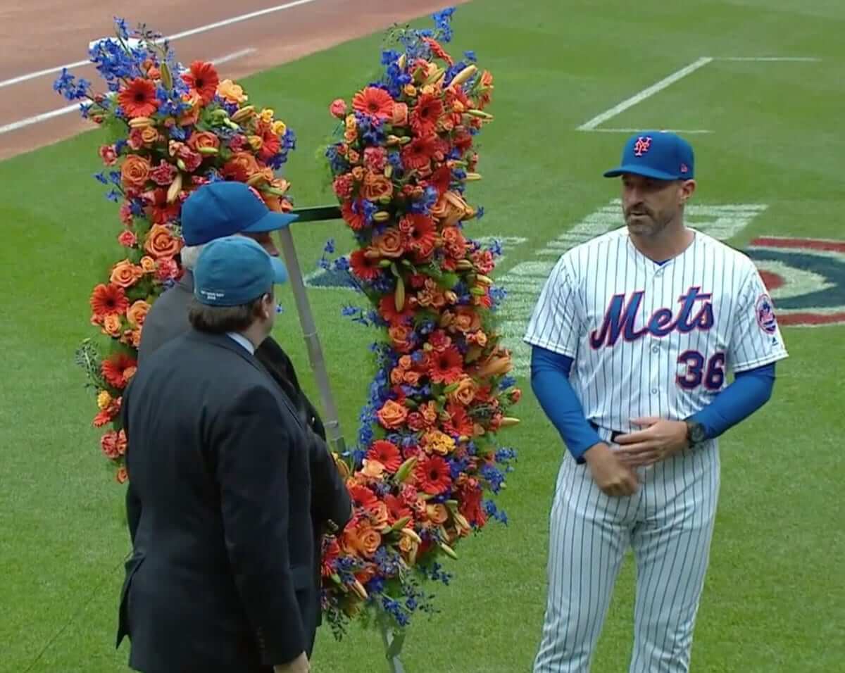
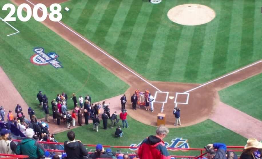
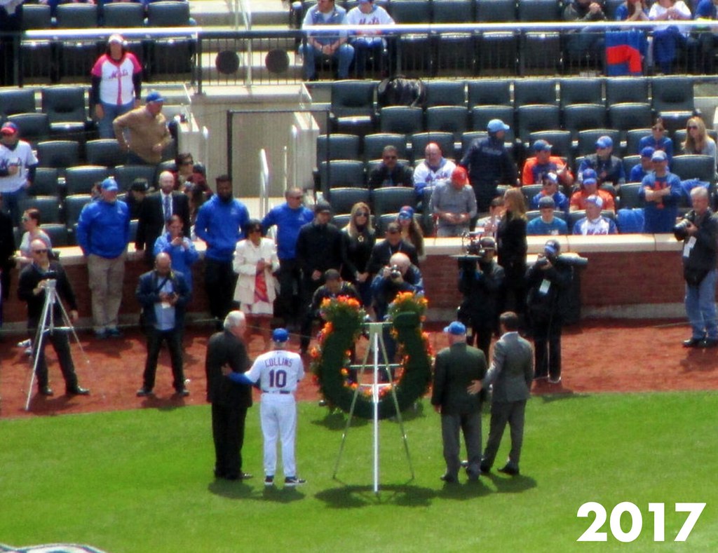
Back on Opening Day, Mets manager Mickey Callaway was presented with a horseshoe-shaped wreath of flowers — a gesture of good luck for the coming season (as shown at right; click to enlarge). This was the latest installment of a long-running Mets Opening Day tradition dating back to the opening of Shea Stadium in 1964. When that stadium’s namesake, William Shea, was still alive, he would present the flowers to the manager. In the years following his 1991 death, the presentation has been made by members of the Shea family.
I was discussing all of this with the Tugboat Captain, because she grew up next door to William Shea’s weekend bungalow (she even got candy from him on Halloween one year!). We decided to look up a few photos from previous Opening Days — and that sent me down a new rabbit hole that has resulted in some very interesting revelations. For instance:
1. The horseshoe used to point down! This really surprised me. Doesn’t everyone know that the luck drains out of a downward-facing horseshoe? The prongs are supposed to point up! But when Mets skipper Casey Stengel was presented with the wreath prior to the very first game at Shea Stadium in 1964, the horseshoe pointed down:
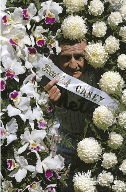
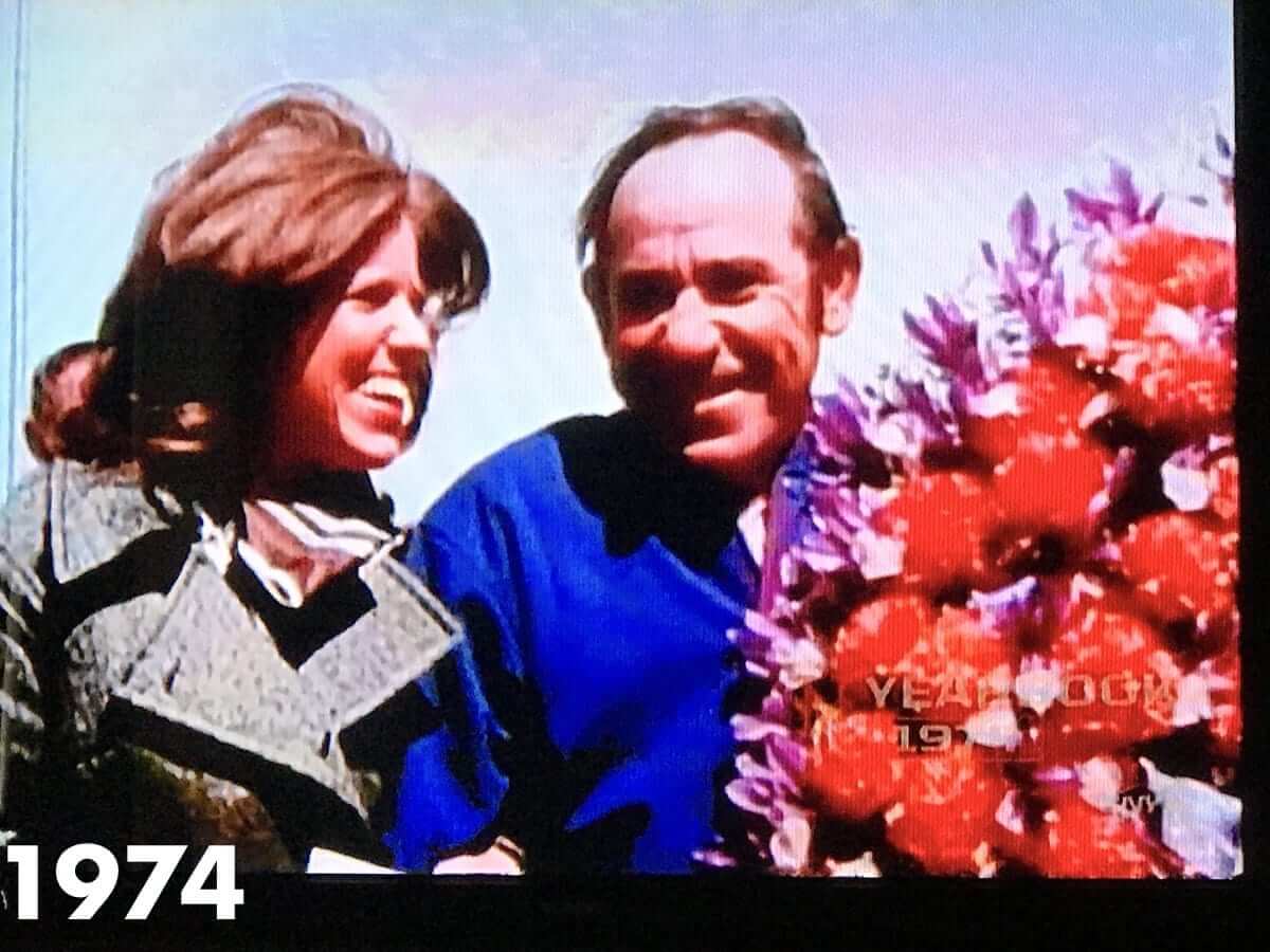
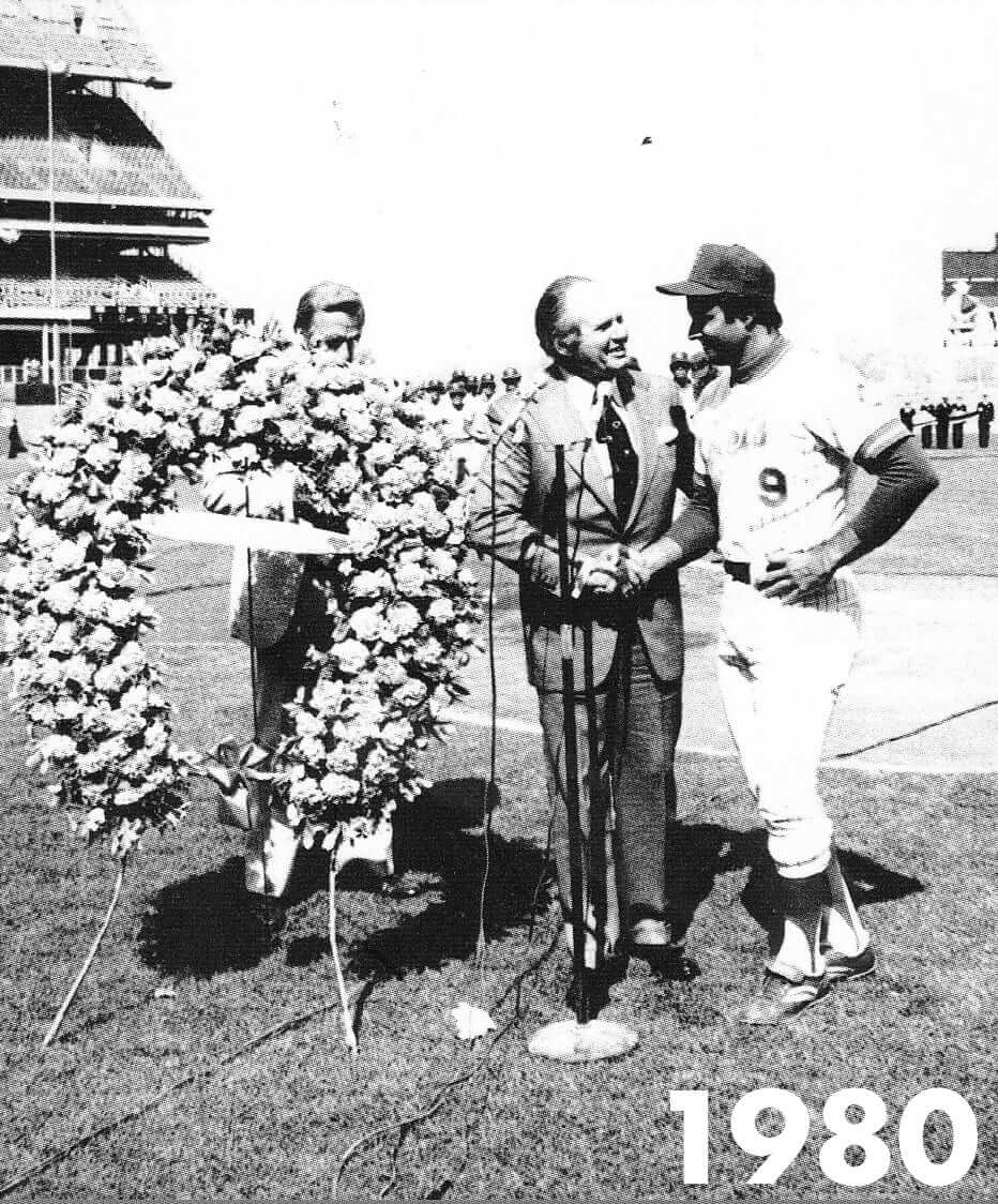
I wasn’t able to find pics from every season, but the horseshoe continued to point downward for every year I could find up through 1980:
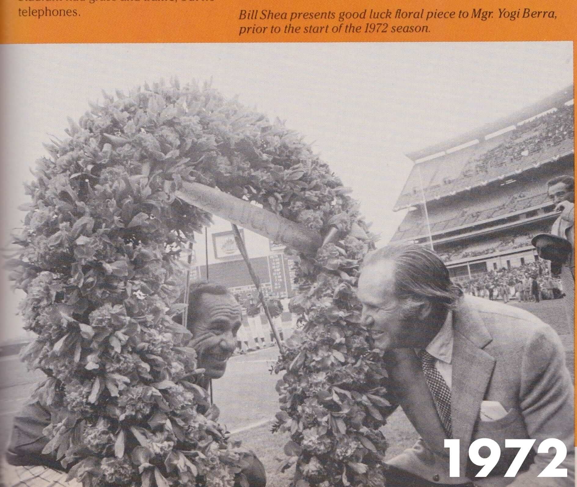
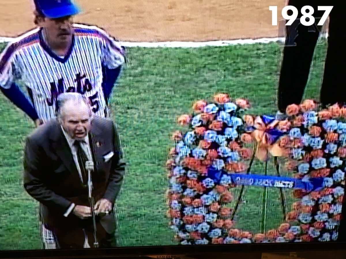
The next shot I have is from 1987 — and it shows that someone had wised up and turned the horseshoe so it was facing upward! Dig:
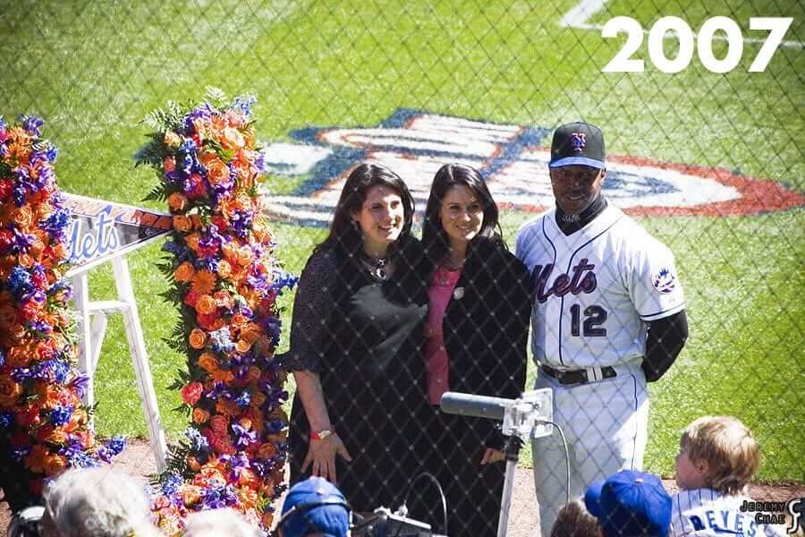
Unfortunately, there’s a 20-year gap in my research timeline, so the next year represented is 2007. In that year, and for the next several subsequent years, the horseshoe was facing upward:
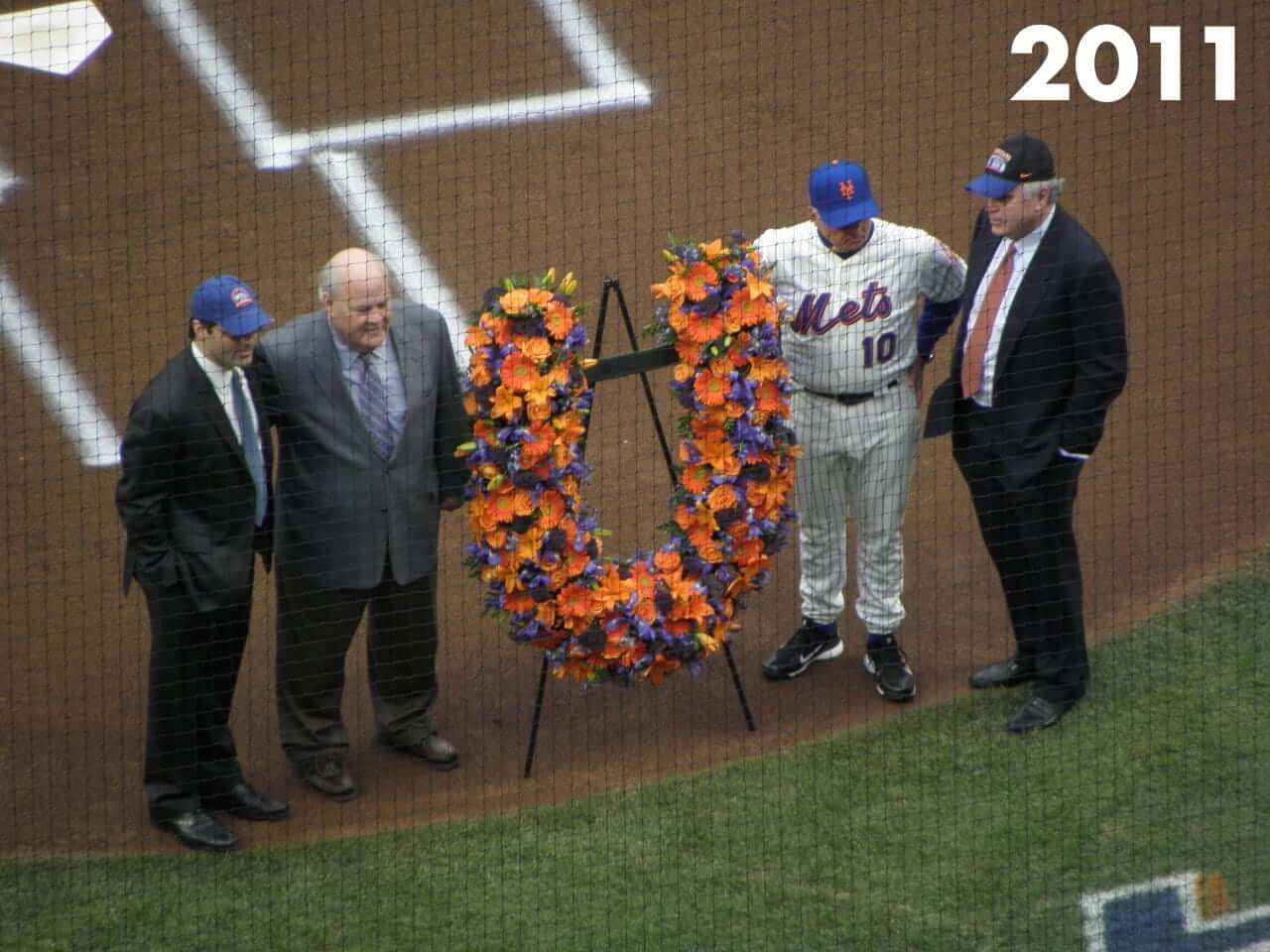
But for the next two years after that, the horseshoe was back to facing downward (plus it looks like they switched to a new florist):


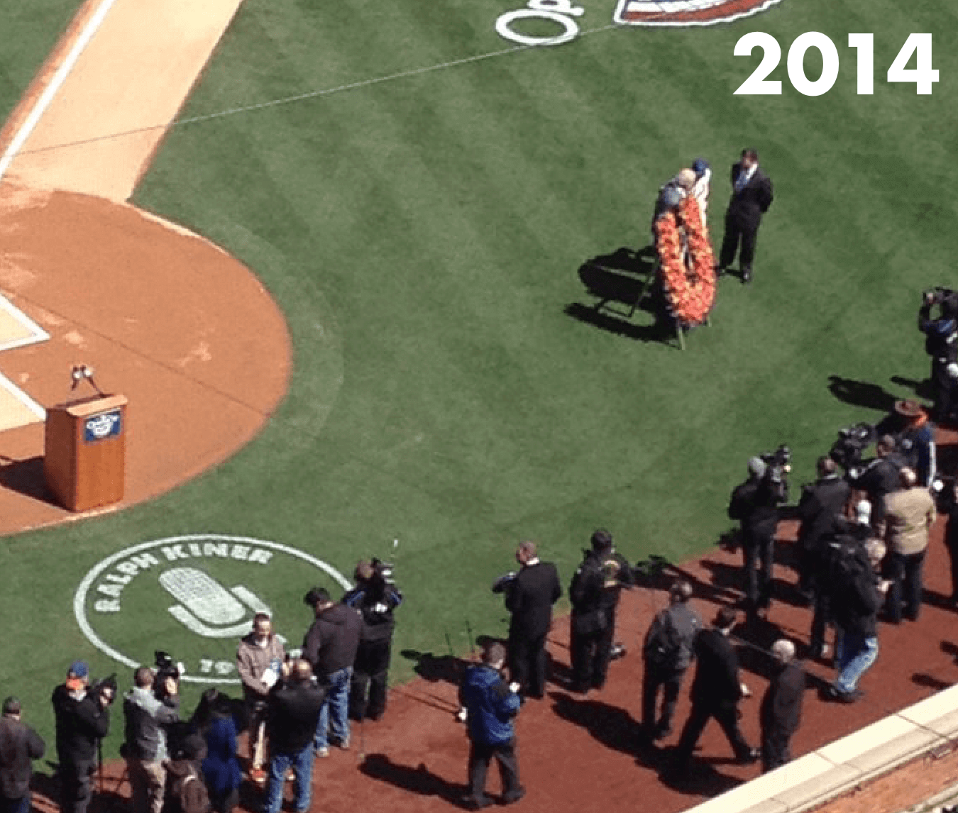
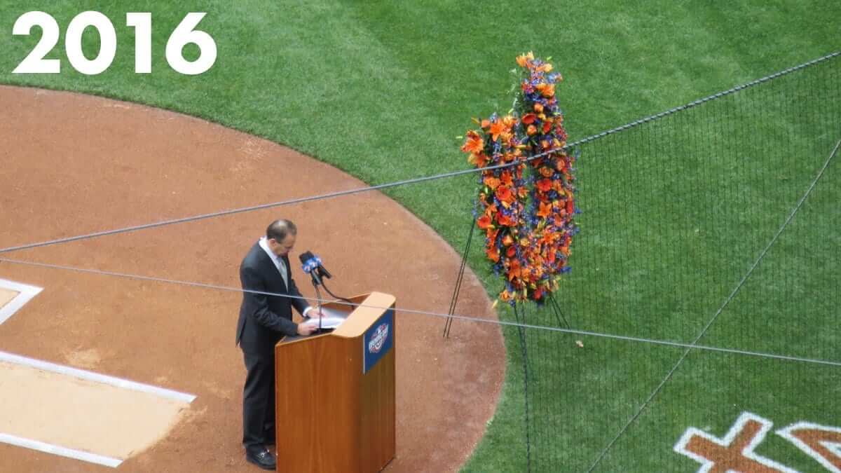
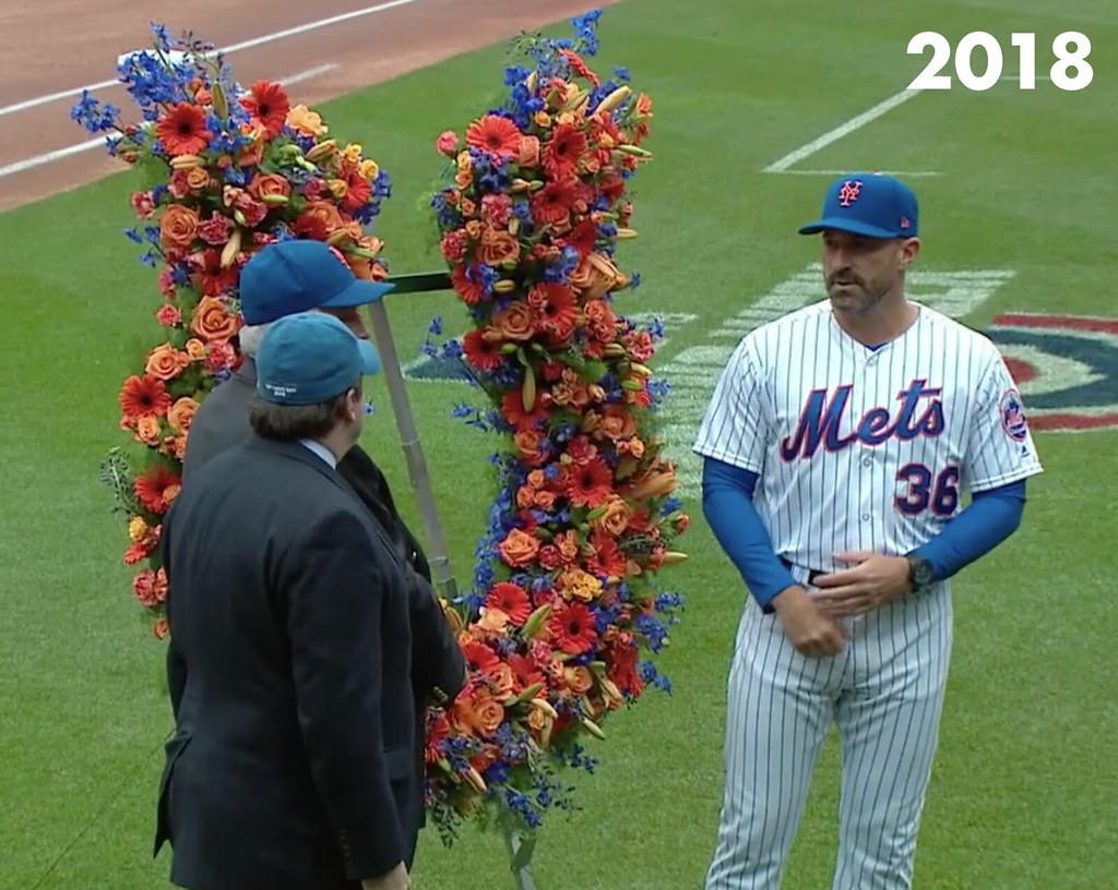
Since then, the horseshoe has been facing upward again:
So that’s the first thing I learned — that the horseshoe’s orientation has changed several times. But it’s not the only thing.
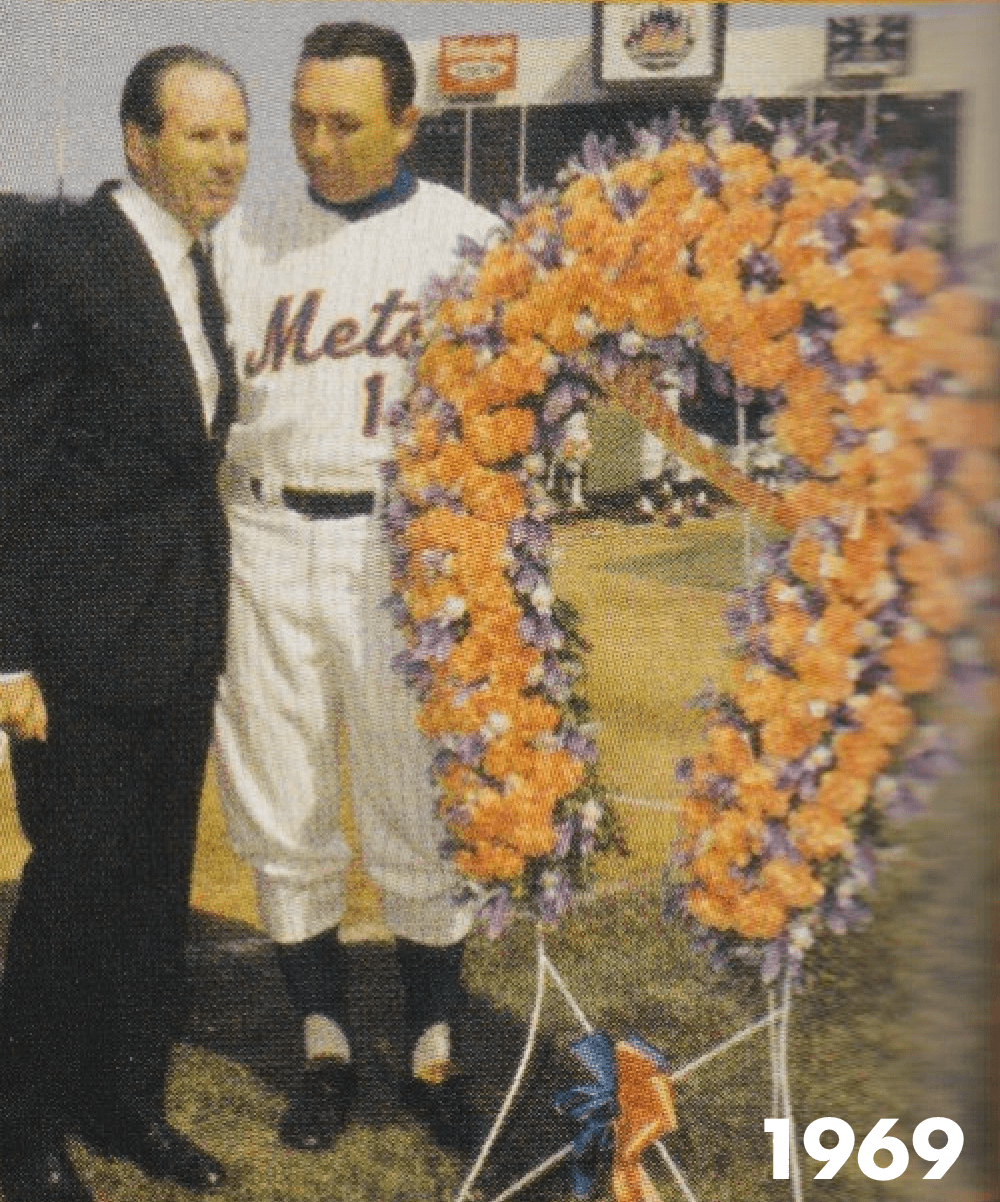
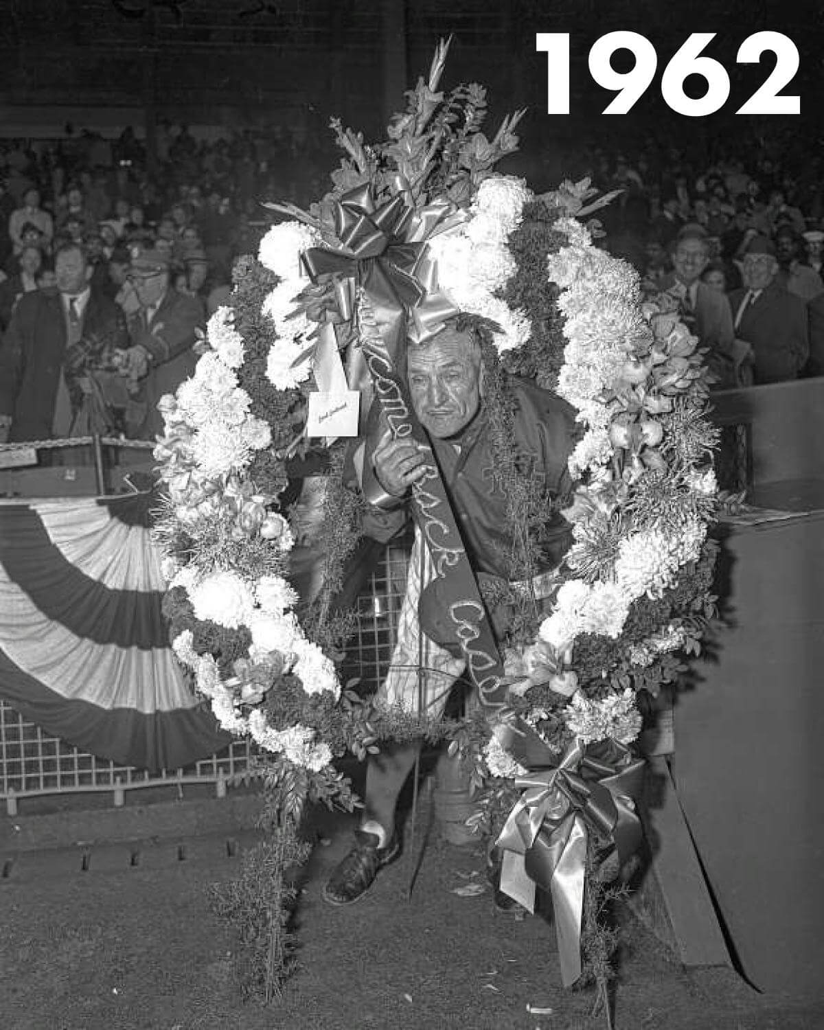
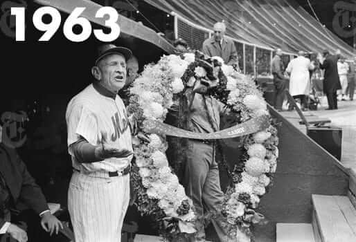
2. This Mets tradition predates Shea Stadium. I’ve heard Mets broadcasters say many times that the Opening Day ritual began when Shea Stadium opened. But it turns out that Casey Stengel was also presented with a (downward-facing) wreath of flowers in 1962 and ’63, when the Mets played at the Polo Grounds. It’s not clear if William Shea had anything to do with those two presentations.
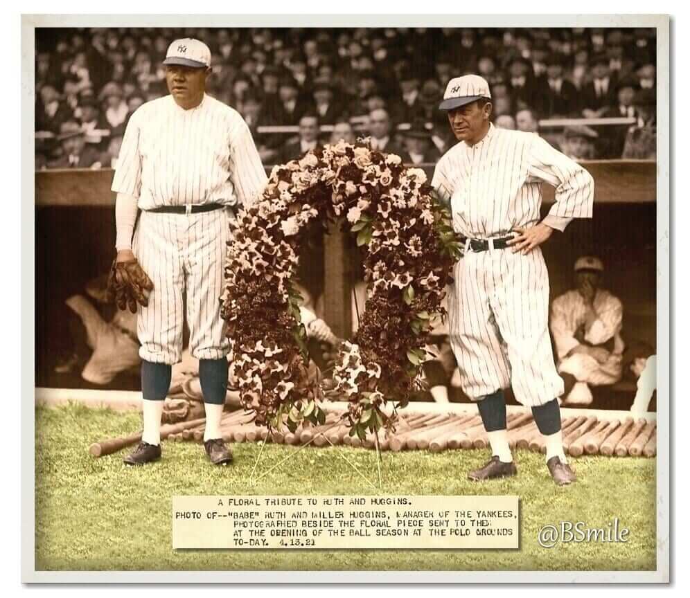
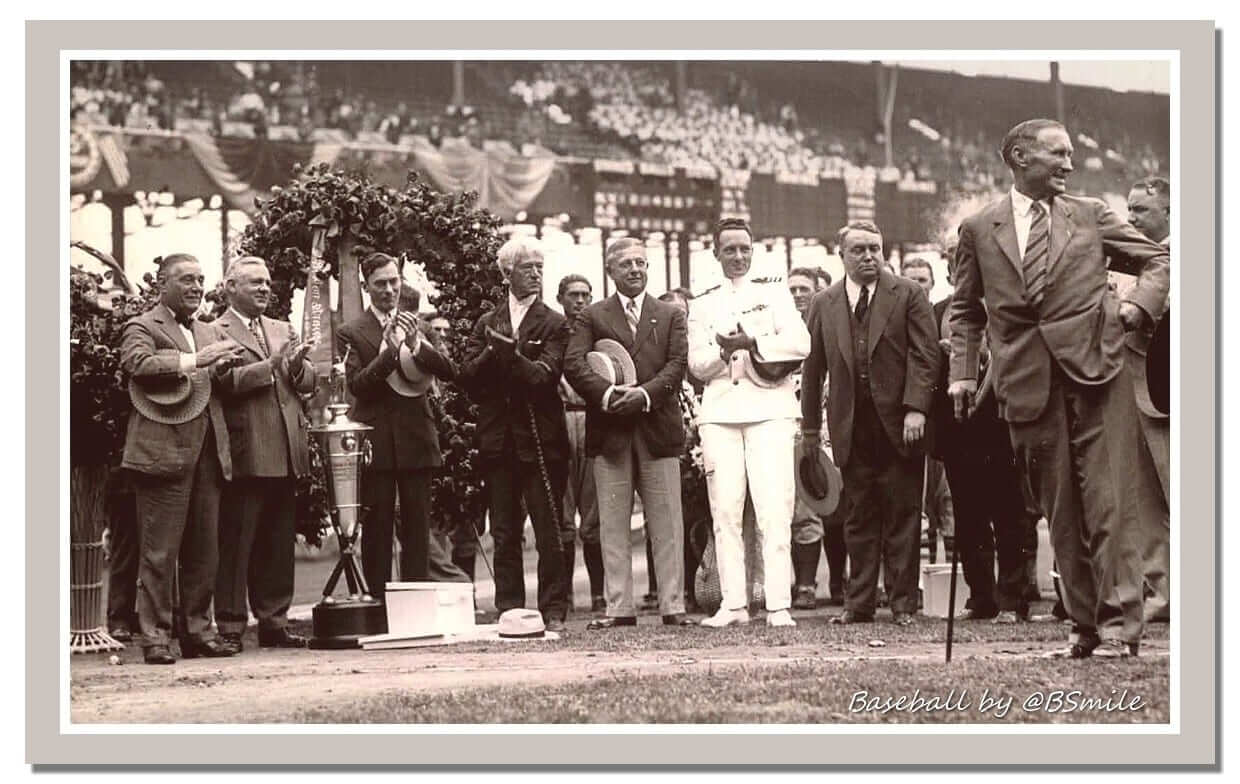
3. This New York tradition predates the Mets. I’d always been led to believe — or maybe just mistakenly inferred — that the horseshoe of flowers was a Mets thing. But it turns out that Yankees managers were given similar floral presentations (all downward-facing) back in the day. Here, for example, is Yankees manager Miller Huggins receiving the flowers in 1921 (click to enlarge):
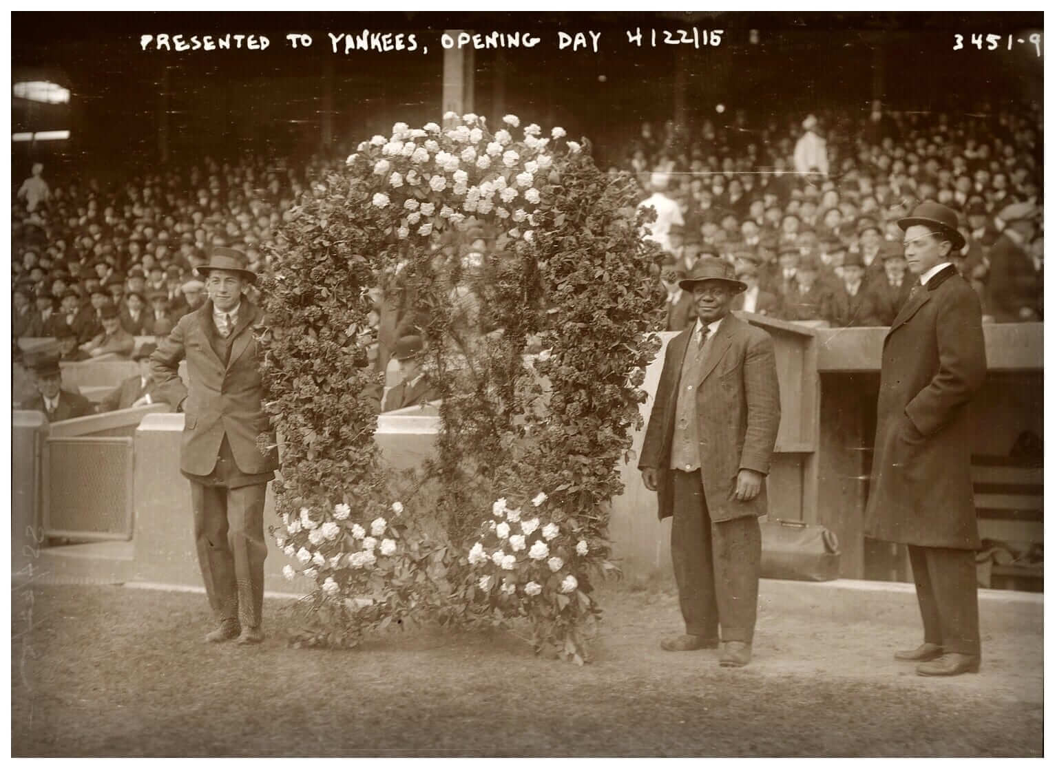
And here’s a shot from Opening Day 1915. No manager in sight, but I think we can safely assume that skipper Bill Donovan wasn’t far away (click to enlarge):
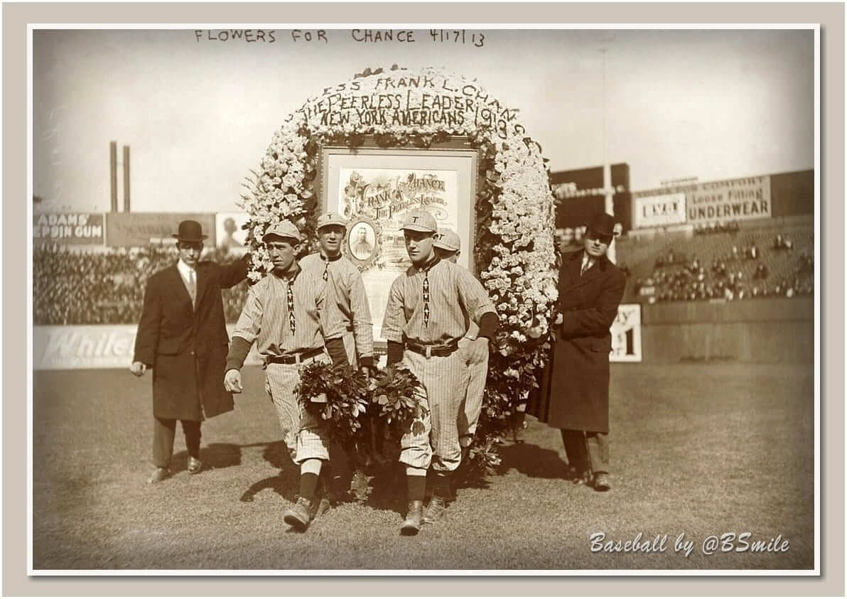
And here’s a shot from two years earlier — Opening Day 1913. The wreath says the flowers are for Frank Chance, who was the Yankees’ manager that year, although the wreath also says “New York Americans,” which was a common nickname for the Yanks at the time (click to enlarge):
All three of those early Yankees photos were taken at the Polo Grounds (Yankee Stadium wouldn’t open until 1923), which got me wondering: Since those first two Mets wreaths were presented at the Polo Grounds, were the floral horseshoes maybe a Polo Grounds thing? And that leads us to…
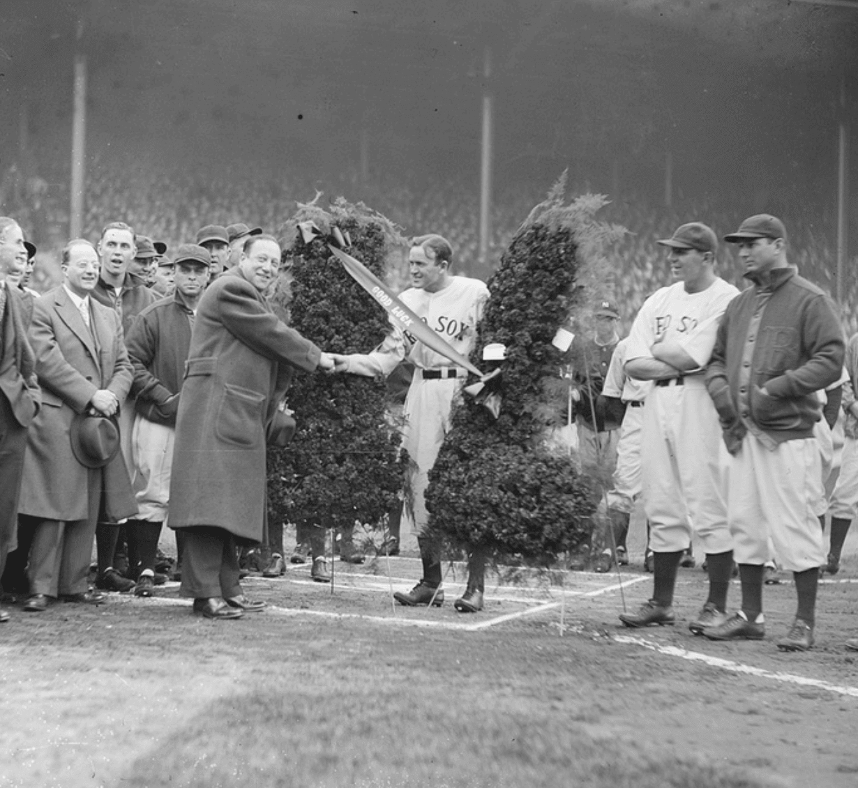
4. It wasn’t just a Polo Grounds thing, or even just a New York thing, or even just an Opening Day thing, or even just a big league thing, or even just a managerial thing: It turns out that floral horseshoes were presented all over the place. Here’s a shot of Red Sox manager Bucky Harris receiving the presentation on Opening Day 1934 at Fenway Park (click to enlarge):

Here’s another Fenway shot, this one from 1935, with manager Joe Cronin receiving the flowers. Interestingly, although the arrangement says, “Good Luck,” it doesn’t appear to be horseshoe-shaped. Maybe it’s supposed to be two socks (click to enlarge):
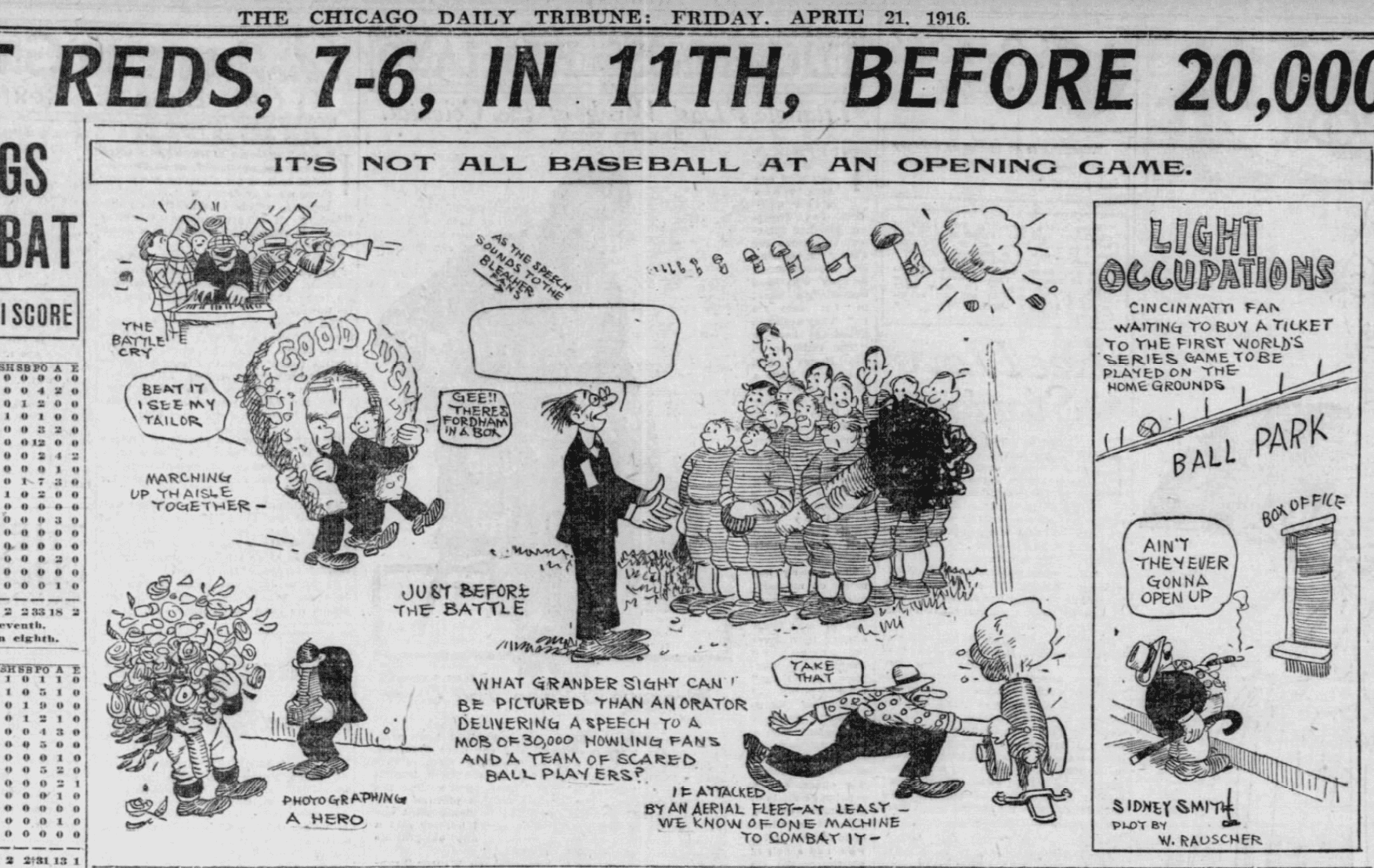
The ritual of the horseshoe of flowers on Opening Day was apparently so well established by 1916 that it was included in this cartoon that appeared as part of The Chicago Daily Tribune’s report on the Cubs’ home opener (click to enlarge):
The flowers also appeared on occasions other than Opening Day. Here’s New York Giants manager John McGraw receiving a horseshoe at the Polo Grounds on July 19, 1927, to celebrate his 25th anniversary with the team (click to enlarge):
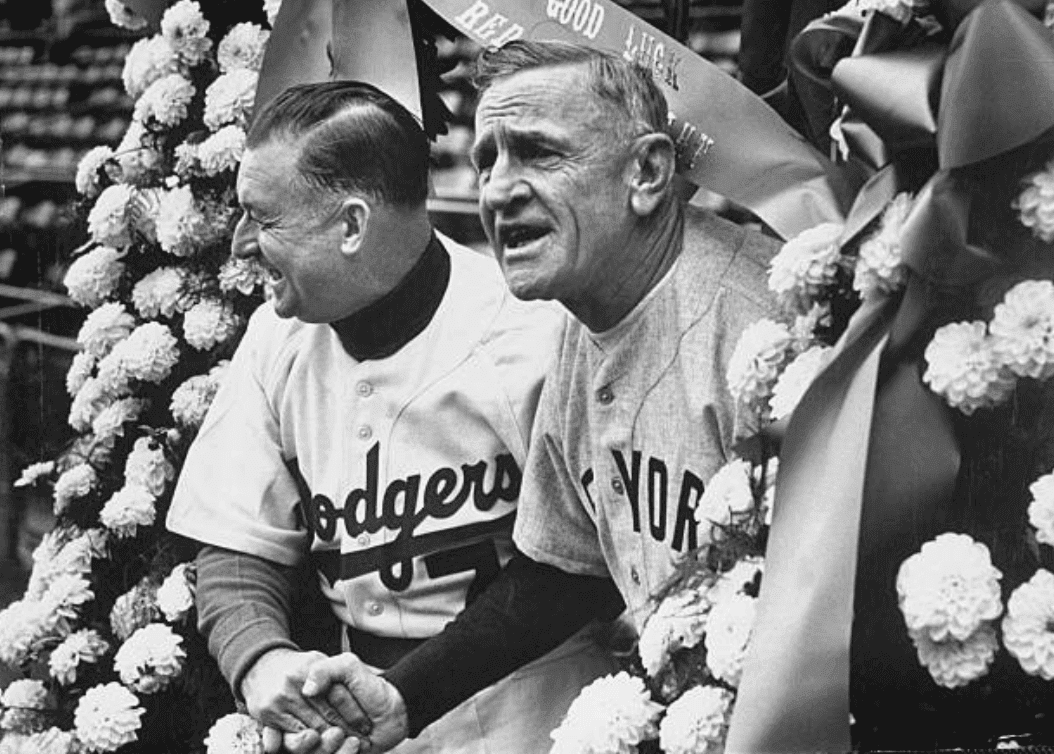
There’s also this shot of Brooklyn Dodgers manager Charlie Dressen and Stengel (who at the time was managing the Yankees) posing under what appears to be a floral horseshoe prior to the start of the 1952 World Series (click to enlarge):
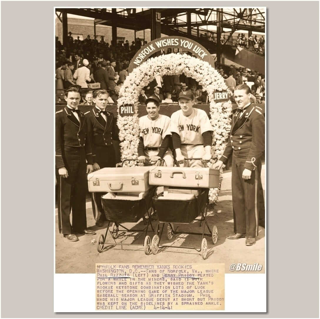
In addition, the ritual apparently wasn’t restricted to managers — or to the home team. Here’s a shot of Yankees rookies Phil Rizzuto and Gerry Priddy with a horseshoe wreath on Opening Day 1941 — at Griffith Stadium in Washington! They had previously played in nearby Norfolk during their time in the minors, so some local fans bestowed the flowers upon them (click to enlarge):
Finally, it’s worth noting that minor league teams sometimes engaged in the floral ritual, as seen in this shot of the Sacramento Solons Baseball Club of the Pacific Coast League on Opening Day 1924. I like how the wreath says, “Success” instead of the boilerplate “Good Luck”:
———
So, in short: Presentations of downward-facing floral horseshoes were fairly common (or at least not uncommon) on Opening Day, and sometimes for other special occasions, for many decades. The Mets appear to be the only team keeping this ritual alive, although it’s not clear if the team’s current management or its fan base even realizes that it was once a more widespread phenomenon. It’s also not clear when or why other teams stopped doing the floral presentations.
I love this! For most of my life I’ve thought it was just a Mets thing, but it turns out to be much more interesting than that.
If anyone knows more about the origins of this tradition (which I suspect extend well beyond the world of sports), and/or if you have any additional photos that can add to the documentation I’ve presented here today, please get in touch. Thanks.
I have to say: This seems like the kind of story that could only appear on Uni Watch. I love that we have this platform to explore this type of story.
(Big thanks to everyone who helped out with research, including Benjamin Engle, Tom Kaszner, @Metstradamus, Nate Morrow, Todd Radom, Peter Rodriguez, Manuel Salazar, Will Scheibler, Matthew Schmidt, Shannon Shark, Jamal Wilburg, and especially Bruce “BSmile” Menard, who provided most of the pre-Mets shots.)
Click to enlarge
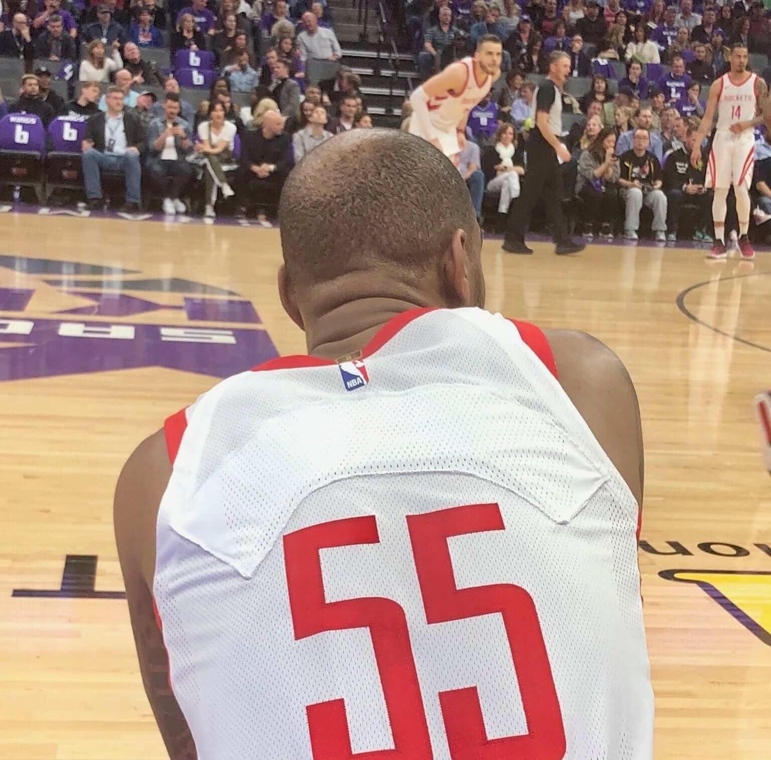
It’s not the crime, it’s the cover-up: It’s one thing when you’re so new to the team that they haven’t had time to sew your name onto your jersey. It’s something else when they give you someone else’s jersey with a blank cover-up nameplate
That was the situation last night in Sacramento, as Rockets guard Aaron Jackson, who’d been signed earlier in the day, made his debut with the team. To make room for him on the roster, the Rockets released guard Tim Quarterman — and then gave Quarterman’s No. 55 jersey to Jackson, with a blank strip of fabric added to obscure Quarterman’s NOB.
The funny thing, of course, is that NBA jerseys usually don’t include nameplates. This one does — but it’s blank.
(Photo by Jason Jones, brought to my attention by @itsdtrain and @chriskingsfan.)
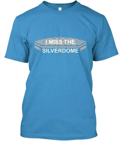
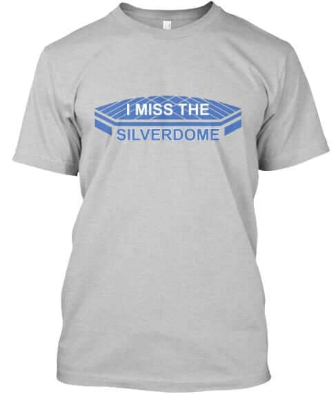
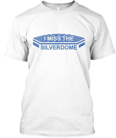
Naming Wrongs update: It’s been several months since we had any new Naming Wrongs designs, but we have a bunch of them today. Dig:
Silverdome: Nice job by designer Scott Turner with this one:
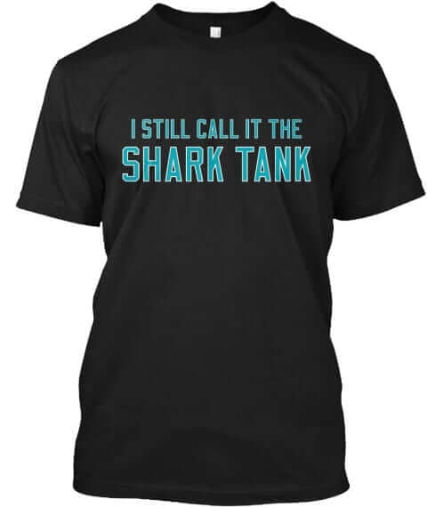
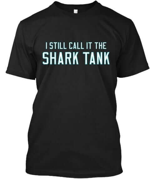
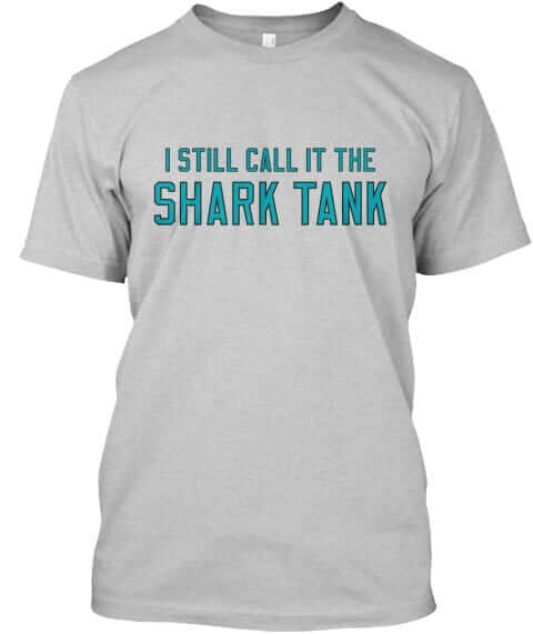
Shark Tank: Unfortunately, Teespring doesn’t offer a teal shirt option, so we made up for it by doing two different black options:
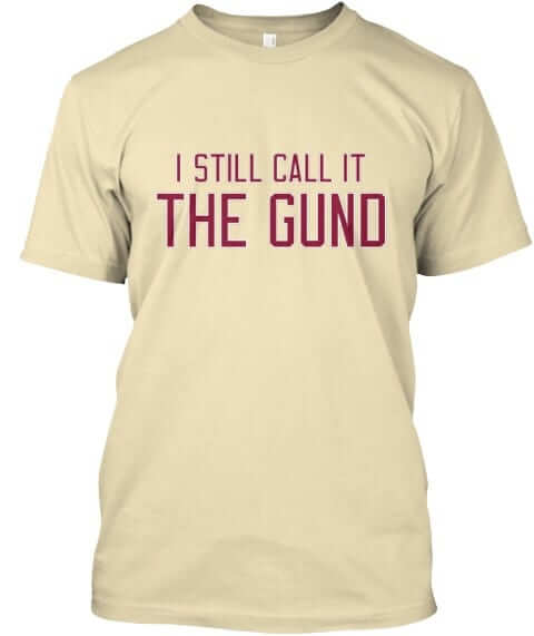
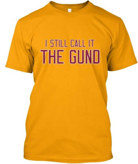
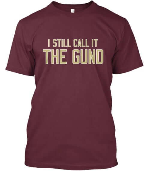
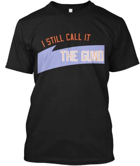
The Gund: Teespring also doesn’t offer a true Vegas gold tee (does anyone?), but we have a tan version that’s fairly close, plus a more standard gold, along with wine and black:
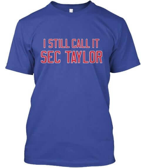
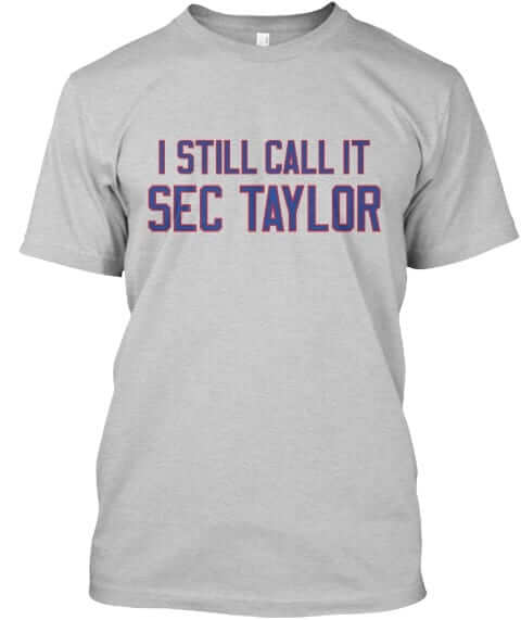
Sec Taylor: This is a first for us — a shirt devoted to a minor league ballpark (in this case, the home of the Iowa Cubs):
All of these designs are now available in the Naming Wrongs shop. They’re also cross-listed in the Uni Watch shop, where card-carrying members can get 15% off. (If you’re a member and need the discount code, send me a note and I’ll hook you up.) My thanks, as always, for your consideration.
The Ticker
By Paul

Baseball News: Lots of good stuff from Ray Hund, including a close-up of Mordecai “Three Finger” Brown’s pitching hand (or as the photo says, his “twirling hand”); a shot of Wrigley Field usherettes from 1918, hired due to a “manpower shortage” during WWI; and Cubs manager Charlie Grimm and owner Philip K. Wrigley raising a Cubs flag in 1938. “The two stars in the diamond represent the Cubs’ World Series victories, and the 14 other stars their NL pennants,” says Ray. Great jacket on Wrigley, no? … Earlier this week we ran a photo of these awesome Gibson Partners uniforms. Now Marc Swanson has provided more background info: “Gibson was a realty company in Cleveland back in the ’70s. Along with that awesome Tequila Sunrise roundel, their offices (at least the ones I can recall) were these great ‘modern,’ jagged-looking houses with a raw wood siding look and a big round bubble window in the foyer area that sometimes had the roundel painted around it. The offices looked really cool when they were built but didn’t age well. By the mid-’80s, the style looked dated, and the bubble windows yellowed with age. They were bought out and the houses looked even sadder as folks tried to repurpose them. Then they all just sorta disappeared.” … Yesterday we reported that the White Sox and A’s would be wearing 1960s throwbacks next week. Now it turns out that the A’s will be including white caps for the coaches — a nice touch. … I still call it the Park at Wrigley (from Andy Garms). … The Giants will be giving away a Giants-themed rugby ball to promote the 2019 Rugby Sevens World Cup, which will be held in San Francisco in July (from Eric Bangemann). … The Mets — and presumably all the other MLB teams — will have new dugout sweatshirts for Jackie Day, which is this Sunday. … The attendance at a recent White Sox game — the actual attendance, not the number of tickets sold — was reportedly less than 1,000. … A Pennsylvania school district is arming its teachers with small baseball bats. … The Lehigh Valley IronPigs — a Phillies affiliate — have new Sunday throwbacks based on the Phils’ infamous 1979 “Saturday Night Special” design (from John Kelemen). … Let’s hear it for Yanks P Masahiro Tanaka, who pitched last night with no New Era logo creep on his cap.

NFL News: The latest on the Rash is that it will likely be optional in 2018. … Here’s a rarity: a shot of Washington RB John Riggins wearing No. 29. “That’s from the 1976 preseason,” says Jon Solomonson. “His familiar No. 44 was being worn by Moses Denson when Riggo arrived in DC, but Denson got injured and retired (or was cut?) before the season started.”
College Football News: New uniforms for Virginia Tech. Additional photos in this slideshow (from Jonathan Sluss and Andrew Cosentino). … Speaking of the Hokies, here’s the fan shirt for their whiteout game (Andrew Cosentino again). … Here’s a good look at the “Beat Iowa” jersey that Iowa State wore for their 1977 rivalry game (from Thomas Norton). … The field for Oklahoma’s spring game features a big graphic of former coach Bob Stoops’s visor (from Sam McKinley).

Hockey News: The NHL has new playoff apparel for players, coaches, and staff (from Jerry Wolper). … The Toronto Transit Commission is allowing some of its employees to wear hockey jerseys today as part of Jersey Day, which is another response to the Humboldt bus crash. … In a related item, the NHL has sent Humboldt helmet decals to every team in the league. … And in still more Humboldt-related news, the Jets came up with a fairly lame-o playoff slogan, which some observers immediately thought come off as a bit insensitive given the Humboldt timing. Personally, I think the real problem is that the slogan, like most playoff slogans, sounds forced and contrived, not that it’s insensitive. … And yet more Humboldt news: Tim Hortons apologized after a Halifax outlet sold Humboldt-themed donuts without intending to donate the proceeds to the team (from Brad Pramberg). … Making a suit with Don Cherry? Sure, why not (from Jeremy Brahm). … I confess that I had no idea that the Sabres’ late-’90s jersey template was designed to create a silhouette of a buffalo’s head. Did you? (From @Hashalanche).

Basketball News: Here’s a look at every outfit that Thunder G Russell Westbrook wore to the arena this season (from Mike Chamernik). … Shai Gilgeous-Alexander is the latest Kentucky player to criticize the team’s checkerboard uniforms (from Josh Hinton).

Soccer News: New jersey advertiser for Hertha Berlin (from Josh Hinton). … Ireland player Alan Browne donated a jersey that will be auctioned off to support a local teen who was injured in a recent storm. … New third kit for Atlético Tucumán (from Ed Zelaski). … New uniforms for Detroit City FC (from Ryan Keberly). … Huddersfield has signed a new kit deal with Umbro (from Ed Zelaski).

Grab Bag: Two Colorado Dept. of Corrections employees were cited for lewd behavior while in uniform. … Delta Airlines will get new uniforms on May 29. As it happens, I will be flying on Delta on that date (thanks, Phil). … Cross-listed from the baseball section: The San Francisco Giants will be giving away a Giants-themed rugby ball to promote the 2019 Rugby Sevens World Cup, which will be held in San Francisco in July (from Eric Bangemann). … There’s a new study on the worldwide market for mountain bike jerseys. … South Carolina athletics may retire many jerseys across different sports over the next year or so. … New logo for the Chicago Tribune Guild, which is unionizing (from Steve Johnston). … Embattled EPA administrator Scott Pruitt wanted to eliminate the EPA logo from the agency’s “challenge coin” and replace it with symbols of personal significance to him, like a Buffalo to represent his home state of Oklahoma and a Bible verse.
What do you think about the VT jerseys? I like the updated home and away, but that orange is garish.
Don Cherry misspelled in Hockey News
Got it.
I don’t get the “I still call it the Shark Tank” shirt. The Sharks’ arena has never been officially called the Shark Tank. The change in official name from San Jose Arena to HP Pavilion to SAP Center hasn’t made any change to the frequency of people using the nickname Shark Tank as far as I can tell.
It’s a short way of saying, “You can give it whatever corporate name you want, but I’ll still be calling it the Shark Tank.”
Even the team refers to SAP as the Shark Tank. It’s never officially been called that, but the team has always embraced the nickname. Even the old Cow Palace got to be the Shark Tank for a few seasons.
Not that I don’t like the shirt.
We never said that the team doesn’t embrace the nickname.
The shirt just says that the official corporate name is bullshit. We had requests for this, so we did it. Simple.
Agree with the sentiment of both these points. If people want it, that’s great you’re willing to make it. I’m sure a couple will buy.
But the official playoff slogan for the team is literally “Turn Up the Tank.” I don’t quite know what the people who want it are getting at, and it wouldn’t make sense to most fans at the arena. But, power to those people.
As an aside — I’d argue it’s the best arena nickname in sports.
Really enjoyed the baseball/horseshoe floral piece Paul – thanks for the shout-out!
The piece is markedly better thanks to your contributions, Bruce – thank you!
So actually, the orientation of the horseshoe could be interpreted as either “holding in good luck” (assuming the opening faces upward), or as “pouring good luck on those below” (if it faces downward).
Interesting use of a fountain pen nib on the Tribune union logo. The nib has become a sort of symbol for writing as a craft, although in my experience most people today don’t even know how to hold a fountain pen to make it write. But even when fountain pens were the common form of pens, journalists tended to use pencils, which were more portable, durable, and reliable – and on the cheap paper of reporters’ notebooks, graphite performed much better than ink. You don’t want to blot when writing with one hand standing at a press conference, and you can write with a pencil in the rain. A tall notebook and a pencil, or maybe a manual typewriter platen or key, would seem to be more apt than a fountain pen nib as a heraldic symbol for journalism.
So if true the coolest aspect of a rather forgettable uniform is discovered nearly 20 years later – that’s quite funny (re: Sabres)
I always thought the stripes on the upper part of the arm looked like sabre blades.
If there’s a line between, “too subtle” and “try harder next time”, it was just found….
I’m sorry my fellow white sox fans and I work and cant make 1:10pm games on a Tuesday when it’s 30 degrees out Bleacher Report!!!!
Let’s not forget that it was supposed to be a night game and then got switched to the afternoon at the last minute. Jeez. The reporter was going after some low-hanging fruit.
I’m not sure what your gripe is. The piece didn’t criticize fans; it simply noted that the attendance was very, very low, which does indeed seem to be noteworthy and newsworthy.
Read the first sentence – it calls fans disinterested
Which actually means “unbiased,” FWIW.
And yet, the Chicago metro area has 9.5 million residents. Three-digit attendance for a big-four pro sports game really is remarkably low regardless of the time of day and weather conditions in a city with 9.5 million residents.
Also: I’ve heard rumors that daytime baseball in Chicago hasn’t been such a rare thing over the years….
Recently, its been a lot more rare than you might expect.
The North Side club has played more and more games at night, especially on weekdays. Usually the only non-getaway day games played in daylight are on the weekend.
Chicago residents woke up Monday to snow on the ground. More than anything that probably deterred fans. The Cubs were scheduled to play their opener at the same time but postponed it. The ability of the Sox grounds crew to clear the snow off the field so the game could go on at all.
link
Andy, this story was reported by multiple sites. Nobody was slamming Chicago or Sox fans.
I Still Call It THE GUND!??!?! Nobody liked that name ever! Say “Gund Arena” really fast….Gundarena, Gunnarena, GONORRHEA! Besides, everyone in Cleveland loves going DEEP IN THE Q!
Maybe go with: I Miss Miracles in Richfield. Before you give me your snarky reply, we had heartbreak as well (Ehlo). Nothing good ever happened to the Cavs in Cleveland when it was called The Gund, except drafting Lebron.
Someone must like that name, because we had requests for that shirt.
Okay, fair enough. Must of been a millennial.
I Still Call It Gateway
I enjoyed the article today. I had not known about the floral arrangement tradition until you brought it to my attention. I am wondering, what did the manager do with it after the ceremony? Did it stay in the dugout? Did some batboy have to carry it to the locker room? Did they break it down and let each player take a flower? Quite an interesting tradition.
It seems like more and more “uniform” redesigns are just new jerseys, and maybe a helmet tweak, at least with Nike schools. Everyone has blank pants, with nary a stripe to be found. It’s a huge part of why throwbacks like the ones worn by Pitt and Cal look so good.
I love the Naming Wrongs series (and own the shirt for The Joe), but I’m guessing that anybody who actually misses the Silverdome never experienced the misfortune of watching a game there.
Here, read this: link
I’m with J.D. I find it hard to believe anyone misses the Silverdump.
And yet we’ve already sold two of those shirts today.
The whole “Nobody misses [the place on the latest Naming Wrongs shirt]” is sooooo played. Lots of people miss lots of things for lots of reasons. Those reasons may not make sense to you, but they exist nonetheless. Almost all of our shirts were created in response to specific requests. And the nice thing about Teespring’s on-demand format is that if those end up being the only two shirts we sell (which I don’t think will be case, but I suppose it’s possible), that’s no problem. It means there are two happy people, and we made some beer money.
I have many fond memories of the Silverdome and have ordered a shirt. I spent my childhood there, Barry Sanders played his entire career there. And to say it was a horrible place to watch a game is ridiculous. The sightlines were great and it was much louder than Ford Field. Lastly, I have serious doubts about your perspective if you think Joe Louis Arena was better than the Silverdome. JLA was (still is) a huge dump.
1983 Michigan Panthers, 1987-88 Pistons, Wrestlemania III, The Pope.
What’s the story with those “Tammany” players presenting the horseshoe to Frank Chance? They must be New York City Hall workers — but they borrowed their vertical-name-down-the-placket uniform design straight from Chance’s Cubs!
Moses Denson. Certainly rings a bell. Through my research (so far) it looks like, Denson played in the CFL for three seasons and won the Grey Cup and a 2 time CFL All-Star. Denson was drafted by the Redskins in ’72, right after his last season in the CFL. Denson didn’t sign/play until ’74 and left in the ’76 preseason. I also found out that he must have been injury prone and that either forced him to retire or he was cut.
Moses Denson won his Grey Cup in 1970 playing with the Montreal Alouettes. Though he wore #26 when in Canada. Here is Moses in action and a playing card from those days:
link
link
Moses played for the Als during that brief period they wore green and red (as opposed to the more signature blue and red). My understanding is that their brief switch to green and red had to do with major team advertiser Labatt Breweries. It tied in with the colour scheme of Labatt 50 brand beer. Seeing the Alouettes is green seems odd.
How would I have promoted watching the CFL to Paul in the early 1970s?
“The CFL – 33.33% of the teams wear green uniforms!”
At least it isn’t purple.
You’re right. Today’s lede story is a quentisenial Uni-Watch entry. (Loved the headline. The motto to my granddad’s greenhouse and flower shop was “There’s a sunshine in flowers, say it with ours.”)
So many players seemed to be appearing in that box score cut off on the left side of the newspaper article about the Cubs-Reds 1916 opener that I went to Baseball Reference to look it up: link.
The game was managed more like something from 2016 than 1916: the starters pitched 6 2/3 and 7 innings allowing 3 and 2 ER, respectively; each team used four pitchers; several pitchers worked less than one inning, and there was a blown save.
And speaking of relief pitchers in 1916, the advertisement that link, in the ticker, has an unfortunate ending: just shy of age 40, Brown had become a very effective — and obviously underappreciated, given the time period — relief pitcher for the Cubs, but on September 4 both he and Mathewson went all the way in a 10-8 victory for the Reds, and neither of them ever pitched in the majors again.
I wonder if each of them insisted on completing the game. Mathewson had become a full-time manager and might not have minded it being his last game, but Brown obviously could have given the Cubs a few more effective outings, if not a few more seasons, if not for a game in which he allowed 10 runs and 19 hits and must have thrown a crazy number of pitches.
I feel like the Winnipeg Jets logo is both gratuitous and insensitive. I’m not usually one for giving too much thought about “being insensitive” or “offending” any certain group. With this situation and the overwhelming deveststation it’s has brought to so many families and an entire community it warrants extra thought.
I don’t want the thought Police or Twitter warriors to shame the team into changing the logo. I simply hope someone on or around the team will realize the timing is all wrong for this type of logo and quietly makes a change.
A quick note – Bob Stoops is Oklahoma’s *former* coach
Right-o. Fixed.
In today’s hockey section: its not just Toronto transit drivers that are wearing jerseys today, its a Canada-wide thing.
link
Its trending in Canada under a couple hashtags, mostly #jerseyday
link
Yup, not just Canada. Down here in Texas rocking my Devils jersey. I added a patch of the Broncos’ logo to it. #JerseyDay
Can’t wait for the game tonight. Go Devils!
Yup, I’ve been counting down the minutes.
#NJDvsEveryone #NowWeRise
The White Sox have had attendance issues off and on since the ’80s. The drop off probably had a lot to do with the switch to cable TV in 1982 from broadcast TV.
A whole generation of fans grew up only being able to watch the Cubs on TV.
I guess the Jags new uniforms aren’t going to be very heavy on the gold:
link
Boo!
Random observation: All of this year’s draft hats have team-colored NFL logos on the back. In the Jags’ case, it looks identical to the gold logo that was used a few years back (for SB 50).
I had no idea the Zombie buffalo created the shape of a buffalo head. It’s still a terrible jersey that screams 90s hockey aesthetic. Then again, it also reminds me of Sabres fan’s hopes and dreams being crushed in 1999, so that’s always a good thing. (Yes, I know that goal should never have stood)
NYT crossword uni-alert! 4-Down is a uni-clue. It’s also a tricky one.
“The Daily News Boys Band Will Render Music” doesn’t sound promising as to the enjoyment of said music, I must say.
Lee
Jeez, how about forced & contrived, AND insensitive?
link
Lee
Now, I don’t mean to join in with criticizing every new Uni Watch shirt that comes out, because I get just as frustrated with these small nit-picks as everyone else. That said,
Raygun, a Des Moines-based shirt company, has been selling basically the same Sec Taylor shirt for years. link There is their tweet announcing the shirt almost a full year before Naming Wrongs 2.0 was launched. And here’s a link to their site, where they’re still selling the shirt: link
I get the idea of having a brand and selling a bunch of things under the same type of idea, and I don’t have a problem with that, nor do I expect Uni Watch to check every local shirt company to make sure a similar shirt isn’t being sold. But in this instance, it seems to make sense that the local company should be able to sell their shirt without an almost identical shirt being sold by a company that has nothing to do with Des Moines.
I honestly had no idea. Frankly, I’d never even heard of Sec Taylor until two people asked for that shirt. I was curious to see how something devoted to a minor league park would fare, so we went ahead and did it.
I’ve notified those two people today. I’ll give them a few days to buy the shirt if they want. And then I’ll pull it, in deference to that Des Moines company. Thanks for letting me know!
I can’t believe I’m saying it but I absolutely love Virginia Tech’s new football uniforms. Gorgeous! The font is great too.
Seems like the Mets are better at bucking superstition tradition. They’ve won the World Series in down horseshoe years, so maybe it’s pouring out the bad luck!
Re: Don Cherry video
That video is almost a decade old. Regrettably, across North America, it’s hard to find good fabric and good tailors anymore. Most people who “tailor” clothing only take what you bought off the rack and alter it. Grapes has a good relationship with a good tailor.
No New Era logo on Tanaka’s cap last night, Kyle Hendricks of the Cubs is pitching logo-free today. A nice trend.
Great floral horseshoes story. Thanks.
I hate to be one of those people piling on about the Naming Wrongs shirts, but FWIW (which I admit is very, very little), I went on the website looking for a shirt devoted the absolute eyesore that was the Capital Centre in Landover, MD. It would be especially cool if the lettering mimic’d the sloped roof, sort of like the Igloo shirts. Unfortunately, I never heard anybody refer to it as “Cap Centre.” Not saying it didn’t happen – just not my frame of reference.
So you’re saying you want the shirt to say “Capital Centre,” rather than “Cap Centre”?
I would like it better if it did, yes.
The next shot I have is from 1987 — and it shows that someone had wised up and turned the horseshoe so it was facing upward!
And yet before that, the Mets won two titles. They haven’t won any since the horseshoe has been turned up!
Love that tidbit about the Sabres’ jerseys. I’d never noticed. On another Sabres note, I was always disappointed at how many people missed the sword in the “Buffaslug” logo. So many people hated that logo, and I can understand why, but I always loved the way they worked the sword in. And I think the general attitude toward the logo would have been more positive if people had noticed it.