It was a big day yesterday for NFL patches, as two teams revealed new commemorative logos and announced that they’ll be worn as jersey patches for 2018. In both cases, the patches get the job done in a somewhat workmanlike manner, but they aren’t all that exciting.
Let’s start in Green Bay, where the Packers raised the curtain on their 100th-season celebration, which will include a 10-part documentary film series (here’s the trailer), a book, a free “Packers Experience” attraction, and more. Tying it all together is the logo you see at right, which is reasonably handsome but rather unremarkable. On the one hand, it’s nice to see something that isn’t overdesgined; on the other hand, I’m surprised they didn’t reference this or this, even if only to include the Wisconsin state shape.
Here’s how it looks on the team’s green jersey (click to enlarge):
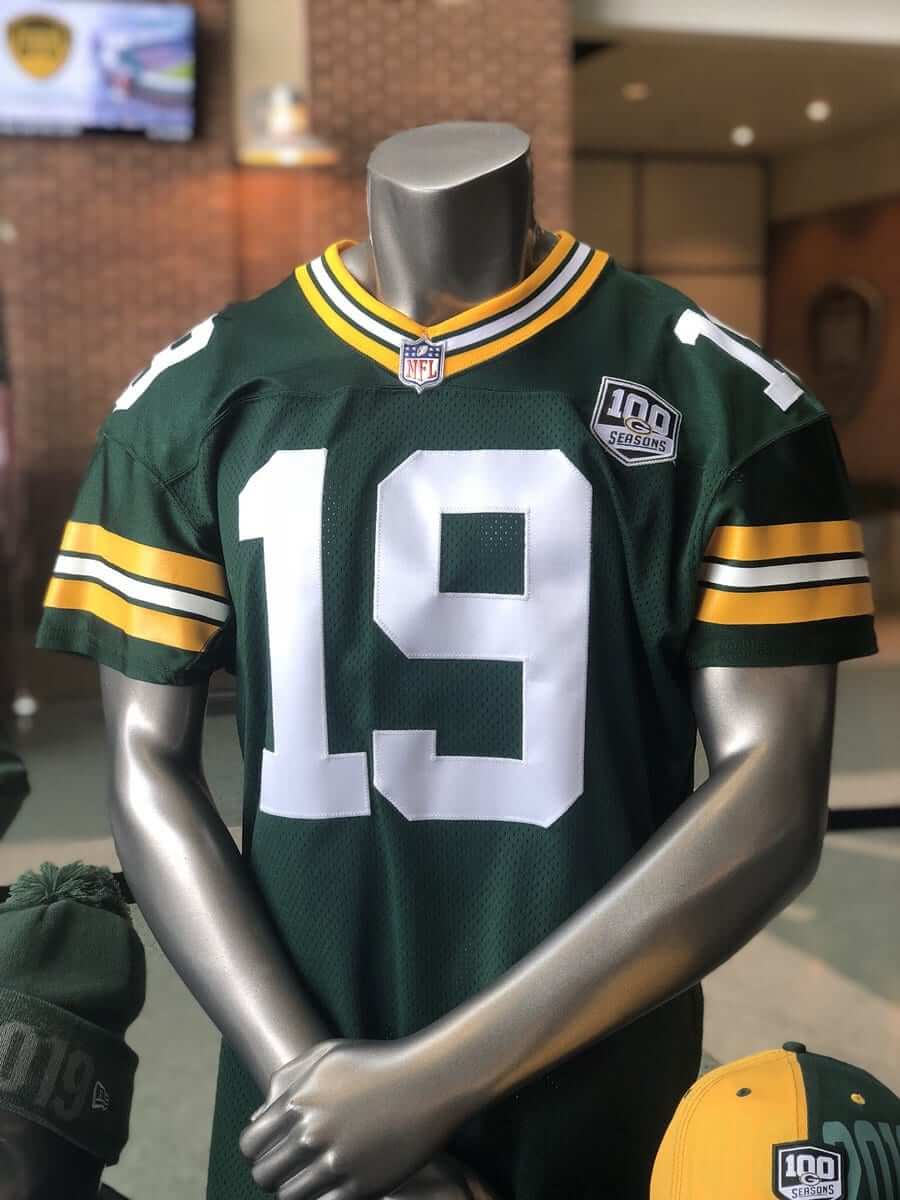
To my knowledge, they haven’t yet circulated a photo showing the patch on the white jersey.
In case you’re wondering, the last time the Packers wore any kind of anniversary patch was in 2007, for Lambeau Field’s 50th anniversary.
Next up: the Colts, who have a new logo, shown at right, to celebrate their 35th season in Indianapolis. I don’t mean to rain on their parade, but that seems like a bit much, no? Is it really necessary to have a 35th-season patch? How many other teams have done that? (I could spend a bunch of time researching that, but it was much easier to be lazy and ask Gridiron Uniform Database historian Bill Schaefer, who said the only other example he could think of was the 1995 Vikings. … Update: Reader/commenter Mike Cline Jr. points out that the Bills wore a 35th-anniversary patch — along with the NFL’s 75th-anniversary patch — in 1994.)
The typography is a bit stronger than what they used for their 30th-season patch five years ago, although I don’t think anyone would consider either logo to be particularly dynamic. Here’s how the new patch looks on the team’s standard blue and white jerseys:
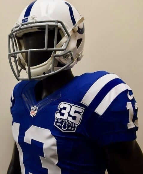
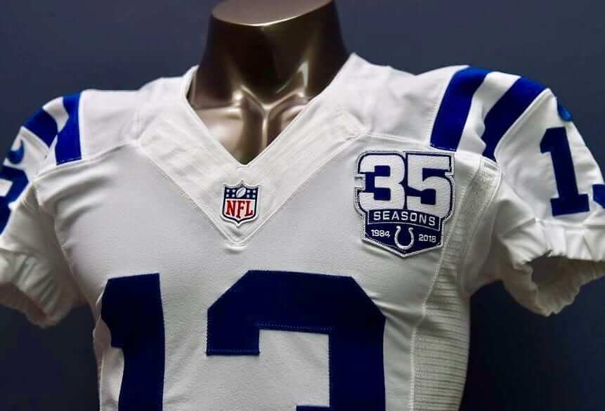
As you can see in the mannequin photos, yesterday’s patch news coincidentally involved two of the few remaining teams that still haven’t switched to Nike’s newer tailoring template. Also worth noting: Both patches are embroidered, not plastic.
There’s more NFL uni news on the way next week, as the Jags and Dolphins are both slated to reveal their new uniform sets on April 19.
(My thanks to Brian Kerhin for his assistance with this entry.)
Domecoming: Yesterday was Domecoming — a chance for Houston residents to pay one last visit to the Astrodome before it begins undergoing renovations. Admission was free and there was all sorts of cool memorabilia on hand. There were lots of fun photos posted to Twitter with a #domecoming hashtag — you can scroll through them below:
Just watch it: I don’t much care about Saturday Night Live, but their most recent episode featured a fauxmercial that pretty much nails Nike’s lifestyle marketing shtick. Don’t miss.
(Big thanks to my ESPN boss’s boss, the awesome Jena Janovy, for letting me know about this one.)
Collector’s Corner
By Brinke Guthrie
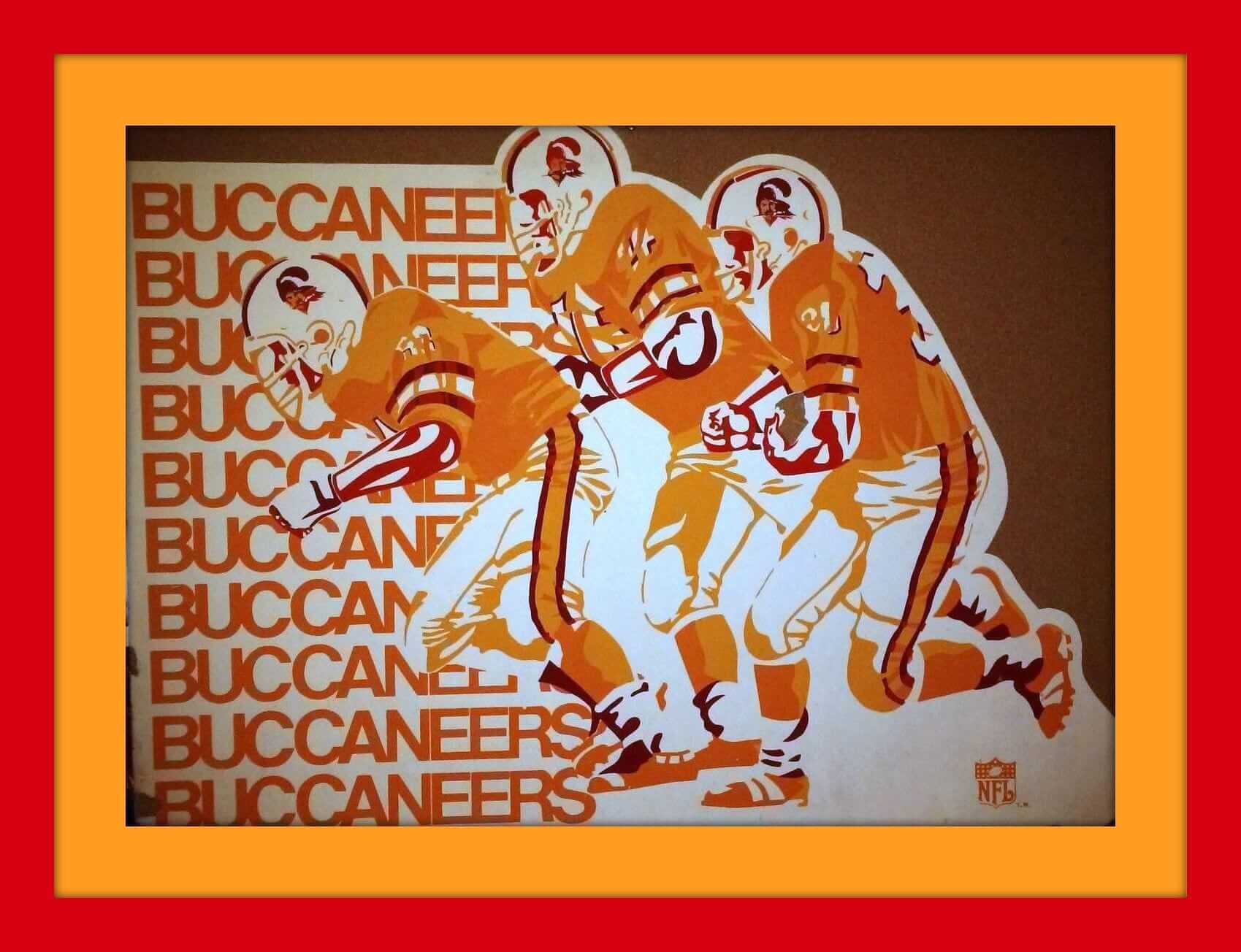
First up this week is this Sears Tampa Bay Bucs bulletin board from 1979. Here’s what another version of it looked like in the Christmas Wish Book from that year — the graphic was reduced to the corner as opposed to this one, which is full-size. The seller has six other teams to choose from; the Oilers, Seahawks, Falcons, Chargers, Eagles, and Saints.
You say you want more than just bulletin boards? Okay, here are the rest of this week’s picks:
• Bengals fans will like this poster from their first season, 1968.
• In one of last week’s Ticker items, there was a mention of “NFL puffy stickers.” I’d never seen nor heard about these, so I proceeded to hunt ’em right up. Sure enough, you can get lots of different teams, like this set for the Green Bay Packers. Just 78¢ back then at your local K-Mart! MLB also available.
• How about this stuffed Oakland A’s doll? This one just says “World Champions” on the front, so let’s say 1973 for this version. There are others on eBay that say “World Champions 1972 -’73 – ’74” on the jersey, so those would presumably be from 1975. Either way, a nice souvenir from the Mustache Gang.
• Check out the artwork on the 1968 NFL Autograph yearbook!
• This 1970 Patriots mini-helmet is still in its original IHOP packaging.
• My first and only Tudor electric football game, Christmas 1971. Cowboys in blue and Colts in white from the previous season’s Super Bowl. I’ll bet that’s Deacon Jones on the front of the box, chasing a frightened Bears QB. Maybe Rudy Bukich?
• Speaking of Tudor, here’s a shopping bag with their 1960s artwork.
• This 1980s New York Jets sticker has a bit of neon flash to it.
• Looks like they forgot the white stripe trim on this late-1960s Cleveland Browns helmet bank. This is the first one I’ve seen without the usual bank sponsor on the base.
• These 1960s NFL seat cushions feature the “Eastern” and “Western” conferences.
Have an item to include on Collector’s Corner? Send your submissions to uniwatchcollectorscorner@gmail.com.
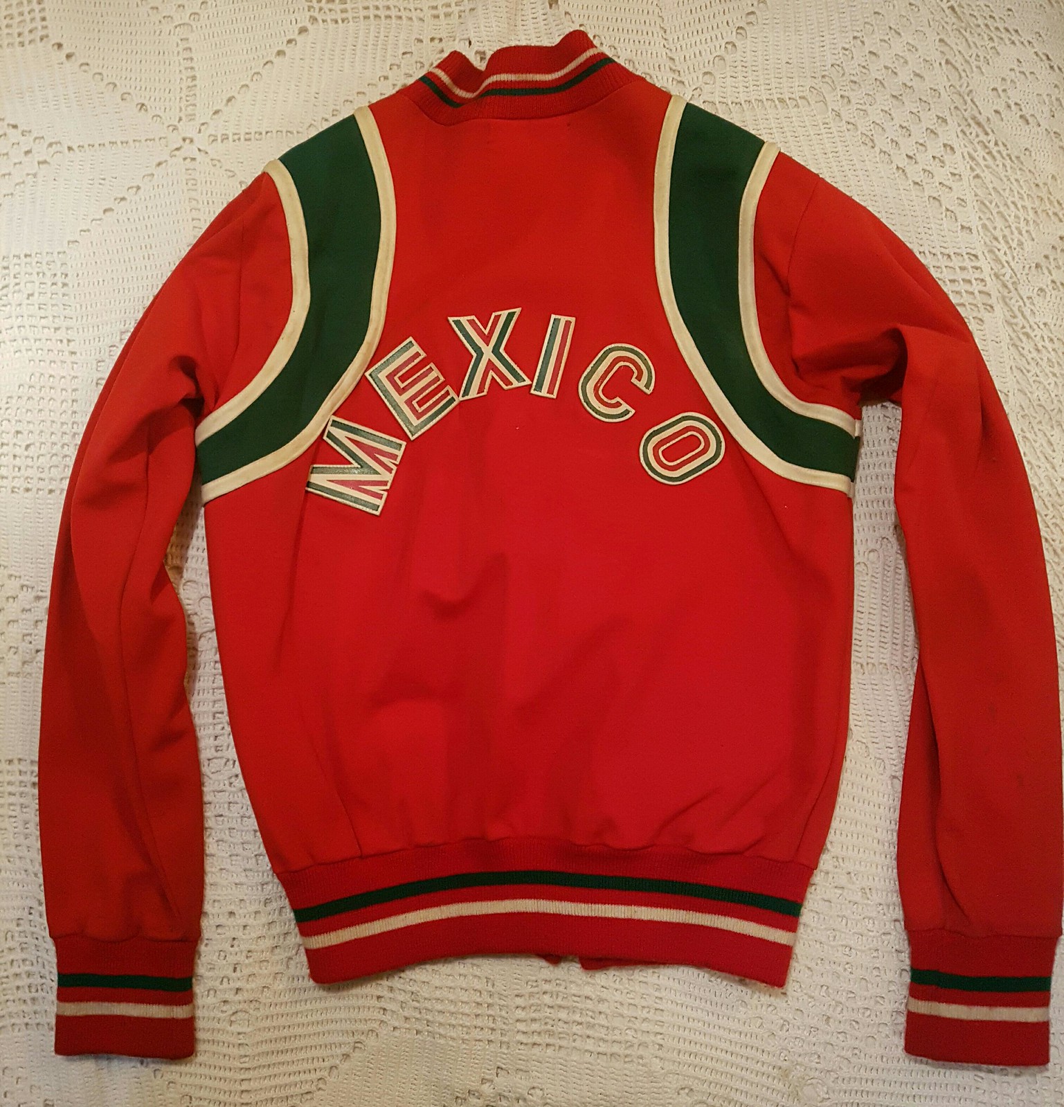
Viva Mexico: I received a note the other day from longtime reader/contributor Omar Jalife, as follows:
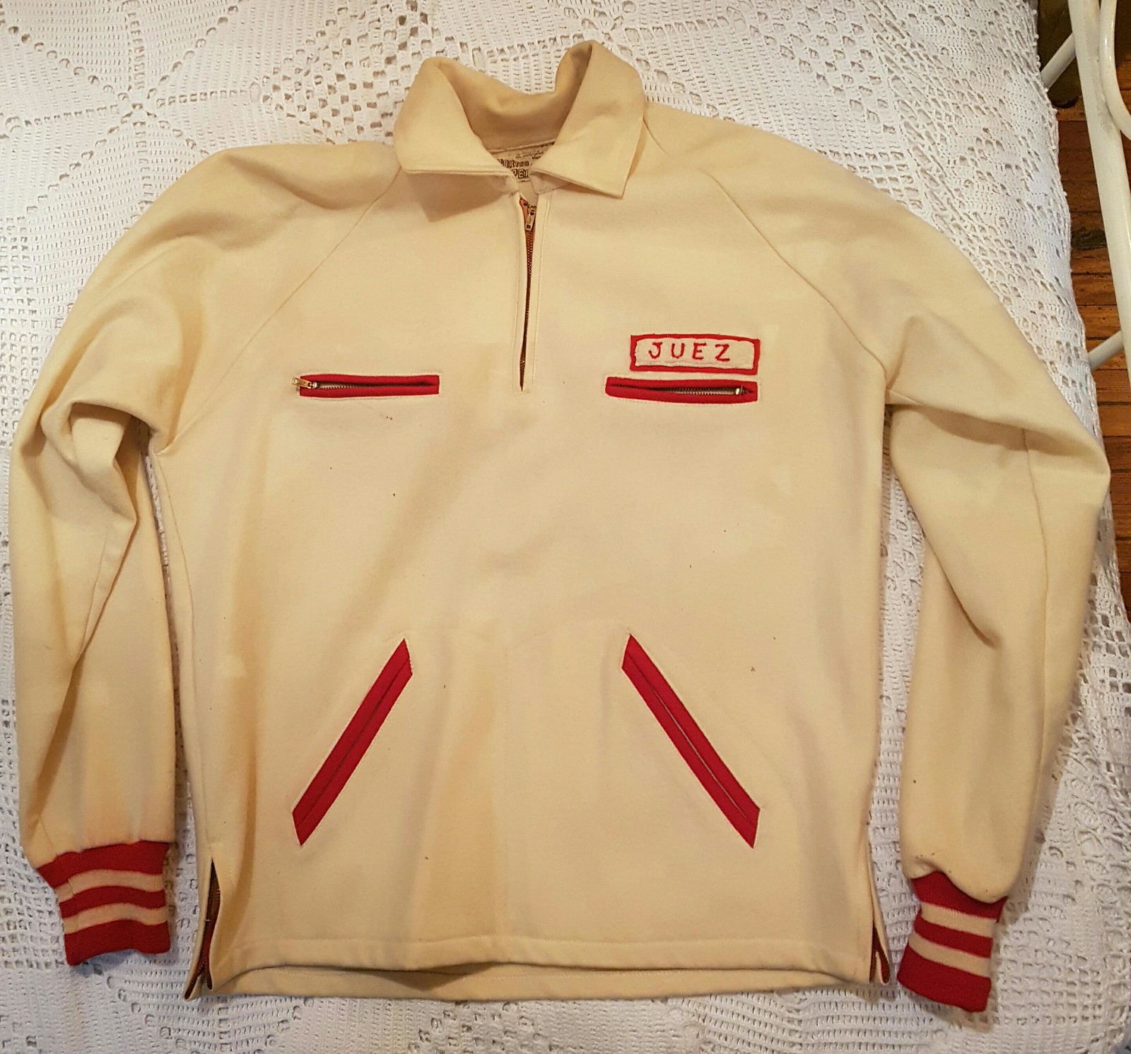
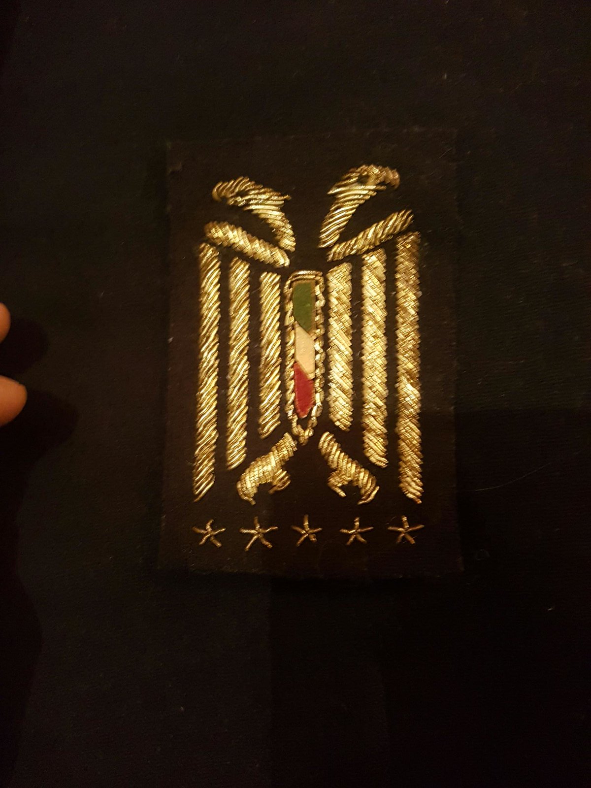
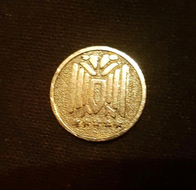
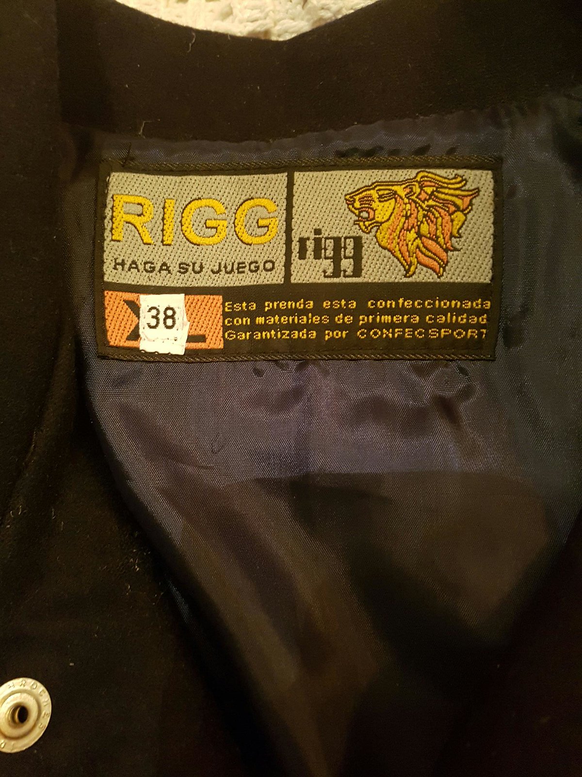
Today I helped my grandmother clean my grandfather’s closet. He died almost a year ago, and it was one of those tasks nobody wants to do. Anyway, both of them were track athletes back in the 1940s and ’50s and I found some very cool-looking jackets that I’m sure you’ll appreciate.
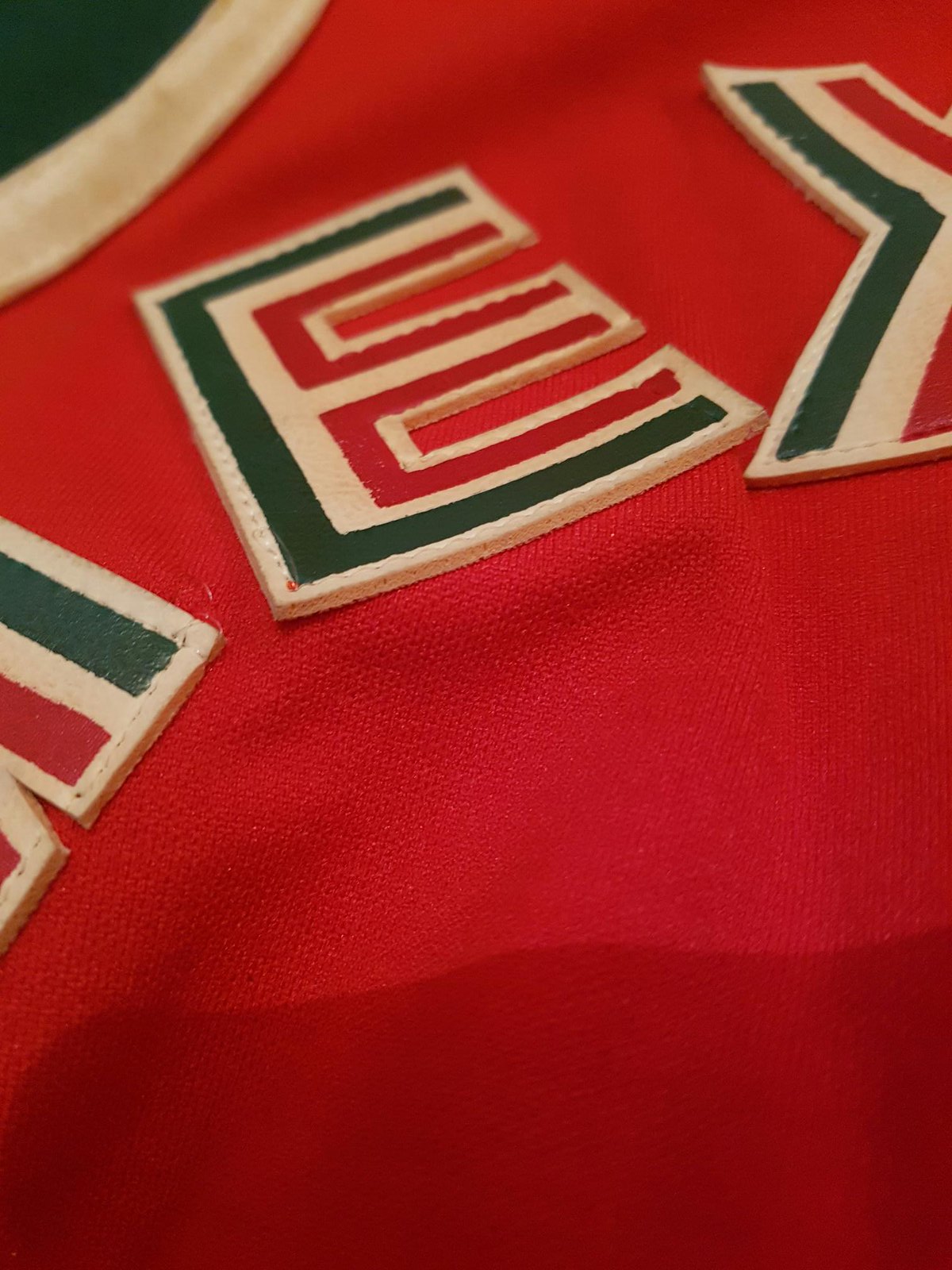
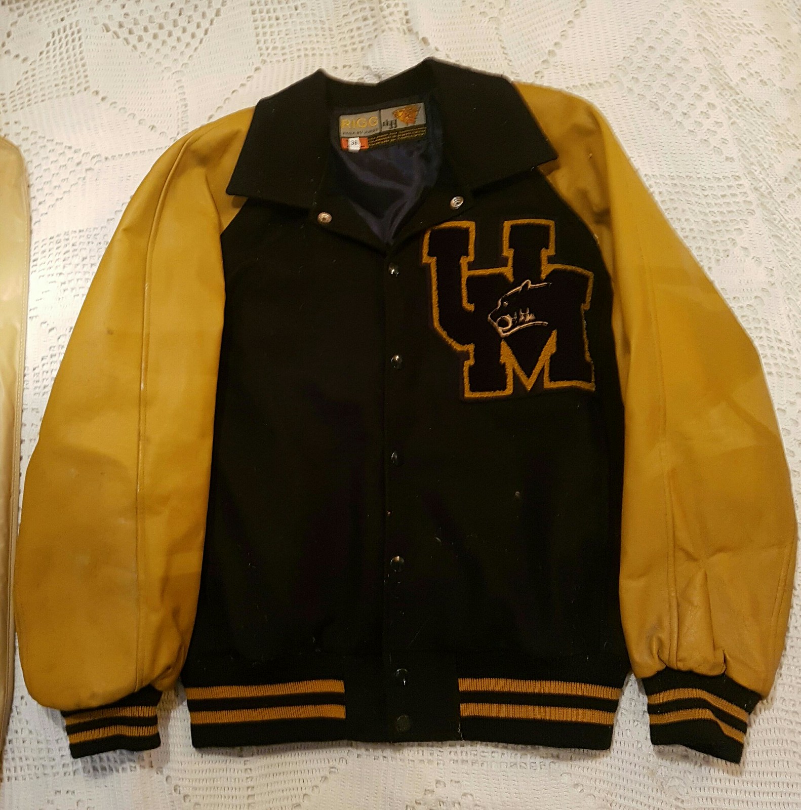
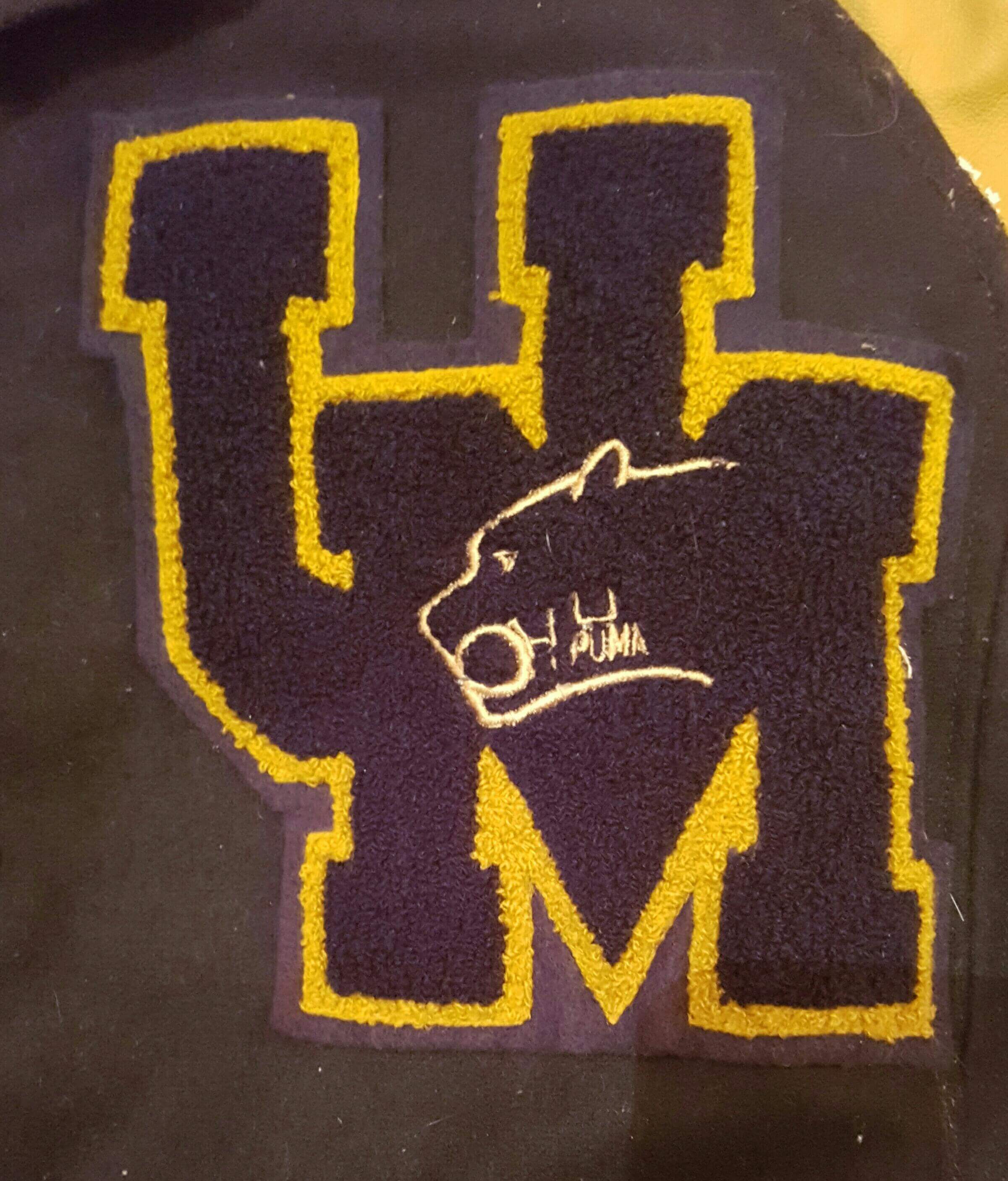
The jackets are gorgeous. Omar says his grandmother’s memory is a bit fuzzy (she is nearing 85), but she gave him enough info to try to piece together a bit of a backstory for most of the jackets. Here they are, with descriptions from Omar. In each case, you can click to enlarge.
• “The white one with the Mexico crest seems to be from Central American Games.”
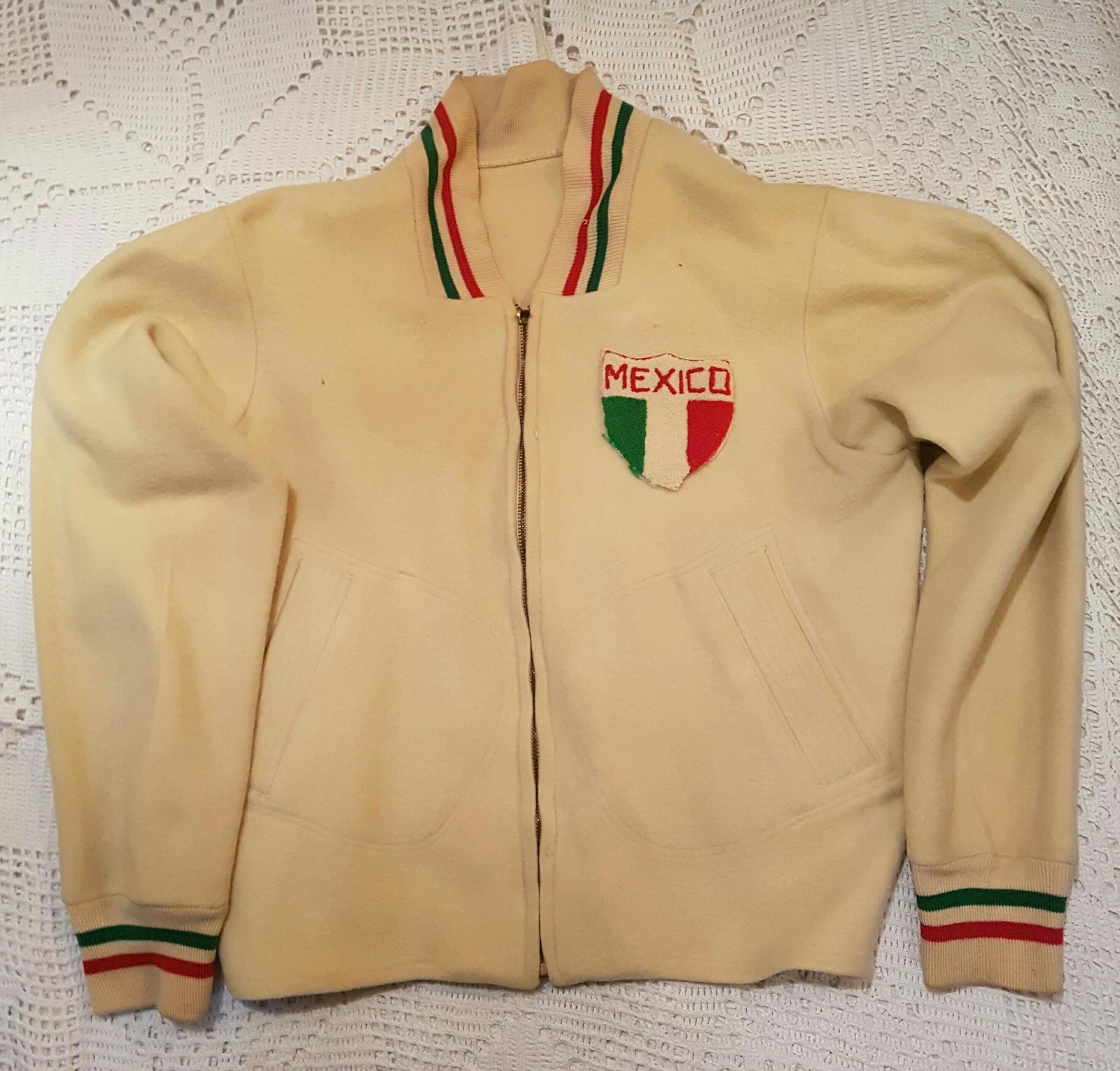
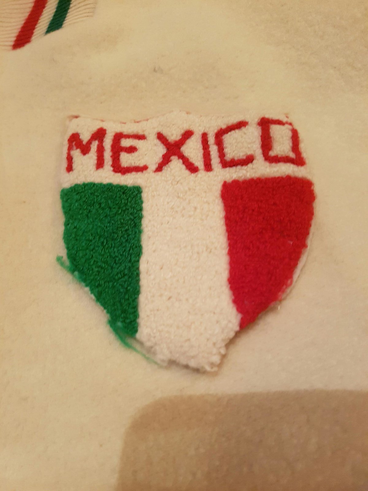
• “The one that says Mexico is from ’60s, when there was a Little League tournament in Mexico, but I need to verify dates.”
• “The plain red one is from the Panamerican Games in Chicago in 1959, as she remembers it.”

• “The UM one is from UNAM, but now they use a very different logo.”
• “‘Juez’ means judge, so this one is probably from when they stopped running and became trainers.”
• “And this one with the eagle crest is from Pentatlón Deportivo Militarizado Universtario, I’m still trying to figure out what that was.”

Great stuff. Gracias, Omar!
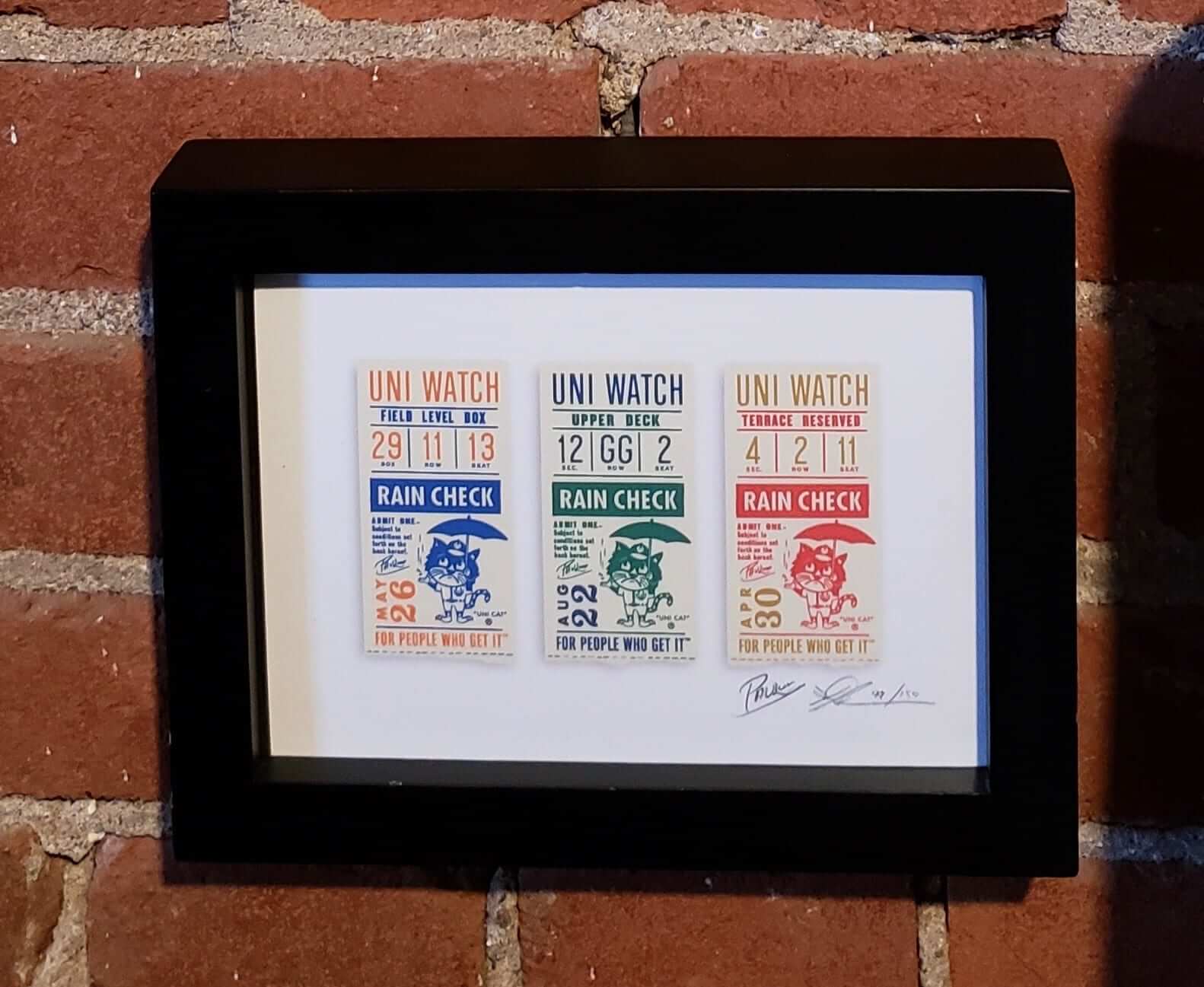
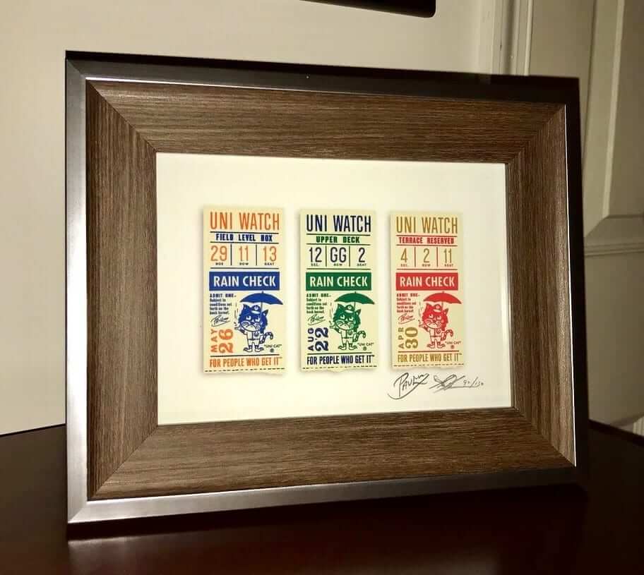
Click to enlarge
“Rain Check” print update: People are starting to receive their limited-edition “Rain Check” prints in the mail, and at least two readers — Michael Schliefke and Andrew Mednick — have already framed theirs! Looks good, right? If anyone else wants to share photos of how they’re displaying the print, send ’em this-a-way. Thanks.
If you missed the story behind the print’s design, you can get the full scoop here, and you can order yours here.
Mystery box: A few weeks ago I mentioned on the site that I was looking for someone with woodworking skills. Reader Steve Dominick answered the call and has been working on a little project for me. It isn’t finished yet, but here’s a photo he recently sent me to show how things are coming along (click to enlarge):
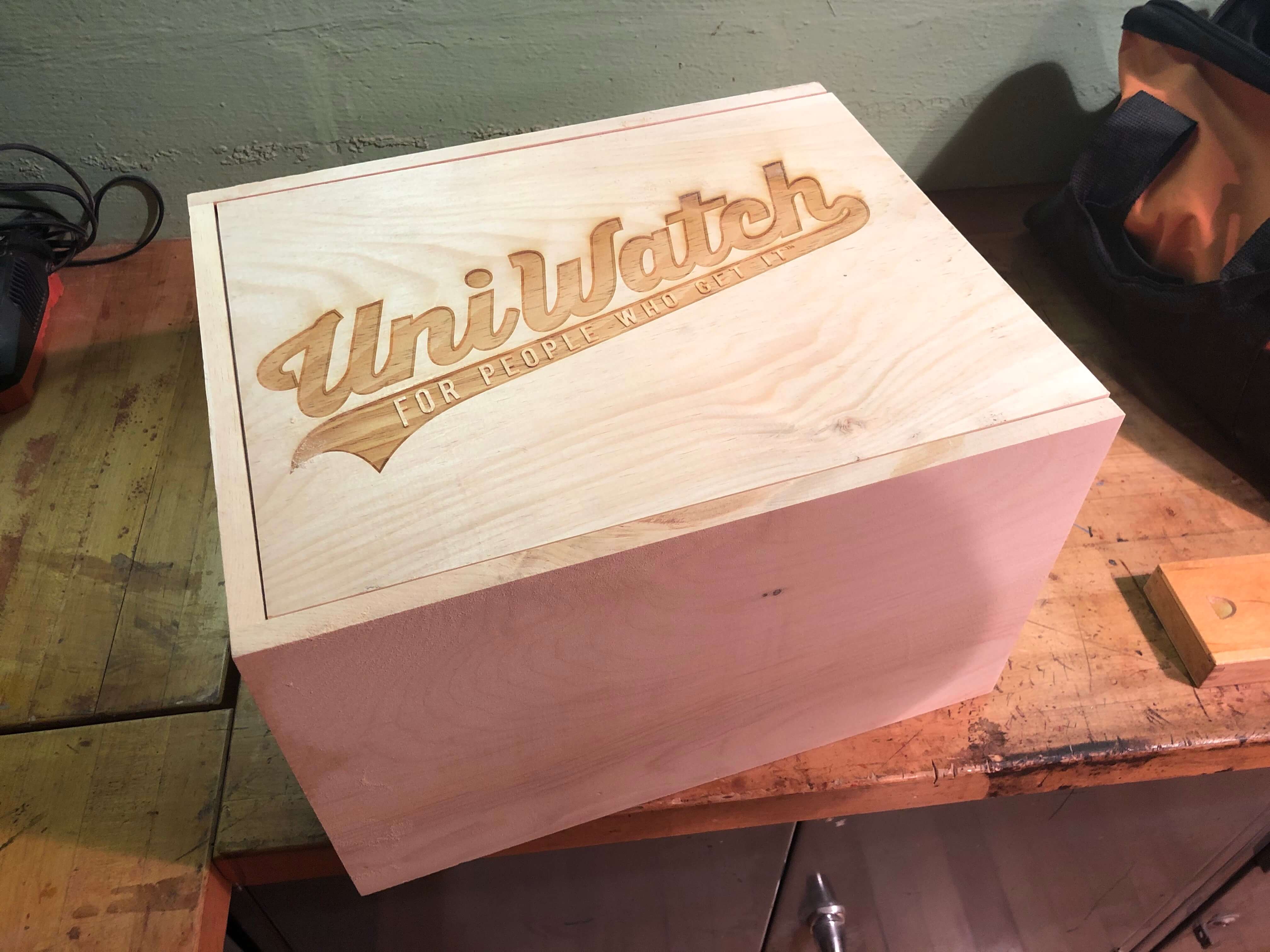
Hmmmmm, what could that be for?
More details soon (or at least soon-ish).
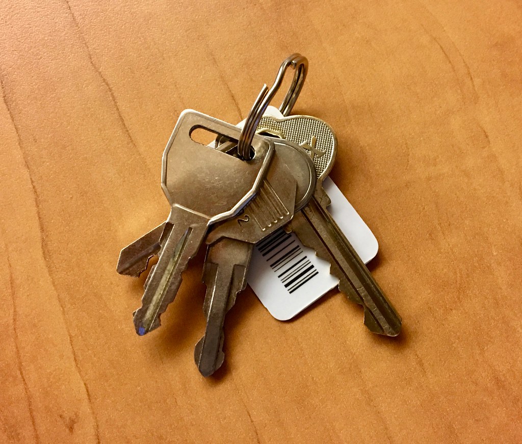
KRC update: The latest installment of Key Ring Chronicles is a bit different than our usual entries. Instead of being about something on the author’s key ring, it’s about a special item that’s no longer there. Check it out here.
The Ticker
By Alex Hider

Baseball News: Mets hitting coach Pat Roessler wore the wrong cap last night. … Speaking of the Mets, P Noah Syndergaard is has switched to a Nike glove this season. He had been using a Rawlings glove (from Wes). … Pirates P Felipe Rivero has legally changed his name to Felipe Vázquez, a change that will soon be reflected on his jersey. He apologized to fans who bought his jersey with the old name (from Jerry Wolper). … Reds 2B Scooter Gennett has been wearing No. 3 for most of his career (save for a controversial stint last season). He says he wears No. 3 in honor of NASCAR racer Dale Earnhardt, and he honors the Intimidator with his bat knob decal. … Broadcasters made note that Phillies 1B Carlos Santana — a switch hitter — had pine tar stains from his bat on both shoulders last night against the Reds. … The Cubs have sold the naming rights to the park adjacent to Wrigley Field (from Nathan Haas). … On Saturday, Reds 1B Joey Votto, who’s Canadian, paid tribute to the victims of the Humboldt Broncos bus crash on his cleats (from Bob Moon). … Here’s another interview with Michael Taylor, the mind behind the excellent Twitter account “Other Birds as the Orioles Logo” (from Andrew Cosentino). … Speaking of the O’s, here’s a breakdown of the new food items available at Camden Yards (also from Andrew Cosentino). … Ray Hund sent along a 1977 story from The Chicago Sun-Times — it’s in two parts, here and here — about the Pirates’ numerous bumblebee uni combos. The money quote: “In Pittsburgh, some fans have gotten up a pool trying to guess which player will make the first (uni) mistake.” Does anyone know of any instances of late-’70s Pirates wearing a wrong uni element? … Javier Farias made a Blue Jays-themed T-shirt to help cheer on his daughter’s T-Ball team. Nice work! … Check out these incredible uniforms worn by a youth team in Cleveland in the early ’80s! What a logo (from CJ Flyer). … Phillies OF Nick Williams’s helmet logo was askew last night.

Football News: Here’s the latest entry in the strong The New York Times series about the unacceptable working conditions for NFL cheerleaders. You can see previous entries in the series here, here, and here. … This is what the Albany Empire of the Arena Football League will wear in their inaugural season. … Does anyone recognize this player? Ernest M. believes this photo was taken in the 1940s or 50s, but also suspects it could be a player for the Duluth Kelleys or the Duluth Eskimos.

Hockey News: Longtime Bruins anthem singer Rene Rancourt is retiring after this season, and the team honored him by projecting this logo onto the ice during their regular season finale. Rancourt was also presented with a golden microphone and a No. 42 jersey to commemorate his 42 seasons (from @jeffisrael25). … Florida Everblades G Martin Ouellette took a shot to the mask the other day, leaving the puck lodged in his cage. Video here (from Thomas Neumann). … The Bellagio in Las Vegas has a five-foot-high statue of Golden Knights G Marc-André Fleury rendered entirely in chocolate (from @OlegKvasha).

Soccer News: Louisville City FC of the USL has already announced it will be wearing its BFBS third kit on Saturday. However, some promotional photos show a different design containing shoulder stripes (from Josh Hinton). … Aston Villa is terminating its apparel deal with Under Armour ahead of schedule (also from Josh Hinton). … There were three referees at a RJ Reynolds High School game in North Carolina yesterday, and all of them wore different uniforms.

Grab Bag: Following up on his submission from yesterday’s Ticker, Jeff Cook put together a visual showing all 12 of golfer Rory McIlroy’s Nike logos from his Masters round on Sunday. … Fans of vintage lacrosse will love this video of John Grant, who played for the Philadelphia Wings of National Lacrosse League in the 1980s (from @PhillyPartTwo). … Typically, the Seneca Valley High School lacrosse team in Maryland wears white jerseys. However, due to a jersey clash with Damascus High School, Seneca Valley was forced to wear all yellow on Monday (from Ken Pilpel). … Staying in the Maryland prep scene, Winston Churchill High School uses three separate bulldog logos in its gym — two here and a third one here (from Matt Eliot).
Nick Williams hit a game-winning homer in the bottom of the 8th. As far as I am concerned, that’s how his helmet logo is supposed to look!
Does anyone know of any instances of late-’70s Pirates wearing a wrong uni element?
I don’t.
Every game I saw they had a pretty tight rein on getting the details right. But a contemporary article in Baseball Digest related that Chuck Tanner nearly made it from the locker room to the dugout before realizing he’d gotten the hat wrong.
Actually, it was that very article from the Chicago Sun-Times which ran in Baseball Digest.
Aside from team photos of the 1976 Japan Tour (unsure what was worn on-field)and the 1977 ASG (Pirates representatives in all-black/yellow cap combo for the game, Parker’s batting helmet issues aside), neither do I.
The NBA had a league-wide 35th Anniversary patch during the 1980-81 season.
Paul,
Something interesting to keep an eye on: Not sure how other MLB teams select unis, but in Cleveland, the starting pitcher selects the jersey/hat for the day. So far it’s been the wahoo cap for each game. It’s starting to be discussed on Cleveland sports radio.
It seems to me that whenever it’s been reported that an MLB team’s uniform selection is given to the players, it’s been the starting pitcher that makes the final determination.
I don’t know if this is new or not, but this post took forever to load something from ads.adaptv advertising. And then when it loaded, it autoplayed something with sound.
I really want to support the site, but I’m turning on adblock if this is what the ads are going to be like going forward.
Desktop or mobile? And where was the ad (top, sides, middle of post, footer)?
I’ve been having the same issue on desktop. I have no clue where the ad is that autoplays. My boss can hear it though, and next time I get caught I’m suspended. But I suppose that’s my own fault for having the volume up. If it helps the one that caught me today was for meijer
I haven’t experienced any of these video ads myself, and I don’t have a blocker on right now. Haven’t seen the speaker icon pop up in the Chrome tab, either.
I’ll say what people say every time the Colts commemorate the flight from Baltimore: there should be elements of the Mayflower logo included.
Thank god we got that out of the way. I think I’m going to flag the word “Mayflower” for moderation today, just so we can avoid countless more iterations of that joke!
New acronym you should use…PFPS (Patch for Patch Sake) A 35th anniversary is NOT necessary!
It’s about as necessary as an AFC Finalist banner
Thank you for using my item in the grab bag. I enjoy the blog and always tell others about it. Unfortunately, the game wasn’t as good as the uniforms. .. we lost 20-0.
If I am seeing correctly, the Packers and Colts patches are both embroidered and not the cheap plastic kind? As boring as they both are, bonus points for not going plastic.
Good point — that’s noteworthy. I’ll add it to the text.
I’m proud of the Packers for remaining traditional in uniform aspects. This patch goes right along with that standard.
Re: Unacceptable working conditions for cheerleaders. This seems like such an odd issue to me. At least from my experience, knowing a former NFL cheerleader, this is not anyone’s full time job, as in, they don’t pay the bills being a cheerleader. It is something women who are either fans, or are looking for a platform to be noticed do. Some of those stories are awful, and again, any time I have seen cheerleaders mingling with fans there is a team employee there who is supposed to be their “bodyguard” to prevent any sort of disgusting physical contact. If it is really so awful, why would any woman sign up to be a cheerleader? I’m sure these stories are true, so I just don’t understand why the women would stay on the squad.
If it is really so awful, why would any woman sign up to be a cheerleader?
I assume you apply this same rationale to any employee who has any complaint about any job, right? Not only that, but if you ever had any complaints about your own job, you’d just STFU because hey, why would you have signed up for that job if you really had anything to complain about?
Hey, if child labor conditions back in the 1890s were so terrible, why were kids lining up to work at factories?
Hey, if things were so bad at the Triangle Shirtwaist factory, why were so many women working there?
And so on.
I think you may have misunderstood my point. My (limited) first hand knowledge from a former cheerleader of many years is that woman aren’t doing this for the paycheck. Unlike the jobs you mention, where people NEED the work, and thus are exploited.
In this case woman want to be a cheerleader because they love the team, or for the prestige, etc. So I am baffled as to why they stay after experiencing all of this stuff.
I relate it to my experience as a high school umpire. I thought it would be fun, and matched up well with my love of baseball. Turns out the pay (which I didn’t need) and fun didn’t outweigh the obnoxious parents and ego-maniacal fellow umpires.
1) You admit that your first-hand knowledge is limited. Let’s please not make the mistake of confusing anecdotes with data.
2) Even if they’re doing it as a hobby, why should anyone be subjected to unacceptable working conditions while pursuing a hobby? Are you saying that unacceptable working conditions are a fair trade for the “prestige” that you claim they’re looking for?
3) Why are you putting the onus on the cheerleaders? Why aren’t you asking why the teams don’t improve the working conditions?
Let’s cut to the chase: The teams are essentially hiring these women to be sex workers. The teams don’t describe the work that way, of course. On the contrary, they describe the cheerleaders as paragons of wholesome virtue — while requiring them to wear push-up bras and bare midriffs so they can play to male fantasies. The classic madonna/whore dichotomy. (Another way you can tell these women are sex workers: There are no male NFL cheerleaders. Compare that to college, where Title IX requires schools to have co-ed cheer squads.)
Personally, I have nothing against sex work — I’ve known several topless dancers and pornographers over the years, and I respect their work. But “real” sex workers exist in the realm of real sex work, where the terms are overt and understood. NFL cheerleading is able to exist because everyone — the teams, the cheerleaders, the fans — engages in willful denial about what it actually is, which is sex work. And when you have sex work that isn’t overtly acknowledged as such, you’re going to have problems.
The real issue is that there’s no reason for NFL teams to employ sex workers. I’m disappointed that one of my favorite teams, the 49ers, continues to have cheerleaders, and very pleased that my other favorite team, the Giants, has never had them. Time for all teams to get rid of them.
I won’t belabor this point. I think we agree on all fronts. I was just trying to express my confusion as to what is so attractive about the position of an NFL cheerleader that women risk being put in those situations? Beyond my small first hand knowledge there are numerous reports of them being paid next to nothing, so again, it cannot be to provide a living for themselves. The onus is on the NFL to be realistic about what they are and treat them fairly if they are going have them. The double standard applied to players/cheerleaders that recently got one Saints cheerleader fired comes to mind as especially ridiculous.
@Paul: “Another way you can tell these women are sex workers: There are no male NFL cheerleaders.”
Not trying to counter your argument (actually I tend to agree with everything you just said on this topic) but the Rams have recently added two male cheerleaders to their squad. Not a surprise given the franchise’s history with minorities.
Just realized someone already said that lower in the comments, my bad!
I prefer the design of the Colts patch (not loving the diagonal “Seasons” for Packers), but my goodness, the size. It’s practically a TV number.
The Bills Wore a 35th Anniversary patch in 1994. They actually had both the 75th NFL Anniversary patch and their 35th patch at the same time.
Ooooh, good one! I’ll add that to the text.
Cool! Although, you put me down as David.
Ugh — we have another longtime reader named David Cline. Force of habit! Now fixed.
KC Chiefs also in 1994 had 35th and 75th patches
Regarding the Winston Churchill logos, it looks like they’ve (mis)appropriated other schools’ bulldogs — the one on the floor looks like Bowie State’s (albeit with a color change), and the one on the wall looks like to me like Georgetown University’s (but even more like high school Georgetown Prep’s — the Little Hoyas), but the one on the sign at the scorer’s table just looks like clipart — unless there’s a school I’ve missed.
Thoughts?
Two of the mismatched ref jerseys (soccer) also had different USA Soccer crest patches (right sleeve).
The chocolate Fleury statue is pretty interesting, but I’m disappointed in the LVJR website for sticking an unskippable 2:45 furniture ad in front of their 1-minute video about it. An ad should never be longer than the video that follows.
Have I mentioned lately that journalism’s business model is broken because people expect content to be free?
I have no problem with sitting through ads if they’re reasonable. But a 2 minute, 45 second ad disguised as furnishing tips just to get to a 1 minute news clip is just a bit unreasonable to me.
And I just revisited the site and this time came up with a movie trailer that is skippable after 15 seconds, so I guess my issue isn’t as much with the website as it is with this particular ad. Especially since a movie trailer is far more interesting than furnishing “tips”!
Love those vintage Mexico jackets. Thanks for sharing!
The Packers patch strikes me as much worse than “workmanlike.” I’d call it badly designed. The angled “Seasons” text appears so low in the pointless shield shape that the text is pushed gratuitously off center in a design that’s otherwise all about centering on the horizontal axis. And the thin border of gold around the G logo is disruptive. It makes the G logo look slapped on at the last minute instead of designed around as it should be. The whole thing is juxtaposition, not design. With attractive colors and pleasantly readable type, so on first glance it looks much closer to adequate than terrible, but in my book it’s quite bad.
It’s like someone took a course in heraldry and then decided to completely half-ass it.
I’m glad you liked them. The minute I saw them, I knew uniwatchers would appreciate them.
Yep, those jackets are pretty cool!
Yes, thanks for sharing these!
Figured I should mention that while I agree with Paul’s views on cheerleaders, some teams are beginning to take notice. The Rams just hired two male cheerleaders. While they deny this is a publicity stunt to avoid opinions such as Paul’s, you can’t help but believe this is why they finally did it.
Was not aware of the Rams hiring male cheerleaders — thanks for sharing that!
Sure enough:
link
Previoulsy, the Ravens were the only team that employed male cheerleaders. They have since their first season.
Quoting from the article I linked to in my previous comment:
“The Baltimore Ravens and Indianapolis Colts have men who perform stunts with female cheerleaders, but don’t dance.”
The Rams’ new male cheerleaders are the first ones that will do the same dance moves as the women.
I don’t pay attention to NFL cheerleaders but my male friend was a Detroit Lions cheerleader last year. I didn’t know that was rare.
McIlroy’s caddie was wearing a t-shirt with a swoosh placed right in the middle of the shirt. Can’t remember seeing that at the Masters before. If he’d been wearing a shirt with a more “traditionally” placed swoosh, it wouldn’t have been visible under his coveralls.
link
Hoping the box is one of those where you slide the top open and a fake spider comes out to get your hand.
Or a uni-clad jack-in-the-box.
I don’t have any additional football examples, but celebrating a 35th anniversary/35 seasons isn’t too uncommon.
2012 Mariners: link
2012 Nets: link
1995 Angels: link
1996 Astros: link
It does seem like overkill to celebrate 35 years. We discussed this in the comments a few years ago, but one reader suggested that teams only commemorate years/anniversaries that match U.S. currency (5, 10, 20, 25, 50, 100). I liked that idea.
There’s a $25 bill?
Well, a quarter
Ah, I see!
Man, everybody forgets the $2 bill!
I really dig that sequence. But I also have no problem with any multiple of ten, nor with 75. It’s the other fives, like 34 or 45, that bothe me.
Also, why do teams never seem to commemorate games played? I mean, sure, you can stretch a seaso anniversary celebration over the course of a whole season. But instead of a silly 35 year thing, they could wait a season and a half and celebrate 600 games. 35 reads like they’re compensating for feelings of inadequacy. 600 feels like a real accomplishment.
dammit. the $2 cost me tens of thousands on Jeopardy back in June Y2K. consequently I don’t like the $2 bill one little bit
Gregg, you were a Jeopardy contestant?
Details, please!
Yes. While living in SoCal. Airdates June 16, 19, and 20. (about two weeks before moving back to Denver for good) Final question “With one of each of the Treasury’s currently produced denominations, you’d have this much money”. To make matters worse, I had the right answer, but crossed it out thinking that $2 was no longer produced.
But it’s still how I got the down payment for the house, so that worked out ok. Also it was a very nice experience even aside from the loot.
Found the recap in the J! Archive – link
Ouch. Those other two contestants weren’t even close! Well, you got to be a two-time champion, at least, Gregg.
Wow, congrats for being on Jeopardy!
Such an interesting anecdote for Final Jeopardy too.
Congrats! I was on later that year, and didn’t make it past my second day. I lost right before the first break in taping, so I didn’t get to have lunch with Alex.
One more detail of the final show. My little anecdote on the third show was that a prior boss had made two appearances on the show. Hubris and nemesis anyone?
Mike,
Not sure how relevant this is, but I think all four of the above were teams who were not good and not in the playoffs. The Colts aren’t expected to be very good next season. Could be coincidence, but I’m betting it’s more of a “let’s get our name out there” thing more than anything.
keeping 20 and 25 seems like overkill to me. Just do 10, 25 and then multiples of 25.
I generally agree with a couple of exceptions. I think NHL teams in the US South should get to celebrate every 5 years. As in “How the hell did we manage to survive this long”. In the case of the Arizona Coyotes, I would let them celebrate each year as a small miracle of survival.
Thanks a lot Paul!!
Super Bowl IV was a dual anniversary patch game.
Has anyone celebrated a 45th anniversay, when do the 5’s (other than 75) become irrelevant? I personally agree with 35 already being at that point.
Astros:
link
Of course, the franchise had previously been called the Colt .45s, so maybe they get a pass for that.
That was the 45th anniversary of being renamed the Astros, and they had previously celebrated their 45th season in 2006 (logo image link, patch link).
That just opened up a can of worms, as the ‘Stros went on to celebrate their 50th anniversary twice as well – in link for the anniversary of the Astros name.
I hope Rene Rancourt goes out a winner with a Stanley Cup Championship.
Watching Mets/Marlins last night…I wonder if Jeter sits in those fields seats looking at the uniforms and going “Uh yeah…we’re getting pinstripes in 3 years..(or whatever the time teams have to wait is) LOL
The Colts should do a patch every five years. Why? To stick it to Baltimore and Baltimore apologists. They still moan and whine about losing the Colts, like no other city that’s ever lost a team – it’s happened before them and it’s happened after them and they themselves have been a beneficiary of such. As someone who lives in Indy, we still have to hear the nonsense that Indy doesn’t deserve a team, nor the Colts for that matter. Malarky! Now that the Colts have spent five seasons more in Indy than they did in Baltimore, I say, patch it up every five years… Heck, the Colts should come at you with a weirdo 36th season patch next year.
If you want to see moaning and whining about losing a team, come to Seattle during basketball season.
Seriously, 36 seasons patch for next year. Love it!
I can’t say I’m particularly sympathetic toward Baltimore fans still crying about the Colts, because just look at Cleveland ever since Art Modell took the original Browns organization out of town, and look at what the Ravens have done.
The NFL may have an official reckoning regarding the franchises and their histories that say that Cleveland was “deactivated” for three years and Baltimore is considered an “expansion” team, but the reality is, Baltimore took away the original Browns organization from Cleveland, and the Ravens have won two Super Bowls since then, while the “reactivated” (read: actually an expansion team) Browns have wallowed in such ineptitude as to make the Lions look good by comparison. The Ravens also won in their 5th season in Baltimore, before the Colts won their first in Indy in their 23rd season there.
When the Oakland Los Angeles Oakland Raiders leave for Nevada after the 2019 season, their patch could be 22-13-25 for their years in each locale. Or maybe simply 63 for California years.
well, 22-13-25 seems more like a number at the bottom of a mugshot, so that does fit the silver and black
That would only be 60 years.
We A’s and Raiders fans are not good at that math thing. Hence, the A’s, of course, celebrating 50 years in the O with a patch in their 51st year.
Colts also put up an ‘AFC Finalist’ banner a few years ago, nothing surprises me with them.
Aesthetic significance of the puck lodged in the mask: the cage in question is the cat’s eye style, which is used at the pro level but is not approved for lower levels of hockey. In fact it is illegal to sell this style of cage in Canada, even for rec league players.
Players claim it has better sight lines than other options, which in my experience isn’t true. It is also less durable, and less safe from both pucks and sticks.
So why is it the default cage at the pro level? Because it has become the standard based on its pro cred, and it also looks cooler than the other safer options with better visibility. Other options being the so-called cheater cage as worn by Tim Thomas with the Bruins, and the modified cats’s eye used by Jonas Hiller with the Ducks.
Not to argue the point, but I’ve always preferred the cat’s eye cage to the HECC-approved checkerboard style. Hard to say how the square grid design, with bars that are significantly smaller in gauge, could be safer than the larger gauge bars used in a cat’s eye design. Yes, the HECC-approved design is more protective from a stick, I will grant that. But the cage I wear (Sportmask RS90) is a tank; I’ve had college players ring a shot off it with no damage at all.
The better question is, how in the world did that happen? That puck didn’t stick in the cage by distorting the bars; there’s one bar that is broken, period. Pushed out from the inside. How does that happen?
The grid cage is objectively safer than cat-eye because there is absolutely no way in HECC a puck is gonna get within millimeters of your eye. Former Flyers goalie Brian Boucher had a close call once.
Check out these incredible uniforms worn by a youth team in Cleveland in the early ’80s! What a logo (from CJ Flyer). …
Love those uniforms!!
Also got a kick out of the dog being front, center, along with the guy on the far right, with the “Mr. Radio” on his coat.
Pardon…guy on the far left.
Absolutely loved this photo. CJ Flyer, any additional info – i.e. exact year, location, sponsor info? Great, great shot. And loved the little shiz tzu mascot as well.
Not football, but the Capitals had a 35 seasons patch: link
Close-up: link
Next season would be 45 seasons, and they’ve since had a patch for 40, so you never know.
link
Baltimore has had male cheerleaders, or yell leaders since they re entered the league as the ravens.
As noted in an earlier thread, those guys don’t dance. Scroll up to see more details.
That is true, they do not dance. But per their apparent job title they are recognized as cheerleaders. They do, however, get to wear pants that cover their legs and wear sweaters that don’t show off their midriff. It seems that the NFL’s and/or individual teams double standard on acceptable work place standards is dividing another roster.
Why are teams wearing patches for 35 years? That’s not really a special milestone.
The Pittsburgh Penguins had a 35th logo, and it was even made in patch form, but they didn’t actually wear it. Notably, it only had the classic skating penguin on it, not the robopenguin (which was still the primary logo of the team at the time). Thankfully, the only anniversary patches they’ve worn have been the 25th (which was a take on the NHL’s 75th patch worn that same year) and the 50th.
Are the Colts likely to switch to Nike’s newer tailoring template any time soon?
Beats me. I’m surprised they didn’t have it last year.
link
Color Rush gone?
One underappreciated thing about the Packers’ timeless uniforms: unlike may other teams, they don’t let patches and team name wordmarks shove the number down the player’s chest, and it sits where it belongs.