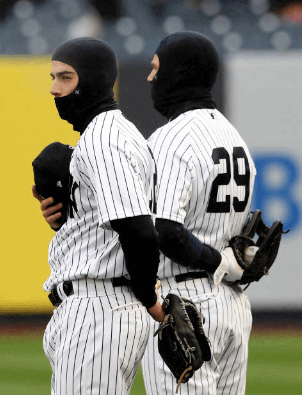
The weather was pretty grim here in New York yesterday, with temperatures around 40º and a light rain (which meant I couldn’t go for my daily bike ride in Prospect Park, grrrr). How grim was it? So grim that the Yankees, who were having their home opener — which had been postponed by a day due to snow on Monday — skipped the customary pregame ceremonies of having the starting lineups standing on the baselines. And so grim that Yanks infielders Tyler Wade and Brandon Drury, shown at right, wore balaclavas during the playing of the national anthem prior to the game. Hmmm, is that as bad a faux pas as wearing your cap during the anthem?
The Yanks weren’t the only ones donning the cold-weather headwear. Several members of the visiting team, the Rays, also bundled up:
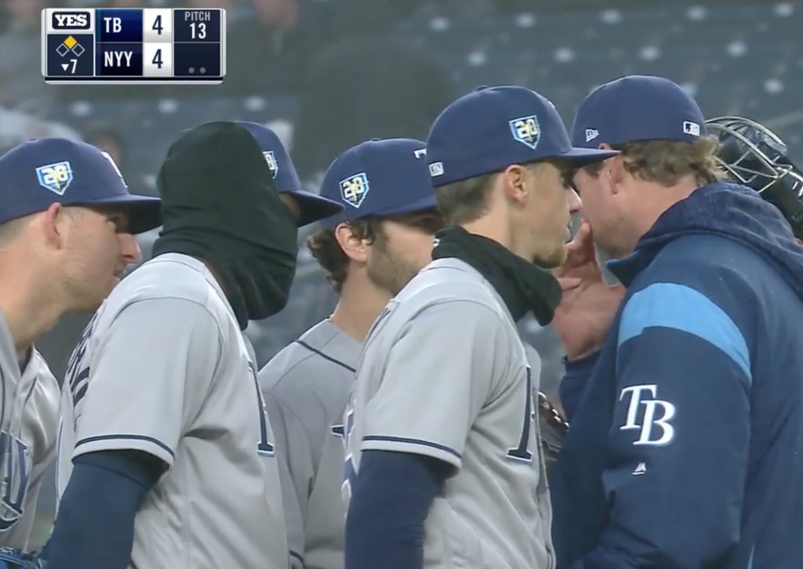
Note that the Rays’ balaclavas had New Era logo creep, while the Yanks’ had little “NY” logos. Also, in that last shot, that’s Rays shortstop Adeiny Hechavarria wearing his balaclava over his cap — an unusual configuration.
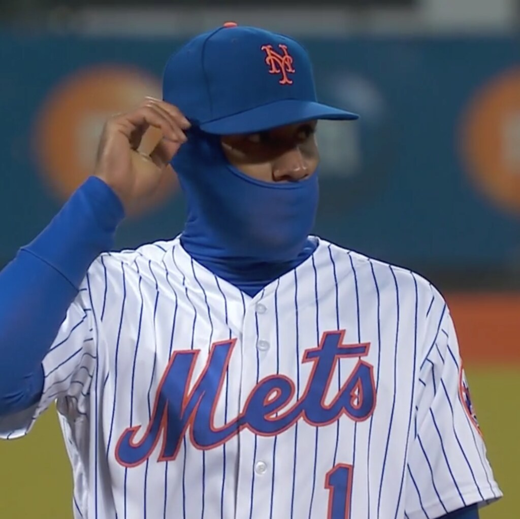
Across town and a few hours later, the Mets and Phillies convened for another chilly ballgame. Once again, players on both sides added some layers:
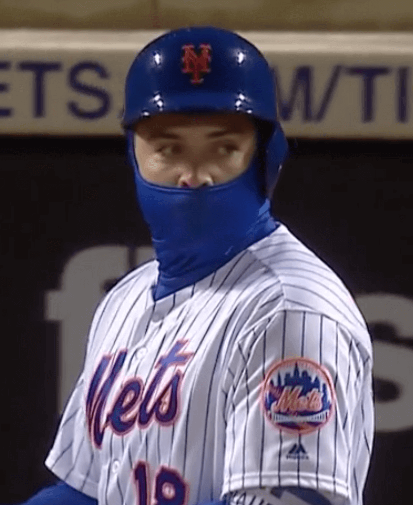
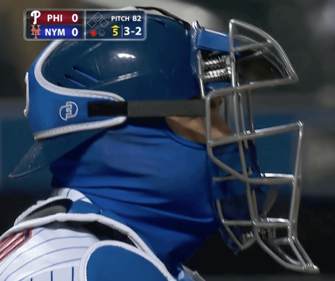
As an aside, you can see that Mets catcher Travis d’Arnaud was wearing one of those new spring-cushioned masks.
Things weren’t much better in Detroit, where the Tigers hosted the Royals. In addition to the head wrappings, a photographer caught Royals third baseman Cheslor Cuthbert warming his hands in front of a heater:
The two teams combined for eight hits and one run in a game that was completed in a brisk 2:17. Pretty obvious that everyone just wanted to get off the field. Although the official attendance figure was 15,083, MLive estimated that no more than 3,000 hardy souls were on hand.
(Just for the record, there were also games yesterday in Miami, San Francisco, Atlanta, Houston, Arizona, Oakland, Anaheim, and San Diego, plus indoor games in Milwaukee and Toronto, so nobody had to bundle up for those.)
All of those balaclavas (balaclavae?) led the great sabrmetrician Bill James to wonder when such accessories first began appearing on the field. He suggested 2010, but I knew that wasn’t right. I quickly found a photo of a ’clava-clad Devil Rays outfielder Delmon Young that’s either from 2006 or ’07 and said I was pretty sure there were earlier examples than that, and then Jacob Pomrenke pointed us toward Game Four of the 1997 World Series, which was played on a very chilly night in Cleveland. Check it out:
So was that the first on-field appearance of this type of head-covering accessory? If you know of earlier examples, please speak up.
Meanwhile, it’s interesting to see that such an esteemed baseball authority as Bill James could be so wrong on something like this. It’s a good reminder that number-crunchers are good at, well, crunching numbers, but uni-watching is a specialized skill that may elude even the most sophisticated statistical analyst.
(My thanks to longtime reader/pal Jerry Wolper for pointing me toward Bill James’s query, and also for his daily proofreading efforts.)
Titans unveiling tonight: The Titans will reveal their new uniforms tonight. The unveiling event will begin at 8:30pm Eastern and is scheduled to run for half an hour. I’ll have an assessment over on ESPN later in the evening, and probably some additional thoughts here on the blog tomorrow.
Meanwhile, here are some related developments:
• A photo of what’s purported to be the new home jersey has been circulating over the past couple of days. I haven’t shown or mentioned it here on the site because I haven’t been able to confirm its legitimacy, but there were reports yesterday that the NFL is investigating the source of the leak, which suggests that the jersey in the photo is legitimate. We’ll all find out soon enough. In case you haven’t seen it yet, here’s the image:
Bruh if these leaks are actually the new @Titans jerseys I’m sad pic.twitter.com/iECyyLPgxA
— Alex Greene (@alexgreene_) April 3, 2018
• Last night Uni sleuth Conrad Burry, whose leak-related reporting tends to be accurate, posted what he claims to be the Titans’ new wordmark. It matches the wordmark on the leaked jersey:
EXCLUSIVE: We've kinda already seen the Titans new logotype via the uniform teasers, but here's the full new primary mark + logotype. New version on the right, old version on the left. Note the changes in beveling detail and updated typeface for "TENNESSEE". pic.twitter.com/mPlzFrjoqk
— Conrad Burry (@conradburry) April 3, 2018
• The Tennessean, which broke the story of the NFL investigating the uni leak, interviewed me the other day on the subject of the Titans, and uniforms in general. I didn’t realize they planned to run it as a straight transcript of our discussion, but that’s what they did. So if you want to read a whole lot of my thoughts, look here.
• Finally, if you want to compare tonight’s unveiling event to the Titans’ last unveiling, here are two photos from that event, which took place in 1999. Hard to believe it’s been that long (click to enlarge):
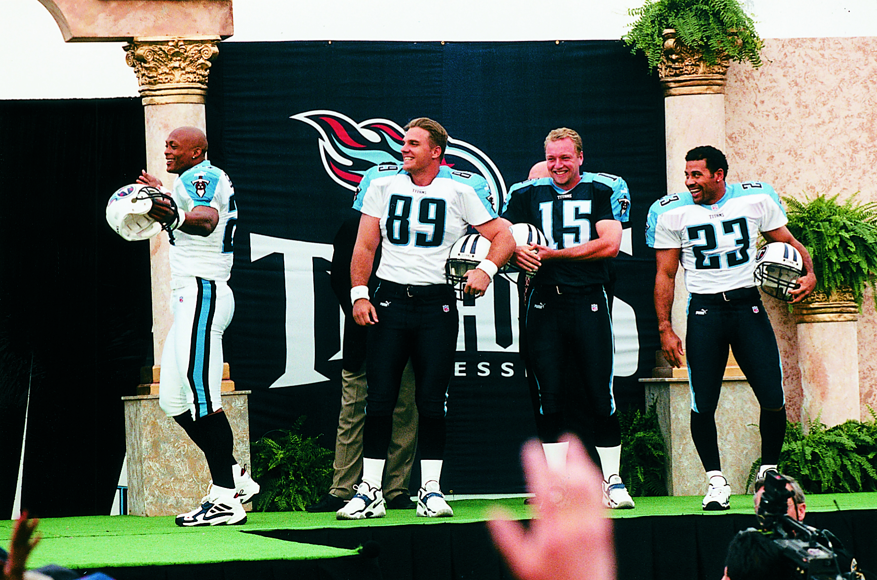
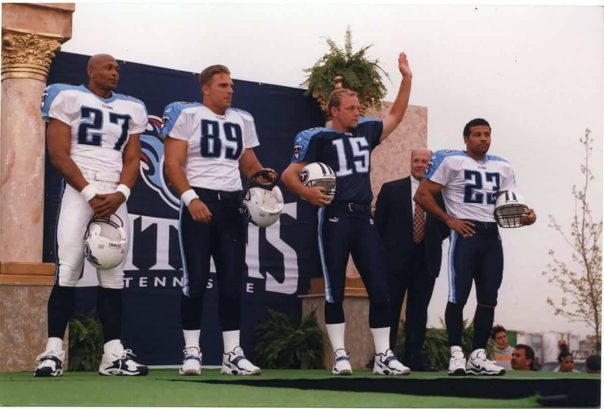
Click to enlarge
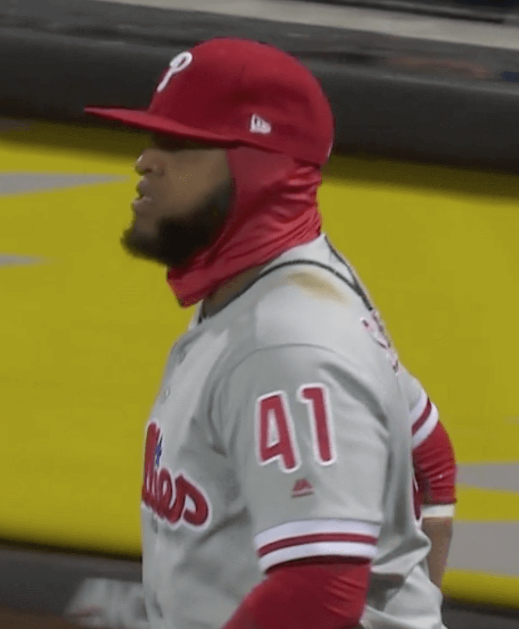
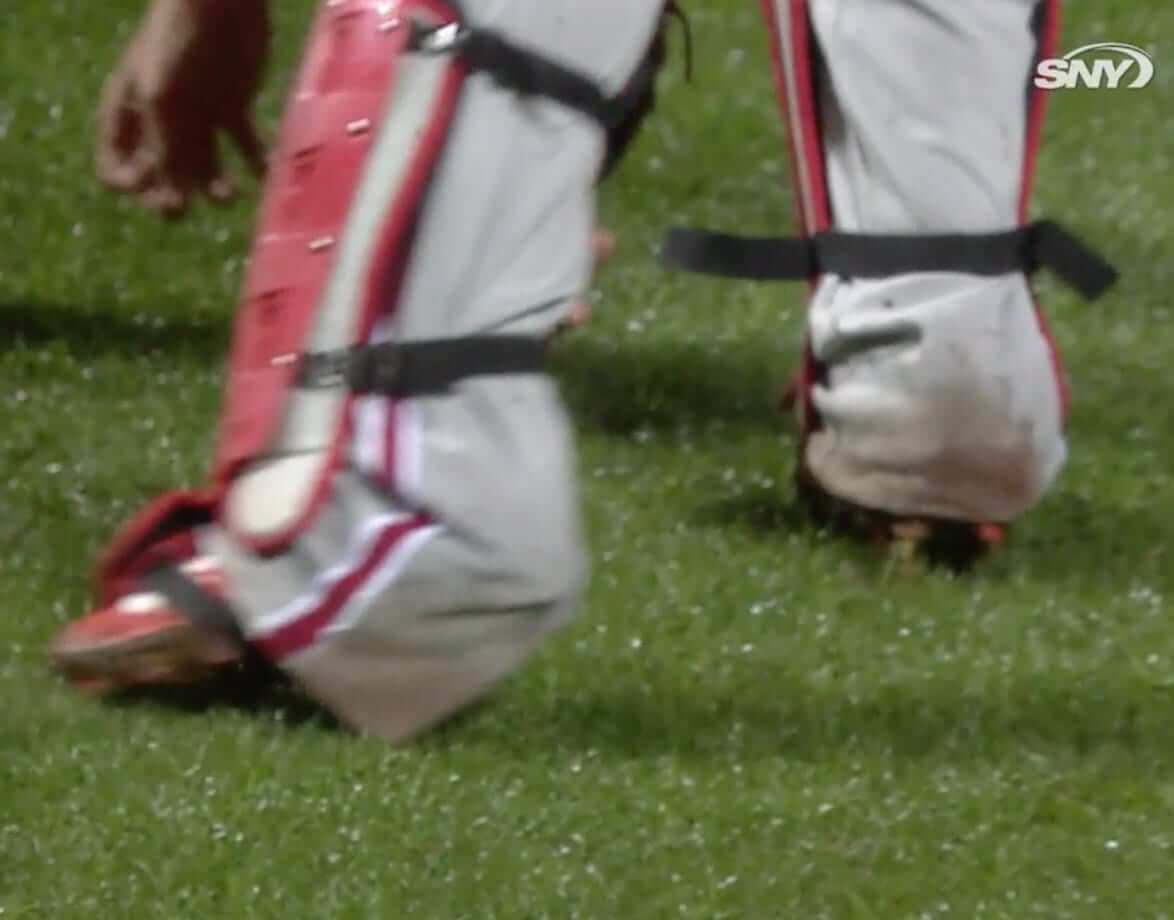
How low can you go? As I was watching last night’s Mets/Phils game, there was a nice play by Philly catcher Jorge Alfaro, so they did a slo-mo replay, at which point it became apparent that he was wearing what might be the longest pants in MLB history.
Now, we all know that I prefer high-cuffed pants. But I’d like to think that even you pajamists out there would be troubled by Alfaro’s stylings here. I mean, at the very least, doesn’t it seem like it could potentially impede his footing? Very strange.
So simple, so good: It doesn’t take much to make me happy. Just be, you know, totally fucking brilliant. Is that so hard?
It not hard at all for a new Twitter project called Other Birds as the Orioles Logo, which is (a) exactly what it says it is and (b) completely awesome. You can scroll through the project here:
Note that in each case, the Orioles’ accursed upside-down apostrophe is included! You have to appreciate that attention to detail — even a detail as miserable as that one.
The project, which launched just a few days ago, is the work of graphic designer named Michael Taylor, who’s apparently done a lot of sports-related design, although nothing in his portfolio approaches the genius of the Orioles project. Uni Watch’s highest rating!
(Big thanks to Bryan Allain for letting me know about this one.)
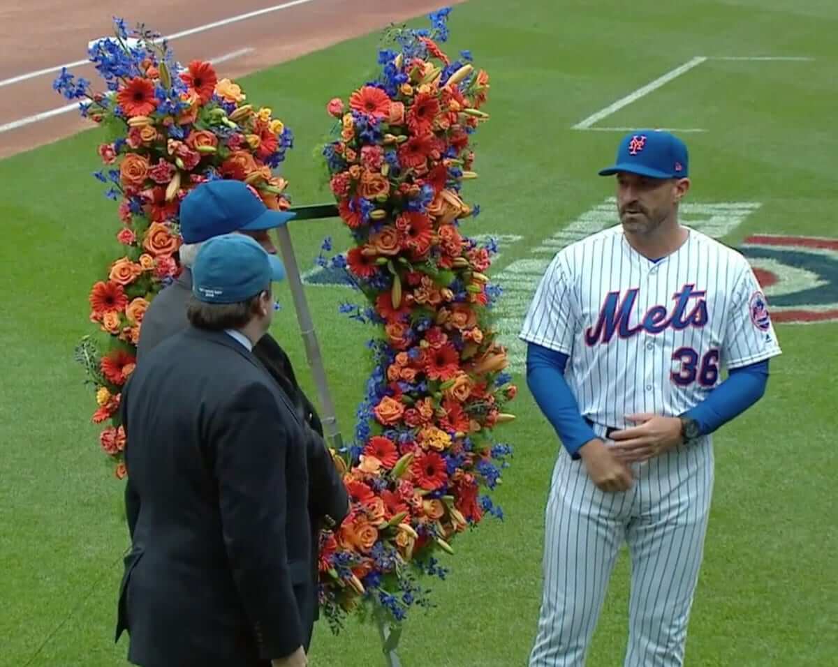
Mets/flowers reminder: In case you missed it the other day, I’m trying to gather photos of the horseshoe-shaped wreath of flowers that’s presented to the Mets’ manager each year on Opening Day. I have many of the years covered, but I’m missing 1965-68, 1975-79, and — here’s the big gap — 1981-2007.
It would be nice if the photos showed the manager, but that’s not essential. What I’m really looking for here are the flowers. If you have photos from any of the years I mentioned (including pics from old yearbooks, screen shots from videos, etc.), please get in touch. Thanks.
The Ticker
By Alex Hider

Baseball News: Here’s a good look at the Astros’ World Series ring, which was given to players yesterday (from Ignacio). … Bryce Harper has been sporting a white glove for the Nats this season. Turns out that flashy glove was designed by a fan (from Mike Carozza). … Former Giants manager Dusty Baker has been hired by the team to be a special advisor. Yesterday, he showed up to his job in a jacket lined with his old jersey (from Andrew Baggarly). … Astros P Lance McCullers was wearing a ’90s throwback cap during pregame interviews Tuesday (from Ignacio). … Fashion label Vineyard Vines has signed a merchandising deal with the Red Sox (from Tom Turner). … Flying Dog Brewery in Maryland has a new Orioles-themed beer that fans can drink at Camden Yards (from Andrew Cosentino). … Clemson wore camo caps and jerseys for Military Appreciation Day yesterday (from Scott Trembly). … The National Museum of the US Navy in Washington will have a baseball-themed exhibit from now through April 30 (from John Muir). … Brewers P Dan Jennings wears No. 38 but is still using his old No. 43 glove from when he was with the Rays (good spot by John Ewanowski). … Yankees pitching coach Larry Rothschild prefers not to wear the team’s jersey (thanks, Phil).

NFL News: New numbers for Steelers DBs Joe Haden and Sean Davis (from Joe Werner). … The Bills are suing watch company Benrus, claiming that company owes them more than $1 million for advertising on giant clocks at the team’s stadium. … Reader Art Savokinas found these NFL puffy stickers while cleaning out his childhood home. … Texans QB DeShaun Watson showed up at last night’s Houston Rockets game wearing an old Hakeem Olajuwon All-Star jersey.
College Football News: Ohio State is known for aggressively defending its trademarks, but the school has seemed to soften that policy for former player Anthony Gonzalez, who is running for Congress and is using the school’s logo in his campaign (from Jason Hillyer). … New helmet for D3 Pacific Lutheran (from Brandon Sparks).

Hockey News: Jets G Steve Mason had a helmet malfunction during last night’s game and had to wear a plain white mask for the remainder of the game (from The Goal Net). … Former Red Wing Sid Abel outfitted his son in a sweet sweater, most likely taken in the ’40s or ’50s (from Ray Hund).

Basketball News: The Sixers unveiled a statue of Dr. J outside of their practice facility yesterday. More here (from Mike Chamernik). … Reader Alex Gerwitz has completed his color-blocked NCAA Tourney bracket. … According to Dan McNamara, Villanova finished the season 11-0 while wearing their 1985 fauxback jerseys. … Cross-listed from the NFL section: Houston Texans QB DeShaun Watson showed up at last night’s Rockets game wearing an old Hakeem Olajuwon All-Star jersey. … Today is the 50th anniversary of Martin Luther King’s assassination in Memphis. But the Grizzlies, who have an alternate uniform based on King’s work during the 1968 Memphis sanitation workers’ strike, are playing on the road tonight, not at home. Seems like an odd scheduling decision.

Soccer News: Dinamo Minsk, a soccer team in the Belarusian Premier League unveiled new uniforms for next season the other day (from Ed Zelaski). … Charlotte Independence of the USL are moving from the Sportplex at Matthew to Memorial Stadium in 2021 (from Josh Hinton). … Also from Josh: Middlesbrough FC has signed a new kit deal with Hummel.

Grab Bag: Phil Mickelson raised a lot of eyebrows yesterday by wearing a button-front shirt during a Masters practice round (from Brinke and Chris Howell). … Golfer Charl Schwartzel has signed an endorsement deal with Michael Kors (from Tom Turner). … Dallas-area sports teams have had a rough year, and The Dallas Morning News summed up fans’ feelings with this graphic (from Ignacio). … The Under Armour All-America Women’s Lacrosse Senior Game uses elements of a men’s regulation lacrosse field in its logo (from James Gilbert). … This is a good piece on the redesign of the International Symbol of Access, aka the “wheelchair symbol.” … Robert E. Lee High School in San Antonio announced earlier this year it would change its name. The school will now be called LEE (Leaders of Educational Excellence) High School, and while its sports teams will keep their name, the Volunteers, the school’s new mascot will be a military service dog (from Brett Baker). … Here are all the helmets of the 2018 F1 grid (from @MisterPigz). … Here are this week’s IndyCar liveries (from Tim Dunn).
Maybe it’s just too early in the morning for me, but I don’t see the crack in the Jim Hart photo. I see his chinstrap hanging over the helmet…
You’re right! When I clicked on the link (while editing the Ticker), it looked like a crack. But I see now that it’s just the strap. I’ll remove that item from the Ticker.
The Sixers “Dr. J” statue looks an awful lot like the photo from the 1976 ABA dunk contest of Doc jamming from the foul line… He was on the Nets at the time.
Sure does: link
I thought the same thing, Louis.
My idea would’ve been to go with him hanging in mid air for the reverse after blowing past Mark Landsberger in 1980 or, even more abstract, not showing him at all — instead, showing Laker Michael Cooper ducking under a piece of the backboard knowing Doc was finishing his rock-the-baby-to-sleep cupping dunk in ’82-’83. That way, we observers could have fun using our imaginations, remembering just how awesome the Doctor truly was.
-C.
RAR Brewery another MD brewery has an Orioles themed beer called Screw Jeffrey
link
Just one more reason to love RAR
I wish I lived closer to Cambridge and could get more of their weirder brews.
Same, I’ll have to hit them up on the way to the coast this summer
As an Orioles fan for nearly six decades let me say that lots of beer, Orioles-themed or otherwise, is going to be needed to get thru what appears to be shaping up as a miserable season.
Interesting that the lining of Dusty Baker’s jacket has NOB, but the Giants’ home jerseys don’t.
Also, it cannot be his old jersey, as he was fired by the Giants after the 2002 season, and the “GIANTS” lettering still had an overlapping “A” on the placket when they were made by Rawlings. The jersey in his coat is the Majestic type.
Missed the ticker. Here is the autism awareness mask that goalie Jacob Markstrom of the Vancouver Canucks wore last night.
link
NFL ticker: Bills “giants clocks”
Also, not a typo, but you might want to remove one of the “last nights” from this graf:
Last night Uni sleuth Conrad Burry, whose leak-related reporting tends to be accurate, posted what he claims to be the Titans’ new wordmark last night.
By itself, that “leaked” Titans jersey is looking like a 3 on the 1-to-4 football-uniform-to-clown-suit scale. Will hold final evaluation in abeyance until full, actual uniform is revealed.
All those cold-weather baseball pics got me thinking: Is anyone else concerned that more and more players are wearing white cleats/shoes at home and on the road? I’m old enough to remember when the Astros and A’s (OK, Senators too) were the only teams to wear white shoes. But now it’s anything goes. And don’t get me started with the various styles of socks too. It’s all a sartorial mess.
Looking at the Titans’ jersey, and found that the 8 actually made me think of the Oilers’ derrick logo. Not sure if that’s by design (I hope it is), but not a bad touch, even if it does make the numbers look all wonky. I don’t understand the flair thingie at the top right, though.
All I can say is that if that leak is indeed accurate, then I’m not very optimistic on the rest of the set. The Columbia blue underarm/side panels and what appear to be gray shoulders (they could be white and it’s just the light reflecting differently on them than on the number and wordmark) just look like a mishmash on the navy jersey.
Because it looks like the right side of the state of Tennessee.
Ah. Good thing they weren’t designing for Florida or the Missouri bootheel.
I hope that that’s what it symbolizes also. Apparently the shoulders are supposed to look like a sword, which is why they’re pointed. I will reserve my judgement until I see the rest of the uniform, as there is still a lot that was in the teaser video that doesn’t appear on this jersey.
If true, not looking good, yet another stupid number font to keep the Buc’s font company.
Officially changing the name of a high school named Lee (named after Robert E. Lee) to LEE (named after a ridiculous backronym no one will ever use) is so weak IMO. It makes it so the necessary repudiation of white supremacy is effectively invisible.
Nothing wrong with making the repudiation of white supremacy invisible. The problem is that it fails to do the repudiating effectively enough to make the original white supremacy invisible. The Lee name needed to go entirely, such as changing to honor Texas’ unionist governor AJ Hamilton.
But kudos for the mascot change. Volunteers is a terrific school sports nickname, and the use of a service dog to represent the nickname is brilliant.
The Lee High School situation is, while not the most elegant solution (having to form a backronym), but it is a clever solution nonetheless, since it minimizes the impact of the change.
The name meaning change reminds me of King County, Washington. Originally named by the government of the old Oregon Territory for vice president-elect William R. King in December 1892 (the bill to split Washington Territory from Oregon wasn’t submitted until January 1853, and didn’t take effect until March), it was officially “re”-named by the state for Dr. Martin Luther King, Jr. in 2005 (two decades after the county government had wanted to do so, but it had to go through the state level).
Of course, in response to Martina’s post above, the school could’ve done better.
“Backronym” – thanks for teaching me a valuable new word!
Congress is great at backronyms.
I always thought that the most strained backronyms were the USA Patriot Act – “Uniting and Strengthening America by Providing Appropriate Tools Required to Intercept and Obstruct Terrorism ” and the CAN-SPAM act – ” Controlling the Assault of Non-Solicited Pornography And Marketing”, but my favorite is Arby’s “America’s Roast Beef, Yes Sir!”
Yeah, since 1995, Congress mostly names major legislation like Hasbro execs name GI Joe vehicles.
1995 is way late
ERISA and COBRA were bastard children of the 80s. The best thing about ERISA is its backronym: Every Ridiculous Idea Since Adam
The pic of the Rays player that Paul linked to is Elijah Dukes, not Delmon Young. Young wore #26 with the Rays while Dukes wore #35.
Actually, Young also wore No. 35:
link
link
You’re right Paul, I forgot that he briefly wore #35. But even looking at his face, from what I can see peeking out, it looks like Dukes. Young has more of a pointy noise whereas Dukes’ nose is more flattened.
I have too much time this morning. :) Keep up the great work Paul, love this site.
I looked at many photos of both of them, trying to decide which face was hiding under that balaclava. Ultimately decided it was Young. But you’re right, it could be Dukes!
Now, we all know that I prefer high-cuffed pants. But I’d like to think that even you pajamists out there would be troubled by Alfaro’s stylings here.
I’m fine with any length from just below the kneecap to just above the ankle. Alfaro’s look is beyond troubling to me. It’s not a style, it’s an assault on both style and functionality. I hope he doesn’t get hurt, but I do hope he trips over his pants and costs his team a run.
“MLive estimated that no more than 3,000 hearty souls were on hand.”
I believe the word there should be “hardy,” not “hearty.” I see those two mixed up a lot. They’re similar but not interchangeable.
“Hearty” is usually the correct word, but if we’re specifically speaking of enduring difficult conditions, then “hardy” is correct. However, we’re not talking a three-year arctic expedition here, so these fans’ enthusiasm for their team may be more on display than their physical stamina. In which case “hearty” would be correct.
I’m surprised no one is pointing out that the Rays’ balaclavas were black. Why? Obviously, not one of their three colours.
Royals’ were black as well. And although I didn’t get a photo, a Phillie was also wearing black. Seems to be a fallback option.
Interesting. I would have thought there was a rule against wearing gear with non-team colours.
Coincidentally I too found a sealed pack of NFL puffy stickers among my old sports collectibles like Art Savokinas found, but mine were LA Raiders. I put them on eBay for $5 but found no takers. Not the treasure I hoped it would be!
Keep posting it. Not too many looking for football items in April, most likely. It’ll sell eventually.
-Jet
Drury, shown at right, wore balaclavas during the playing of the national anthem prior to the game. Hmmm, is that as bad a faux pas as wearing your cap during the anthem?
Good question! Most of the time, the custom is described in terms of removing one’s “hat” or “headgear.” A balaclava is clearly headgear, as is a hood. But it’s not so clearly a type of hat. So the letter of the custom may very well permit wearing a balaclava during the anthem. But the spirit of the custom would seem to be about uncovering one’s head, so balaclavas, hoods, and other items that cover the head but may not technically be hats ought to be removed.
Ultimately, respect is more about intent than particular actions. But if we adopt the principle that what matters is whether a person intends respect or not, then most of the “patriotic” huffers-and-puffers who take such umbrage at things like black athletes kneeling would have nothing to complain about. Anthem kneelers do not intend disrespect, any more than balaclava wearers intend disprespect, so we would have no grounds to complain about their disrespectful gestures if we adopt a standard based on intention.
I can flat promise you puffy stickers in next week’s Collector’s Corner. How cool!
Great lede today. As a diehard Baseball guy, I don’t like the neck balaclavas because they make players look soft. I personally blame the balaclava for opening the door to dugout hoodies instead of clean pro jackets. One thing I thought you guys would mention was the ’08 craze when the Philkies and Rays word goofy ear cover hats in the World Series.
Also love the project of making other birds in oriole bird style. Keep em comin’!
Mickelson’s button-up golf shirt is making my eye twitch. It’s just so jarringly wrong for golf. It’s like when you see someone wearing jeans on the course. In theory I really don’t care, but it’s just… off.
Not scheduling the Grizzlies to play in Memphis today might have actually been intentional. There is so much going on downtown today, logistics are already a nightmare. The Lorraine Motel/National Civil Rights Museum site is only a few blocks from the FedEx Forum, and the commemorations and events are going on down there for most of the day.
Just curious, Paul–and apologies if this has been answered before–do you typically bike for commutation, recreation or both? Any favorite rec routes/parks besides Prospect?
Both.
I bike every day in the park (as long as it isn’t raining, snowing, or below 25º), mainly for exercise and also just to get myself out of the house, and I bike to get around Brooklyn. For longer excursions, I take the subway or my car.
Re:vineyard vines/red sox. Vineyard vines is pricey, but I have a blue polo that is one of my favorite shirts, well worth the pricetag for me as far as fit/color go. Looking forward to pairing it with my nantucket red pants for the summer lol
Hm, this Titans jersey doesn’t have a chrome NFL shield like the newer jerseys do, but it looks awfully real unless someone went to a ton of trouble to make a fake. If it weren’t for the light blue panels on the side I’d like it alot. Their biggest problem has been their helmet and thumbtack logo IMO. If they fix that then I don’t mind minor alterations to the jersey. It does invoke Titan/Greek imagery as much as a football jersey can IMO. I also don’t hate the 2 shades of blue.
The reason it doesn’t have a chrome shield is that it appears to be a retail replica version. It’s also strange how it appears to be in the old Nike template.
Other birds ala Orioles….
But which have open v.closed mouths??
Actually, you know what? I am calling this Titans jersey a fake. The retail jerseys are sized S-M-L-XL. This jersey doesn’t have the triangle collar thing or the chrome NFL shield, so that would mean if it were retail it would only be the screen print version. If you look at the tag in the lower right hand corner it has numerical sizing, which is only available on the $300 elite jerseys for retail and is how they size the game jerseys. If it were indeed the base retail jersey, the sizing on the tag would just be S-M-L, etc. If it were the actual players jersey or the elite jersey, it would have a chrome NFL shield and the triangle collar thing (that the Titans already showed in one of those promo vids.) I call fake.
It appears as though it’s in the old Nike replica template from around two years ago, as they had the same structuring and tags as this one does. Not sure why it would be in the old template though. That’s the only thing that makes me believe it’s a fake. And if it is fake, how many hours did someone spend making such an elaborate fake, and also somehow get the press to believe that the NFL is investigating.
Don’t get so caught up admiring the cute little Redwings jersey on Sid Abel’s son that you miss the totally awesome DIAMOND captain’s “C” on Sid’s jersey!!!
-Jet
I’ll be honest. When I see extensive coverage (heck, any coverage) here on NBA unis and soccer kits my eyes glaze over. Just not my thing. But when I see stuff like other birds in place of the Oriole I get giddy. This is why I love this website. Thanks.
Love the color block, but the maker fell into an all-too-common trap. URI proudly uses Keaney Blue, similar to UNC’s blue, not aqua as presented.
If real, the Titans jersey is disappointing. The number font can make or break a teams look. The Steelers are a perfect example. They could have a top 5 uniform if they would lose the clown font. I guess some teams just want to look terrible.
Is the Steelers font really that much different from the Bears, a uniform that regularly ends on top of the pile in terms of ranking NFL uniforms.
If that is indeed what the Flaming Thumbtacks’ new jersey looks like it is a subtle yet significant improvement, IMO.
Just saw the actually uniforms.
I have not yet seen how Paul grades these, but I give the effort a solid B+. Huge upgrade without totally losing the team’s established identity.
New Titans’ helmet is a very slight upgrade. Silly sword stripe kinda ruins it. Unis themselves are no better, no worse than the old ones. A whole lotta meh overall.
Font – downgrade
Shoulder stripe sword – a little juvenile, making the Nike logo
pop, again seems to be the main driver
Helmet – Minor upgrade
My take on the Titans’ new uniforms:
link
Paul, I guess we’re not too far off – I give the upgrade a solid B+.
I know you are not a huge fan of customized number fonts, but I like these. As long as they are not too weird, they can give a uniform a unique detail that makes it stand out from all the traditional block fonts.
One thing I’m definitely noticing is that a new uniform or overhaul almost always gets a lower grade from Uni-watchers than it will be viewed in a few years. I think people tend to not like change generally speaking when it comes to uniforms, but over time they get accustomed to it.
Titans’ new outfit is a clown suit, not a football uniform. The design has potential (I kind of like the beveled shoulder panels and helmet stripe) but I can’t deal with the awful font, side panels, stripeless pants (those are parallelograms, not stripes), and vomitacious monochrome variants.
“Clown suit” is a bit over the top – that’s basically a traditional uniform with a few modern features.
I get that some people think that all football uniforms should use the standard block numbers, but this font is an improvement over the old one and is not really that out there.
I agree with you that the side panels are unnecessary and the monochrome blue is not the best combo. The white-on-white looks great, however.
The blue helmet is a huge improvement and the silver shoulder panels look a lot better than the older versions.
My first thought on seeing that the Titans font was supposed to be “Greek” was more of Anthora coffee cups than stone. Hope they serve gyros at the game.