[Editor’s Note: With the MLS season set to kick off this weekend, today we have a guest entry from Harrison Hamm, who’s going to bring us up to date on the league’s new kits. Phil will have fellow contributors Kyle Evans and CJ Fleck doing their annual kit previews this weekend, so you’ll have an additional perspective on those coming up. Enjoy. — PL]
By Harrison Hamm
Soccer teams adjust and redesign their uniforms at a much faster rate than teams in traditional American sports. And although there’s no more “Jersey Week” promotion, MLS teams have been unveiling new kits on the regular this winter. Let take a peek at all the new looks, shall we?
Atlanta United
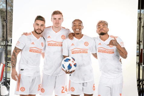
Atlanta, an expansion team in 2017, has kept the same template for its secondary kit but changed the color. The Five Stripes (nicknamed for their home look) went from red-accented white kits to peach-accented white kits — nod to Georgia’s most famous fruit.
It doesn’t fit the red/black color scheme they made their own last season, and not changing the base look almost at all from year to year was a mistake. But the orange they chose looks tremendous, and the uniforms are slick. Solid job by the splash-making second-year club.
Chicago Fire
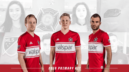
The Fire didn’t make dramatic changes to their red home kits. They added double white bars to the front of the jersey in a throwback to their trophy-winning 1998 expansion season, and they put distinct blue stripes on the shoulders, but these look similar to last year’s home set.
The white bar across the front unfortunately serves to accentuate an unnecessarily large advertiser, and the stripes simply don’t make sense. Chicago’s red works well, though, and this is a unique template in MLS.
Colorado Rapids
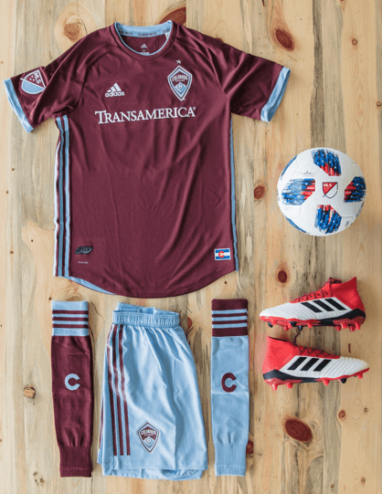
Colorado’s maroon and light blue home colors will not be changing anytime soon, even if there is a ceiling to how well they can pull it off. This new home kit scraps the white shoulders and shorts from the last two years, moving more toward their light blue secondary color that had been underused.
They executed it well, eliminating unnecessary frills (except the three-stripe side panels, which are unfortunate) and allowing the colors to shine. As an added bonus, they’ve added to their aesthetic connection with the NHL’s Colorado Avalanche.
Columbus Crew SC
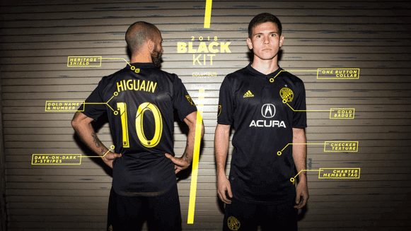
Amidst a relocation controversy that could see the team moving to Austin, Texas, after 2018, Crew SC unveiled a sharp black look that will contrast nicely with their all-gold home kits. They moved away from the gold stripes and checkered pattern that characterized their previous black unis, instead focusing on simplicity.
These rank as arguably the best of the new MLS kits. The flaw, naturally, lies in the execution of the advertisement. Acura’s wordmark stands out too much on a uniform without white anywhere else.
D.C. United
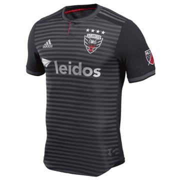
D.C. United, entering brand-new Audi Stadium for the 2018 season, did not stray far from their historical norm in designing the jerseys they’ll don there. They always worn all-black home kits in their history, dating to the league’s 1996 inception.
Their latest twist is dark-grey pinstripes, which are muted enough to keep the classic DCU look yet loud enough to be noticeable. This addition is a clear minus. A cool positive, though, is the exact latitude of the new stadium printed on the rear neckline.
FC Dallas
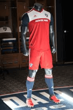
Here we have a debatable design from a team nicknamed the “Hoops” for their iconic stripes. This Texas flag-inspired kit will be FC Dallas’s new home attire for 2018.
The white chest and navy shoulders are expertly designed — immediately one of the best uniform features in MLS. But they are offset by other flaws. Adidas’s shoulder stripes are much too thick, the Advocare advertisement appears disproportionately small, and, most damagingly, the red shorts create a large blank slate of red. This design desperately needs blue shorts.
Houston Dynamo
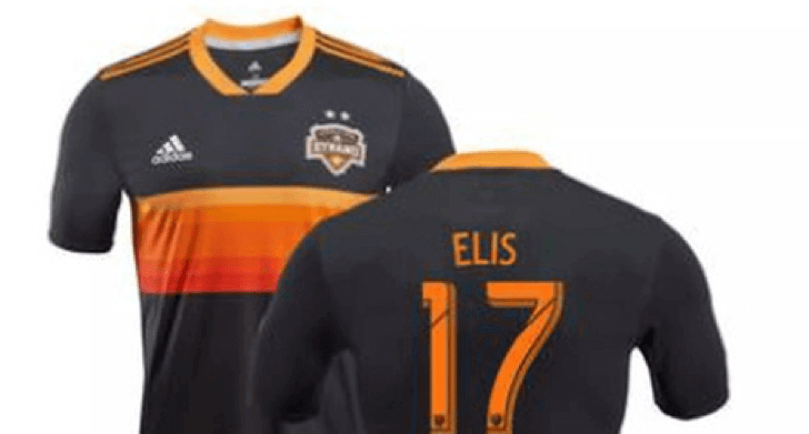
In a homage to the World Series-winning Houston Astros, the Dynamo’s new black away kit features a tequila sunrise-style design (although the press release says that the “progressive shades of orange” actually represent the city and team’s cultural diversity, not a ’Stros tribute). They pulled it off well. Their beautiful orange primary color makes their home kit solid without too much worry, allowing them to try things with their road unis, and that’s what they did to great effect here.
The best thing about this: No ad!
LAFC
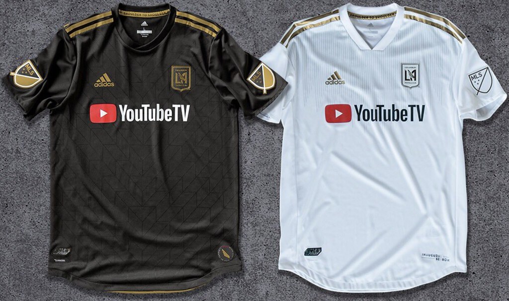
MLS’s newest club will become the only team in the league to wear black and Vegas gold as primary colors. Their new kits have very few design features aside from the three stripes, which appear in three places. But their advertiser, YouTube TV, goes a long way toward ruining the look, with the gaudy red logo destroying an otherwise clean-cut jersey.
LA Galaxy
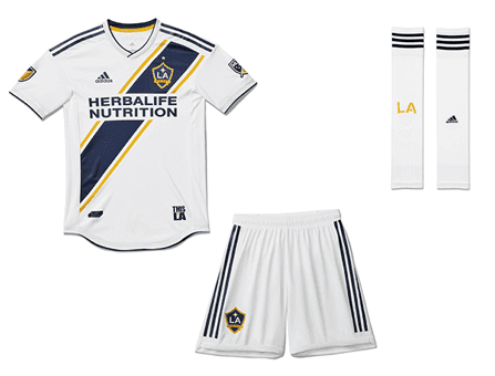
LA’s classic sash on the white home kits receives its bi-annual makeover. Last year, it was a slick blue/yellow split; this time it features a thicker blue stripe with thinner yellow stripes on either side.
It may not seem like much of a change, but there is a clear upgrade buried in there: The Adidas striped side panels have been removed, leaving a cleaner white base. If we could only get them to try something else for the pattern on the shorts …
Minnesota United
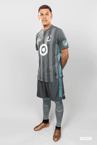
The Loons, who entered the league alongside Atlanta last year, chose light blue and grey as their color scheme, consistent with their history in lower tiers of American soccer. Their uniforms last season were grey and white — a missed opportunity to use their beautiful blue more prominently, but an understandable decision given how many MLS teams use a similar color.
This year, they downgraded their grey look massively with grey-on-grey pinstripes, further minimizing the light blue. A missed opportunity.
Montreal Impact
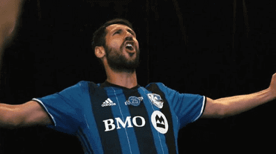
The Impact made very few changes for 2018. They will keep their blue/black-striped home kit, making only subtle adjustments. They’ll be the only team to not introduce a brand-new jersey, although they said in their press release that they will have a new primary jersey next year and “two other new jerseys for the next two seasons.”
This set will feature a 25th-anniversary patch on the front and silver numerals, an understated throwback to their original look.
New England Revolution
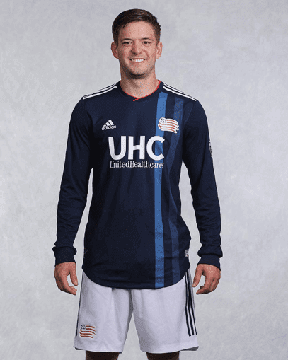
New England kept their general look for 2018 and 2019 — dark blue jersey, two vertical stripes, white shorts — but they relegated red to tiny sleeve and collar accents and introduced light blue for the first time in team history via the two front stripes.
It’s inoffensive, thanks to the standard blue-white-blue combination and simplicity of the jersey, but the light blue is a curious addition. For a team with a patriotic theme, it doesn’t make a ton of sense to prominently feature a color like light blue, especially alongside the navy and red.
New York City FC
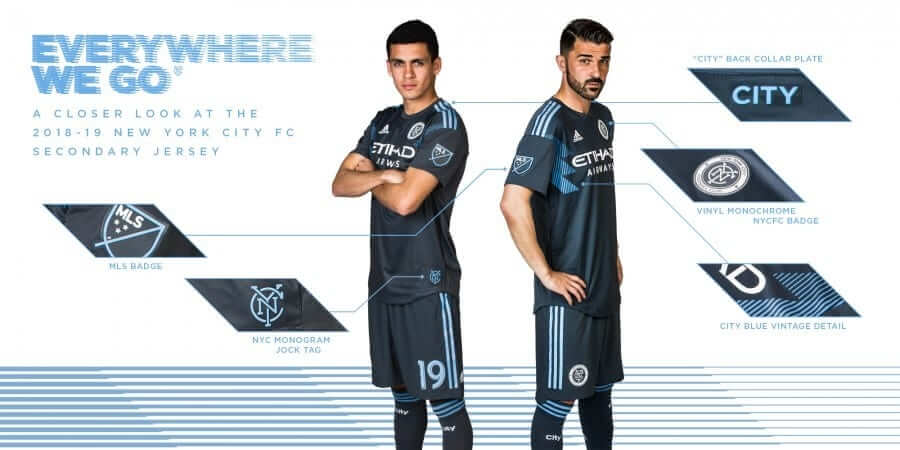
NYCFC will wear light blue home kits as long as they are a member of City Football Group (alongside Manchester City), but their road unis are an opportunity to show New York pride. After two years where they wore funky-looking navy and orange secondary kits (a tribute to the NYC flag), they dialed it back for 2018.
Their newest uniforms introduce a new greyish-blue color, intended to represent the “grit and attitude” of the concrete jungle. The spikey design thing (for lack of a better description) coming out of the shoulders detracts from it.
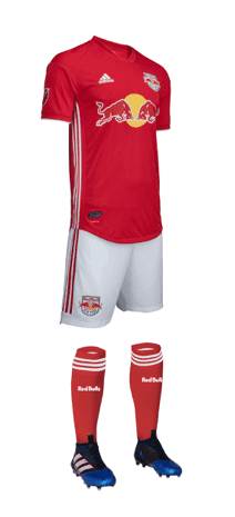
New York Red Bulls
Finally, after years of white-jersey, red-shorts combinations, the Red Bulls unveiled red kits. They will be paired with white shorts, and for the first time, the jerseys will be barren of heavy design features and excess lettering.
RBNY will let the colors do the talking, and it looks great. This club is the most corporate-inclined in MLS (for obvious reasons) but, paradoxically, their jersey ads are among the most manageable in the league, because they look the most like a logo. This kit is arguably the best in Red Bulls history.
Orlando City SC
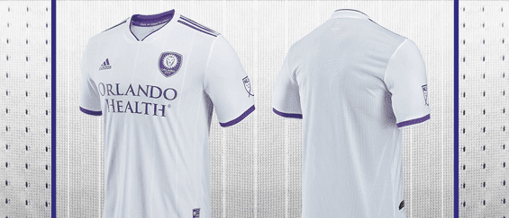
The only MLS team to use purple in its color scheme will again use white as a secondary color. This year, they simplified the design, scrapping purple shoulder coloring and the secondary gold they use more prominently on their purple home kits.
It is yet another straight white secondary look, but it works well enough. The ad isn’t too cumbersome and the jersey will complement their purple look well.
Philadelphia Union
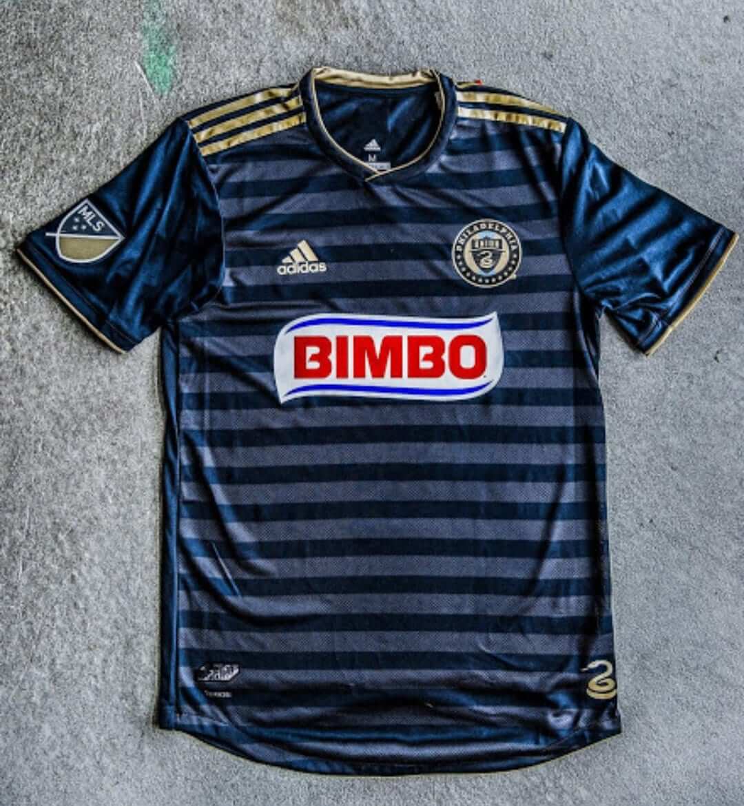
Adidas must have liked the muted stripe idea. Philly’s stripes, while horizontal instead of vertical, look all too similar to D.C. United’s and Minnesota’s. It did not work well for either of those teams, and it similarly flops for the Union.
Philadelphia has a good-looking navy and Vegas gold color scheme, but forcing blue-on-blue stripes was a lousy idea that undersells their beautiful secondary color. Their Bimbo advertisement is the most poorly-executed in the league, adding to the struggles of this new kit.
Portland Timbers
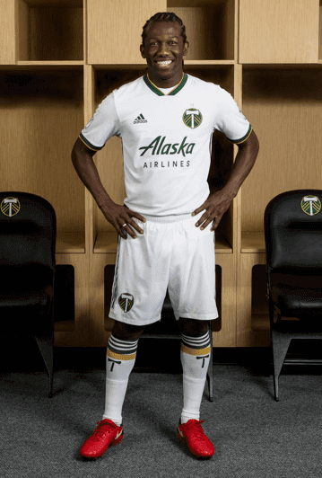
Portland’s fantastic green and gold home kit is arguably the best in MLS. For their away uniforms, they scrapped the black and red secondary colors they had used for so long and went with an all-white look.
It’s clean and simple — a well-needed change from the often gaudy away unis they’ve worn over the years. But the Adidas three-stripe side panels are an unwelcome intrusion, and the Alaska Airlines ad doesn’t seem to fit what they’re trying to do.
Real Salt Lake
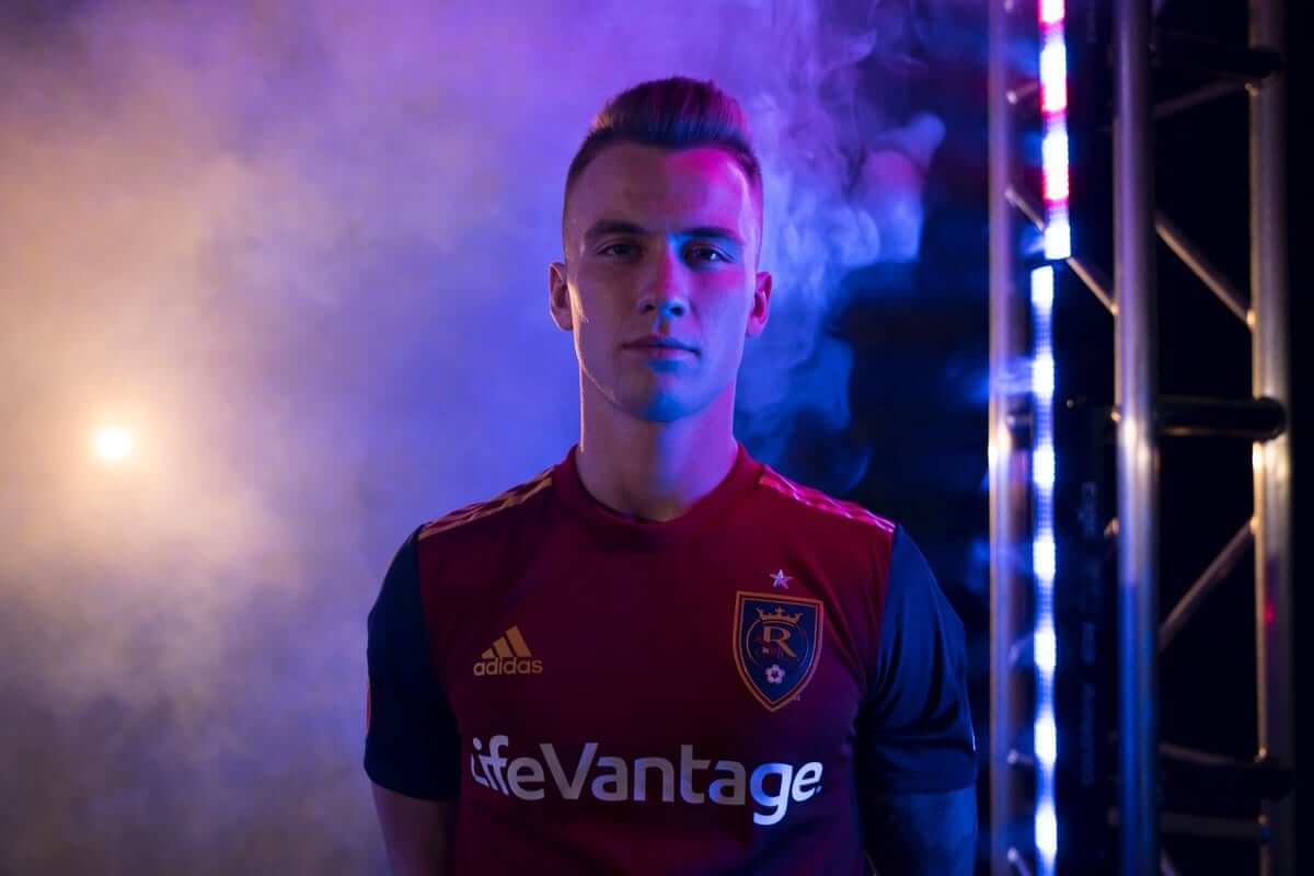
RSL have rarely departed from their “claret and cobalt” (aka red and blue) color combination, and their latest home kit is only a slight adjustment. They didn’t do anything dramatic, but they didn’t need to, and the result is pretty good. Extra props for including a specially designed goalkeeper kit in the official unveiling.
San Jose Earthquakes

San Jose departed from the blue jersey, black shorts combination last year with an all-black look. For 2018, they’ve complemented that with an all-white kit. It features the Quakes’ “iconic impact pattern representing fault lines” and a Navy SEAL Foundation patch, with 5% of the profit from each jersey sold at the team store going to benefit the foundation.
This design contrasts beautifully with their black kit and accentuates their tremendous blue very well. The grey pattern on the front makes it unique, and judging from the unveiling images, it will look good on the field. These get my vote as the best in MLS.
Seattle Sounders
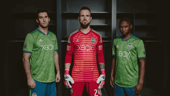
The Sounders, owners of the best green in sports, have added a new pattern to the front of their home kits. The uniforms include the “You Will Hear Us” slogan of SB Nation Sounders blog Sounder at Heart, a nod to their notoriously loud fans.
The pattern, though, is a disaster, an unnecessary gimmick that only serves to detract from their iconic rave green. Seattle has had some of the best uniforms in MLS since its 2009 expansion season, but this is the worst look in team history. Hopefully this at least means they’ll use their all-green combination less, which often blended into the field.
Sporting Kansas City
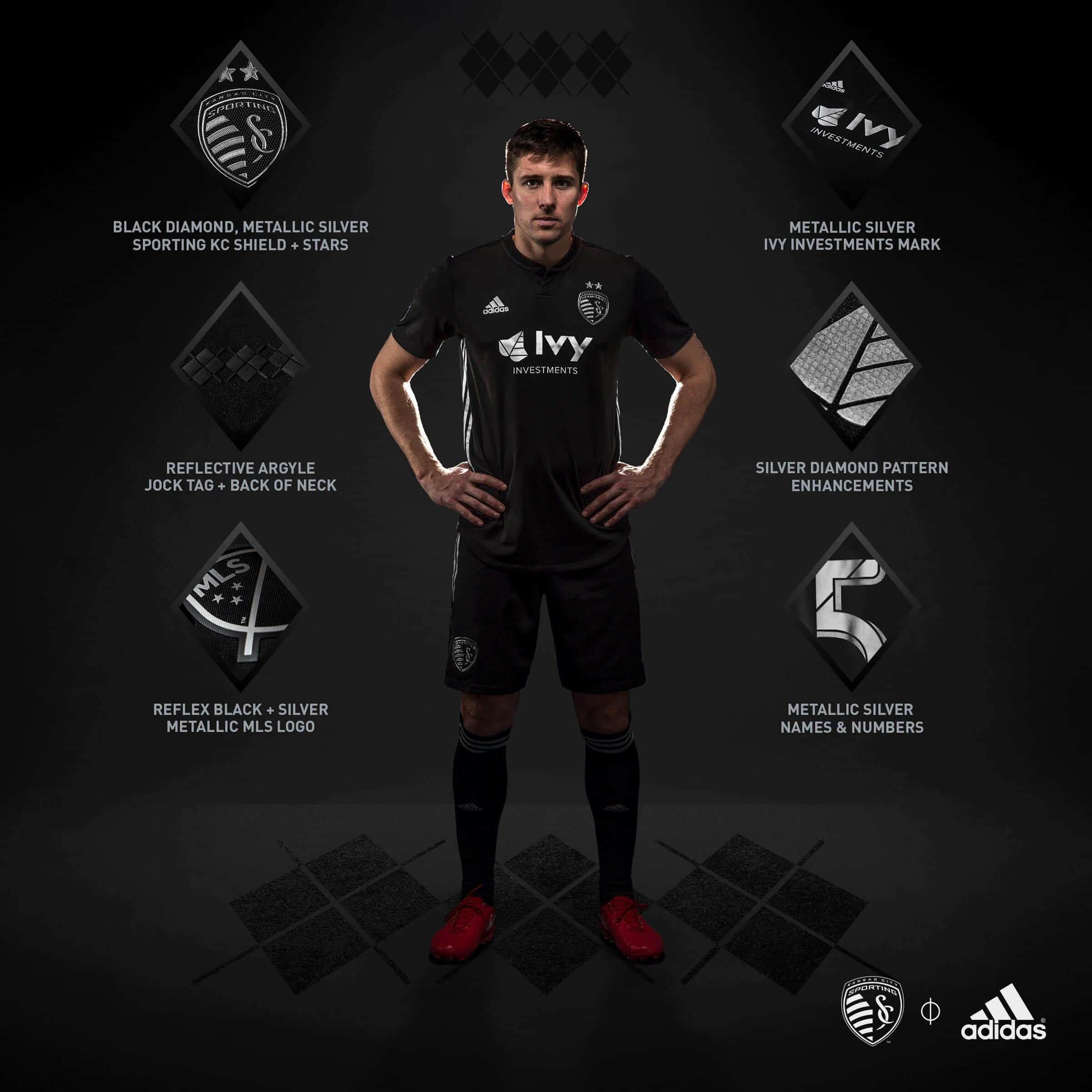
SKC are one of four MLS clubs that use light blue as a primary color (NYCFC, Colorado, and Minnesota are the others), with their home set featuring light blue over white with dark-blue accents.
But as has been the case in the past, their secondary kit not include either shade of blue. This year, it is an all-black uniform, accented by metallic grey. It looks okay when viewed in a vacuum, but they made a mistake in not using a white or dark blue base to complement their home kit. They have good colors — they should use them.
Toronto FC
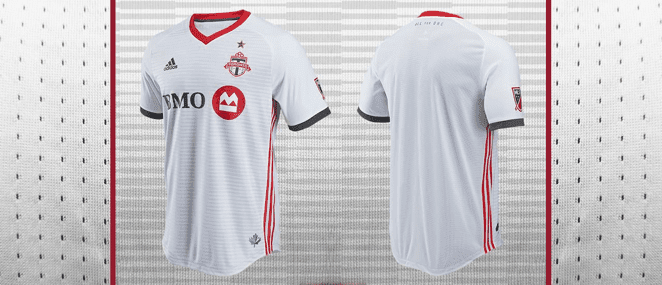
TFC, coming off a season in which they became the first team in league history to win three trophies, complement their red home look with a sleek white kit. This replaces last year’s white set, which made prominent use of blue and had a prominent red bar across the front.
They discarded the extras from their new whites, letting their secondary dark-grey feature on the sponsor and on the end of the sleeves. While the Adidas side panels are unnecessary, this set will contrast more effectively with their home reds.
Vancouver Whitecaps

Two years ago, the Whitecaps had one of the best looks in MLS, with a pattern expertly evoking actual whitecaps at the top and a light- and dark-blue color scheme working quite well. That is now completely gone, as Vancouver unveiled a dark-grey kit that is eerily similar to Sporting’s black.
Light blue is now completely gone from the color scheme, despite appearing prominently on the logo. This uniform runs into the same problems that SKC’s does: It neglects the team’s colors and settles for an uncreative, boring design.
———
Paul here. Big thanks to Harrison for today’s entry, since I’m way too soccer-clueless to provide any meaningful MLS commentary myself.

Click to enlarge
Small world: Longtime reader/contributor Gene Sanny’s friend Danielle (far left in the photo above) and her sister attended the Winter Olympics in Korea. During their flight home to the States, they bumped into Team USA curling gold medalist Tyler George (the guy who got me into curling eight years ago). They asked about his gold medal, and he said, “Grab my coat out of the overhead — my medal is in the pocket.” He even let them try it on:

How cool is that?! Once Tyler gets settled in back at home, I’m hoping to interview him on the ins and outs of the curling team’s uniforms and gear. Stay tuned.

Click to enlarge
Collector’s Corner
By Brinke Guthrie
We originally had a different lead item set for today, but Paul liked it so much that he bought the item for himself! [I’ll feature it in an upcoming entry. — PL] No problem — we’re flexible here at Collector’s Corner, so it’s on to Plan B: Here we have a cool-looking Baltimore Colts bulletin board from the mid- to late 1970s. The plastic border (not shown) has a small crack on the right side, but that’s easily fixable. The seller says the back is “worn and beat up,” but who looks at the back? You can see a little shading on the top left, as if the sun bleached the cork and left that spot where something was tacked on. Sears did something similar in 1979, so maybe this was a Sears item. From the sleeve, pants and socks, I’d say that was a Dallas Cowboy on the bottom there.
Now for the rest of this week’s picks:
• Here’s a photo of former Chiefs coach Hank Stram attending some type of banquet, and he’s still wearing that famous blazer with the arrowhead logo! He must have never taken it off. (On the sideline he’s wearing a dark arrowhead, and at the banquet it looks to be a lighter color- maybe gold. Home and away, perhaps?)
• This guy was a big part of my growing up: The Reds’ Running Man, shown here on this T-shirt, was pretty geeked up here after the Big Red Machine won the first of their back-to-back World Series titles in 1975.
• Ever have one of these? This is a 6″ Cincinnati Reds pin, which also has an easel stand on the back, so you can put it on your desk or shelf. Not sure who’d pin something this big onto their shirt!
• You know how flashy and technologically advanced today’s sneakers are, right? Then there are Bob Cousy’s “PRO 14 Basketball shoes by Randy.” This listing is just for a carry bag they came in, but the artwork here is terrific. How could your feet take the pounding in these?
• Falcons fans can clean up with this vintage soap on a rope set.
• Here’s another personal hygiene collection, this one for the Steelers. Look at the font used on the packaging — maybe it’s just me, but I found that one hard to read. I first thought it said “for bath and shonner.”
• Back in the day, NFL Strategy was a fantastic game to play. I learned a lot about the intricacies of the game from this one.
• This AL West Mini Sport Caps N Bats Kit looks to be in great condition! The seller calls it 1970, but the presence of the Rangers means it’s from 1972 at the earliest.
• NFL varsity jacket time: I cannot fathom why I didn’t get one of these 1970s Cowboys jackets from Sears when I lived in Dallas. And the seller here says this Stahl-Urban Rams jacket is also from the 1970s.
• Cool NFL helmet logos on these 1970s folding stadium binoculars from Tasco.
’Tis the Season: With March 17th right around the corner, I’ve reactivated our St. Paddy’s Day T-shirt design, which was originally part of the Uni Watch T-Shirt Club in 2015 (click to enlarge):

This shirt is available here. You can see the rest of our Teespring product in the Uni Watch online shop.
The Ticker
By Alex Hider

Baseball News: Orioles 1B Pedro Alvarez is switching from No. 24 to No. 2 (from Andrew Cosentino). … Cubs 1B Anthony Rizzo has a new bat grip (from C.D. Tatak). … The Reds Hall of Fame and Museum is opening a uniform-themed exhibit in the coming weeks (from Brice Wallace). … Seattle Seahawks QB Russell Wilson worked out with the Yankees yesterday and wore a regular Yanks cap, not a spring training cap. … Here’s some great footage of a “Turn Ahead the Clock” game in 1999 between the Orioles and Angels (from Mark Lackinger). … Ever seen the logo for the A’s Oakland Alameda Coliseum? Good find by Manzell B. … The Twins will start selling official team Prince merchandise this year (from Jimmy Lonetti and @iheart_miKA). … The A’s wore sansabelt pants during spring training in 1988. I’m guessing they were leftover game pants from 1986, which was the last year they wore that style during the regular season (from Mike Davie). … One of the characters in The Karate Kid can be seen wearing a Washington Senators cap. The movie was released 13 years after the Sens left for Texas, and 21 years before the Nats returned (from Steve Sher). … The Pulaski Yankees, a Rookie League team, will wear cow-themed jerseys at some point this season (from Andrew M. Greenstein). … The Wisconsin Timber Rattlers will wear bratwurst-themed uniforms, complete with lederhosen, on June 9 (from Alex Fubu Niles). … Imagine getting this baseball card in a pack: The announcer of a minor league baseball team in full uniform (from Brendan Gargano). … Players for the 1993 Ft. Lauderdale Red Sox had some serious height to their caps (from Matt Shevin). … ECU will debut new pinstripe unis on Wednesday (from Bill McViker). … It appears that South Carolina has made some edits to its “SC” logo (from Brett). … Just like their classmates on the gridiron, the Iowa baseball team wears “America Needs Farmers” decals on their batting helmets (from Kary Klismet). … Here are all of this season’s St. Patrick’s Day caps and jerseys.

Football News: Reader Dan Ravn found a 49ers shirt at a local Goodwill that he thinks at one time may have been issued to a former coach. Anyone have any more info? … The Spring League, a developmental league for NFL prospects, has new Vicis helmets for next season (from Caleb B. Marsh). … Cross-listed from the baseball section: Ever seen the logo for the Raiders’ Oakland Alameda Coliseum? Good find by Manzell B. … If this graphic is any indication, Dickinson College will have a two-tone helmet next season (from John Philips).

Hockey News: According to Jay Nichols, new Islanders D Brandon Davidson will be the first player in team history to wear No. 88. … Ducks G Ryan Miller has been wearing this mask for “Hockey Is for Everyone” month, which supports LGBT inclusion and other marginalized groups. The mask was designed by a local elementary school student (from @OlegKvasha). … New Predators winger Ryan Hartman will wear No. 38. … A couple of minor league hockey players did a curling-themed goal celebration recently. Paul and Phil would approve (from Maks).

NBA News: Joaquin Oliver, one of the victims of the school shooting in Parkland, Florida, was buried in a Dwyane Wade jersey (from Mike Chamernik and Kary Klismet). … Pretty brutal gray-on-light blue matchup between the Celtics and Grizzlies in Boston last night. … Oklahoma City’s Steven Adams was wearing a jersey without a maker’s mark last night (from Jon Hamm). … Is the NBA’s All-Star Game logo heading the way of the Super Bowl logo, with a boring, generic design? (From @GameplanChicago.)

College Hoops News: Kansas wore red last night for senior night (from @chris892O). … WGN used an old Iowa logo in a graphic during a sports segment the other day (from Stephanie Swieca). … Virginia Tech wore maroon at home against Duke, who wore white (from Andrew Cosentino). … According to North Carolina uni expert James Gilbert, the Tar Heels wore a patch commemorating the team’s 1957 national championship from 1958 to 1961. After that, a patch with a similar shape remained until 1991. … Don’t do drugs, kids.

Soccer News: If you want more coverage of the new MLS kits, here’s Sports Illustrated’s rundown (from Ed Zelaski and Geoff Holm). … The Portland Timbers announced a new advertising deal for their training jerseys (also from Ed Żelaski).

Grab Bag: ICYMI: A Spanish figure skater wore a stylized Superman costume during his exhibition routine at the Olympics. Kary Klismet says the costume highlights “the absurdity of figure skating costumes” and the trope of “athletes being conflated (or conflating themselves) with superheroes.” … NHRA driver Billy Torrence was wearing an old 2015 firesuit with a current 2017 NHRA patch glued over the old one (from David Firestone). … Rugby Canada has a new logo and uniforms. … Johnnie Walker is releasing a limited brand of scotch called Jane Walker, which includes a female version of the striding man logo (from Max Weintraub). … For all you New Yorkers who are interested in logo design: First Round, a showcase of original presentations made to clients showing initial design explorations for logo projects, will take place on May 11 (from James Gilbert). … This infinite regression video is making the round on Facebook (from Brice Wallace).

Please join me in wishing a happy birthday to longtime Uni Watch pal/ally Todd Radom, who’s celebrating another trip around the sun today. Between his uniform, logo, and patch designs, his historical research, and his generous behind-the-scenes support of various ventures, Todd makes the uni-verse a better place on a regular basis. Have a good one, buddy!
MLS uniforms are the worst. All mono-white or mono-color. Bad uniforms for a bad league.
Adidas templates. Unoriginal and typical. Can’t expect much from Don Garber and peons.
Disappointing to see so many advertisers on MLS uniforms. I remember when the league began in the ’90s and all those front logos were team names. I give credit to Minnesota’s advertiser, who uses a logo with no words — this is much less annoying when you see it on a jersey. Same for the Red Bulls; if you have to accept advertising, this is how it should be. No letters, no words.
The Houston Dynamo, of course, have the best look by far: no ugly ads and a gret shout-out to another team in their city. I’m no orange fan but I’d wear that Dynamo gradient jersey!
I’m also a little disappointed that every MLS team uses (has to use?) the same number font. I like the font and it matches some of the teams’ looks, but not all. Some of these jerseys seem to be crying out for multi-colored, bordered numbers, or block numbers.
And happy birthday, Todd!
A number of leagues, including the top four in England, La Liga in Spain, and Ligue 1 in France, have standard number fonts for all their teams. Spain and Grance allow flexibility in colors; England and MLS also limit the number of colors available.
Other leagues I can think of that have a standard number font: the NWSL, Scotland (all four tiers of the league), Portugal, Australia, and Japan.
If I’m not mistaken, different fonts are used for the UEFA tournaments.
Correct. The clubs often use fonts designed by their various uniform manufacturers.
Happy Birthday Todd!!
After watching a handful of ST games, I’m going on record as saying the Prolight caps really look terrible when they’re sweated in. Yuck. Bring back the Diamond Era caps.
Uninspiring batch of MLS kits this year for the most part. Worst among them the last two years is Minnesota United who for 3.5 seasons in the NASL had brilliant dark grey tops with a giant loon wing across the front. Once they moved up they became victims of the league-wide deal with Adidas that often sees teams limited to templated designs and less creative freedom. Wish they would free each team to go with whatever manufacturer they want (or at least have Adidas let the teams full creative control).
A couple of minor league hockey players did a curling-themed goal celebration recently. Paul and Phil would approve (from Maks).
That’s actually major junior hockey, the OHL to be specific – Windsor Spitfires players celebrating against the Soo Greyhounds.
Also, nice throwback action by the Spitfires.
The throwbacks for the Spitfires are waaay better than their regular uniforms. Their regular uniforms need an upgrade and looking more like the throwbacks would be a solution.
I remember when the Spitfires wore the double-coloured blue and white helmets. Those were cool:
link
I am not a fan old the present regular Spitfire uniforms to the point I would rather see them back wearing the orange and brown again, a nod back to the days when they wore brown Cooperalls!
link
And Soo Greyhounds looked better when they had the stars on their pants.
link
Agreed that the Spitfires’ current regular unis are a hot mess.
Although I’m not eager to revisit the Compuware Spitfires era, it’s somewhat amusing that the logo from that period has a 1960s feel to it, down to “Spitfires” being rendered in a font that reminds me of link.
For anyone interested, look at SI’s MLS kit rundown (in the Ticker) as well – the writer came to a conclusion similar to us commenters that the league is currently dull-looking and has too many monochrome kits, whether black/white/red/(insert other color). They singled out LAFC in particular for taking several years to come up with literally just mono-black and white.
The Rams item cracks me up – their own damn site is off by 6 years on the re-introduction of yellow, which happened in 1973 (not 1979).
Whoever wrote that page did a piss-poor job. They used the watercolor images and the corresponding dates from the Heritage Sports Arts evolution poster, but treated the dates as actual uniform changes rather than the sample dates they were intended to be. Further proof that they really weren’t paying attention is that they put “1994-95” beneath the 1994 throwback, which was not worn in the first year in St. Louis.
Thanks so much, Paul (and all!)
the Advocare advertisement appears disproportionately small
Not small enough…I can still see it…
Paul, I am in the same boat as you on the lack of knowledge when it comes to soccer uniforms, not to mention the giant advertisements which seem to make the uniforms billboards for products rather the teams themselves.
However, it seems to be that soccer uniforms basically change year to year, is there a reason for this? Is this tradition or are they just fully embracing the uniform as merchandise philosophy?
It is really unfortunate, while I don’t particular like soccer, I find the tshirt and shorts with high socks an opportunity for great uniform design, more so than just about anything but hockey.
It’s completely money driven.
In every top league, each team changes uniforms every 2 years, the Primary one year, the Secondary the next, and so on.
Lee
That’s how it works in MLS, but teams in big European leagues get two (or three) new kits every season.
The practice of new kits every few years (at least) started around the same late ’70s/early ’80s time as shirt ads, but introducing new ones every year is much more recent.
There’s exactly one reason: $$$$$$$$$$$$.
The movie was released 13 years after the Sens left for Texas, and 21 years before the Nats returned
The expansion Senators were never referred to as the “Sens”; it was always the “Nats” for both that franchise and the one that preceded it (when that on wasn’t being called the “Griffmen”). I’ve only heard or read “Sens” in reference to the NHL franchise currently in Ottawa.
As for the red Nats cap, it wasn’t difficult to find those for sale during the 1970s. I bought one (American Needle) from the bargain bin at a DC sporting goods store while on a high school field trip. Now faded to the approximate color of a pair of Nantucket Reds, it still holds a place of pride on my hat rack.
*when that one
Jimmer Vilk pointed this out in a Ticker entry last August, though without a picture. I’m pretty sure a screenshot had been linked before, too, but I can’t find proof using Google.
I did used to see the occasional badly-reproduced curly-W Senators cap in DC prior to 2004, they weren’t exactly common. And I don’t recall ever seeing one outside of the DC area, except in a production of “Damn Yankees” in the Twin Cities. IMDB reports that “Karate Kid” was filmed entirely in California and Arizona, except for the opening scene in New Jersey.
“the Whitecaps had one of the best looks in MLS, with a pattern expertly evoking actual whitecaps at the top and a light- and dark-blue color scheme working quite well. That is now completely gone…”
Well, not really completely gone. The dark grey is a third kit for the Whitecaps. Yes, not a huge fan of the dark grey kit. However, they still have the sea-to-sky kit featuring a lot of light blue and the present white kit is still their primary.
Their brown change kit from a few years ago was the best.
link
The comment readers may know I absolutely love the brown kit. The brown with the light blue trim was unique and looked good. I am a firm backer for the Whitecaps to Bring Back the Brown!
Here is the arbutus brown kit in action some years ago at home against Dallas.
link
Isn’t it brown for brown sake :)
Vehemently and completely disagree on the Union’s new hoops. They look really good in person. The lighter stripe has a hint of gold to it. This is an upgrade IMO over what they had.
Kansas wore red last night for senior night (from @chris892O)
The link is dead. Looks like the tweet may have been deleted. Here’s another image of you need a new link:
link
Thanks. New link now swapped in.
A Spanish figure skater wore a stylized Superman costume during his exhibition routine at the Olympics. Kary Klismet says the costume highlights “the absurdity of figure skating costumes” and the trope of “athletes being conflated (or conflating themselves) with superheroes.”
To be clear, I do think Javier Fernandez was intentionally highlighting these things as a form of social commentary. Gentle ribbing of systems in which he operates…
Small correction:
Last year’s Atlanta United secondary kit was gray with red accents, not white with red accents.
link
And at times with white shorts (yes, not gray) and at times with red shorts.
Why do the Delaware 87ers wear “SEVENS” on their jerseys? Shouldn’t it be “SEVENERS?”
link
I’ve wondered that myself. My only thought is that they use a similar font size to what the parent Sixers use on their jerseys, and they want to keep the aesthetic theme intact by not shrinking or compressing the word mark to accommodate the extra letters. Although they then undermine that premise by slapping an eye-searing advertisement underneath the front number, so never mind, I guess. #nouniads
Nice work on the MLS writeup, Harrison! While these may not be the best crop of uniforms ever, I don’t dislike them as much as other commenters here. I think the use of sublimation and subtle patterns on several of the uniforms makes for some interesting visual effects.
Unfortunately, much of what’s good about the aesthetics of these uniforms is destroyed by the garish advertisements dominating the fronts of the jerseys. I don’t care that uniform advertising has been around for roughly 40 years now or that all the big clubs in Europe and South America do it, uni ads look terrible and always will. #nouniads
Uniform ads aside, I do like the updated look for the Colorado Rapids. Nice to see the sky blue featured more prominently, which works well as a contrast color to the burgundy. The heavy focus on white trim on their previous uniform set always felt superfluous and diluted an otherwise great color scheme. And I’m glad they went with blue shorts so as to avoid the monochrome look that everyone is complaining about with the other new uniforms.
Happy birthday to Todd! Thanks for all your contributions to the Uni-verse!
WGN used an old Iowa logo in a graphic during a sports segment the other day (from Stephanie Swieca)
Hey! A Crack Hawk sighting! By way of explanation, the University of Iowa introduced that logo as part of a failed attempt at rebranding the athletics department back in 1999. The fans hated it and dubbed it the “Crack Hawk” because of its perceived resemblance to Iowa’s classic link .
The coaches never embraced it, either. The new logo never made its way onto any team uniforms and has been largely forgotten. Today, you almost never see it, except on the occasional bit of obscure clearance merchandise – or when a clueless production assistant pulls it out of mothballs for use in some random television graphic.
Just wondering…is that Pulaski Yankees cow uni related to some sort of Phil Rizzuto tribute night?
Wishing you a Happy Birthday Todd!
Thanks so much, Jerry!
Regarding the A’s using 1986 uniforms in the spring of 1988: using uniforms that are several years old in spring training is not an uncommon act for the A’s.
In the spring of 1974 they dressed in the vests that they had last worn in 1971.
link
Also, Chris Creamer lists the “Crack Hawk” logo as a current alternate logo (from 1999-present). Bvk1126, great back story for the name!
link
Why does the entry say the Reds pin is 6″ when the ruler in the picture shows 3″?
Great job on the MLS preview! Just for the record, the Colorado Rapids took maroon from the Avalanche and light blue from the Denver Nuggets as the owners of the Rapids (Kroenke Sports) also owns the Avalanche, Nuggets and the Pepsi Center.
Check out Andrew McCutchen’s sweet Golden Gate Bridge socks
link
Some of us remember the Rapids wearing Green. Blue. Gold.
Will the St Patrick’s day shirt arrive before 3/17?
I believe you now need to add rush shipping, for an extra $4.99.