
By Phil Hecken
Follow @PhilHecken
As longtime (and possibly relatively new) readers of this blog know, I love colorizations of old black and white photographs — and have featured many artists (including old favorites Larry Bodnovich, Gary Chanko, George Chilvers, John Turney and others, as well as newer artists such as Chris Whitehouse) over the years. Recently I’ve come into contact with a few more, and today I want to share the work of another aspiring colorizer, Matt Olbert, who I “met” via Twitter and who goes by the user name @FenwayPhotoshop. As you can probably glean from that name, his primary love is old Red Sox black and white photographs. We’ll meet Matt today, and I have asked him to share some of his photoshoppery with me.
Here’s Matt:
Uni Watch: OK, standard question first — are you a Uni Watch follower (and if so, for how long?) and what first brought you to the blog?
Matt Olbert: I’ve probably followed along with Uni Watch for about 7 or 8 years now, I remember when I was younger I used to dive through the archives to read each sports’ annual Season Preview posts showcasing all the little changes to each team’s uniforms and commemorative patches over the years. Since then I’ve mostly followed along on Twitter.
UW: How old are you?
MO: I am 27 years old, I’m from Worcester, Massachusetts. As people can probably tell from my Twitter handle and the majority of the photos I’ve colored, I’m a huge Red Sox fan. I know the last thing the internet needs is another outspoken Boston sports fan, but I keep my Boston sports opinions to my personal account (The Pats will be back! Brady’s the GOAT! In Bill We Trust!). All jokes aside though, I’ve been a huge baseball fan for my entire life, & getting the chance to explore baseball history with like-minded fans through these photos has been awesome.
UW: As readers know, I’ve always loved colorizations, and featured many (including one or two by you so far) on the blog. How long have you been doing them?
MO: This may come as a surprise, but I’ve only been coloring photos for a couple of weeks. I’ve always been pretty handy with photo editing, I used to (and still do) design Fantasy team logos for myself & my buddies, but only on my phone or in Microsoft Paint. Last fall I decided it was probably time to actually learn Photoshop, and I’ve been trying to teach myself how to use it since then using online videos and articles. I made my first colorization in January, mostly just to see if I could do it, and I was as surprised as anyone when it came out half-decent. Since then I’ve been practicing a ton. In each photo I colorize, I try to challenge myself a little further. “Okay, I can do photos of one person, let’s try two (or twenty!)”, “Okay, I should learn how to colorize large distant crowds of fans”, “Okay, I should learn how to colorize faces in shadow”, things like that. I’m thrilled that people seem to like the work that I’ve done so far, but I feel like I’ve still got a lot to learn.
UW: Do you only use photoshop? Obviously, from your Twitter Handle (@FenwayPhotoshop) that’s your medium. When I did colorizations (and not well, I used GIMP, which is of course the “free” version of Photoshop).
MO: Yep, only Photoshop at the moment, and I’m probably not even getting the most out of it that I can since I’m still learning as I go. I will admit, though, (understatement approaching): Photoshop is a lot more powerful than Paint.
UW: What attracted you to colorizations? Do you do any non-sports ones?
MO: I’ve always been a huge baseball nerd as well as a huge history nerd, so the idea of colorizations, of being able to bring the past back to life a little bit, is something that I’ve always thought was pretty amazing. For a long time now I’ve followed a few accounts on Twitter that do baseball colorizations (@BaseballinColor, @Dto716, @ManCavePhotos) but I never thought it was something I’d be able to do as well. Since I’ve dipped my toe into the colorization community, all of them have offered advice and support, I really look up to them and their work. If anybody likes my stuff, go follow those guys, they’re unbelievably talented.
In terms of non-sports photos, not too many at this point. I have colored a couple of old photos for family, which is fun, but it’s a different element of pressure trying to bring to life an image of someone that people knew personally.
UW: Is this a hobby or do you do any of this professionally? If not professionally, would you like to try to turn it into a money making venture?
MO: Strictly a hobby at this point, but like I said, I’ve only been at it for a few weeks. I’d certainly be open to the idea of making some money someday (as Heath Ledger’s Joker says, “If you’re good at something, never do it for free”) haha — but no, anything like that is probably a long way away at the moment — unless anyone has any relevant advice or would like to give me money, in which case I will gladly accept.
UW: Where can we see more of your work? Do you have a website and any other social media platforms besides Twitter?
MO: Right now, just my Twitter page and an Instagram account, both at @FenwayPhotoshop. To be totally honest, there’s not too much there that’s not also shown here, haven’t done enough to really put together a website of work, but I’ve been pumping them out pretty frequently. I’ve always got a few extra photos finished but not posted yet, don’t want to bombard people.
UW: How long did it take you to “learn” to colorize? Do you use any ‘tricks’ or special techniques? I found the hardest thing to do was skin tone (and this is not a critique, but I notice you’ve gone with a few different tones in different photos).
MO: Every photo you see on my Twitter page is a look at my learning process, each hopefully a little better than the one before. You’re right that skin tone can be a nightmare, I’ve got a couple of photos that I’ve just scrapped or set aside because I just could not get the skin tone quite right. One “trick” I’ve been using lately is that I found a skin tone I liked (from the photo of Ted Williams holding the camera) & I sometimes copy that layer into new photos I’m working on. Gets me 75% of the way there and usually only requires a little bit of tweaking to adjust for different lighting. Another “trick” is to colorize photos taken at Fenway. Saves a lot of “what color should this wall be?” time.
With that in mind, Baseball Twitter will catch any historical mistake you make, no matter how small, which is a great challenge. If you mis-color the lining of a jersey or a particular ad on the outfield wall, someone on Twitter WILL catch it and let you know. It’s a lot of fun though, and it means that I always end of trying to research things like “What color Bob Feller’s eyes were” before posting a photo. [Update: Brown]
UW: How long does an “average” colorization take? What picture took you the longest?
MO: The average photo takes a couple of hours depending on the detail involved, maybe two to three. The longest by FAR was the photo of the Babe signing autographs at Fenway, that one probably took me about 20 hours of work spread out over the course of a few days. I put the colors for each individual figure in the photo into their own separate Photoshop group, and I had to name each person to keep track of them all. To the mid-left in the red sweater, that’s “Waving Guy”. Right in the middle in the hat with the big grin, that’s “Smiles McGee”. Up top with the glasses, that would be “Harold Ramis”. And down at the bottom, a big fan favorite, the aptly named “Sitting Dude”. I feel like I spent more time that week with those faces than I did with my own family.
UW: Do you have plans to colorize any sports photos that aren’t baseball?
MO: I haven’t really thought about it, but I’d definitely give it a try. I’d love to see if I could breath some life into photos of Bill Russell & the old Boston Garden, but I’ve yet to actually experiment with indoor lighting so strictly baseball for now.
UW: Great and thanks, Matt! OK, let’s see a sampling of your work with some descriptions.
“babe at bat”

Babe Ruth at bat, Brave Field, 1935. Feels like you’re right there in the stadium looking down at him. It must have been both amazing and bittersweet to watch him finish out his career with the hapless Braves.
“babe”

Babe Ruth signing autographs, Fenway Park, 1934. By far the most difficult photo I’ve done. At the time, I’d never done distant crowds before and I’d never done more than one or two figures in a photo before, so this was a little ambitious to say the least. To see images of the players on the field is one thing, but to bring a photo to life where I can say “I’ve stood right there where those fans are standing, by the visitors dugout at Fenway” and imagine Babe Ruth standing there, that’s pretty exciting.
“doerr”

Bobby Doerr, Fenway Park, 1939. Doerr might be the most underrated Hall of Famer ever in my opinion, often in the shadow of Ted Williams, but he’s a player that I admire a lot. Love this shot of him and love the beautiful 1930s-40s Red Sox uniforms. Yankees catcher Bill Dickey is seen with the 1939 “Baseball Centennial” patch that helped date the photo.
“foxx simmons”

Jimmie Foxx & Al Simmons, Fenway Park, 1937. This is the first colorization that I was really proud of, one of the more photo-realistic ones I’ve made which is always my goal. Love both uniforms as well. Not sure what’s going on with Simmons’s pants but hey, I just colorize the photos, I don’t take them.
“HOF weekend”

The first Hall of Fame Induction Ceremony, 1939. Possibly the greatest collection of baseball talent to ever be in the same room together, especially considering that Ty Cobb was running late and missed the photo. I had to get some assistance from my wife on this one because it required a little more fashion sense than I have myself.
“hurt babe”

Babe Ruth is carried off the field at Fenway after the famous “Boston Charlie Horse” injury, April 23, 1931. The injury kept Ruth sidelined for almost three weeks.
“lou”

Lou Gehrig, 1937. Coloring skin correctly is so hard, I’m still trying to get better each time. If you mis-color a jersey or some grass a little, the average viewer won’t notice, but if someone’s skin is too yellow or too pink or too gray, it stands out right away. I often found myself holding my own fist up to the screen to compare to Gehrig’s hands. Color-wise? Similar enough. Strength & size? Advantage Gehrig.
“RickFerrell”

Red Sox catcher Rick Ferrell, 1930’s. It may sounds silly to say, because in a lot of ways colorizing photos is just a matter of staying in the lines, but it can be a powerful feeling to suddenly see a real person come back to life right before your eyes.
“ted bob”

Ted Williams & Bob Feller, Fenway Park, 1941. Arguably the best hitter & pitcher of the 1940’s, Ted said that Feller was the best pitcher he ever faced. High praise from Ted considering he hit .347 against Feller over the course of their careers [Phil, can you possibly double-check this stat for me?]
“ted color”

Ted Williams, Fenway, 1939-40. I’m a huge Red Sox fan and Ted has always been “my guy”. Photos like this are a nice reminder of why he’ll always be known as “The Kid”.
Thanks Matt! Nice job on those (and especially nice given the limited amount of time you’ve actually been colorizing!).
Matt Olbert’s photo colorizations can be found on Twitter & Instagram at @FenwayPhotoshop, and he does take baseball-related colorization-requests. He’d like to give a quick shout-out to the Assumption College 2x Intramural Inner-Tube Water Polo Champions, the Average Bro’s. Also, if Andrew Benintendi is reading this, Matt’s wife says hi.

.

Old Time Base Ball Hockey Photos
Readers will recall I featured Ronnie Bolton (who posts on Twitter as @OTBaseballPhoto and who you should definitely follow) earlier this year with some great football played on baseball field photos and writeups. As his twitter handle implies, Ronnie’s specialty is old baseball photos.
I mentioned in that article I’d have Ronnie back periodically, and he returns today. With the Olympics nearing their finale tomorrow, and with the US Women having won the gold medal this week, I asked Ron if he could take us back a few decades to some USA Hockey gold medal winning teams from the past.
Enjoy. Here’s Ronnie:
Canada vs USA, February 25, 1960, Squaw Valley, California

USA hockey forward Paul Johnson lifts his arms in triumph as this teammates begin the celebration just seconds after upsetting Canada 2-1 and giving the upstart Americans an unlikely Gold Medal, a squad that would produce just two NHL players down the road.
And the architect for the next band of heroes two decades later in Lake Placid would be a no nonsense coach from Minnesota in Herb Brooks, the last player cut from the 1960 team and turning in an epic redemption.

USA vs USSR, Lake Placid, NY Feb 22, 1980

Despite taking it to the spunky Americans for most of the first period and out shooting them 18-8, it was the one-man effort by Mark Johnson to score with just one second left on the clock that left both teams equal at two goals a piece heading into the first intermission.
But the riveting goal also resulted in a coaching decision that still has the hockey world shaking it’s collective heads – Soviet coach Viktor Tikhonov replaced goalie Vladislav Tretiak, who many considered the best goal in the world, with backup Vladimir Myshkin, a move that stunned both teams and was the turning point in one of the biggest upsets in sports history.
Olympic Center, February 24th, 1980

Before the 1980 Olympics at Lake Placid kicked off, not much was expected of the USA Hockey Team, hopefully as the two weeks event winded down on February 24th at the medal ceremony they would surprise everyone and be standing to the right with a very satisfying Bronze Medal. Or maybe even to left with a unexpected but deserving Medal of Silver. But to be standing in the distance with the glorious Gold Medals hanging around their necks and feeling a sense of pride and euphoria most can only imagine? Just remarkable!
[And we all remember how that one ended, right? — PH]
Thanks, Ronnie. He’ll be back periodically with more wonderful old photos and the backstories that go with them.
.
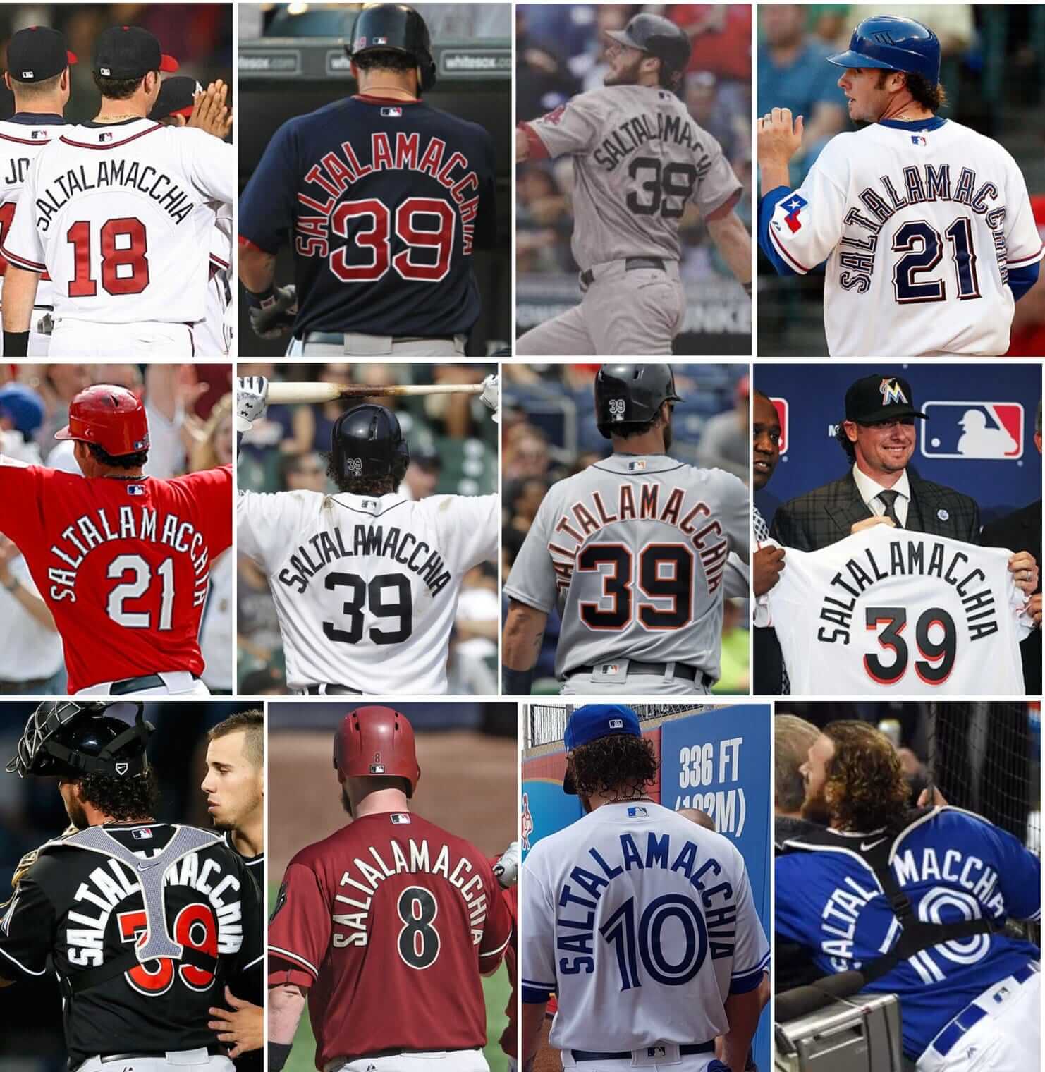
ESPN reminder: Paul here. In case you missed it on Friday: With Kansas City Chiefs offensive lineman Laurent Duvernay-Tardif bidding to become the first athlete to have “M.D.” added to his NOB, my latest ESPN column takes a look back at many notable moments in NOB history (including the many attempts to fit Jarrod Saltalamacchia’s name onto a jersey, as shown above). Check it out here.
We now return you to your regularly scheduled Phil fiesta.
.
Your Olympic Schedule for…
Saturday, Feb. 24
NBC
• 3-6 p.m. Men’s and women’s speedskating, mass start golds; men’s cross-country, 50 km gold
• 8-11 p.m. Figure skating gala (LIVE); men’s bobsled, four-man gold (LIVE)
NBCSN
• 6:30-9:30 a.m. Men’s hockey, bronze (LIVE)
• 9:30-11 a.m. Men’s and women’s speedskating, mass start golds
• 11 a.m.-2 p.m. Women’s curling, bronze
• 7-10:30 p.m. Women’s curling, gold (LIVE)
• 10:30 p.m.-2 a.m. Men’s hockey, gold (LIVE)
.
The Ticker
By Anthony Emerson

Baseball News: The Marlins honored the victims of the Marjory Stoneman Douglas massacre with several gestures, including adding a “MSD” patch on the chest, wearing MSD Strong T-shirts during batting practice, and wearing Stoneman Douglas caps during their game against the Cardinals, who also donned Stoneman Douglas caps. Even new owner Derek Jeter got involved, wearing a polo with the MSD patch. The Marlins also met with Stoneman Douglas’ baseball and softball teams (thanks, Phil). … Speaking of the Stoneman Douglas massacre, the Pirates and Rays both wore MSD caps during their Grapefruit League game (from David Leslie). … Reds prospect Jimmy Herget earned the save and rocked the ‘rups in Cincy’s Cactus League game against Cleveland. Let’s hope Jimmy makes the big club (from Mark Sheldon). … Matt Duffy once again with Duffman bat knob decals (from Boris Mayfield). … Speaking of bat knobs, the Phillies’ Nick Rickles has his bitmoji on his bat knobs (from Blake Fox). … According to the impeccable @ColorWerx, the Braves very slightly altered their shade of navy and gold this offseason without anyone really noticing. … UCLA softball has new pinstriped unis (from Mike Smith). … Greg Burda sends along this 1944 White Sox roster sheet. “Love how the road hotels are listed!” he says. … Here’s a good look at the Dodgers’ 60th Anniversary in Los Angeles sleeve patch (thanks, Phil). … Apparently the Padres trained Friday wearing shirts that said “Hot Talent Lava” on the front and “= Major League Rock” on the back. These shirts were inspired by Scott Boras’s recent comments (from Mike Chamernik). … Todd Radom and his book got a shoutout in Steven Heller’s Print Magazine column (from Gordon Blau). … Utah Utes player Rykker Tom wears Stephen Curry’s basketball sneakers modified with baseball spikies (from Bryan Brown).

NFL News: Here’s the final installment of ChicagoNow’s rundown of NFL unis — the other intallments are linked in the article (thanks, Phil). … Here’s more confirmation that the Jags and Titans new looks will be unveiled in spring, but news that the Browns are making changes for the 2020 season. I knew their new unis wouldn’t last (from our own Alex Hider). … And speaking of new unis being unveiled in spring, the Titans posted this image to their Twitter account revealing the launch date for their new unis to be April 4 (from Daniel Frame). … And here’s what Titans fans are hoping for (thanks, Phil). … Ted Cruz (yes, that Ted Cruz) has a custom Eagles jersey for some reason. He’s up for reelection this year…I think this will hurt him in the Dallas-Fort Worth area (thanks again, Phil). … Eagle-eyed reader Bryan Moss noticed a weird serif on the right shoulder (viewer’s left) No. 3 of Bears player Eddie Jackson. Anyone have any ideas what happened there? Was it just poorly cut?
College Football News: SB Nation asks: which non-Nike school will be the first to make it into the college football playoff? (from Cole Pessolano). … Also posted in the Olympic section: the Rutgers offensive line went curling with The Players Tribune. In the video, the Nike shoes worn by some of the players are blurred out, as Rutgers is an Adidas school (good spot by Darian Somers).

Hockey News: Did you know Kenya has a national hockey team? It’s true! Did you know they have some of the best-looking sweaters in international hockey? That’s also true! (thanks, Phil). … Woodbridge Township (NJ) boy’s hockey crest combines three schools mascots (and many other logos) in one; Colonia High School’s patriot (obviously the New England Patriots’ logo), Woodbridge High School’s baron is represented by the top hat and John F. Kennedy High’s mustang. In addition to that, we have the letter logos: Colonia’s C is UT Chattanooga’s, Woodbridge’s W is Wisconsin’s and Kennedy’s K is Kentucky’s (thanks to Greg Tartaglia for sending this our way). … The AHL’s Syracuse Crunch are evidently going BFBS this weekend (from Shane Bua). … Some very confident Leafs fans have gotten John Tavares jerseys (though one’s home made, natch; from Will Leslie). … Next Friday, the Kamloops Blazers of the WHL are wearing Don Cherry sweaters, inspired by the former coach and current pundit’s unique suits (from Tim Dunn). … Speaking of crazy sweaters, the Huntsville Havoc of the SPHL are wearing Nickelodeon Paw Patrol sweaters. These things are even uglier than the Blazers’ Don Cherry sweaters, which were designed to be ugly like Don Cherry’s suits (blame goes to Mike Chamernik for sending these our way).

NBA News: The Heat are adding a black band with “MSD” in honor of the victims of the Marjory Stoneman Douglas massacre (thanks, Phil). … The Bucks had this little package dropped off to NBA offices in New York to make their bid for the 2023 All-Star Game. Note the generic logos, except for that beer mug mark (from @TheRealPepman). … Last night’s Celtics/Pistons game looked real bad on TV. I’m actually watching this game as I’m writing this, and the Pistons’ Motor City unis look black instead of navy, and the Celtics’ green is too dark to quickly differentiate the two teams at a glance (from Jai Ayra). … Goodyear Tires has gotten the most bang for its buck among all the corporations that advertise on NBA unis. It makes sense, Goodyear has the Cavs, and the Cavs have LeBron (from Jason Hillyer).

Soccer News: Liverpool’s 2018-19 home kit has been leaked to FootyHeadlines. It’d be a beaut if not for those weird shoulder stripes. … Iceland will launch its 2018 World Cup kit on March 15, and kit manufacturer Erreà posted these teaser images. … Toronto FC’s 2018 season ticket package is pretty cool (from Moe Khan). … Manchester City manager Pep Guardiola has been fined by the Football Association for a breach of “kit and advertising regulations” for wearing a yellow ribbon in support of Catalan independence during a match (from Ed Żelaski). … Orlando City SC’s kit advertiser, Orlando Health, changed their logo recently. Naturally, Orlando City updated the logo on their kits (good spot by @bdh_photos). … Twitter user @Scabbybats noticed Spanish club Real Betis’ logo on an extra’s hat in the 1986 movie Troll. How bizarre is that? Pro soccer was not a hugely popular sport in the US in the 1980s, and Real Betis were never a hugely successful team (as a matter of fact, they’re not even the most popular club in their home city of Seville). Strange. … “If you’re bored and like soccer, here’s a quiz of 50 soccer team logos to pass the time,” says Kary Klismet.

Olympics News: Russian bobsledder Nadezhda Sergeeva made headlines for wearing a T-shirt that said “I don’t do doping.” You’ll never guess what happened next (hilarious find by Griffin Smith). … French figure skater Maé-Bérénice Méité pulled off a costume change in the middle of her free skate routine. Impressive (from Kary Klismet). … Cross-posted from the CFB section: Rutgers offensive line went curling with The Players Tribune. In the video, the Nike shoes worn by some of the players are blurred out, as Rutgers is an Adidas school (good spot by Darian Somers). … Jocelyn Larocque, the Canadian hockey player who removed her silver medal immediately after having it awarded to her, has apologized. Personally, I didn’t have a problem with it. If you’re a Canadian hockey player, you should expect the gold at the Olympics (from Kary Klismet).

Grab Bag: @LandArchGamer sends this tweet along, showing a Twitter user’s father’s woodcarving of sports logos. … Last night, UNC lacrosse player Timmy Kelly switched his number to 18 in memory of Dave Huntley, Kelly’s high school coach. Huntley wore No. 18 during his playing days (from James Gilbert). … Here’s what the 2018 Indy 500’s ticket will look like (from Jared Law). … The Los Angeles Valiant of the Overwatch League (e-sports) have partnered with Lionsgate Films to promote the new TV series Ash vs. The Evil Dead (from Will Leslie). … Tiger Woods’ shirt yesterday “looked like something Andre Agassi would’ve worn in 1989,” says Justin Hicks.
.
Miracle on Pebbled Ice – Congrats
Congratulations to our Uni-Watch representative. To get five at once is statistically a miracle, but they’ve earned every kudo. The real surprise was the nice comeback forom 2-4 in the round robin play.
Congrats on Gold, USA Curling!
Awesome tournament, unbelievable finish.
A Worcester shout out and nice work on the colorizations to Matt Olbert. Al Simmons’ pants look funky because he’s got his glove jammed into his back pocket.
Tremendous colorizations…thanks for sharing.
I never really noticed that Babe Ruth was always high cuffed.
Great colorizations! Couldn’t tell you haven’t been doing it that long.
Every team wore SD hats
Good point. Imprecise social media posts may have led to some confusion. For example, the Mets posted how they were going to wear the hats, but did not mention all of MLB was doing so. People started to comment things like “great idea Mets!”, “the Mets are always there to help”, “MLB should follow this.” Since I read on Uni Watch it was an MLB wide initiative, I commented that the Mets should make it clearer it was not just their idea and not take credit for it. People naturally started attacking me. Yeah this social media use is really advancing tolerance and discourse.
Eddie Jackson’s 3, I think, is just the pad underneath raising the bottom edge of the number a little and combined with the camera angle, makes it look like a serif
That’s exactly what it is.
The Babe is really choking up on that bat. Beautiful photo.
Speaking of colorizations, you see this on Antiques Roadshow?
That would be an awesome picture colorized…
link
IF it was much, much cleaner, that photo needs repairs first
Considering new buildings are often rewarded with All Star Games, I hope Milwaukee gets it. Since Milwaukee’s last ASG was in the mid-70s, it certainly would be about time. But a bit odd that the Bradley Center never got one in its 30 years.
Jetzt geht los, Deutschland!
Some zany videos from Japan for you curling buffs; on one of the wacky variety shows that Japan is famous for, they have invented a hybrid curling/luge contest where people are dunked in slippery lotion and made to slide down a giant hill, aiming for a curling target at the bottom, while their partner stands at the bottom, sweeping the lotion away so that the human curling rock will stop in just the right spot.
First they had celebrities try it, and link, with her partner unable to slow her down, while link.
Turning things back to uniforms, they then got link If the fourth one hadn’t knocked one of her partners off the target, they would have had a perfect score.
Japanese variety TV is so wacky and crazy… I have no idea how they come up with these ideas!
Great job Matt. Keep up the good work and enjoy.
Excellent work, Matt! Look forward to more of your posts!
The Finnish flag in the last photo of the 80 hockey team looks like a faded Swedish flag haha
Wait nvm that is a Swedish flag…I thought we defeated Finland in the gold medal game…was the tournament different back then?
Not very good research on the Atlanta United second kit. Last year’s shirt was gray, not white, with red Adidas stripes and badge, and had sublimated dark gray stripes running horizontally across the front. This year’s is white, with a sublimated hexagon panel pattern on the front, with peach Adidas stripes and badge. Last year’s away kit had a white shorts option though.