Click to enlarge
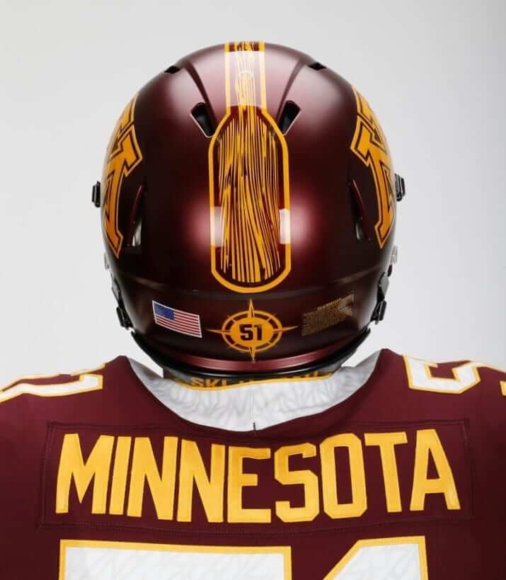
February isn’t usually the time for college football uniform news items, but the Minnesota Gophers came up with a whopper yesterday, as they unveiled a new uni set that includes, as you can see above, an oar-themed helmet stripe and compass-themed helmet numbers. Those are references to Minnesota coach P.J. Fleck’s motivational “Row the boat” mantra (although I’ve never seen a compass on a rowboat), which he came up with during his previous coaching stint at Western Michigan.
“Row the boat” is more than just a coaching philosophy for Fleck — the slogan is rooted in the death of his second son, who had a congenital heart defect and died shortly after birth.
All of which is a powerful and moving story, but it has exactly nothing to do with Minnesota. Putting an oar on the Gophers’ helmets sends the message that the coach is more important than the team. Putting a coach’s slogan on the inner collar (where nobody can see it) or on the nose bumper (where it’s inconspicuous) is one thing, but making it part of the uniform design reflects an upside-down hierarchy of priorities. It was bad enough when Fleck got to dress Western Michigan in oar-themed jerseys. When he inevitably moves on to his next coaching gig, and the one after that, and the one after that, will those schools wear the oar? What if he makes the jump to the NFL — will one of those teams wear the oar?
When the news of this move broke yesterday, Uni Watch reader Kary Klismet posted this in the comments:
[T]aking that phrase from being a form of individual inspiration and shoehorning it onto the uniforms of every football team [Fleck] winds up coaching strikes me as an exercise in personal vanity and selfishness.
I agree, but I’d go a step further: In a world that’s increasingly dominated by the nonsense of “branding,” what we’re seeing here is the ascension of Fleck’s “personal brand.” You can tell that’s how Fleck himself views the situation because he paid Western Michigan for the intellectual property rights to the slogan when he left that school and moved on to Minnesota. It’d be one thing if he wanted to use the slogan as the title of a self-help book, or to sell T-shirts, or to start a rowboat concession down at the lake. But giving his personal brand equal time on the uniform of the of the school he supposedly serves is nuts. It’s the tail wagging the dog, or the boat rowing the oar, or something like that.
All this for a coach who went 5-7 in his first year at Minnesota, and whose lifetime mark is 35-29. I mean, shit, Alabama didn’t wear houndstooth for Bear Bryant until he’d been dead for 27 years.
For the record: The new Minnesota set includes three new helmets, only two of which have the oar. The third helmet is a gold chrome design. There’s also the same miserable number font they had before and increased use of the anthracite dark-grey jersey and pants. What a mess. Lots of photos and a press release riddled with embarrassing grammatical errors here.
Contest reminder: In case you missed it last week, our latest ESPN design contest is to redesign the Jaguars. The deadline is the day after tomorrow, so move fast. Full details here.
The Ticker
By Alex Hider

Baseball News: “Most, if not all” MLB teams will wear the cap of Stoneman Douglas High School during spring training games on Friday to honor the victims of last week’s school shooting (from Brinke and Mike Chamernik). … The Angels are lowering the right field fence at Angel Stadium from 18 feet to 8 feet (also from Mike). … Indians minor leaguers are wearing a memorial cap patch for the clubhouse manager of their Triple-A affiliate. It will remain there for the rest of spring training (from Robert Hayes). … Teams wearing green for St. Patrick’s Day will also have the option of wearing green striped socks (from Robert Hayes). … Newly acquired Giants 3B Evan Longoria posed for team photos yesterday, but his bat still had a Rays knob decal. … The Royals are auctioning off the old costumes from their hot dog race. Relish, ketchup and mustard are available (from Tyson Billings). … MLB The Show 18 features 19 throwback uniforms that players can choose (from Robert Hayes). … The Triple-A Omaha Storm Chasers will become the Runzas on June 9. Runzas, a Nebraska delicacy, are bread pockets filled with ground beef, cheese, sauerkraut, and other goodies. … Check out the striped basketball uni that Hall of Famer Nolan Ryan wore in high school (from Brad Eenhuis). … Good spot by Brice Wallace: It appears the A’s repurposed this photo from the 1972 World Series for their 1973 yearbook. It’s an odd shot for them to choose, because that photo shows Blue Moon Odom being thrown out at the plate to end Game Five of the ’72 Series. Here’s video of that play. … Kentucky wore classic pinstripes last night for their home opener. … New BFBS unis for Florida (from @SeaislandCaddie). … Louisville has added a memorial patch for a fan to their caps (from Joesph Matlock). … The Northwoods League, a Midwest college summer league, has a 25th-season logo (from Jerry Nitzh). … At the Olympics, a tech who was working on a Kazakhstani short track speedskater’s skate yesterday wore a Dodgers cap with the New Era logo covered up (from Eddie Lee). … The Gwinnett Stripers, the Braves’ Triple-A affiliate, have new jerseys that visually riff on the Braves’ old 1970s “feather” jerseys (from @freehawk).

Football News: A Guatemalan refugee was filmed wearing a 2007 Patriots “perfect season” sweater while arriving in the US for a recent CNN piece (from @OnlyInBOS). …
Remember when Aeropostale made Connecticut’s football uniforms? … Looks like Team Pennsylvania’s uniforms for the Big 33 game have been unveiled (from Noah Kastroll).

Hockey News: New Flyers G Petr Mrazek was wearing his old Red Wings breezers during his first practice with Philly yesterday (from Moe Khan and @notthefakecasey). … New playoff logo for Allan Cup Hockey, the Senior AAA league in Ontario (from Ross Taylor). … Love these old WHA pennants (from Greg Burda). … Jarome Iginla, currently a free agent, practiced with the Providence Bruins of the AHL yesterday. He took the ice in a Kings helmet — the most recent team he played for (from Mario Vasquez). … Chris Mizzoni found this ad for a tabletop hockey game in an old Canadian Tire catalogue. … You can clearly see where they removed the NHL centennial patch from Canucks RW Nikolay Goldobin’s jersey (from @mbrenner53). … Speaking of the Canucks, they supported the LGBT community and sports inclusiveness by wearing rainbow-patterned jerseys for last night’s pregame warm-ups (from Richard Musterer).

Basketball News: Giannis Antetokounmpo of the Milwaukee Bucks has filed a trademark for his nickname, the Greek Freak (from Mike Chamernik). … Cross-listed from the baseball section: Check out the striped uni that baseball Hall of Famer Nolan Ryan wore in high school (from Brad Eenhuis). … Has anyone else seen this Iowa State dunking cyclone logo on former coach Johnny Orr’s shirt? (From Brian Edmiston). … Penn State had some juicy vertically-striped socks — and sleeved jerseys! — back in the ’60s (from Troy Caldwell).

Soccer News: The Houston Dynamo have unveiled their alternate kits for 2018. Perhaps a bit of inspiration from their neighbors on the diamond, no? … Has anyone else seen this US Soccer Federation logo before? Our own Jamie Rathjen found it on the cover of a 1978 program. … In case you haven’t seen them yet, here are the uniforms for Nebraska Bugeaters FC of the USPL (from Marc Viquez). … New home kit for San Antonio FC (from Brandon Hopkins).

Olympics News: White Lines, a snowboarding website, has ranked the best and worst snowboarding unis from the Olympics (from Kary Klismet). … USA’s nordic combined team practices cross-country skiing in a refrigerated parking garage in Slovenia (from Jim Vilk). … Cross-listed from the baseball section: A tech who was working on a Kazakhstani short track speedskater’s skate yesterday wore a Dodgers cap with the New Era logo covered up (from Eddie Lee). … American cross country skiers Kikkan Randall and Jessie Diggins wore great striped socks on the medal platform after winning the gold in the women’s team sprint freestyle (from Phil).

Grab Bag: Did you know that most of the flags at Disney World’s Main Street USA don’t have 50 stars? Most only have 45 stars, making them unofficial and able to be left out at night and in poor weather conditions without violating the U.S. Flag Code (from Jon Solomonson).

Click to enlarge

What Paul did last night: There’s this Tuesday-evening lecture series about comics and illustration that I often attend at the Parsons School of Design in Manhattan. Usually it’s really interesting, but every now and then there’s a stinker. Last night was one of those, so I left early and went to one of my favorite spots, where I got the last seat at the bar.
This place is pleasant, cozy, and has the best deal in town: For the price of a drink (although I usually stick around long enough for two or three), you get complimentary tapas — usually cottage fries and meatballs, although chorizo, frittata, and chicken wings occasionally appear — along with perfect lighting, a nice crowd, one extremely friendly bartender, and one less friendly bartender who’s nonetheless a very interesting character. Usually they’re quite generous with the tapas, but every now and then they’re stingy, which seems fair, just so we don’t take these freebies for granted.
Many things about the place seem precarious. Each time I’m there, I think to myself, “This might be the last time. It could close or disappear any day now.” So far, though, that hasn’t happened. So each visit is a gift, much like the tapas themselves.
Sorry, not gonna tell you where it is, at least not today. Like I said, I got the last seat last night.
Love the title. Everything you said plus the idea that we are branding unpaid student-athletes with a coach’s personal brand purchased from one university to brand SAs at another school all in the name of creating a bullshit sense of community that’s actually a front for new revenue streams for everyone but the players who have been branded. Not that branding, in a slightly different usage but not much different, ws central in our nation’s history as a tool for demonstrating ownership of other people.
Notice Minnesota and Nike don’t even show a picture of the “traditional” Minnesota color combination: maroon helmets and jerseys with gold pants.
Caveat: I grew up in the 90s, so that’s what I see as traditional.
Maroon helmets, maroon jerseys, and gold pants have been the enduring home uniform combo since about 1977. I too was surprised to not see it photographed for the press release.
The addition of the oar to the helmets gets all the attention, but based on that splash photo, I think Minnesota’s new jerseys are a serious downgrade as well. Their previous primary jerseys were excellent, featuring gold numbers against the dark maroon jerseys. White numbers with some kind of weird fuzz in them, outlined in gold, don’t have the same pop.
link
The weird fuzz is a combination of an oar, a boat and a compass. Because if ever a major state university in a prestigious conference like the Big Ten had to whore out its design and identity, it would be for PJ Fleck. Minnesota, you should be embarrassed.
I’m embarrassed, and I didn’t even go to Minnesota – I just live here.
Honest question directly related to the lede. What is the difference between the rowboat motif here and the Princeton/Michigan/Delaware coach who brought the two-tone helmet everywhere he went?
Can’t say I’m a huge fan of that either, but there are big differences, the most prominent being that the coach in question (who most people, perhaps including yourself, can’t even name) didn’t “own” the design either literally or figuratively. While the winged design is most closely associated with Michigan, it’s still worn by Delaware and others. Moreover, the winged design was based on the sewing pattern used to stitch together leather helmets, not on a coach’s motivational philosophy. It was completely an aesthetic issue (more akin to Matt Millen imposing black on the Lions because he played for the Raiders), not a “personal branding” issue.
There’s a big difference. The winged helmet was not any sort of personal mantra, it was simply a stock design from Spalding that was used by several teams in the ‘30s, including Ohio State, Michigan State, Indiana, and Georgetown. More info here: link
The coach you’re referring to is Fritz Crisler, and he never coached at Delaware. Although oddly enough he did coach at Minnesota before going to Princeton and Michigan.
The painted winged helmet also appeared in the NFL in the 1930s, based on the GUD. In fact, the Giants had the winged helmet as late as 1947. Other teams that sported the two-colored winged design were the Frankford Yellow Jackets, the Philadelphia Eagles (when they were still using the Yellow Jackets’ colors), the Chicago Bears, the Cincinnati (football) Reds, and the Pittsburgh (pre-Steelers) Pirates.
I remember that when I was a kid in the early 80s, someone in my family had gone to a concert at Crisler Arena and brought home a souvenir cup. I couldn’t tell you who it was or what event, but I just remember seeing the name of the arena on the cup, being told the name, and after hearing it out loud, being confused as to why the name was spelled so differently from “Chrysler”, which I was more familiar with at the time.
Cool. Thanks! I knew viscerally that this rowboat is more disgusting, but I like hearing about the histories. Did not know the winged helmet was a stock design.
The “wing” was simply padding used on the leather helmets to try and mitigate hits on the forehead. A number of teams simply painted it a contrasting color for a good look. That then became a “stock design” on the plastic helmets.
Regarding the A’s 1973 yearbook, it looks more like the slide where Reggie Jackson broke his leg in the ALCS against Detroit. That’s a pretty odd choice too…
It’s definitely Jackson; #9 is clearly visible. It doesn’t quite match up to the ALCS slide though: link
Not Reggie.
the :58 mark of the video is the *exact* frame. Altered a bit to look like Reggie on the cover.
Blue Moon puts a pretty big hit on the home plate umpire at the 0:13 mark.
Wondered why he was not ejected…until I finally realized that it was the final out of the game.
It may be the Blue Moon Odom slide, but it’s definitely Reggie on the yearbook cover.
Correction in the Soccer section:
Nebraska Bugeasters should be Bugeaters.
Fixed.
It looks like the original post in that Reddit NFL uni ranking has been removed. A lot of comments are still there, but the original content is apparently gone.
Removed from Ticker.
Re: the lede, I wish the uniform designers (and whoever agreed to all the oars) would remember that the coaches and players are fleeting, but the team/fans aren’t.
2. I’m confused as to why MLS teams are calling their second-choice kits “alternates,” because, as we know, that has a different meaning in every other sport. The terms “primary” and “secondary” were/are pretty well established by the league itself:
link
3. For anyone wondering, the USSF logo I found is similar to, but not the same as the one used at the 1990 World Cup.
I like the new Houston secondary jersey, but I hate the promotional video for it. Why? Because it shows fans in street clothes modeling the jersey, not players in full uniforms. Once again, we have a clear example of the real purpose behind this jersey – not the way it looks on the field, but the way it flies off the retail shelves.
Yeah, that’s true – we have a good idea of what the shirt looks like worn with jeans, but haven’t seen the rest of the kit yet. Shows where their priorities lie.
The United States officially adopted a 45-star flag upon the admission of Utah in the 1890s. Under the U.S. Flag Code, any flag, once adopted, remains a valid flag forever. Also, anything that looks like a valid flag is a flag for the purposes of the Flag Code. So flying a 45-star flag doesn’t get Disney out of any obligations it feels under the Flag Code.
It’s odd because the Supreme Court struck down the Flag Code as law years ago. I wonder if the “not official US Flags” excuse is trotted out if someone is offended and complains?
The flag code should still be followed. It just cannot be enforced due to freedom of speech.
It’s like the guy on the street corner with the bullhorn yelling that everyone is going to hell. He’s allowed to do that because of the 1st amendment, but he’s still an asshole.
Or it’s like the person in a website’s comments section making really bad comparisons that have no basis in logic or common sense…..
45 stars were on the flag during the time which is loosely represented by the Main Street portions of Disneyland and Disney World. I will assume that is why they are being used.
Perhaps Disney should fly a 47- or 42-star “banner”, as neither ever existed.
If I remember correctly, this is the explanation given during Cast Member training at WDW twenty or so years ago.
It’s an “attention to detail” rather than a way to skirt flag traditions.
(Btw, if the guests don’t know that the flags have less than 50 stars and that “flags with less than 50 stars don’t count as real flags,” wouldn’t leaving those flags up annoy just as many people as the “real” 50 star flags?)
Thank you for your accurate assessment of the new Minnesota football uniforms.
These are beyond ridiculous and it’s hard to believe any athletics administrator would even come close to approving them.
I sure am glad I didn’t go to Minnesota.
I’m not sure I can think of a less visually appealing helmet adornment than that oar. I guess we should be grateful they didn’t put one down the sides of the pants? What a disaster that whole set is. What happens if the coach is fired in the middle of the year?
Obvious – then they’re up a creek without a paddle…
(Sorry, I had to say it before someone else did!)
The Canucks did the same thing last year with the rainbow pattern on the jerseys in warm-ups.
In fact, the photo in the ticker is last year’s Reebok Edge jersey with this year’s Adidas logo photoshopped over it above the nameplates.
So if they fire Fleck halfway through the season, he takes his IP and goes home? They strip the oars off the helmets?
Bravo, PL. Every word of your take on Minnesota’s misadventures in uniform/personal branding is spot-on. This should be printed, copied and stapled to the front door of their administration and athletics buildings.
What’s especially puzzling is why they’re going out of their way for PJ Fleck – a mediocre coach running a mediocre program. He’s not paying them for the right to deface the school’s uniform. He is their coach. Nick Saban, he ain’t. Who signed off on this as a good idea?
Spell check – it’s “Jarome” Iginla
Fixed.
Not a fan of the oar on the helmets for Minnesota for multiple reasons. It doesn’t belong and they have screwed up their uniforms.
Another reason as a football fan. It provides a hint to other teams to try something disastrous with their football uniforms.
I really hope the Toronto Argonauts don’t ever see this and think it would be a good idea for a 3rd helmet. If it would be appropriate to have an oar on a helmet, it would fit in with Argonauts. But not a good look.
Why would I be worried as a CFL fan? How do you think the Calgary Stampeders got the idea to introduce a two-toned 3rd helmet in 2014 (thanks Jacksonville!).
link
Even more so, as the original owners of the Argos were the Argonaut Rowing Club.
Yep – was thinking just that. It was Toronto Argonauts rowing club first. Same double blue colours. The football team was formed in 1873 to provide another athletic outlet for club rowers who were drawn to rugby football.
Also I don’t get the black on the white helmets for Minnesota. None of the uniforms have black trim, including their white uniforms which have maroon trim.
Paul, is “embarrassing grammatical errors” your way of referring to the vomit-inducing name of the uniform “system” they’re using, by any chance?
No, “embarrassing grammatical errors” refers to the embarrassing grammatical errors that appear throughout the press release.
But yes, there’s also the issue that you refer to. Separate thing.
One question: Was the oar helmet design the coach’s idea or Nike’s idea? The answer does not change 90 percent of the article’s premise (that these uniforms are elevating an individual over team), but I would like to know. And I don’t think we can make any assumptions over the coach’s decision to purchase the rights. He may have wanted the slogan as a rallying cry, but not a uniform detail.
Even if it was Nike’s idea, Fleck should have said no. And if he didn’t have the sense or decency to do that, then the school should have said no. Plenty of blame to spread around here.
Also, you don’t need to own intellectual property as a “rallying cry.” You need to own it for commercial purposes, so that was clearly on his mind.
PJ is such a douche.
He puts his “branded” ego creation above the University’s established brand… and that institution just laps it up. What a jerk. And their fans simply don’t even grasp it.
There’s no sauerkraut in a Runza. It’s ground beef and cabbage. Cheese optional.
At least the oar is more fitting in Minnesota than his last stop.
10,000 lakes and all.
Because it’s hard to find water in Michigan?
Thanks for summing up my thoughts on the Gopher re-design, Paul. With the exception of your criticism of the number font (which is from the 1940s and a look I consider classic and yet unique), you nailed it! As a life-long Gopher fan, I’ve never been so disappointed in a team’s uniform re-design.
Found it funny that in the ad for the table hockey that the description states,” Toronto vs. Canadiens”, not “Toronto vs. Montreal” or “Maple Leafs vs. Canadiens”
Actually, that is a “compass rose” on the helmet. A compass is that thing with the spinning needle that always points North.
Didn’t say there was a compass on the helmet. Said they’re using “compass-themed helmet numbers.” Which they are.
Ah, “-themed”.
I do love a Runza. No sauerkraut, though. Cabbage is the unique ingredient The original version is great, but my favorite is the mushroom swiss.
If “Looks like we’re gonna need a bigger boat” isn’t already IP I’d like to apply for it.
So when Fleck takes his next job, will that school “Row The Boat” with oars on their helmets. Can you imagine an elite school doing this? That oar would look great on the Trojan helmet. Better yet, Penn State doesn’t have anything on their helmet so might as well plaster this all over it. Geez…
I’ll take the Minnesota tail wagging one step further. The uniform system is called “H.Y.P.R.R Elite.” I though this was some new Nike name (à la Pro Combat or System of Dress), it turns out that both of these are even more mantra’s that Fleck uses.
link
link
Oh, damn. I can’t blame that on Nike then?
Well, somehow that just makes me hate this even more.
I mean, it sounds like something out of a 90s “extreme” toy line revamp!
“The evil Iron Klaw has added the H.Y.P.R.R. ELITE troops to the evil forces of SKAR! Quick, call in Sgt. Savage and G.I. Joe EXTREME!”
UGH UGH UGH UGH UGH.
I am a Minnesotan and a Gopher football fan. The uniforms seem to be neither anything to hold a parade over nor to raise a protest over. They seem pretty generic apart from the “Row The Boat” branding which comes at the expense of the “Ski-U-Mah” slogan that has been part of U of M sports for more than a century. This new look has no likely chance of becoming iconic like the uniforms at Michigan, Alabama, and Texas to name a few, or just instantly identifiable like Iowa’s.
I like the clean look that isn’t overly busy with side panels and stripes although the contrasting colored neckbands were a poor choice. The number font looks fine to me as well. I am surprised that the photo shoot didn’t include the maroon helmets and maroon jerseys with the gold pants since that has been more or less the official home uniform since the late 1970s in various forms.
Here is my biggest complaint. The University of Minnesota is frustratingly unable to settle on proper shades of maroon and gold, and to then maintain consistency in those shades across the board. If you look at the different sports teams, merchandise, licensed apparel, signage on campus, official stationery, and anything that can have a logo or school colors, the shades of maroon and gold are all over the place. The maroon ranges from nearly brown to practically red and various places in between. The gold can be metallic, something subtle, a light yellow, a mustard yellow, almost a light orange, and other iterations. The combinations of these many shades seem infinite. How can the school not have a clear and consistent color scheme for all potential uses of school colors? This is not an apparent problem at other schools and pro teams. Why can’t Minnesota get something so important right?
Actually ASU, Arizona State, has the same problem. When I moved to Arizona in 1990 I noticed their maroon was practically the same as my USC Trojan’s cardinal red. Going to a game at Sun Devil Stadium was interesting, since all the fans from both schools dressed in the same colors. Didn’t know how many Trojan fans were there until USC got a touchdown. They got more consistent a few years back when Nike seemed to embrace the true nature of maroon (more brown/red). I also noticed about the same time Minnesota went with this darker, browner, maroon. Before whenever I saw a TV at a bar with the Gophers on it I took a double-take thinking it was my Trojans. Now it seems like ASU isn’t as dark maroon now that they are back with Adidas.
Personally I use an oar, mallet or some other wooden device to play Gopher Golf (with apologies to Carl Spackler).
Re: the Disney flags.
The reason the flags on Main Street in DL and WDW have 45 stars is because the 45 star flag is thematically accurate to the rough time period Main Street is supposed to be in. (Disney theme parks are another of my geeky obsessions)
Same.
If there was a Costume Watch site, I’d probably visit it just as regularly as Uni Watch. :)
That tapas bar is true to tapas bars across Spain. Last year, I completed the Camino de Santiago (500-mile hike across northern Spain) with a buddy and each night, we looked forward to the complimentary tapas with our drinks, usually the Estrella Galicia beer that you had in the picture. Very cool to hear about a tapas bar with a similar philosophy here in the states. Thanks for sharing! And I’ll be looking forward to when (or if) you decide to share the name of the bar with us.
If you are really interested, PL left enough clues that a cursory Google search will get you there in under five minutes. (I’ve never been, but it looks good and I will definitely seek it out the next time I am in NYC.)
Agreed. Very easy to find. Complimentary patatas bravas and albondigas. Nice.
You’re both right! I found the spot, thanks to some of those clues. Looking forward to giving this place a try next time I’m in Manhattan.
Diggins and Randall weren’t just rocking the stripey socks on the podium:
link
The US women have been wearing them in other team sprints as well:
link
NBC mentioned during their broadcast of the women’s 4 person team cross-country relay (the one we got 5th in) that the striped relay socks are a good luck charm that the US women’s XC teams have embraced over the past year or so. Apparently the socks originally came from a convenience store in Europe (Germany if I recall correctly) and after a good performance in them, the team made it a regular thing.
A co-worker from Iowa says the Johnny Orr logo could be from a ’90’s era camp that he ran. He remembers getting a t-shirt from the camp with that logo on the front and sponsors on the back.
In and of itself, I love that blue/black combination on Florida’s baseball unis. But I really hate the BFBS of it all.
Nitpick Warning: An oar by definition attaches to the vessel, a paddle does not. For example, rowboats use oars; canoes use paddles. It appears the Western Michigan uniforms feature paddles, not oars. I wonder if the marketing folks pushing this “brand” understand the difference.
The things you learn working at a Wisconsin summer camp during adolescence…
Oars can still be detached. In other words one can see an image of an oar without a boat. After all, the slogan is “Row the Boat” not “Row the Canoe”, so they should be r ferried Tomas oars.
“referred to as oars”
I’ve written many times and posted pics about the two other teams (other than the California Golden Seals) who wore colored skates in the 70-71 season – both the Penguins and Blues for only a handful of games. But here’s an article from the NY Times before the season announcing that TWO OTHER teams were planning to wear colored skates – the Kings and Redwings!!
link
.I’ve never seen pics of either of these teams with colored skates so thinking it probably never came to pass…
-Jet
Whoever sent that article through an OCR program for archiving on the web must not have taken the time to proofread the article. There are a few unintended spaces in words, and “Goaltenders” is misspelled “Goabenders”.
As long as Minnesota loses the axe for a 15th straight time this fall, I don’t care how ugly the jerseys are…
Just give us back The Slab of Bacon!
MLB The Show 18 features 19 throwback uniforms that players can choose
Is it just me, or does that Cincinnati Reds ’75 throwback have (egregiously historically inaccurate) buttons on the front jersey and belt loops on the pants?
link
Also, why do I care? It’s a video game!
The “’02 Road” Astros uni was their current road set. Hopefully, the game’s not finished yet.
It’s not due out until March 27th.
I see that MLB The Show still somehow manages to not position jersey numbers correctly for teams without names on their backs. How is it possible that they can get such minutiae as the correct manufacturers of each player’s batting gloves yet get this so wrong?
Fleck gives out oars to the local businesses who presumably support the program. You can see them in the windows of some of the local stores. He signs them and adds, “RTB!”
At first I thought this was going to be something fans would bring to games like bringing a broom to baseball game if there was a chance for a sweep. Luckily, I don’t think anyone has tried to do this yet.
One of the local news people trotted out the suggestion that the new design were aimed at 17 year old recruits. Would said recruits really think this is cool? Somehow I don’t see row boats as being a thing a lot of the potential blue chip recruits would be into.
The whole “recruits respond to shiny objects” trope (irrespective of whether an oar qualifies as a shiny object) doesn’t hold up. I’ve already explained why, here: link
Paul your assessment is 100% correct. The entire decision is just oar-ful.
But between the OAR and now the oar I’m guessing it’s been a great two weeks for O.A.R
link
Curious Paul – if you could undo only one – this “mantra” treatment or the ads on NBA uniforms- which would you choose?
Oh, NBA ads for sure. Not even close.
The Gophers new unis has some pluses and some minuses. Bad news first: I hate the oar design. They could have included the oar as a decal or maybe a patch, but the decided to make it the helmet stripe which causes it to be a focus of the uniform. Also, I hate chrome helmets, but that’s just my personal bias.
Good news: Matte burgundy helmets!!! Apparently, matte is a thing in Minnesota, with both the Vikings and the Gophers now using it, and I love it. The matte burgundy looks great. College teams have attempted matte helmets time and time again, and I feel that this is the best one jet. Just needs to lose the oar.
Also, what’s the sublimated pattern on the numbers? Is it like the houndstooth used across college football (to the brand’s detriment) or is it something relevant(!) to the team?
Also, what’s the sublimated pattern on the numbers? Is it like the houndstooth used across college football (to the brand’s detriment) or is it something relevant(!) to the team?
Radical suggestion: Read the linked press release.
I looked through the press release for more pics of the design but I didn’t read it because I always cringe when they refrence ‘innovation’ or ‘evolution of the sport’ or stuff like that. For example, here’s a link to the nhl’s press release for the all-star game jerseys:
link
Read that and tell me you don’t cringe.
Dude, I have to read this stuff for a living. Cringing is part of my job.
Hard to tell for sure but my assumption was that he crammed more oars/paddles as a subliminated pattern.
why would a frikking gopher need an oar?
HEY COACH FLECK, GOPHERS CAN SWIM
Honest question Paul, why do you think the bar might not be there so shortly? Why not drop the name if your concerned they’d be shuttering?
The things that concern me about the place have nothing to do with the level of business (like I said, I got the last seat at the bar, so business is doing fine). Dropping the name would not change anything.
OMFG, the minnesota chrome helmets, anthracite jerseys, and yellow pants literally made me laugh out loud.
Man, where to begin with my Minnesota Gophers new uniforms…
Starting at the top I guess. I really don’t care for how pale the gold of the chrome helmet is. It’s just so, so different from the gold of the jerseys. It just seems too disconnected from everything else. Still, worn with the maroon tops, I at least give it a passing grade. The maroon helmet is my favorite of the three because the white ones should never, ever be worn anytime, anywhere. We’re not Penn State, so why emphasize a color that’s not “ours”?
Jerseys: how much does a “designer” get paid to come up with three stripless jerseys? I’d dislike the white one less if it had some maroon stripes around the arms and the player names in a higher contrast maroon. The gold-on-white names is invisible. The maroon jerseys are fine. I’d probably prefer gold numbers, but at least they aren’t three color numbers like they did once, which look more at home on a hockey jersey. They can take their trendy “Anthracite” and shove it. It’s not a Minnesota color. That said, at least they don’t have a gold top that they can pair with gold pants.
Speaking of pants, I firmly believe is should be a federal law that all football pants should have a stripe down the side in some way, shape or form. One wide one, two touching ones of equal width, a Northwestern pattern, hell, how about a repeating line of Goldy Gopher heads down the legs? Anything but blank.
One final thing, remove any and all “row the boat” references. Oars, compasses, boats, anchors, harpoons, number patterns. All of it.
In summary, I’d drop the white helmet option, put some stripes around the arms and down the pant legs and ditch any grey uniform pieces. At home I’d wear the maroon tops with the gold pants for all games but homecoming, where I’d allow all maroon. Never, ever Maroon tops with white pants. On the road, it would be white tops with maroon or gold pants with all white allowed once annually.
There, I’ve simplified your “more than 100 possible uniform combinations” down to ten, including all helmet options.