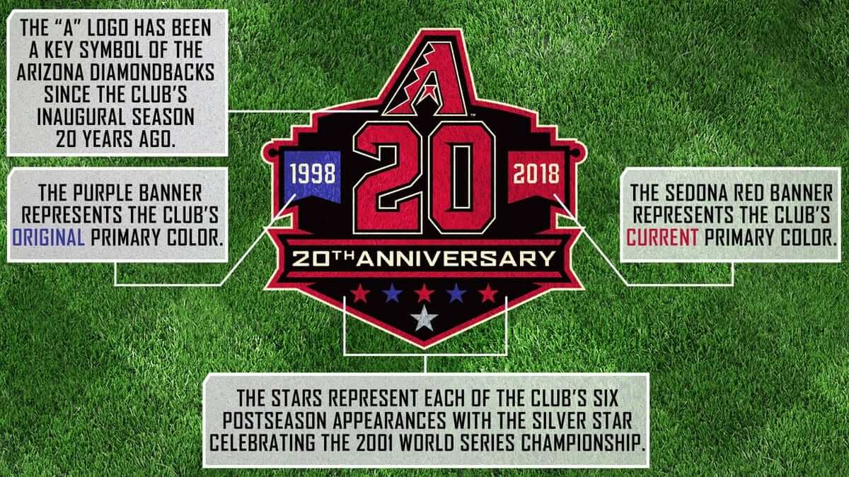
Click to enlarge
The Diamondbacks officially unveiled their 20th-anniversary logo yesterday. It will be worn as a sleeve patch throughout the 2018 season and as a cap patch during the season-opening homestand on March 29 through April 4.
In addition, the D-backs will wear six throwback uniforms for select Thursday home games. Chris Creamer helpfully created a graphic showing all of them:
A look at the six throwback uniforms the Arizona D-backs will be wearing throughout the 2018 season #Dbacks #MLB
This plus their 20th anniversary patch were both announced earlier today, check 'em out in our post here –> https://t.co/uJHGkRDCdK pic.twitter.com/xMO1pJrgrY
— Chris Creamer (@sportslogosnet) February 15, 2018
Someone on Twitter asked me if the six throwbacks represent a single-season record for an MLB team. As I explained, it’s not even close, beause the Cubs had a whopping nine throwbacks when they celebrated Wrigley Field’s centennial in 2014.
Click to enlarge
Friday Flashback: With pitchers and catchers reporting this week, I have a Friday Flashback piece on ESPN that looks back on how the Reds and Dodgers have been particularly innovative with their spring training uniforms over the years (including the Reds’ 1983 experiment with white helmets and caps, shown above). Check it out here.
Contest reminder: In case you missed it yesterday, our latest ESPN design contest is to redesign the Jaguars. Full details here.
The Ticker
By Kris Gross

Baseball News: Why should we care that the Mets signed OF Matt den Dekker? It once again gives New York three players at camp with lowercase Ds on their NOBs, the other two being C Travis d’Arnaud and P Jacob deGrom (from @Josh1938). … Brewers third base coach Ed Sedar will now wear No. 0, as new CF Lorenzo Cain will take his old No. 6 (from Mike Chamernik). … Giants season tickets feature different images or players to promote their 60th anniversary in San Francisco (from Joe Farris). … Reader Robert Andrews came across these photos of the 1956 Orioles, who wore black armbands in honor of the death of team treasurer Howard Jones. “I don’t remember seeing an armband this darn wide.” [You can see additional examples of very wide armbands here and here — PL]… It sounds like spring training caps are made of dri-fit material this season (from William F. Yurasko). … The Phillies’ 1968 yearbook had a great cover design (from BSmile). … More from BSmile: Wilson Sporting Goods displayed their new uniforms before the 1947 season. … Philadelphia is getting a new sports museum next year, which will have items from Joe Frazier trunks to Jackie Robinson’s jerseys (thanks Phil). … The Corpus Christi Hooks, Double-A affiliate of the Astros, will become the Blue Ghosts for a weekend in June (from Ignacio). … The K-town Intimidators, Single-A affiliate of the White Sox, will wear Yoda uniforms on May 4. … Cal has new jerseys (from Chris Mycoskie, Curtis Godt). … Arizona will honor former coach Jerry Kindall, who passed away in December, with sleeve patches and helmet stickers (thanks Phil). … New helmets for Maryland and Alabama (from Matt Shevin, Griffin Smith). … Iowa has new gear for the new season (from Kary Klismet). … LSU has worn every uniform combination in practice so that nothing feels unfamiliar when the season arrives (from Chris Mycoskie). … Florida shared a photo from their inaugural baseball season in 1912 (from Kevin J. Kobasko).

Football News: Here’s something that hadn’t been previously announced: The Dolphins will be making some uniform tweaks for 2018. Expect an unveiling in April (from Curt Kobae). … John Flory got his Sports Illustrated renewal notice in the mail, and the free sweatshirt offer featured several outdated helmets. … Alabama has added their most recent national championship logo to their locker room entrance (from Griffin Smith).

Hockey News: The Capitals’ “Mentors’ Trip,” which brings players’ dads on the road with the team, is underway, and it has its own logo. “Nice touch with the trees and skyline for Minnesota and Chicago,” says Bill Curran. … The Flint Firebirds of the Ontario Hockey League will honor Jackie Moon and Semi-Pro with Flint Tropics-themed jerseys tomorrow night. Take a better look with this video (from Jason Lewis). … The Penguins gave their scoreboard a retro look for 1990s Night. … The Czach goalie at the 1980 Olympics had an interesting throat protector (from Bill Kellick).

NBA News: Following the massacre at a Florida high school, Jazz rookie Donovan Mitchell wrote “End Gun Violence” and “Pray for Parkland” on his shoes Wednesday night (from Mike Chamernik). … Dominique Wilkins had a huge NBA logo on his warmups at the 1985 dunk contest (from Chris Perrenot). … This clip uncovered by Mike Chamernik shows Ron Artest at the 2004 All-Star Game wearing four shoes from four different brands in an attempt to land a shoe deal. … Also from Mike, the Timberwolves wore special shoes for Flip Saunders night last night.

College and Rec League Hoops News: Nice spot by Don Schauf who found this photo in a piece from the Milwaukee Journal-Sentinel about the 1968 Marquette team. “I spotted an MU logo that I’d never seen. That’s spectacular.” … A judge has declined to drop charges against Adidas executives in the recent corruption case (thanks Paul). … Timmy the Cop reports that the Metropolitan Police Department in Washington, DC, has a new basketball league: “There are seven patrol districts, each with its own team and unique uniform, complete with sublimated print featuring the names of fallen DC officers.”

Soccer News: We knew this from the leaks, but Atlanta United FC has now officially unveiled their alternate kits (from @woogidyboogidy). … Here are some good soccer kits based on Atari game concepts (from Mark Higgins).

Olympics News: South Korea’s Yun Sung-bin wore an Iron Man skeleton helmet (from @VerbDC). … Check out the pants Norway wore in yesterday’s curling match against Canada (thanks Phil). … A cool story behind why Swiss goalie Florence Schelling wears No. 41 (from Mike Engle). … The CBC’s open to the USA/Canada women’s hockey game featured some great vintage footage (from Ted Arnold). … “Best job at the Olympics” nominee: curling measuring device guy (from Doug Kalemba). … The Jamaican bobsled coach has quit, and might take the sled with her (from Kary Klismet). … The American curling team is trying to create suspense about their pants color (from Steve Herbert). … With the Olympics cracking down on things like stickers and patches, athletes express themselves via nail polish and painted moustaches (from Jerry Wolper).

Grab Bag: Oregon women’s lacrosse has new uniforms (from Ian Gerig). … Cross-listed from the baseball section: Philadelphia is getting a new sports museum next year, which will have items from Joe Frazier trunks to Jackie Robinson’s jerseys (thanks Phil). … Here’s how Richard Nixon’s redesigned White House Police uniforms became band uniforms in Iowa and/or Utah (from Bryan O’Nolan).
Proofreading:
“Richard Nixon’s redesigned DC Police uniforms” White House police – part of the outcry was the idea that it was just Nixon’s Imperial Guard.
Fixed.
My appologies to Paul as that error was mine.
Great story behind that Marquette basketball photo from February 1968. DePaul coach Ray Meyer had called Marquette center Pat Smith “a stumble-bum who couldn’t throw it in the ocean if he was standing on the beach.” Two days later, Al McGuire took Smith down to Lake Michigan, where they posed for that photo. Even Ray Meyer had to laugh.
Can anyone recommend a free, design site or software to use for the uniform contests? I usually use EA Sports NCAA Team Builder, but its old and very limited. Thanks!
The Dolphins changes sounds like it’s already disappointing. They really need to go back to their old logo with the dolphin wearing the helmet.
Yeah, just go back to the 1997-2012 set and logo, maybe just get rid of the navy drop shadow on the numbers, go with an orange and navy double outline instead.
The new UC Berkeley baseball uniforms look pretty nice but the “Two Brands/One Family” tagline, which puts UA on equal billing with what is arguably one of the best public universities in the country and implies a relationship that’s more than just business, leaves a really bad taste in my mouth. Talk about the tail wagging the bear – er, dog.
Well put. The whole thing is nauseating.
I was looking for this year’s spring training jersey numbers and stumbled on link, which contained some really depressing stuff:
“”We look at the roster; who is invited to camp,” said McLaughlin, 46, who began working with the Red Sox as a ball boy in 1986.
…
“We look at that crop of young kids there who are on the verge or on the bubble of maybe helping us, we put them in something in the 60s, so if they come up, we don’t have to change their number right away. We try not to put them in the 80s or 70s, but in the 60s. Believe it or not, it’s a process to change a guy’s number from spring training to the regular season. There’s money involved.”
Jerseys cost about $100 each, McLaughlin said, and each player gets 12 jerseys for the season.
“People think that because we’re the Boston Red Sox, we don’t worry about money,” he said. “Well, that’s not true.”
Now that is pathetic. The Red Sox are reluctant to pay a few dollars to pull an ugly spring training number off a jersey and put something else on, as every team has done for decades? Or keep regular-season jerseys unnumbered until the player arrives? They’re giving out numbers in the 60s in the regular season?
Until about the turn of the century, the Red Sox were one of the most conservative, well-maintained teams when it came to not letting numbers get too high. You *never* saw a guy over about 55 until presumably this guy took over.
Sometimes I’m almost ready to give up on tradition altogether and hope that baseball players just pick randomly from 0 to 99 so that rosters, already depleted of low numbers because of all the retirements, aren’t so top-heavy with guys in the 50s and 60s everywhere.
…and the $100 jersey retails for $242.99.
This bugs me and I’m a capitalist.
I’m guessing the Dolphins are adding more orange, which seems to be a common complaint even among those who like the current design…
Great article about Spring Training with the Reds and Dodgers! BTW – the Reds/White Sox batting helmet picture was taken at Al Lopez Field in Tampa, where both teams played spring games. The site is now the NFL football stadium.
When I first went to a Reds game on 3/17/83, I remember how people seemed to love the green caps and unis, even with the teams being the REDS. There was no merchandising of these items ( or many others for that matter). We all took a lot of pictures…
Paul, I am assuming you aren’t a fan of the current Diamondbacks set since it seems like a change just to be different and buck the traditional baseball design with haphazard elements? If this is a case, do you prefer the throwbacks even though they include excessive amounts of purple?
Here’s what I wrote about the Dbacks at the time the current set was released:
link
I think the original set, purple and all, has aged quite well.
Thanks for the refresher. I wish the franchise could come up with a good way to get their nickname on the chest of the home jersey. The 1998 version and the modern “DBacks” both miss the mark for me.
Does anyone else think it’s crazy that a 20 year old franchise has had that many different uniforms?
Paul Lukas’s 2013 take on NFL redesigns: In 2013, the Dolphins, Jags and Vikings all redesigned their unis in the same year. Paul’s 2013 NFL preview stated: “Upgrade of the year goes to the Vikings …”
As it turns out, the Jags are already redesigning and the Dolphins are tweaking. I’d say that’s confirmation that Paul got it right in 2013.
Minnesota went more traditional (and needed to be fixed). Miami was fine how they were, and both they and Jacksonville went with modern gimmicks. No surprise that the team that went traditional is the only one keeping their threads 5 years later. Makes you wonder if these teams/Nike even bother doing public focus groups on the designs before they are released?
Hopefully Tampa follows suit next year and all the Florida teams at least look respectable again.
Support the idea of making it a hat trick in terms of Florida’s NFL team getting uniform fix ups
And what’s ironic is that the Vikings, Jaguars, and Dolphins older uniforms remain an upgrade over their new uniforms. Especially when you go further back in time. They keep trying to fix what wasn’t broken.
I’m happy to hear the Jaguars are going back to a solid color helmet, bring back the teal, and presenting a more traditional look. Wish other teams (hello Buccaneers and Browns) would follow suit.
Amen. Change for the sake of change isn’t a good policy when trying to create an iconic look. Some of the best uniforms in the league are the Packers, Bears, Raiders, Chiefs, Colts, Saints (when they wear gold pants), Steelers… notice how they have all had basically the same look since the start of the Superbowl era.
Change for the sake of change isn’t a good policy when trying to create an iconic look.
The problem with this statement is that most teams *aren’t* trying to create an iconic look. They’re trying to create the flavor of the month for a short-attention-span audience, which yields predictably miserable results. In their way, they’re successful at what they’re trying to do. It’s just that what they’re trying to do is insipid.
Of course Paul. We fans of quality uniform design are left in the dust by franchises which see uniforms simply as merchandise to be sold.
“They’re successful at what they’re trying to do. It’s just that what they’re trying to do is insipid.”
Perfectly stated.
The Orioles wore wide black armbands on the other jersey sleeve in the 1957 opener, as can be seen link Were they worn in memory of the same person?
As a D-Backs fan, I wasn’t real keen on switching from their original colors. I admit the purple and teal, along with black and copper, were real dated to the 1990s. However they won a World Series with these, along with many of their best players from this era. From what I remember, their new owners wanted to get away from the Jerry Colangelo colors, and didn’t want the same colors as another team in their division, with Colorado having black and purple. I would have liked them to simplify their original colors, with either eliminating or limiting the purple. Black with teal, especially the new brighter teal they use now which is almost turquoise, would be a great look for Arizona.
Copper caps, turquoise unis with black trim…there you go. That’s timeless Arizona. I’d love to see that.
I liked the originals, but I could see not wanting to bring back purple when that’s a Rockies color.
I really liked the copper; a distinctive color that isn’t used anywhere else in baseball. They should have done some kind of copper-and-teal or copper-and-purple uniform.
The copper was the best thing about those unis. They also used a very good hue of purple; they always looked like a purple team, never a blue team as the Rockies often have. It’s a shame they ditched their original color scheme entirely instead of shifting the balance between purple, teal, and copper.
The good news is that the D-Backs will be a pretty good looking team for at least six games this year. That’s like a 4% improvement over 2017.
I believe the Reds of the early ’60’s had home & away batting helmets.
I sense the Atlanta’s MLS team can make that color their own for a very long time.
RE: Wilson baseball Uni-picture. in the left background, there is a framed article titled “The Secret of America’s Strength”. Because it was 1947, shortly after WWII, one might assume it was a patriotic essay of a sort. Now I’m stuck online, still looking for more about this. Any help?
I’d like to know also. Maybe an editorial about Jackie Robinson? Two years after WWII to be about returning soldiers and sailors.
How long has “spring training uniforms” been a thing?
Not sure, I had always assumed spring training uniforms came about around the same time as the batting practice jersey/hat started popping up. To me they are the same thing; practice attire. Though I’m sure teams have different BP and ST gear at this point.
Well, it depends on what you mean by the question. Teams have always worn uniforms during spring training, and have sometimes had special protocols for those uniforms. But the new crop of MLB-wide spring training uniforms (distinct from the BP jerseys/caps that had been worn for the previous decade-plus) debuted last year.
I love the peach Atlanta United second kits. I think they should make it their standard home color scheme. So much more original than black/red/gold. I will admit, though, the color scheme reminds me a bit of the Tennessee Vols, but I think I can get over that initial reaction. Orange (or peach, as it were) and white is a color palette that is underutilized to the point where there should be room in the sports world for another team to stake a claim to it.
Orange and white scheme is not utilized much but looks good.
Shout out the the CFL’s BC Lions for going with the rare orange and white scheme for their road look, leaving the black for their home uniforms.
link
link
Is Kannapolis now K-Town?
For the design contest, is just a side view of the pants (to show the striping) acceptable or do I need a head-on view of the pants as well?
Based on that graphic the 1998 throwbacks won’t have the MLB patch on the neck (historically accurate) but the 1999 throwback will have it (not historically accurate). Patch wasn’t introduced till 2000.