Click to enlarge
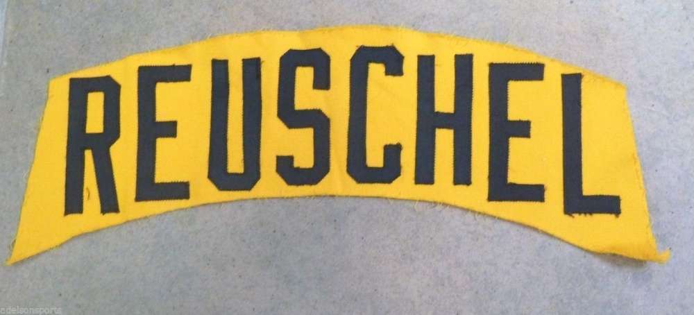
When it comes to arched NOBs, there’s radial arching and vertical arching — and then there’s the style shown above. It’s sort of like vertical arching, because the letters aren’t fanned out, but it isn’t true vertical arching, because the letterforms aren’t customized based on their position. I’m not sure if there’s a name for this, but for now I’m going to call it step arching, because the letter heights step up and then back down.
That nameplate was supposedly taken off of a game-used Pittsburgh Pirates jersey from the 1980s. Longtime reader/pal Joe Hilseberg spotted it for sale on eBay. The NOBs on the Pirates’ yellow jerseys, worn from 1977 through 1984, had true vertical arching, so Joe theorizes that maybe they used the step arching as a quick placeholder until the real vertically arched letters could be cut.
The weird thing here is that Rick Reuschel didn’t join the Pirates until 1985, which was the year the team stopped wearing the yellow alternate jerseys. In other words, Reuschel never wore a yellow Pirates jersey, so why would he have a yellow nameplate?
So it could be a fake (although the seller has a 100% rating). But Joe was intrigued by it, so he poked around on eBay and Amazon and found some additional examples from a different seller (who’s also 100%-rated):
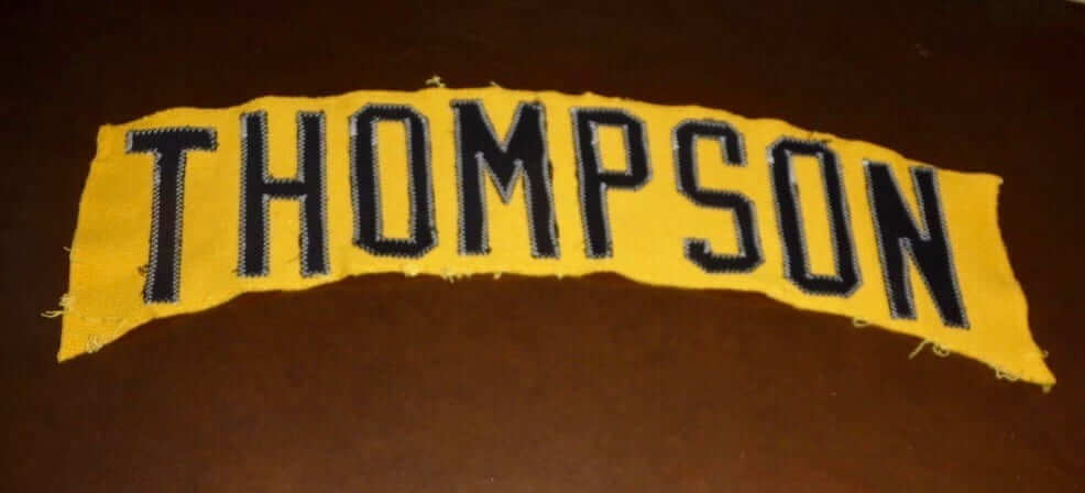
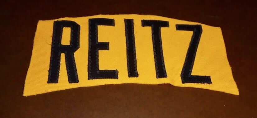
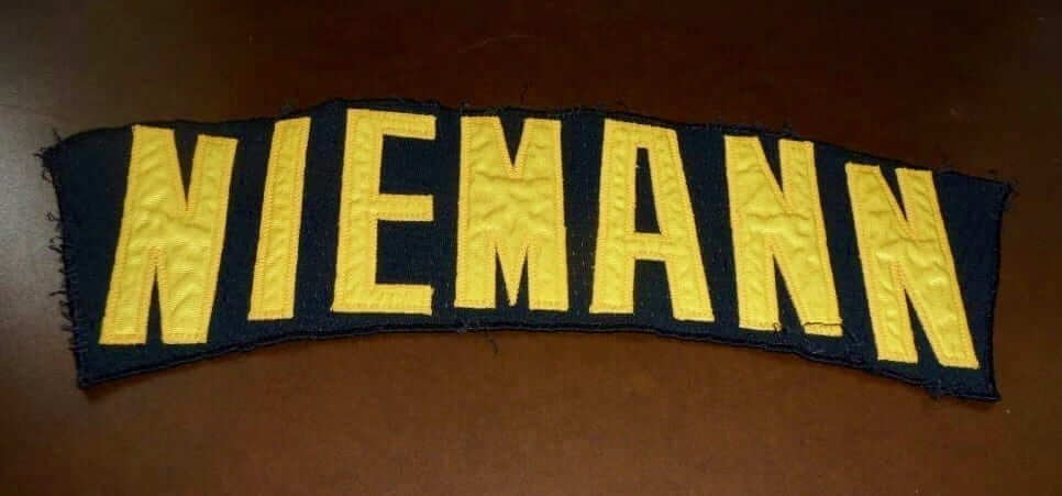
Jason Thompson, Ken Reitz, and Randy Niemann all played for the Pirates during the bumblebee era, so these nameplates, unlike the Reuschel ’plate, don’t suffer from any calendar conflict. The weird thing is that the Pirates’ black jerseys had radially arched NOBs (yes, the blacks and the yellows had inconsistent NOB styles — weird but true), so why would they need to do step arching on Niemann’s NOB? They could have used those same letterforms to create the standard radial arching.
Even weirder, Joe found some yellow nameplates with radial arching — look here, here, and here.
I ran all of this by doubleknit-era historian Bill Henderson, who had this to say:
This huge batch of Pirates nameplates goes up for auction on eBay every year. I check eBay daily for oddball stuff, and this is probably the fifth time I have seen these all for sale.
My strong suspicion is that these oddly lettered ’plates were made midseason, perhaps locally in Pittsburgh, by the team’s local stitcher. As we’ve discussed before, in those pre-digital days it was very difficult to make vertically arched lettering, requiring multiple sets of cutting templates, with each set of templates having all the letters at a different uphill or downhill slant. The local shops usually were unable to do this, or couldn’t be bothered.
Why the black nameplate is so lettered is a mystery. Again, perhaps the local shop did it?
Neither Joe nor I could find a game photo showing a Pirate wearing a step-arched NOB, and Bill said he’d never seen one either. But I did find one late-’70s shot of the team wearing yellow jerseys that appears to show third base coach Joe Lonnett with the standard vertical arching and outfielder Dave Parker with radial arching:
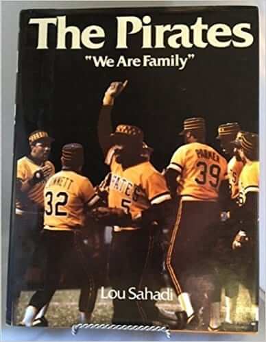
That’s a big mishmash of oddities we’ve just covered. Can any Pirates historians help sort them out?
As for step arching, I can think of only one other uni-related example of it — the Seattle SuperSonics’ chest lettering from 1978 through 1995:
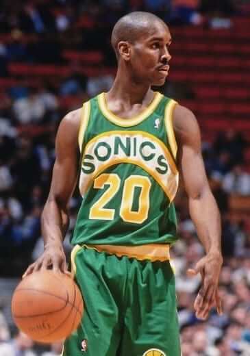
But the Sonics used conventional radial arching for the NOBs. Too bad they didn’t go with step arching, so the front and back of the jersey would have been consistent.
Can anyone supply any other examples of step arching on either the front or back of a uniform?
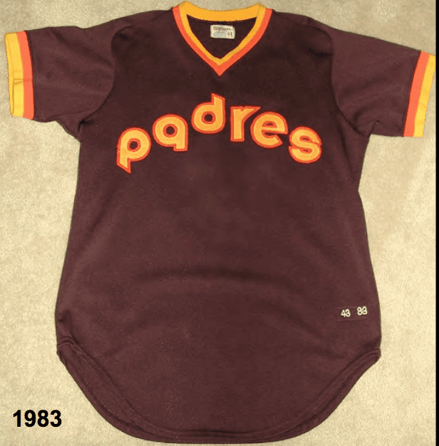
Update: Reader/commenter Bruce Covahey has come up with another example of step arching — the early-1980s Padres:
ITEM! Jags redesign contest: As most of you know by now, the Jaguars will have new uniforms this year. The unveiling is slated for April, but we’re getting out in front of that by challenging Uni Watch readers to redesign the team’s look.
Here are the details:
• Your entry must include a primary logo, full home and road uniforms (helmet, jersey, pants, socks) and a solid-colored uniform for Thursday-night games. If you like, you can also include secondary logos, a throwback or alternate uniform, and a field design, but those aren’t required.
• You can maintain some of the team’s current elements (the helmet logo, say, or the color scheme) or change everything. Up to you.
• You’re perfectly welcome to include a two-tone helmet as part of your uniform set if you like. But try to make it better than the outgoing design.
• Your designs can be created in any digital or analog medium (Illustrator, Photoshop, crayon, whatever) and can be submitted in any standard digital format (JPG, PDF, TIFF, etc.). You can also create a video presentation, upload it to YouTube, and submit the YouTube link as your entry.
• The files you submit should be named after yourself (PaulLukas.jpg, for example). If you’re submitting multiple files, please either number them (PaulLukas1.jpg, PaulLukas2.jpg, etc.) or use some other designation (PaulLukas-homeuni.jpg, PaulLukas-logo.jpg, etc.). Files that don’t follow this format will not be considered.
• In keeping with longstanding Uni Watch chromatic policy, entries with even a hint of purple will not be considered.
• Email your entry to Uni Watch HQ. If you have more than one concept, feel free to enter as many times as you like.
Deadline: next Friday, Feb. 23, 7pm Eastern.
The best entries will be showcased in one of my upcoming ESPN columns. Good luck!
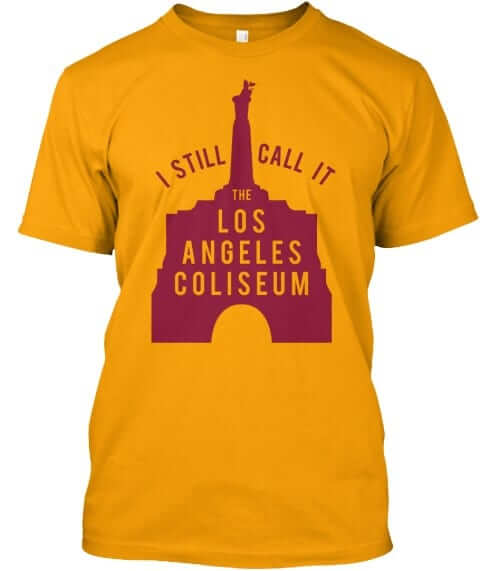
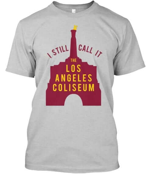
Naming Wrongs update: Several USC fans said they liked our L.A. Coliseum shirts but wanted the words “Los Angeles” spelled out. Ask and ye shall receive:
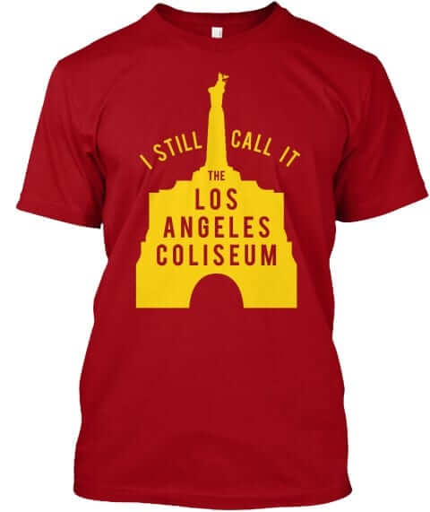
All of these designs are now available in the Naming Wrongs shop. They’re also cross-listed in the Uni Watch shop, where card-carrying members can get 15% off. (If you’re a member and need the discount code, send me a note and I’ll hook you up.) My thanks, as always, for your consideration.
KRC update: The latest installment of Key Ring Chronicles is by an old Uni Watch reader, Mike from Queens. It’s about a broken key. Check it out here.
The Ticker
By Paul

Baseball News: The Blue Jays had previously announced that they’d be wearing a Roy Halladay memorial patch this season. Here’s our first look at the patch itself (from Mike Chamernik). … Here’s how the All-Star Game patch will look on the Nats’ caps (from @JoshDO7). … Pitt has unusual jerseys with contrasting sleeves and contrasting nameplates (from Rob Perkey). … John Francona, father of current Cleveland manager Terry Francona, died yesterday, and the team tweeted an old photo of him with an odd-looking jersey number. Almost looks more like electrical tape than fabric (from Robert Hayes). … The NHL’s St. Louis Blues will be giving away this Cardinals-themed Blues baseball jersey on March 27 (from @ournada). … New mono-red uniforms for Indiana (from Kyle McCammon). … Here’s a new approach: The Daytona Tortugas will wear a new jersey each Friday this season (from Tom Mace). … A sign at the Cardinals’ training camp originally had backward close-quote marks, until the team made an adjustment (from Jeff Funke). … Here’s a great 1965 shot of the Astros’ shooting star uniforms. Note the cap design, which was worn only during 1965 spring training (from Brad Lundblad). … The AHL’s Stockton Heat — a Calgary Flames affiliate — will wear jerseys honoring the Single-A baseball team the Stockton Ports on March 17 (from @CptAutism). … Looks like the Corpus Christi Hooks will be unveiling a new cap today (from Greg Beard). … A Ghanaian skeleton rider at the Olympics appears to be wearing Rawlings batting gloves (from @A_Steener). … Here’s the best view I’ve ever seen of the William Penn sleeve patch that the Phillies wore in 1938 (from @BeerMeABeer). … New pinstriped uniforms for Auburn softball (from Clint Richardson).

NFL News: Olympic snowboarder Arielle Gold is a big Broncos fan and has been known to wear Broncos jerseys in snowboarding competitions (from Kary Klismet). … The Steelers will have a new throwback uni for 2018. Here’s hoping it’s the Batman design. .. Russell Goutierez’s daughter designed a very cool T-shirt honoring the first Saints game he attended. “She even included the fantastic patch design teams wore that year to commemorate the NFL’s 50th season,” he says. “She’s careful about infringement and figured this would be okay since it’s a one-off gift, not something for sale.” … While looking for something else, I stumbled upon an item about Stormy Daniels — the porn star who reportedly had an affair with Donald Trump and then received $130,000 in hush money — hosting a Super Bowl party at a Las Vegas strip club earlier this month. She wore a jersey with a “Stormy” NOB for the occasion, plus the club went with a helmet-themed logo treatment.

Hockey News: The Austin Bruins, a junior team in Minnesota, raised $24,000 by painting the rink pink. … Here’s more about the Hurricanes’ new ownership embracing the franchise’s Whalers past. … Pretty interesting piece on how the Sharks have reinvented the hockey bobblehead (from Mike Chamernik). … Cross-listed from the baseball section: The Blues will be giving away this St. Louis Cardinals-themed Blues baseball jersey on March 27 (from @ournada). … The Fargo Force will be wearing a jersey designed by a local pediatric cancer patient on Friday (from Brandon Baumgartner). … Former NHLer Georges Laraque has his own radio show these days, and a guest on his show recently showed up with a bunch of Laraque jerseys. It’s not clear whether those are game-worn or just retail merch (from Jerry Wolper). … Hulk-themed jerseys this Saturday for the Sudbury Wolves (from Sean Kautzman). … Cross-listed from the baseball section: The AHL’s Stockton Heat — a Calgary Flames affiliate — will wear jerseys honoring the Single-A baseball team the Stockton Ports on March 17 (from @CptAutism). … Autism awareness jerseys tomorrow for the Tulsa Oilers. … Here’s a piece on how some Penguins players ended up with their uni numbers (from Jerry Wolper). … Hockey Milano Rossoblu’s new jersey has leaked (from Matthew Klimberg).

NBA News: The NBA’s jersey sponsorships advertising patches have generated a lot of “brand value,” wheee! … Larry Nance Sr., whose No. 22 was retired by the Cavs, wants the number to be unretired for his son, Larry Nance Jr. (from Jim Vilk). … Pelicans F Anthony Davis had some tape on his hand and finger for yesterday’s game against the Lakers (from Zachary Loesl).

College Hoops News: Always great to see the old Jacksonville uniforms with the smiley-shaped lettering. It’s worth clicking on that first photo to get the full effect, complete with the awesome sock striping. … Kansas State’s two-tone lavender-over-purple throwbacks, which were worn for a home game last month, were worn again for a road at Oklahoma State (thanks, Phil). … Cincinnati will wear red uniforms on Sunday (from our own Alex Hider). … Air Force wore “Vegas Strong” warm-up tops for last night’s game against UNLV (from James Jefferson).

Soccer News: The Colorado Springs Switchbacks have a new apparel deal with Capelli Sport (from Ed Zelaski). … New kits for the Tampa Bay Rowdies (from Kody Allenson). … The Pennsylvania-based youth soccer team Montco Select has a logo that’s a straight poach of US Soccer’s old logo (from Kary Klismet). … Rough-looking blue-vs.-green game last night between Guadalajara and Queretaro (from @CoryMizer).

Olympics News: Saturday Night Live’s Leslie Jones has emerged as the Olympics’ de facto fashion critic (NYT link). … If you think hockey mask artwork is cool, check out the helmets worn by the Canadian skeleton team. … American snowboarder Shaun White got a lot of criticism for dragging the American flag on the ground after winning the gold in the halfpipe (from Kary Klismet). … The Norwegian curling team wore, of course, Valentine’s Day trousers yesterday (from Ted Arnold). … Here’s a slideshow of 12 notable figure skating costumes over the years (from Kary Klismet). … Cross-listed from the NFL section: American snowboarder Arielle Gold is a big Denver Broncos fan and has been known to wear Broncos jerseys in snowboarding competitions. In addition, she is an accomplished equestrian, which may explain why she had a horse on her helmet during the halfpipe competition (from Kary Klismet). … USA Luge is now accepting donations via Bitcoin. Key quote: “Gordy Sheer, director of marketing and sponsorship for USA Luge and a 1998 Olympics silver medalist in the men’s double event at Nagano, says the team will happily offer BTC logo merchandise and add the logo to its training gear if it reaches its cryptocurrency funding goals.” … Cool story about the helmet design worn by a Ghanaian skeleton slider (from Brian Edmiston). … Cross-listed from the baseball section: That same Ghanaian skeleton rider appears to be wearing Rawlings baseball batting gloves (from @A_Steener).

Grab Bag: There’s going to be a branding exhibit — like, about real branding, of cattle (from James Gilbert). … There’s a new book about the surprisingly intriguing world of coffee cup lid design (from Thomas Quallas). … Delta Airlines will get new uniforms this spring. … New logo for the Indian tech firm 3i Infotech. Check this press release passage: “The new corporate logo brings to life the brand’s refreshed promise of creating new opportunities and value for its clients and underscores the strength and focus of its products and services portfolio. The distinctive colours represent a fresh approach, bringing vibrancy and dynamism to the brand, and stand for a new way of creating results. The distinctive typeface lends a modern, clean look and highlights the values of innovation, insight and integrity that are at the core of the Company’s DNA.” You could copy and paste that into almost any company logo unveiling press release — meaningless mush.
I get a 403 error for the Sonics back link.
Was working fine for me. But here’s a new version:
link
That arching made me think “Upsy-Daisy”.
Spotted a typo in the NBA section – Larry Nace Jr.
Fixed.
also it’s Ghanaian not Ghanan
Something else from Guadalajara/Querétaro: Querétaro changed from white to black shorts at halftime, ostensibly to provide more contrast.
First half: link
Second half: link
Proofreading:
“an ol photo”
“Here’s slideshow”
Fixed.
Does this qualify as step arching?
link
Oh, good one — yes! I should have thought of that.
I’ve added that to the text (and credited you, of course).
Thanks. It was really obvious on the ASG hats from 2016.
link
Wow, that Astros hat looks like it says qstros. This is what happens when you try to apply one teams design scheme across the board.
Now, close the italics.
Gah. Done.
I don’t think that lettering style is the new stepped. They are on a curve not just straight up and down like the samples in the article.
I was referring to the player name…
Me too. The wordmark is stepped. The name on back does not look to be.
Right. Just talking about the front.
That is from a throwback game from about 4-5 years ago. You can clearly see the Majestic logo on the sleeve. Also, just looks like radial arching to me.
I’ve swapped in a new photo: link
And that is definitely step, not radial. Each letter is oriented as if it’s sitting on a straight horizontal line. In radial arching, the letters are fanned out along a curved line.
The new picture shows it better than the one I linked to. It also shows one of my pet peeves with that wordmark — I’ve never understood why the D and R are not on the same level since the midpoint of the wordmark is between those letters.
First time I’ve ever heard of Terry Francona’s day being called “John.” He’d always been “Tito” as far as I knew, which begat his son’s nickname
Francona’s “dad”
Not strictly uni-related but the topic of players best known by their nicknames is interesting to me. Babe Ruth was famous enough that many know he was George Herman on his birth certificate but how many could provide the real names of Dusty Baker, Doc Medich, Butch Wynegar or all-time nickname teamer Vinegar Bend Mizell? Dwight Gooden switched to “Doc” mid-career while Tim Raines for a brief period asked to be referred to as “Rock” on baseball cards and by stadium announcers.
I miss cool nicknames. Tiny Archibald, Pooh Richardson, Muggsy Bogues, Mookie Blaylock, Mookie Wilson, Curly Neal, Penny Hardaway
Most nicknames today seemed forced and trying too hard to be cool. Names like Penny, Pooh, etc they seem far more genuine because the nickname itself isn’t cool, it becomes cool because it is a random nickname.
Sleepy Floyd, World B. Free…
I don’t know the real names of Cap Anson, Cool Papa Bell, or Gump worsley. And that’s the way I like it.
Although I know his real name was Lawrence, Yogi is hands down my favorite nickname.
Speaking of Yogi: In today’s more litigious and IP-aware world, would they have been able to launch a character named Yogi Bear, whose name was obviously a riff on a famous person?
Apparently Berra sued for defamation, but dropped it – link
I think as a kid I assumed Yogi the Bear came first
Pure conjecture on my part, but I wouldn’t at all be surprised to learn that Hanna-Barbera cut Yogi a check at some point. Yogi was well known to be shrewd in financial matters, and if there was a buck to be made, I’d not bet against him making it.
Came here to say this but you beat me to it. I never even knew his name was John, he was universally known as Tito. Calling him John is like calling Chipper Jones “Larry.”
some older hockey ones:
Newsy Lalonde
Ace Bailey
Pie McKenzie
Butch Goring
Chico Resch
Nance Jr. said no.
Found another one with step arching – Raptors OVO City Edition
link
Yeah, sort of. More of an angle than an arch. But definitely related.
RIck Reuschel did wear the yellow Pirates jersey.
link
link
That’s bizarre. Reuschel didn’t join the Pirates until 1985, and the bumblebee uniforms were discontinued after the 1984 season. Maybe they were worn in ’85 spring training, and that’s where those photos are from..? Spring training might also explain the step arching.
Looks like he has a jersey number in the 70’s in that second photo, so I would guess spring training, for sure. I miss the good old days when teams just wore whatever the hell for spring training, rather than specialized spring training specific uniforms with hat patches and the like.
Spring training might explain why Reuschel is wearing a number in the 70s in that Fleer Star Sticker (which is from 1986, so the photo could be from ’85)… but the background of that photo looks like an Astroturf field…
Looking further, Multiple baseball card manufacturers had Reuschel in a Cubs Jersey in their first set of 1985 cards, which I would assume were manufactured before spring training.
link
Then a number came out with revised cards, based upon roster changes early on (e.g., Reuschel signed with the Pirates on 2/28/85)
link
This would suggest that the Pirates wore the yellow/black in spring training in 1985. A quick look at other Pirates cards from 1985 show a majority in non-white/gray unis (e.g, they made the first cards from 1984 pictures).
’85 is just barely still within the era when the presumption must be that teams wore the previous year’s uniforms in spring training. We’d have needed to see evidence that the Bucs didn’t wear old unis in spring to find anything unusual about Reuschel’s nameplate appearing on an ’84 uniform.
Both of those ’85 baseball card photos have all the hallmarks of spring training shots, while also existing in a context where spring training photos were the norm for new-to-the-roster players.
Step arching – great name. Turns out I love step arching on the back, hate it on the front of a jersey. Whereas with vertical arching, I love it on the front, hate it on the back of a jersey.
found another one for him in black – link
It’s very sloppy.
When you go there, eBay gives yuo links to some similar items, and you can see this crazy Doug Frobel nameplate in which the R is actually a sawn-off B, and the B is from the alternate condensed font that they used for longer names. (Do any teams still have this? It used to be standard.)
Link isn’t working, Mark. Can you just copy paste the URL by itself?
Paul, here you go:
link
Probably the only time in my life that I will ever type “frobel nameplate” into a search bar! (And eBay has several more of his, with both vertical and radial arching.)
From working in a shop I have franked-lettered a bunch before from pre-cut stock, but nothing that obvious. I’m talking like turning a D into an O, or a Q into an O. And E into an F… basic stuff that would still look normal.
That Sonics jersey Gary Payton is wearing is the best NBA jersey of all time, in my opinion.
Funny… As I was looking at that same pic, I was thinking “gosh that’s a bad uniform”.
Anyways.
Lee
I have a friend that works in marketing for a fast food chain that said the hornets approached them to have their logo on the jersey for a cool five million dollars (nothing compared to Rakuten/warriors deal). They declined and I think that was a wise move. Will $5 million in jersey ads really convert to awareness and ultimately sales? Hard to track, hard to know. Would’ve been better looking than LendingTree though, not that it matters.
That being said, if someone offered you 5 million dollars for a 2 inch patch on your jersey, would you say no out of uni-design-integrity? I think it’d be reallllly hard to say no…
Just curious where you think 100-year-old hockey crests like those of the Seattle Metropolitans (link) and Vancouver Millionaires (link) fit into the step arching discussion. I realize they’re not strictly “arched,” but they’re certainly stepped.
Or, in the case of the Metros, they’re arched in multiple directions.
I always feel like a total idiot when nameplate arching discussions come up because I have SUCH a hard time distinguishing between styles and remembering which is which. I get it when they’re side-by-side, but that’s about it. It’s like a uni-blind spot or something.
If I’m using the current primary logo for my concept can I just send you an image of it or do o have to recreate via whatever medium I use?
Also, both the front and back of the uniform have to be visible? (I.e for the NOB)
Do you want an explanation for the elements I used or not? I’ve already made a concept just for fun, but the design makes more sense with an explanation.
You should include the logo you’re using, even if it’s the current logo.
Showing front and back is not required but is advisable.
Explanation is welcome but not required.
Thanks, hope you like my concept!
I really hope the Batman unis become the new Steelers alts. Or their color rush unis. Anything but the bumblebee.
I saw somewhere (perhaps it was a fictional statement) that the Cardinals may have flipped the quotation marks in paying homage to Ozzie’s Opening Day and Post-Season flips. Probably hokey, but passing it along. For all I know, some love of this site started it. :)
Great examples! Another aspect of nicknames is the difference between media contrivances (e.g. the Splendid Splinter for Ted Williams) and actual nicknames that would be used by teammates. Gordie Howe was dubbed “Mr. Hockey” but was far more likely to be called “Blinky” in the dressing room
Proofreading:
Demonym for people from Ghana is “Ghanaian.”
link
Fixed. Thanks for letting me know!
John Francona? Please. You mean the original Tito Francona. I thinks it’s great when Terry is referred to as Tito as well.