For all photos, click to enlarge
Another day, another Florida-based MLB team announcing its anniversary plans. On Tuesday it was the Marlins, and yesterday it was the Rays, who are marking the franchise’s 20th anniversary this season.
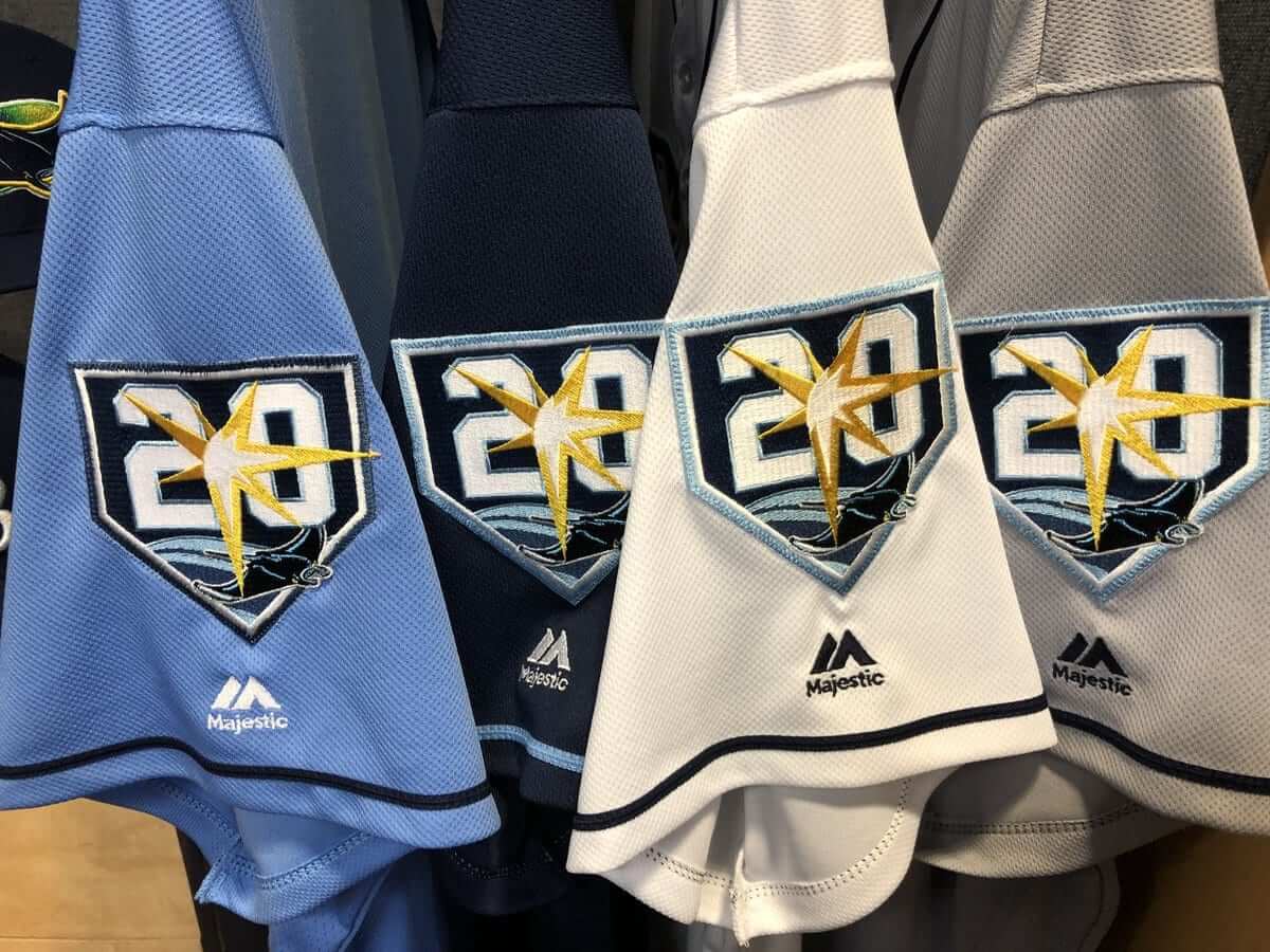
They’ll begin by wearing a 20th-anniversary sleeve patch on all of their jerseys (see above). This isn’t a surprise, as the patch had already leaked via video game screen shots and the logo had been been hung on a banner at the Trop on Monday. Can’t say I’m nuts about the design — the sunburst and the numerals don’t gel very well. Also, take a closer look at the sunburst by itself. Why do the white points extend into the yellow point on the right side of the logo but not on the left? That inconsistency bugs me. I’d never really thought about it before, but it somehow sticks out more on the anniversary logo. Hmmmmm.
The Rays will also wear 1998 Devil Rays throwbacks for four games. The dates are March 31 (20 years to the day after the franchise’s first game), June 9, June 23, and Sept. 8.
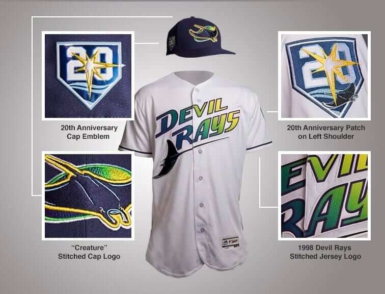
Look closely at that graphic — the cap looks navy, not black, right? That’s because they’ve created a hybrid cap featuring the old devil ray logo and the current navy background:
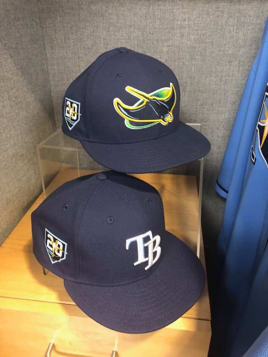
I’m puzzled by this. It’s one thing to create a navy hybrid cap to use as an alternate this season, but why would you want to use that with the throwback? I figured it must be a mistake, so I called the team, where a media rep confirmed that the navy hybrid design will only be worn for the four throwback games (although I wouldn’t be surprised if it shows up on the field more often than that, if only because teams tend to change things up and color outside the lines quite a bit these days).
So they’re pairing a historically accurate jersey with a historically inaccurate cap. Weird! And just to be clear, I think they’ve created a very nice cap. I just don’t understand why it’s going to be worn with a 1998 jersey.
For all photos, click to enlarge
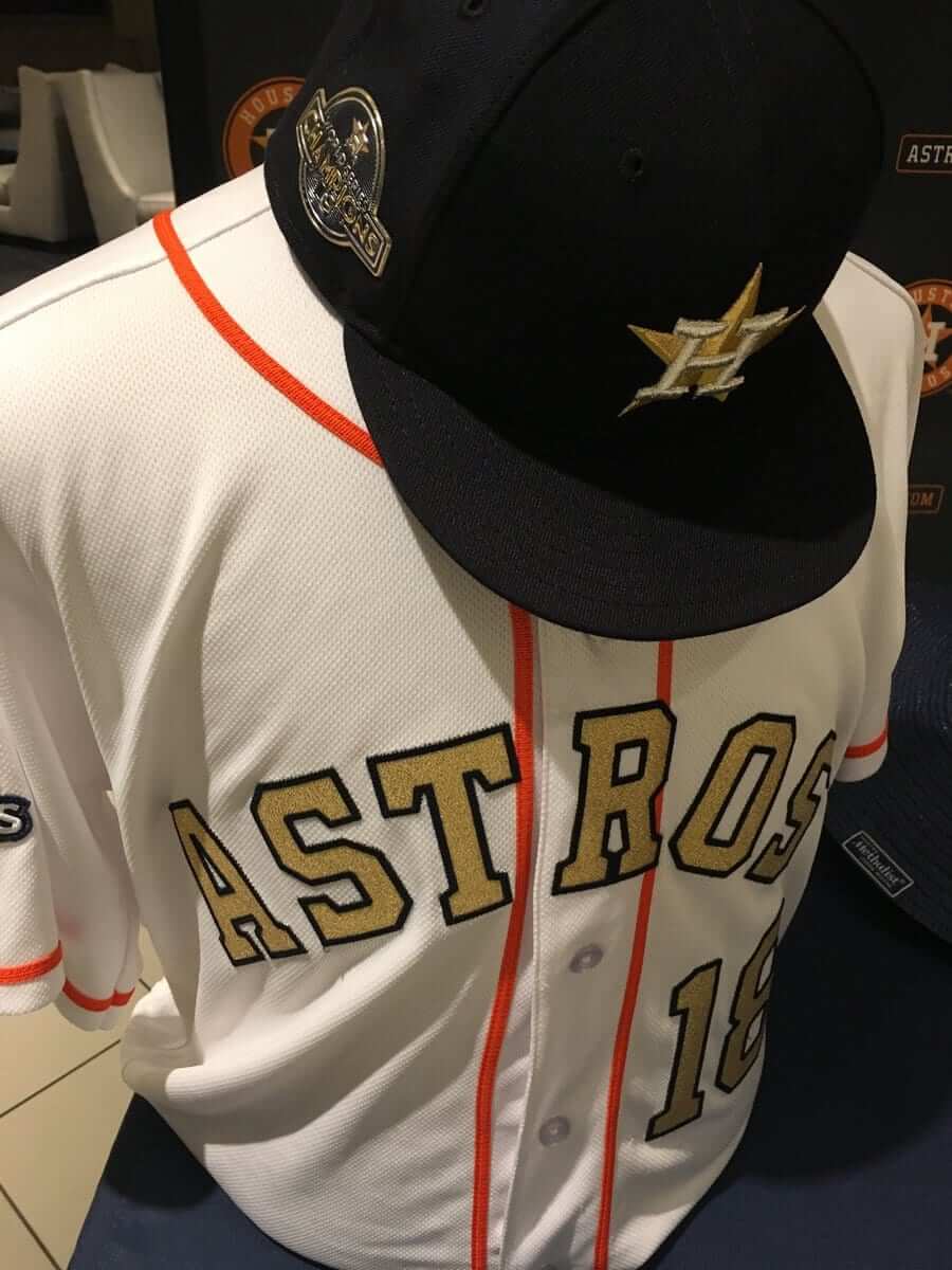
And speaking of MLB…: Recent World Series champs have waited until fairly close to Opening Day before unveiling their gold-accented championship uniforms, but the Astros aren’t wasting any time. Yesterday they revealed the combo shown above, which will be worn for their first two home games — April 2 and 3.
This is one of the better-looking gold-trimmed unis we’ve seen, since gold is a relatively close cousin to orange. Nicely done.
The Ticker
By Paul

’Skins Watch: Ryan RedCorn, a Native American comedian, created a graphic to celebrate the demise of Chief Wahoo (from Kary Klismet). … In case you missed it a few days ago, Jim Thome says he wants the block-C on his Hall of Fame plaque because “it’s the right thing to do” (from @AjenkinsCLE).

Baseball News: Cardinals rookies had temporary numbers taped to their backs during spring training in 1938. … New 25th-season logo for the New Orleans BabyCakes. “Nice touch using the Zephyrs’ old ‘baseball Z’ as part of the design,” notes Jeremy Poursine. … Oooh, look at the cool striped collar on this 1888 uniform (from BSmile). … Expect to see Seattle Seahawks QB Russell Wilson in a Yankees uniform during spring training. … Ever notice that a lot of Cuban players have names that start with “Y”? Here’s why (from Kary Klismet). … New uniforms for UCLA (from Mike Smith). … The Astros have scheduled a tequila sunrise giveaway jersey promotion for Aug. 10, so they’ll likely be wearing throwbacks on that date (from @igTXSalazar). … A towing company in California uses the Twins’ logo. … The Hartford Yard Goats have new lime green Sunday jerseys and will also become the Hartford Steamed Cheeseburgers for one game this season (from Nick Irving). … The Mets had newly acquired 3B Todd Frazier do a Twitter session with fans last night. Based on what he was wearing, it appears that the Nike maker’s mark on the team’s undershirts is changing to orange this year, instead of white (good spot by Niko Goutakolis).

Football News: Cross-listed from the baseball section: Expect to see Seahawks QB Russell Wilson in a New York Yankees uniform during spring training. … The Jaguars have announced that Julian Suri, a pro golfer on the European Tour, is the team’s new official ambassador, which presumably means he’ll be wearing a lot of Jags apparel (from Jake Patterson). … Minnesota Timberwolves C Karl-Anthony Towns saluted the Eagles’ Super Bowl victory on his sneakers last night (from Tyler Mason). … Pitt’s new “victory lights” feature the school’s retro colors (from Robert Hayes).

Hockey News: The Maple Leafs’ Stadium Series jersey has reportedly leaked (thanks, Phil). … Speaking of the Leafs, the jersey that Darryl Sittler wore while recording an NHL-record 10 points in one game has resurfaced after 42 years (from James Beattie). … Pretty cool Zombie Night jerseys for the Toledo Walleye (from Mike Chamernik). … U.N. sanctions against North Korea are creating tricky situations regarding uniforms and sticks for the joint North/South Korean Olympic hockey team (NYT link). … Blackout uniforms last night for the Orlando Solar Bears (from Jesse Liebman). … “Euro style” jerseys next week for the Ontario Reign (from Kristopher Sharpe). … Also from Kristopher: The Kings wore Chinese Heritage Night warm-up jerseys last night.

Basketball News: The Federal Aviation Administration’s Twitter account inadvertently triggered the Rockets’ emoji to appear by using the #rockets hashtag. … Kobe Bryant says the Lakers will retire Pau Gasol’s number. … Cross-listed from the NFL section: Timberwolves C Karl-Anthony Townes saluted the Philadelphia Eagles’ Super Bowl victory on his sneakers last night (from Tyler Mason). … NBA buzzer-beater shots are now sponsored advertised. Douchebags (from Jim Vilk). … Those Clemson throwbacks that were mentioned in yesterday’s Ticker will be worn tonight.

Soccer News: New away jersey for Sporting KC (from Ed Zelaski). … Minnesota United’s new kit has leaked (from Sawyer Michaelson). … So has Nigeria’s World Cup kit. … New away kit for NYC FC. … England’s World Cup kits have been revealed (thanks, Phil). … Meanwhile, the British tabloid The Mirror has ranked the World Cup kits so far (thanks, Anthony). … “I co-host a soccer talk show, called The Throw-in, out of Austin, Texas,” says Justin Simmons. “Recently we’ve started digging through our closets and been wearing some fantastic soccer jerseys to try to outdo each other for our own edition of ‘Who Wore It Best?’ We share on our Twitter feed before the start of every show.” … The USL’s Las Vegas Lights FC have unveiled their inaugural kit, and it’s very Vegas-flashy. Additional views here and here (from Kody Allenson and Elijah Newsome). … Another kit leak, this time for the Colorado Rapids (from Connor Cape).

Olympics News: Russian Olympians are getting used to their neutral OAR uniforms. … Cross-listed from the hockey section: U.N. sanctions against North Korea is creating tricky situations regarding uniforms and sticks for the joint North/South Korean Olympic hockey team (NYT link). … Here’s a look at some notable Olympic uniforms from the past and the famous apparel designers who created them.

Grab Bag: Here are some tips for choosing carwash uniforms. … There’s some controversy over a change to the Zimbabwe Anti-Corruption agency logo. … The British Veterinary Dental Association claims that a pet products company is using its logo without permission. … Pro golfer Dustin Johnson will start wearing the Royal Bank of Canada logo on his apparel and gear starting this week (from Jeff Eisenband). … New airline logo for Lufthansa. … Last night’s Final Jeopardy category was “Flag Colors,” and the answer gave some team color hints (from Paul Bastia). … When I was a kid, there was a shopping plaza at the intersection of Sunrise Highway and Veterans Highway. It was called, Sun-Vet Mall. I mention this because I’ve just learned that Charles Edward Rogers has a Tumblr devoted to buildings, businesses, and organizations with this type of intersection-based name — Sun-Vet Mall, the Bel-Ray Restaurant (at the corner of Belmont and Racine), and so on. It’s not exactly design-related, but it’s niche-obsessive in a way that many Uni Watch readers will likely find satisfying. Check it out here.
By the time you read today’s entry, I’ll already be in Manhattan, where I have an early-morning appointment for a story I’m working on. So I won’t be able to fix any typos or other errors that you folks spot, but Phil will do his best to fix anything that’s pointed out in the comments. Go easy on him, and thanks for your patience. — Paul
I like that the cap anniversary logo is sans-Devil Ray on the throwback hat. Didn’t wanna over-Ray that thing, I guess.
Proofreading:
“Yesterday the revealed”
“sanctions against North Korea is creating” are – both places
Fixed
Proofreading:
This isn’t a surprise, as the patch had already leaked via video game screen shots and the logo had already been been hong on a banner at the Trop needs some revision.
Should need only one been and hung instead of hong.
fixed
I love that new cap for the Rays, and I agree, I bet we will see it worn as alternate a lot more than 4 times.
Also, I really do not like the gold filled logo or team name jerseys the championship teams wear. It’s too much, a simple gold outline is much better, imo.
Agreed all around. Throwback uniforms are not historical recreations. It’s a ballgame, not a museum exhibition. The navy cap looks better than the black ever did. The original jersey happens to look great within the team’s current two-blue color scheme, so there’s no reason not to essentially make it a part of the team’s current look for the purposes of the celebration. All together, the commemorative uniforms nicely evokes the team’s origins and history even if it doesn’t quite exactly recreate the team’s original uniform. And, for this particular team, there’s real value beyond the event in designing the cap such that it can be used beyond just the event dates. So, again, it better expresses the character of the team than a strictly accurate recreation of the 1998 cap. That is the definition of successful design.
I like the idea of the gold-adorned championship uniforms, but rarely like the execution. For the Astros, it’s precisely the closeness of gold to orange that makes Houston’s version a failure. The gold is sufficiently close to the orange in hue and tone that it clashes. A gold outline or drop shadow would have been preferable. The Royals’ gold-filled championship jersey script worked so well precisely because the uniform had no other similar elements. So the gold contrasted with and complimented, rather than clashed with, the uniform.
Proofreading:
(ticker) Karl-Anthony Towns, not Townes
fixed
I really like using home plate for the anniversary patch. It says “we’ve been home right here for 20 years.” Also, it’s a strong, clean geometric shape, and also not a circle (which is really really common).
The OAR uniforms story is behind a paywall.
I actually didn’t have any problem viewing it.
If you’re on a computer, you can right-click the link and open it up in a private/incognito window (depending on browser). Mobile users might be out of luck, though.
It still didn’t work for me when I tried that. But I saw that it is an AP story, so I figured that other outlets besides the San Antonio Express-News would have picked it up, and I was right. I found it on ABC News’ site, without a paywall. Here is the link: link
Maybe we should find out who was behind the Rays’ redesign in 2007 and ask them about the sunburst? Might be a good way to get a retrospective about the whole redesign process while we’re at it.
I’m surprised you didn’t mention the arc on the left side, Paul. I’m guessing there’s some significance to it, since the arc seems to form a barrier stopping any further protrusion of white into the left-side rays. Maybe it’s a stylized representation of the sun peeking over the edge of the Earth?
Michael Raisch of Fanbrandz was the designer. There’s some context about 3/4 down the page in this interview with him: link and the case study is here: link
That works too. I was actually trying to look up any background on the redesign, but my initial searches had turned up empty. It’s rather interesting that he used a metal numeral 4 to come up with the sunburst design. That’s definitely different!
I guess I should also say, Thank you, Drew E!
LINK BROKEN on “Those Clemson throwbacks that were mentioned in yesterday’s Ticker will be worn tonight.”
“Maybe it’s a stylized representation of the sun peeking over the edge of the Earth?”
That’s what I was thinking, too. It’s a white sun, peeking in from behind the gold layer.
Also, this is my first time noticing that Majestic has put its *name* below its logo on the sleeves of these jerseys. I hope this is just for retial jersey sand not for the ones worn in games.
The word-inclusive Majestic logo began appearing on MLB jerseys last season.
I guess I can’t say anything definitive about the Maple Leafs’s Stadium Series jersey since they haven’t leaked the whole thing. But from what we can see, it looks like this might be the most conservative Stadium jersey yet. Not a bad design, but I’d hate to see Stadium Series unis start to become traditional and conservative. I think one of the biggest appeals of that particular outdoor promotion is the weird and wacky uniforms that they come up with.
I wouldn’t call the Capitals’ uniforms “conservative.” Quite color-block-y in a way I’m not used to seeing on anybody. If that’s the Leafs jersey, I’d bet it’s a Lou Lamoriello decision and not a shift to conservatism for the Stadium Series. Remember, the last time Lamoriello had a spot in the Stadium Series, the Devils simply wore their red-and-green throwbacks.
That is true about the Devils. And I was referring only to Toronto’s jersey this year. Washington’s is far enough outside the box to fit the bill IMO. Plus, I’m always a huge fan of white shoulder yokes. Kudos to the Caps for being the one NHL team to keep that element alive over the last few years.
I’d love to see the Rays bring back that old design full time, maybe with the new colors, but columbia blue as the primary. The original font, both on the chest word mark, and the TB cap are way better than the generic font they have now. Maybe ditch the manta ray from the chest and cap, just use it as a sleeve patch. For the away jersey the second design with same font, but arched lettering a good option.
*Maple Leafs’
Does anyone know which color the sleeve piping on the Rays fauxback is?
It was black in the original with purple outline on the letters. If they made the cap navy blue it wouldn’t surprise me if the piping was navy too.
The outline for the letters appears to be purple, the ray itself is black, and as best I can tell from that image, the piping is the same color as the ray. Could just be the lighting. Very odd that they went with the navy cap.
Throwback, not fauxback.
A fauxback is a uniform designed to evoke a historical era, while not attempting to replicate a specific historical uniform. A throwback, however, is an attempt to replicate a specific historical uniform, which is what this jersey is doing.
The Rays’ “1979” uniforms are fauxbacks, because the franchise didn’t exist in 1979, so they opted to take inspiration from the 1978 Padres, adding their own touches in the process.
Sorry to come off as a pedant, but I just want it to be clear: just because a throwback isn’t 100% accurate, doesn’t make it a fauxback.
Well the cap is definitely a fauxback because its not replicating the 1998 design, it’s taking the logo and updating the color scheme to navy and yellow. Sort of like how the White Sox use the batterman in black and silver on their BP caps.
When I think about throwback accuracy I tend to think about technical details like the sleeves being shorter than they were in 1910 or striping being too thick.
I’d say if the “Devil Rays” script outline and the piping are navy, then its a fauxback because its deliberately bringing and old era into the current scheme. If the script outline is purple and the piping black, then its a throwback.
Tampa Bay uni observations:
1.) The retro ray on the hat is way too large (must be trying to keep up with their in-state neighbors down south.
2.) The sunburst has always struck me as looking more like a logo for a mega church or even a stylized take on the Church of Scientology. It’s way too vague for my tastes. So many more cool possibilities for a team that once used such a neat-looking fish as their main identity. They never should have abandoned it.
-C.
The sunburst bisecting the zero in the Devil Rays logo makes it appear to me that they are celebrating their 28th anniversary. The contemporary gift for a 28th anniversary is something purple. Maybe I’ll gift them their old purple visor for that pseudo throwback cap.
All I see is 28 thanks to that ray going across the zero… I’m surprised that passed with the folks in charge. Even when I’m just designing for shirts or signs in this little town, I avoid stuff like that, because I know even the small businesses owners and truck drivers etc would see something like that right off the bat, so to speak…
The Rays’ old gradient color scheme looks much better on navy blue than black. I never liked the gradient until now. Seeing it paired with the navy, it actually looks like a cohesive, well-considered color scheme rather than something splashy and new slapped on top of BFBS.
Historical inaccuracy aside, I prefer the new cap. I wouldn’t mind if the Rays wore it as an alternate on a regular basis.
Mmmmmmmm….steamed cheeseburgers……
Jon! Good to see you on the site. It’s been a while!!
I also saw “28” on the Rays’ patch at first glance. Poor execution. Love the special Astros uni though.
1.0 apostrophe catastrophe in the 1988 Phil Athletics player photo caption.
Speaking of Rays and Padres (which I brought up in my reply to Thomas above), anybody else feel that the waves in the home plate design of the Rays’ anniversary logo make it feel a bit like the Padres’ 2000-11 primary logo? It just makes it feel like Tampa Bay loves ripping off San Diego.
Edit: I’m a dummy, I somehow blocked out the FREAKING DEVIL RAY in the anniversary logo!
Nevertheless, though, the effect is enough to make me see a similarity.
link
link
Cap ann’y logo doesn’t have the devil ray in it so you’re not super far off
That must’ve been what I was looking at when I formulated my initial post.
It took me a solid minute to come up with that on my own after my first comment (coffee didn’t kick in immediately), but you’re not alone.
“Hot Stove Uni Scene Heats Up” and not “Uni Scene Hot Stove Heats Up”?
A couple of things here:
While the Astros gold unis are gorgeous, it feels like a missed opportunity. They should have made it blue and gold so it could work as a fauxback to their 90s sets as well as a world championship uni.
The Leafs Stadium Series jerseys are simplistic and great (assuming it’s a real leak). Can’t wait to see it on the ice.
I was thinking the same thing, with regards to the Astros. I don’t know that I have an eye for color combos or anything, but the navy, orange, and gold don’t seem to mix well for me. It would look much cleaner if they’d just used a navy headspoon.
I really don’t like the increasing size of the logos on the hats (as exemplified by that Rays logo and the Marlins logo). There was nothing wrong with the size of the Tigers’ D, for example. The bigger the logos get, the cheaper and gaudier the look to me.
So true.
Those Yard Goats Sunday jerseys are a downgrade from the 2017 white vests the team wore. Wonder if those are getting mothballed since fans don’t buy vests.
With regard to the white points extending or not extending into the sunburst logo, is it my imagination or does the white bit kind of resemble a ray? (with its head facing up and to the left) That might explain why it’s done that way.
The whole Devil Rays thing is a classic case of how NOT to do a logo/uniform program…
If they had just left it alone, the cap would be considered iconic by now.
Instead, the team has a generic name and hat that most people on the street would not even recognize as a MLB team.