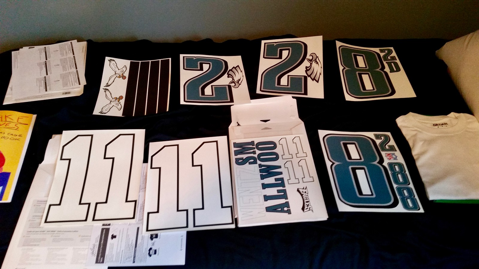
Click to enlarge
As longtime Uni Watch readers may recall, reader Steve Speicher always DIYs himself a jersey for the Super Bowl. Here are the ones he did in 2012, 2013, 2014, 2015, 2016, and 2017.
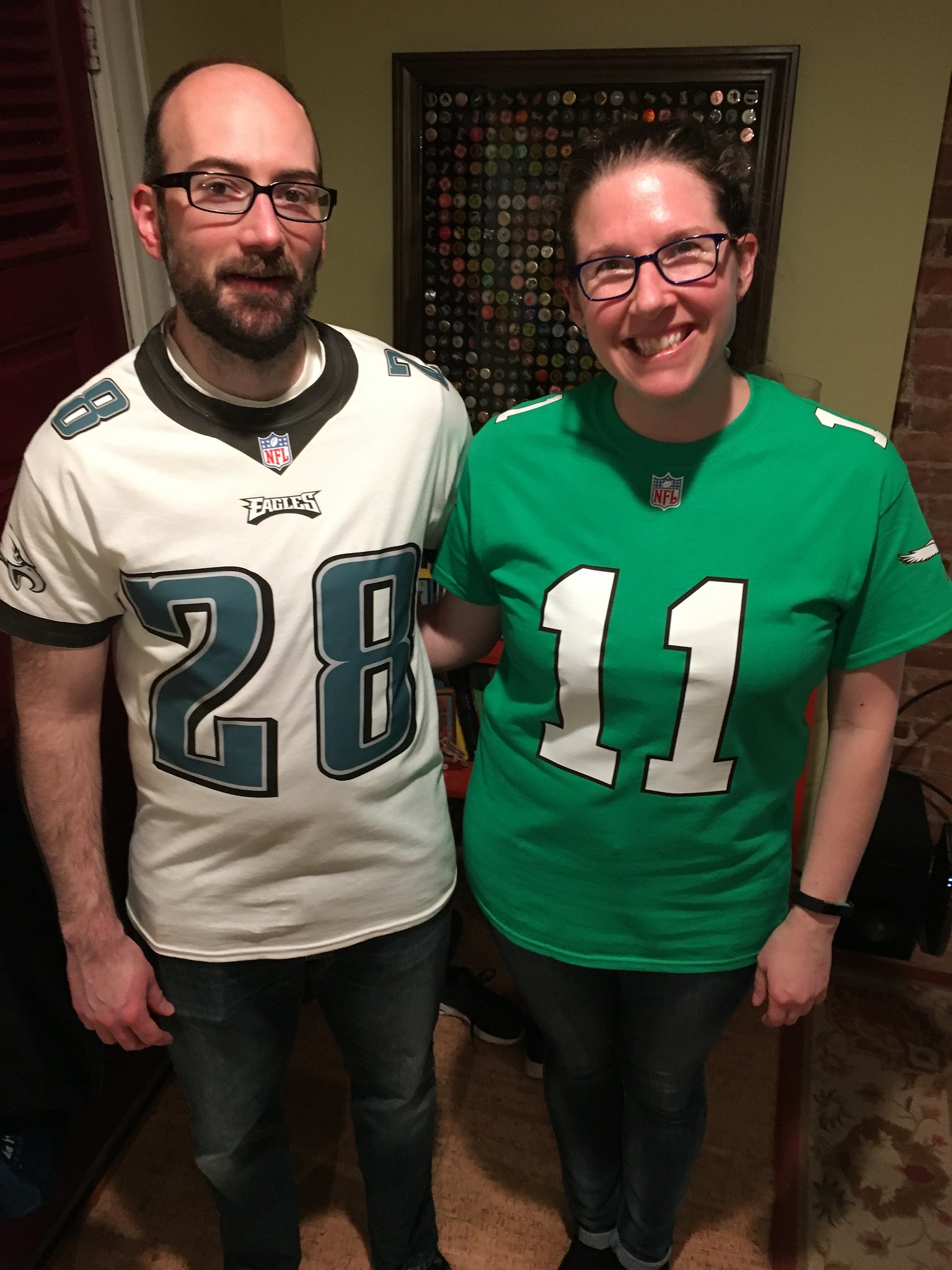
For this year’s Supe, Steve chose to make Eagles jerseys for himself and his girlfriend, Anne. Here’s his annual rundown:
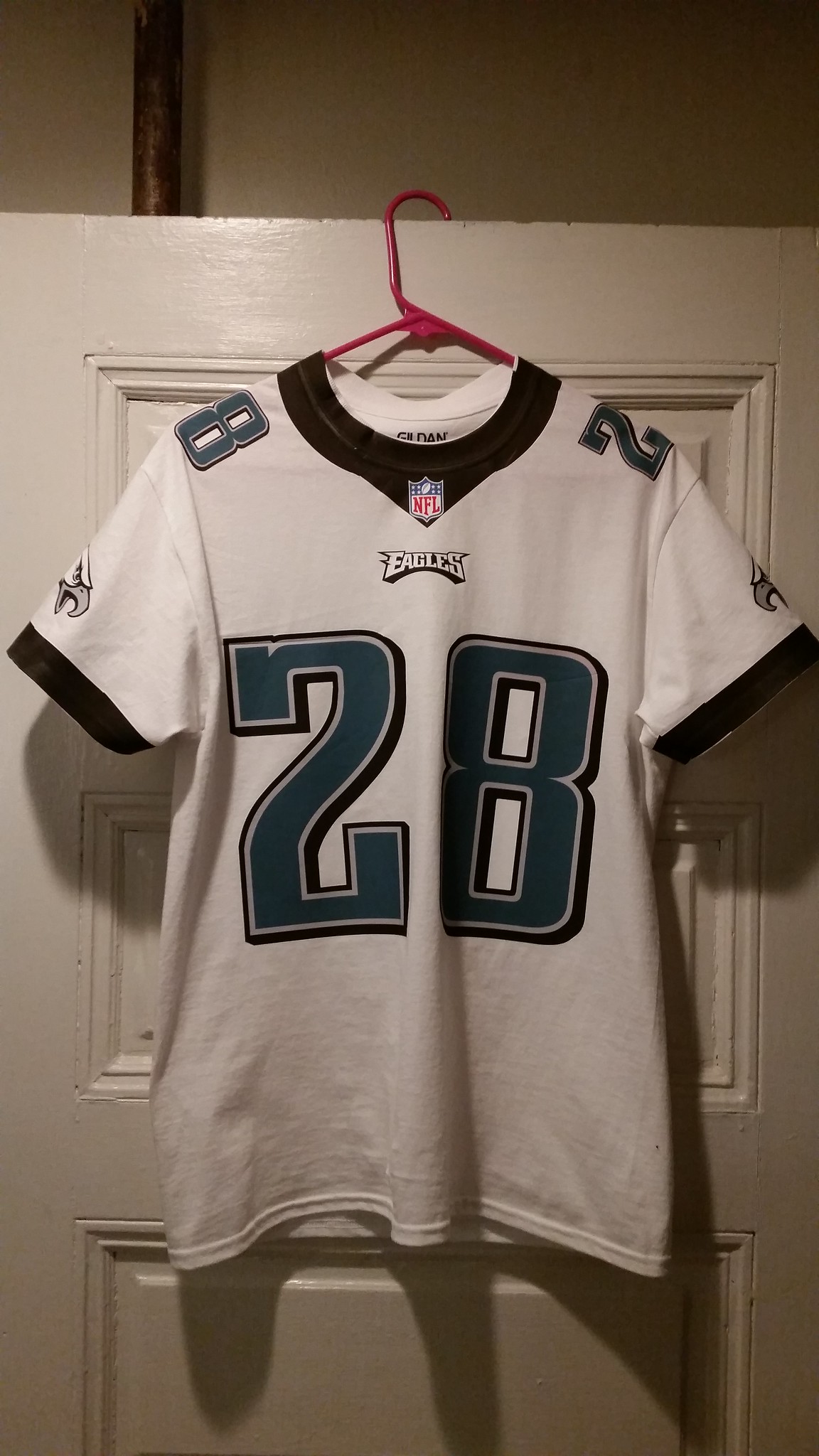
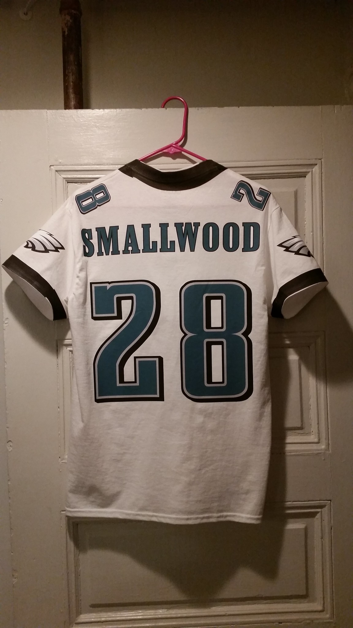
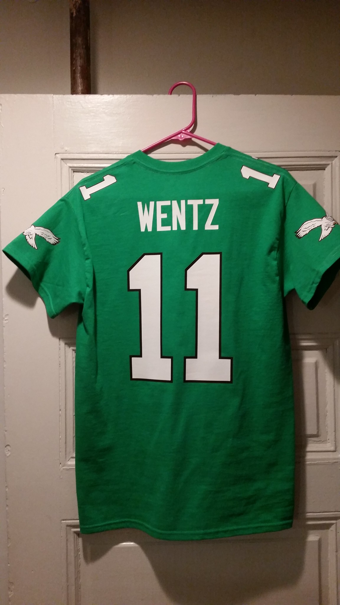
I chose the Eagles’ current road jersey and the 1991 home jersey as my models. I went with the road white because the Eagles’ shade of green isn’t ready available at the craft store. I did attempt to dye a shirt “emerald green,” but the results were a bit off (probably due to user error, not to the dye itself). I didn’t have a specific reason for picking 1991 for the throwback home jersey — it just happened to be what I selected when looking at the Eagles’ history on the Gridiron Uniform Database.
The throwback green was pretty straightforward to execute. The white jersey had a bunch more graphics, as well as the dreaded collar. You’ll see the collar is somewhat imperfect, but overall, it’s not terrible. I’m also happy to report that all birds are facing the appropriate direction.
Our player choices were Carson Wentz for the throwback home and Wendell Smallwood for the current road. It’s been a tradition do the starting quarterback for these DIY jerseys, and although Wentz may have lost the starting job due to injury, in my mind he’s still “the starter.” As for Smallwood, we became aware of him when he had some big weeks earlier in the season, and we really liked his name! I also read that he grew up an Eagles fan in Delaware, and when he was a kid he pictured himself playing for the Eagles in the Super Bowl, which is a nice story. But we knew that he would most likely be inactive for the game, which made it additionally quirky that both of the players we chose for our Super Bowl DIYs would probably not play in the game.
Here’s how they turned out (click to enlarge):

———
Very nice! Big thanks to Steve for once again sharing his DIY project with us.
Super Bowl wrap-up: A few final loose ends from Sunday’s big game:
• In the days leading up to the game, it looked like they were going to keep the Vikings’ number font for the yard markers on the field. But they replaced those with a more conventional font prior to gameday. My bad for not mentioning that in yesterday’s post.
• The grounds crew neglected to include hashmarks on midfield NFL logo, so the marks had to be painted in just prior to the game (additional info here):
This is really happening hours before the Super Bowl pic.twitter.com/BNQygZ7TEW
— Mark Daniels (@MarkDanielsPJ) February 4, 2018
• I was watching the game at a friend’s party, and there was a lot of chatter going on, so I missed some of the broadcasters’ commentary, including Cris Collinsworth saying that that the Super Bowl LII logos, which appeared between the 20- and 30-yard lines on each side of the field, were apparently causing bad footing for the kickers, which might explain all of the missed kicks in the game.
• If you want to look ahead, they’ve unveiled the logo for next year’s Super Bowl in Atlanta. But if you were expecting something creative, think again:
Logo for next year's Super Bowl in Atlanta. pic.twitter.com/trkGY63T8z
— Josh Katzenstein (@jkatzenstein) February 5, 2018
(My thanks to Kary Klismet and Tim Dunn for their contributions to this section.)
Rookie mistake: Mavs forward Dirk Nowitzki is in the midst of the 20th season, and last night he hit the 50,000-minute mark for his career — the sixth-highest total in NBA history. So you’d think by now they’d know how to spell his name on his jersey, right?
Wrong:
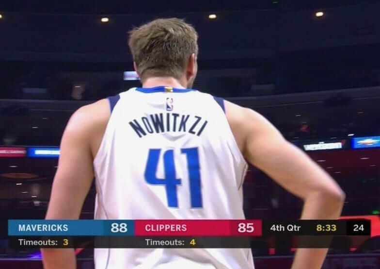
That’s from last night’s Mavs/Clippers game. Add it to the annal of classic NOB typos.
(My thanks to Uni Watch alum Mike Chamernik, who was the first of several readers to let me know about this one.)
Click to enlarge
Collector’s Corner
Brinke Guthrie
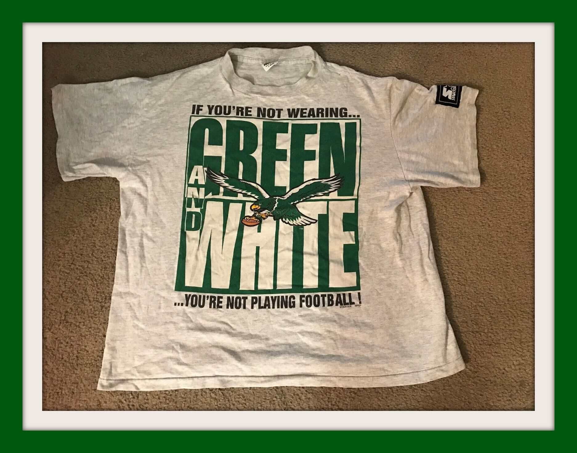
Congratulations to the Philadelphia Eagles, who defeated the New England Patriots to win their first ever Super Bowl title. Here’s an Eagles Starter T-shirt from the 1990s, which lets everyone else know that if you’re not wearing green and white, you’re not playing football.
Now for the rest of this week’s picks:
• This 1970s Bobby Clarke (Philadelphia Flyers) “hockey soft puck” is still in the package.
• Nice-looking design to this vintage San Francisco 49ers jacket from Shain.
• This Baltimore Orioles cap will take ya back. These were hugely popular back in the day. AJD was the company behind this “snapback” trucker-style cap.
• Want to see what the Dallas Cowboys should like? This photo of their O line is from the 1970s, and you’ll notice the pants are not blue-green.
• Boston Bruins all-time great Bobby Orr graces this 1970s Aladdin plastic Thermos.
• This 1970s zip-front St. Louis Football Cardinals sweater come straight to you from the Sears Put-On Shop. (100% Virgin Acrylic!)
• This late-1960s/early-1970s K.C. Chiefs bobblehead is in perfect shape.
• Look at the cover art of this Raiders/49ers game program from September 1967.
• And here we have some Super Bowl II program cover art for you — Raiders/Packers, Jan. 14, 1968.
• One more game program for you, from a season later: On Sept. 29, 1968, the Niners hosted the Falcons at Kezar. Look at the gold detail on those helmets!
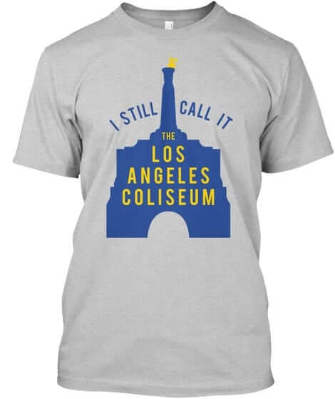
Naming Wrongs reminder: In case you missed it yesterday, we have a bunch of new shirts for the L.A. Coliseum (like the one shown at right). You can see all of them here.
The Ticker
By Alex Hider

Baseball News: Orioles infielder Tim Beckham has a new personal logo (from Andrew Cosentino). … Previews for MLB The Show 18 may have given us the first glimpse of the All-Star Game patch on the Nats’ jerseys, a look at the new Rays’ 20th-anniversary patch, and previews for new cleats. It also depicts Babe Ruth in a batting helmet and modern Yankees uniform (from Brad Hartland, AJ, and Ted Schwerzler). … TCU will have 3D helmet logos this season (from @mikethegratest). … Couple of Japanese baseball notes from Graveyard Baseball: New blue softball tops for the Hokkaido Nippon-Ham Fighters of the Pacific League. Also, the Seibu Lions of the Pacific League will wear 2004-2008 throwbacks for four games this season. … Nothing quite like a color-on-color matchup in the ’70s. That shot is from the 1979 World Series between the Pirates and Orioles (from @GoatJerseys).

NFL News: This great New York Times piece walks you through how Super Bowl rings are made. … Eric Juergens found this shot of a guy in a Tom Brady/Carson Wentz frankenjersey at the Super Bowl. … Garrett Beatty put together some uni concepts for the world champion Philadelphia Eagles. … A former Denver mayor thinks that the marijuana industry in town should team up and buy naming rights for the Broncos stadium and keep the name Mile High Stadium. Get it? (From Kary Klismet.) … A Pittsburgh TV station put up a graphic listing the Steelers’ Super Bowl championships yesterday, but mistakenly included Super Bowl XII instead of Super Bowl XIII. The Cowboys won Super Bowl XII (from Jim Vilk).
College Football News: The latest episode of the Radiolab podcast explores the historical development of the forward pass and includes some great photos of its pioneers, the fabled Carlisle Indian School football team (from Kary Klismet).

Hockey News: The Kalamazoo Wings of the ECHL will wear Grateful Dead uniforms on Saturday (from @mikeobs). … Ohio University goalie Jimmy Thomas has both the school’s academic logo and a throwback paw print logo on his mask (from Trevor Wilson Patton).

College Hoops News: You know how great it looks when USC and UCLA go color-vs.-color on the football field? It looks pretty awesome on the basketball court, too. That game took place on Saturday night (from Billy Ballas).

Soccer News: New primary green kits for the Seattle Sounders (from Markus Kamp). … New BFBS uniforms for the Vancouver Whitecaps (from Russell Varner). … New kits for FC Cincinnati of the USL. … In this vintage NPSL shot from 1967, you can see Art Welch of the Baltimore Bays and his FiNOB jersey (from @GoodSeatsStill).

Olympics News: This is a good piece about the guy who designed the goalie masks for Team USA this year. Paul did an ESPN story on this guy way back in 2005 (from John). … Also in Olympic hockey, IOC has deemed South Korean goaltender Matt Dalton’s mask to be “too political,” and has asked that he not wear it (from Matthew Walthert and Mike Styczen). … Speaking of helmets, skeletoner AJ Edelman, who will be representing Israel, has Samson on his helmet (from Phil).

Grab Bag: A Pepsi Super Bowl ad Sunday night featured former NASCAR driver Jeff Gordon racing a DeLorean. But David Firestone points out that Gordon’s car is a sixth-generation car (circa 2013), with a 2007 paint scheme. … New lacrosse helmets for the University of Virginia (from our own Jamie Rathjen). … Syracuse also has new lacrosse uniforms, which include some iconic spots on campus (from @PhillyPartTwo). … New logos for Livonia Churchill High School in Michigan (from Ryan).
The Nats All Star patch has been present on jerseys in the MLB online store for weeks now. link Sorry I didn’t send a note to the Ticker when I noticed it – I assumed it had already been covered.
It should be Samson, not “Sampson” for skeletoner AJ Edelman, who will be representing Israel,
Fixed.
Vancouver Whitecaps new 3rd kit is actually a dark grey, not black.
I was hoping for a return of the arbutus brown kit for a 3rd kit. I loved that 3rd kit. I feel like I was the only Whitecaps fan who liked it.
Should have brought back the brown!!
link
link
Or we would have liked to see something vintage:
link
Great work on the Eagles T’s, Steve!
I really hate to say this, but I see this all of the time with Eagles jerseys (even officially licensed ones for some reason) – the in-line color on the numerals is Charcoal (425), not Silver (877/421).
Fantastic job nonetheless.
Hey Donovan, if only there were link for pro team uni colors… ;)
It was a fantastic job tho.
Ah, I see now! I just used the same color from the beak of the logo. Looking closer, it does appear a bit darker. Oh well – close enough? :)
Outstanding work on the shirts!
Not critical, but could have also gone with the local angle with Corey Clement (from Glassboro NJ – south Jersey Eagles country) with the added bonus of Clement actually playing.
Also critical, but admittedly nitpicky – the spacing between the 2 and 8 on Smallwood could be slightly reduced for better accuracy.
Still basking in the glow of a championship – 57 seasons is quite a time to wait!
A while back I read somewhere (perhaps on Uni Watch) that for their few few years of existence the Falcons had two gold stripes on their helmets because the primary color of Georgia Tech (also in Atlanta) is gold. In addition, apparently the Falcons primary colors of red and black were chosen because those are UGA’s colors. Probably trying to recruit fans from both college fanbases (who do not particularly care for each other).
That was brought up here when the Falcons wore their 1960s throwbacks from 2009-2012, which included the gold stripes on the red helmets.
“If you’re not wearing green and white……”
Ah, the good old days.
Well, we still can get our fix of kelly green and white pro football in the present come July if you tune into the game up north. Go Riders!!
link
Much prefer their alternate throwback. Too bad that’s not their regular look.
link
Hey, if the Rangers can get Wayne Gretzky’s name wrong – on a vertically-arched NOB, no less – then anybody’s fair game!
The Super Bowl yard-line fonts looked the same. It appears all they really did was remove the purple border from around the numbers.
It should be Cris, not Chris, Collinsworth.
Though, given some of his other commentary in the game (like way overanalyzing the Ertz touchdown – I was rooting for the Pats and even I was like, “That’s a freaking touchdown, dude, shut your damn piehole already!”), I have to wonder about the veracity of anything he said…
Whoops, that shouldn’t have been a reply!
Fixed.
They also removed the nesting on the tens digit but it was the Vikings font.
The color-vs.-color shot was from Game 7 of the 1979 World Series. But the Pirates and Orioles also went color vs. color in Game 1 of that series:
link
I’ve been offline for a few days. Has it been mentioned that the Viking font/”serif” was removed from the yard line numbers for the SB?
Someone didn’t read today’s entry very carefully! ;)
aw jeez
You’re on the posting “walk of shame” I know the feeling.
Anyone else notice Reggie White has a green face mask in the 1991 Home jersey picture while his teammates have silver ones. Reggie played for Philly before Green Bay, why the green?
That photo make Reggie’s face mask look kind of green, but it’s actually dark grey. He wore a face mask style (Riddell Kra-Lite, I think) that gained some popularity in the late ’80s and early ’90s. The grey face masks for that style were notorious for being considerably darker than other face mask styles. Here’s a photo collage that demonstrates this:
link
I could have sworn there was a Uni Watch feature about football face masks from the 1980s that covered this particular style, but I can’t find it for the life of me.
The picture’s from 1992 anyway, with the Jerome Brown memorial patch.
That UCLA-USC basketball shot would be lot MORE awesome if both players weren’t rolling down their waistbands.
Truth.
I can’t believe KDKA did that with the Steelers. WPXI, sure.
I’m programming in M-Block and they have a sprite (character) of a football player. It looks like he is wearing a USC jersey with the number 4 on it. The player is African-American. Does anyone know who this could be?
It could be #4 from this year Chris Hawkins, but I’m not sure
It’s a shame that the kelly green is probably never coming back full time now that the “midnight green” won a Super Bowl.
The Randall Cunningham-era Iggles were beautiful uniforms green or white jerseys.
It’s been around for 22 seasons, so who knows? Teams have gone and changed uniforms after championships before (though in the modern era, such changes have usually been in the pipeline for some time).
I remember the very first Uni Watch post I read, because it was Steve’s Kaepernick jersey project. Since then I always enjoy seeing new versions each year. It also inspired me to get going on my own projects. Great job Steve!
Thanks! The stuff of yours I’ve seen is way more impressive than mine. :)
I am pretty good at ignoring most everything related to the NFL, but good grief. Now that I have taken 5 seconds to actually consider the SB logos, I’m amazed at how relentlessly dull they are. Woof.
The Jeff Gordon car was a scheme that he ran in 2015, which the car was Navy. It was his last Pepsi scheme that he ran before he retired. It just looks dark in the commercial.
Not sure how anyone could be confused into thinking he was driving the DeLorean, either, when he was pretty clearly racing against it.
Look closely at the side view of the car (top left sponsor decal field)and you can see the 2004-2007 Nextel Cup logo sticker.
I think Gordon only ran that scheme once (’07 Daytona July race); the Monte Carlo (SS) was semi-retired in 2007 as NASCAR was phasing in the CoT…Chevy badged their entries as Impala SS’s.
Also, driver last name decals didn’t appear on the windshield until 2013.
It’s actually the Sprint logo not Nextel on it, 2015 is the scheme and car
That’s actually a frankenshirsey. The Brady side would have shoulder stripes if it were an actual jersey – and the foul would be even greater for trashing a red throwback.
The DIY Philadelphia Eagles t-shirts look awesome, especially the 1991 version. Did Steve find everything at the craft store, including the numbers, NFL logo, etc? I would love to see instructions on how to do it. Maybe he could make a YouTube video. :)
The graphics are made using iron-on transfer paper. I prepare everything in Photoshop. Most of the logos I obtain from Chris Creamer’s site. For the letters and numbers, I found a free NFL font package last season which is pretty good, but not perfect. I had to do some manipulating of the numbers for the Smallwood jersey to get the perspective effect correct.
Does anybody else here find the decision to go to generic Super Bowl logos one of the most depressing developments in the uni-verse in a while?
It used to be that the logos made each SB feel like a special event. If your team happened to play in one, you’d probably remember the logo with some sentiment. The logos also helped tie the event into the host city.
I have no idea why the league ditched this. Even for business reasons, how does this help the league’s brand?
Agreed. The new Super Bowl logo system is soulless, sterile, and unimaginative. It seems that almost all the major sporting championships in the US have gone with standardized logos, including the NBA Finals, the World Series, and even the CFP Championship Game. At least the Final Four still allows for some level of creativity:
link
I remember reading over a year ago (sorry, could not find the article) that the NFL was looking for something long lasting and iconic along the lines of the Olympic Rings or some other marketing bulls**t.
Then they should have thought of that 52 years ago.