The most significant uni-related detail in yesterday’s conference championship games was probably the bandage wrap on Patriots quarterback Tom Brady’s injured right hand. That hand ultimately helped save us from the ignominy of having to watch the Jaguars’ two-tone helmet in the Super Bowl. Phew!
A few other items from yesterday:
• With Eric Kendricks playing for the Vikings yesterday and his brother Mychal Kendricks playing for the Eagles, their family spread the love with this Franken-tee:
Here's the t-shirt Eric and Mychal Kendricks' family will wear to NFC title game: pic.twitter.com/pcjqYx03Uz
— Tim McManus (@Tim_McManus) January 20, 2018
• Here’s a weird one: Yesterday morning the NFL posted a graphic to promote the two conference championship games. For some reason they depicted Eagles quarterback Nick Foles in a green jersey with black pants — a uni combo that the team has never worn:
Welcome to Championship Sunday! #NFLPlayoffs pic.twitter.com/bAZJz4lGXY
— NFL (@NFL) January 21, 2018
• After the Vikings scored an opening-drive touchdown against the Eagles, they celebrated with what is presumably the NFL’s first-ever curling-themed routine:
Starting things off with a 75-yard touchdown drive.#BringItHome pic.twitter.com/K6n1VaAZcX
— Minnesota Vikings (@Vikings) January 21, 2018
• Vikings fans traveling to the NFC championship game in Philadelphia were warned by travel agents not to wear Vikings apparel in Philly.
• In another item pertaining to Eagles fans, officials greased the lamp poles in Philadelphia in order to keep people from climbing them as part of a postgame celebration or riot (reminds me of the old Paul Revere & the Raiders tune “Crisco Party”):
Good morning from Philly where crews from the city are greasing the light poles with Crisco to prevent #Eagles fans from climbing after the #NFCChampionshipGame tonight. #Vikings pregame coverage starts at 3 on FOX9. They call themselves the #CriscoCops pic.twitter.com/w1ZkYWZhYG
— FOX 9 Sports (@Fox9Sports) January 21, 2018
But the grease apparently didn’t work, at least for one enterprising fan:
The grease didn’t work. pic.twitter.com/it0XDv4Nvs
— Matt Gelb (@MattGelb) January 22, 2018
Okay, so we have the Pats and Iggles in the Supe. The AFC is the designated home team this year, so it’ll presumably be New England in blue vs. Philly in white (although some superstitious folks are already calling on the Pats to choose white, because 12 of the last 13 Supe winners wore white). If they do indeed go blue vs. white, it’ll be the opposite of what we had when these same two teams matched up in Super Bowl XXXIX) 13 years ago.
Want to take a deeper dive into this year’s Super Bowl uni matchup? Reader Jay Braiman does that every year, and the gun had barely sounded at the end of yesterday’s games when he checked in with his annual breakdown. Take it away, Jay:
The Patriots will likely wear blue. In nine prior Super Bowl appearances, they are 2-2 in blue, 3-1 in white (3-0 in the current design), and 0-1 in red.
The Eagles will likely wear white. They lost both of their prior Super Bowls, both while wearing green. If they decide to go with green pants in the Super Bowl, they will be the first team ever to do so. However, they wore white pants in four of the five games they played this season in white jerseys. If they wear white pants, they will be the 15th Super Bowl team to go white-over-white; such teams have a 6-8 record, including the Panthers’ loss to the Patriots in Super Bowl XXXVIII.
If the Eagles go with green pants, this will be the 11th time that both teams will wear same-colored helmets and pants.
This will be the seventh Super Bowl rematch. The Patriots will become the second team to play in Super Bowl rematches against two different teams (they previously had rematch against the Giants), the other being the Cowboys (Steelers, twice, and Bills).
In other Super Bowls with subsequent rematches, the team wearing white won the first game four of the five times (Dolphins/Redskins in Super Bowl VII, 49ers/Bengals in Super Bowl XVI, Cowboys/Bills in Super Bowl XXVII, and Giants/Patriots in Super Bowl XLII). Of those four, two (Cowboys and Giants) also wore white in the rematch (XXVIII and XLVI, respectively) and won. Of the other two, the Dolphins wore aqua in the rematch (XVII) and lost; the 49ers wore red in the rematch (XXIII) and won.
This is the fifth consecutive year that both teams have mirror-image helmet decals, and that neither team has letters of the alphabet in its helmet decals, each extending last year’s record. The Patriots are undefeated (5-0) in Super Bowls against teams without letters in their decals (Rams, Eagles, Panthers, Seahawks, Falcons) and winless (0-4) against teams with letters (Bears, Packers, Giants twice).
This is the second year in a row, and fifth time overall, that neither team’s helmet has center striping. It’s the first time that’s happened in consecutive years. The Patriots have been involved in four of those five. The only one they weren’t involved in was Super Bowl IV, Chiefs/Vikings.
This is the 12th Super Bowl — also the third involving the Eagles and the third involving the Patriots (and the second involving both) — between one team whose helmet decal is its primary logo, and one whose helmet decal is not its primary logo. The former have dominated the latter, winning 10 of the 11 games:
IV – Chiefs (p) def. Vikings (np)
VIII – Dolphins (p) def. Vikings (np)
IX – Steelers (p) def. Vikings (np)
XI – Raiders (p) def. Vikings (np)
XIV – Steelers (p) def. Rams (np)*
XV – Raiders (p) def. Eagles (np)*
XVI – 49ers (p) def. Bengals (np)*
XXIII – 49ers (p) def. Bengals (np)*
XXXIV – Rams (np) def. Titans (p)
XXXVI – Patriots (p) def. Rams (np)
XXXIX – Patriots (p) def. Eagles (np)(*According to sportslogos.net, during the relevant time periods the Rams’, Eagles’, and Bengals’ helmet designs were the respective teams’ primary logos. However, this statistic refers to the decal, specifically, not the whole helmet. The statistic also does not count the Seahawks [1-2], whose primary logo and helmet decals differ only in execution, or the Giants [4-1], whose differ only in color.)
This will be the seventh Super Bowl in which both teams have three colors other than white in their color schemes.* The Patriots (red, blue, silver) have been involved in all but one of these games, including their previous matchup with the Eagles (green, black, silver) in Super Bowl XXXIX and both XLII and XLVI against the Giants (blue, red, grey), along with XXXVIII against the Panthers (silver, black, Carolina blue) and XLIX against the Seahawks (navy, neon green, grey). The other such games was Super Bowl XXXV, Ravens (black, purple, gold) vs. Giants.
(* Not counting the blue and red hypocycloids and grey outline on the Steelers’ helmet decals, the black outline on the 49ers’ decals, the yellow beak on the Cardinals’ decals, or the silver outline on the Falcons’ decals, all of which colors appear nowhere else on the respective teams’ uniforms. Counting these details would add four more games to the statistic: Super Bowl XL [Steelers/Seahawks], XLIII [Steelers/Cardinals], XLVII [Ravens/49ers], and LI [Patriots/Falcons]. The statistic also doesn’t count grey facemasks on teams that don’t otherwise use grey or silver, which would further add several games from the early years [I, IV, VII, VIII, IX, XIV].)
That, my friends, is the kind of info you won’t find anywhere else. Mega-thanks to Jay for his heroic number-crunching.
(My thanks to Andrew Franklin, Nick Janeway, Sam McKinley, and Phil for their contributions to this section.)

Call for research assistance: I have a handful of names and addresses of people from the mid-1960s and am trying to track them down for an ESPN piece I’m working on (or, if they’re deceased, I’d like to track down a next of kin).
I’d normally handle this type of thing myself, but I’m super-busy with other work obligations this week and may not have time. If you have experience with this type of research and would like to help, please give me a shout. Thanks so much.
NBA Uni Tracking
By Collin Wright
For the first time in over a month, there were fewer than 10 color vs. color games this past week. With only eight games featuring both teams in a colored set, traditional matchups rebounded in a big way, with 25 games (51%) featuring the home team wear white — the most since the week of Nov. 13. Here’s our updated chart (click to enlarge):
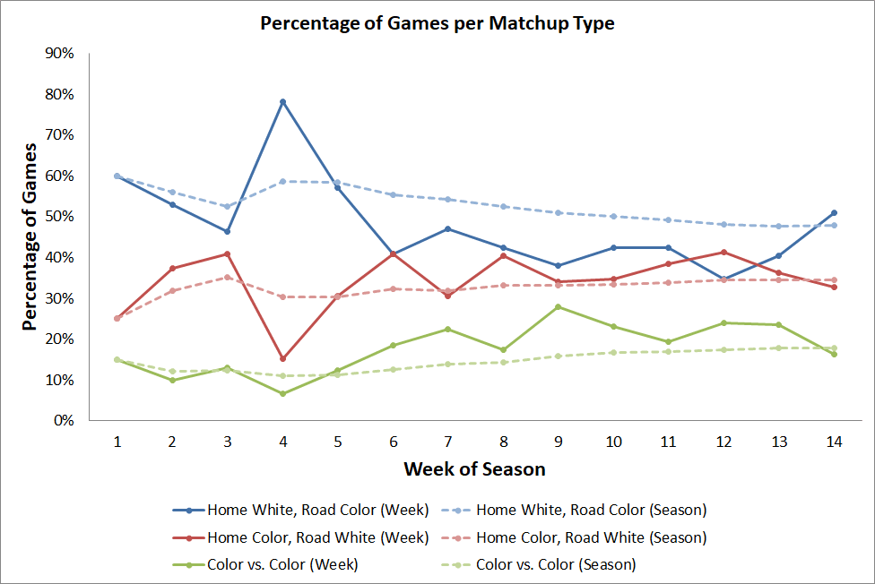
Several observations from this week that jumped out at me:
• The Grizzlies wore their MLK-inspired alternate uniform. What stood out to me in that game, however, was that they paired it with black leggings. I think that makes sense given that the lettering on the uniforms is black, but I will be interested to see if any other teams introduce a new color into their “accessory” rotation that is specific to their alternate uniform design. Previously Memphis had only worn white or blue leggings.
• On Tuesday, for the first time since Nov. 10, Orlando won a game while wearing blue. They had lost nine straight games in that color.
• Miami wore their “regular” black uniform for the first time since October 28. They had worn their throwback black set 16 times since that date.
• The Raptors’ loss at Minnesota on Saturday was the first time they lost a game on the road while wearing their white uniform. They had previously been 7-0 in that set. They remain undefeated while wearing white at home.
• New Orleans continues to be the team most likely to wear contrasting tights and/or socks instead of the unitard look. New Orleans has worn mismatching accessories in 26 of 45 games (58%). No other team has done so in more than half of its games.
• The Spurs have donned their silver alternate for seven games. All seven have been color vs. color matchups.
• One late item from last week: On Jan. 13 we had our first game with one team in grey (San Antonio) and the other in yellow (Denver).

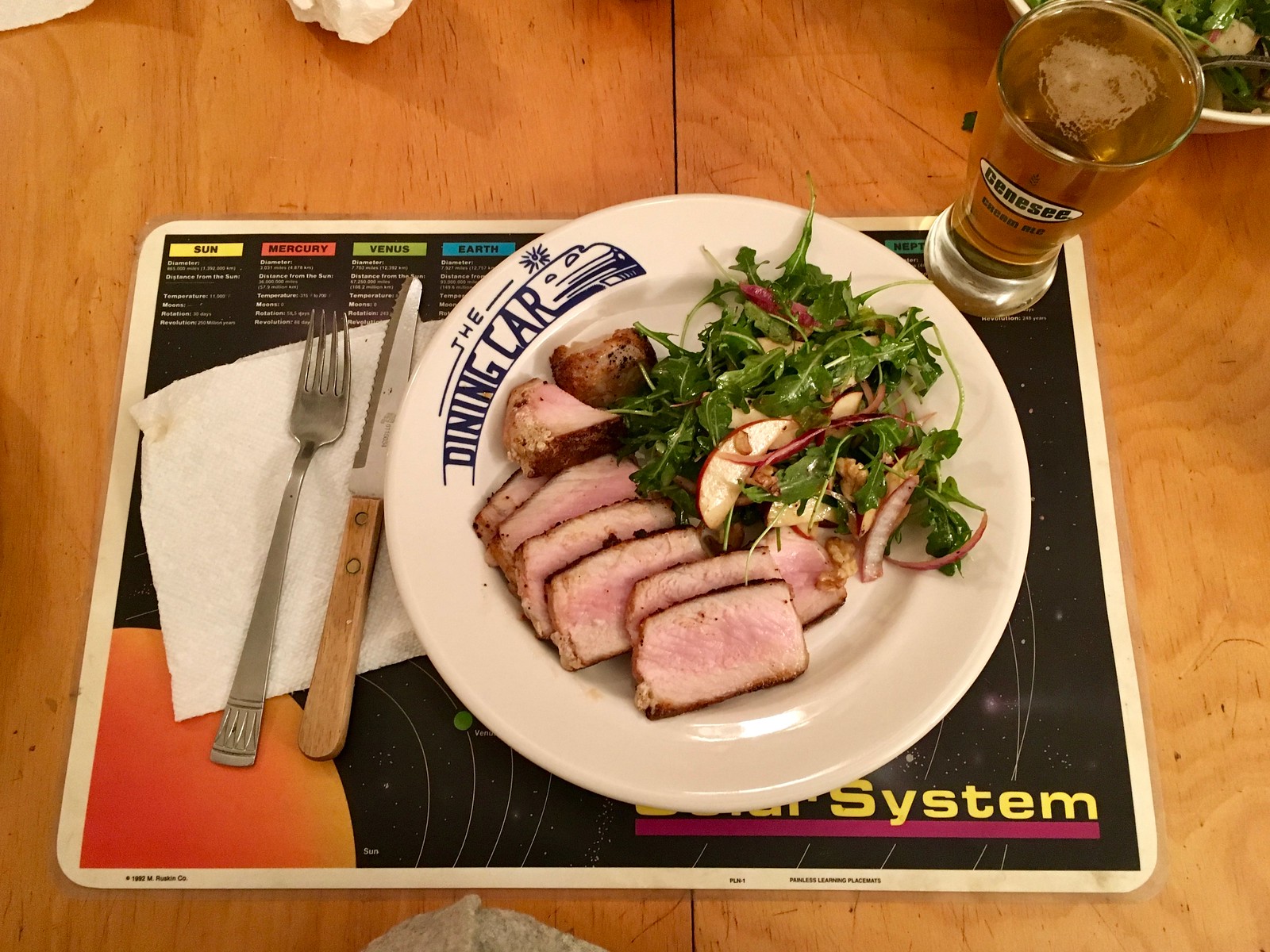
Culinary Corner: Want to cook a perfect pork chop? It’s not hard: Heat a tablespoon or two of olive oil in a very hot skillet and then sear the chop — two minutes on the first side, then one minute on the other side. Then reduce the heat to low-ish medium, partially cover the skillet, and continue to cook for three minutes per side (or four per side for particularly thick chops, like the ones I’m about to show you).
That’s the method I used the other night for two thick boneless chops that had been sitting in my freezer since last May. This was supermarket pork, which doesn’t have much flavor, so I treated the chops with a spice rub, which created a nice blackened effect in the skillet. The meat turned out a perfect rosy pink; meanwhile, the Tugboat Captain made a really nice arugula salad with apples and walnuts. So simple, so good (click pics to enlarge):
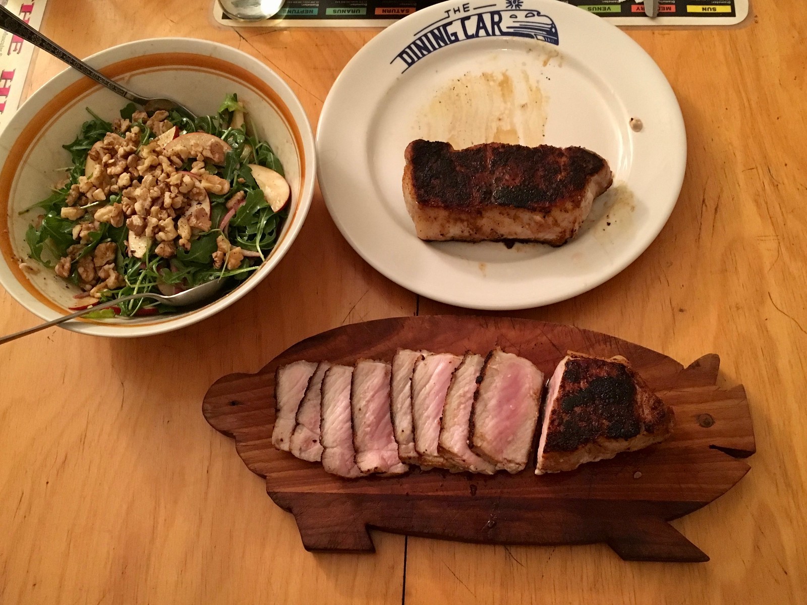
And yes, I have a pig-shaped cutting board. I don’t use it exclusively for pork products, but it’s particularly satisfying to use in situations like this one.
Naming Wrongs update: It’s been well over a month since our last round of new Naming Wrongs designs, but Scott M.X. Turner and have been working on a new batch, which is now ready to go. One at a time:
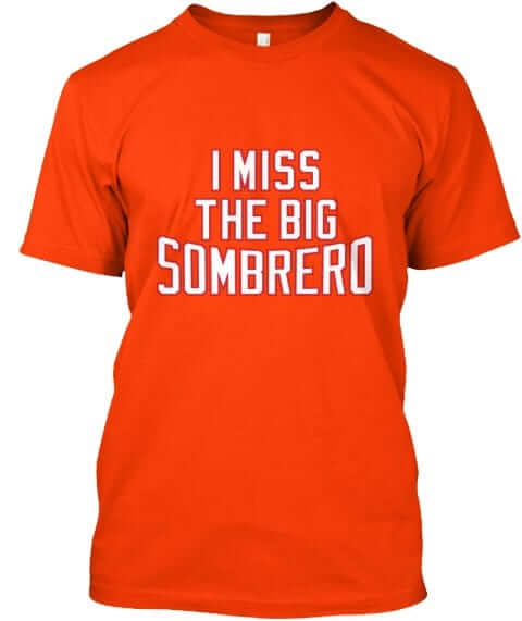
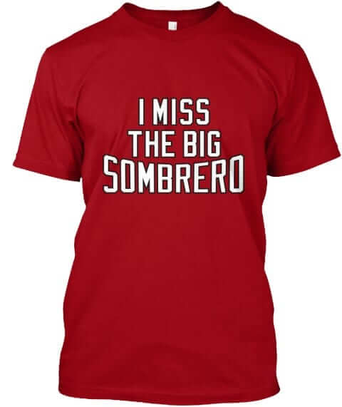
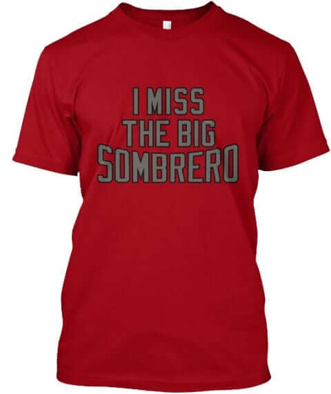
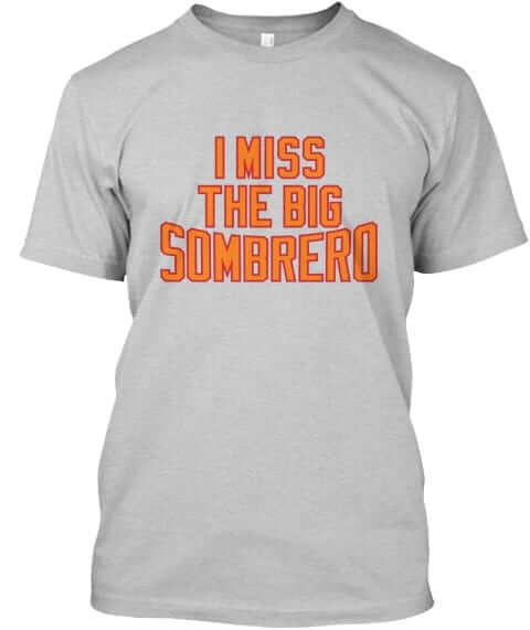
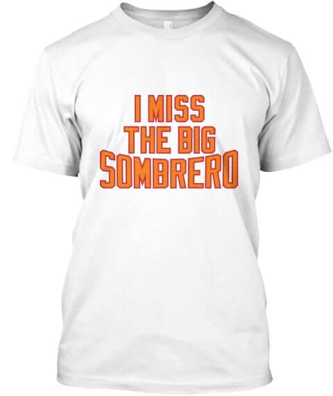
The Big Sombrero: Got a few requests for this one from Tampa fans. It’s available in orange, red with white type, red with pewter type, grey, and white:
———
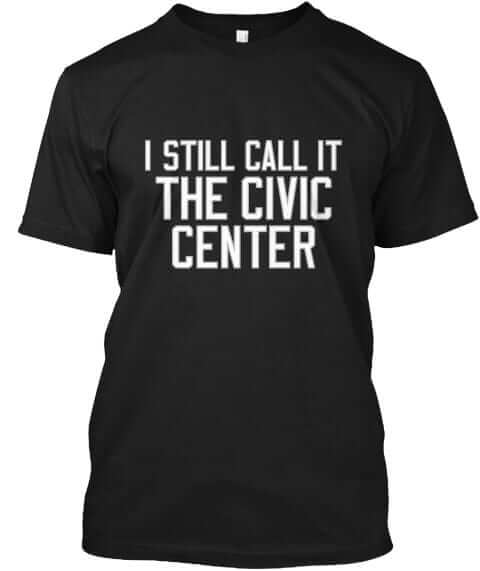
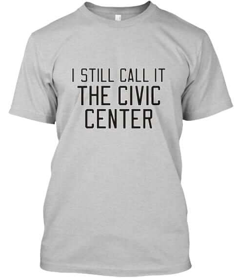
Providence Civic Center: For all you Friars fans out there, this one is available in black and grey:
———
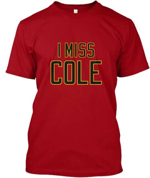
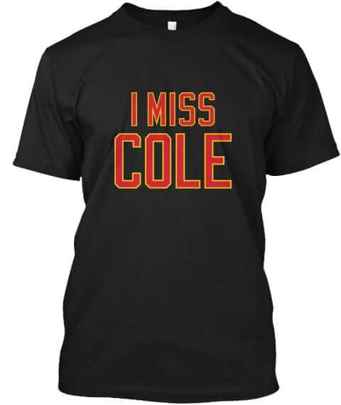
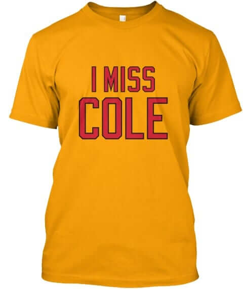
Cole Field House: Xfinity Center, my ass! This one’s available in red, black, gold, and grey:

———
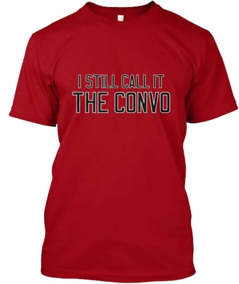
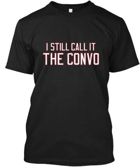
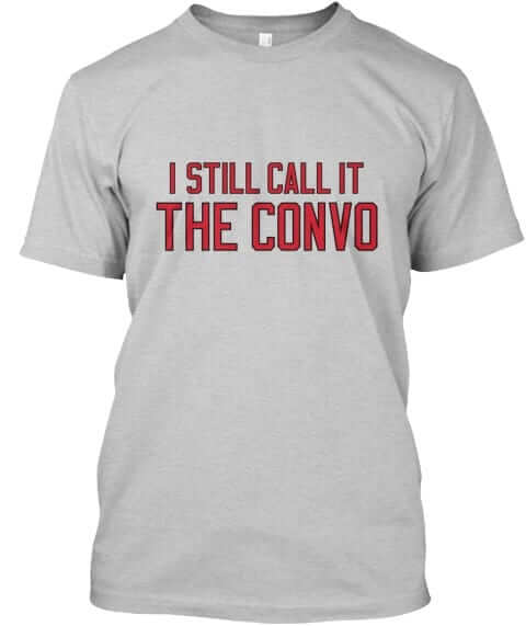
The Convo: Arkansas State hoops fans, this one’s for you. Available in red, black, and grey:
We have one more design in the works, which I hope to share with you tomorrow.
All of these designs are now available in the Naming Wrongs shop. They’re also cross-listed in the Uni Watch shop, where card-carrying members can get 15% off. (If you’re a member and need the discount code, send me a note and I’ll hook you up.) My thanks, as always, for your consideration.
The Ticker
By Jamie Rathjen

Baseball News: We received some vintage Tigers photos from Jack Spooner, including several players with three-digit uni numbers (presumably from spring training) and a batboy with a “Mascot” NOB, as well as first baseman Hank Greenberg holding a Yankees jersey. We’ve seen at least that last one before, but it has an interesting story behind it. … Thomas Juettner found this White Sox picture on Getty Images captioned as from the mid-1910s, but with a puzzling dark uniform. He believes it’s from the team’s 1914 world tour with the Giants, specifically the Feb. 26 game at Stamford Bridge (Chelsea’s stadium) in London. … The NHL’s Anaheim Ducks wore Angels-themed warmups yesterday (from Tyler Johnson).

Football News: The Jaguars are the London’s de facto “home team,” so Wembley Stadium arch was lit up in Jags colors (well, teal-ish and gold) yesterday (from Mark Johnson). … In Canadian university football, the University of British Columbia will wear a new gold helmet, says Wade Heidt, who thinks this may be part of a new alternate uniform, as the Thunderbirds’ colors are usually royal blue with yellow, not gold.

Hockey News: Wisconsin added a memorial decal for former center Jim Johannson (from Jerry Nitzh). Johannson was a Whalers draft pick in 1982, but spent his entire career in the minor leagues. He played for the United States at the 1988 and 1992 Olympics and the 1992 World Championship and later worked for USA Hockey; he was the general manager of the current Olympic team. … Roger Krafve picked up a hat worn by the bus driver for the minor league Minneapolis Bruins ca. 1963-64. It was made by a company called Unitog, one of whose catalogs Paul once wrote about. … Cross-listed from the baseball section: The Ducks wore L.A. Angels-themed warmups yesterday (from Tyler Johnson).

Basketball News: Iowa marked the 25th anniversary of the passing of former player Chris Street by placing his jersey on the bench and wearing special warmup shirts Saturday against Purdue. … Texas wore white on the road against West Virginia (in yellow) on Saturday (from Kenny Kaplan). … North Carolina women’s coach Sylvia Hatchell received a No. 1000 jersey and several other mementos, as well as a banner, for reaching 1,000 career wins (from James Lee Gilbert). … British Basketball League team Cheshire Phoenix have nearly illegible blue numbers on a blue jersey (from @SplitFocusSport). Their white jerseys have the same problem. … Loyola (Ill.) and Valparaiso played a color-on-color game (from Scott Held).

Soccer News: Reader Omar Jalife was at the Football Museum in São Paulo and saw the shirt Pelé is purported to have worn when scoring in the 1970 World Cup final. Omar has documented for us in the past that that was the last World Cup finals game before logo creep set in in 1974. “It was fun to discover they had Umbro uniforms” from the shirt’s tag, he says. … The new NWSL No. 1 draft pick, Stanford midfielder Andi Sullivan, posed with last year’s Washington Spirit shirt, which she likely won’t actually wear next season. Ostensibly to avoid that situation, draft picks in both the NWSL and MLS usually pose with scarves instead. … Continuing in the NWSL, former Seattle Reign and USWNT goalie Hope Solo received a No. 200 shirt at yesterday’s national team friendly against Denmark. Solo reached 200 caps (i.e., appearances) for the USWNT during the 2016 Olympics. … Scottish League One (third tier) team Alloa Athletic changed at home from gold/black to dark blue in a Scottish Cup match, because opponents Dundee United’s mono-orange and mono-black kits would have both clashed with them.
Photo by Mary Bakija; click to enlarge

What Paul did last night two nights ago: I’ve mentioned the awesome New York indie-rock band Scupper several times now. Saw them play again on Saturday night, at Muchmore’s, where the bandstand was so tiny that lead guitarist Noah Gordon had to have his foot up on a stage-adjacent chair for much of their set.
They deserve a bigger stage, and a bigger audience. You can help by checking out their tremendous new album, Some Gauls, which is embedded below. If you like it (and it’s hard to imagine anyone not liking it), do the right thing and pay for the download, or even order the physical vinyl LP.
Scupper’s next show is two Saturdays from now, Feb. 3, at the Cobra Club. You know what to do.
Proofreading:
“such teams have a 6-8”
“For the first time in over a month December”
More proofreading:
“officials in greased the lamp poles in Philadelphia”
All fixed.
Crisco party!! I like this kind of party!
link
Paul, you’ve mentioned in recent weeks that there are certain Patriots players that have their shoulder numbers encroaching on their striping. I was looking closely at the game yesterday, and it appears that there are two styles of patriots jerseys: one like that of Amendola which has a very large silver stripe, and one like that of Brady where the silver striping is considerably more narrow. It looks like the cut or style of jersey that is having the shoulder issue is the style that running backs, receivers and defensive backs wear. While all other players have the cut or style of jersey with a considerably smaller silver stripe. Interesting that they don’t seem to have consistent stripe width. It seems different to me from the 49ers sleeve striping fiasco from a few years ago.
Cooks definitely had part of his numbers on the shoulder stripe yesterday
Scupper gig…
“…the bandstand was so tiny…”
Ummm, that is supposed to be the drum riser!!
I’ve noticed Brady wears the short sleeve scuba shirt underneath his jersey since it’s black and the designated sleeve color is Navy.
“This will be the seventh Super Bowl in which both teams have three colors other than white in their color schemes… the Giants (blue, red, grey)…”
Do the Giants officially list gray as a team color? I’ve always viewed them as a blue and red team. Their use of gray seems to be in the same manner as baseball teams wearing away gray uniforms.
A good question, but whether they “officially list” it or not, they wear gray pants on the road and, until recently, at home as well, and the white pants they use now have gray stripes, so it counts as a team color. Football uniforms obviously don’t work the same way baseball uniforms do; the point about gray road uniforms is interesting but the analogy is better-suited to the use of gray facemasks, which traditionally were more utilitarian than aesthetic and which every team in the NFL once used. Put another way, every MLB team has a gray road uniform but not every team in the NFL has gray pants, and most never did.
Totally, gray isn’t ubiquitous in the NFL like it is in baseball. And the gray stripe on the white pant is an excellent point for it being a team color. Probably nitpicking, I just don’t really see gray as anything more of an element to the Giants pants. It’s not featured in their jersey, their logo or wordmark logo, etc. I have viewed the Giants use of gray since they adopted their quasi-throwback design as a nod to old fashioned uniforms when white pants weren’t the norm.
Compared this to say, Seattle which incorporates gray into their logos, all of their uniform, and merchandise.
Even “when white pants weren’t the norm,” I don’t think that gray pants were ever the norm in the NFL. In link, for example, 5 of the 13 teams had white pants, 4 had gray pants, and the rest had some other color (yellow, tan or green). In link, only two teams had gray pants. In link, the teams all had tan pants. So maybe tan pants were once the norm, but by the mid-1930s teams were wearing all different pants colors, including gray and white, very often changing them year-over-year and using multiple pants colors in individual seasons.
Proofreading: “Tom Bady’s” in the very first paragraph.
Gah. Fixed.
Typo or Freudian slip?
It could be argued that the Falcons helmet logo is in fact a letter F. That design was not a coincidence, nor was the original logo the Falcons used prior to this one.
While the logo resembles an F, I would say that it is not a letter in the same way that the Giants or Bears have letters on their helmets. Especially since the Falcons’ logo gets mirrored on the opposite side of the helmet. The logo is a bird who also happens to be positioned in an F shape, it is not an actual letter F.
I agree. So it’s an F as long as they’re moving to your right, but from the other side, not so much. So I don’t think that qualifies as a functional “F”.
Well… yes and no. In cursive, a Capital “F” customarily faces left, though one could argue the exaggerated shape is a flourish and not part of the essential letter. But to argue the helmet emblem mimicks a Roman “F” on one side and a Longhand one on the other is imbuing the insignia with dexterity it never pretended to have.
For it to be a functional “F”, it would have to either like the Bears helmets, where they share the same decal, or like the Chiefs, which changes direction of the overall decal, but keeps the letters facing the same way.
Having a forward-flying bird on one side of the helmet and a backward-flying one on the other would be a source of mockery.
Maybe I’ve missed it, but has it been discussed how the Vikings jerseys numbers are different from each other when one numeral is the first digit (with seriphs) and that same numeral is the second digit (without those same seriphs) (that’s probably the best way I can explain it). You notice it best on players who wear numbers like ’22’. Does any other team in any other sport have different style numerals depending on whether it’s the first or second number on the jersey? And if this has been discussed before, I’m sorry cause I missed it. Just thought this was very interesting
Yes, it has been discussed before.
It’s been that way since 2013. We’ve discussed it, but probably not all that recently. The 10’s digit has the “sail” font, while the 1’s digit is a “normal” font. If a player has only a single digit number, it carries the “normal” font.
It’s annoyingly stupid design.
It’s been discussed at length since the team’s current uni design was introduced in 2013.
No other team does this, because no other team is stupid enough to have such an asinine typographical system for its uni numbers.
As bad as it is, it’s not nearly as bad as link or link.
Or link.
I’m not aware of any other historical examples, certainly not in the NFL, or in MLB.
Wayne may have signed that jersey, but that’s most definitely not an authentic numbering job on that one. link is what the Blues’ angled numbers actually looked like, and link the road blue version.
OK; the only purpose was to point out other examples of “any other team in any other sport hav[ing] different style numerals depending on whether it’s the first or second number on the jersey” which was the OP’s question.
As bad as the Vikings variable number idea is, I’d still rank the Jags helmet, Bucs alarm clock number font, Dolphins tramp stamp, Rams white nonsense, and Browns word stripe pants as worse for NFL uniform design sins.
So, sixth worst uni design sin in the NFL? That’s still pretty bad. And generous, to my mind. I’d rate the Vikings numbers as worse than the Bucs alarm-clock font, and maybe worse than whatever we call what the Rams are doing right now. Each mismatched element of the Rams uni is basically fine on its own; they just don’t work together. Whereas the Vikes number thing is irredeemably bad on its own, even though some of the numbers actually work nicely with the rest of the jersey.
I’m with RS. Every word of it.
I disagree. The Isles and Blues tried irregular stripes (curvy and slanted, respectively) and made the numbers to be faithful to the design. The Vikings did not have such design limitations, as there are no stripes or design elements on the body of the jerseys to work around. They did a stupid thing to get attention, it is just the wrong kind of attention. None of the Arabic 0-9 numerals lens themselves to being shaped that way, and very few of those same numbers nest well into the design element; consider “41” or “54”. you could argue that the Isles/Blues designs forced them into using weird numbers, which is true. But it least it harmonized with the overall (awful) aesthetic of the design. The Vikings didn’t even do that much.
Culinary corner has reduct instead of “reduce”
Thanks. Fixed.
Nick Foles uniform in the NFL graphic makes him look like he may have been suiting up for the U. of Saskatchewan Huskies from a few years back:
link
When I think of Crisco Party, I immediately think of the 1975 cult comedy The Ritz. Just don’t invite Chuck (Bednarik).
link
Big shout out to your Genesee Cream Ale glass!
I didn’t see it talked about in the column or comment, but the confetti that fell on the Eagles last night looked like Kelly green to me. I cut the cord so I don’t have a DVR to look closer but surely one of y’all has it recorded right?
Paul, if you ever wanted to add a humorous twist to the Naming Wrongs line of shirts, you could do worse than “I Never Called It Charlotte Bobcats Arena”.
The Saints, like the Giants, are also a team who wore their primary logo in what is not technically the official color of that logo on their helmets in a Super Bowl. The Saints true primary mark for the season leading to Super Bowl XLIV (and continuing to today) was the gold fleur-de-lis, while their helmets, obviously, display the black version.
People cook pork to death. Stop the cooking at 137 internal and cover and rest.
The Cole shirt is also appropriate for Pirate fans missing their former pitcher.
Jamie, thanks for the Hank Greenberg link in The Ticker. A great ball player and a great man. I kind of like the simplicity of those ’47 Pirates unis.
Could the British Basketball League’s Cheshire Phoenix be channeling their inner Harold Ballard with those white numbers on white and blue numbers on blue jerseys? Just a thought.