
For all of today’s images, you can click to enlarge
Today we have something very, very special — a 1965 promotional brochure from a company that made uniforms for stadium workers. It involves a lot of reading, but trust me when I say it’s worth it.
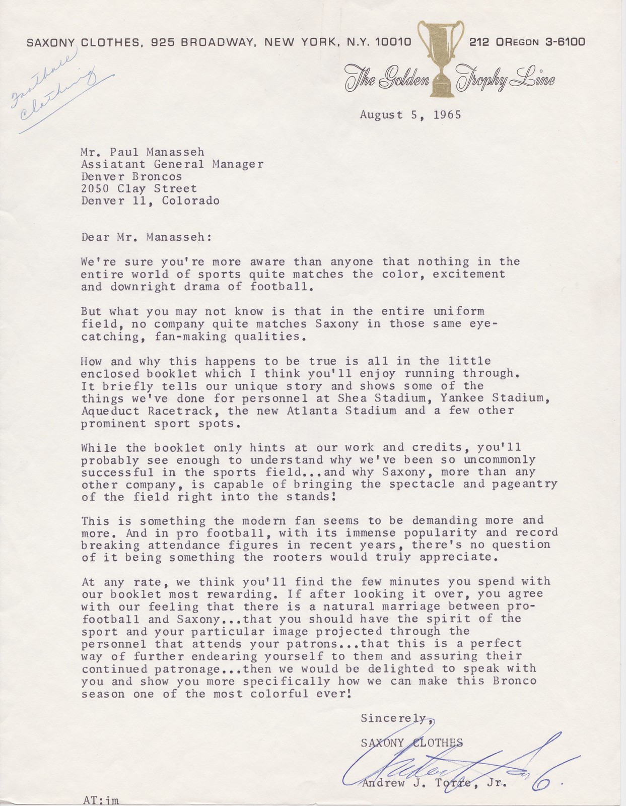
The brochure was sent to Denver Broncos assistant GM Paul Manasseh and later acquired by longtime Uni Watch reader Tom Jacobsen, one of the nation’s foremost collectors of Broncos memorabilia, who recently loaned the brochure to me. It was made by a now-defunct New York company called Saxony Clothes, which for many years had specialized in making uniforms for hotel and restaurant workers. Then, in the early 1960s, they decided to expand into stadium apparel. Here’s the cover letter that accompanied the brochure:
The first page of the brochure is a bit cheesy but sets the scene nicely and gives a bit of background on the company:

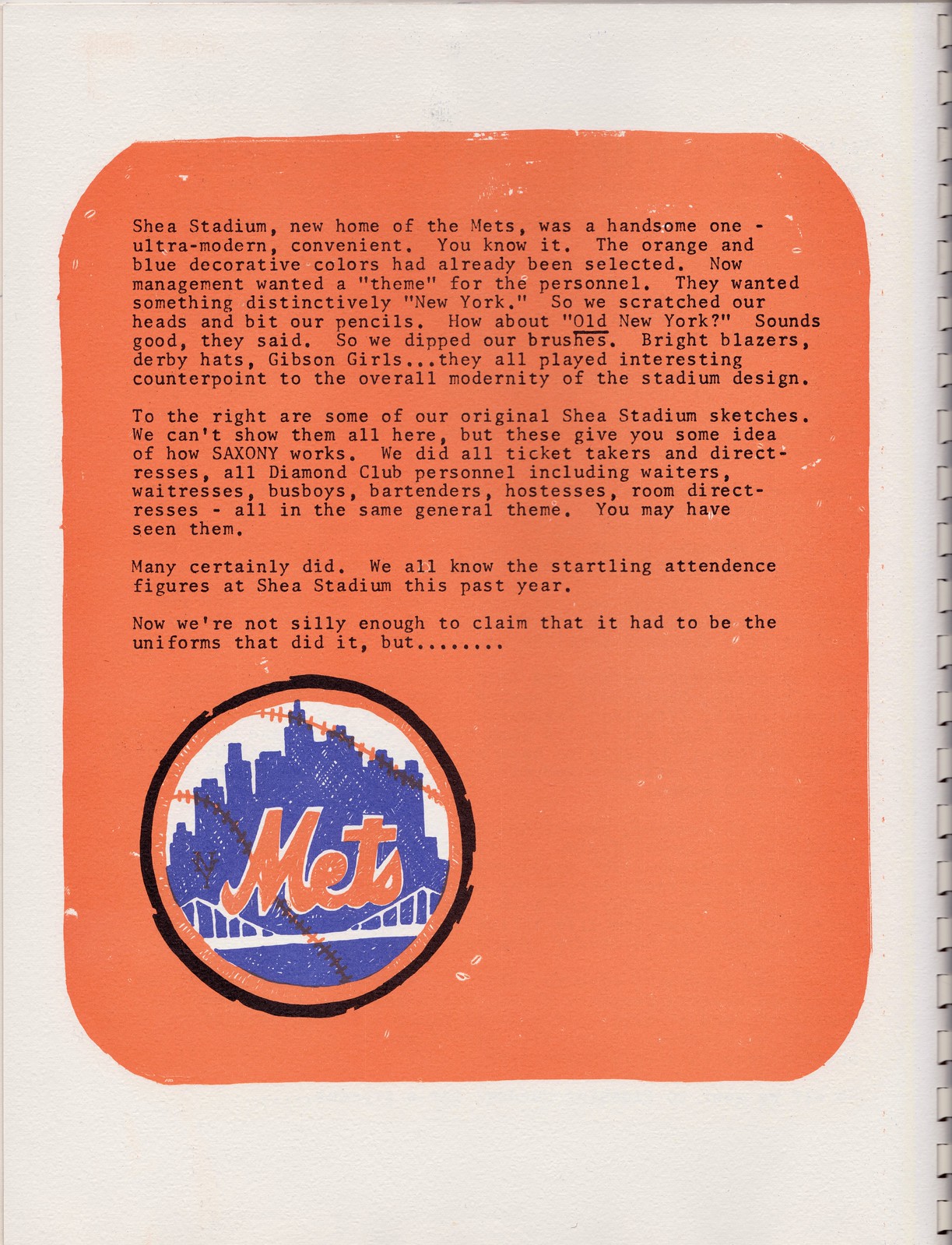
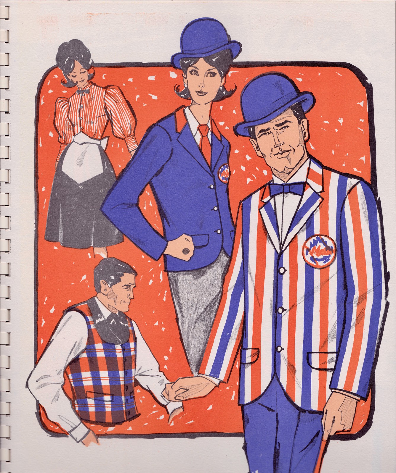
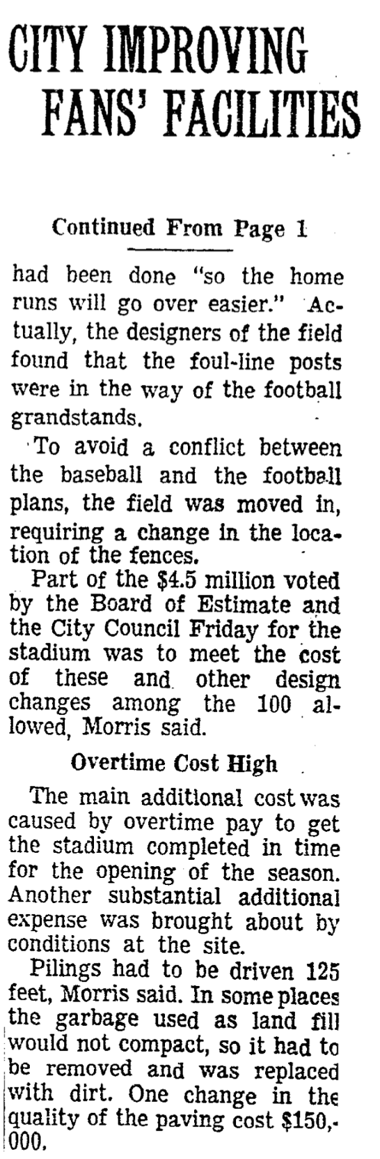
The next two pages describe how Saxony created uniforms for Shea Stadium, which had opened as the Mets’ new home the year before. Check this out:
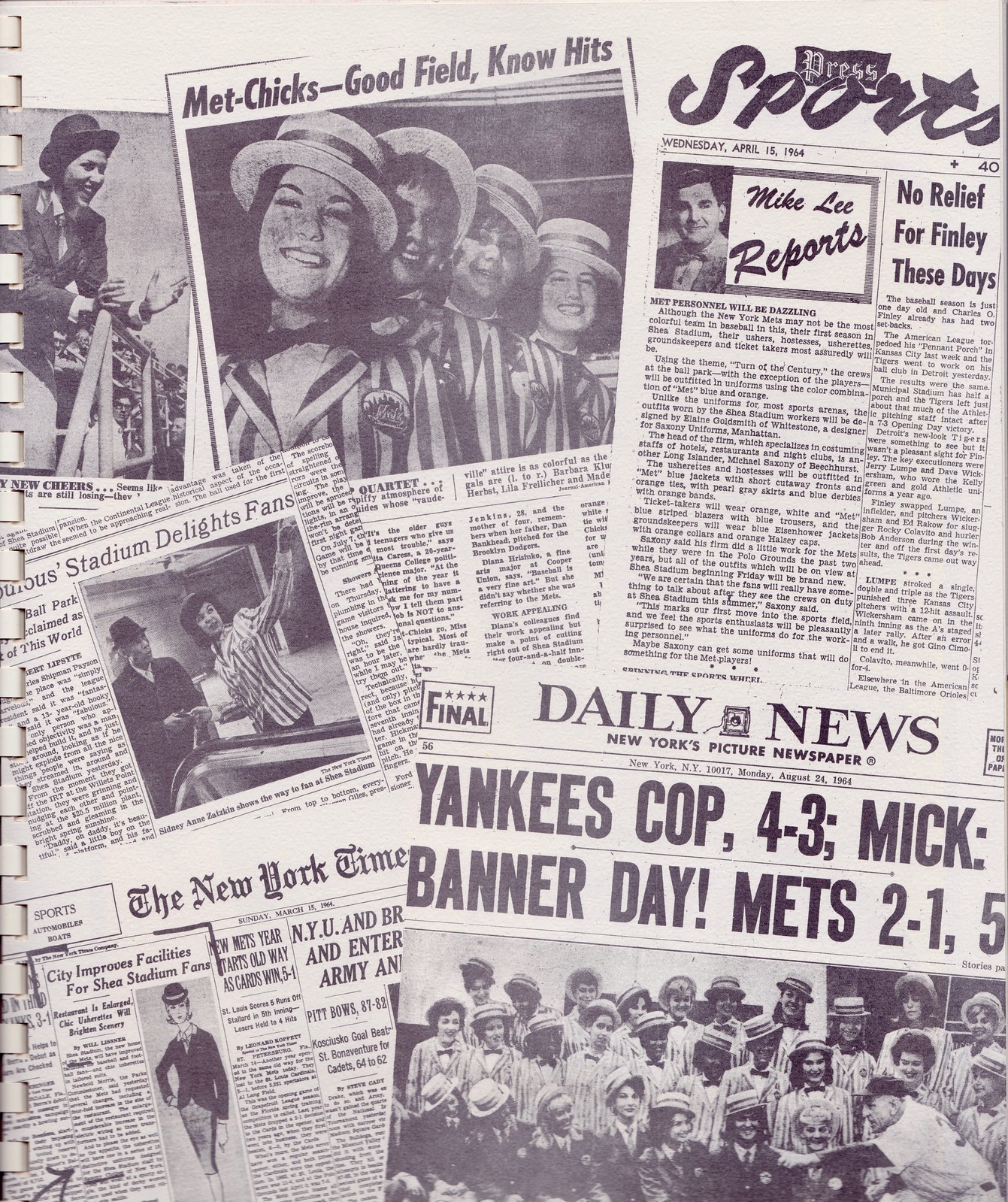
The Shea attire was apparently a hit, because the next page in the brochure shows a bunch of newspaper articles referencing the new apparel:
I’m a lifelong Mets fan and was not aware of any of this. Some teams are famous for having had fancy employee uniforms back in the day, but I’d never heard anything like that regarding the Mets.
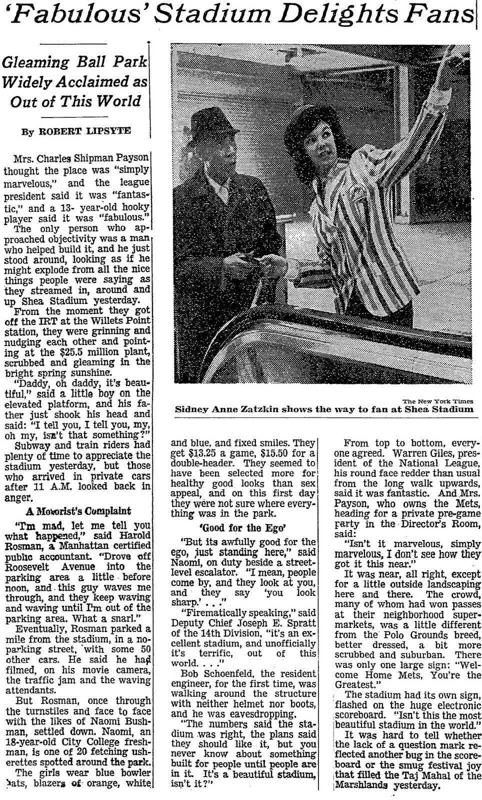
Let’s take a closer look at those newspaper clippings. Two of them are from The New York Times. Those were easy for me to track down. First there’s this one, from March 15, 1964:

And then there’s this one, from April 18, 1964. It mentions the “fetching usherettes” wearing “blue bowler hats, blazers of orange, white, and blue”:
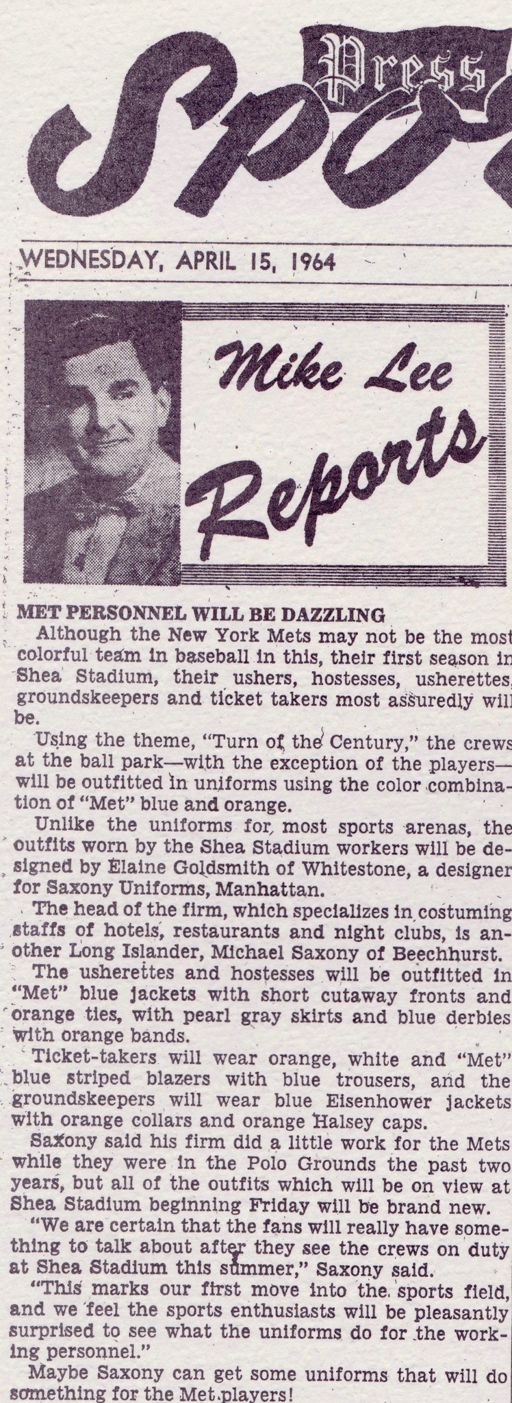
There’s also a clip from the old Long Island Daily Press, a paper that went out of business in 1977. This clip is from April 15, 1964. Although it has no visuals, it has a bunch of good information about the stadium uniforms, including the name of the Saxony designer who created them:
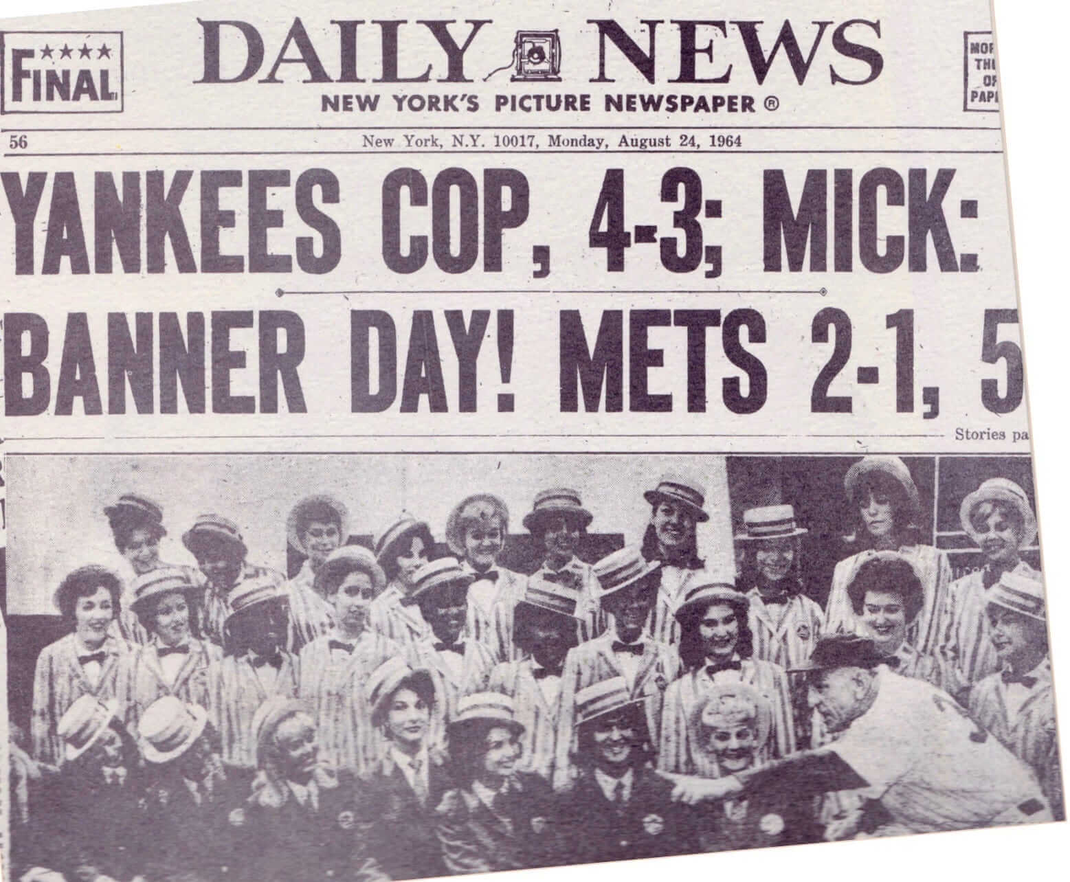
There’s also a clip — it appears to be the back page — from the Aug. 24, 1964, edition of The New York Daily News. The News, somewhat surprisingly, does not have an online archive, and I haven’t had time to go to the main branch of the New York Public Library to look up the microfilm (anyone want to tackle that one?), but we can see most of the clip as it’s shown in the Saxony brochure. It appears to show Mets then-manager Casey Stengel with a bunch of usherettes wearing the Saxony uniforms:
Finally, there’s a clip from the now-defunct New York Journal-American. No online archive for that either, but here’s the portion of the clip that’s shown in the Saxony brochure:

That’s some serious Mets history right there!
But there’s a lot more in brochure. The next spread features the stadium apparel that Saxony prepared for Shea Stadium’s other tenants, the AFL’s New York Jets:
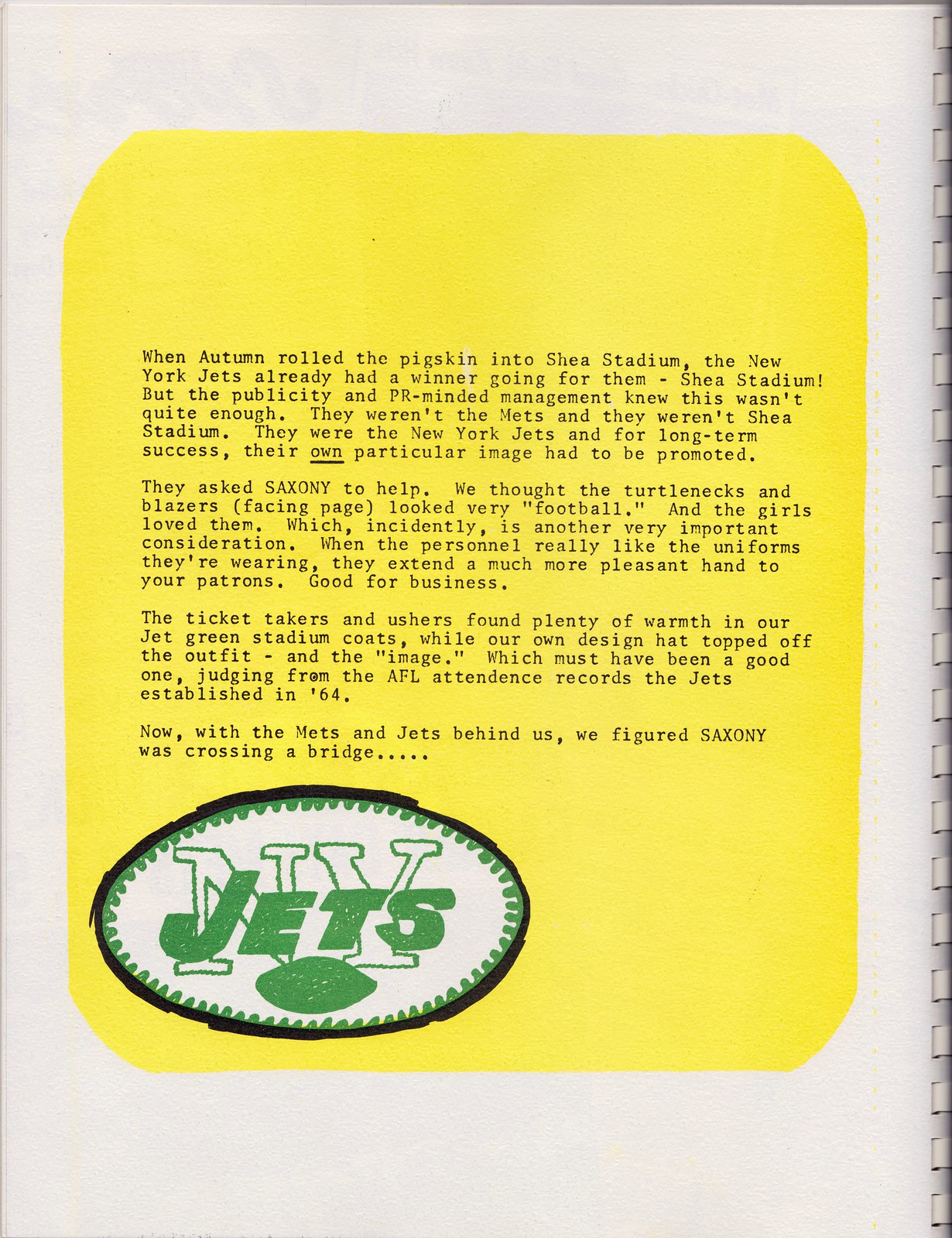
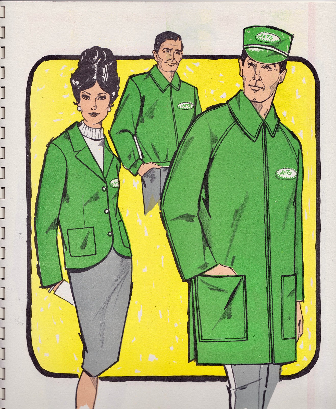
Unfortunately, the brochure does not show news clippings for the Jets attire (or for any of the other non-Mets designs).
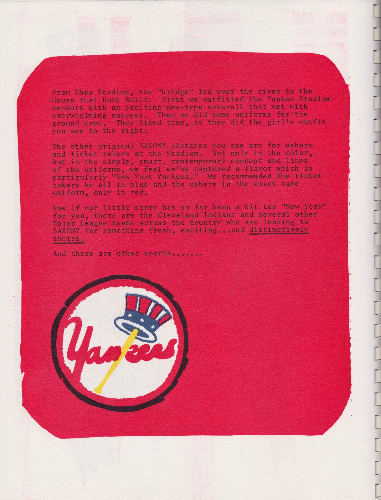
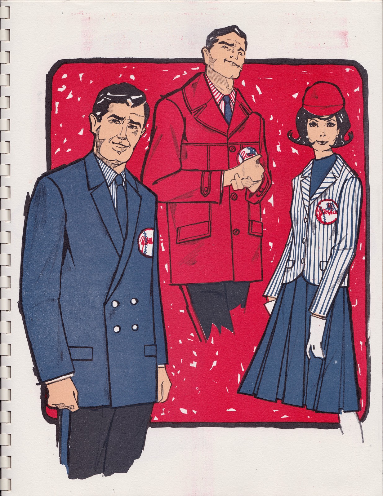
Next up: Yankee Stadium, which was another Saxony client. Check it out:
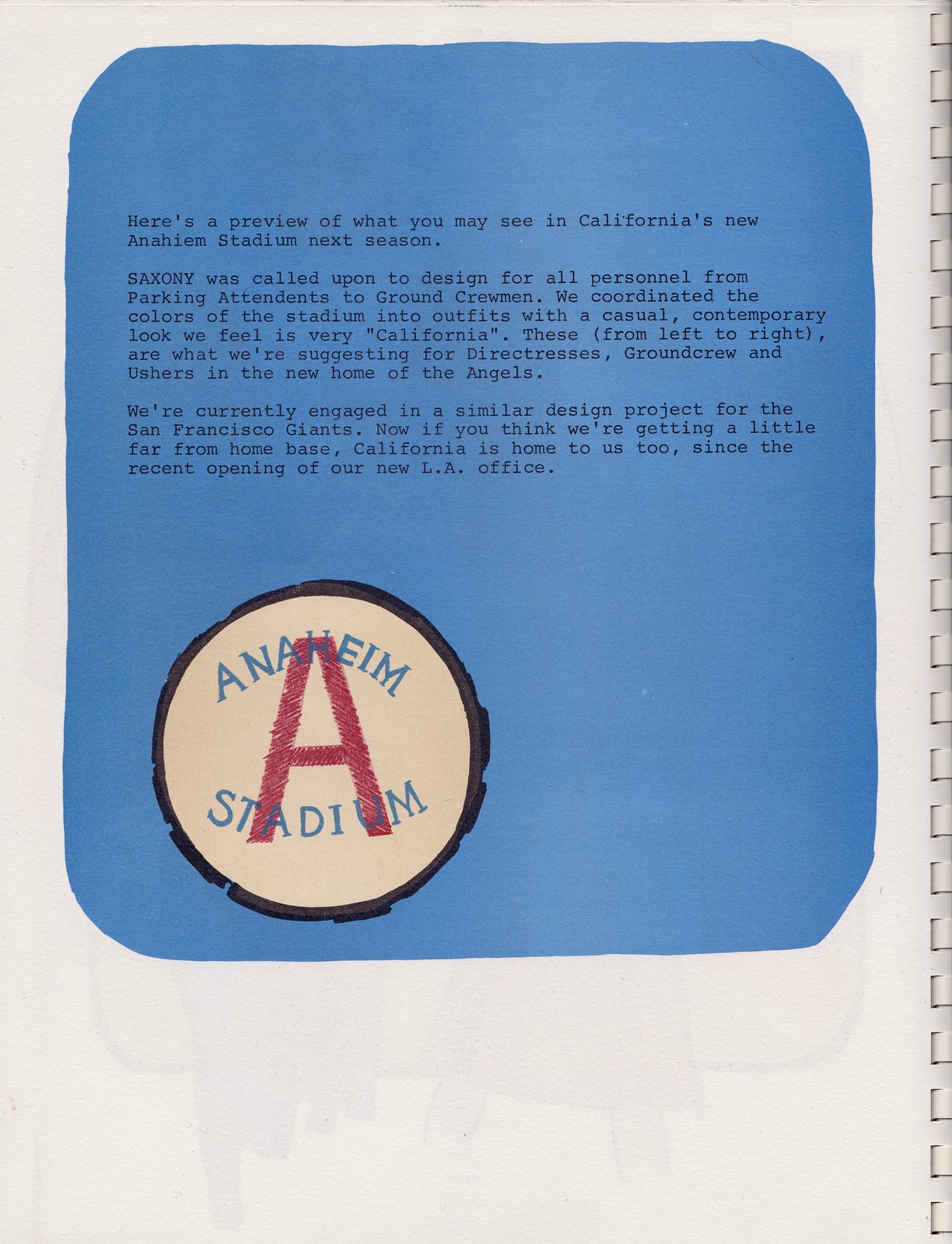
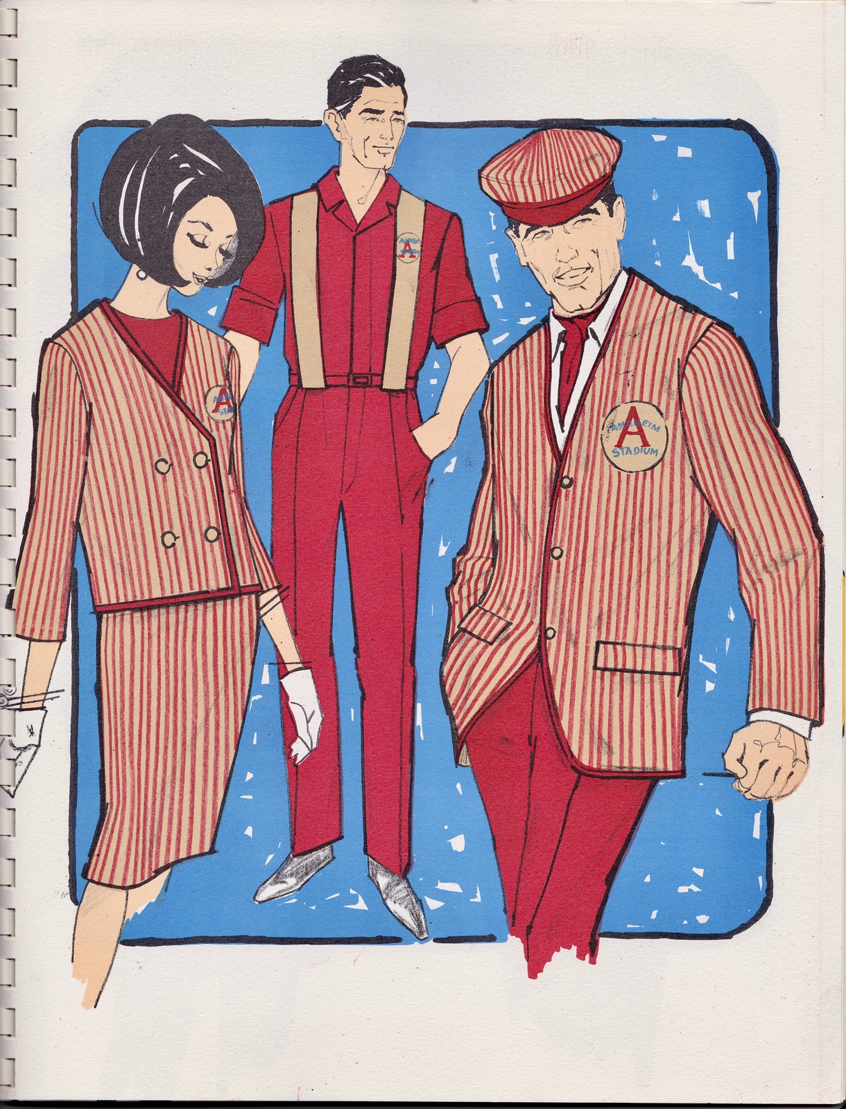
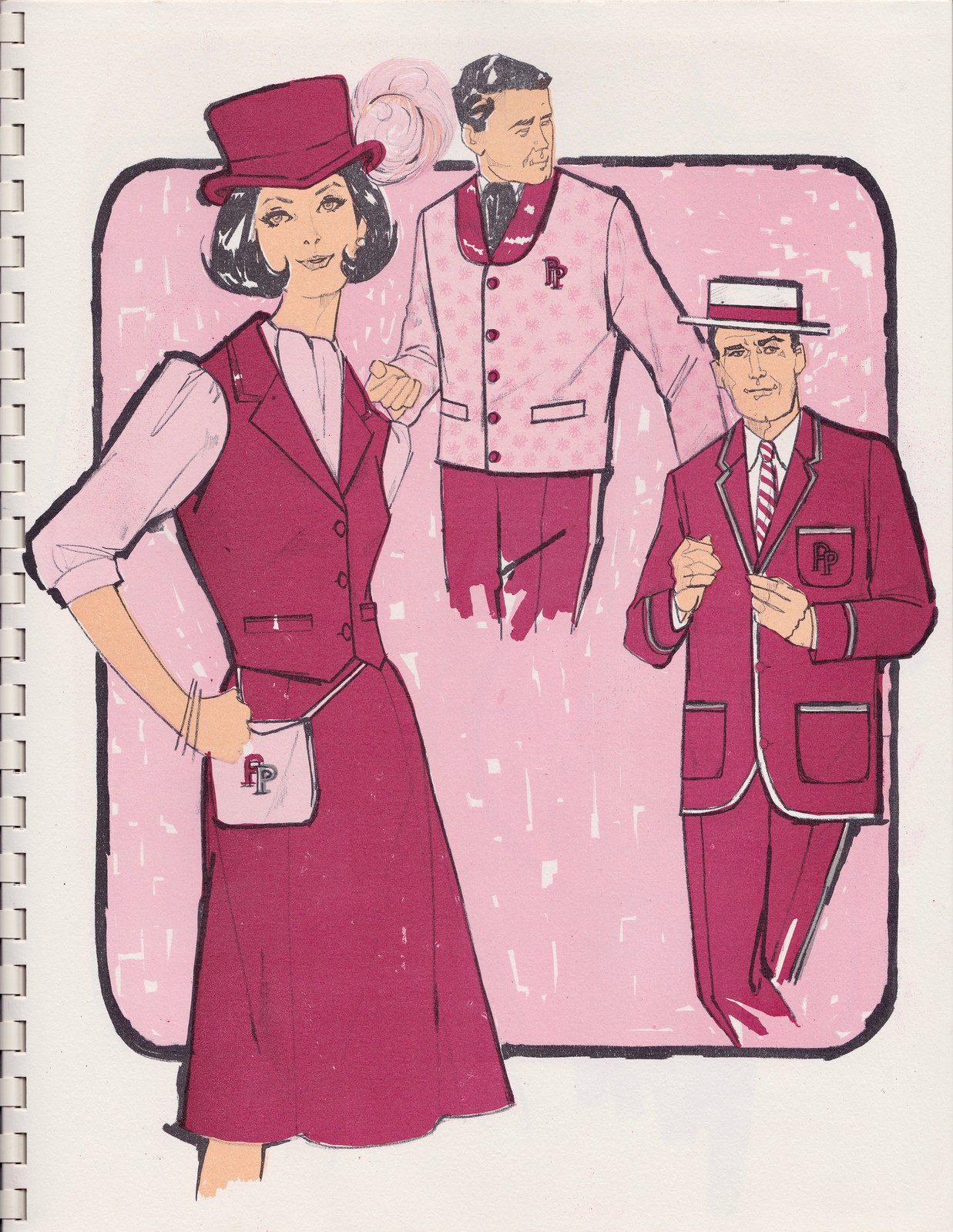
When this brochure was sent out in 1965, the Angels were preparing to open Anaheim Stadium — the Big A — which would open its doors in 1966. Saxony was working on uniforms for them as well:
Fulton County Stadium in Atlanta was also getting set to open in 1966, and Saxony was working on designs for that too. This is the strangest spread in the brochure, as you can see here:
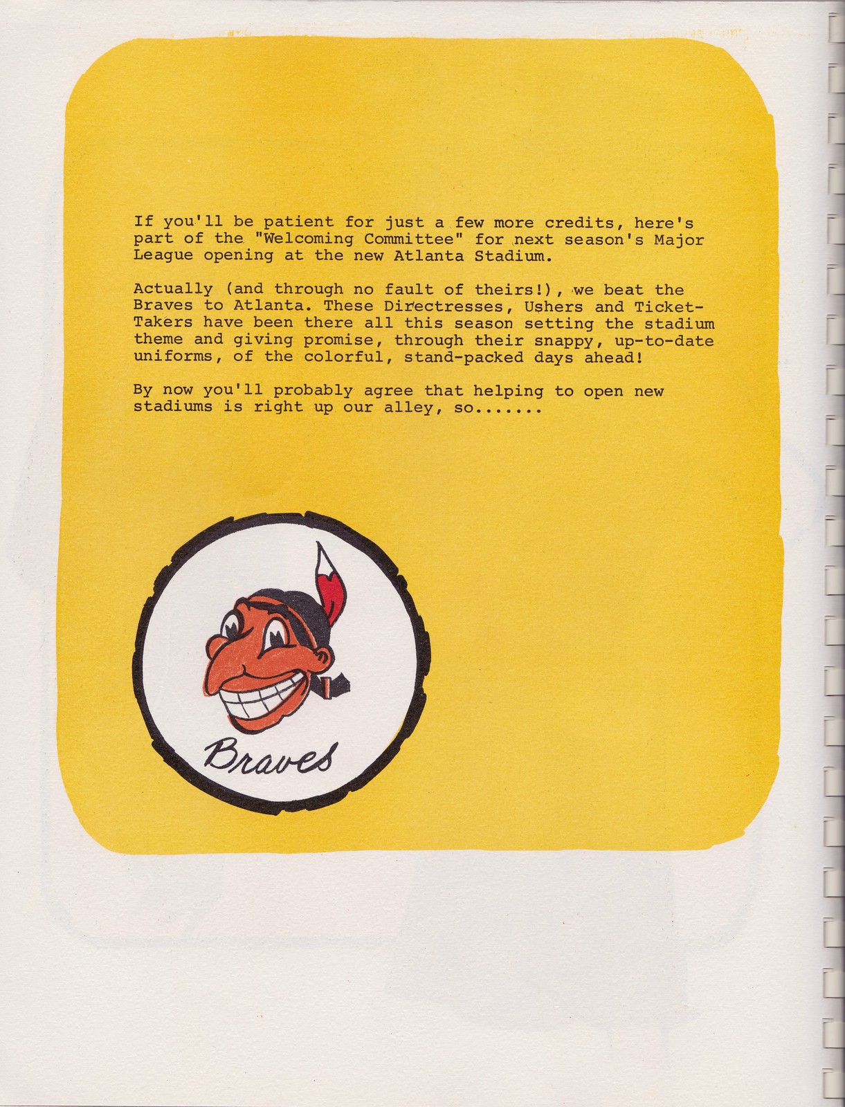

Obviously, that’s the early, late-1940s version of Chief Wahoo, not the Braves’ whooping Indian. Hard to understand how they got that wrong. (And yes, this version is even more unacceptably racist-looking than the current Wahoo.)
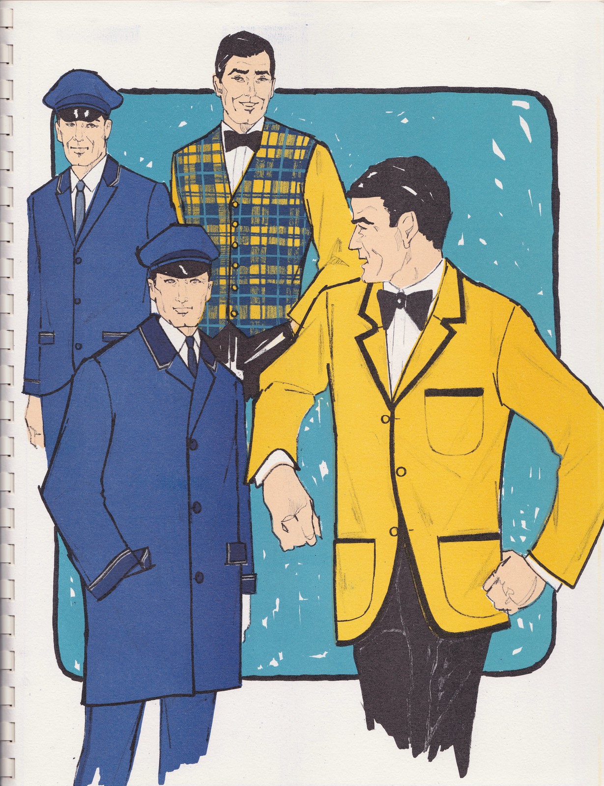
The brochure concludes with two spreads about uniforms for horse racing tracks — Pompano in Florida and Aqueduct
———
And that’s it. It’s a pretty remarkable document, and in pristine condition. Doubleplusthanks to Tom Jacobsen for sharing it with me. (Tom has also acquired lots of other interesting Broncos- and NFL-related documents, at least one of which is of major historical importance. I’ll be writing about that shortly for ESPN — stay tuned.)
The Ticker
By Alex Hider

Baseball News: Padres fans who want to #BringBackTheBrown will have to wait until 2020 — at the earliest. More on that here (from Phil). … Hall of Famer Reggie Jackson was spotted on the links wearing a cap with “Mr. October” embroidered on the back (from Frank McGuigan). … Antiques Roadshow featured a 1914 Red Sox sweater on a recent episode (from James Gilbert). … We’ve covered this before, but Tim Donovan found this photo of former Indian Joe Charboneau wearing small “Press Star” patches. The Cleveland media would give out the award weekly to players as voted on by readers. … Dakota State University has new tequila sunrise-style jerseys for 2018 (from Paul D. Vold). … New uniforms for Missouri State University (from Austin Schick and Ben Gross). … The Giants Photoshopped recent acquisition Evan Longoria into a Giants jersey with his familiar No. 3. But Longoria won’t be wearing that number, because the Giants have retired it for Bill Terry. The Giants’ roster page currently shows Longoria without a number (from @bdh_photos).

Football News: Not sure if this has been shared before, but apparently the old Metrodome was one yard short of a full-sized NFL field. One end zone was reportedly only nine yards long (from Jeff Flynn). … Yesterday’s Edmonton Sun cover story was about the CFL QB Kevin Glenn, who recently signed with the Edmonton Eskimos, making him the first player in CFL history to be on the roster for every team in the league. The cover featured the jerseys of every CFL team (from Martyn Bailey). … Team USA’s jerseys for International Bowl IX have been unveiled. More on the International Bowl here (from @josh_claywell).

Hockey News: The Blues have added an “MFS” memorial decal in honor of former team chairman Mike Shanahan, who passed away Monday (from @ctrauma). … Blackhawks C Jonathon Toews started a charitable foundation, which also has its own logo (from Marc-Louis Paprzyca). … Apple’s Siri apparently doesn’t recognize the Golden Knights’ logo — maybe she knows something we don’t about the ongoing trademark feud (from Micah Sledge). … The Kootenay Ice of the Western Hockey League will wear Cranbrook Colts throwback jerseys next season. The Colts operated from 1971 to 1998 (from Jim Wooley). … Former Libyan dictator Muammar Gaddafi once sponsored a German hockey team in the 1980s (from Johnny Garfield).

NBA News: During Monday’s Clippers/Rockets game, Blake Griffin had his tights ripped and torn by a Rockets player (from Paul Deaver). … John Sabol points out that ESPN has taken to using three-letter abbreviations for two-word cities on its scorebug. They used “NOP” for the Pelicans last night, and used “GSW” for the Warriors on Monday. … Alex Steinke found this photo of the Lakers’ James Worthy wearing an NNOB No. 00 jersey in a December 1987 game against the Celtics. Presumably a blood jersey. Anyone know more? … Here’s a piece on how the Bucks and Harley-Davidson are capitalizing on their jersey advertising relationship (from Ray Barrington).

College/High School Hoops News: Notre Dame and Louisville went color-on-black last night (from Andrew Cosentino). … A Toledo player was wearing one yellow shoe and one gray shoe last night against Ohio (from Michael Moamis). … Milnor-North Sargent High School in North Dakota uses the Bobcat construction company logo as its own. According to Greg Enkers, the company has a plant in town.

Soccer News: This drone video gives a good look at Tottenham’s new stadium (from Josh Hinton). … Reading FC changed kits at halftime of its match with Stevenage yesterday because their blue-and-white striped kit clashed too much with Stevenage’s red-and-white kit. Reading’s Jon Dadi Bodvarsson ended up scoring three goals while wearing two different jerseys (from Kevin and The Boot Room). … The Pittsburgh Riverhounds of the USL signed an endorsement deal with Adidas yesterday (from Harrison Hamm).

Grab Bag: Roger Federer wore shoes commemorating his five Australian Open championships the other night (from Chris Perrenot). … Speaking of the Aussie Open, a match between Ash Barty and Aryna Sabalenka caused a bit of a stir because of Sabalenka’s excessive grunting. At one point the crowd was mimicking the grunting, leading to an admonishment from the chair ump. … This golf cart seen at the Bob Hope Classic is outstanding. We need more golf carts shaped like people (from Leslie Blair). … For those who haven’t heard, Formula 1 has a new logo, but the new logo may infringe on a trademark (from James Gilbert). … The New York Times has a good profile on Brian Hanlon, the sculptor of many of the statues of athletes that appear outside of stadiums and arenas. … Need a refresher on the ins and outs of curling before the Olympics? The Washington Post has you covered (from Phil).
I wonder there are some pieces of those stadium crew uniforms still extant. I’d love to see that Jets hat, for instance. I also wonder how long it was before the above designs were replaced given the very rapid changes in clothing styles that followed 1965.
Wow!!! Those employee uniform sketches are amazing – a major find indeed!
Great lede – I’m a bit of a sucker for vintage ads, if this counts as one.
Proofreading: “International Bow” in football is missing an L.
In the Reading-Stevenage item, it’s not a Championship match, it was an FA Cup third round replay. Also, “clashed to much.”
Re: ESPN using three-letter abbreviations for two-word names, they (and NHL.com but not anyone else) have been doing that for the NHL for as long as I can remember – NJD, LAK, CBJ, etc.
Thanks, and fixed.
Might be too late for today, but that is actually TNT & NBA TV that uses the three-letter abbreviation for every team. Started doing that last season.
Paul any typos go right over my head no problem to me. I enjoy your work.
Makes me wonder how the Rams and Raiders were handled while still in Los Angeles together.
Pro Football Reference uses RAM and RAI, but how was it handled contemporarily? Especially since they played each other at Anaheim Stadium in 1994.
In 1994, was the score bug yet being used? I don’t know.
I was able to find the highlight package that ESPN’s NFL Primetime showed of the 1994 Raiders-Rams game, and they used “RAI” and “RAM” when displaying the teams records.
Lee
link
Yes, I knew 1994 was close… Too bad I cannot find any game footage.
Lee
I did find a clip from a Fox-covered game for the Rams – against the Saints. Fox used L.A. and N.O. (with periods!) in the box in that case.
The Raiders-Rams game was covered by NBC, though, so they wouldn’t have had a running score bug. As far as I can tell, they usually used the full nickname when showing the score on screen (e.g. Raiders 20, Rams 17).
I remember I was at a Rangers game at MSG in 1995 on a Monday night; the Raiders were playing the Broncos in Denver. This was the Raiders’ first year back in Oakland. During the game, the readout on the MSG scoreboard kept switching back and forth between “OAK” and “LRD”.
“…had his tights ripped and torn …”
These words should never appear in an NBA (or NFL, or most other sports!) update!
Really, any sports update, to be honest.
Just a small fix – Kevin Glenn’s rights have been held by all nine current teams but he never actually suited up for Toronto or Ottawa.
Thanks for the clarification — wording now adjusted.
Kevin Glenn is no star but he is a serviceable veteran. Would be the reason he has moved around so much. Not only has he been on the roster of all teams, he has played for the Saskatchewan Roughriders on 3 separate occasions and the Winnipeg Blue Bombers 2 times.
Here is a story showing the timeline of roster moves Glenn’s had since starting his CFL career in 2001, with photos of him in the uniforms on the field:
link
“One end zone was reportedly only nine yards long”
why wouldn’t they just set both up at 9.5 yards each?
Or reduce the width of the white border a bit?
i think I’d like more than just one tweet to verify that claim.
Wow, what a great find, thanks for sharing all of those sketches with us!
Reminds of team themed vintage flight attendant uniforms.
The blue, orange, and white striped Mets blazer is amazing.
This golf cart seen at the Bob Hope Classic is outstanding. We need more golf carts shaped like people
But highly exaggerated caricatures of them? Hmmm…
Does this count?
link
Hope’s caricature was about as famous as the man himself. And this is coming from someone whose best memory of Hope in anything contemporary to his own lifetime was his cameo in Spies Like Us!
Those stadium employee uniforms are amazing! And they were pretty well-paid, too: $13.25 for a single game was about ten hours’ worth of minium-wage labor; it would be over $70 today! (Do they make that much per game nowadays?)
$70 a day?! Watch out Forbes top 100 list. See ya soon.
curious why you think that wahoo is “even more unacceptably racist-looking than the current Wahoo”? I view them as equally offensive.
The earlier one strikes me as several degrees more objectionably caricature-ish. But if you want to argue that it’s a distinction without a difference, or that there are no degrees of unacceptability, I won’t dispute the point.
I’d say that the old logo looks much more like something you’d see in a newspaper cartoon sort of thing, as a racist caricature. The current one seems more of a highly stylized logo. I guess the earlier one seems intentionally racist, while the modern one seems less intentionally racist as a result of creating a logo from said caricature. If that makes sense?
I always just took it as an evolution of style– kind of how Bugs Bunny looked more pointed and thin at the beginning and kind of softened his features as time went by.
I always thought Wahoo looked like one of those Warner Bros. cartoons anyway.
One such as “Scalp Trouble:”
link
Great lede — I love all the ad speak about how they “bring flavor”.
Those Missouri State baseball uniforms look very American Legion league circa 1988. I approve.
Metrodome trivia….
“On November 4, 2007, Antonio Cromartie of the San Diego Chargers returned a 57-yard field goal attempt, which was short, 109 yards for a touchdown, which became the longest play in NFL history.”
Or was it???
That’s a great point!!
Hmmmmmm…..
Or the infamous Orlovsky safety…
I just want to know if you asked Randy Moss or Dante Culpepper or anyone else who played for the Vikings during that era if they’d say they were aware of it.
I’m thinking James Worthy’s 00 uniform in the 1987 game wasn’t a “blood uniform”. The NBA enacted the rules about blood after Magic Johnson decided to return to the NBA for the 1992-93 season, after a number of players, most notably Karl Malone, voiced concern. This is a road game, and I’m wondering if Worthy’s jersey didn’t make the trip.
Yeah, I doubt it was a blood jersey — not just because of the Magic blood rules, but the time clock shows it being early in the first quarter. I would assume his jersey didn’t make the trip either — or stolen (like MJ’s in Orlando).
I looked up this game and the box score shows Worthy only played 14 minutes. He must have gotten injured. By the way, Lakers won 115-114, and Magic had 18 points, 17 assists, and 8 rebounds. He made an amazing shot at the end of the game. Bird had 35 points, 9 rebounds, and 8 assists.
Another (smaller) mistake in the Saxony brochure: on the page describing their designs for Anaheim, they misspelled the stadium as “Anahiem Stadium”. It is spelled correctly in their rendering of the logo, though. I wonder how many layers of copy editing a brochure like this would have gone through? Or perhaps it was custom-prepared, given that it looks typed out on a typewriter?
John Sabol points out that ESPN has taken to using three-letter abbreviations for two-word cities on its scorebug.
The link goes to a clip from last night’s game that was broadcast on NBA TV. So is it that NBA TV does the three-letter abbreviations?
It’s also NBATV and not ESPN
Also the NBA app.
‘Baby poop’ brown indeed. Only wish I had thought of that. #NeverBrown
In terms of Siri nor recognizing logos, it still doesn’t get some of the newer MLS teams, ie NYCFC
Funny, but due to later ownership I always felt that the best New York Jets stadium staff uniforms were the white-and-green apparel worn by Hess gas station attendants …. there was a guy who used to run up and down one of the baseball dugouts in a Hess uniform the last years the Jets were at Shea Stadium ….
Weird fact but if the LA Chargers are considering changing their uniforms, it’d be roughly the 5th uniform era in team history and the longest tenured era in team history was the navy with white bolts worn from 1988 to 2006.
I just want the shoulder bolts to be back over the top of the shoulders like they used to be, not sideways like they currently are.
I miss the way the 90’s uniforms consistently used the same bolts (white) on the same background (navy) no matter which part of the uniform they appeared.
Well, technically, the present-day bolts on their standard uniform combinations are all the same colors. Exactly the same, actually, as the outer navy outline ends up blending in when used on a navy background.
The Color Rash set only has a single navy outline on the bolt, but is internally consistent on that set as well.
Though, yeah, the old set did have consistent bolts on both the white and navy jersey combinations, since the white jerseys and pants had navy panels on which the bolts were set, but the navy jerseys and pants did not have contrasting white panels.
Right that’s exactly what I mean. I like the Color Rash set precisely because that set has internally consistent bolts: gold bolt with single navy outline on a white background.
Here’s something I’d love to learn more about, if I had the time and the wherewithal to do the actual research: Why did the Jets discard the jet-plane helmet logo after only one season (1963) and replace it with the white ellipsoid shown above that also lasted only one year (at least as a helmet decal)? The reason for reversing the colors in ’65 is obvious; the decals were hard to see from a distance or, importantly, on TV. But I’d really be interested to know more about what happened to the jet-plane logo and why it was discarded.
Because it looked like a 6th-grader drew it.
I beg to differ; I think it link.
I understand that some folks liked it. I’m not begrudging that. Just not MY fave.
It was one of those non-symmetrical (right side v. left side) logos.
Any logo that has letters of the alphabet in it as part of a design that is asymmetrical in itself is going to have asymmetrical right- and left-side decals (see: Chiefs, Ravens).
Regardless, the issue is not how we think it looks today; what I’m curious about is why the Jets organization in 1964 decided to replace it, and perhaps also, why in 1965 they designed a third logo decal instead of reverting to it.
Capitals just released their Stadium Series unis and they’re absolutely gorgeous in my opinion, will you be reviewing them anytime soon? I’d like to see what the Uni-verse thinks
Tomorrow.
Thanks for the swift reply. Looking forward to it and all the grade-A content you all are known for
Gorgeous, but the predominance of blue is all wrong for the Caps. A rare misfire for NFL special-event uniforms, and for the Caps in particular.
Speaking of hockey jerseys with “CAPS” lettering across the front, check out what the Madison Capitols of the USHL will wear next Friday: link
From what I’ve seen of Caps fans, they’ve wanted a blue alternate for a long time. But, the other thing they’ve wanted is the Weagle front and center.
Initial reaction from a few Caps fans I know is that it’s a disappointment because it doesn’t even have the Weagle on it at all.
Interesting. I’ve never liked the weagle. For one thing, the wings look like flames, so it has a sort of “phoenix rising from the flames feel” instead of an eagle feel.
But more importantly, all I’ve ever been able to see when I look at that logo is a bird being impaled on one of those old oil cans:
link
Though it had its detractors, I thought the swooping eagle with Cassiopeia’s “W” on the wings was the Capitals’ strongest emblem.
I’m curious to see Paul’s review tomorrow. I’m not a fan. It seems like a lazy, thrown together design.
UNIWATCH / STAR TREK / CROSSOVER NERD ALERT!!!
James Worthy played a KLINGON on star trek!!!!
link
Old news to a lifelong Trekker like myself, who remembers watching that episode (“Gambit, part II”) when it debuted back in 1993, and the coverage Worthy’s guest appearance received at the time.
Whoever designed those USA’s unis for International Bowl IX, needs to have their graphic design software uninstalled.
My goodness, those are horrible!
Lee
In looking through the excellent 2017 Who Wore What When page on the Gridiron Uniform Database (link), here are some takeaways that I find interesting:
The team who wore the fewest combos: Vikings (2). They did not wear any alternates, and did not play a Color Rush game. Just the basic white-over-purple and purple-over-white.
The most combos worn by a team: 7 – this is a tie between the Ravens and Titans, with a caveat that you could also include the Bills and Bengals if you count it as separate combos when they wear the same jersey and pants, but different socks. Also, the Buccaneers wore 5 different combos in the regular season, but there were two additional combos they wore in the preseason only.
Most worn uniform combination: Cowboys standard white-over-greenish-silver (13 times). The Browns also wore white-over-white 13 times, but two of those times they had brown socks, with orange socks for the other 11 times.
Am I the only person who loves this kind of stuff?
You are not alone.
Of course, it’s interesting to spot the more subtle differences. For example, the Cowboys wearing the older-style navy jersey in the preseason, but wearing the Vapor model in week 12 – to the untrained eye, they’d look exactly the same at first glance, but the difference in the collar area stands out once you realize it.
What’s really interesting is that the letters on the files sometimes indicate several more possibilities that were ultimately unused, but that the GUD team prepared anyway.
The Browns last year had a league-high 13 combos, thanks to mixing and matching jerseys, pants, and socks.
This year, they pared it down to four, in part because they didn’t wear orange jerseys or pants.
One minor note, if Tim, Bill, or Rob are reading – the 2016 link on the 2017 WWWW page actually goes back to 2015. Fortunately the 2016 link on the 2015 page works.
7 combos for TB, but 2 of the 7 only worn in preseason.
Also, the Ravens never wore any combo more than four times. The white-over-white and purple-over-white were each worn four times. Every other team had at least one combo that was worn for at least five games. So the two purple teams were at the extreme ends of consistency vs. variety.
Paul,
Thank you for sharing the Saxony brochure. My first MLB game was at San Francisco on Labor Day weekend 1975. We made a trip to the Bay Area to shop for school clothes and to see the Giants one time before they moved. It seemed to be a done deal then that the Giants would be playing somewhere other than SF in 1976.
The game was played on a sunny Saturday with a crowd of only 5,600. We bought walk up tickets and sat ten rows behind the Giants’ dugout. What I remember most about that game was how sharp the ushers and usherettes looked. The Giants must have still been using the designs that Saxony supplied.
For contrast, when we go to Safeco Field to see the Mariners these days, the ushers wear khaki slacks and denim shirts with a Safeco Field logo embroidered over the pocket. It looks cheap. No wonder the M’s have the longest playoff drought in MLB.
What a difference between then and now. At Shea, the employees wear almost every color except orange and blue, because they need to stand out as employees instead of camouflage with the Mets fans. So not only does everybody look more casual, but the employees distinctly look disintegrated from the environment. All in all, I think that’s too bad.
Certainly better than the maroon-themed clothing stadium employees for the Mets wear today.
The Braves and Falcons first home was called Atlanta Stadium, its name from 1965-1976. Naturally, I still call it Atlanta Stadium. The name was changed in 76 after Ted Turner bought the Braves. “Fulton County Stadium” does sound more quaint.
Georgia State University took over old Turner Field and played football there this year. GSU is supposed to build a baseball stadium in the footprint of old Atlanta Stadium, though it has not been determined the exact orientation of the field. AFC’s internal wall still divides the parking lot into an upper and lower section, and could be used as a Green Monster-type outfield wall (a doubtful scenario).
I imagine some effort will be made to retain the location of the Hank Aaron wall, if not incorporating the segment into a new outfield wall.
There is a “replica” of Atlanta Stadium in Richmond, VA: link
Is Reggie Jackson holding a right-handed driver there? Did anyone else notice that?
Is that a thing? I can’t possibly envision someone swinging a baseball bat and golf club from different sides.