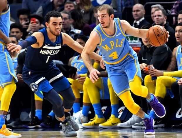
We are now about halfway through the NBA season, with its revamped uniform system. So today, with a big assist from Collin Wright (who’s been providing our weekly NBA uni-tracking feature here on the blog) and a further assist from ESPN’s Stats & Info department, I have a new ESPN column that takes a deep dive on how NBA unis have looked and performed this season, including how many color-vs.-color games there have been, how many blue-vs.-blue games there have been (that’s one of them shown above, from Jan. 1), which uniforms are undefeated or winless, which colors have been worn the most at home and on the road, how ad-clad teams have done when facing ad-free teams, and a lot more. Check it out here.
Collin also provided some additional info that I ended up not using in my ESPN piece, including 30 pie charts showing the uni-color breakdown for each team so far this season (if you can’t see the slideshow below, click here):
In addition, Collin provided info on the tights and socks worn by each team. Again, I didn’t include this in the ESPN piece but I’m happy to run it here. Take it away, Collin:
I’ve tracked lower-body accessories for every game throughout the season. Unfortunately, I don’t have data on compression arm sleeve colors, because it was a few weeks into the season before I realized teams could wear different-colored upper-body accessories, but I’ve tracked the leggings and socks for every game of the season. Some interesting things that have stood out regarding this data:
• Teams have gone with the unitard look (i.e., the tights and socks match the jersey and shorts) in 83.2% of all games played. That includes 96.4% of games featuring the primary white uniforms, , 90.8% for the primary dark sets, and 80% for the throwback sets.
• The initial alternate “Statement” sets see the most variation. Teams have only gone full unitard 63.4% of the time when wearing those uniforms. I believe this is intentional. Nike released promotional photos of every design in this set on Sept. 15, most of the photos showed contrasting tights. In only one of those photos (a shot of Minnesota’s Karl-Anthony Towns) was the player wearing socks that matched the tights; in all the others, the socks matched the base uniform color.
• Four teams (the Cavs, Nuggets, Warriors, and Suns) have gone full unitard in every game they’ve played this year.
• On the opposite end of the spectrum, the Pelicans are the team most likely to break up their look, wearing contrasting leggings in 50% of their games. In fact, the Pelicans have worn contrasting leggings in 19 of their 20 games since Nov. 24. Their only unitard game since then was on Dec. 4, when they went all-white.
• If you count leggings and socks as part of the uniform, the Hornets have worn the most uniform combinations so far this season (10) in the league, followed by the Wizards (seven).
• As I said, I haven’t actually tracked any data on arm sleeve colors, but I believe Oklahoma City probably has worn contrasting arm sleeves more than any other team in the league.
That there is some pretty heroic number-crunching. Please join me in thanking Collin for his fantastic work.
Click to enlarge
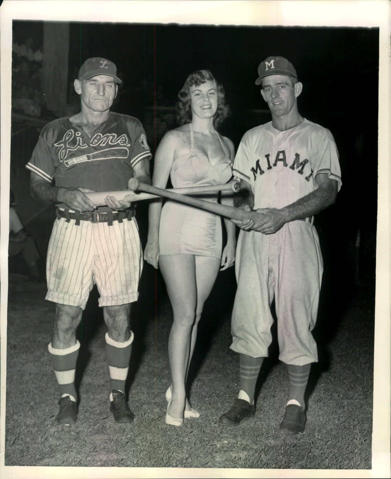
Another baseball team in shorts: If you can get past the gratuitous bathing beauty bullshit, this is a pretty great photo. It’s from the 1950s, and the team on the left is the Ft. Lauderdale Lions of the Florida International League. Love the henley-style pullover jersey, which appears to be rayon or Durene. And the cuffed shorts are a nice touch.
The Miami uniform isn’t as tasty, but note that it too includes a henley/pullover jersey. I didn’t realize that was so common back in the ’50s.
(My thanks to Blair Rifell, who spotted this photo of Ebbets Field Flannels’ Facebook page.)

Click to enlarge
The most important news item you’ll read today: Longtime readers may recall that I once developed a serious Diet Coke habit and kicked it by going cold turkey about six years ago. Since then, I’ve gradually allowed Diet Coke — or “the sweet nectar of the gods,” as it’s known here at Uni Watch HQ — back into my life. I don’t drink nearly as much of it as I once did, but I do tend to consume some of it almost every day.
So I was rocked to my core when the news came down yesterday that Diet Coke is getting a makeover and introducing a bunch of new flavors. Some quick thoughts:
• In theory, I’m fine with the slimmer/taller cans and the new graphic design. In practice, though, I wonder if different can configuration will make it harder for delis and bodegas to stock Diet Coke alongside all the other sodas in conventional 12-oz. cans. Hmmm.
• The new flavors sound like something out of a Nike marketing meeting: “twisted mango,” “zesty blood orange,” etc. (Reader Kody Allenson jokingly suggested that the flavors will now actually be known as “editions”: Association, Icon, Community, Athlete’s Mindset.) “Feisty cherry” is particularly embarrassing, and some of the ad copy on the Diet Coke home page is even worse. But whatever — as long as they leave the original flavor alone, which they say they plan to do, I don’t really care what they do with brand extensions.
• Speaking of which: Not many people realize this, but back in the 1970s, before Diet Coke existed, Tab (which was the Coca-Cola empire’s diet cola at the time) rolled out a bunch of additional flavors. They all tanked in short order.
• The President is reportedly a big Diet Coke drinker. I assume the tweetstorm will be forthcoming shortly.
The Ticker
By Paul

Baseball News: New uniforms for Indiana. Phil will have more coverage of this and several other new Adidas college baseball designs this weekend (from @UIArtifacts). … The Charlotte Knights have a new logo marking their 20th season as a White Sox affiliate (from Lee Wilds). … Looks like MLB has a new Opening Day logo (from @brianspeaksnow). … Here’s how the D-backs’ 20th-anniversary sleeve and cap patches look on some fantasy campers (from Josh Pearlman). … The U. of Cincinnati is the latest team to go with a 3-D helmet logo. … Old baseball jerseys sometimes had vertical lettering down the contrast-colored placket (one of Phil’s favorite design elements), but it’s interesting to see a jersey with a contrasting placket but with no lettering. As noted in the photo, that was a team sponsored by American Optical, an eyewear company that was once the anchor of Southbridge, Mass. (from James Hayes).

NFL News: Former Cowboys QB Troy Aikman told SI’s Peter King that he considered joining the Dolphins and Chargers at the end of his career, so SI Photoshopped him into those teams’ uniforms. Period-appropriate, too (from Matt Dunn). … The Titans will once again go white over light blue for Saturday night’s playoff game against the Patriots (from Lee Wilds). … Here’s a fun video compilation of NFL equipment malfunctions (from Blake Fox).

Hockey News: The U.S. Army has filed a brief opposing the Vegas Golden Knights’ trademark application, which could result in the team having to change its name. … Excellent news out of Buffalo, where the Sabres have announced that they’ll wear their gorgeous Winter Classic uniforms three more times this season. … Milwaukee Admirals G Juuse Saros, who’s been riding the shuttle between Milwaukee and Nashville this season, was wearing his Predators pants and pads last night. … Oh man, check out this incredible colorized photo of a Vancouver women’s hockey team from 1914. Here’s the original black-and-white version (from Will Scheibler).

NBA News: Is this a sneak peek at the NBA’s All-Star uni? Let’s hope not. For reasons I can’t disclose here, I believe that the All-Star unis will indeed carry the Jordan logo rather than the Nike logo, so count that as a small point in favor of this leak’s potential legitimacy. … Update: Looks like it probably is legit. … The Knicks finally made it official, unveiling the firefighter-themed alternate uni that everyone already knew about. It’ll make its on-court debut on Jan. 30 against the Nets. I believe the only two teams that still haven’t unveiled their second alternate unis (even though we pretty well know what they’ll look like) are the Raptors and Heat. … The Wizards gave out John Wall and Bradley Beal M&M’s to promote their All-Star candidacies (from Michael Kinney).

College and Rec League Hoops News: Blackout uniforms for Pitt. … The Vanderbilt women’s team has added a “25 Strong Inside” memorial patch for Perry Wallace, the SEC’s first black basketball player. The term “Strong Inside” refers to Wallace’s biography (from @CMIVanderbilt). … The scandal involving the Cincinnati youth league league team with racist NOBs has now prompted the resignation of a school board member. … Not uni-related but still interesting: Georgetown is banning cell phones from one section of its arena for the Jan. 20 game against St. John’s. … After Texas G Andrew Jones was diagnosed with leukemia, the team expressed support for him by adding an “AJ1” patch for last night’s game against TCU (from our own Kris Gross). … 1985 throwbacks last night for Villanova. And with vertically arched NOBs, too (from Blake Fox). … New skyline jersey for Texas A&M-Corpus Christi (from Josh Hinojosa).

Soccer News: The USL’s Harrisburg City Islanders will now be known as Penn FC (from Josh Hinton). … Also from Josh: New home kit for the USL expansion team Nashville SC. … Also-also from Josh: Nike has released its keeper jersey templates for 2018, which will include the upcoming World Cup. … France wore five different kit combos in six games while winning Euro 2000, and also had some badge discrepancies (from Denis Hurley). … The Philadelphia Union is hinting at a new color scheme (from Anthony Petrella and Mitchell Gladstone). … New gold jersey for Pumas (from Ed Żelaski). … Adidas appears to have a new team scarf template (from Moe Khan). … Here’s a closer look at ATL UTD 2’s logo evolution (Josh again). … G.I. Joke uniforms for the San Diego Sockers. … DC United teased a new uni unveiling, which will take place on Jan. 19 (from Joe C).

Grab Bag: American Airlines has finally come up with replacements for the uniforms that were literally sickening thousands of workers. … A Wisconsin high school has earned high marks, at least from one observer, for going with two-piece wrestling uniforms instead of singlets. … Here’s more on the Team USA medal stand outfits for the upcoming Winter Olympics. … New IndyCar liveries for Alexander Rossi and Ryan Hunter-Reay (from Tim Dunn). … Pro tennis star Novak Djokovic has signed an endorsement deal with ASICS (thanks, Brinke).
I suspect it’s been a long time since “excellent news” and “Sabres” have been used in the same sentence. But in this case it does apply.
The absence of numbers on the chest automatically makes those jerseys an improvement.
I’m surprised the Sabres are only wearing them 3 more times. I was hoping they would make it their away uniform for the rest of the season (though I’m not sure adidas would allow them to do so).
Adidas doesn’t get to “allow” teams to do anything. It’s amazing how fans continue to mistakenly think the outfitters are running the show and making the rules. They’re not.
Take the NY off the crest and make these full-time with a blue to match and I’d be a happy camper.
What’s wrong with the NY? They are in New York, after all. Or is it purely an aesthetic objection?
Including “NY” is a New York City thing to me. It has little resonance in Western New York, in my experience anyway. “NY” is shorthand for “the city.” And the rest of the state definitely is not NYC.
I live in the Finger Lakes area, and I occasionally see NY used here — usually in contrast to Pennsylvania, which isn’t far.
And they there’s the whole Syracuse marketing of themselves as “New York’s College Team”
Harrisburg City Islanders*
Fixed.
Re: New style Diet Coke Cans
Michelob Ultra uses those slim/tall 12oz style cans, and I can tell you from experience from working at a golf course where we stack a bunch of different beer in coolers and fridges, it is really annoying.
They don’t fit properly into coolers golfers can take onto the course, and they slide around in our beer cooler behind the bar because the slots are too large for them. It’s actually quite annoying. I’m sure many stores will have the same annoyance with thsse new Diet Coke cans.
Interesting that you bring up Michelob Ultra being in “skinny” cans as well. My first reaction was, “hmm, skinny can. Must be trying to invoke that ‘skinny’ lifestyle feeling.” I’ve always associated this style of can with Red Bull which to me fits that mold as well. Finally to my point, Michelob Ultra is always being advertised as the beer for folks to enjoy after the gym.
Are there any other skinny can drinks that come to mind right away? Does anyone else have that instant association to “active” when they see a skinny can? Diet Coke isn’t necessarily “active” to me, but at least “healthier.”
I’m also kind of thinking of the topic brought up last week in regards to uniform numbers, specifically the Georgia RBs. I am in the camp where 1 seems faster than 27, and to me a skinny can is a 1, a traditional can is a 27…
Coors products are in the slim can style also. Works real well with coolie cups (not).
coolie cups?
a koozie?
I would beg to differ. They are too skinny for my koozies.
oh…I feel for the “not” joke. Dang it.
Bud Light Lime
Six Point Brewery uses skinny cans.
oops: link
First skinny numbers, now skinny cans.
From a practicality perspective, cars have their cupholders based upon the squatty can design. Koozies. Golf carts. I guess because Coke has decided on a skinny can, all tooling has to change?
Need to go get skinny…
I was amused by the fact that I read that piece while drinking a Diet Pepsi. To each their own… ;)
We’ve had oddball cans for a while with some other products. Certain “energy” drinks come to mind. But it’s interesting to see such a change with such a major product.
Will they dispense from soda vending machines?
My family owned a Pizza and Family Restaurant for close to 50 years. I recall as a child in the early 80’s that we would mix the cherry soda and Pepsi together and sell it as cherry Pepsi. This was a big deal to me as kid as they were limited choices of soda back then. Everything was more special in the 1980’s as opposed to today and I would not change a thing for anything – just an observation.
everything? link
The Army formally opposing the Vegas Golden Knights name and logo doesn’t even warrant a Ticker entry?
Also, I laughed a little at the Aikman in a Chargers uni pic. The use of Ryan Leaf’s facemask style was brilliant!
Ideally this is the first step in them becoming the Las Vegas Knights.
Agreed. That’s the most likely outcome. I hope they don’t have to change the unis very much. I actually like them. A lot more than I thought I would.
Yeah, and in addition to the Vegas instead of Las Vegas nonsense, as the Golden Knights their primary jersey isn’t even gold!!! Why bother even being the Golden Knights if you primarily wear gray and black?
Use of gray and black has to do with the gray overcoats and dress uniforms of the Cadets, who are rightfully known as “the Long Gray Line”.
That’s what they should be but my understanding was that the OHL’s London Knights had a trademark on that name?
Was not aware of it. I’ll add it now.
If *you* were aware of it, perhaps you should have sent it in, instead of just expecting it to be there.
#boom
The thing that gets me in the filing is the claim by the Army to have common law rights to the “black-gold/yellow-white” color scheme. The problem I have with that is that the color scheme identified is so generically worded, and the fact that there are at least two dozen other Division I programs alone that can claim versions of those colors, not to mention over half a dozen major league teams (including MLS). And some of those programs have been around longer than Army’s. Purdue, in particular, have had black and gold since 1887, a dozen years before West Point adopted their black-gold-gray scheme.
It would bug me a lot less if gray was included in the claim, as that would be a bit more specific of a combination.
Well, the color scheme with the name can plausibly be argued to be sufficiently distinct within the realm of sports and sports-merchandise retailing. More bothersome to me than the Army’s possibly overbroad claim is that a supposedly professional team’s management went through a years-long process of establishing a team, name, and visual identity, and even began play, without definitively settling such an obvious potential legal problem. Legal merits aside, in a moral sense the Vegas NHL team deserves to have its name, uniforms, and visual identity maximally disrupted. It would be a better world if incompetence of this magnitude were punished rather than rewarded.
If it’s colors plus name as a whole being considered, that’s one thing, but if the colors alone are being used as a standalone argument, that’s what’ll bug me.
Certainly, though, the Vegas team, and by extension the NHL, have nobody to blame but themselves for failing to hash this out in a timely manner.
As far as to the whole “Well, they can’t be just the Knights because of the London Knights” argument, quite frankly, I can’t see how they couldn’t have worked something out there, either. A lot of teams in the CHL leagues don’t exactly have original identities, and I never heard anything about the Lethbridge Hurricanes (est. 1987) taking issue with the Carolina Hurricanes (est. 1997) – though Lethbridge did have to suffer the wrath of the Washington Capitals for aping their Edge-era style, but I digress.
The point is, the team’s situation should have never gotten to this point.
FWIW, for a short period of his career, Aikman wore the same facemask style that Leaf wore in San Diego:
link
Did the Army file a similar opposition to the University of Central Florida Golden Knights?
They were only “Golden” in name for about 14 years, but the initial change seems to have been about the vanity of the AD at the time, Steve Sloan. I haven’t turned up anything about the Army having anything to do with the change back to just “Knights” in 2007, as it seemed to be the then-current administration’s decision to clean up the branding.
Can they just go like “Fine, let’s drop the ‘g’ and the yellow/gold and just call them the Olden Knights. Anybody got a problem with that?”
The Army should have far better things to do with their time. What a complete waste of time.
Those are brutal all star uniforms for the NBA.
Regarding the NBA and uniform tracking, does anyone take into account how many teams have a certain color as their primary color jersey, etc. Being a bit of a stat nerd here, what I’m getting at is blue is certainly the plurality when it comes to a teams primary color, so one would expect it be the color we see the most, but weighted against the teams that CAN wear blue, is it still worn the most? There might be 100 opportunities for blue to be worn, and it is worn 50, meanwhile say there is 60 opportunities for red, but it is worn 40 times, and so on.
Hi Greg,
I completely agree – the opportunity to wear blue occurs far more frequently than any other color (white excluded). I did not dive quite THAT deep in my tracking. Especially considering the staggered release of the alternate uniforms, that’s a little beyond the scope of what I’ve been looking at. Great idea though!
Taking a glance at my tracking data, the following teams have preferred their regular dark (“Icon”) uniform over alternates: Atlanta, Brooklyn, Chicago, Denver, Detroit, LA Lakers, Minnesota, Philadelphia, Sacramento, San Antonio, Washington.
The following have preferred the alternate dark (“Statement”) over the regular: Boston, Charlotte, Cleveland, Dallas, Houston, Milwaukee, New Orleans, Oklahoma City, Orlando, Phoenix, Portland, Toronto.
The following are using their dark uniforms equally: Golden State, Indiana, LA Clippers, Memphis, Utah.
New York is in a unique scenario in that they are the only team with a second white uniform as their “Statement” design. They have chosen their regular white set more regularly than the alternate set.
Lastly is Miami – they’ve worn their throwback set more often than either of their other dark uniforms, but have worn their third set (red) most frequently since it was introduced.
**The Bulls and Nets are wearing their regular dark uniform at home so that does impact the above observations some, the Nets are wearing their third set more frequently than white, the Bulls have worn their third set and white set equally**
It seems to me the Bulls are tending to wear their black uniforms against teams that wear white at home and their white uniforms against teams that wear colors at home.
They announced before the season that white would be their primary road color (when the home team isn’t wearing white, obviously).
Of course. It just interests me that they seem to have isolated the red uniforms for home use only.
So to circle back to your original point:
* Four teams (Denver, Detroit, Minnesota, Philadelphia) are choosing a blue option more frequently than another option.
* Four are choosing their other option over blue (Charlotte, New Orleans, Orlando, Washington).
* Three ONLY have blue options (Dallas, Memphis, Oklahoma City)
* Washington is the only team to introduce a blue design as it’s third set that didn’t already have a blue option (Dallas and Memphis introduced blue third designs but already had blue). To this point they have still preferred their red design over the blue.
Thanks Colin. Very interesting stuff. Do you happen to have your data set available to share? I wouldn’t mind doing some data mining of it to share with the group. Though I guess it gets a little complicated in respects to “option to wear color x” because the various alternates were not available at the beginning of the season, thus creating some hiccups when making that comparison.
Great job Collin, that’s a incredible amount of research.
Also seems like a good hunk of teams like wearing white.
Yeah, so what was the original Adidas ASG uni lineup again? Big Logo, then Big Color, then what came after that?
Kind of lame that Philadelphia Union would switch to black and gold the same season LAFC enters the league with the same colors.
I don’t get the statement that there is a hint about Philadelphia Union changing colours. This seems to be speculation on behalf of people who commented on the tweet.
They wear a dark navy blue and gold. The dark blue can be mistaken for black depending on lighting.
link
Plus, I’ve seen comments assuming, based on that image, that they’re going to bring back the gold jerseys. But all the image shows is the 3 Adidas stripes.
No real news here.
Are the Union releasing a new home kit or away kit; if it’s the away kit, it is a non-story because soccer away kits are rarely team colors.
Never mind, it’s a home kit. However, they could just be switching to gold and navy hoops.
This year, a new home kit. The rumor is they are replacing the dark mustard gold color with a lighter color closer to buff.
Don’t forget to check out the backs of the Villanova throwbacks. Vertically arched lettering for the player names!
Thanks for the tip. Now added to that Ticker item.
They’re fauxbacks. The outlining on the school name is not accurate, the numbers didn’t have drop shadowing, and the font on the NOB is wrong. They’ve actually done a better job of this in past years, not sure why they would alter what had been working fine.
Re: new Minnesota Timberwolves unis. Due to their colour change this year, they look to me like the Dallas Mavericks when I catch highlights.
However, was thinking this would not be the first time that the teams looked similar:
link
link
The word zesty should never be put before the word blood.
Proofreading:
“this photo of Ebetts Field Flannels’” on Ebbets
Fixed.
That Charlotte Knights patch is for their 20th year as a White Sox affiliate. The team has been in existence since 1976
Fixed.
“The team has been in existence since 1976”
Technically, I’m not sure this is the case.
The Charlotte minor league team started in 1976 as the Charlotte Orioles, the AA affiliate of Baltimore. They were mostly known as the O’s.
When their Charlotte stadium burned down, the team, then owned by then-Hornets owner George Shinn, moved to a temp ballpark in Fort Mill, SC, and were renamed the Knights after switching to a Cubs affiliate in 1989.
Where it gets complicated is that in 1993 (according to Wikipedia) Shinn received an expansion AAA franchise which was also named the Charlotte Knights and was affiliated with Cleveland. However, the team “took on the heritage” of the original Knights, whatever that means. The team was the affilate of the Marlins from 1995-1998, and then joined the White Sox in 1999, after Shinn sold the team to Don Beaver.
The original AA Knights moved to Nashville and then Mobile.
The Knights moved back to Charlotte in 2014.
Interestingly the Army claims they are using their colors. Yet Army uses the yellow gold and Vegas uses metallic gold
that looks like an old Pepper Martin playing for the Ft. Lauderdale Lions
It sure does…
Anyone know why the players are holding the bats by the barrel?
Pepper Martin managed the Fort Lauderdale Lions of the Florida International League to a league championship in 1953.
I noticed that also. I’ve never seen that before.
My first thought on seeing those Diet Coke cans was “how are they going to get those into vending machines?”
Ooooh, I didn’t even think of that. Good point!
I know Pepsi sells certain products in cans that aren’t the “traditional” 12 oz. shape in their Pepsi-branded machines. My guess is Coke will be able to do the same, boosting sales of their own machines and potentially impacting third-party vendors?
I also thought how are those cans going to fit in cup holders in cars? I don’t know if that was thought of earlier in the thread but that’s definitely going to be a problem.
Shoot, I didn’t scroll all the way down to see that you’ve already asked this.
The new PUMAS kit is their third kit for the 2018 Apeturua and Clasuria.
(Typically, in soccer, people refer to the kits as home, away, and third rather than by color.)
Proofreading:
Kody Allenson jokingly suggested that the flavors will now actually known
– “be” known
Fixed.
A note about yesterday’s video clip of 1930’s hockey between the Rangers and Canadiens — the centers are facing the SIDE boards for the opening faceoff. In 1943-44, it was changed to how we know faceoffs today – centers facing the opposing END boards…
-Jet
According to this article, they will still offer diet coke in the standard 12oz can.
link
“Diet Coke also will continue to be offered in all existing package sizes, such as standard 12-oz. cans, mini cans, glass bottles and more. All new packaging and flavors hit store shelves this month.”
But will they offer the flavored ones in the 12oz cans?
Odd that the promo for IU’s new baseball uniforms shows the player wearing a red top with a white undershirt. White undershirts aren’t typically seen on the baseball field.
Will I still be able to get diet Coke on a plane? Will the Coca-Cola Company help find new airline beverage carts?
Henley-style pullover jerseys: Just enough buttoned placket to disrupt the script. Really a worst-of-all-worlds design choice.
I like Nike. I have been a fan since I was a kid. I feel like they are really dropping the ball with the pro bowl and all star unis here. There all star games! They should be colorful and fun but keep a level of tradition. The pro bowl unis are kinda blah with the color fade numbers and the all black all star unis are the same. In my opinion this is there time to shine. They probably have a full creative license for these events and this is the best they could do? Nothing wrong with simple but they could at least keep it classic if that’s the route they choose to go.
As a hockey fan and a someone with a general taste for good design, I despise Nike. They always screw up every single uniform they make. From giant shoulder yokes to the crazy Olympic jerseys, I feel like Nike just doesn’t care. Look at what they make team Canada wear! they have had some of the best hockey uniforms I’ve ever seen, and now they make them wear this:
link
The NHL and other hockey leagues should just have CCM, an actual hockey company (!) make the uniforms. They actually care about the sport, not ridiculous and annoying cash grabs. Whoever reads that, thanks for listening to my rant about Nike.
*on the Canada jerseys, ‘they’ve had the best uniforms’ not ‘they have’
In short: Nike is a lifestyle brand that happens to make athletic gear. CCM is a sportswear company.
Big difference.
I believe coke has said there will still be regular cans of diet coke as well. And brand new’s article shows a picture of one.
I like, will be interesting if 20ozs have just a small vertical stripe.
Today’s ESPN column is up:
link
The Diet Coke flavors sound like wine coolers.
I definitely remember drinking Tab root beer and black cherry in the ’70s. The other flavors I don’t remember.
I stopped drinking diet soda altogether a few years back; when I drink it now I find the artificial sweeteners rather awful. I might try one or two of these new fruit flavors, just to try them.
Comments about the New Diet Coke cans and flavors.
Cans
Coors Light. Top seller in the brand.
Red Bull. Top seller of not #1? in the brand.
Flavors.
Gatorade and other energy drinks have an infinite amount of varieties of flavors to choose form.
When I was a kid in the 60s, luncheonettes in Brooklyn sold cherry and vanilla Coke by adding a shot of cherry or vanilla syrup. 7 cents for a small and dime for regular so the 60s trumps the 80s (but I do l like that sharp outfit in the Sears ad).
Paul-
Have you tried Coke Zero Sugar (the recent replacement for Coke Zero)?
It’s amazing taste-wise and this addictive.
I don’t care for Zero or Zero Sugar. Prefer Diet Coke!