The NHL Winter Classic is always a visual feast, and that was definitely the case yesterday in Queens, as the Rangers and Sabres faced off. A few quick notes:
• Sabres goalie Robin Lehner wore a toque over his mask:
• Advance word was that Rangers goalie Henrik Lundqvist was going to wear pads with a design inspired by the Mets’ skyline logo, but he ended up wearing a different design:
• The Sabres’ uniforms looked particularly excellent. This is what they should be wearing full-time:
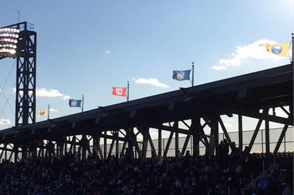
• Uni Watch reader and Rangers super-fan Alan Kreit was at the game and notes that the flags atop the Mets’ stadium had been replaced with Rangers and Sabres flags (click to enlarge):

Lots of additional photos here and here.

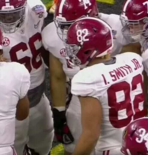
NOB job: Alabama tight end Irv Smith Jr., shown above during last night’s Sugar Bowl, has FIOB and JrOB, which is pretty absurd.
There’s one other Smith on the ’Bama roster — wide receiver Devonta Smith, who has FIOB but not JrOB. So there’s really no need for either of them to wear a first initial, because Irv could just have “Smith Jr.” while Devonta could just have “Smith.”
Of course, there’s no need for Irv Smith (or anyone else) to wear a generational suffix, because his surname is Smith, not Smith Jr. So the better solution would be for him to scrap the “Jr.” and just go with “I. Smith.”
There’s also the school of thought that says first initials are unnecessary because the players have distinct uni numbers, so you could make that case as well. But any way you look at it, Irv Smith definitely doesn’t need the initial and the generational suffix.
(Big thanks to Cork Gaines for the Sugar Bowl screen shot.)
NBA Uni Tracking
By Collin Wright
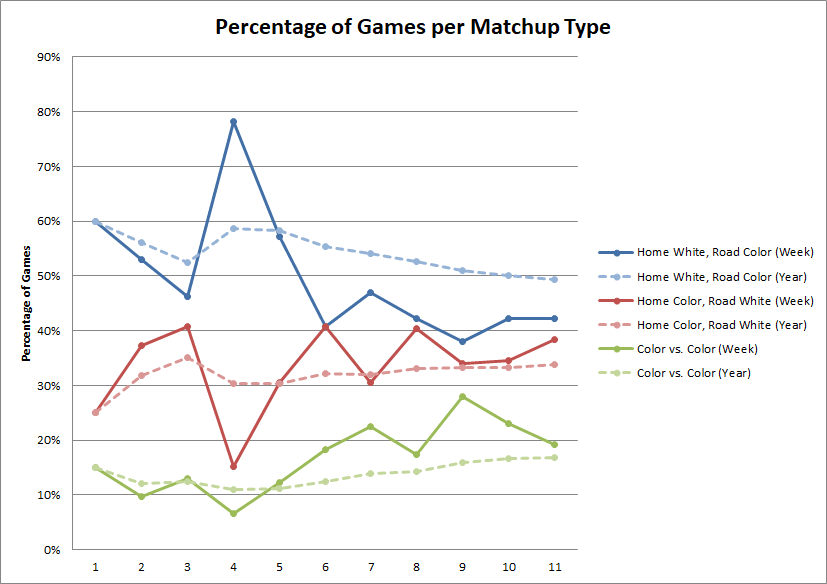
For the first time all season, traditional white-vs.-color matchups are now occurring in less than half of all games. As this week’s graph clearly illustrates, things have been trending that way for a while now, but this week is the first time the yearly average has dipped under 50% (49.3%, officially; click to enlarge):

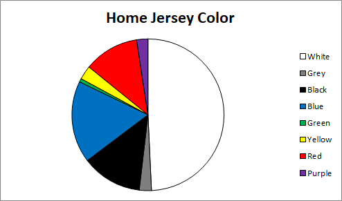
So when the home teams aren’t wearing white, what color are they choosing? Perhaps unsurprisingly, the next most popular color is blue (17% of games) followed by black (13%) and red (12%). Green is being worn at home least frequently, which makes sense given that only three teams (Boston, Milwaukee, Minnesota) even have a green uniform and the Bucks haven’t worn their at home. Below is a visual breakdown of how frequently teams are wearing each color at home:

It will be interesting to see how these numbers change as teams begin wearing their recently unveiled fourth uniforms.
Sorry, no Ticker today. We’ll get back to full-scale content tomrorow. Happy 2018! — Paul
“…because Irv could just have “Smith Jr.” while Devonta could just have “Smith.”
Now see THIS presents a dilemma. One might conclude that Smith, Jr. WAS INDEED the son Smith in this case (though we know this is absurd too).
A suffix should only be used to distinguish you from your father/son if on the same team. period.
Yes, I think this is the only appropriate time to have Sr or Jr on a jersey. And the one time it actually happened (that I know of), when the Griffey’s were both on Seattle, they chose to omit the generational suffix.
Other father/son combos on the same team: Tim Raines and Tim Raines Jr. (for one day, I believe) and Cal Ripken and Cal Ripken Jr. (when the father was a base coach and manager). None of them wore a suffix.
Ken Griffey and Ken Griffey Jr. on the Mariners…
Someone didn’t read the second comment in this thread very carefully.
Someone’s still hung over from New Years.
Another time it happened, when Gordie Howe played with his sons, they did not use the suffix.
link
The Howes couldn’t use suffixes because there was no jr/sr issue there. Not the same kind of situation that we’re discussing here today.
Oh yes, brain fart on my part Paul! If they have different first names don’t need to have jr./sr.
IIRC Eric Young, Jr. was playing for the Rockies while Eric Young, Sr. was coaching for them.
Just another college athlete desperately seeking attention. “Look at MEEEE!”
It’s not just college athletes….
All I could think, every time Georgia kicker Rodrigo Blankenship showed up on tv last night, was, “I can’t wait to see a full profile on this guy and his glasses” (for reference: link) on Uni-Watch some day
please tell me there wasn’t already one that I missed
The pock mark on the Sabres unis was the addition of NY to the logo. Not only is it out of place, it makes zero sense. It would be like the Lightning adding FLA to their uniform when they play the Panthers. Stupid.
How does it “make zero sense”? Buffalo is in New York State. They were playing in New York City against the New York hockey Rangers, on New Year’s day. It would be like complaining about the ACTUAL Sabres logo being a buffalo jumping over sabres as “unnecessary” because they’re already called the Buffalo Sabres.
As a permanent addition to the logo? Silly. But in a one-off game against an in-state rival? Really?
What your complaint should have been was that the only “pock-mark” on the whole uniform was the single yellow stripe down the pants. With the jersey and sock-striping, it looks like an afterthought in the design. Add some white stripes to outline or just one down the middle but it breaks up the flow/design of a pretty solid uniform.
You’re putting the initials of your opponent on your crest. How does that make sense?
What about when the NY Yankees play the NY Mets?
The Tampa Bay Area is in Florida just like the South Florida area is, so what’s the big deal?
Was interesting how the Rangers handled the captaincy patches. The “C” or “A” replaced the “N.Y.” that the other Rangers were wearing in the shield patch in the upper left corner of the jersey front.
link
Also a few taxi cabs available on the field if players needed to make a quick getaway ;)
link
They should had the taxis driving around the field and while at it paid some extras to walkaround the city grid, staring up at the buildings and generally clogging up the sidewalks.
Lundqvist didn’t wear the Mets skyline pads because they weren’t broken in enough:
link
Correct. He slapped a couple of extra decals made of Pad Skins on his normal pads for the special occasion.
Follow up from yesterday, and perhaps it has been addressed here before. Why did the Rams have a navy helmet when royal blue was their color? I am talking in the past, now it is because of one shell rule. As a kid it always bugged me that the Rams were blue and yellow but had a navy helmet.
Back in early 1970s the helmet companies – specificaly Riddell – started molding the shells in colors instead of just white (or kind of an off-white color in the 50s/early 60s) and painting them. At any rate Riddell wound up with only 2 blue colors – navy and a fairly light blue. The Rams, Giants and Chargers used the navy blue and the Broncos used the lighter blue. Later on they had both more shades and painting the helmets came back into style (particularly the pearl finishes of the late 1990s/early 2000s) si they start matching the colors better.
Prefer the contrast with the Navy Helmet. NY Giants had it too for years. Dark hats make the royal blue shirts pop.
CFL Montreal Alouettes had a similar problem with the blue helmet being darker than the jersey:
link
Good info. Thanks! Can only hope when they officially go back to royal blue and yellow that they go with a royal blue helmet this time.
They haven’t announced what their colors will be. Seems just as likely they go back to the Royal Blue & White of the 1960s, since they have gone with white predominately now.
Yeah, I’m just assuming that is their plan. Seems that royal blue and yellow is overwhelmingly the popular choice among fans.
I get the impression that the navy/white combo they have now was to differentiate themselves from the St Louis days, and they’ll wait to make their full change until they move into the new stadium, where they’d go back to the classic blue and yellow.
Guys this is all pretty much known. Almost positive they announced they’re returning to the 60’s White/Navy combo and they were planning to do it with the opening of the new stadium but that got pushed back a year, so I think, but am not sure, that they’re getting new uniforms next season.
They had a big fan-contest to select the pants this season already and have petitioned the league several times this season to wear their throwbacks in games they were forced to wear their dark uniform set.
They’ve done it very dumb. They immediately switched to the white/navy color-scheme but couldn’t/wouldn’t make the full uniform switch because they were specifically waiting until the new stadium opened. So now they have the old jersey with the new helmet/pants and it looks horrible with the gold accents.
No, they leave the gold accents because the nfl has an annoying rule that a team can only alter their jerseys 5 years after the previous rebrand. However this rule only applies to the jerseys, so they could alter the pants and helmet. This is how the Rams got stuck with their mismatched uniforms. They actually petitioned the league to allow them to go back to the royal blue and gold coinciding with their move to LA but the NFL said no because of this rule.
Of all the terrific things about those Sabres’ sweaters, the best part is the TV numbers; they’re centered in the space allowed, something that has driven me nuts for years. Check out this photo of Steve Yzerman: link
and compare it to this photo, from the Reebok Edge days:
link
Aside from the fact that the shoulder yokes aren’t nearly long enough, the position of the TV numbers drives me up a wall. Maybe I am a little OCD, after all.
No, I agree. It’s why the NHL’s 100 patches were awful, hardly any of the teams put them flush or center and they look like a gaudy league-ad.
I also agree about the sleeve/shoulder treatments with the modern uniforms. It seems like they’re over-engineering them sometimes. But, supposedly there’s some benefit to having the tapered shoulders and angled sleeves versus the old-style sweater construction with straight shoulders and sleeves.
They could push the sleeve stripes upward a bit to balance things out. If the top of the stripe got partially cut off by the seam (essentially pushing it into the armpit of the jersey), it wouldn’t necessarily be the worst thing in the world. It’s not like sleeve stripes haven’t been interrupted by jersey construction issues before (see c.1997-2007 Toronto Maple Leafs’ pothole-mesh underarm panels).
Thank you, PaulS and Rob S! Here I thought that I was the only person that was bothered by this. The shoulder yokes are way too short, the TV numbers look goofy how they are placed below said-short shoulder yokes and the sleeve stripes are too low. Add to that: the current collar treatments are incredibly butt-ugly and tails on the jersey are just plain stupid.
The only improvement they made was to reduce the scoop on the back and reduce the curvature of the waist stripe (among teams that have a waist stripe anyway)…it’s a start.
Yes, I’m OCD too.
I mean the one thing I havent seen anyone touch on is the factor of the JrOb: Maybe it’s a sense of pride. I, for one, have a very odd and rare last name (it’s Hamar) but any chance I got, especially when I played in college I wore JrOb as an honor to my dad. (He passed away when I was very young) so I wanted people to have a sense of wonder when I made a big play about my dad.
But that’s just me, I don’t know Irv Smith’s story but it could just be as simple as that.
People are proud about all sorts of things, but that doesn’t mean those things belong on their nameplates.
Was wondering what’s up with all the red in the CFP. Made a list of all the schools in the CFP’s short history (Alabama (4x), Oregon, Florida St, Ohio St (2x), Clemson (3x), Oklahoma (2x), Michigan St, Washington, and Georgia). Five of the nine schools to participate in the CFP have worn red, and ten of the 16 teams were red. Furthermore, every national championship game has worn red, and counting this year, three of the four champions will have worn red. I was wondering if this is simply what to expect mathematically, based on the number of teams that wear red, or if it is a fluke that has happened the past four years.
“…every national championship game has featured a team wearing red…”
Mike Van der Hoorn from Swansea City AFC (Association Football Club) is wearing his NOB as “v. d. Hoorn” vs Tottenham today. Not sure how long this has gone on.
Thank you for exposing the folly of generational suffixes on athletic uniforms. Generational suffixes are not only unnecessary, their use is improper in the absence of a full name. Davis Love III should not be listed as “Love III” on the scoreboard. If the generational suffix is to be used it can’t just be the last name. If Robert Griffin (whom I blame for starting this infuriating trend) wants III on his jersey then he must include not only the Robert but also any middle name/s for proper usage. If someone is named John Joseph Smith has a son named John Robert Smith that son is not a Junior. Finally, it is customary to drop or change a generational suffix when someone in the line dies (everyone moves up one if it happens in age order). Davis Love has a son listed as Davis Love IV. They should, at this point, be known as Sr. And Jr.
The L.A. Lakers wore their Minneapolis throwbacks yesterday, against the Timberwolves, IN Minneapolis.
Which I found very disrespectful, as a Minnesota sports fan.
link
I agree, I would be pissed if the Dodgers wore a Brooklyn throwback against the Mets or Yankees.
I saw that too and it seemed kind of odd. Was it done with the Timberwolves blessing or did the Lakers just do it on their own? About the only difference between this instance and the Dodger reference John made was is that to my knowledge there was little uproar over the Lakers leaving for LA way back when. However, I would not be too pleased if the evil Dallas stars showed up at the “X” wearing North Stars throwbacks anytime…ever!