On Wednesday afternoon I was yakking on the phone with Chicago Tribune sportswriter Phil Thompson, who was interviewing me for this story about the Bulls’ new alternate uniform. The uni design is based on the Chicago flag, and I mentioned to Thompson that the Chicago flag is a particularly strong design that really seems to have caught on with people. He agreed.
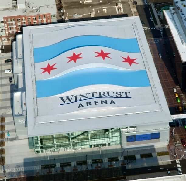
The next morning, as if on cue, Uni Watch reader Ryan Lindemann sent me a link to this Chicago Sun-Times story about a giant Chicago flag that’s been added to the roof of DePaul’s new basketball arena (see photo above; click to enlarge). Of course, it would be nice if this civic symbol didn’t have to share space with a noxious corporate advertisement, but it’s still pretty cool.
It’s interesting how some flag designs catch on and others don’t. I’ve now lived in New York City for over 30 years, and the NYC flag has virtually no presence here. Well, that’s not entirely true — the flag itself can be found in all sorts of municipal settings (there’s one flying at a city playground a block from my house, for example). But it hasn’t caught on as a symbol of urban pride. In Chicago, there’s all sorts of city flag-based merchandise, and people even get city flag tattoos. Hell, the Chicago Red Stars — a women’s soccer team that plays in the NWSL — are named after the city’s flag design.
There’s none of that here in NYC. In fact, I’d be willing to bet that most New Yorkers couldn’t even identify our city flag from lineup of similar flags. That’s probably due in part to the NYC flag featuring an ornate seal in the center (click to enlarge):

A seal looks nice on stationery, but nobody can make out the details on a flag that’s flying way up high. (New York’s state flag suffers from this same problem.)
The Chicago flag, by contrast has readily visible graphic symbols: two stripes, four stars — done and done. I think it helps that the stars have a distinctive six-pointed shape. (Note that the stars aren’t shaped like two overlaid triangles like a Star of David. The Chicago stars are more like two overlays of this shape, which is called an isotaxal star triangle. The stars themselves are called isotaxal star hexagons.)
Each stripe and star — and each point on each star — has a meaning. It’s a bit much (seems like Nike-style “storytelling”), and I’m pretty sure most Chicago residents couldn’t recite the significance of each element, but it’s still interesting (click to enlarge; additional info here):
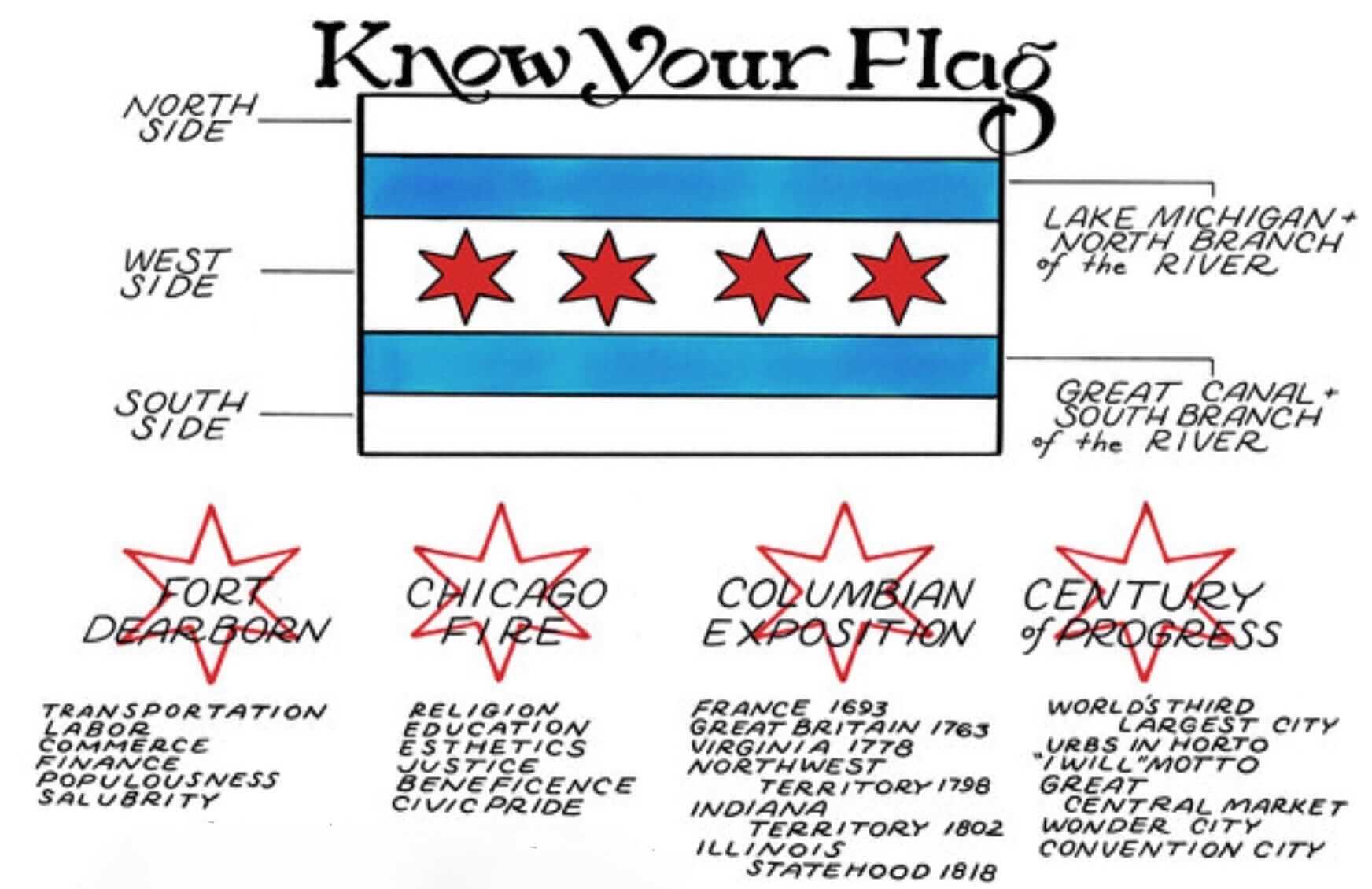
There’s also this wiseacre version.
City flags have been getting more attention lately. The great design podcast 99% Invisible devoted an episode to city flags in 2016, which in turn led some cities to reconsider their flag designs. I can think of at least one sports uniform outside of Chicago that features a city flag (MLS’s Portland Timbers have a small Portland flag patch on their jersey), and I assume there are others I don’t know about.
The overlap of uniforms and city flags is not a new topic for Uni Watch. Back in 2009, Phil imagined what it would be like if MLB teams in the American and National Leagues wore their respective cities’ flag colors — good stuff, and worth revisiting.
The Ticker
By Paul

NFL News: Check it out: Joe Namath in a generic “NFL” uniform. … Check out the amazing sideline apparel worn by these Houston Oilers coaches. Looks like one of them was smoking, too (big thanks to Tris Wykes). … Good story on the Cowboys’ mismatched uni colors (thanks, Brinke). … Also from Brinke: Saints RB Alvin Kamara was fined $6,000 for wearing those Xmas-themed cleats last Sunday. … The Rams will be wearing their throwbacks this weekend.
College and High School Football News: For the Cotton Bowl, Goodyear made statues of USC’s and Ohio State’s mascots out of tires (from Jason Hillyer). … Here are the uniforms for the upcoming Army All American Bowl. … Here are the end zone designs for the Rose Bowl (from @Bigj52). … Here’s a quiz — can you spot the fake bowl names? (From David Firestone.) … “Virginia Tech QB Chase Mummau usually wears No. 18, but he changed his number to 95 for the Camping World Bowl,” says Andrew Cosentino. “Virginia Tech used it to their advantage — they tricked Oklahoma State with a fake punt by putting in Mummau instead of their normal punter, Oscar Bradburn, who wears No. 91. OKST must have not noticed the change.”

Hockey News: The on-ice officials for the Spengler Cup have truly hideous uniforms (from Nick Maibroda). … The Maple Leafs have added a memorial patch and a memorial decal for Johnny Bower. Note how the negative space in the “B” forms a “1” — Bower’s uni number (from Adam Gignac).

Basketball News: For reason that aren’t entirely clear to me (but I’m sure someone will enlighten me), the Pistons gave UConn women’s coach Geno Auriemma a 1,000th-win jersey (from @TJMtoWit). … The Museum of Modern Art here in NYC currently has an exhibit about modern fashion. There’s a section about sports jerseys, and It includes a photo of a Texas/Oklahoma State game, but the accompanying caption placard inaccurately lists the home team as Ohio State (from Andy Shain).

Grab Bag: Love the manufacturers’ names and label designs for these two vintage curling sweaters: Bonspiel-King and Curl-Rite. … There’s an Italian apparel company called Steve Jobs, and Apple can’t do anything about it. … Adidas has released a line of shark-themed golf shoes (from Zach Loesl).
Phil will have his usual weekend content, and then I’ll be back on New Year’s Day. Everyone have a safe and happy holiday weekend, and I’ll see you in 2018. — Paul
That Joe Namath photo looks like an old-school cut-and-paste job. Head seems a tad too small for the body.
I agree. Joe would never do anything to make himself look so silly. Right?
I agree also. Imagine how much it would have cost to have “Swinging” Joe Namath do an actual photo shoot?
On the subject of city flags on unis – the supporter-owned amateur soccer club we started here in Fort Lauderdale (after the Fort Lauderdale Strikers pro club folded this past year) has three uniforms that draw heavily from the FTL city flag: Our secondary kit (link) and the two crazy pattern 90s-inspired goalkeeper options (link – sorry about the purple Paul haha). It helps to have a city flag that doesn’t totally stink. City flags are more prevalent in soccer I think here, as local/civic pride is a much bigger deal because the teams aren’t that relevant outside their home towns.
I’ll agree the NYC flag could use some work to make it more iconic, but when it comes to sports I’d argue it’s plenty referenced. The Knicks, Mets, Islanders and NYCFC all use blue, white and orange as their colors! Surely not by total coincidence.
Adding to this, D.C. United sort of kind of has been adding the D.C. flag to its visual program (it’s contained in the new version of their logo on a black background instead of white) or at least the white/red combination.
The crest Manchester United used before its current crest was based on the city’s coat of arms.
Additionally, a long time ago (the first half of the 20th century, maybe), before team crests on soccer shirts were common, I believe teams playing in the FA Cup final (at least) would occasionally wear their town’s coat of arms.
The Knicks and NYCFC maybe, but the story behind the Mets’ colors is well-known to not have anything to do with the flag, and the Islanders have been outside the city for most of their history.
(Speaking of link…)
NYCFC’s colors are primarily about Manchester City, which owns the team. NYC flag connection is tenuous at best.
Light blue is the main color of all the teams of the Etihad Sports Group, but they did add orange specifically to represent New York (similar to the red they kept when they bought Melbourne Heart and changed the name to Melbourne City).
They are also the colours of NY State and hearken back to when NYC and NY were New Amsterdam and New Netherlands. I think NY’s flag is FAR superior to Chicago’s generic one.
Actually, NYCFC did have a city flag-colored captain’s armband and a city flag in the jock tag position this past season.
The Etihad group, which own NYCFC, Melbourne City, and Man City, all wear light blue as the primary color. Melbourne City’s flag is white and red with three animals and a vessel (it has the English flag and one of the four objects in each corner/quadrant of the flag). Melbourne City’s sky blue had nothing to do with their flag.
Furthermore, the sky blue has little to nothing to do with NYC’s flag and Manchester’s cost of arms.
Nycfc uses the NYC flag a lot actually their goal is orange white and blue just like the flag, their corner flags are the NYC flag but the Crest is the nycfc logo instead and that same flag on the bottom of their jersey too
Hi Paul,
The Johnny Bower memorial patch link is missing. It goes to Spengler Cup officials.
For now, click on “for Johnny Bower.” But yes please, move the Spengler link’s /a to the left.
Fixed.
The fix didn’t seem to take.
Come to think of it, I’m surprised the Wizards haven’t shoehorned the DC flag into a new Nike jersey yet. That would be a natural!
As the “City” uniforms will reportedly change each year (the better to sell product), that motif will be seen sooner or later.
Re: Spengler Cup officials. The advertiser is Chio Chips. I think the black triangles are supposed to represent tortilla chips.
Is it worse than the Swiss Milk uniforms they wore prior?
link
The Philadelphia union uniform design is loosely based on the Philadelphia flag although they took some liberties with the colors. Supporter groups often use the traditional flag colors and I wouldn’t be surprised if the team followed suit one day for an away or third jersey
They did a couple of seasons ago, using light blue and gold trim on a white jersey.
For the 2016 season, MLS team Columbus Crew SC changed the color scheme for their traditional yellow kits to the color scheme of the Columbus flag (link, link). Local reaction was mostly negative, and the team changed back to the traditional yellow and black for 2017 (link).
Massachusetts has a typical boring flag, but one that I’ve seen popularized over the last few years has been the flag of New England.
I’ve lived in New England my whole life and had never seen the flag until a few years ago (at which point I thought it was the Lebanese flag).
It’s turning up more and more and the New England Revolution have based their change kit on it the past 2 seasons.
Flag of New England: link
Revolution flag-inspired uniforms: link
3 stripeson the Chicago flag? Am I missing something?
To me it’s either 5 (3 white, 2 blue) or 2 (2 blue stripes on a white field) – and probably the latter if you think of the way that heraldry is described as things overlaying each other.
Definitely cool though – and it makes that Chicago alternate one of the best too.
Right you are. Fixed.
As for flags, what I find interesting is that even though Nashville has its own flag, you see the state flag everywhere, as if it’s the city flag.
Good point! Nashville’s two top professional teams have three stars in a logo (Titans helmet, Predators shoulders) to evoke the state.
In Wichita, the city flag has been popping up everywhere in the last ten years. Lots of bumper stickers showing civic pride…and with good reason. I think it is one of the best civic flags I have ever seen. link
There is also a local football club, FC Wichita, whose club logo and basic color scheme is based on the flag.
link
That’s a nice design!
the captain’s armband for Toronto FC is based on the Toronto flag
As noted, Chicago flag catches on because it has some quniquetoo it (much like Colorado state and Denver city flags) and is not just some standard three color (like NYC) with a crest in the middle. Also I think Chicago is helped by a somewhat unique color scheme. Seems most flags here are some combo of red and blue, usually with yellow mixed in. Having light blue helps them stand out I think.
Lest we forget, a Pittsburgh Steelers throwback which basically *is* link.
Anyone notice that the third point on the second star is supposed to stand for “Esthetics?”
Right in line with the Uni-Watch moto.
Here is a great talk about what makes a popular city flag. Has to be able to so simple it can be recreated by a kid:
link
Cool move by Virginia Tech changing the QB number to trick Oklahoma State!
I have always wondered why more teams don’t do this.
Basketball would work really well to have your point guard show up wearing a different number so the other team doesn’t know who to guard when bringing the ball up the court, etc.
I know the negative space in the B in the Johnny Bower patch is supposed to be a 1, but I just don’t see it. Looks like a pair of sunglasses to me.
At first glance it looked like JD to me.
Looks like the Stanley Cup from a distance. The notch that forms the B makes it hard to see the 1 in the negative space.
Agreed. Would have been more successful if they used the space between the letters.
Thanks for the shout-out, Paul! As a Chicagoan born and raised, I absolutely love our flag and am guilty to buying anything with it’s design. I have always wanted Chicago sports teams to adapt it into their identities. I think the Bulls new jersey is terrific, and will be looking to purchase related “City Edition” gear.
St. Louis Blues use the city flag’s pattern in the neckline of the jersey (albeit not seen while wearing).
link
Don’t think I saw it mentioned, but the Pelicans’ blue/Gold/red scheme is based on the city flag. I’ve seen that flag popping up more and more around my hometown since Katrina.
link
There honestly may not be a better backdrop for a bowl game than Pasadena. We need Keith Jackson back in the booth. Even at 89 he’s better than 75% of the guys doing games now.
Not sure if this was mentioned somewhere else, but last night’s Holiday Bowl featured white, green, white of Michigan State vs red, white, red of Washington State. Very festive Christmas colored matchup for the Holiday Bowl!
The Chicago Mustangs- the professional indoor soccer team- uses the Chicago flag design for one of their kits, too.
link
The Chicago Fire Soccer Club has also tried to incorporate the flag into some of their kits, with varying success.
link
Does anybody see the new name added to the Rose Bowl stadium in the photo? Not an advertiser though.
link
There was consideration given to adding another star to the Chicago flag if the city had been awarded the 2012 Olympics (which went to London).
Chicago did not bid on the 2012 Olympics; New York did. Chicago bid on the 2016 Olympics.
The (former) wrestler turned mma fighter CM PUnk had gear based on the Chicago flag, I think designed by comic book artist (and Chicagoan) Jill Thompson.
The 2015-16 Chicago Fire away kit was based off of the Chicagoan flag.
link
The flag is also on the back of the kit.
The 2015 Chicago Fire third kit was also based off of the city flag.
link
There are too many other city flag posts, but starting another (because why not)
Portland – The Trailblazers new city uniform (the Rip City one, whatever that’s called), has a one color application of the Portland flag on the waistband. Image: link
MLS – most MLS teams have little flags either on their captains armbands or on the bottom left of their jerseys. ie: Timbers, Rapids (have the C), The Dynamo have the state flag, NYCFC has the New York Flag, Seattle has the crest of their flag, etc(they’re a little small here, but: link)
More MLS – another interesting flag tidbit with the MLS is that the Timbers/Sounders/Whitecaps have a fan run “Cascadia Cup” every year, so the Cascadia flag is frequently seen in stadiums and on merch. For example, I have a Timbers Army (Fan Group) produced Cascadia Scarf, the Sounders have something Similar with the ECS.
European Soccer:
Amsterdam based Ajax have worn a jersey based on their city flag (and have done so for a fairly long time). Jersey: link , Flag: link
FC Barcelona had a Senyera based Jersey a few years ago, as that’s the flag of the region of Catalonia. Jersey: link Flag: link
There are more out there, as I think of them I’ll try to comment on this.
Louisville City FC, a USL club in Louisville, KY, uses several elements of the Louisville flag (see below) in their kits/crest.
link
The crest (link) uses the fleur de lis inside of the bourbon barrel.
The club also incorporates gold into the badge and kits, which is taken from the flag.
Finally, the 2016 kit’s “jock tag” uses the fleur de lis and a circle that it similar to that of the city flag.
The Colorado Rapids’ away kit is typically based off of the yellow/blue flag of Denver and the state of Colorado.
FC Barcelona typically has an away kit based off of the Catalan flag.
Almost every MLS team incorporates some reference to their state or city flag.
Adding to the MLS discussion: NYCFC uses a mock of the NYC flag as their corner flags with the NYCFC badge in place of the seal. They certainly try to use the flag and its connections to the City when marketing the team, however I think the poor design of the City flag leads this to be a little weaker than others attempts to connect the flag and franchise (Chicago, Portland…)
Yeah and both the Fire and the Timbers incorporate their flag in their kits in a major way; Chicago with the two alternates a couple years back and Portland with the Rose City kits.
I love Portland’s flag.
Also this year Orlando adopted a new city flag. The old one was awful, the new one is pretty great.
To piggy back a few earlier comments about the NYC flag…Mets are definitely from Dodgers/Giants, and I am unsure if the dodger blue and giant orange matching the city flag is a coincidence or not.
I believe knicks colors are based on NY flag.
Islanders could not be city flag as they have had the same scheme for the most part since inception…it is worth noting though, Nassau County’s colors are also orange and blue.
NYCFC’s blue has nothing to do with the city, but they have incorporated the city into other elements of the uniform.
Finally, while not completely recognizable, the NYC flag has been used/crossed with our sports teams, see this recent example by the 7 line:
link
Interesting that not only did the Museum of Modern Art get ‘Ohio State’ instead of ‘Oklahoma State’, they also couldn’t find a date for the photo and just put “n.d.” It has to be either 15-16 or 16-17 since Yancy is wearing #5 for Texas. A quick search of the two games played at OSU in those seasons confirms that the pic is from the February 11, 2017 game. In the 2nd video on this page you can see some of the same fans in the same spots in the front row under the basket.
link
More interesting information about the Chicago flag:
5th Star: If Chicago would have hosted the 2016 Summer Olympics, the City Council was to out a vote forward to add a fifth star to symbolizes the significance of the global event. That of course went up in flames just like the Great Chicago Fire.
No Licensing Fees: The Chicago flag is public domain so there are no licensing fees nor trademark issues restricting usage.
Atlanta has a cool seal but a poor flag – blue with the city seal in the middle. I always thought the Phoenix rising from the ashes (in reference to the city’s recovery from the Burning of Atlanta by federal forces during the Civil War) was a great design for any of our sports teams to use.
Seal: link
Flag: link
I prefer the wiseacre backstory of Chicago’s flag.
Best thing about the Chicago flag is how great Christen Press looks in it in her Red Stars uniform
Philadelphia Union uniform uses the colors of the City’s flag (yellow and light blue) as did the Frankford Yellow Jackets (predecessor of the NFL Eagles) as shown in a throwback jersey.