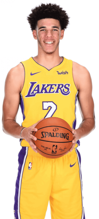
Here’s something from a few weeks ago that I missed during the Thanksgiving weekend: Lakers fans apparently think the team’s current shade of gold is too yellow. Key passage from that article:
“We started hearing early on that the gold looked too yellow,” said Tim Harris, the Lakers’ president of business operations and chief operating officer.
It was considered serious enough that the Lakers took the question to Nike, which determined the shade was identical to what the franchise wore in the early 2000s. Lakers gear had gradually taken on a more golden hue under Adidas, Harris said.
When he looked closely at the new Nike duds, Harris decided the problem wasn’t with the uniforms, but the accessories.
“To me, the tights looked yellow,” Harris said, “and I thought maybe if we can apply a contrast to this it will show more gold.”
The Lakers ditched the monochromatic look championed by Nike, and starting on Nov. 17 against Phoenix switched back to white leggings with their gold uniforms.
“It’s less like a highlighter,” Harris said.
Two nights later, they replaced the gold socks with white ones, leaving [equipment manager Carlos] Maples with racks of gold — or, rather, yellow — leggings and socks and sleeves for which he has no use.
Interesting. I like how Nike basically blames the whole thing on Adidas. As for Nike’s claim that the current color matches the early-2000s shade, Uni Watch reader Derek Lady isn’t buying it. “No way is it the same gold. I have the uniform. I’m an artist and graphic designer and I can see the color difference. One is warm, the other cold yellow.”
Several other Lakers fans have said the same thing to me, and some fans have tried comparing old and new photos to show the color difference. I’m generally skeptical of this approach, because lighting conditions and photo equipment can vary so much.
I asked hue guru Donovan Moore, who runs the excellent ColorWerx site, what he thought of all this. Here’s an edited version of his response:
Any color changes are undoubtedly due to the move from Reebok/Adidas, which used the DyStar textile system, to Nike, which has its own set of proprietary fabric colors. That said, you’d think Nike would have taken greater care in making sure a color as iconic as the Lakers’ gold (which is shared by just about every other NBA team that uses yellow/gold) would appear unchanged. For what it’s worth, the Lakers’ official Pantone specs have not changed, but things can still appear different.
I’m always dubious of using photographic evidence to assess color differences, however. All of the lighting and/or environmental conditions have to be just right to get an accurate comparison.
For what it’s worth, I agree that the Lakers’ current uniforms look a bit too banana-y, although I’m not sure I would have noticed it if other people hadn’t pointed it out.
Click to enlarge
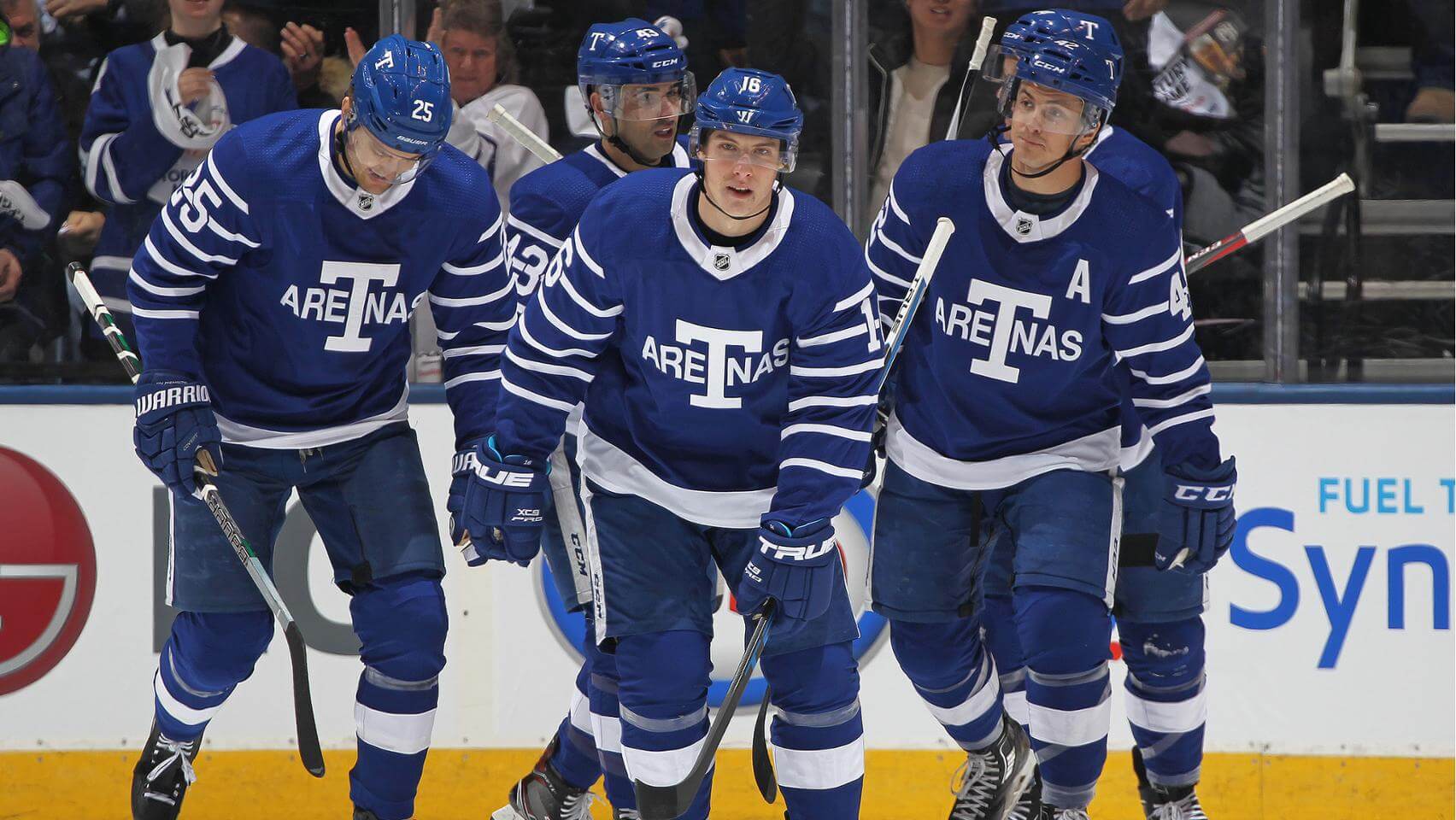
Century mark: Yesterday was 100 years to the day since the Maple Leafs franchise, and the NHL itself, made their debuts. The Leafs were called the Toronto Arenas back then, and yesterday the team wore a very nice-looking set of 1917 Arenas throwbacks to mark the centennial anniversary. Here are some additional photos and videos.
More mini: I received an early Christmas present in the mail yesterday from longtime Uni Watch reader/pal Michael Princip: a mini-helmet incorporating the Hale America-style shield logo that fellow reader/pal Rob Ullman recently designed. Check it out (for all photos, you can click to enlarge):
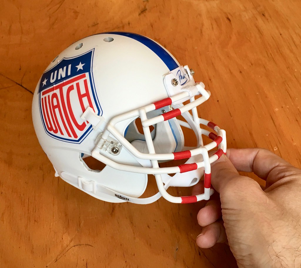
Michael has done some industrial design work for Schutt (as you may recall, he was the lead designer on the Schutt F7), so he used a Schutt XP mini-shell. As you can see, he also gave the facemask a Sean Taylor-esque tape job.
There are several other custom elements. Michael used a 3-D printer to create a miniature version of Schutt’s twist-clip nose bumper (an element that isn’t normally available for mini-makers), and I was surprised to see my own signature on the bumper plate:
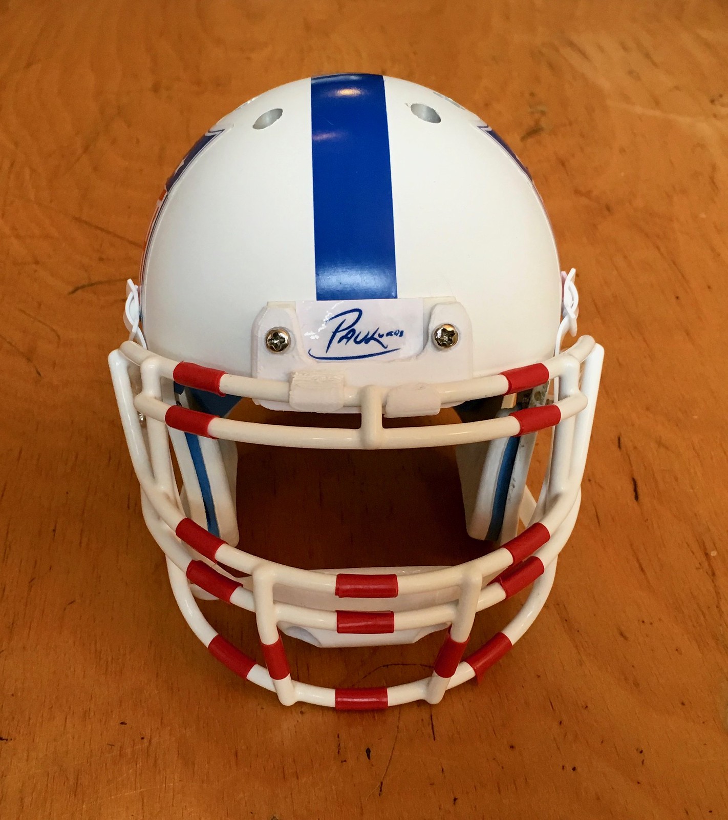
How did Michael get my signature on there? Turns out he traced it from this photo, which I had previously run here on the site.
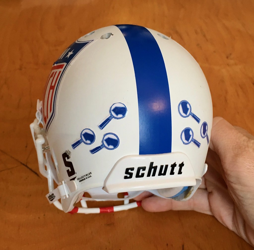
More customization: The top of the shell has hand-drilled ventilation holes. “If you look at all other Schutt mini-helmets, they don’t have the circular vent holes,” said Michael. “The holes are one of my favorite features on that helmet, so made sure your mini-helmet had them.”
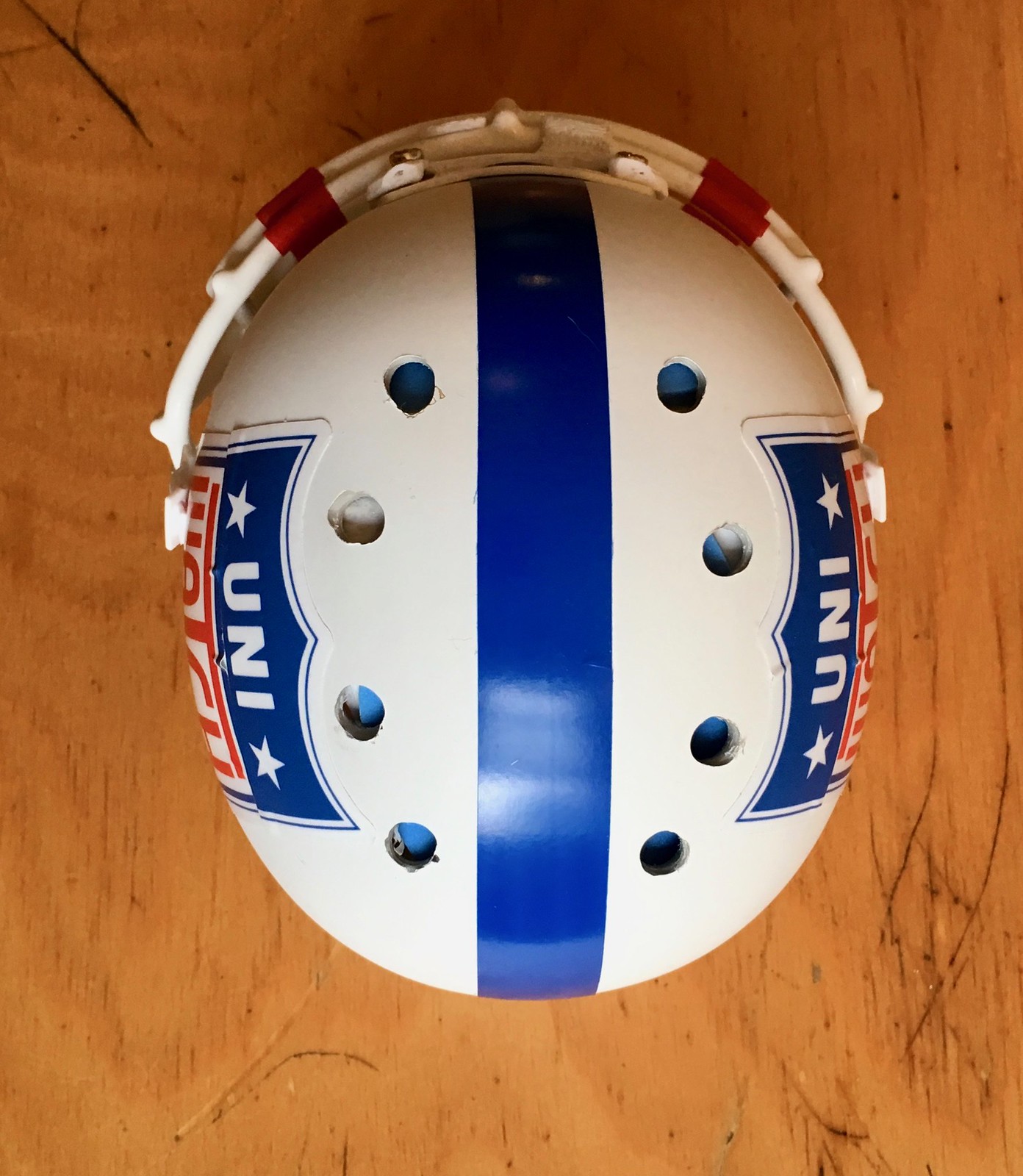
And as a finishing touch, Michael included merit decals on the back of the shell:
Very cool. Thanks so much, Michael.
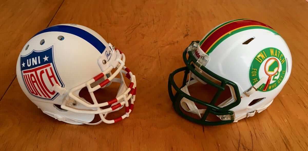
Just think, two months ago I didn’t know jack shit about mini-helmets. Now I have two of them. Look at that — it’s a collection:
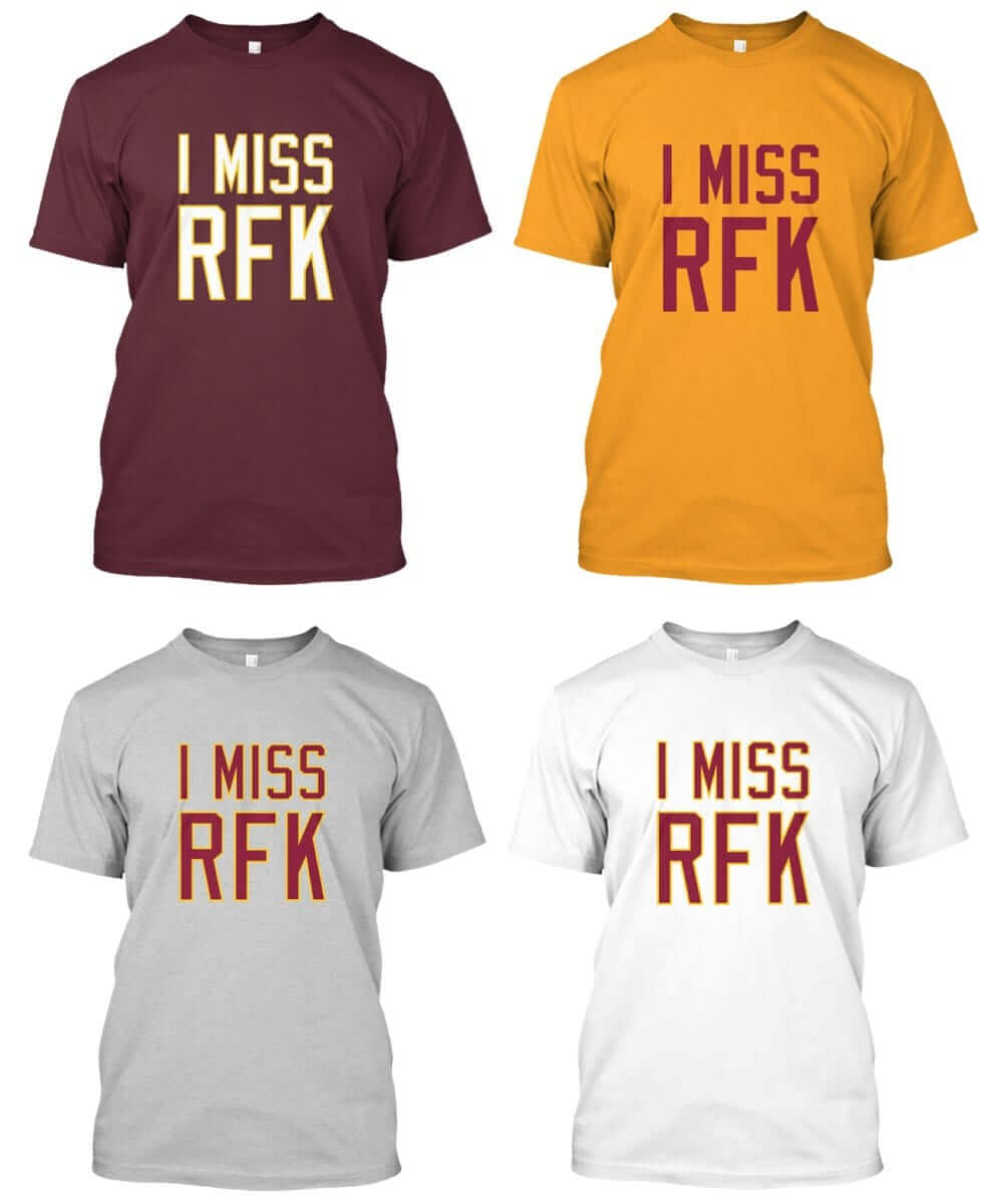
Money, mouth, etc.: Yesterday I donated $469 to the American Indian College Fund. That was our profit this year on “I Miss RFK” shirts in ’Skins colors. (Any RFK profits that we generate in the remainder of this month will be paid out in 2018.) ESPN routinely matches its employees’ charitable contributions, so the total will be well over $900 — not bad.
I’m proud to support this organization, and I thank everyone who purchased these shirts.
Raffle reminder: In case you missed it last Friday, our annual year-end raffle is currently underway. The deadline for entering is tomorrow evening, 7pm. Full details here.
Click to enlarge
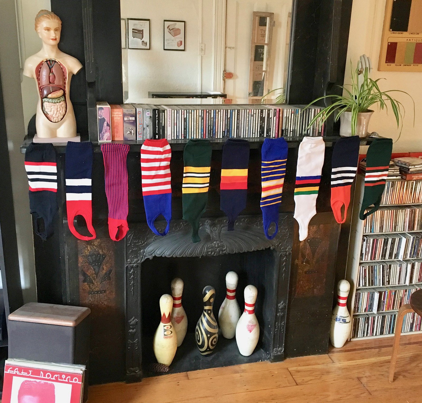
Holiday tradition: ’Tis the week before Christmas / And at Uni Watch HQ / We’ve hung our stirrups by the chimney / How about you?
The Ticker
By Alex Hider

Baseball News: The Charleston RiverDogs are celebrating their 25th anniversary next season. Since they’re dogs, they’ve come up with an anniversary logo that marks the occasion in dog years. … Reader Tom Tagliabue was touring the USS Lexington Museum in Corpus Christi, Texas, and spotted this old baseball jersey, glove, and bat used by the ship’s baseball team in 1936. … Phil is continuing his countdown of his top 10 favorite Negro League uniforms. Here are Nos. 7 and 8. … Tigers fans want the team to retire Lou Whitaker’s No. 1, but the team isn’t inclined to do that because Whitaker isn’t in the Hall of Fame (from Brinke).

NFL News: A Detroit Ford dealer is running an ad that features Lions QB Matthew Stafford and his “teammates” — i.e., a bunch of guys wearing oversized No. 00 jerseys (from Jeffrey Sak). … Brinke came across this photo of Paul Brown and a Bengals player, likely in the late ’60s or early ’70s. The black trim around the orange jersey stripe is much thicker than a traditional jersey of that era, and the black pants stripe is much thinner. “Maybe a variance in production or a new supplier?” Brinke asks. … Barstool Sports is threatening to sue the NFL for stealing its trademarked slogan and putting it on merch. … The Steelers’ longstanding protocol of omitting front helmet numbers during the preseason led to an oddity in their Pro Bowl promo graphic.
College Football News: Heavy rain in the Dallas area meant the grounds crew got a late start on painting the end zones for the Frisco Bowl last night (from Mark Johnson). … San Diego State will wear helmet decals honoring the five branches of the military on Saturday in the Armed Forced Bowl (from Nathan Clark).

Hockey News: According to Mike Reilly, it appears that the NHL has made a change to its game pucks. The NHL 100 logo has been removed from the back, and the white inner ring is a bit smaller than in years past. … The Sharks will be giving away a nutcracker in the likeness of D Brett Burns on Thursday — though the figurine has him wearing the wrong color pants (from @GKG_77). … Olympic hockey uniforms for Russia — er, Olympic Athletes from Russia — may have leaked. … South Korea’s goalie was using a backwards stick in a recent game (from The Goal Net).

NBA News: The Undefeated has a new piece on NBA players and their shooting sleeves (from K.C. Kless). … The Jazz will officially unveil their fourth uniforms on Dec. 27 (from Mike Chamernik). … Here’s some good shots of Kobe Bryant in high school. Who knew that Lower Merion wore numbers on their shorts at the time? (From Leif Nomeland.) … Wizards G John Wall saluted Kobe Bryant by wearing Bryant’s signature sneakers last night (from @Hall21rip).

College Hoops News: Wisconsin will retire No. 44 in honor of former PF Frank Kaminsky in February. … Florida Gulf Coast went GFGS last night (from Joe Balsamo). … Concordia University in Texas, a D-III school, calls its teams the Tornados. Their basketball jerseys shorten that moniker to simply “Nados” (from Keith Leventhal). … D-II Wheeling Jesuit went big with their jersey numbers (from Andrew Kurzawski).

Soccer News: Leicester City’s Kelechi Iheanacho has been wearing interesting diacritical marks on his NOB — note the dots beneath the first and last letters (from Richard). … Reader Josh Hinton sends along a pair of jersey leaks: Peru’s World Cup “home” kit and Atlanta United’s 2018 road kit. … This blog digs into the eclectic Chelsea kits of the early ’80s (from Denis Hurley). … Real Madrid is letting FIFA 18 players go BFBS in the video game (from Luke Plunkett).

Grab Bag: Over on The Driver Suit Blog, David Firestone handed out awards for his favorite racing paint schemes of 2017. … The logo for the 2018 World Chess Championships is arguably NSFW. … Slovenia has unveiled its opening ceremonies uniforms for the upcoming Olympics (from Phil). … A Chinese clothing company is suing Apple, claiming the tech company stole its logo and used it as the App Store’s logo.
I isn’t just Real Madrid… adidas also gave Manchester United, Juventus and Bayern Munich digital “4th kits” only available in fut mode on FIFA
link
Pretty much every FUT-only kit is totally bizarre.
(For the uninitiated, Ultimate Team in EA games is basically fantasy sports except you can actually play with your team and in FIFA this includes choosing uniforms/a ball/a stadium for them.)
That new mini helmet is great. Made me think how great a pro bowl would look with both sides wearing white NFL shield helmets like that (maybe NFC with blue facemasks, AFC with red), going color on color blue vs red jerseys, and white pants.
First time I’m seeing “shooting sleeves” in print. So they serve an actual function, more than just aesthetic?
I’m sure Nike would say they have some sort of compression effect that keeps muscles more pliable and thus make the players less likely to cramp. I run with ankle sleeves and certainly find it less painful.
But officially: it’s just wavy. Allen Iverson started this, lots of NBA players idolized AI growing up (look at how many players wear #3/cornrows were actually a thing for roughly a decade) and it’s now basically just a fashion accessory.
An interesting thing that Paul might wanna look into: I’ve generally noticed star players tend to wear more accessories (sleeves/leggings) than bench/rotation players do. Maybe there’s some unstated hierarchy in locker rooms that states you have to be important to wear all that. Maybe it’s just because star players play more. But it’s certainly a thing you’ll notice if you watch a lot of NBA hoops.
Obviously those things really work, and if the bench guys wore them they’d become stars.
What are the chances Staples Center changed the type of lighting they use in the past 15-ish years? Not even just from going from incandescent to LED, for example, but I’ve seen 3 different temperatures of LEDs widely available commercially–warm/soft white (closest to regular ol’ incandescent bulbs), bright/cool white, & daylight. Switching between any of those would impact how it looks.
I know retail jerseys are not a thing here, but if someone has 3 of them, this can be settled fairly quickly because pictures could be taken side by side and with the same lightning. Just grab a 2000 Nike jersey, an Adidas one and the current one and we are done.
Except retail dye lots are not always the same as gamer dye lots, plus old jerseys fade, etc., etc.
I had no idea about dye lots being different. Too bad
Wonderful idea supporting the College Fund! Nice that ESPN is matching as well.
Just to be clear: ESPN isn’t matching this as a special project or anything. They routinely match our charitable contributions. Company policy.
Ah, I wasn’t aware. Thanks for the clarification. It is still a nice policy.
I’ve just updated the text to make the meaning clearer.
Proofreading:
“is too yellow. Key” missing space
“> Tigers fans” extra angle bracket
Fixed.
Does anyone else “see” ARETNAS or “Aretnas”?
I saw the same thing.
I don’t see “Aretnas” but something about that logo design is definitely off. I just chalk it up to being 100 years old and not the same aesthetic standard we are used to for that sort of thing.
Just like you said Greg about aesthetic standard back in the day. it is old-timey. Like this old PCHA Victoria Aristocrats jersey with the low name sash:
link
I honestly thought on first glance that it a front-of-jersey advertisement for my health insurance company.
Yeah, “AreTnas” was the first thing my retinas saw.
Barstool Sports better get their litigatin’ britches on!!
link…130292.133747.0.134080.5.5.0.0.0.0.46.186.5.5.0….0…1c.1.64.psy-ab..0.0.0….0.pZGu1MyjdV0
Tigers fans that were there in the 80s definitely are pissed that Whitaker has been overlooked. Really, it makes no sense to have Trammell in the Hall without Whitaker, because they were one of the best double-play combos of all time. Sweet Lou definitely deserves better.
Whoops, that wasn’t supposed to be a reply!!!
As a Tigers fan, I’m ticked that it’s taken this long, and this event, to retire Trammel’s number. When they whored out the #3 to Gary Sheffield, that set me off. If there’s a team that is tone-deaf to their fan base, it’s the Tigers. The #1, and the #3 should have been retired a long time ago.
The “we only retire the numbers of HOF players” is BS; what about Willie Horton? Not to disparage Willie, the man has a heart of gold, as big as the city itself. This is on the Tigers; they waited, some would say deliberately, until Sparky Anderson had passed, before they retired his number. The Ilitches can show a distinct lack of class.
Agreed. For decades I have had a poster of the two next to each other with their stats below them. I always considered Lou statistically the better of the two.
Different Matthew Stafford commercial….
at the :17 mark the NFL shield is taped over.
link
Peru’s World Cup kit wasn’t leaked, it was released.
Riverdogs get anniversary patch of the last 7 years.
I have definitely been saying the same thing re: Lakers yellow this entire year. I think it’s quite obvious on the Warriors jerseys as well. Their yellow also looks like highlighter, which it didn’t before. This has to be due to the switch to Nike. So funny how cocky they are about their designs for new uniforms etc. but they can’t get the color right for the most iconic franchise in the NBA.
PS A little disappointed that I mentioned this Laker yellow issue nearly a month ago in the comments and it was never brought up until now :/
You may have brought it up a month ago, Brendan, but the impetus for today’s entry was that article linked in the 1st graf (which was also from a month ago, but I missed it), because the article made it clear that the team and Nike had investigated the issue.
It’s not just yellow. Nike’s take on Celtics green is more like radium than shamrock. I’m inclined to say this is something you’d expect from Under Armor, but that’s not true–this is totally a Nike move. Nike ended the idea of a consistent color scheme (Oregon) and gave us FFFS (fluorescent for fluorescent’s sake). Tradition is understated, the future is shrill! This design principle is the one-trick pony that Nike can’t seem to put out to pasture–even when it comes to what could be exacting color reproduction.
I’m not joking when I say an analysis of the fabric dye would ultimately reveal at least a few flakes of phosphor-like substance–it is clearly synthetic, not even trying to fake a natural pigment. Kudos to Nike for finding a way to “upgrade” two of the most iconic jerseys in sports.
My hot take: The new Lakers yellow and Celtics green align with the digital design trends–flat mobile app/material design palette. My hotter take: As always, Nike’s design decision is about the $$$. Without drastically changing the jersey’s appearance, they’ve still managed to render the Adidas era jersey obsolete.
I would like to call for an official Uni-Watch inquest.
Robert,
I totally agree, I think the Celtics green is off too. For a while there I thought my eyes were playing tricks on me.
The Celtics Green, Lakers Yellow, Bulls Red, Warriors Gold Trim come to mind – all of which almost seem neon when watching on tv. I’m in Hornets territory so I see a lot of their games on tv and that Teal *might* be brighter than last year too. I don’t hate it, however…
Sort of like how they couldn’t figure out the Eagles shade of green for over half the season. But don’t worry, the material is super light and wicks away all the moisture. As a result everyone performs at 120%!!!
Football manufacturers have had a terrible time matching paints and fabric dyes lately.
I think this might be part of the driver for matte/satin finish helmets. The flatter finish better matches the flatter fabrics (although how the Vikings got screwed up is beyond me)
Vikings seem to have had a problem matching their helmet and jersey for years, and yeah, I have no idea why.
Most iconic franchise in the NBA = Boston Celtics.
Contentious issue, but my vote’s with the Lakers: It’s the team everybody wants to play for.
The Lakers were one of the 10 teams to wear Nike uniforms in early 2000 (when the template changed to the wishbone collar). The gold was more yellow in hue and changed when Reebok took over and then transferred it to its parent company adidas. I have a shooting shirt back home in LA (I live in NYC now) that matches the color that the Lakers use today.
Paul,
Classy move donating the profits from the shirts to the American Indian College Fund. You have championed cause and have backed it up with your actions. It just goes to show that values and beliefs can stay outweigh money. Kudos to Paul.
Nike and Adidas both pushed the highlighter yellow along with all the other neon garbage. It was real bad with the University of Michigan. Thankfully Harbaugh put a stop to it.
PAULUKAS
I see what you did there.
If you’re referring to my signature, yes, it’s what I’ve been doing for most of my life (and how I sign every Uni Watch membership card, among lots of other things).
New logos for the 2018 World Chess Championship:
link
This being the 21st century, the logos come with acres of flabby text about the story the logos tell. “Controversial and trendy, just like the host city,” the text declares of a logo already being called too sexually suggestive to be used in schools, where most organized chess is played.
Is there a reason why the manufacture would be pushing monochromatic elements? I get it in the nfl where they create new uniforms they get to push in retail but I am not understanding why Nike would want to advocate for the Lakers to be monochromatic in their socks, leggings, etc.
New look, new visual style, becomes associated with the new manufacturer (i.e., Nike).
In short: “rebranding.”
Epistemological question: What are a team’s uniform colors? The colors the team defines in its style documents? Or the colors of the physical artifacts worn by players on the field?
NBA uniforms in general are brighter this year. Washington’s road reds, Boston’s greens and Dallas’ blue all pop out as different. This isn’t just the Lakers. This seems like a leaguewide trend with the change in manufacturers.
The question now is will the Hale American Shield Uni Watch mini helmet be offered for sale with the original??
I’m open to it, if there’s enough demand. I think we’d need at least a dozen people to be interested in it, or else the numbers don’t work. But I wasn’t looking to do a sales pitch with this helmet — just playing show and tell.
(And just for the record, if we did sell it, I would *not* want my signature to appear on the bumper.)
Well, then a mini football and you can have your signature like the NFL commissioner does ;)
Concerning Nike and the brighter yellow uniforms for the Lakers…many USC fans believe for a number of years now that the “gold” pants for the Trojans football uniforms are more yellow than before. Maybe it’s a Nike thing.
I think part of the Lakers thing is just how the uniforms appear on TV because that’s what I assume most people are going based off of. I remember seeing the Celtics uniforms the first few games and thinking the uniforms looked way too bright and even a little lime-y. However I’ve seen both jerseys in stores and all that and they both look a lot deeper and richer in person. Might just be the bright lights washing them out and lightening them up.
I’m not really sure the South Korea’s goalie stick is “backwards”, it looks like he is a left hand catching, right hand shooting goalie. so when he passes the puck, the curve is correct.
Catching with the left hand has no bearing on the way the goalie shoots but I agree that he is a right handed shot so the curve is correct for him.
Regarding the Lexington glove, jersey, and bat…the bat looks fishy to me. Though it is hard to tell for sure from a picture, it looks more like a softball bat. Softball bats have a narrower barrel than baseball bats. Also, the red Louisville Slugger label looks far more modern than what would have been used in the 30’s. I can remember in the late 80’s or early 90’s Louisville bats started having a similar logo instead of their classic HB one inside the oval. LS gloves also had patches with the same font/design.
link
link
Golden State’s gold/yellow looks off this year too … too cold, like a canary yellow instead of the warmer tone from the Adidas set.
Proofreading:
wearing interesting diacrtiical marks on his NOB
Fixed.
Sorry to be the bearer of bad news; it’s still misspelled.
Fix-fixed.
No piece on the new nba city alt jerseys????
Uh…
link
Pay attention! ;)
I’m confused on a number considered being ‘retired’ – Kaminsky’s #44 is going to the rafters but will still be in circulation.
For a team to base its decision on retiring a number on whether the player is in the Hall of Fame makes no sense. The only criterion should be the player’s importance to the team’s history; the decision should have nothing to do with the votes of the Hall of Fame electors.
And yet, the HoF standard is used by many teams.
Paul,
Tried blowing up your fireplace pic so I could check out your cd collection but it was much too blurry. Could only make out your Chicago Blues box, This Is Maxwell Street box (I’m a big fan of Carey Bell) and Fats Domino lp. Thumbs up on your musical taste. Also love the unique black & white bowling pin. Is there a story behind it?
The bowling pin is actually black and gold, and was painted for me as a gift back in 1993 or ’94 (I forget which) by my friend Jasmine, who’s a decorative painter and designer. One of my most treasured objects.
Took another look and noticed the gold this time (first time around I thought it was yellowed white). A beautiful piece among other interesting items I’ve noticed throughout your household. Would love to see a story dedicated to your home design aesthetic.
I find it funny people are calling a slightly darker shade of yellow, “gold.” It’s STILL yellow folks.
That being said, the shade of their purple jersey’s isn’t the same either, but they never wear them so…