Click to enlarge
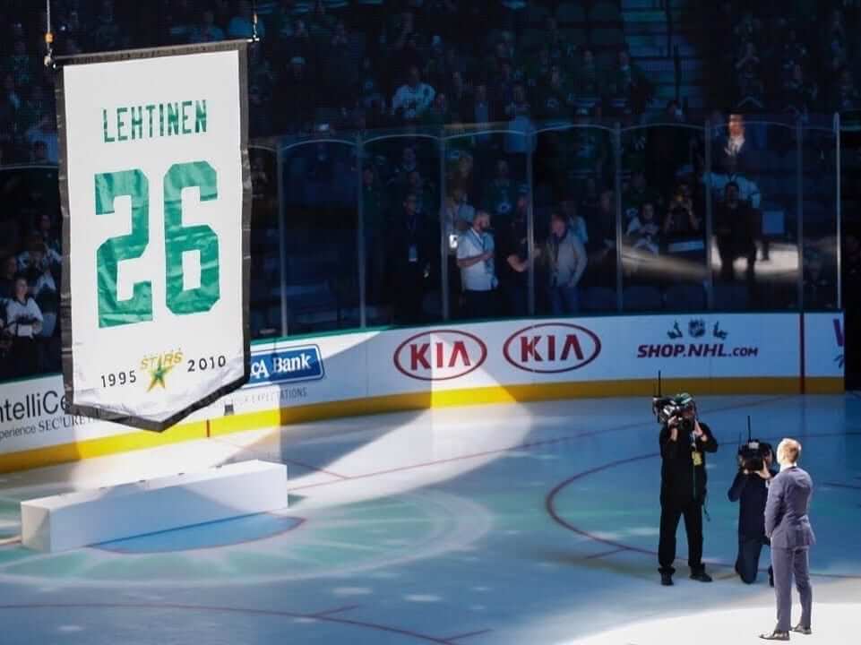
The Stars retired Jere Lehtinen’s No. 26 last Friday night. They made two uni-related moves to mark the occasion — one rote and predictable, the other more subtle and special, with lasting effects.
The rote and predictable move was that all Stars players wore No. 26 Lehtinen jerseys during pregame warm-ups. This has become a standard NHL trope when someone’s number is retired, which means it no longer feels special or momentous — it’s just “that thing we do because it’s what we’re supposed to do.”
Stars players about to take the ice for warm ups wearing Jere Lehtinen jerseys. #GoStars pic.twitter.com/hF98XSxAjD
— Dallas Stars (@DallasStars) November 25, 2017
The other move, however, was really cool. Lehtinen had a uni-related quirk during his playing days — he wore yellow skate laces:
So on the night that his number was retired, the Stars all wore yellow laces for their game against the Flames:
Nice, right? The Stars won that night, so they went yellow-laced again for Tuesday night’s game against Vegas (click to enlarge):
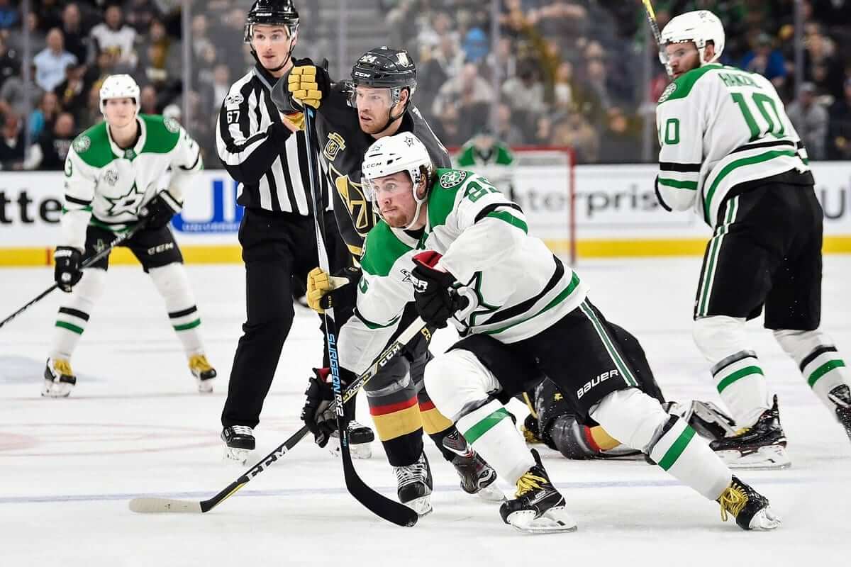
They won again, and now it looks like they’re going to keep wearing the yellow laces for tonight’s game against the Blackhawks, and as long as they keep winning, and maybe beyond:
The boys are channeling their inner Jere Lehtinen. The laces are sticking around for a little while longer at least. @Kia pic.twitter.com/28HAuFdDCu
— Dallas Stars (@DallasStars) November 29, 2017
I love this — a small gesture that goes a long way, and a nice way to extend the good feelings from the number retirement.
(My thanks to Brian Rowland for tipping me off about this one.)
Anthem update: Could the end of the NFL’s national anthem protests be at hand? Possibly. Word came last last night that the league and a group of activist players had reached an agreement calling for the league to commit $89 million over the next seven years to social justice issues that are important to the African-American community. That’s a greater financial commitment than the Salute to Service or cancer promotions. It’s unclear if the social justice initiative will include any uniform-related elements like the rainbow-patterned captaincy patches or camouflage waistband towels.
As for the anthem, here’s the key passage:
The agreement does not include language calling for players to end protests during the national anthem in exchange for funds; there’s no implicit quid pro quo. But the NFL hopes this effort will effectively end the peaceful yet controversial movement that former San Francisco 49ers quarterback Colin Kaepernick started in 2016, when he refused to stand for the anthem.
For months, Goodell and Troy Vincent, the league’s executive vice president of football operations, strived to find common ground with players who took a knee and raised fists in an effort to shine a light on racial injustice. The owners whom Goodell and Vincent serve could have attempted to push through new rules regarding the anthem in the NFL game-operations manual during offseason committee meetings. However, for Goodell and Vincent, trying to force players to stand for the anthem — which would have undoubtedly triggered a fierce battle with the NFL Players Association — wasn’t a fight worth having. League sources also said Goodell, in particular, believes that fighting for social justice is the right thing to do, which factored into the decision to place no anthem attachments on the partnership.
It’ll be interesting to see what happens with the anthem protests this Sunday. At least three players have already criticized the deal (NYT link). One of them, 49ers defensive back Eric Reid, described the deal as an attempt to “buy our silence” and said he would continue to protest.
Logo creep update: When the new MLB BP caps were unveiled last week, we noted that the New Era maker’s mark on these caps was “silicone-printed” rather than embroidered, and that this would presumably make the logo harder to remove.
Turns out we needn’t have worried. The logo comes off pretty easily (video and photo from @HatOnHeadWearer):
UPDATE: turns out if you scratch at it you can peel the New Era logo right off. Not perfect and I’ll probably continue to try and get any residue off, but much better. It came off easily enough I wonder if we’ll see team logos fall off of caps in games. @UniWatch @PhilHecken pic.twitter.com/eW4CQbVJPj
— Lets Chat About Hats (@HatOnHeadWearer) November 29, 2017
A little Goo Gone should take care of any remaining residue, and then you’re good to go. Nice!

Culinary Corner: A few years ago the food website Serious Eats ran a series of posts under the rubric “Will It Waffle?” The idea was basically to try putting anything and everything in a waffle iron (which was so much fun that it eventually led to a cookbook). Inspired by that example, I convinced the Tugboat Captain’s brother Peter to reheat our leftover Thanksgiving stuffing and mashed potatoes on his waffle iron.
Actually, “reheat” is the wrong word, because waffling is really a form of cooking, or maybe alchemy.
We started by putting some stuffing and mashed spuds on the iron (for all of these photos, you can click to enlarge):
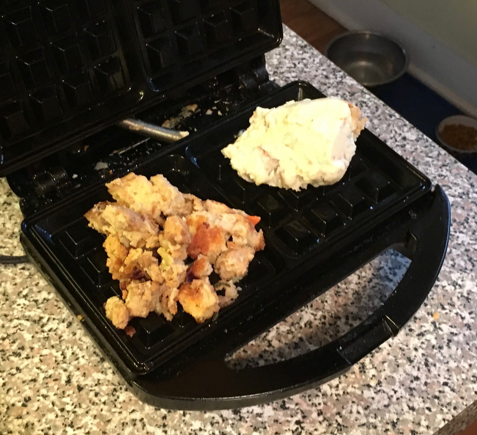
It was hard to know when they were done (or even what constituted “done”), so we had to peek periodically. The initial viewing indicated that we were making excellent progress:
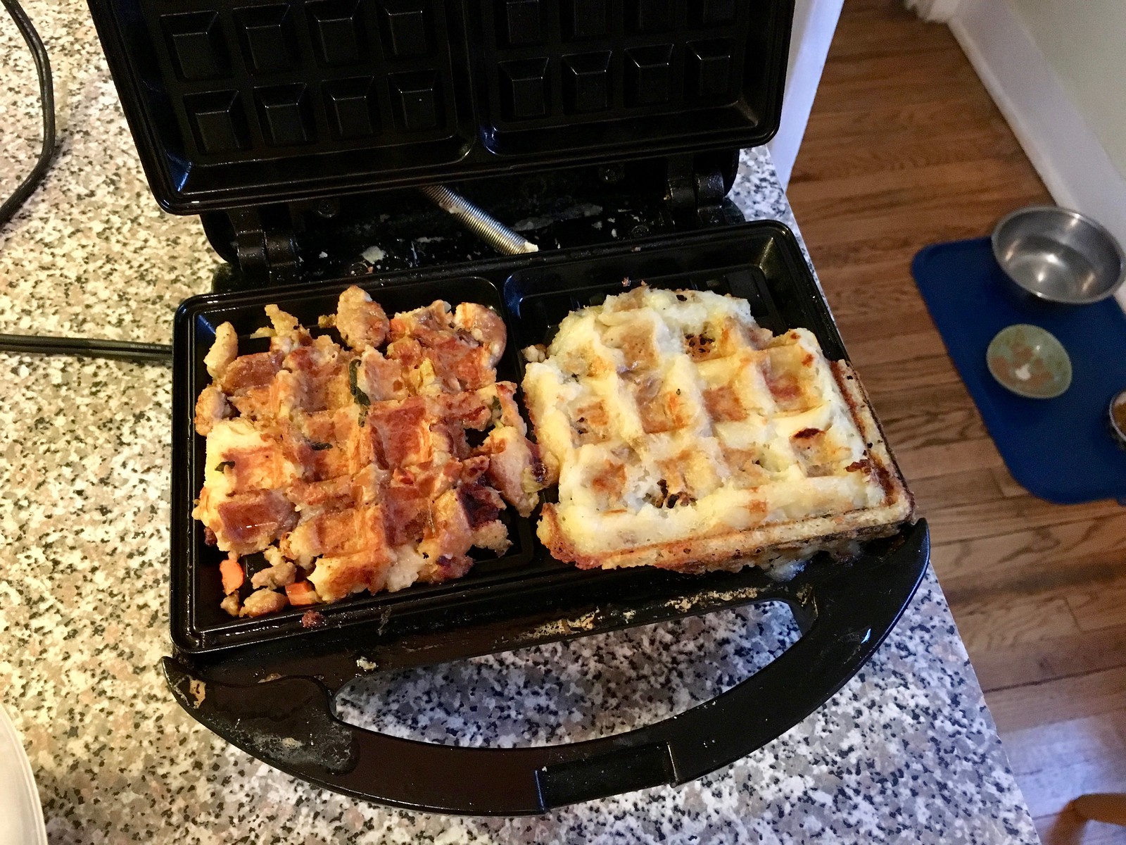
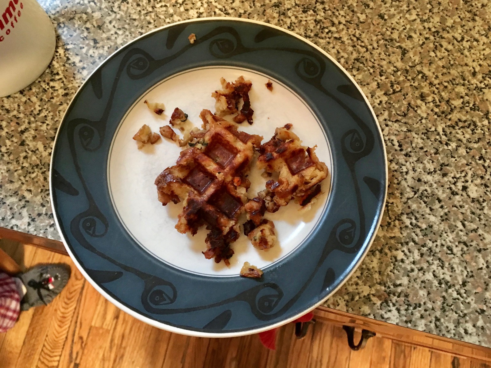
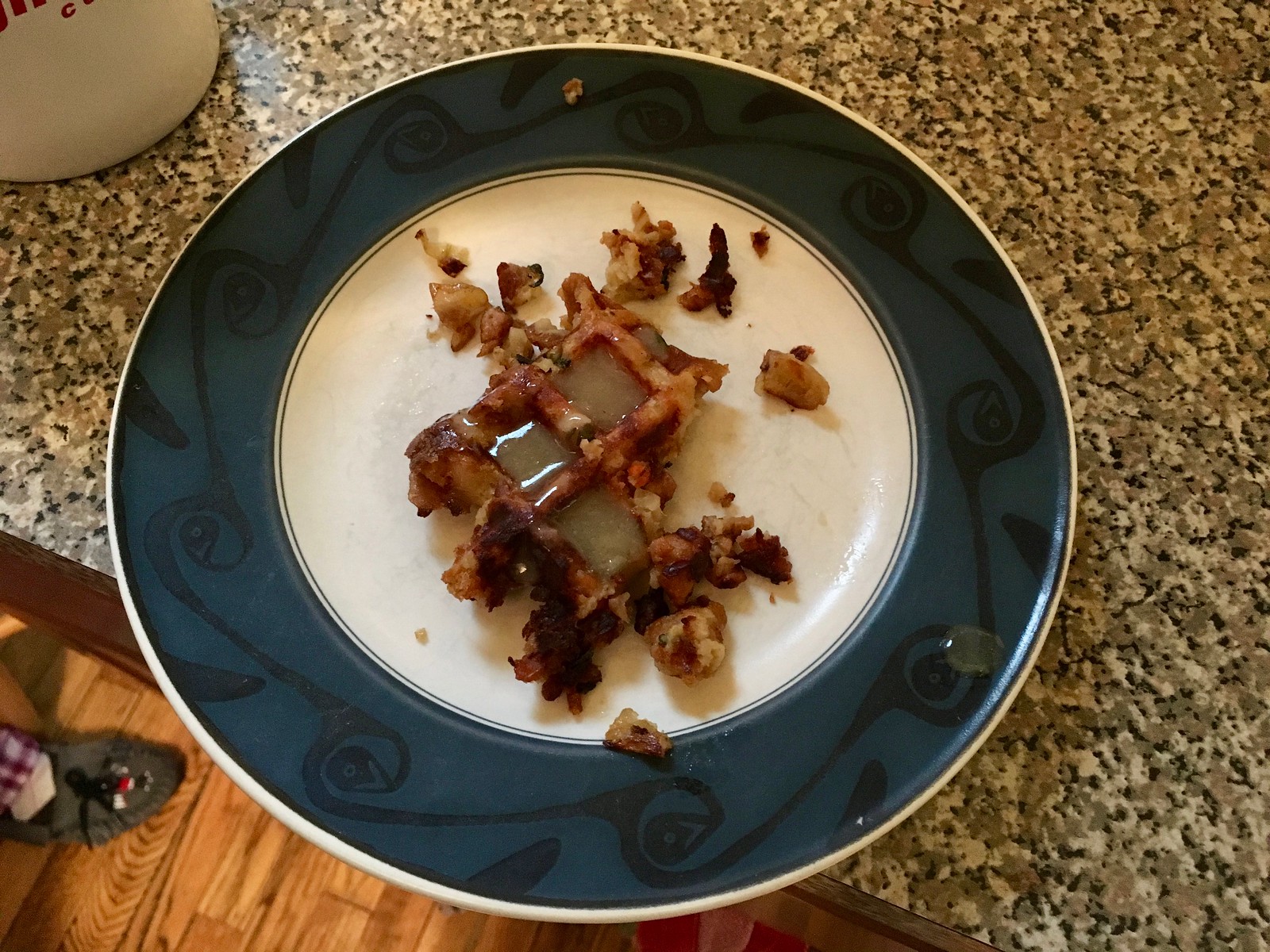
A few minutes later, we were ready to eat. Here’s some of the stuffing waffle — first on its own, and then with a bit of “syrup” (i.e., leftover gravy):
The mashed potatoes came out looking very much like a normal waffle. But they tasted like the best hash browns ever:

The whole thing seemed like a bit of a miracle. Check out the stuffing in this next shot, followed by the resulting waffle just a few minutes later:

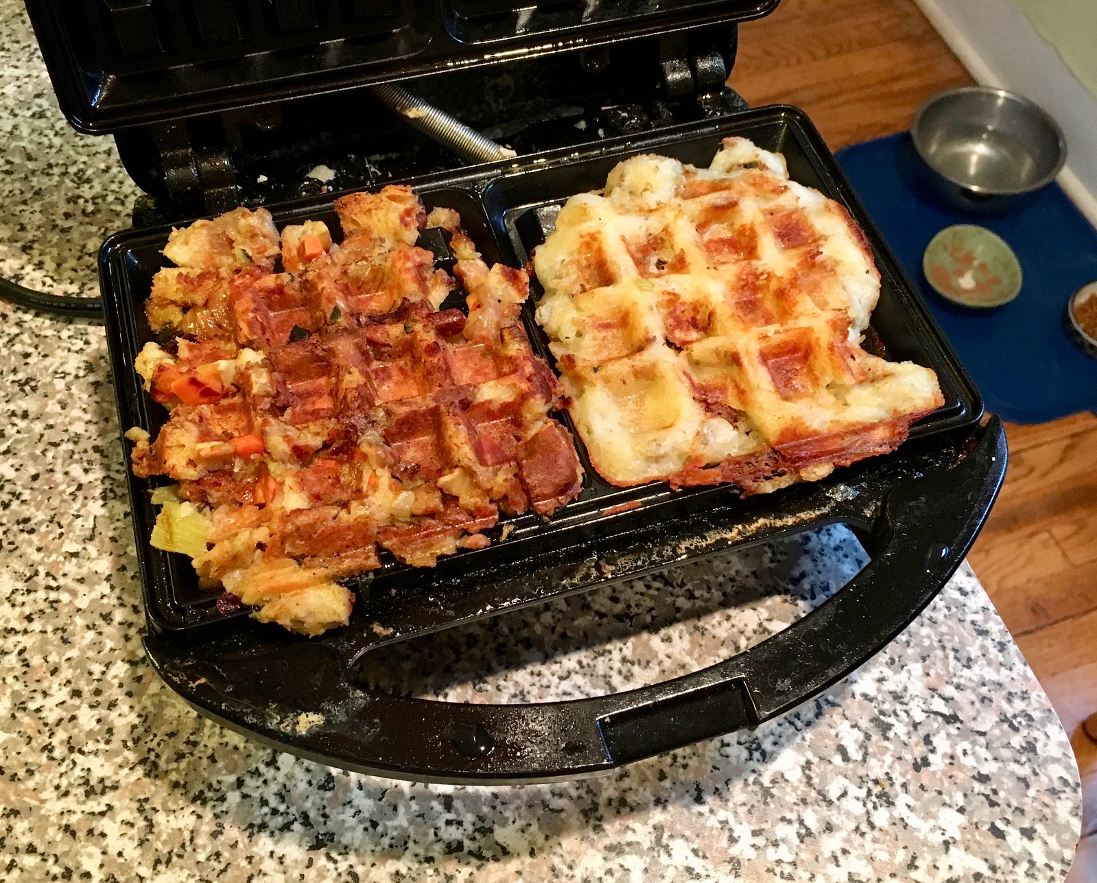
So cool! And really tasty. Made the whole house smell good, too. A successful experiment!
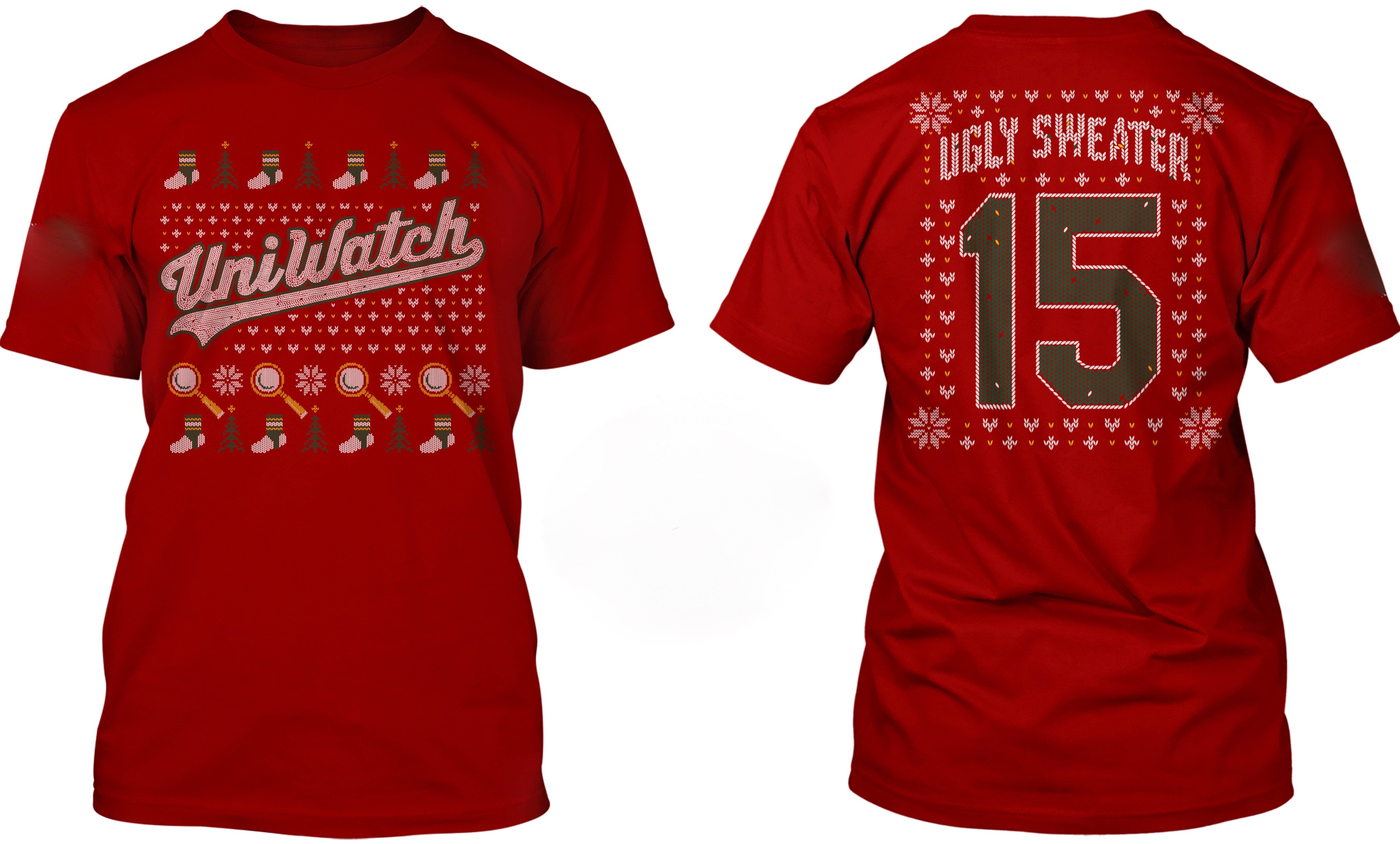
’Tis the season: In case you missed it the other day, I’ve reactivated our Ugly Sweater T-shirt for the holiday shopping season.
This shirt, designed by Bryan Molloy, was originally the December entry in our original Uni Watch T-Shirt Club series from 2015. The version we’re selling now doesn’t include the sleeve patch graphic that the original version had but is otherwise the same design.
It’s a great design concept, with a really satisfying level of detail in the “stitches.” Click on the image at right to see a larger version of the front and back designs — Bryan really nailed it with this one.
The shirt (which also comes in long-sleeved and sweatshirt versions) is available here.
The Ticker
By Paul

’Skins Watch: Although Edmonton mayor Don Iveson has recently called upon the CFL’s Edmonton Eskimos to change their team name, some Inuit people in the Edmonton area disagree (from @PureLipschitz).

Baseball News: As noted last week, the “C” on the Reds’ new BP cap is based on the one worn by the old Cincinnati Red Stockings. But Ken Traisman notes that it also resembles the “C” used by Corona beer. … New softball uniforms for Southeastern Louisiana (from Chris Mycoskie).

Pro Football News: The Jaguars will reportedly wear their teal alternates on Dec. 10 against the Seahawks (from @aacameron1). … Here’s a rare preseason shot of the WFL’s Birmingham Vulcans wearing jerseys without their usual stripes. … The Bills are going mono-blue this weekend against the Pats. … Panthers QB Cam Newton, who’s an Auburn grad, wore an Auburn cap with a very odd brim yesterday. Anyone..? (From @BackAftaThis.) … Titans WR Rishard Matthews will wear cleats in support of former 49ers QB Colin Kaepernick for this weekend’s “My Cause, My Cleats” promotion. Matthews and Kaepernick were college teammates at Nevada. … Packers RB Jamaal Williams wore a hoodie over his helmet in practice yesterday (from @Bigten119).
College Football News: Reader Michael Rich notes that Georgia Tech wore the same jersey for the entire season. “I wonder when was the last time a team achieved that feat,” he says. … Cross-listed from the NFL section: Carolina Panthers QB Cam Newton, who’s an Auburn grad, wore an Auburn cap with a very odd brim yesterday. Anyone..? (From @BackAftaThis.) … Clemson will wear orange for the ACC championship game, while Miami will go mono-white (from Phil and Eric Yesner, respectively).

Hockey News: Reprinted from yesterday’s comments: Flyers G Michael Neuvirth wore a purple mask for Hockey Fights Cancer two nights ago. Here’s an action shot (from Bob Sullivan). … Pens equipment manager Dana Heinze says the NHL centennial patch will be removed in mid-December. … Love these old hockey program ad illustrations (from Chris Mizzoni). … The ECHL’s Maine Mariners unveiled their new logo (from Russell Wilson). … The Zamboni at Boston’s City Hall Plaza rink looks like a T car (from Greg Niforos).

NBA News: Could this Sixers T-shirt be the basis for the team’s upcoming city-based alternate uni? Jack Connell spotted that shirt at a local shop. … Postgame jersey swaps are now spreading to the NBA. … The Knicks wore orange compression sleeves last night. They had previously been wearing white. … Stunner last night in L.A., as the Lakers wore purple at home.

Soccer News: 1992 throwback kit for Charlton Athletic (from Ed Żelaski). … Here’s a really great video clip about Guatemalan soccer team whose uniforms are based on their Mayan heritage. Really interesting stuff — highly recommended (big thanks to Anthony Nuccio). … Portland Thorns striker Nadia Nadim has been wearing mismatched shoelaces (from Kenny Ocker).

Grab Bag: Here’s the logo for the NLL’s new Philly franchise, the Philadelphia Wings. … Here’s one observer’s picks for five cricket players whose jerseys should be retired. … Here’s more about the new F1 logo. … New logo for the 2018 Boilermaker Road Race. … Russia has unveiled its Winter Olympics uniforms, although the country is facing a possible doping ban. … Interesting story on the “uniform” worn by anti-fascist activists (NYT link). … New logo and mascot for a field hockey tournament in India.
On a serious note, you’ve probably heard that 150 ESPN employees got the heave-ho yesterday — the third round of staff cuts in the past two years. I appear to have once again dodged the bullet (not really a surprise, because my current contract has another year-plus to go, so my compensation is a sunk cost), but several of my colleagues were not so fortunate. My thoughts today are with them.
I’m sure the “Hockey in India” is field hockey
Definitely. The mascot is holding a field hockey stick. In fact, the term “Field Hockey” is a retronym (a term created to provide clarity where previously none was required) to differentiate it from the more recently developed Ice Hockey.
Other retronyms: Whole Milk, Acoustic Guitar, Analog Clock
Thanks. I’ll move it to the Grab Bag.
“I’m still calling it ‘hockey'”
link
Link to Cincinnati Reds BP cap goes to a picture of a Mets jersey.
Fixed.
Is there a uniform in the NFL that digresses more in look than the Buffalo Bills, when the Bills opt for mono-blue as they’ve chosen to do this weekend? Maybe the Dolphins, but it wasn’t much to look at in the first place.
“digresses”?
Do you mean “diminishes”?
Yep I was wondering if I had the right word there. Thanks
Bills’ uniform decision represents a fashion problem in football that has developed in today’s pro game. Think of a Bills team that wore a similar design in 1983 for example. Blue jerseys were only worn with white pants. Blue road pants only worn with white jersey.
No poor decisions by teams to switch it up and wear their non-white road pants with the home jersey of the same colour to create the mono-strosities.
Well, I will look at this weekend’s Bills uniforms with the glass half full. Remember when it would look like this:
link
When did this trend start? Was the first NFL team to do this the Seahawks circa 2002? It seems like they started it and others jumped on the bandwagon. I don’t think it really became regularly widespread until the late 2000s or early this decade. Now we see terrible monochromatic looks all the time. Granted it probably became common in college before the pros. That said, it looks terrible.
Here, you can look that up yourself on the Gridiron Uniform Database:
link
I believe a few teams went mono on very rare occasions before Seattle made it commonplace when they switched to the navy uniforms. It is brutal, and has gotten even worse when the socks became mono as well. I think the worst mono looks are when the helmet is a different, lighter color than the rest of the uniform. Not sure why this trend caught on, but it is one of the worst uniform trends I can think off.
Solid white is the only look that really works.
More on mono-history:
link
Looking through the Gridiron site, it seems 2002 was the year when mono unis began to make their regular appearance. The Bills, Seahawks, Jaguars, Patriots, and Eagles all introduced mono looks that year, despite none of them doing so previously. Oddly, the Saints did mono-black in 2001, but did not in 2002, despite other teams jumping on the bandwagon.
Interesting!
First mono in the Super Bowl era, however, was Eagles in 1997.
From Paul’s 2014 ESPN article about mono-color uniforms: “One final thought: As noted in a recent column, Uni Watch is very much in favor of more color-versus-color games. Now imagine what that would mean for a game between two mono-clad squads. In addition to going mano a mano, the teams would also be going mono on mono — nice.”
Well, that’s what we have gotten with the Thursday night games, and my understanding is that Paul is no longer a fan.
When I think of first teams to go mono as their primary look in the more modern era in pro football, 1984 USFL Oklahoma Outlaws come to mind:
link
The Ottawa Rough Riders in the CFL started wearing mono-black as the primary look in 1989:
link
It does both me a bit that my favourite football team (CFL Saskatchewan Roughriders) have decided to wear mono-green as the primary look since the league switched to Adidas two seasons ago. It would look better if they subbed in their white pants a lot more often:
link
But their mono-green does have a bit of a throwback nod, as the Riders wore mono-green in the 1950s and a good part of the 1960s:
link
Well, that’s what we have gotten with the Thursday night games, and my understanding is that Paul is no longer a fan.
Based on my understanding (and feel free to correct anything I get wrong, Paul), it’s not the mono-v.-mono aspect that he doesn’t like, it’s the blatant gimmickry of the “Color Rush” program – that teams are adding new jerseys and new uni elements specifically for this program, that they wouldn’t otherwise be doing (would the Cowboys ever have worn white pants for any uniform that wasn’t a 1960-63 throwback?).
There’s a difference between regular mono (in which existing uniform elements are used, the socks still typically have a bit of white to them, and the shoes are normal) and the Rash (in which everything is one color from shoulder to toe).
I think the last paragraph of that ESPN story is evidence enough to indict Paul as giving the NFL the inspiration for implementing Color Rush.
I confess that I was surprised to read that I had written that. What was I thinking?
I may have gotten too seduced by the mano a mano pun.
Right? Knowing Paul’s stance on color rash as well as mono sock/pant combos, I thought he must have had a head injury while writing that little bit!
Browns all-brown, Chiefs all-red, Vikings all-purple, Eagles all-black, to name 4.
With the exceptions of the Chiefs which I would agree is a furhter diminishment than the Bills, the rest are not great to begin with. Admittedly Cleveland goes from not great to horrendous. I think maybe the Bears would be a bigger degradation (I think that word fits)
Contract or no contract Paul, I’m glad you dodged the layoff bullet. Now please excuse me while I go waffle something.
Is Cam Newton actually an Auburn “grad”?
Yes. Received his sociology degree in 2015.
Proofreading:
“called up the CFL’s Edmonton Eskimos to change their team name”
Fixed.
At least the Stars had the best of their jerseys for Lehtinen. They could’ve had the original Edge unis, which are the worst of their jerseys.
Agreed! Good to see those star “throwbacks” on the ice again
I still just can’t believe they retired his number. Were they that desperate to inject some perceived importance into their history? He was a nice player, a three-time Selke winner, on the ’99 cup team, but certainly not HOF material or someone who ever seemed worthy of a number in the rafters to an out-of-town hockey fan.
It’s somewhat surprising they haven’t retired Derian Hatcher’s number yet, considering he is a Hall-of-Famer and he captained that Cup-winning team.
I thought he was an odd choice to have his number retired as well.
That Auburn hat brim has gotta be self modified, right? Looks like Cam just took some sharp cutting tool and cut that out. I assume it’s just part of his unique fashion sense. But who knows.
Today’s entry will be prominently featured in the Mount Rushmore of Culinary Corners. I have to try a stuffing waffle now.
I’d eat that!
“Stuffing waffle.” If this isn’t a major coastal culinary trend on the magnitude of …
[Googles “culinary trends” to find examples other than cupcakes and speakeasy-style bars, and discovers that putting rando foods into waffle irons is already a coastal culinary fad.]
… Never mind. Now to go find a used waffle iron at the Goodwill and cook up some stuffing.
Was hoping the Philadelphia Wings would have used the logo they used previously when they had a team. New one does not look as good in my opinion.
New one looks great – for a metal band and/or a tattoo. Sports team, other than maybe high school club quidditch? Nope.
Paul, I’ve been putting unusual foodstuffs in my waffle makers for a few years now. This Thanksgiving was the second time we’ve made stuffing waffles. I’ve also done mac & cheese, tater tots, and pizza pockets in the waffle iron. With 3 kids at home, it’s a fun way to switch up some old favorites on the menu.
I have never wanted a left-over mashed potato waffle than I do now.
Of course, I never knew I wanted a left-over mashed potato waffle before now either.
Waffled some crawfish dressing this morning and it was amazing. Also try some bacon bits with the potatoes. Damn good. Tried the scalloped potatoes last night, couldn’t wait for the weekend, and they were spectacular. Easy to make. Thin is definitely best.
To heck with waffling stuff, tell us more about crawfish dressing. Sounds delicious.
Friendly hint for phone users, Jere Lehtinen’s yellow laces are seen in #2 of 10 on that Getty link.
I think you made this point implicitly, Paul: I wish the Stars had gone with the yellow laces without the pregame hoopla expecting that their fans are observant and knowledgeable folks. Less if often more; the pre-game routine takes away a little from the genius of the choice to do the laces. The laces are an A+ decision, so they can and should stand on their own.
Here’s a link to some photos of the 1969-70 Columbus Checkers of the International Hockey League.
First notable thing is that the Checkers are in home white while the visiting team is in yellow.
Next, note the CHECKERBOARD PATTERN down the side of their pants! And it’s also on the front of the jersey above and below the “C”. Never saw this hockey uni before, very cool…
link
I hope that Sixers tee isn’t their fourth jersey. Not incorporating the angry Ben Franklin logo into one of their uniforms would be a terrible mistake.
He’s not angry; he’s just mischievous-looking:
link
Hasn’t LSU worn the same uniform (white) the entire season on occasion before?
It’s been a while. They usually break out the purples for non-conference home games against a non-Power 5 (excluding Opening Night).
Negotiating protests? Is this was pregame is turning to in the NFL? No wonder why they’re losing eyeballs on tv’s and butts in seats.
Actually, it’s pretty clear that they’re *not* negotiating the pregame protests, since there was no quid pro quo negotiation.
I read “…strived to find common ground…” as “negotiation”.
Seems like more of a dialogue to me. Whatever — we all know by now that you’re opposed to the protests, Tim. Let’s please move on. Thanks.
Any idea on specifics for wear the $89 million would go? Social justice issues is pretty broad term. Hopefully they would fund some good programs. Considering past pinktober nonsense I am always skeptical of the league when it claims its is going to donate money.
*where* the $89 million will go… Subliminal uniform related homophone error.
Pro tip: Read to the end of the first linked article.
Is the another level of “mono-chromatic” nirvana if the uni and helmet are the same color?
Love the story about the laces. Also love the look of the yellow and green.
Makes me sad they got rid of the gold from their color scheme.
Though the current unis are still far, far better than their 2007 Edge unis.
From what I can tell, it looks like Cam Newton just took a pair of scissors and cut a wedge out of his Auburn had for whatever reason.
Also, I don’t know if this has been noted, but Cam also was wearing an Under Armor shirt with Auburn colors but a “CN1” logo that I had never seen before where the AU logo normally would be:
link
Even more interesting, it appears that the logo contains a hidden “2” since he wore that number at Auburn.
The wife and I did a bunch of waffling a couple of years ago.
Thanksgiving items are/were awesome.
Also great and pretty quick:
brownies, roll cookie dough, frozen hash browns, “waffled cheese sandwiches”, burgers.
those are the hits that stick in memory.
I would imagine trying to waffle roast turkey would be an unmitigated disaster.
To be honest, I’m not as big on roast turkey as I once was. At least, when you’re trying to cook an entire bird and present it as such. Really, though, is that presentation worth the hassle?
DG, we’ve also done brownie waffles and made them into ice cream sandwiches. Quite tasty indeed!
RE: Cam’s hat brim….
Perhaps he used one of these (one of the top 5 tools in my tool chest btw!!)
link
Am i the only one who dislikes Miamis uniform stripes not matching their helmet? If it was a different type of stripe it wouldnt bug me as much but the jersey stripes should match the helmet. The helmet is classic so no need to change that and the numbers are bold and beautiful but cmon give me some matching stripes!
The new Maine Mariners of the ECHL are a revival, in name, of the AHL team of my childhood. They steered way clear of the simple logo the old team had, though, with a kitchen sink logo I can easily see being replaced in a few years. On the plus side, it’s not Brandiose.
In the linked article about the CFL’s Edmonton Eskimos changing names, it’s Winnipeg’s Mayor Brian Bowman who called for the team to change their name, not the Edmonton mayor.
A hoodie over a helmet would not be warm.