Blue vs. blue yesterday in Dallas, as the Cowboys wore their navy jerseys at home (!) and the Chargers wore their powder blue alternates (don’t call them throwbacks, they’re not). I was busy eating and socializing, so I didn’t see any of the game. Was the blue-fest annoying? Was there enough contrast between the two teams? Lots of additional photos here.
In other NFL action from yesterday, the Lions wore their throwbacks against the Vikings (additional photos here):
In the night game, the Giants added retro visor tabs for their game in Washington (click to enlarge):
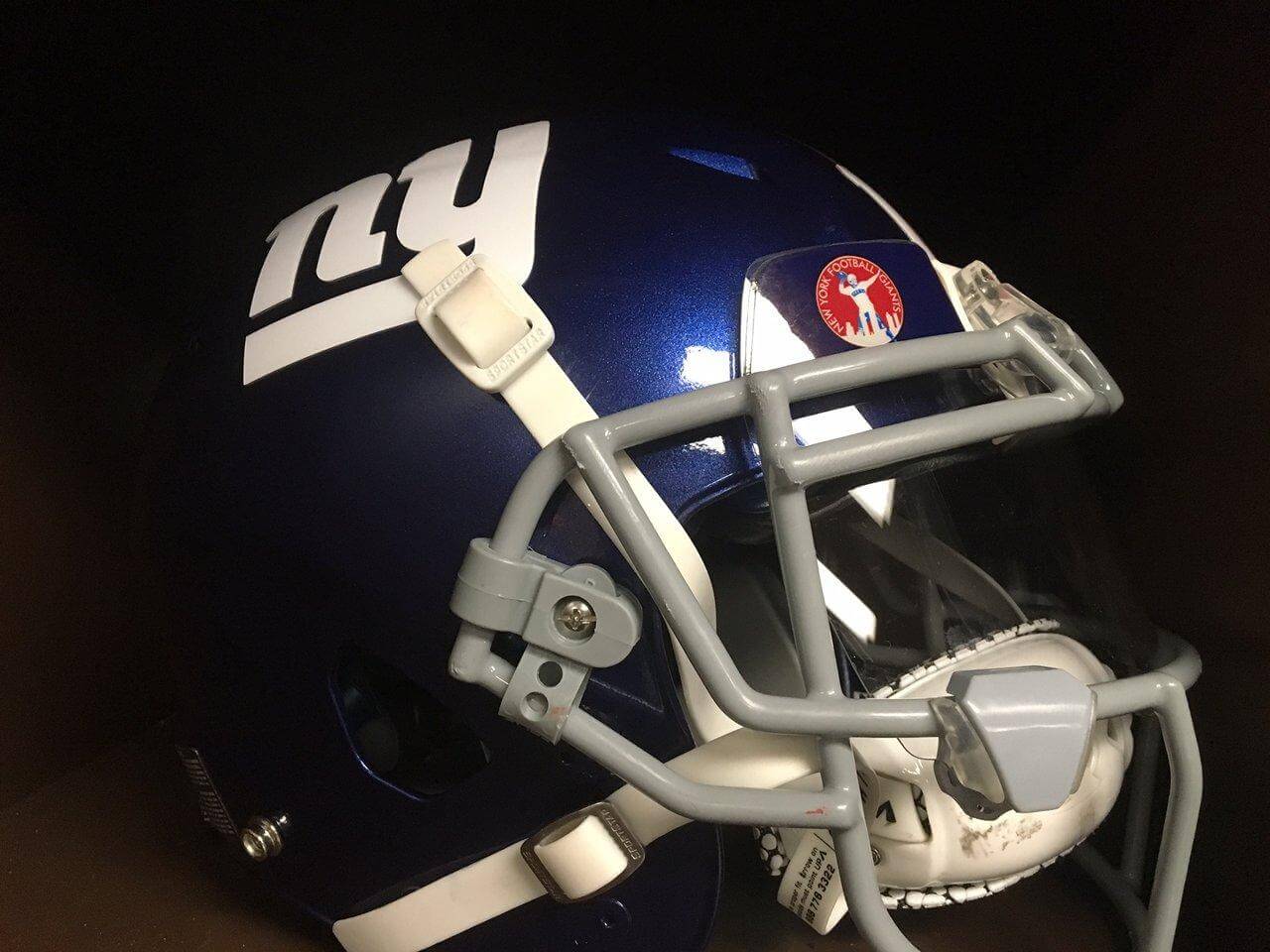
Sorry, I couldn’t find a game photo showing the visor tabs.
ESPN reminder: In case you missed it during the Thanksgiving shuffle, my latest ESPN column tells the lost story of how the Vikings’ original uniforms were created. Check it out here.
The spirit of the holiday: Today is Black Friday, when the entire world is trying to sell you a bunch of crap that you don’t really need. But here at Uni Watch, we have a different approach: We’re trying to sell you something really cool that you don’t really need.
Here’s the deal: Remember the shirt we did for this year’s Purp Walk? We had a lot of requests to do a similar design in Uni Watch colors. So Bryan Molloy, who designed the purple shirt, has come up with a green-based version — but with a few twists.
As you may recall, the crest on the Purp Walk shirt was based on the logo of the New York Athletic Club:
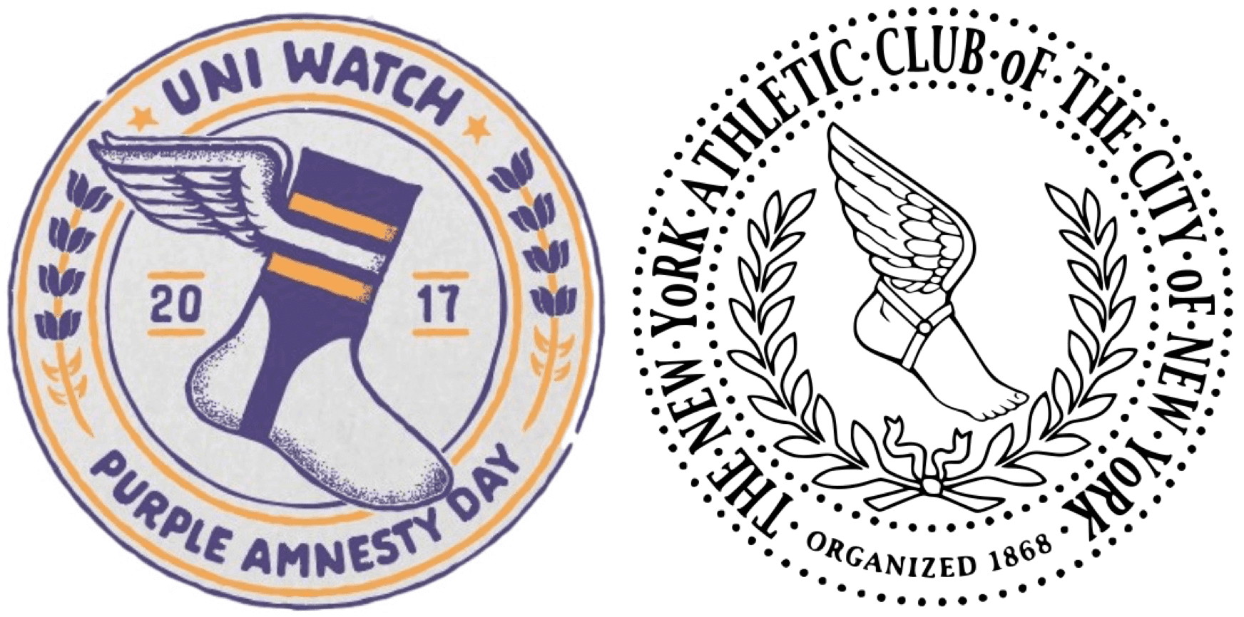
Bryan has now taken that concept a step further. He’s envisioned a Uni Watch Aesthetic Club (UWAC), whose members will get to wear this shirt (click to enlarge):
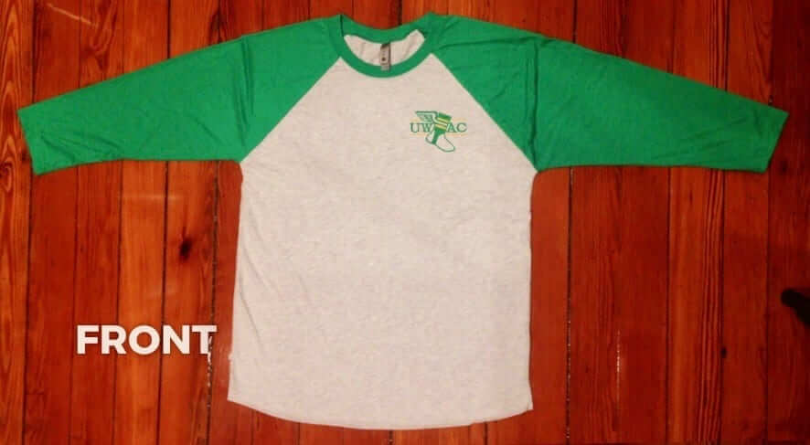
That’s the front of the shirt, with small-ish logo on the upper-left chest. The back has the full UWAC crest:
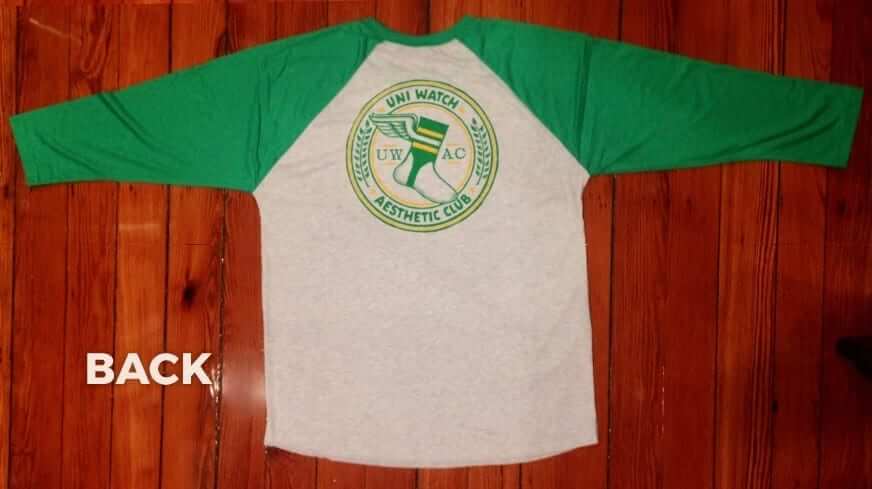
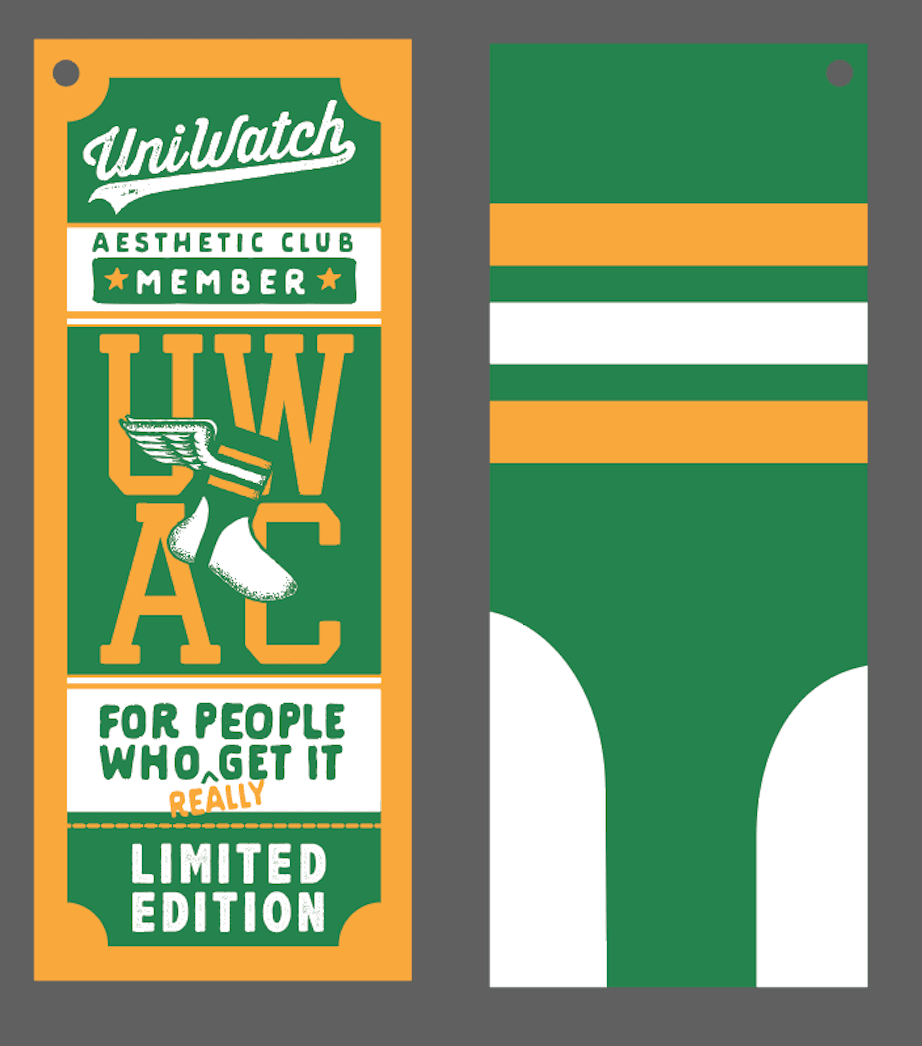
The Purp Walk shirt had lots of bells and whistles, and this one does as well, starting with a hangtag that will be affixed to your shirt with green-and-white striped string (click to enlarge):
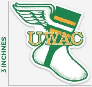
And just like the Purp Walk shirt, this one comes with a sticker:
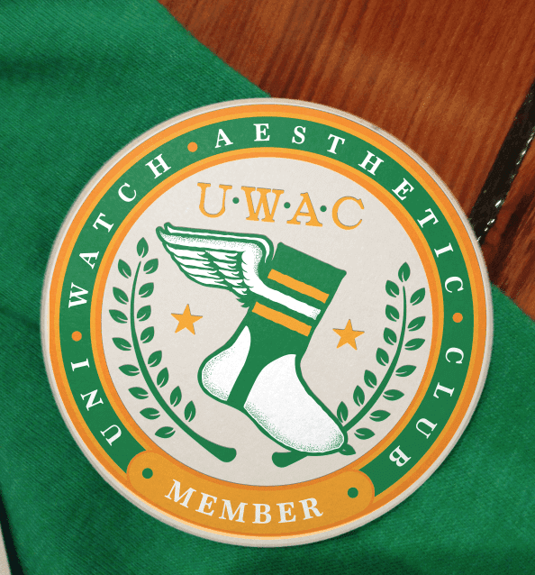
In addition, the first 40 people to order will get this UWAC magnet:
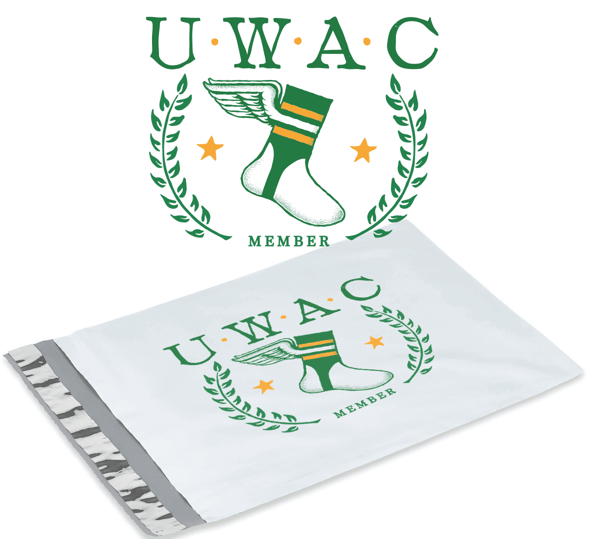
And the whole shebang will be shipped in a custom-printed UWAC mailer (click to enlarge):
The Purp Walk shirt was available for only 24 hours. There’s a slightly larger window for this one: It’s available here from now through the end of next Monday, Nov. 27. (Because this shirt is being sold through Bryan’s website instead of through Teespring, and because of all the extra design features, we can’t offer the 15% discount to Uni Watch membership cardholders. Sorry about that, and thanks for understanding.)
Major props to Bryan for going the extra mile on this one. Once again, the shirt is available here. (Maybe next year we’ll do BFBS Friday!)
Sorry, no Ticker today. Have a great weekend!
I watched a little bit of the Chargers-Cowboys game, and was surprised that I didn’t have any trouble telling the teams apart, despite the similarities.
When I tuned in partially into the game, it was a on a close up of the chargers, and I thought, nice, that blue is beautiful. .. then it went to a full field shot of both teams and I said outloud, “whoops, both teams are in blue” and even my daughter said “wow, that’ll be kinda hard for the color blind people to tell the difference.” I know the 2 blues don’t have the same darkness value, but she gets it… apparently the nfl doesn’t, or forgot about last time, or just doesn’t care anymore :)
Someone who is colorblind would have trouble distinguishing between the shades of blue? I am certainly no expert, but this is not how I have ever understood colorblindness to work.
That aside, I thought the game looked great and had no trouble following the action. I’m a Cowboys fan, and I know how beloved the whites are, but I really like the blues and wish they would wear them much more often. Unfortunately, yesterday’s lots isn’t going to help that cause.
You can tell lighter shades of a color from darker shades. It’s when the colors are the same shade of brightness. If that makes sense. It was like the difference between Pink and red. Now pink and powder blue might blend in. Hope that helps.
I did say I know they don’t have the same darkness value. ..
This was more a comment on both teams wearing blue, but for some reason, the color rash has morphed into mono color versus mono white. You can have 2 teams wear virtually the same color – at least the same family of color, yesterday…. but now on Thursday color rash games, we can’t seem to wear color on color even when they are wholly different colors and values. Just confused on that, really.
I guess to further explain my comment, she mentioned it because of the color rash bills jets game, and thought if that was an issue, then 2 blues on the same field might be an issue as well.
Well, the problem is that color-blind people can’t tell the difference between red and green. Source: My step-father is colorblind. Brown looks like red, red looks like brown, green looks like red, etc… But they can usually tell two shades of the same color apart from each other.
My dad has a form of color blindness, and didn’t have any issue with the Chargers v Cowboys game yesterday.
Now the Jets v Bills game a few years ago, he couldn’t watch it at all, couldn’t tell the teams apart.
Lee
Bills Jets would be hard for red/green colorblind. There’s also blue/yellow, and total (no color at all, shades of grey). For total or blue/yellow, both teams yesterday would be grey, and shades could be difficult to pick out. Someone who is either of those categories would have to comment if they had trouble.
Loved the blues.
UWAC shirt is superb! Great work!
I believe the Lions kept their modern word marks on their visor tabs. Completely reasonable, for everybody knows the throwbacks involve stripped helmets.
The uniforms in Cowboys-Chargers were like steak and ice cream. I love them both, but not together.
For what it’s worth, the “Kit-clash poll” about soccer jerseys had most people saying that light blue vs royal/navy blue is an acceptable matchup.
Apropos of nothing here’s a pic of a Chelsea/Man City match.
link
OMG, that shirt is AMAZING, I want it SO BAD!!!!!!!!!!!!!!!!!!!!!!!
Those Lions uniforms look so good. One of my favorites. Which hurts, bc I’m a Packers fan.
Re: color on color, what I saw – it was in the upper end (positively) of what works and what doesn’t – and I think it really comes down to light vs. dark?, whereas something like medium shade green vs. medium shade blue – looks terrible (IMO)
When Dallas wears their normal gear at home, there’s an opponent that really makes their pants look more blue than silver. I think its the Titans, wearing their lite blue pants – but can’t remember
By far my favorite Uni Watch t-shirt design EVER! But I hate 3/4 sleeves. . .
Agreed on the design – I think it best represents whatever this thing we love is all about
On the Chargers-Cowboys, everything the Chargers wore was indeed of a lighter hue than the Cowboys, not just the powder blue, but white helmets and pants as well. (Hypothetically, putting the Chargers in their navy pants–and I know they never wear them with the powers–might have been more of a problem. The exact combination the Chargers has provided enough contrast to the Cowboys.
I’ve always thought the Cowboys navy jerseys make for a better look. The team seems to think the white jerseys are a core part of the “brand,” though I understand the navy jerseys outsell the white ones in stores.
I agree that the cowboys look MUCH better in blue.
It’s 25% because the jersey design is better, and 75% because their colors are more uniform when they wear blue.
Disagree. Just like the Redskins still don’t look right in burgundy, the Cowboys never look right in blue.
I would like to see the Redskins bring back the white pants with the burgundy jersey and ditch the yellow pants.
Darken the burgundy a bit, and go with mustard instead of athletic gold.
I’m a fan of blue. It was a fantastic look.
Nba players with their warm up hoodies up are looking like the Freeze mascot at Braves games this summer. Ive sent a few links for comparison. Hope everybody had a great thanksgiving!
link…34102.43833.0.44480.33.27.0.0.0.0.2805.9536.2-1j7-2j2j1.6.0….0…1c.1j4.64.mobile-gws-img..29.1.2803…0i30k1j0i8i30k1j0i24k1.3507.3T2Qteifur0#imgrc=vOi5FJpktoMoGM:
link…34102.43833.0.44480.33.27.0.0.0.0.2805.9536.2-1j7-2j2j1.6.0….0…1c.1j4.64.mobile-gws-img..29.1.2803…0i30k1j0i8i30k1j0i24k1.3507.3T2Qteifur0#imgrc=UzLqD6wjBWoRdM:
link…206766.210997.0.212783.26.14.1.0.0.0.464.801.3-1j1.2.0….0…1c.1j4.64.mobile-gws-img..23.3.896.3..0j35i39k1j0i67k1.6382.KkbDuzzxMZo#imgrc=KbMDJsjehvllsM:
I miss the old days in the NBA when teams had their unique and awesome warm-up duds. Those were some good days:
link
link
I watched the whole game, there was enough of a contrast. Still, though, none of the actual Color Rush games this year have had true color vs. color–its either been color vs. white or color vs. black.
Rangers Winter Classic reveal:
link
Jesus Christ. $30 for a freaking t-shirt.
How about skip the hang-tag, the sticker and the stupid mailer (that will most likely be thrown out anyway) and price the shirts at a more reasonable $20.
The Lions throwbacks are my favorite Uni’s in the NFL!
Navy Blue and Light Blue look nothing similar, and had great contrast.
Disappointing that the UWAC shirts are not available in a size above 3X. I wanted to get one, but I cannot. I always appreciate that the regular UniWatch shirts can be ordered in big man sizes, and find it unfortunate that this one is not.
Seriously, how often do you get the best 2 NFL uniforms in one game? Chargers powder blues and Cowboys navy blues have to be the top 2 uniforms in the NFL.