For all photos, click to enlarge
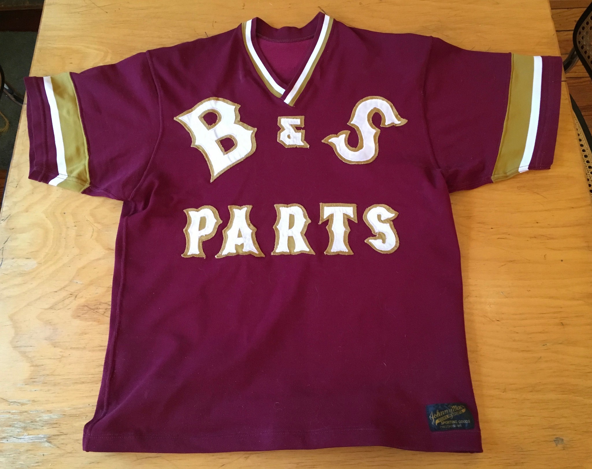
As you all know by now, I have no interest in purchasing or wearing mass-produced retail jerseys, but I do like vintage jerseys from high school teams, factory teams, softball teams, and the like. It had been a while since I’d picked up one of those, but I recently found this beauty on eBay (only $14!), which appears to be from the 1970s or ’80s.
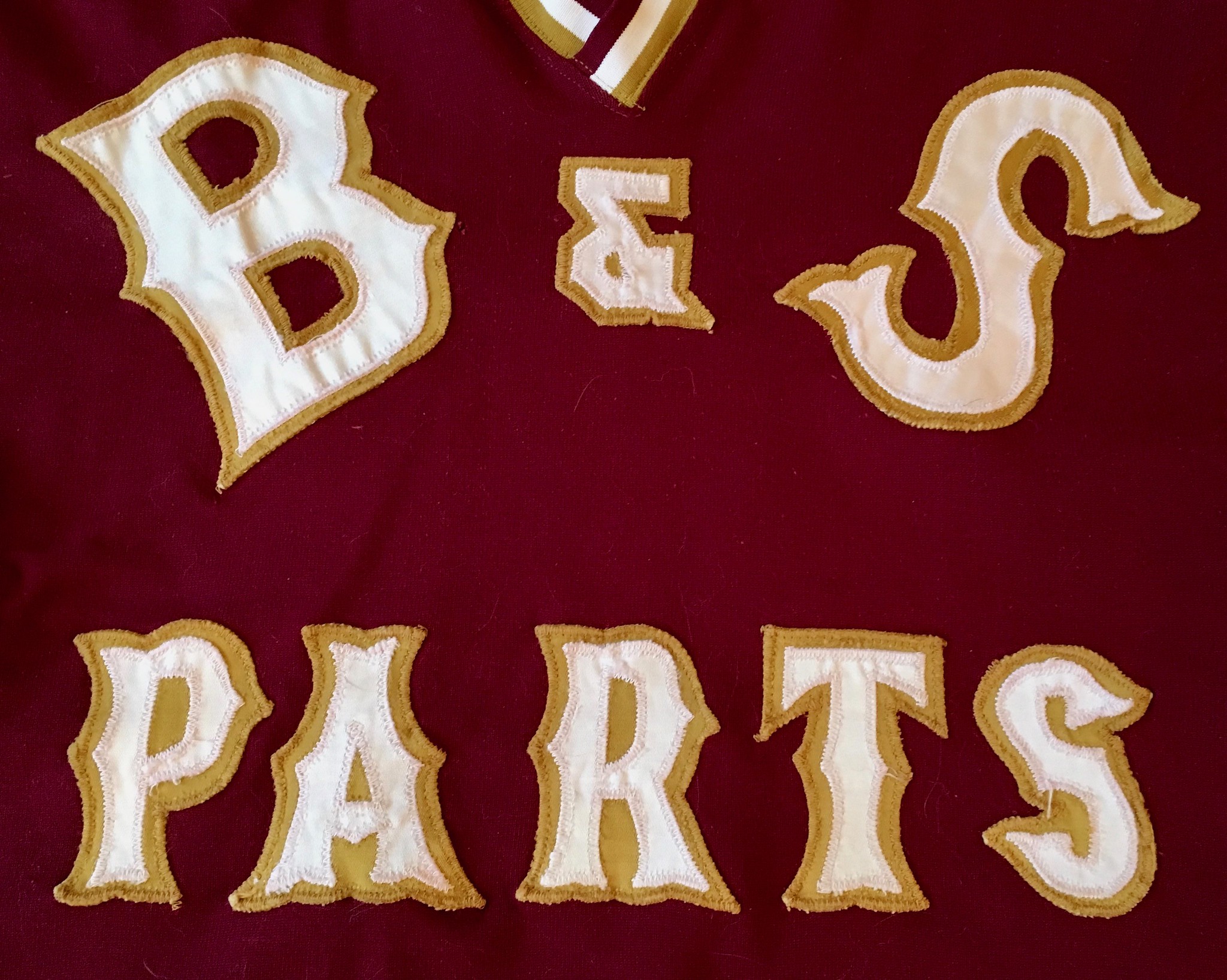
I love so many things about it, beginning with the color scheme. Maroon and mustard — mmm, tasty. I also love the lettering (looks like it was hand-cut), including the endearingly clunky “B & S” across the chest. The font is similar to what the Red Sox and Mets use on their road jerseys, but not quite the same. Here’s a closer look:
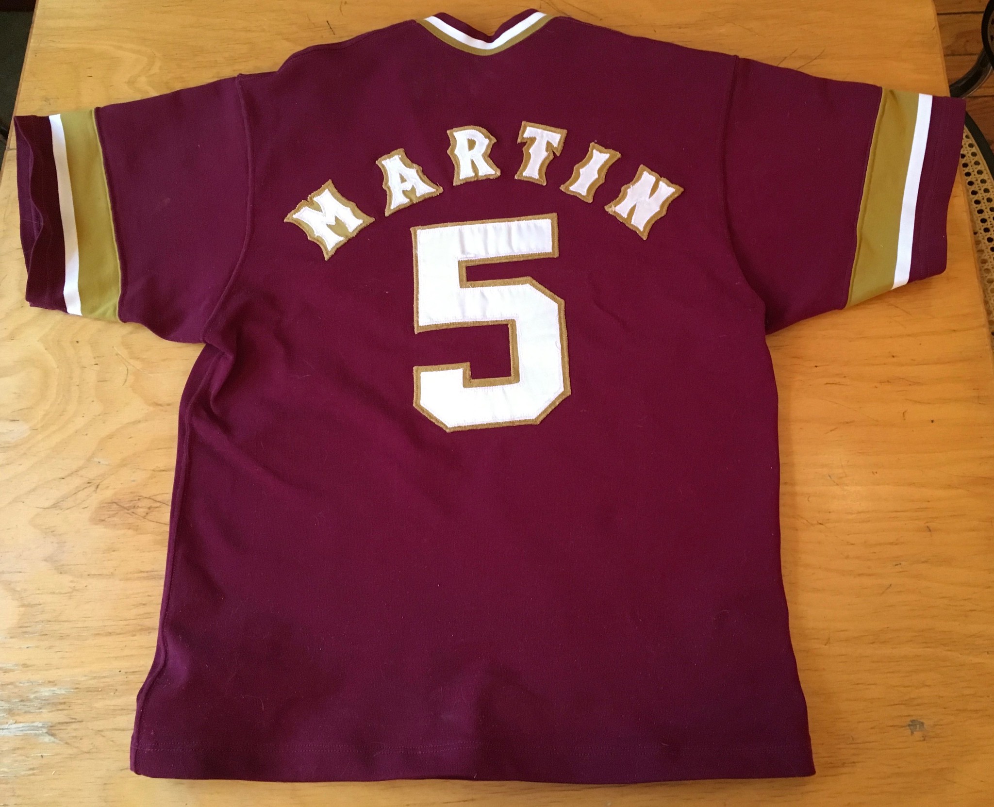
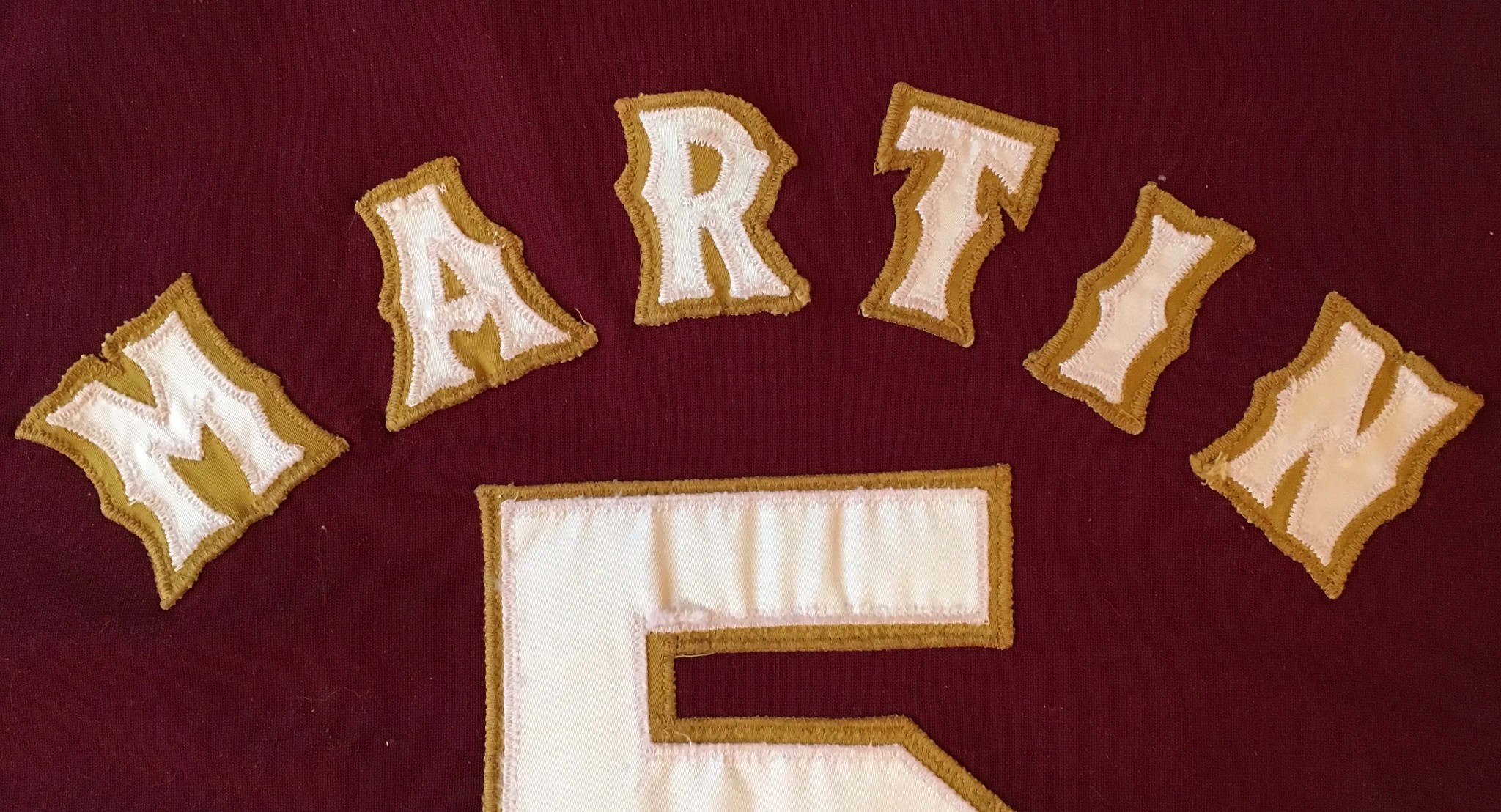
The back is just as nice, thanks to some really nice NOB lettering:
I like how much of the negative space disappears on the mustard layer.
One thing I like about vintage jerseys is that they have stories to tell. What is this one’s story? A tag on the front-left hemline indicates that it was made by a shop called Johnny Mac’s in Crestwood, Missouri — a suburb of St. Louis:
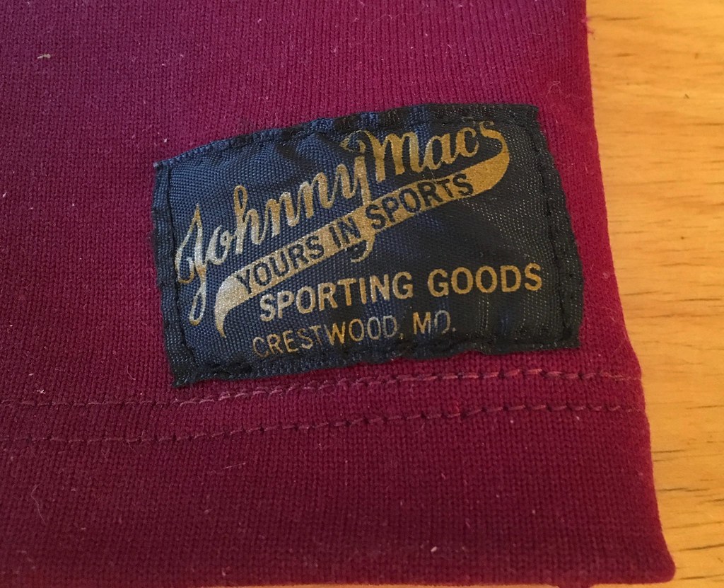
The Missouri location got me thinking that “B&S Parts” could refer to Briggs & Stratton, which has a Missouri plant in Poplar Bluff, about two and a half hours from St. Louis.
As it happens, Johnny Mac’s is still in business. In fact, they’re a chain, although none of their eight current locations is in Crestwood. I contacted them to see if they could tell me more about the jersey and heard back from a manager named Clay Keeney, who said the jersey was likely from the 1970s. He said my Briggs & Stratton hunch was probably correct, and that he thinks B&S used to have a plant that was closer to St. Louis than the Poplar Bluff facility.
As for the “Martin” NOB, we’ll likely never know who Martin was. Too bad.
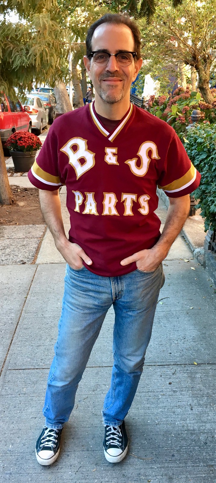
And how does it fit? Like the proverbial glove (photos by Mary Bakija, click to enlarge):

The one thing I don’t like about the jersey is the crossover collar, which is a topic I want to talk about for a minute. I’ve never liked that style, which always seems like it ruins the symmetry of the jersey. It’s interesting to see the crossover on a baseball/softball jersey, though. I checked with Bill Henderson, who confirmed my initial thought that no MLB team in the pullever era (1970-1992) ever wore a crossover collar.
I associate the crossover style mostly with basketball — think Knicks, Hornets, last season’s NBA All-Star Game, Rutgers, etc. And then there were the early-1960s Dallas Cowboys, who had that weird variation on the crossover collar.
Interestingly, all of the examples I just cited have the top crossover layer on the same side, and my vintage jersey also has it on that side. Have there ever been crossover collars with the top layer on the other side? If not, how did the prevailing side get to be that way? Hmmmm.
’Tis the season: I’ll soon begin work on my annual Uni Watch Holiday Gift Guide. If you have any suggestions for items or companies that should be featured, I’m all ears. Thanks.
The Ticker
By Kris Gross

Baseball News: The University of Texas football equipment staff congratulated the Astros on their World Series championship with an Astros-themed football helmet. How about that tequila sunrise helmet stripe?? (From Dave Jones.) … Everyone in Houston is celebrating the Astros championship, including this priest in tequila sunrise vestments (from Anil Adyanthaya). … The Phillies’ new manager Gabe Kapler will wear No. 22, a number he never wore during his 12 seasons as a player (from Todd Zolecki). … Now this is cool: The Indians’ Instagram account posted an old photo showing “Tribe legends” Charlie Nagy, Mel Harder and Sandy Alomar playing catch in era-appropriate uniforms on the site where Jacobs Field would be built (from @History_Cle). … Oops. No matter what anyone at Sportsnet may say, Texans DE JJ Watt is not a World Series champion. … Following up on Tom Konecny’s post from Tuesday about the changes at Dodger Stadium, reader Les Campbell points out the changes that have replaced lots of foul ground around home plate with seats. … Here is a cool story on a man who sold his 1957 Cubs jersey off his back after wearing it to a convention (from Brett Clark). … Speaking of old-school jerseys, check out these 1965 uniforms for the “newly renamed” Houston Astros (from BSmile). … The Coastal Plain League reimagined their team logos as football helmets.

NFL News: The Jets wore their kelly green unis and the Bills went mono-white last night. More photos here. … The Eagles are going mono-black this Sunday (from Blake Fox). … New 49ers QB Jimmy Garoppolo explains why his No. 10 is so important to him. … There’s more at stake than you might think when the Cowboys host the Chiefs this weekend. An ”unsightly” trophy, which cost less than $100 to make, is up for grabs. The Preston Rd. Traveling Trophy was named for the “Dallas street on which both Chiefs founder Lamar Hunt and Cowboys owner Jerry Jones lived.” More info here. … Cross-listed from the MLB section: Is Texans DE JJ Watt spending his time on the IR with the Astros? … Reader Steve King reminds us that Dan Marino didn’t have the NFL 75th-anniversary patch on his jersey during the “Fake Spike Game.” … The promo poster for Kenny Chesney’s concert at Gillette Stadium features a modified Patriots helmet with Chesney’s logo (from Matthew Olson). … Mike Hersh was watching last night’s episode of The Good Place. “One of the characters is a Jaguars fan and they gave him a bag with a fake Jaguars logo and a fake Jags jersey,” he says. “It’s not great but would be a vast improvement over their current uniforms.”
College and High School Football News: We know what TCU, Liberty, and Stony Brook will wear on Saturday (from Patrick Muffley). … Cross-listed from the MLB section: The University of Texas football equipment staff congratulated the Astros on their World Series championship with an Astros-themed football helmet. (from Dave Jones). … Virginia Tech posted this video of their 1995 win over Miami. The interesting part? “Not all of the Hokies have sleeve stripes,” says J Fletcher. … Brice Wallace passed along this graphic of Weber State DB Jordan Preator and, wow, there’s a lot going on with his uni here. “The leg bands, leg sleeve, biker shorts with the laces flowing from the crotch. The under ‘skirt’ and long sleeves.” … Surprising that the refs would allow this black-vs.-grey matchup in a Texas high school game (from Chris Mycoskie).

Hockey News: The Blackhawks will celebrate G.I. Joevember on Sunday (from James Beattie). … Pinktober may be over, but the Sioux Falls Stampede of the USHL will skate on pink ice Saturday night (from Brock Nelson). … All of Nike’s Olympic hockey jerseys have been released. …

Basketball News: New jerseys for Weber State (from Brandon Garside). … Dayton will continue to wear a No. 5 patch memorializing Steve McElvene. They originally added the patch last season (thanks, Paul). … New court designs for Washington and Missouri State (from Carlos Montalvan and Kyle).

Soccer News: Cameroon has a rich uniform history, including the one-piece unitard from 2004 and serving as the basis for Serena Williams’s outfit at the 2002 French Open. Here’s their latest kit (from Justin Bell).

Grab Bag: Olympics news incoming! We’ve got a uniform reveal for the United States freeskiing team (thanks Phil). … The US snowboard team will wear NASA-inspired uniforms (from Rudy). … Is the future of footwear in 3-D printed, customized shoes? (From James Gilbert.)
Knicks crossover collar link is broken Paul.
Love that Tribe legends photo!
Proofreading:
‘An ”unsigtly” trophy’
Fixed.
I know that there were some crossover collars on football jerseys…the New York Giants had them from 1980-99, and I think the Eagles did at one time as well.
Paul, is there a way to edit my comment? Just noticed that you talked about the Cowboys…
It’s fine that way you presented it, Ron. Thanks for bringing up the Giants and Eagles, which I hadn’t thought of!
You’re most welcome!
Was the slightly darker shade of green between the white stripes in the Jets jersey last night deliberate, or just the continuous challenge that the Jets jersey seems to pose?
Yeah Sweden (re: hockey jersey) – doing what I wish Canada would do, pick one and stick to it. Virtually the same uni for the last 40+ years.
It’s just the regular shoulder insert.
Re: the Jets. I think it is done on purpose, the difference between the colours is really noticeable. Maybe the reason behind the scenes may be to hide the problems Nike is having matching the greens? The uniform is like wearing double green. It is kelly green with their usual hunter green as a trim colour.
Fine with me that it has the darker green trim. Otherwise, the Jets’ Color Rash jersey and pants would just be an exact copy of the throwback uniform combination worn by the Saskatchewan Roughriders in the 2013 CFL Western Semi-Final:
link:
I actually really dig the dual greens. Aesthetically it works and its better than the black trim the Jets wore in the 90’s.
The left-over-right crossover follows the pattern of men’s clothing with buttons. A man’s shirt, jacket, or coat crosses over with the same left-over-right orientation.
So, question: do crossover collars go the other way on women’s uniforms, as they do on women’s shirts?
Ah, the button connection — good call. Hadn’t thought of that!
Here is right over left crossover – Tennessee women’s basketball:
link
Oh fantastic, just what the world needs – another needlessly gendered product.
What a great find Paul! It’s been awhile since I’ve bought something that made my wife mad, I may have to start a new habit that drives her crazy.
B&S jersey is great.
On
Oops hit the send button by accident!
What I was going to say:
One redeeming feature of the crossover collar is the particularly clever way it’s designed. It’s hard to describe, but basically the ends of the strip of collar material get sewn into the same seam that attaches the entire length. Very efficient solution to the design.
Love the lettering on that B & S jersey!
The Sunset Hills Johnny Mac’s location is technically the Crestwood store. Crestwood Mall was just up the street off Watson and was a great place for mallrats to hang out in the 90’s. They demo’d the mall recently sad to say. Crestwood was a popular area 70’s-90’s suburban St. Louis. Now more of a ghost town. But Johnny Mac’s is a great store specializing in custom uniforms! I even had a few personal shirts made there for that uni look. Also a GREAT resale shop called Value Village in Crestwood.
Also I’ve not heard of B & S Parts. I’m guessing a defunct small business.
Reply #3: Neat the shirt made it all the way there! Enjoy!
As already noted in today’s entry, it’s probably Briggs & Stratton.
I lived in Crestwood between age 13-22, and couldn’t remember exactly where the border falls… turns out Johnny Mac’s is literally right next door to Crestwood. What I don’t know is whether they’ve always been in that location and it was annexed by Sunset Hills at some point, or moved there many years ago from an area actually inside Crestwood.
Chesney (apparently?) in a Pats helmet here.
link
The Dr J.-era Sixers had something I’ve never seen on another uniform – crossover arm trim, just underneath the armpit. Always wondered why, I can’t imagine it would have been all that comfortable.
That’s a pretty good looking Astros football helmet!
Ahh, Poplar Bluff, it was the biggest city close to us growing up.
Tangential: in Japan, kimonos are worn left over right. Only the dead are buried with the kimono right over left.
“…this priest in tequila sunrise vestments”
Oh, he’s goin’ straight to hell.
Tequila SonRise vestment.
Ah! Good news! (get it? Good News!)
He’s safe.
RE: the new Swooshie Olympic hockey jerseys – ugh. And, “a tie-down strap connects the jersey to the ‘shorts'”?! Is this Olympic hockey or soccer? They are called pants or breezers, never ‘shorts’; no wonder they failed miserably in the hockey market.
Also, on the adidas 3-D printing new shoes: let’s see, overpriced footwear that falls apart within months? Apparently the future is NOW!
In the UK we call them ‘shorts’ in relation to hockey equipment, rather than ‘pants’ (used very rarely) or ‘breezers’ (never used, and most British players would have no idea what you were talking about). ‘Shirts’ is used more frequently than ‘jerseys’, too. It’s just the more Euro-English way of putting it, I guess.
In terms of the designs, I’m disappointed in Sweden. I know the weird wing/feather/BP logo sleeve effect is more subtle on their jersey when compared to others (as it is on Russia’s, too), but they usually do a pretty decent job of resisting Nike’s horror shows.
With apologies if this has been discussed before, I just noticed this page, and that the Buffalo Bills pic is (obviously) incorrect. I believe the Pats went with white on their Rash night, as well. How many of the rest of these are wrong?
link
Its a joke that despite the whole “Color Rush” promotion only one of these games has actually been a color v. color all year.
Johnny Mac’s had a location in my hometown. They did a big business in local high school gear. Letterman jackets, windbreakers, silkscreened hoodies, homecoming gear, etc.
Sort of uni-related (more equipment than uni): Circa 1987 stood in line to meet Ozzie Smith at our local Johnny Mac’s. He was promoting Kangaroo shoes. They gave out a poster that had then starting infield (Terry Pendleton, The Wizard, Tommy Herr, Jack Clark) along with Whitey Herzog on the top step of the Busch Stadium dugout sporting Roos. It’s said don’t meet your heroes, but if you ever meet Ozzie Smith, he’s an exception to that rule.
You have a hole in your ass pocket.
One of the better casual nitpicks I’ve seen in the comments in recent times.
That pic of older Dodger Stadium has got me thinking: I wonder if a contributing factor in the lengthening of MLB games is that more pop fouls are falling into the stands rather than into fielders’ gloves?
Today it is fairly common that pop fouls get thrown into the crowd anyway, so more foul ground doesn’t really affect that. So not sure if that really extends the game. And even if we assume that wasn’t done 50 years ago because they didn’t want to give away usable balls, the time it takes to throw the ball back to the pitcher is not significantly shorter than the time it takes an umpire to get a new ball from his belt bag and give it to the catcher or throw it directly to the pitcher.
I believe Herc is talking about pop-ups into foul territory that would have been caught for an out, but instead land in the stands, thus prolonging an at bat, and by extension, the game.
Stadiums today have reduced foul territory so fans are closer to the action. Even older stadiums like Wrigley have added seats into what was once the field, which leads to more foul balls landing in the stands.
Ah, of course. More pop foul outs = quicker innings. Totally missed that one.
I don’t think Herc Tone is referring to the fact that an umpire has to get a new ball. Rather, many hit balls that would otherwise be an out are now foul balls, which extends an at-bat, and possibly extends an inning. If you compound that throughout the course of a game that could certainly lead to longer game length.
ever wonder why not many countries have purple on their flags?
link
Man, I love the old Astros shooting stars.
They should be wearing those full time, with the tequila sunrise as alts.
link
Yeah, I think they really dropped the ball when they left the shooting star out of their current design.
The current design has grown on my quite a bit. I used to think they completely missed a march by not including the shooting star. Now I think their uniforms are great as-is, but could be even a little better with the shooting star.
My only concern is that I’m not sure the current block script would really work with a shooting star. On the old unis, the not-quite-block script really integrated well with the shooting star.
Fully agree. My only regret about this championship is that it might set the current uniform in stone, because of its lucky connotations. In fact, I fear the orange top in which they won Game 7 might become their primary jersey.
The Astros football helmet isn’t too shabby either.
The Astros Priest apparently had a better connection than the Nationals Priest, who was last seen blessing the bats before the deciding game v. the Cubs a couple of weeks ago.
Anyone know how many teams won their last World Series game in an alternate jersey (as the Astros did)?
Cubs did last year
There were a few crossover necks in pro hockey too. The Philadelphia Flyers and Chicago Blackhawks both wore them for about a year in the early 70s. The Edmonton Oilers wore crossovers on their original WHA jersey worn from 1972-74 and was brought back for their throwback/fauxback orange jersey a few years ago. Sadly, Adidas dropped this feature.
The Boston Bruins and California Golden Seals both wore crossovers in the 1973-74 seasons but it’s hard to see since they were one-color collars. Bruins also had crossovers on their short-lived white all-screened-on 1973 playoff set which had a black-gold-black striped crossover collar.
So, is it just me or does Bob Lilly (Dallas Cowboys example of the crossover collar) look EXACTLY like Tim Tebow???
This may be old news – forgive me, I’ve missed 2 weeks due to a death in the family, a serious medical event in the family necessitating a 911 call to the $&@% funeral, multiple days hanging around hospitals, and related travel across multiple time zones, but –
Turned on the TV and there was blue Thunder v. green Celtics.
Ugh, is that new?
I mean, I caught the news about NBA uni changes theoretically allowing color v. color, and the follow up news that teams were wearing boring white anyway. Has there been more news or was this a noteworthy development?
(Also, I don’t really watch NBA regular season often, so for all I know there is some color v color Friday promotion that’s been going on for 4 decades.)
Oddly, I didn’t like it!?!
I love that shade of blue. I love that shade of green. I love color on color. But.
It didn’t look right?
Sorry to hear about your family issues.
There’s been a Monday Uni Watch feature where someone is tracking how NBA unis are being worn this year. Color vs. color has been rare.
Thank you for the lead!