When the NBA announced that it was eliminating home and road uniform designations this season, I figured we’d see lots of color-vs.-color games and, at the very least, lots of home teams opting not to wear white. So with the season now fully underway (there were 11 games last night, to go along with the two games from Tuesday night), I thought I’d see how the uniform pairings played out. Here’s a game-by-game rundown:
• The Cavaliers wore white at home, creating a standard white-vs.-color game against the Celtics.
• The Warriors wore white at home, creating a standard white-vs.-color game against the Rockets.
• The Wizards wore white at home, creating a standard white-vs.-color game against the 76ers.
• The Pistons wore white at home, creating a standard white-vs.-color game against the Hornets.
• The Pacers wore blue at home. No chance of going color-on-color here, because the Nets’ black uniforms wouldn’t provide enough contrast (and their dark-grey alternates would be even worse), so this was another white-vs.-color game, albeit with the road team wearing white.
• The Magic wore white at home, creating a standard white-vs.-color game against the Heat.
• The Celtics wore white at home, creating a standard white-vs.-color game against the Bucks.
• The Grizzlies wore white at home, creating a standard white-vs.-color game against the Pelicans.
• The Mavericks wore white at home, creating a standard white-vs.-color game against the Hawks.
• The Jazz wore white at home, creating a standard white-vs.-color game against the Nuggets.
• The Spurs wore white at home, creating a standard white-vs.-color game against the Timberwolves.
• The Suns wore white (throwbacks) at home, creating a standard white-vs.-color game against the Trail Blazers.
• The Kings wore purple at home. I suppose the Rockets could have worn red, but that might have resulted in a real retina-bleeder, so they wore white. Which means this was another white-vs.-color game, albeit with the road team wearing white.
For those scoring at home, that’s zero color-on-color games, and only two home teams not wearing white. In short: Pretty much the same as last year.
Granted, the Bulls haven’t played yet, and they’ve announced that they’ll be wearing red as their primary home uni. Their home opener is tonight against the Raptors — whose colored uniforms are red, so they’ll probably wear white. (They could conceivably wear their black alternates, although that seems unlikely.)
And of course the season is just getting started, so there’s plenty of time for teams to break out of the white-at-home mode if they want to. Still, it’s interesting to see that very few of them have wanted to go that route so far.
If anyone wants to track all of this during the course of the season, I’d love to see how it all plays out.
Unusual reader request: As you may recall, back in 2015, as part of the Uni Watch T-Shirt Club, we tried doing a sublimated tequila sunrise design, but the sublimation turned out to be tricky, with the front and back stripes often ending up misaligned:
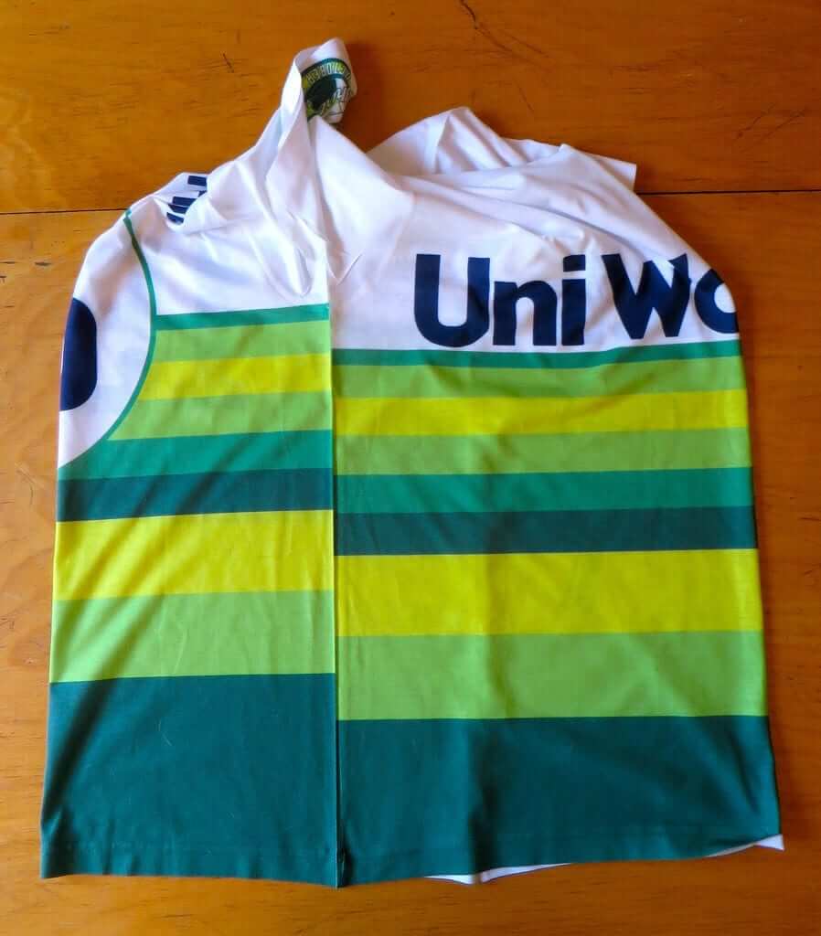
If you have one of this misaligned-striping shirts and are willing to sell it, reader Brady Graham wants to hear from you. Contact him here.
Naming Wrongs update: Two days ago I announced the launch of several new Naming Wrongs shirts for college basketball arenas. One of those was for the Illinois arena, Assembly Hall. Our design read, “I Still Call it the Hall,” but a bunch of fans got in touch to say we should have used the full arena name, so we’ve scrapped the initial design and replaced it with a new one, which is available in navy with no-frills lettering, navy with white-outlined lettering, orange, and grey (for all images, click to enlarge):
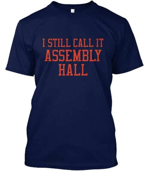

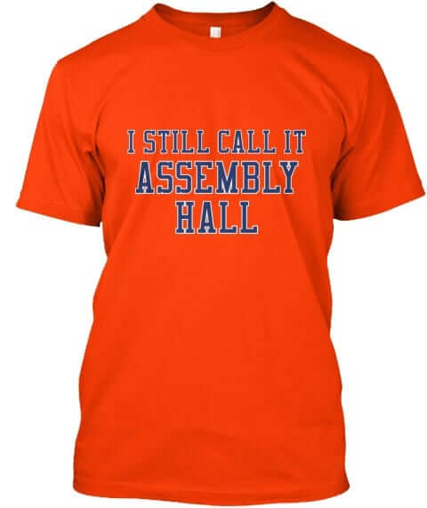
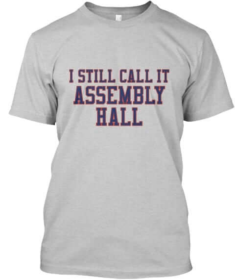
All of these designs are now available in the Naming Wrongs shop. They’re also cross-listed in the Uni Watch shop, where card-carrying members can get 15% off. (If you’re a member and need the discount code, send me a note and I’ll hook you up.)
The Ticker
By Paul

Baseball News: There will be two new collegiate wood bat teams in South Dakota next season. The Spearfish Sasquatch and the Pierre Trappers (from María Canales). … Here’s a map showing the most hated MLB team in each state and province. “Even folks in the Arctic Circle know that the Padres should wear brown and that the White Sox should wear white socks,” says Jim Vilk. … It’s been a while since I’ve bought a vintage jersey, but I just nabbed this one on eBay yesterday. I find the big, clunky letters oddly appealing. More photos once I receive the jersey from the seller.

NFL News: The Jags will reportedly have new uniforms in 2018. Let’s hope that includes a new helmet (thanks, Phil). … After a series of meetings, the league has decided not to require players to stand during the national anthem. … The Raiders will go mono-white at home tonight.
College Football News: Ohio State will apparently be wearing this grey jersey against Penn State on Oct. 28, although the numbers don’t look like they provide enough contrast to pass NCAA muster (from Dylan Glickman and Taylor Bowdish). … Weber State will wear 1987 throwbacks on Oct. 28. I like that helmet logo so much, I don’t even mind the purple shell (from @MikeFromSLC). … Not sure who the teams were here, but that sure is a lot of stripes! (From Brice Wallace.) … The manager of a Boise State retail shop says he gets shipped a lot of product with mixed-up Boise/Florida designs. Hey, could be worse — the Mets use those colors too! (From @MDWDFW.) … Here’s a good look at the new orange jersey and new white helmet that Virginia Tech will be wearing this weekend (from Andrew Cosentino).

Hockey News: Reprinted from yesterday’s comments: The front of the Panthers’ collars looked pink on Tuesday night. Additional examples here, here, here, and here. This was a laundry issue (similar to how the Dallas Cowboys’ Nikelaces turned blue a few years back), not a Pinktober thing.

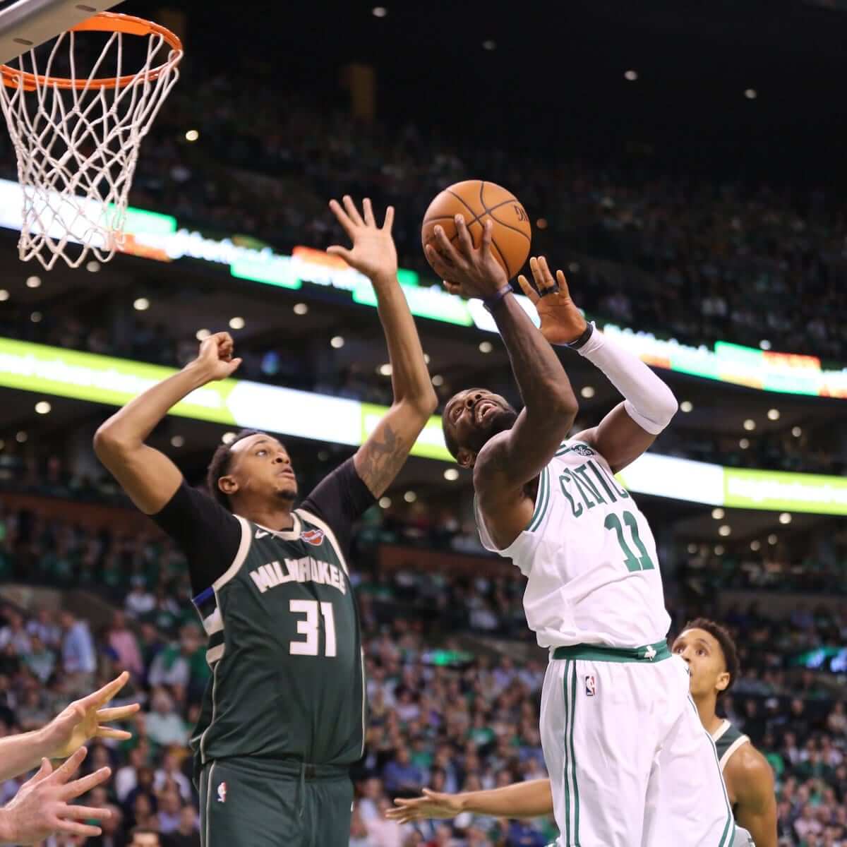
NBA News: The Suns have added a memorial band for Connie Hawkins. Here’s how it looks on the jersey. Have to wonder if they’d’ve been able to wear it if they had an ad patch (from Mike Chamernik). … Meanwhile, as you may have noticed in that last link, the Suns wore their new throwbacks for their season opener. … Nike is trying to figure out why LeBron James’s jersey tore during the Cavs’ season opener on Tuesday night. … Hawks G Kent Bazemore’s jersey didn’t have a maker’s mark last night.

Soccer News: The name and logo for San Diego’s new NASL franchise have been revealed. Additional info about the team name here (from Henri Bradley and Kurt Crowley). … Here’s a discussion of whether the New England Revolution need a brand overhaul redesign (from Dave Leiphart).

Grab Bag: Snooker players usually wear formal black shoes. But Ronnie O’Sullivan, a five-time snooker champ, has a sprained ankle and is wearing sneakers, which is causing problems (from Jim Vilk). … Subtle change to the Cub Scouts’ Wolf rank cap logo. … Quebec has passed a new law banning face covering for anyone using a public service, including taking a bus, using a library, or going to a public hospital. The law’s critics say it targets Muslim women, who traditionally wear burkas or niqab (from Jason Hillyer).
Click to enlarge

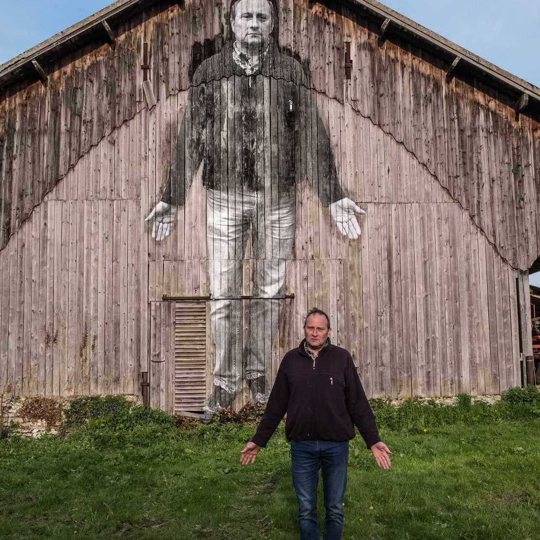
What Paul did last night two nights ago: On Tuesday, after spending the afternoon at the taping of the Puppy Bowl (sorry, not allowed to tell you anything about it until mid-January), I went downtown to see a new movie called Faces Places. It’s a documentary collaboration between the 88-year-old French filmmaker Agnès Varda and the 33-year-old French photographer/muralist who calls himself JR. The movie follows them as they take short road trips out in the French countryside, meet people, take photographs of them, and then paste huge prints of those photos on the sides of houses, barns (as shown above), factories, shipping containers, train cars, water towers, and so on, having loads of fun and making lots of friends along the way.
The elderly filmmaker and the young artist are a classic odd couple, but they’re a very appealing pair, and their massive photos are completely charming. The whole project feels incredibly life-affirming, generous-spirited, funny, and smart, and the movie is the best piece of art I’ve encountered this year. It’s hard to imagine anyone — anyone — disliking it, and easy to imagine most people loving it as much as I did.
To see where Faces Places is showing, look here. If you don’t live near any of those cities, find it on DVD, or on demand, or streaming, or whatever — it’s really special.
Here’s the trailer:
Proofreading:
“This was not a laundry issue (similar to how the Dallas Cowboys’ Nikelaces turned blue a few years back), not a Pinktober thing.”
I’m guessing the first ‘not’ doesn’t belong.
“has a sprained ankle and is sneakers”
Fixed.
I like teams wearing white at home. But I guess to appease millennials they had to do something different.
Yeah, millennials kill everything. Enjoy Applebee’s tonight.
While I see your point about it not being about millennials, the thing I find is that we’re hearing more and more the mantra, “but it’s so boring…”
What’s boring? The game? Tradition?
This is the same feeling that seemingly mandates blaring music throughout the game.
Is the NBA the only sport where music is played during actual action? I never understood how that could be appealing to the fans.
Cue the “Let’s hope they go back to their original design” chorus.
No, seriously, cue the “Let’s hope they go back to their link” chorus.
The current helmet will go down as the NFL’s link. Good for the Jaguars, realizing their mistake and correcting it, assuming that’s what they’re doing, although you never know, since their uniform has been progressively sliding down the football-uniform/clown-suit scale every time they make a change.
Amen. Though I think a gold helmet would be great. Either way, they can’t dump their current garbage look soon enough.
Agreed. The original look you linked to has been their best. I even prefer that Jaguar head logo to the current one.
This had me thinking about other recent redesigns that were done seemingly just to do it, rather than fix or update something that needed it. How many of these recent changes for the sake of change made things worse?
Dolphins, Bucs, Jags, Browns, Cardinals, Falcons, Seahawks, and Rams are worse off for it.
I think maybe only the Lions and Vikings (who corrected previous change for the sake of change) alterations are the only ones that actually improved things, and even those teams have design quirks that are unnecessary and take away from the quality of the look.
The ampersand is unusually important on that jersey from e-bay
Kent Bazemore, not Kevin
Fixed.
KENT Bazemore plays for the NBA Atlanta Hawks, not Kevin.
Worth noting that the Rockets had worn red Tuesday night, so their equipment team probably just packed the whites because of the quick turnaround to Wednesday night. It’ll be interesting to see which color they favor over the course of the season, though b
Extraneous “b.” Sorry–typing on a phone.
Two thoughts on the Jags news:
– I wish the NFL would give each franchise a single “uniform mulligan” where, if the team unveils a new look that totally bombs with the fans, could simply admit it was a mistake and return to the previous uniforms. Maybe add the penalty that they are not allowed to try anything new for ten years? So this way we are not stuck with obvious uniform mistakes for five years and teams will have more leeway to experiment with designs knowing that if they don’t work, they will can be pulled back.
-Second, it is interesting to me, as a Panthers fan, that Carolina has stuck with the same basic uniform design (with one minor logo tweak) since our debut in 1995 while our expansion cousins the Jags have gone through at least three major uniform redesigns, plus a few tweaks during that time.
I wonder if there is any connection to the fact that the Panthers have had more success on the field and also in the branding world?
I wonder if there is any connection to the fact that the Panthers have had more success on the field and also in the branding world?
The Jags’ most recent makeover can be attributed to a change of ownership, while the Panthers have had stable ownership throughout their existence.
That is true. Maybe I’m asking the broader question of whether sticking with a look benefits a franchise as opposed to updating it every so often?
The Panthers and the Jags happen to be just good examples because they started at the same time and have gone in different directions, both on and off the field.
Panthers uniforms are nice and all, but I’ve always found them too close to the Raiders to make them distinctive. I have always wanted them to go with a Carolina Blue helmet and jersey, and use the UCLA shoulder stripes with just numbers on the sleeves.
The logo however, is a modern classic, using the shape of North and South Carolina to make a panther head is brilliant.
I agree, the Panthers should go with the blue jersey as the primary and the black as the alternate.
Technically, the color is “process blue” not “carolina blue”, there is a bit more yellow in the Panther’s hue than the Tar Heel’s.
Also, yes, put the TV numbers under the UCLA stripes. There is no need for the same logo on the helmet, sleeves, and hips.
BTW, Jerry Richardson has stated that he is never going to change the uniforms as long as he owns the team, as he likes the way they the current team to past teams.
I like the present Panthers look and respect that they are keeping same uniforms.
Though I think they would look good with a combo of black helmets and the blue jersey.
The most annoying thing about the Panthers’ unis is link. Cam Newton (and only a couple other players) have proper, complete shoulder loops, while everyone else has that mutant rainbow stripe thing going on where both ends of the stripes are at the armholes. I much prefer Cam’s style, which is the “proper” style that was introduced in 1995.
Re: the shade of blue. You are right, they don’t wear Carolina blue, but if I was calling the shots I’d switch to blue and make it much closer to the Carolina blue shade.
I actually think the black jerseys would be better if they went with a white helmet and white pants. No NFL teams use the white/black combo, and I think the silver is sort of superfluous, it is only part of their identity in the uniforms. The logo and majority of other branded gear are just black and blue.
I actually like their current shade of blue, as it looks electric to me. That’s one thing I wouldn’t change.
Really, just fix those mutant rainbow stripes – ideally, fix it so everybody has Cam’s style of proper shoulder loops again – and they’d be just fine.
When the Panthers first took the field, the uniforms were praised as future classics and I see no reason to update that status. I particularly like the formal octagonal numbers and shoulder hoops. Even the rarely-seen black pants are fine because they have a fat blue stripe and are worn with blue socks. One of the NFL’s better looks.
They were, until the shoulder stripes became inconsistent (see my post above).
I agree that they still work today, and certainly am of the opinion that if it isn’t broke don’t fix. I’m a firm believer in maintaining a good look pretty much forever. My changes were more so “in a perfect world” scenario thinking.
Some of the issues with the shoulder stripes is due to the way the jerseys are customized for each position, for example interior linemen like their jerseys as tight as possible so there is nothing to grab…I believe Paul has pointed out that Nike issues the teams a lot of blanks and then each team has local people who sew on the numbers and details…
So basically…not much can be done about that.
I was thinking about it the other day and there is so much about the Panthers uniforms that should never work: the tapered helmet stripes don’t match any other uniform element; there’s no correlation between the striping colors or the numbers; the pointed shoulder stripes, wearing silver pants at home and white on the road…
None of this is what you would do to design a uniform at any other time than the mid-90’s and YET somehow its all managed to work.
It’s almost as though any design becomes a “classic” if you simply leave it alone and let enough time go by…
I’m just hoping for an legendary NBA foul up due to no designated jersey colors. The mystical white uni vs white uni game you could only expect in preseason or rec leagues.
Also hopefully another Uniform design contest for the Jags. I would guess that wearing that the teal the other day. kind of shows they are going back in that direction
Home teams should have enough options available to them that there will be contrast. (I like your thought, though, even if it just means sending the home back into the locker room before tipoff.)
I coached college for 8 years. There were never “designated jersey colors.”
There were exactly 0 (zero) foul ups. It’s not hard to get a game in without having designated jersey colors.
But did your team ever wear “dark” at home without telling the visiting team? My guess is no.
Paul, doubting there is much demand for it, but any chance for a “I still call it the Fieldhouse” for Saint Joe’s University. (They renamed it after a wealthy alumni donor helped pay for renovations about 10 years ago).
We only do shirts for buildings that were either renamed with corporate-advertised names or replaced by buildings with corporate-advertised names. Hagan is a vanity name, not a corporate name, so it doesn’t meet our standard. Sorry.
Thanks, and a good policy.
Just make your own on TEE SPRING Greg.
Spreadshirt would be the better option. You can do a one-off on the cheap.
Loved the trailer for that movie. Thanks for sharing!
Nike is trying to figure out why LeBron James’s jersey tore during the Cavs’ season opener
What’s to figure out, Swooshketeers? In the race to make the lightest jersey you made them too light. Don’t overthink this…just go back to the way you used to make jerseys. It wasn’t as if players a decade ago were wearing chain mail…
Good point…i think Nike, et al. is still trying to persuade consumers that the way to become a successful athlete is not putting in the practice, etc. but rather buying the right equipment.
I mean, if LeBron James played his next NBA game in a pair of shorts and a tank top from Walmart would it really drag him down?
I love this comment!
Susan, good to see you back on the site. Hope the computer-blocking issues were settled!
“Here’s a map showing the most hated MLB team in each state and province.”
… okay, some really bizarre things going on with that map. How did they come up with Oakland as the most hated team in Michigan? It makes no sense to me.
“Perhaps” and as an A’s fan I’m only guessing it stems way, way back to the 1972 ALCS when Oakland won a deciding game five (only a 5 game series back then) in Tiger Stadium.
Plus, there was a questionable call in that deciding game. Read about it here:
link
That’s ancient history, though, and we’ve beaten the A’s the last 3 times we’ve played them in the playoffs.
Moreover, it’s been pretty clear in the last few days that there’s still a lot of hatred for the Yankees, at least in metro Detroit. Plus, y’know, our division rivals? Cleveland and Chicago in particular? Nobody around here talks about the A’s that I know of.
When I said “perhaps” I was speculating Rob… And it being ancient history is irrelevant. Fans can hold grudges. Perhaps you’re young (I don’t know) but there are teams in leagues I dislike because of past crossings that are now considered “ancient history”.
For example. I can’t stand the Reds. I didn’t like them BEFORE the 1990 World Series, and I REALLY, REALLY haven’t liked them since. They swept my A’s in the World Series that year (if you don’t remember ancient history). And when any Reds fan brings it up, I fire back with the “Big Red Machine” breaking down in game 7 [AT HOME!] in the 1972 World Series against the [so called] underdog A’s… that usually ends the conversation.
And my point is that nobody around here talks about the A’s, even when we’re playing the A’s. Nobody talks about 1972 around here. Maybe it’s because we prefer to look back at 1968 and 1984, but Oakland just never really comes up.
Maybe it’s different outstate. Maybe people in Lansing and Grand Rapids really do hate the A’s. But I just don’t see it here in Detroit.
Then again, nearly 25 years ago, I had a border guard try to convince me and my sister that the Quebec Nordiques were the biggest rivals of the Red Wings…
Kinda ended up being that way when they moved to Colorado…
I just find it funny that Nunavut hates the White Sox and the Northwest Territories hate the Padres.
And that Yukon Territory, Newfoundland, and Prince Edward Island either hate nobody, or hate all MLB teams equally.
And the Reds are the most hated in all of PA and WV? Maybe in Western PA/Pittsburgh, but in the east/Philly it has to be the Mets. Would like to know how the “Real” McCoy came up with these results. (not holding my breath, mind you)
Yeah, it’s not true for WV either. I grew up in Charleston, so southern part of the state, in the 1980s. And for whatever reason, the Reds were the only team shown on TV. As a result, I grew up a huge Reds fan. The Pirates were never on TV, and I don’t know any Pirates fans in West Virginia. The part of West Virginia that’s close to Pittsburgh it’s small, and someone set off from the rest of the state, both geographically and culture wise. I don’t really think of the Northern Panhandle as part of the state. Plus, the WVU-Pitt rivalry is a big deal, or at least it was when I was growing up. I really grew up hating Pittsburgh. I don’t know people in West Virginia who are Pirates fans, or Steelers fans, etc. At least not in the large meaty part of the state.
Also, I think of that map where actually legit, there would be a lot more recognized hatred of the Yankees.
I know a guy from West Virginia who grew up a Steelers fan. I don’t know what part of the state he’s from.
I’m wondering if the creators of the map tried really hard to find a team other than the Yankees for each state.
There’s no love lost between the White Sox and Twins, but as a Twin’s fan I have much more venom for the bloated salary of the Yankees and the fact that they’ve knocked us out of the playoffs 5 or 6 times in a row.
I question how and why the Dakota’s hate the Rangers. Plus Texas hating the Angels. I know they are division rivals, but I’m really indifferent to them. Probably because you don’t really encounter obnoxious Angel fans. At least not here. I have sat near Angel fans at games and they were polite and friendly. It’s when the Yankees and Red Sox come to town. The fans, at least for me, is what makes me hate a team. Oh, and the Blue Jays.
The map left me wondering what the Giants ever did to Oklahoma.
The Dodgers have a farm team in OK City, so maybe it’s a Dodgers/Giants thing? Similarly, Hawaii is shown as hating the Dodgers, and in my experience the Giants have more fans in Hawaii than any other team, so the Dodgers are the rival to the adopted home team.
I’m hoping the Jags realize that a teal metallic helmet with black face mask would be a winner. NOT Black with teal sparklies in the paint and NOT half and half. Just a plain and simple teal metallic shell with Jaguar logo on the side. They would have a unique helmet (only teal one) that is SANE and looks good too.
Dare I say, redesign the Jags contest?
Hey, I like the “Black with teal sparklies” helmet! Quite frankly, I think it’s the best helmet they’ve had to date. Though a metallic teal helmet would be pretty sweet.
Of course, just about any single color would be preferable to the half-and-half mess they have now.
I think I’m the only person in America who actually likes the current Jag’s helmet and uniform. I’m not proud of this fact, I realize I should probably be ashamed, but yeah, for whatever reason I kinda like those helmets.
Don’t be ashamed. Own it.
I might be the only person who sees pictures of the Rams and thinks, man, the white on their helmet really pops with that blue & gold jersey.
Haha. Love it! Not sure if you were being serious or sarcastic, but love the comment either way.
Pops like a pimple, maybe.
To be more accurate, the white horns do pop, but they make the navy/gold jersey look muted by comparison due to the dearth of white trim on the jersey. As a result, it just doesn’t look right.
BTW, What’s with the Florida Panther’s helmets having the old logo on them?
It’s now a secondary logo and is used on their helmets.
Thanks!
It is actually an updated version of the old logo, unveiled during the recent uniform update.
link
The college re-naming shirts make me think of the Hearnes Center, which was replaced at first by Paige Sports Arena (has there ever been another school name a building after a student then currently enrolled at a different school?), but that didn’t last, and it’s now just good ol’ Mizzou Arena.
I just like that thought process — “Oh, screw it, let’s just call it Mizzou”.
The Florida Panthers’ collar issues just highlights the awful color design on those Adizero collars to me. Was there really a need to reinvent the wheel here anyway with this so-called “lay-flat” collar? I just don’t get the point.
Faces Places is currently scheduled to show in over 30 locales around the country, according to this site:
link
Oh — excellent! I’ll update the text.
I’m going TOTALLY out on a limb and saying that the photo on the ticker of the crazy striped teams is Michigan vs. Illinois. Again, totally guessing but it looks so Big 10. :)
I don’t know if that’s Michigan, though. I can’t find any indication that they had white jerseys like that (their first white jerseys were in 1949, and were link). Plus, the dark pants with backside stripes would be highly anomalous if it were Michigan.
Could it be Princeton? Seems like they were always decked out in stripes.
Could it be Delaware? Haven’t they had the winged helmet as long as Michigan?
Oh, and Paul, what about an “I Miss the Forum” for us Lakers fans? Oh wait, never mind, the whole purple thing. :P
Actually, we’ve done purple Naming Wrongs shirts before (it’s not a Uni Watch shirt, so I’m fine with it), and we plan to do one for the Forum. Soon!
Fantastic! And I forgot about the Metrodome shirts :)
How about “I don’t miss the L.A. Sports Arena” shirts for the Clippers and USC basketball? Hahaha…totally kidding.
I love the white jerseys with silver numbers the Raiders are wearing tonight. I think the Saints have something similar with gold numbers instead of their usual black. Both the Raiders and Saints should go with these whenever they wear white. Wonder what these would look like if they went with silver socks, instead of the white they’ll wear tonight, or their usual black?
Yeah paired with black socks would essentially be their throwback with modern helmet logo, perfection.
I agree on the silver numbers; reminds me of the George Blanda days. As for silver socks…that reminds me too much of Michael Jackson lol
My theory on why the NBA so far has stuck with white at home mostly: the players think they look better in white and have informed management that they’d prefer sticking with what they’re used to for the most part.
Also, from the player’s point of view, with the action moving as fast as it does, they want the most contrast possible so they can quickly identify teammates verses opponents.
It was just the home opener for many teams. Not surprised teams would wear the white at home opener. Likely to see more variation as the season progresses.
And, presumably, after the second alternate – uh, I mean fourth “edition” – gets released later this season.
I wouldn’t be shocked to see a game without a white uniform not involving the Lakers by the end of this weekend.
Found this in my random YouTube watching today. Not sure if you’ve seen this… It’s an old Film Board of Canada documentary on the Nordiques, and there’s a bit around the 13-minute mark with the designer of the logo and uniforms, who grouses about how his blue-and-white designs were dismissed in favor of something more mimicking the Canadiens:
link
Yup. We’ve featured that on the site before. Good stuff.
Can you imagine if “actual/real” businesses had to adhere to the NFL YOU ARE STUCK WITH THAT UNIFORM rules?
Coca-Cola announces “NEW COKE is KILLING profits but New Coke MUST be sold for the next FIVE YEARS before they will switch back to the profitable ORIGINAL COKE”.
#PepsiRejoices!
Correction in the grab bag: hijab does not cover the face. The ban would affect the burka and niqab.
Thanks. Fixed.
The Bulls-Raptors game tonight is in Toronto, so we’ll have to wait til Saturday vs. the Spurs to see what happens with the Bulls in red at home
It’s against the Spurs so it could be either black or grey.
Five and Done – No surprise with the Jags, Cleveland will likely follow suit. I wonder how much influence Tom Coughlin had on the decision? I (like most) expect a return (no doubt slightly updated) to thier initial glory days look
I could’ve sworn the Raiders were wearing pants that were a lighter silver instead of white, but now, I’m not even sure. Nonetheless, many Raiders fans are royally pissed off that the team’s not wearing black jerseys and black pants instead.
When isn’t Raider Nation pissed off?
Can you blame us?
In a way, I can understand. An all-black Raiders uniform set would look badass.
Even though I despise them, I get the BFBS look in the NCAA. But WTF is the appeal of these gray-out uni’s? Do any teams really get all charged up suiting up in all gray from head-to-toe? Ugh!
No, it’s just a neutral color that’s a change from white. I mean, some schools have white as an “official” school color, but many others don’t. But almost every school has a white uniform. I don’t see grey as any different. To me, it looks good, especially with certain colors (e.g., orange).