We cover some pretty small details here at Uni Watch — belt buckles, shoelaces, wedding bands. But until now, I don’t think I’ve ever devoted an entry to the topic of facemask clips.
Some quick background: Back in the day, facemasks used to be screwed directly into the helmet shells. Then came the development of facemask clips, which made it easier to swap masks in and out and also, crucially, provided a bit of a “give” upon impact, helping to disperse the force of a blow.
I’ve been aware of facemask clips for almost as long as I’ve been watching football, but I’ve never given any thought to the different brands or designs. That changed when I recently received a note from longtime Uni Watch contributor/pal Michael Princip. As you may recall, he’s an industrial engineer who’s the lead designer on Schutt’s new F7 helmet. He’s also a helmet collector, and he was excited to tell me about one of his latest projects:
I thought you might be interested in a helmet DIY project I’ve been working on. Back in the 1980s, the original Shockblocker clips were introduced (or as I call them, Zide clips, because they were designed by a guy named Robert Zide). These were the first version of what would eventually become the current and more popular shockblocker clip.
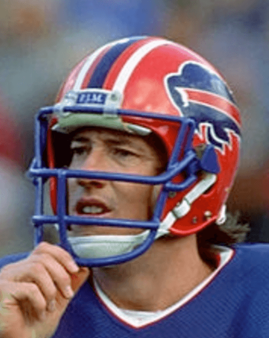
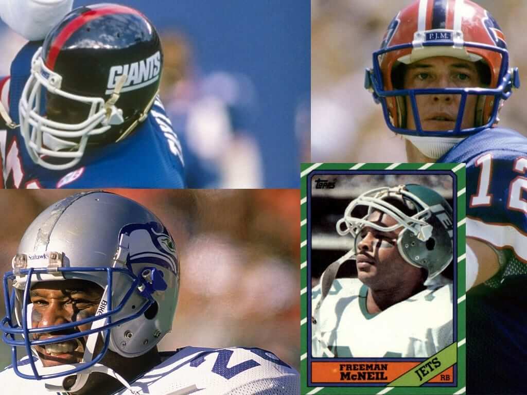
That first version was monstrously big but simple in design, with surgical tube used as the shock absorber. A lot of NFL players wore them, including practically the entire Buffalo Bills team They’re very hard to find these days, and when you do, they’re very expensive. I had some royal blue 3D printer filament, so I decided to make my own clips.
Okay, let’s go one thing at a time. First, here are some photos of NFL players wearing the original Shockblockers. Sure enough, they’re huge, just as Michael said. For some reason I never really noticed them until now (click to enlarge):
.
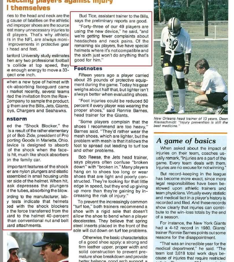
Michael also sent me some scans of the December 1983 issue of Pro Football Athletic Trainer (“The biannual publication of the Professional Football Athletic Trainers Society”). It includes an article about the then-new Shockblocker. Unfortunately, the scan, which wasn’t done by Michael, cuts off part of the page, so the article is hard to read, but you can still glean a bit of information from it (click to enlarge):
.
Here’s the patent for the original Shockblockers (which has since expired). Michael used the patent drawings as a guide for creating his 3D-printed verisons (click to enlarge):

.
And here’s how his clips look on an old Seahawks helmet from his collection (click to slightly enlarge):
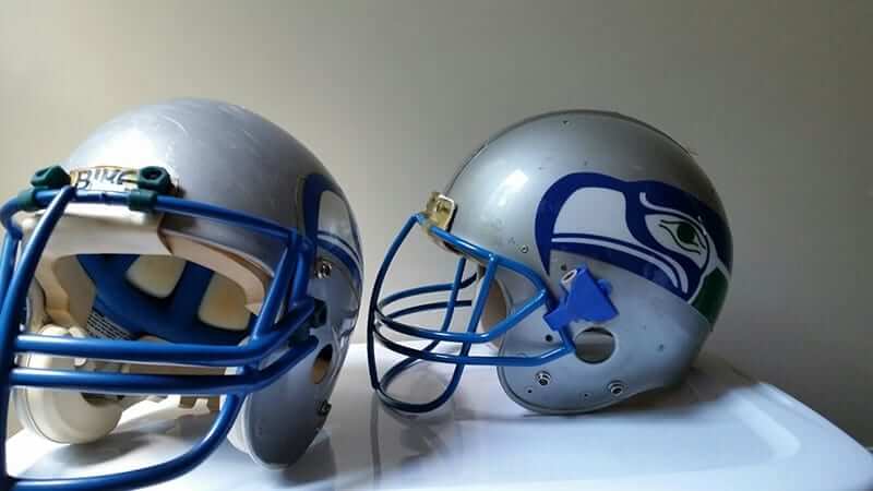
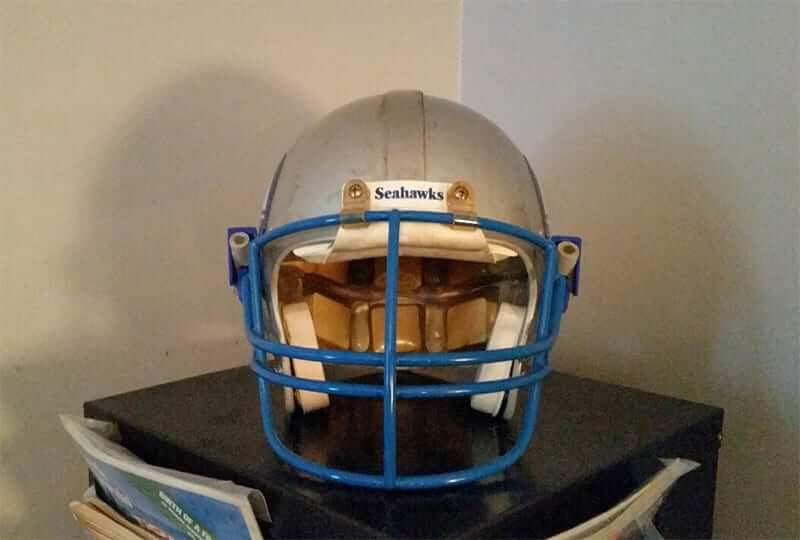
Not bad! What should we call this — the Princip Clip? The PrinClip? By any name, it’s very cool. Thanks for sharing this one with us, Michael.
StripeRite update: The second batch of StripeRite socks (shown at right) is now on sale for only $10/pair, including shipping (a big discount from the usual $16.50/pair). You can also get the third batch at the regular price, although quantities are dwindling. The first batch, alas, is now sold out.
The Ticker
By Paul

Baseball News: Looks like the Phillies are overhauling their outfield turf. … New field for the Royals, too (from Spencer Davis). … Derek Jeter, now running the show for the Marlins, says it’s fine if any of his players want to kneel during the national anthem. … New alternate uniform for the Orix Buffaloes.

NFL News: The Eagles will go mono-white for tonight’s game in Carolina. … The Panthers, meanwhile, will go mono-blue and will also add a “51” memorial decal for Sam Mills (thanks, Phil). … Lots of high schools poach NFL logos for their football teams, which is lazy and unethical. But the town of Shelbyville, Ill., takes things a step further by putting the Rams logo on their water tower (from Eric Bangeman).
College Football News: New mono-red uniforms for Eastern Washington (from Alex Bruder). … Albright College, a D-III school, cut a player for kneeling during the national anthem. … A Florida player walked out onto the field in this weekend’s gator-print uniform accompanied by a real alligator (thanks, Phil). … In a vaguely related item, the gator-print uniforms prompted this humor piece on rejected Florida uniforms (from Eric Juergens). … Here are this week’s uni combos for Troy, Miami of Ohio, Vanderbilt, Air Force, and Incarnate Word. … Yesterday’s Ticker mentioned that Miami would be wearing their mono-BFBS alternates this weekend against Georgia Tech, but that’s no longer the case. Details here (from Javier Davalos). … NC State will wear “J.R.” helmet decals this weekend in memory of Johnny Roseboro, the father of player Darian Roseboro, who passed away this week (from James Gilbert). … Colorado State’s flag-based uniform has been a big hit at retail (from Frank Naqvi).

Hockey News: Latest reason not to waste money on overpriced polyester shirts: The new NHL authentics have this completely annoying plastic Adidas button on the front. “Can’t figure out how to get it off,” says John Bub. Several folks on Reddit have already addressed that. … Here’s a retrospective look at the Oilers’ uniforms through the years. “The way the uniforms transition from one to the next underlines how ugly the navy blue looks compared to the previous lighter shade (not to mention how bad the orange jerseys are, in general, compared to the blue ones),” says Matt Walthert. … A hockey club in Houston has done a straight-up poaching of the Wild’s logo (from Ed Hughes). … ECHL teams will wear Marvel superhero-inspired uniforms this season.

NBA News: NBA headbands now have subtle Nike logo creep. They still have the NBA logo, although many players appear to be wearing it on the back, or inside-out (from Mike Chamernik). … Uniform designer/historian Todd Radom has done a great piece on the visual legacy of the ABA. Highly recommended. … Grizzlies PG Mario Chalmers had a small hole in the back of his jersey during last night’s preseason game against the Rockets (from @HitTheGlass).

College Hoops News: One of UNC women’s coach Sylvia Hatchell’s former players sent her quilt made from UNC T-shirts (from James Gilbert). … Also from James: Pretty good article on the company that made UNC’s championship banner. … Whoa, check out this shot of a 1980s game between WVU and Youngstown State with both teams going untucked and YSU wearing SNOB! (Great find by Robert Hayes.) … Michigan State has added a memorial patch for former coach Jud Heathcote, who died in August (from our own Kris Gross).

Soccer News: Dynamo Dresden will wear an anti-racism slogan instead of their usual jersey ad (from Ed Żelaski). … Thought-provoking note from Omar Jalife, who writes: “I was at the U2 concert in Mexico City last week and saw this U2 T-shirt, which mimics Pumas UNAM’s (soccer) jersey. Obviously, the U2 number and Joshua tree below it are not in UNAM’s jersey, but the main point I want to make is that people are so used to advertisers on our soccer jerseys that even a bootleg T-shirt maker felt the need to add all the ads. Could this shirt accomplish the same effect without the ads? Of course it would, but now there’s a mindset that ads are part of the design itself. I just hope it doesn’t end like that in the U.S. sports.” … Here’s what appears to be a pretty comprehensive index of soccer team crests (from @_VToasty_).

Grab Bag: Love these photos of German bowling alleys (from Jon Solomonson). … The Virginia State Police issued a statement affirming that on-duty officers should not cover the name tags on their uniforms. Several officers had covered their name tags during a recent pro-Confederacy rally. … The Boy Scouts will now allow girls to join, which will likely result in some uniform adjustments. … Here’s more on the U.S. Army’s revival of the old “pinks and greens” uniforms (from @RollinDeathStar). … Pinktober jerseys this weekend for Akron volleyball (from Jim Vilk).
Matt Walthert is so wrong. The new Oilers threads are maybe the best they’ve ever worn. The muted blue works so well with the orange. Whatever. To each their own.
2007-12 navy Reebok Edge ones were the worst.
I can dig the new Oilers uniforms. They are not bad (and this coming from a Canucks fan). For me the royal blue with orange trim will always be my favourite look and signature to the Oilers. They had a dynasty in that uniform with 5 Stanley Cups. From my perspective, you should keep the look you were a dynasty in. Yet they have ditched their glory years uniforms on 2 occasions now.
The problem was the oilers were to busy resting in the old glory days. While the blue with orange trim is probably the best, I honestly don’t understand peoples hate towards the orange. Orange is imo the most underused color in sports
Underused? – Teams that have orange in some form:
The Knicks / Browns / Islanders / Astros (at one point) / Miami Dolphins / Bengals / Florida Gators / Denver Broncos / Chicago Bears / New York Mets / Detroit Tigers / Syacuse…just to name a few…seriously…underused?
I’ll tell you this, when the Bears wear their orange jerseys. NASTY! You notice they no longer wear them. I wouldn’t be against them using orange a little more but please, PLEASE, not as a jersey.
But the link Matt sent is super cool. Great presentation.
The Adidas 2010 World Cup replica jerseys had some sort of silicone button thing on them, too. I’ve got a Germany and Mexico and I’ve never been able to get them off.
Are you talking about the small circle in the lower right area at waist level? I think those acted as jock tags and authenticity more than any functional purpose
link
I always wondered about those facemask clips. They seemed pretty limited to the “New York” teams back then
The Miami article has a quote here that doesn’t make much sense:
“When this was scheduled to be a Thursday Night game, Miami was going to debut their all-black alternate jerseys. With this being an afternoon game, and the South Florida sun being way too much to wear black at that time, Miami will instead go with Green jerseys over White pants vs GT this week.”
The green Miami wears is still a dark color so if your supposed rationale for not wearing black is the heat, it doesn’t make much sense to wear the green. Seems like orange would be the better option.
That’s great about the clips… the cool thing is seeing that Seahawk from back in the day with the more modern facemask, that clips “forward” usually, installed with the clips going backwards.
There’s a town in South Jersey (West Deptford) whose high school colors are green and white and their mascot is an eagle. They’ve always had the Philadelphia Eagles logo on their water tower. When the NFL Birds changed the logo 20 years ago, so did the town.
I should also mention, back when I first saw these, I thought they were just “covers” for the hardware holding the mask on, as protection for others. I remember a teammate in high school coming back to the huddle with a gash in his arm from an opposing players helmet hardware, so when I saw this, I thought that’s what it helped with.
You weren’t the only one, Gene. I used to think they functioned with the same purpose to keep opponents’ fingers from getting ripped up. -C.
In the bowling photos, I never gave a thought that their could be other ways to set up the pins. In one a few of the photos the pins are setup in a diamond pattern with what looks like 9 pins. Never saw that. Is that just a German variation?
With that schematic of the clip I now understand the shockblockers name. I too kind of thought it was a cover to protect fingers or something from getting caught in the small triangular area or along those lines.
Ninepins is the original form of bowling that is still played in some parts of Europe. When the game was brought to America, the tenth pin was added to circumvent gambling laws.
I’ve written about ninepins here on Uni Watch:
link
Weird thing about poaching logos: I was at a tailgate before the UVa football game last week and we collectively realized that all of our respective high schools (five different ones) use an NFL or college logo.
Also, proofreading the soccer section:
-“The Dresden Dynamo” -> “Dynamo Dresden”
-“Puma’s UNAM” actually has a greengrocer’s comma in it, but I don’t know if it’s yours or not.
The better way to type it in this instance would be “Pumas UNAM’s”, as it is in the possessive form.
Done.
Fixed.
“…some scans of the December 1983 issue of Pro Football Athletic Trainer”
ACK!! Look at that Chargers helmet on page 1!!
It’s the dreaded Placo/Gresh helmet plaque!
Also, the Saints player with the tied up belly shirt is looking FABULOUUUUUS!
Never thought I’d see a dive on helmet clips here but this site never ceases to amaze me. Great job!
But related to the Jim Kelly pictures accompanying this piece, who or what is PJM for the Bills on the nose bumper?
The “PJM” was a memorial for team exec Pat McGroder. Worn in 1986 and ’87.
Interesting we no longer see memorials (at least any of which I’m aware) on nose bumper plates. Instead of being out front like the Bills’ PJM, memorials are typically on decals at the back of the helmet. Wonder if there’s an NFL proscription against memorials at the front of helmets.
If uniform ads make soccer kits look more authentic, then U2 might have done well to render its album titles in bumper sticker format to slap all over the garment. Preserves the look while staying proprietary to the group. Arcade Fire did this with their newest cd.
The Miami Hurricanes did the smart thing by not wearing their black tops and helmets since ESPN is gonna have their game start at 3:30 p.m. EDT. Even in October, the heat and intense humidity still remain here in Florida. The Canes can always save the black uniform elements for their game vs. Virginia Tech.
Or better yet, not wear ridiculous BFBS uniforms at all.
The 1980s women’s basketball game between WVU and Youngstown State that shows both teams going untucked, also shows both teams wearing sleeved jerseys. Do sleeved jerseys just look better on women, and is that why they are not so popular for men’s teams?
Oh my no! I don’t care for cake! Too sweet…
Re: Small Details
Have you covered how NHL players (or teams) treat their lace-up collars?
I noticed that a lot of Flames players have them going straight across to form three stripes (adidas?).
link
That’s not a player thing, and it’s not a real lace-up collar. The jersey is made with faux laces.
Classic example of a skeuomorph:
link
That Houston youth hockey club was started by the Houston Aeros, who were the AHL affiliate of the Minnesota Wild.
Ah, interesting — thanks.
The mention of Pinktober shirts for Akron in the “Soccer” section appears to actually be about the volleyball team.
Thanks. Fixed.
“Grizzliers” PG Mario Chalmers
should be “Grizzlies” PG Mario Chalmers
Thanks. Fixed.
Loved those 84-86 Bills helmets with the crimson shell and royal blue facemask
Jeter says it’s fine if his players take a knee? i expected more from him. Then again, after the way he treated Arod I should have expected it.
Unfortunately, the development of the shockblocker clip led to the ongoing and consistent teaching of the tackling technique of “lead with your head/facemask” tackling, exacerbating concussion issues, one of the may issues which are leading to the drop in interest in football and the NFL.
Players lead with their facemasks? I’ve never seen/heard that, nor have I heard the Shockblocker blamed for it.
What I see and hear is that players lead with the crown of their helmet.
Not saying you’re wrong, but it would be news to me.
The way I was taught (albeit in the 70s as a defensive tackle) was to tackle with your head up, and put your face in the ballcarrier’s sternum. Dropping your head, leading with the crown of the helmet has ALWAYS been bad technique (mostly exhibited by DB’s)
I didn’t say leading with your crown was good technique, Tim. I said leading with your crown is what has caused the concussion problems you mentioned. It may not be good technique, but it’s what most players now do, and that was actually the point you were raising.
You move the goalposts a lot (pun fully intended).
Damned Kickers…
What needs to happen to make football safer is to remove facemasks and enforce/teach rugby style tackling. But I digress..
#GIVEBLOODPLAYRUGBY
When EWU wears that new all-red ensemble this Saturday at home against MSU, on the red carpet Inferno turf, they are going to be freaking invisible!
Seeing that vintage Seahawks helmet sure makes me wistful for the days when Seattle had decent uniforms. Today’s costume is easily the worst in the entire NFL (and don’t get me started on that color rush abomination).
Never could understand why some teams elected to not put their name on this clip. Some had the helmet manufacturer’s name on it, and I thought maybe it was an agreed upon advertisement. Same with the pad on the back, neck area, of the helmet.
Late in the day, I know. If anyone’s still around, how is it that high schools can appropriate pro logos?
Anyone can poach anything. It’s just a question of whether you get away with it.
I believe the NFL will allow the use of it’s franchises logos subject to certain strict conditions. For instance they would be required to use any profits from merchandise sales for specific purposes. The town I live in uses an NFL logo (although a different color scheme) and there isn’t a problem. Some of the more successful programs in the state use versions of college logos (UGA and Clemson come to mind immediately, again with different color schemes).
Other schools I have seen use the Rams horns, the Washington logo is popular in some parts as well. You can do it, you just have to follow some not unreasonable rules and conditions. I know my town makes very little off merchandise sales, as do most. And with school budgets stretched to the absolute limit that’s not unreasonable.