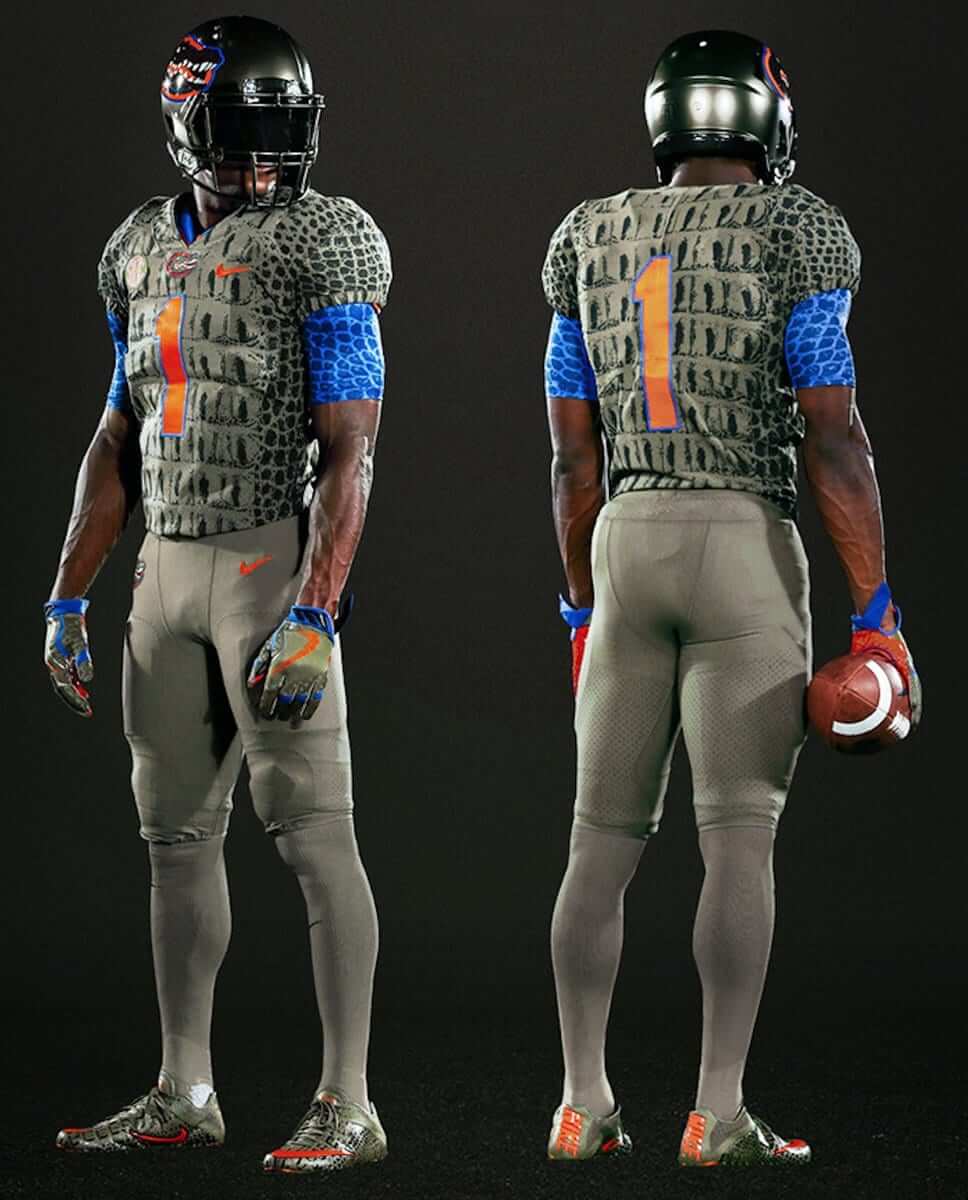
Click to enlarge
The Swamp will be a bit swampier than usual this weekend, or the Gators will be more Gators-y than usual, or something like that, as Florida will be wearing a “swamp green” gator-print uniform. The new design, which was unveiled last night with no buildup or warning (at least that I was aware of), will be worn for Saturday’s game against Texas A&M. According to a press release, it’ll mark the first time the Gators have deviated from their familiar orange/blue color scheme.
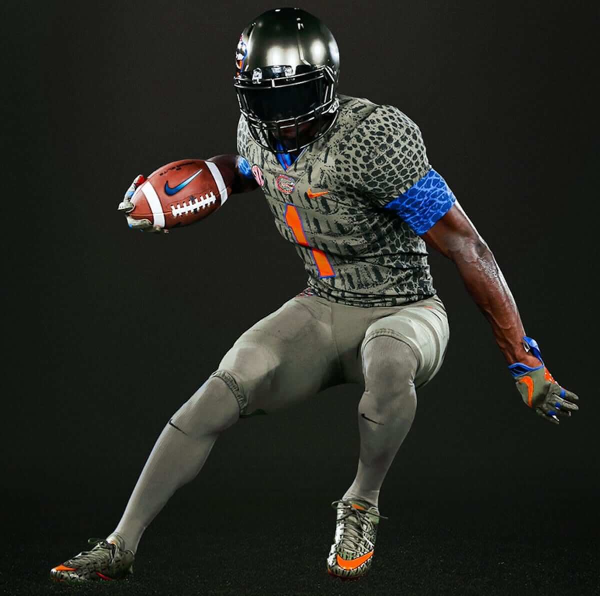
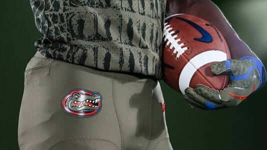
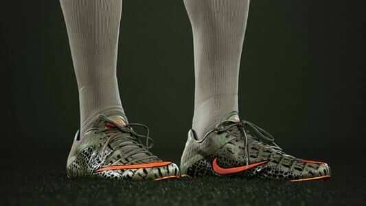
Here are some additional photos (the first of which you can click to enlarge):
Okay, so this is the part where I’m supposed to say how this is a costume, not a uniform, and how it’s just a bad joke, and how I hate the whole thing.
And yeah, it is a costume. But guess what: I don’t hate it. I mean, I wouldn’t call it attractive, and it’ll probably look a lot worse on a green gridiron, but I think it’s a fun idea. I agree with one of my Twitter followers, Juan González, who gave this assessment last night: “So ugly they’re awesome. Helmet, pants, and socks should have included the gator skin, too.” Exactly! If you’re gonna do it, do it all the way.
Another one of my Twitter followers, Jeremy Posner, raised a more serious concern: “Those uniform numbers are invisible for those of us who are red-green colorblind.”
As you might expect, Juan and Jeremy weren’t the only people on Twitter to offer their thoughts on this uniform. Most of the responses were predictable (the same barfing GIFs again and again, yawn), but a few of the reactions were inspired. This one was my favorite:
See ya later, Florida Gators pic.twitter.com/CfItuikszh
— LosRealAli West (@LosRealAli) October 10, 2017
Click to enlarge
Collector’s Corner
By Brinke Guthrie
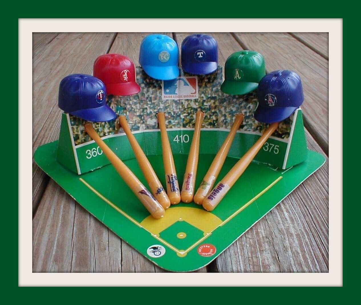
This Mini Sport Caps N Bats Kit for the 1970 AL West is in perfect shape! And the seller has several other sets up for auction, too. There’s a real charm to this kind thing that you don’t see any more.
Now for the rest of this week’s picks:
• Still in the bag, a 1970 souvenir Pirates batting helmet.
• Here’s a 1970s NFL pennant that says “Ask us about….” About what? About the NFL?
• This L.A. Rams metal serving tray is 14″ wide, so you can get a lot of gameday snacks on it. A classic look for sure, which is not what you usually think of with the Rams these days.
• How about the art on this 1970s Philadelphia Eagles pennant? Showin’ off that state of the art Veterans Stadium, so maybe fall of 1971 for this.
• Camel cigarettes sponsored this 1970s Vikings key chain, so naturally they had a little camel on there along with the Vikes helmet.
• Check out the great cover artwork on this 1970 Dodgers yearbook. The artist was Karl Eubenthal, a prominent sports cartoonist. You can see more of his work here.
• Great vintage graphics on this 1970s MLB card-holder album.
• Another baseball card-holder album for you. This 1980s one is smaller and was made for Les Expos.
• Definite Monsters of the Midway/Papa Bear vibe on this late-1960s NFL poster for Da Bears.
The Ticker
By Alex Hider

Baseball News: For the first time ever, Cleveland wore the block-C caps in a postseason game last night (from MD and John Sabol). … The home plate ump in that game had some issues with his postseason patch and memorial patch. … The Red Sox’s Hanley Ramirez lost his helmet during a hard swing yesterday, and because he puts so much pine tar on his helmet, a clump of dirt stuck (thanks Paul). … Cleveland 2B Jason Kipnis was wearing a shirt with a personal logo inspired by the MLB’s batterman silhouette during a pregame presser yesterday. The logo is inspired by Kipnis’s distincitve batting stance (from Mike Menner).

NFL News: The Broncos will be going mono-blue on Sunday (from Phil). … For anyone looking for a close up of the “Crucial Catch” captaincy patches, here you go (from Zach Zaidman). … Here’s a great photo gallery of Giants’ great Y.A. Tittle, who died yesterday at age 90. RIP (from Phil). … Vote here for your favorite uni matchup of this week’s NFL games (from the Uni Watch Fan Page). … This may have been covered before, but it appears that the Steelers are keeping Ben Roethlisberger’s helmet stripe intact this year, even though he wears a Speedflex helmet. However, RB Le’Veon Bell also has a Speedflex helmet, and his numbers and stripe are both cut (from Omar Jalife). … KPTV, a Fox affiliate in Portland, used an old NFL logo during a recent broadcast (from Neal Hanson).
College Football News: Ohio State will wear grey alternates on Oct. 28 against Penn State (from Luke Schaffner). … Michigan State is 3-0 in white lids this year, bringing them to .500 all time in program history (from Spartan Jerseys). … Some Penn State players have been wearing watch-like performance trackers made by Whoop during games (from Jack R. Hirsh). … At least one Kentucky player had facemask paint problems during their game last Saturday (from Drew O’Neal). … Fox Sports has been running a college football commercial based on Ohio State’s logo-less helmet (thanks Phil).

Hockey News: I don’t think we’ve seen this in hockey yet: The Blue Jackets are using 3D helmet logos this year (from Patrick Thomas). … Sabres RW Kyle Okposo had a misspelled NOB last night. … The Blackhawks have added a small “3” helmet decal for former player Pierre Pilote, who died in September. It wasn’t there for their home opener, but they added it for their second game and have kept wearing it (from Bill Schaefer). … No photos yet, but the Green Bay Gamblers of the USHL will unveil military appreciation jerseys today at 11 (from Terry Charles). … Adam Lilyquist got a T-shirt heat press for his birthday, and the first shirt he made was inspired by the Hawks from the movie Mighty Ducks — aka, the “bad guys.” … The Oilers updated G Cameron Talbot’s bobblehead to reflect his new gear and the team’s new Adidas uni.

Basketball News: The Knicks teased the unveiling of a new jersey patch. It is expected to be an advertising patch. The formal announcement will come today at 11am Eastern. … Speaking of the Knicks, Jarrett Jack had no maker’s mark on his jersey for last night’s preseason game (from @taquito420_). … The Mavericks’ costumed mascot is still wearing his old Adidas uniform … New uniforms for the Cal women’s team (from Phil).

Grab Bag: I don’t think we’ve ever seen this before: Morgan Hurd, a member of the US women’s national gymnastics team, wears glasses during competition (from Chris Weber). …Could these be the Colombian men’s national soccer team kits for 2018? (From Michael Romero.) … Not sports-related, but fans of architecture will enjoy this listicle of America’s wildest buildings (from David Firestone).
Proofreading:
“it’ll probably look a lot worst”
“Fox Sports has been a college football commercial”
Fixed.
Those Ohio State uniforms look awful light, going to be interesting when my Nittany Lions line up in their whites.
Lions wear blue on the road! Nope not happening.
That’s Karl Hubenthal ,
One of the all time best, a bio of his storied career, by another great graphic artist Bob Staake link
Florida Gators – They like more like Teenage Mutant Ninja Turtles.
Why to the turtles wear masks? As to the Gators, the gator skin pattern looks like it would be terrific on a helmet. On the jersey, I’m not loving it. Also, why not do it in Florida school colors? The literal or representational gator-skin coloring just makes it look like the team killed and skinned some alligators. If someone is going to butcher a team’s mascot, shouldn’t that be the team’s opponent, not the team itself?
Anybody else bothered that the “swoosh” was photoshopped to be right side up on the football in the action shot?
A jersey patch warrants a tease (Knicks)?
first sentence: more Gators-y “than” usual…
Fixed.
“Swamp green” looks gray to me. First thought it was my phone, but also so on my PC monitor. We will see when it takes the field
Steelers backup QB Landry Jones also has a solid stripe/number on his Speedflex. He wears #3. Perhaps it is a single digit thing. ???
What is the “NB” on the Eagles Veteran Stadium pennant?
For God’s sake, bring back that beautiful Art Nouveau typeface when the Eagles return to kelly green.
As a UF alumnus, I think those Gator costumes are uglier than home-made sin. I hope they change their minds about this stunt.
You NEVER go full gator!
My dad bought exactly that Eagles pennant for my room when we moved to Philly in 1980, so whenever it was introduced, that design was available at retail during the 1980-81 season.
In Game of Thrones, greyscale is considered a deadly affliction to be avoided at all costs.
Daenerys Targaryen, mother of dragons and the first of her name, should order them,like she did with Jorah Mormont,to find a cure.
Like wear their normal uniforms.
You’ve gotta get the security certificate fixed. It makes viewing the site at my office harder (I’m on my phone) and I’m sure I’m not alone.
Just remove the “www” from the URL. That’s it.
I don’t hate these uniforms, either. I think I would like them better with the gator print extended to the pants and helmet and and maybe some orange and blue socks to give it a little more color. I’d also prefer the F logo or script over the gator logo.
Like you stated: make helmet, pants, and socks have same pattern AND with the helmet, ditch the decals, put some big gator eyes on the anatomically-correct area (or at least close) and then use the facemask to display an open mouth full of teeth. Hell, if you’re going full costume, go full costume!
That mini hat and bat collection is gorgeous but it’s from 1972 at the earliest. In 1970, the Brewers were in the West and the Rangers were still the Senators.
Beat me to this….was going to say the same thing about the Brewers/Senators
I love these Florida uniforms! I just wish they would have included the pattern on the pants and socks.
I also think they should have added teeth to the helmet or facemask that would have been really cool.
True believers might howl, but the Gators need a redesigned reptile. I despair at the sight of cartoonish mascots on the helmet, like the Kansas Jayhawk or the Louisville Cardinal. Maybe I’m simply trumpeting my individual tastes, but my ideal helmet logo is abstracted to about the degree of the Iowa Hawkeye or the Kansas State Wildcat.
Also, patterns like animal skin need to be done with a lighter touch, such as the Cincinnati Bengals’ color rash getup.
Ooh, that sounded a little harsh on Kansas University. No offense! A particular offender is the Fresno State Bulldog.
“Those uniform numbers are invisible for those of us who are red-green colorblind.”
Good thing the Wallys went Gray and Orange!!
From a Safety standpoint, I am surprised all the extraneous jewelry is allowed on players. I suppose at the Professional Level, it has been “earned”, but when I see College players, and certainly those at lower levels of play, with so many bracelets, step-counters, etc., it just seems the potential for injury exists. Especially for college players who, at the least, dream of, if not directly working towards, a professional career. Fingers can get caught, plastic can land in horrible places. I would think it is a simple safety issue. Let alone, a distraction from appropriate attire for the game. Of course, that is a whole another issue, so often addressed on this forum.
Screen grabs of tweets are showing greeked type.
Screen grabs of what tweets?
Never mind; it’s also happening on YouTube. Seems I’ve disabled a crucial font, somewhere.
Adam Lilyquist – Get yourself some heat press pillows to get rid of that pressed through collar marking – link
Thanks for the tip!
Update on the Gator uniforms for this weekend, they definitely look more “green” in person than in the pictures from Nike. Here is an image from the UF Bookstore this morning.
link
Your picture looks even less green to me. That looks like a gold-ish brown.
Lee
agreed.
Nike.com had the gator print Florida jerseys up for sale the day or two before the “unannounced” reveal
Two things I found interesting about the cool Dodgers’ yearbook cover from Hubenthal:
1) Yes, kids, that’s how big the Miracle Mets were. They were featured on an opposing team’s yearbook cover the next season!
2) Of the characters representing the division rivals attacking the Dodgers and Mets, the Expos are represented by a lumberjack. You know how prevalent they are on the streets of Montreal!
I like that the Giants were depicted as the Jolly Green Giant. Definitely a playful jab from the rival Dodgers on that one.
Wow. I can’t believe a crazy uniform came out, that I don’t like, that Paul likes. What’s up is down. Or, maybe I just had a stroke?
Wait until you see what’s happening tomorrow, Cole. Trust me, you’ll find it interesting.
Now literally on the edge of my seat…
Re: Mini Sport Caps N Bats Kit – the person selling them is off by a year, as the White Sox were still wearing their royal blue caps in 70. The red ones were introduced in 71.
The Golden Knights are playing their home opener with no ads on the boards:
link
Oct 9 – UEFA World Cup Qualifying (soccer): Nemanja Matic of Serbia had his sleeve patch come off by the end of the match.
link
Wally Gator! God I loved Hanna Barbera cartoons.
Besides tiger stripes, I would love to see what other teams made uniforms to try and look like their actual mascots (a leopard print uniform springs to mind).