Click to enlarge
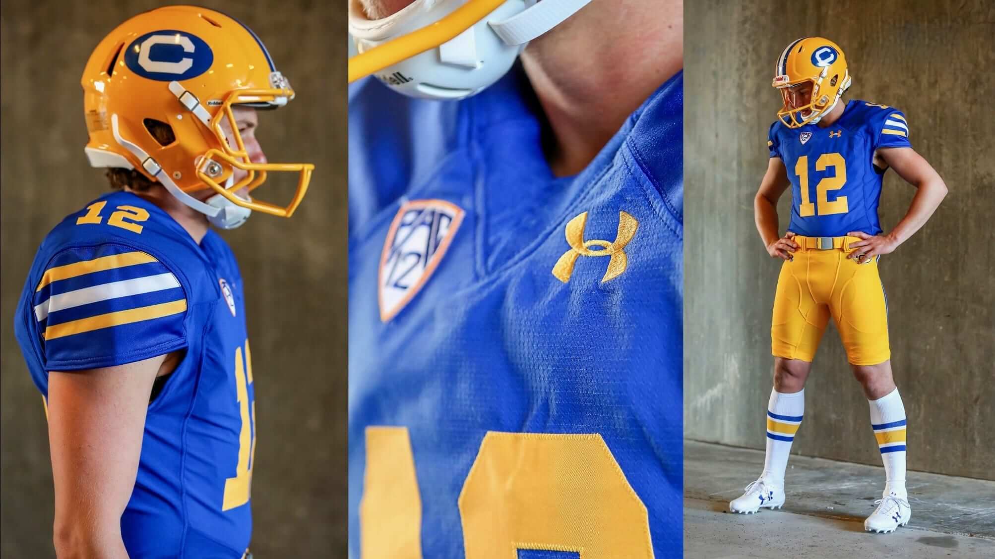
It’ll be a good-looking game on Sept. 23, when Cal wears 1975 throwbacks while hosting USC. The Golden Bears announced the retro uniform yesterday. (Here are some additional photos and info.)
The uniform is known as the “Joe Roth design,” a reference to the former Cal quarterback who led the team to the 1975 Pac-8 title before dying of cancer. The school has maintained a memorial locker for him for all these years.
Naturally, I love it — the sleeve stripes, the tube sox, the old-school helmet logo. And they’ll go NNOB for this game, too. What’s not to like? (Okay, so the facemask is the wrong color, so there’s that.)
As it happens, I also have a bit of a personal connection to that era of Cal football. My brother Henry went to law school at Cal from 1974-77 (I was 10 to 13 during those years), and at various points he got me a few Cal football trinkets: a patch, a bumper sticker, that sort of thing. I was never a huge college football fan, but Cal was my favorite team for a few years there. They were never on TV, at least not on Long Island, but I remember poring over the Sunday paper to see how they did each week, and every now and then I’d see a wire photo, which was exciting.
Unfortunately, those Cal souvenirs got lost or tossed at some point along the way. But seeing this throwback uni takes me back to those days.
Raffle reminder: I’m currently raffling off a bunch of cool Hartford Whalers items. Full details here.
The Ticker
By Paul

Baseball News: Who’s that in the sunglasses? None other than Joe Namath, shown with his high school baseball team (from Patrick O’Neill). … Twins catcher Chris Giminez had his shoulder guard ripped off by a foul tip during yesterday’s game against the Rays. It was later replaced in a new color. … Now that Derek Jeter owns a piece of the Marlins, his Jeter’s Leaders charity program has changed from Yanks-themed jerseys to “RE2PECT” jerseys (from Steve Flack). … Love this Tony Gwynn-themed beer can design (from Ty Murphy).

NFL News: Looks like the Saints have installed new field turf (from Ernie Ballard). … Newly acquired Steelers CB Joe Haden bought teammate Robert Golden’s No. 21 for an undisclosed amount (from Mr. Budziszewski). … Starbucks is offering a series of coffee cup holder/sleeve thingies that look like Seahawks jerseys. … Panthers LB Luke Kuechly wears the team’s solid-black uni combo in a new Campbell’s soup commercial.
College Football News: New helmet number font for Iowa. … Arizona State will wear 1975 throwback helmets this weekend as a tribute to former coach Frank Kush (from Marc Altieri). … Cal will wear 1970s throwbacks against USC on Sept. 23. Additional info here (from John Lemein and Guan Gorcey). … Whoa: The 1985 Penn State/Maryland game was so hot that the refs wore shorts (from our own Alex Hider). … Here are this weekend’s uniform combos for Michigan State and Washington State (from Kris Gross). … Also from Kris: Louisiana-Monroe is that latest team to go with raised neck bumper lettering. … Virginia Tech will be wearing a Hokie Stone jersey and helmet this weekend (from Andrew Cosentino). … Gross: UNC cheerleaders are soliciting uniform advertisers (from James Gilbert).

Hockey News: New practice jerseys for the Capitals (from Jason Hocker). … New mask for Predators goalie Juuse Saros (from our own Alex Hider). … There’s some info on new Oilers uni number assignments in the middle of this piece. … Chevrolet has created a pretty cool sculpture for the Red Wings’ new arena. … New 15th-anniversary logos for the Atlanta Gladiators (from Matthew Caldwell). … New mask for Blues goalie Jake Allen (from Mike Judy).

Basketball News: This is pretty awesome: I’ve never seen this Minneapolis Lakers shooting shirt before. Love it, although a comma would be helpful on the “10,000” (from Jimmy Lonetti). … Last night’s Phoenix Mercury WNBA game featured a combined ASU/Mercury court design (from Josh Pearlman). … New uniforms for Valpo (from Scott Held). … New practice/workout gear for the Spurs (from Quin Patterson).

Soccer News: Wales had a good-looking (but one-time use) yellow-and-black away kit for Tuesday’s World Cup qualifier against Moldova. “Interestingly, this article announcing the new kit indicates a possibly coincidental similarity to the yellow-cross-on-black flag of Wales’ patron saint, St. David,” says Jamie Rathjen.

Grab Bag: Turns out that tennis star Roger Federer likes to go shopping for sneakers (thanks, Brinke). … Here’s a photo slideshow of bold player attire at the U.S. Open.
Saints turf link goes to the Roth uni story.
Fixed. Here’s the proper link:
link
“UNC cheerleaders are soliciting ”
Wha…wha…What???
:^)
Link for new Saints fieldturf is broken
Already fixed. Here’s the proper link:
link
I believe the Superdome got new LED lighting. Maybe, like Atlanta’s new dome, they play tricks on the eyes.
Proofreading:
“Alex HIder” Unless that’s his way of saying hello.
Fixed.
Jeter’s Leaders charity program has changed from Yanks-themed jerseys to “RE2SPECT” jerseys
No S. Just “RE2PECT”
Right. Fixed.
So, is it pronounced “ree-two-pect”? “res-two-pect” “reth-pect”? Some other variation? I know it is a thing to drop numbers in for letters, but I can’t bring myself to actually pronounce “respect” when there’s a “2” in there.
It also still feels Yankee-themed (to me).
The cal throwback reminds me of the king corcoran uniform in philly
link
MY first thought was the USFL Oakland Invaders.
link
Hmmm… wonder if someone got a deal on some used Cal jerseys.
Interesting that you mention The King; I thought of him immediately when I saw the picture of Joe Namath wearing sunglasses.
What is not to love: The bike shorts.
I was going to say the same thing! Only I like Cal’s white tube socks better than the blue socks the Bell wore. In 1971 my father played on the Norfolk Neptunes with Nelson Muncey, the players were already hearing how good Nelson’s younger brother Chuck was going to be.My favorite throwback uniform is the one Pitt wears from the Dorsett era but Cal’s is right up there, they did a great job
Last night’s Phoenix Mercury WNBA game featured a combined ASU/Mercury court design
I love a shared court/field design. We need more of those!
Would be cool if Cal-USC is color vs. color!
Definitely!
Interesting that the throwback facemask is Gold and the facemask in the memorial locker for Roth is Gold, but they actually wore Grey facemasks back in ’75… Did they want to match the memorial locker on purpose?
They did wear yellow masks in ’76, which I believe was Roth’s last year, so that’s why they have that version in his locker. But they won the conference championship in ’75.
1. The “12” in the Cal fauxback is wrong. The top of the 1 should have a curved notch toward the serif and the 2 should have a diagonal bar. Considering the source material is there for all to see, this is an egregious oversight.
2. The helmet numbers for Iowa look neither like the uniform numbers (Varsity Block) nor the yard markers (italicized, based on the bottom right picture).
…also, the Under Armour logo shouldn’t be present; the arm stripes should go all the way around…the PAC12 logo should not be on the jersey…if you’re not going to do it right, don’t do it at all…
I think there are certain things that are reasonable to expect from a throwback, and other things that are not reasonable to expect.
Example: MJ is absolutely right when he says the number font should be period-accurate. That’s throwback 101.
However: While I would prefer not to see maker’s marks or conference logos on throwbacks (frankly, I’d rather not see them on *any* uniforms), I don’t consider them dealbreakers.
Similarly:
– I realize that a throwback uniform will not be made of the same fabric as the original.
– I realize that a throwback uniform will not be sewn in the same tailoring pattern as the original.
– I realize that a throwback will not have the same sleeve lengths as the original.
– I realize that a throwback helmet will not have the same design (or the same facemask) as the original.
And so on. You probably don’t expect a throwback to have any of those things either. So when we call for “accuracy” or “doing it right” or words to that effect, it’s important to keep in mind that such concept have their limits.
This is actually pretty interesting. The number font ISN’T wrong! Compared to the locker photo, it looks wrong, but as Paul stated above, the locker room photo is from the 1976 uniform, his last year.
Compare the uniform to the 1975 photo that Paul linked and the numbers are accurate with the facemask being inaccurate. In a way, this is sort of a 75/76 uniform hybrid.
Ah, but see, look up a photo of Joe Roth in uniform, and you’ll see they *did* get the numbers correct, it’s the one in the locker that seems wrong.
The first letter of the post is currently lower case. Those are very cool looking Cal unis and I love the preserved locker for a fallen teammate.
Weird. Fixed.
Thanks for the link to the Roth story. I remember going to the 1977 Hula Bowl with my dad and hearing he was sick with cancer. When he died a month later, it was one of my first glimpses into how cancer can claim anyone, at any age.
Random edit re: the Chris Giminez item… by rule, a foul tip can’t hit a catcher in the shoulder – it must go directly to his mitt. What you have there is a foul ball. This has been a huge pet peeve of mine as I train summer league umpires but the MLB broadcasters get it wrong daily.
Cool info. The “minutia” is why we are here.
thanks.
I can’t think of Joe Roth without getting misty eyed. He passed away during my junior year in high school. It was hard to believe that someone that was such a bright light could just suddenly be gone.
The Chevrolet sculpture is nice, but not my favorite part of the new arena. Supposedly, someone salvaged the old neon letters that spelled Olympia from the Old Red Barn (at least, from one side – it was on both sides of the building). They’ve been refurbished and installed inside the new place.
Love this Tony Gwynn-themed beer can design (from Ty Murphy).
SPLENDID. In fact, the can uses Futura Book for the graphics, which improves somewhat on the hand-done Padres’ font. Futura is very geometric, so the circle-based letters are perfectly round. It used to rankle that San Diego’s 1980 lettering was vertical, and arched, yet not vertically arched. The “r” cocked up the arrangement.
Just saw the NBA2K Kyrie Irving cover. Big winners are Nike and General Electric.
link
“Love this Tony Gwynn-themed beer can design (from Ty Murphy)”
My thoughts as well! A great beer can design, indeed. On Labor Day I went down to Petco Park for the first time but was disappointed to find several fans wearing .395 Pale Ale shirts to the game. I loved seeing fans wear brown to a Padres game but this isn’t really a Padres shirt. It’s not even a Tony Gwynn shirt. It’s a shirt for AleSmith Brewing’s .395 Pale Ale.
Now, I’m not really a Padres guy (so perhaps I’m just being nitpicky), but wouldn’t it be better just to sport a Padres shirt or a Tony Gwynn shirt to the game?
I also admit it’s crossed my mind that these shirts may have been given out for free at some point in time. But still, it’s a beer shirt- not a Padres shirt right?
Are you any less of a fan for wearing whatever on earth you want to the game?
Point taken. I suppose I just should be grateful that it’s brown and not blue.
Some background on Pale Ale .394
link
Since WSU is going mono crimson, I wonder if Boise will go mono blue?
New Nike uniform template has massacred the shape of the Pats sleeve stripes. They were neatly tapered front and back, USC-style. With the new template, they are not neatly tapered in the front at all, and weirdly-shaped in the back, too. Looks like something someone’s Mom slapped together.
The Virginia Tech Hokie Stone Uniform is more or less the same thing wore in last years Battle of Bristol against Tennessee except, White helmet instead of Black and the decals inversted a bit, White Pants instead of Black Pants, and White Shoes with Black Stripes instead of Black with White Swoosh.