
[Editor’s Note: Paul is on his annual August break from site. Deputy editor Phil Hecken is in charge from now through Aug. 25, although Paul is still on the clock over at ESPN and may be popping up here occasionally.]
By Phil Hecken
Follow @PhilHecken
…John Elbertson.
The Grand Rapids Griffins have culled over the 12 finalists as selected by you, Uni Watch readers, and they have made their decision.
Marissa Malson, the Griffins’ Director of Digital Marketing, and who worked with me on this contest (this year as well as last year), said, “I’m thrilled by the number of entries we received! Choosing a winner was difficult, but we’ve selected John Elbertson as our winner.” She adds, on behalf of the Griffins:
Thank you to all 119 of our designers who entered the contest and congratulations to our 12 finalists! It was a difficult decision, but the Griffins have chosen John Elbertson as our winner! John’s design will be worn on ”˜80s Fauxback Night on Jan. 12, 2018. He’ll also receive a personalized version of his jersey and tickets to the game. Finally, thanks to Phil and Uni Watch for once again hosting a fantastic contest!
So congratulations to John and I also want to thank each and every entrant for their efforts. I know there were a few “hiccups” along the way, but I think the contest went smoothly for the most part. Each time I run one of these, I do my best to make it as fair and fun as possible, and I want to thank each and every reader for participating and for those who sent their feedback, either in the comments section or via e-mail, to make future contests better. You guys are all aces!

US Open Fashion, 2017

The U.S. Open (tennis) begins this Monday, right around the corner from me in Flushing Meadow, NY. I asked my doubles partner, Brinke Guthrie, if he’d like to give us a quick rundown of some of the uniforms outfits we’ll be seeing on some of the star players this year. He obliged. Here’s Brinke:
US Open Style
By Brinke Guthrie
Showtime in New York City for the US Open, starting Monday. As usual, the big names are rolling out the big guns for maximum exposure.
Nike has the highest profile, of course. Maria Sharapova missed last year’s Open (pesky suspension, ahem) but returns in a Nike dress designed by Riccardo Tisci. Roger Federer also missed the Open last year (injury) but returns with a reprise of his 2014 Jordan Brand/Nike RF shoe, in a colossal corporate merger of mega-superstars. Jordan is the Federer of hoops. Or…Federer is the Jordan of tennis. Either way. The Nike Zoom Vapor Air Jordan 3 went on sale two days ago at a place called Kith in Soho — they opened up an RF pop-up store that will run through Sunday, supposedly.
Musician Pharrell Williams created a line for the adidas pros, which also includes Sascha Zverev and Wimbledon winner Garbiñe Muguruza, who used to wear the adidas by Stella McCartney line along with Caroline Wozniacki, who still does. (Shown above.)
Other major lines offering up new gear include Fila (headed by not-for-long world #1 Karolina Pliskova) and Lacoste, who lost their newly-signed flagship player Novak Djokovic to a season-ending injury, just one of several players who’ve been plagued by injuries this year.
No Serena Williams this year due to her pregnancy, but sister Venus returns, starring in her own EleVen line. And as far as hardware goes, Wilson’s got a new thing where you can really customize your own frame – mine ended up looking like Miami Vice.
Now, would anyone like to bop over to that Soho store and find me a pair of Fed/Jordans in an 11?
Thanks, B!

.
Oregon Ducks Introduce New Uni

Ok — Oregon may have jumped the shark a couple years ago, but this is still pretty cool — on Sept. 9, Oregon plays Nebraska and will sport uniforms designed by a trio of cancer survivors from OHSU Doernbecher Children’s Hospital. The Nike press release is full of corporate speak, but there are nonetheless some interesting takeaways. It’s…
a brand-new Nike Vapor Untouchable uniform and cleat performance system designed in partnership with OHSU Doernbecher Children’s Hospital to win the game and the fight against cancer. The head-to-toe look features inspiring graphics, modern use of color fades and camo patterns and motivating slogans personal to three brave childhood cancer survivors.
While the team has (along with Nike designers and developers), for the past 14 years, paired with Doernbecher Children’s Hospital patients to create footwear and apparel collections “that have raised nearly $17 million to date to help fund pioneering medical research, purchase state-of-the-art equipment, recruit leading pediatric specialists and cover the cost of care for families most in need,” this year they decided to let the kids take a much bigger role.
The full story behind this special partnership between @OHSUDoernbecher and @OregonFootball. Together we will overcome. #StompOutCancer pic.twitter.com/3415nVut85
— GoDucks (@GoDucks) August 24, 2017
The all white uniform will be worn at home against Nebraska, which Twitter tells me will be the first time the Huskers will be wearing red on the road since 1976, when they played LSU.
The Ducks will be bringing back the “winged” helmet (or a slight variation thereof), which they haven’t worn since 2014.

New Oregon Wing helmets are sharpened up from the old design👌🦆#goducks @PhilHecken @UniWatch @sportslogosnet pic.twitter.com/Xf2ouh6ThL
— Adam Butler (@AdamB8) August 24, 2017
The uniform is a white jersey and pants, accented by yellow highlights and “features inspiring graphics, modern use of color fades and camo patterns and motivating slogans personal to three brave childhood cancer survivors.” The second “O” in the OREGON word mark is replaced with a yellow cancer ribbon.

The pants have lots of words on them: “Win the day … Win the fight” are written down both sides where stripes would normally reside. They’re embedded on sublimated gray ‘wing’ patterns:


One of the three kids (Joe MacDonald) who had a hand in helping design the overall look has much of his handiwork shown in the socks and shoes. The color fade, modern camo, socks and cleats were all designed by MacDonald.


Gloves that (I’m guessing most of) the players will wear have “OVER” and “COME” (OVERCOME) on the top side, with Puddles “stomping” out cancer on the palms:


In a season when the Ducks have announced they’ll be wearing fewer uniform combinations, they’ve introduced a new one straight away. We’ll see if this is the only new uniform in their arsenal.
As most of you know, Oregon’s school colors are green and yellow, but they’ve pioneered the BFBS and GFGS trend over the past couple decades. And, when they don’t wear any green on their uniforms, they are apparently not very successful:
If you think the #Huskers surrender whites are jinxed, Oregon has NEVER won a game when their uniforms don't include green. pic.twitter.com/nAIEA74s5A
— Big Red Fury (@BigRed_Fury) August 24, 2017
Hmmm.
Maybe a home game against the Huskers (and I would think is probably a nationally televised TV game) combined with “helping” kids fight cancer will be enough to erase the “no green=no win” jinx. We’ll see.

It’s Gonna Be A … Colorful Weekend
For the few of you who have (luckily for you) been blissfully unaware, today begins the wearing of the “Players Weekend” alternate caps and jerseys. We got our first look at those a couple weeks ago, and this past weekend, the Pirates and Cardinals wore them Sunday night (scroll down).
All 30 teams will be wearing the gear this weekend, beginning with today’s games. Below is a slideshow of all the caps & jerseys. Remember, the players can also wear stylized shoes and protective gear, plus fancy socks. They’re allowed to tweak their bats (and other equipment) as well. And of course, most jerseys will have NickNOBs. Remember how bad the TATC games were? Multiply that by 30. But it’s coming anyway.
Enjoy.
If you can’t see that, click here for the slideshow or here to see the set.

.
ESPN reminder: Paul here. In case you missed it yesterday, my annual college football season preview is available now over on ESPN.com. Enjoy.
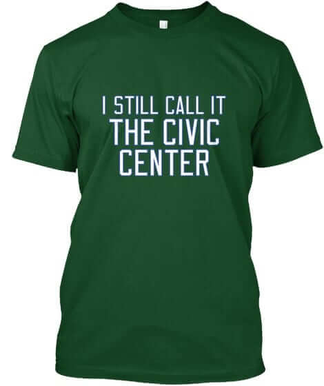
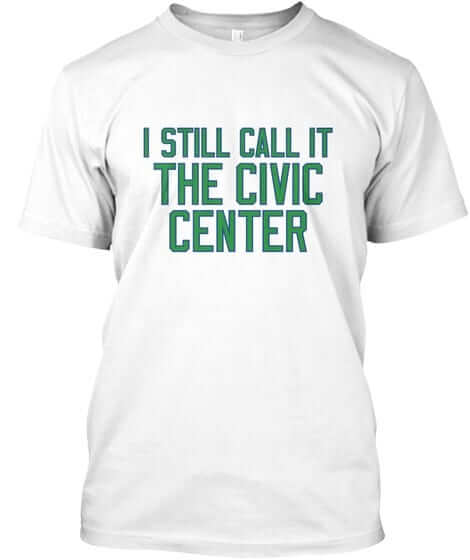
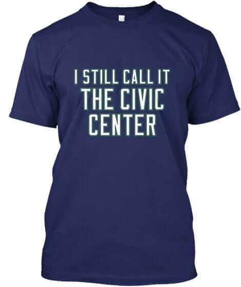
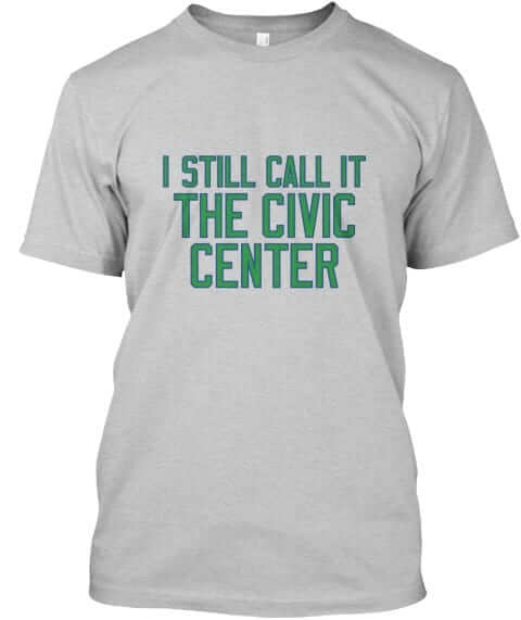
The green outlining on the navy shirt’s lettering is a bit hard to see in that mock-up. Here’s a better view of the lettering.
These designs are now available in the Naming Wrongs shop. They’re also cross-listed in the Uni Watch shop, where card-carrying members can get 15% off. (If you’re a member and need the discount code, send me a note and I’ll hook you up.) More designs coming soon — stay tuned.

.
The Ticker
By Alex Hider

Baseball News: The Rangers unveiled the new corporate name for their new unnecessary ballpark (from Uni Review). … Not sure if this has been brought up before, but I love how Dixon Machado of the Tigers matches his striped socks to the team’s home and road jerseys (from Beau Parsons). … Rockies P Chad Bettis recently made a rehab start with the Hartford Yard Goats, and wore his purple pinstriped Rockies pants with the Goats’ white, green and blue uniform. Bad look (from Steve). … Full. Cream. Cheese. Nate Reysen spotted this jersey at a wedding hall in Fillmore, Wisconsin in a display that paid homage to former Milwaukee Brave Warren Spahn. It’s not clear if he ever wore the jersey. … The Charlotte Knights have new “Queen City” uniforms.

Pro Football News: The Chargers fired Bob Wick, their longtime equipment manager of nearly 40 years yesterday (from Mike). … Speaking of the Chargers, they’re using their logo from the ’60s prominently at their new practice facility (from Mandy Lopez). … For whatever reason, ESPN is using an old Saints helmet in Monday Night Football promos (from JJ Sledge). … ESPN’s Fantasy App is still using old logos for the Jags and Panthers (from Omar Ezzat). … Looks like Target got its football teams confused (from Chris Williams). … Check out this photo of an old Canadian football game. It looks like they’re playing inside a cycling velodrome (from Miles Filbert).
College Football News: Indiana unveiled new alternate jerseys yesterday, which contain a large script wordmark and stone-patterned numbers modeled after Memorial Stadium’s “The Rock.” … Here’s what Memphis will be wearing next season (from Kevin Maltzy). …Does UCLA have a navy uni in the works? Or is this just an edited photo clip? (From Aarik Woods). … Looks like Boston College has a new end zone design this season (from Mike Cappiello). … Daniel Mayes reviewed the new uniforms for his Jacksonville State Gamecocks.

Hockey News: The sheet of ice at the Minnesota Wild’s home arena will now contain water from some of the state’s 10,000 lakes (thanks Mike). … New uniforms for the Mississippi RiverKings of the Southern Professional Hockey League (from Mike Campos). … New home whites for Brandon Wheat Kings of the Western Hockey League (from Matt).

Soccer News: Sadio Mané of Liverpool had some patch problems on Wednesday (from Mike Chan). … Everton wore an ad for their charitable foundation on their jerseys yesterday in a Europa playoff game. They normally have an ad for an online betting service (from Jim Howicz).

Grab Bag: Golfer Tony Finau wore purple and gold Nikes yesterday on “Mamba Day,” aka Kobe Bryant Day (8/24. Get it?) (from James G). … New logo for the Baltimore Brave of the Women’s Professional Lacrosse League (from James Gilbert). … This Washington Post piece points out that many Confederate monuments are identical to some monuments of Union soldiers, except for the the belt buckle, which either reads US or CS depending on which side of the Mason-Dixon you’re on (from Addison). … Fans of “Colorize This!” will definitely enjoy this Vox video on photo colorization (from Chris Howell).

.

And finally…
Thank you, dear readers, for letting me come into your living rooms bring you a month of Uni Watching, weekday edition, once again. You guys have been great, and I’m especially thankful we have such a great community of like-minded (well, for the most part ;)) individuals. It makes it all worth it.
I say this every year, but I cannot emphasize it enough — just doing ONE month of Uni Watch borders on having a full-time job (which I already have, thank you) and it makes me appreciate all the more how awesome it is to have Paul guiding our ship year in and year out. We’re lucky to have him, and I know he’s got a LOT on his plate right now, I only wish I were able to have completed the month — unfortunately (for him, maybe not for you guys) I had a pre-arranged bit of home (condo) construction that will be taking place starting on Monday, so I’ll literally not be around for the next couple weeks. I may check in from time to time, but there’s no way I could have done any blog work next week.
I also want to thank the myriad contributors I had this month who helped me — either with content or giving of their time and energies to let me interview them and share a bit of their talents with you. I could have done without 15 or so NBA unveilings, but it is what it is. Because of that, I had lined up a bunch of other folks who DID work with me to produce content, but I was simply unable to get to their stuff this month. I’ll definitely run those pieces when I return to weekends next month. I’m just sorry I couldn’t get to share their efforts yet.
After my, ahem, vacation, I am pleased to let everyone know I’ll be back with the SMUW (Sunday Morning Uni Watch) crew this fall: Terry Duroncelet, Joe Ringham, Rex Henry, Dennis Bolt, Kyle Acker and Ethan Dimitroff. These guys are awesome and invaluable in enabling me to bring you great college football coverage throughout the season and beyond.
Johnny Ek will take you through the weekend, and Uni Watch will return next week!
And with that, I am outta here.
Peace.


.
You might still call it the Civic Center, but I, and I have to believe others, still call it The Mall. Anyone?
That’s what I was thinking!
“The Chargers have parted ways with equipment manager Bob Wick …The Chargers did not give a reason for the firing”
How ’bout for putting lightning bolts on helmets backwards.
Just sayin’
Chargers better hope Bob’s son is not John.
Love how they waited until after he relocated.
Los Angeles is stuck with the two worst organizations in the NFL.
Well, we don’t know for sure that he was even fired. The spokesman only said that he was no longer with the team. If he was fired, perhaps it was for something he just did or the team just found out about. If that’s the case, how could they have fired him before he moved? Perhaps you’re right and the Chargers fired him for no good reason, and waited until he moved out of sheer cruelty. We just don’t know. But we live in a time when people make snap judgements and air their opinions online without knowing all of the facts.
exactly! everyone slow down
PS it was a DUI
link
Sure it’s the same Bob Wick? That happened in Illinois.
Wouldn’t Wick be older than 53?
That’s not the same guy – unless Wick graduated high school at age 14. (Other stories say he joined Chargers a year after high school).
Always bothers me how quickly a team will dismiss a staff member or low level player for something like this but cling to star players for longer. I completely understand the business side of it, but you would think they could show a smidgen of compassion and help people through these things.
link
Worse than the Jets?
Or the Browns?
Apostrophe catastrophe…. Cream cheese jersey:
Ok, are the abbreviating “manufacturing”? I’m guessing here.
I get the first 2 apostrophes, but what’s with the third one?
Or what does M’F’G’ mean???
Funny, was thinking the same thing; my modern brain read it as “mutherfucking”, but I’m pretty sure it’s not that
I’m going to guess “manufacturing”
Congratulations, John.
And thanks, Phil. For a sleepy August, it’s been quite a month.
Thanks, Jerry!
Cheers to Phil for a great August Uni Watch!
Huzzah! Thanks, B!
That Spahn picture with the cheezy uniform is actually the puzzle from the 1989 Donruss set.
link
I recognized it right away. That was one of the first sets I purchased when I…and millions of others…fell victim to the card collecting craze of the late 80s and early 90s.
Great job, Phil!
Appreciate it John!
There is green on the Oregon uniform, in the form of Puddles’ outfit, so the Ducks winning wouldn’t necessarily end the no-green curse.
What number is Don Mattingly wearing in that last umpire-tossing GIF? It’s clearly two digits, and I could have sworn that he wore number 8 when managing the Dodgers.
First, check out his jersey. He wears number 88. It is his third number this season, a record for Dodgers managers, who have sometimes worn the same number for two decades.
“I don’t think anybody really notices, do they?” he said with a grin.
link
Thanks, Crayola and Mole; it’s hard to find data on managers’ jersey numbers (Baseball Reference only lists players), and I had had no idea that he had switched to 88 at one point (or that he had worn 12 for one day). His choice of 8 in honor of Yogi Berra was famous and that was all I was familiar with.
Probably 88… he wore 12,8, and 88 in 2012.
88.
Didn’t know the number 12 story. Knew he had 8 first and switched, but forgot it was to accommodate Shane Victorino.
Wouldn’t he also have worn #42 for a game or did they not do that tribute league wide in ’12?
Oregon beat Wazzu a few years ago in that game where they wore pink helmets. I’m also guessing there are other examples, they’ve not worn green and awful lot and up until last season, were pretty successful for the most part to have never won with green.
*without green
they have won plenty of times with no green in the uniform — they were 2-0 last year in the yellow/black splatter jerseys with black helmets and black or yellow pants (link), they’ve also won a good number of games in the all black with yellow trim uniforms, similar to link against wazzu a couple years ago with yellow pants and helmets, too. plus the black and pink vs wazzu.
Point is, yeah that guy is way wrong.
The Sharecare ad on the Atlanta Hawks uniform was officially announced a week ago. link
And covered by this site link
bwahahahaahah
“cleat performance system ”
are you kidding me?
Quick, get me a “I’M STILL CALLING IT A SHOE” tshirt!
Congratulations to John Elbertson! Your design got one of my votes.
Looks great!
I am pleased with the Brandon Wheat Kings’ decision to change their white uniforms. They needed a change. Some disappointment though.
The new white uniforms have the right idea, except I am not a fan of the torso stripe. It is becoming a recent fad for teams to add this (Panthers, Wild). The uniform would look rather nice without it. The torso stripe seems much too wide on the Wheat Kings jersey.
What about the black uniform? Strange that they would not announce a change to this. The uniform templates between the dark and white uniform will be a lot different if the black uniform is not changing.
For whatever reason, ESPN is using an old Saints helmet in Monday Night Football promos (from JJ Sledge).
They should bring it back. The current fleur-de-lys is too fussy.
Congratulations to John Elbertson! I voted for him in the initial rounds, and his was one of only two finalists that actually fit the criteria that the the team could have worn it in the 80s.
Thanks for your stewardship, Phil.
Gracias, Sean!
The Mets’ Players Weekend jersey appears to use the wordmark from the ball logo…straight on bottom, without the slant, long space between M and e, and bloated e the current jersey script uses. Don’t believe the Mets have ever worn this version on a jersey. For the record, here is what I believe to be the traditional and best Met jersey script:
link
Good luck to the official spotters at the Oregon vs Nebraska game. The numbers on the Ducks uniforms will be very difficult to read.
Congratulations and thanks for another great August Phil!
According to the internet, the Canadian football game was between the 4th Canadian Armoured Division Atoms and 1st Canadian Army Red and Blue Bombers, in Utrecht, Netherlands, October 1945
Merci, Mike!
Thanks for Phil-ing in, Mr Hecken.
Cheers, Josh!
Are the Memphis unis for next season or this season?
The Rangers do need a venue with a roof over it because when they play afternoon games in the spring and summer, it can be brutal for everyone involved (intense heat). They’ve had to play some Sunday home games at night whether ESPN aired them or not as a result.
Yeah I saw that too and bristled. It may seem unnecessary to people that don’t live here, but I don’t want to sit in the sun on a 105° day. Even night games are brutal. I’ll definitely go to more games now. Fact is when the lease was up there’s no guarantee they’d stay. People we’re worried about Dallas try to steal the Rangers, but what about Austin, Charlotte or Montreal? Plus with a retractable roof, they can open the last week of September when it’s only 90°.
The Rangers had the misfortune of opening the Ballpark just before the retractable roof parks came along. Just like Houston, Miami and Phoenix, you really need a roof for summer baseball in the brutal heat. Hell, even night games in Arlington are pretty unbearable in July and August.
Plus, it was dirty… you didn’t expect them to pay to clean it, when they could shake down the city for a billion dollars to build them a new one, did you?
Idea for a Blackhawks Naming Wrongs shirt: “I miss the Stadium”, or “I still call it the Madhouse” (even though the United Center was never without a corporate name, most people I know call it the Madhouse, or the UC.)
“I miss the Stadium” could apply to any city that has lost a stadium, not just the Blackhawks/Bulls.
“I still call it the Madhouse” doesn’t make much sense, since it is still called the Madhouse, like you mentioned it. Drop “still” and it might work.
Wouldn’t “I Miss Chicago Stadium” be more accurate since that was its actual name, and it would clear up any confusion about which stadium is referred to.
And the United Center has a large “Welcome to the Madhouse” in lit-up letters on the facade of the second level (if memory serves as to the location)
As a CT resident and big Whalers fan (one of the best logos in sports) I was going to suggest the Civic Center but didn’t think anyone would know what I was talking about. I’m placing my order!
Todd H
Forgive my ignorance here but could someone tell me what is wrong with the Kirk Cousins jersey at Target ?
Is it just the color that is wrong ?
Did they get it confused with another Washington area athlete named Cousins ?
(If I was forced to guess, I would have to say it looks like 49ers colors, which may even be the answer here…)
there are niners logos on the sleeves.
Ah yes, you’re right. My apologies. I noticed that it did indeed look like 49ers uniform font but I disregarded it because of the number (#8).
I seriously doubt they’d let Cousins wear Steve Young’s number UNLESS Young was ok with it well ahead of time and the team was also ok with it.
Well besides the colors, the shirt has 49ers logos on the sleeves.
Lee
Thanks Lee. See my response above. The number (#8) threw me off due to it also being Steve Young’s number.
Phil, tremendous job, as always. Paul is lucky to have you to back him up, and we’re all fortunate to have a steady hand maintain course of this ship. Mazel Tov on a great month!
Thanks Dave!
Re: the Canadian football game played in a velodrome.
It would appear as though that could be in Winnipeg. Reason is that it was built in 1967 for the Pan American Games, and it was big enough to hold a Canadian Football field — which takes some doing since most velodromes are 333m or 250m per lap.
According to Wikipedia, the Winnipeg Velodrome had a 400m lap circumference, which would fit a CFL field (160 yd by 65 yd) in the infield.
And, according to Wikipedia, the Velodrome was host to a number of high-school football games.
Which brings us to the picture. Amazing that some Canadian youths didn’t wear face masks even in the late 1960s?
Also, one of the teams has the BIGGEST numbers I’ve ever seen on a football jersey. Bigger than the 1950s-era 49ers, bigger than the New York Football Yankees of the 40s. Anyone know what that team is?
Phil,
Thanks for a great August! Since you usually post special things on the weekend, it made every day like a Saturday for me on this site!
thanks, Mike!
Thank you, Phil!
My votes on the weekend baseball “color” jerseys: (Jerseys only, not caps, maybe I’ll do them separately)
LIKE: A’s, Bluejays, ChiSox, Pirates. That’s it. Four teams…
INDIFFERENT: (not great, not horrible) Angels, Braves, Cards, Indians, BoSox, Reds, Royals, Twins.
LOATHE: (burn them with fire) Astros, Brewers, Cubs, D-Backs, Dodgers, Giants, Marlins, Mets, Nats, O’s, Padres, Phillies, Rangers, Rays, Rockies, Tigers, Yankees.
-Jet
Thanks Pete!
Rating the weekend baseball color CAPS…
LIKE: A’s, Cards, Indians, Nats, Phils, BoSox, Reds*, Royals, Tigers
INDIFFERENT: Astros, Bluejays, Giants, Marlins, Rangers, Rockies, ChiSox
DESPISE: (oh, the humanity) Angels, Brewers, Cubs, D-Backs, Dodgers, Mariners, Mets, O’s, Padres, Pirates, Rays, Twins, Yankees
*In fact, I’ll give a double-like for the Reds for the irony of the cartoon character wearing a pillbox cap on a standard cap…
-Jet
Griffs boot the “unoriginal” contestant… then pick the White Sox knock off… Classic.
And who knew that “80s fauxback” meant baseball, not hockey, ’cause that certainly doesn’t look like any hockey jersey I remember from the 80s.
How is it any more of a White Sox knockoff than a Montreal Canadiens knockoff? They both have a wide stripe that goes across the chest and sleeves, flanked by narrow stripes above and below, with a logo/wordmark in the middle of the chest.
White Sox: link
Canadiens: link
Try this link for the White Sox: link
Well, yeah, if a wordmark and a logo are the same thing, then it’s just like the Canadiens. Of course, a wordmark and a logo aren’t the same thing.
BTW, the Reds announced in an e-mail they’ll wear their camopander/GI Joke unis tonight. I believe there was supposed to be a Military Appreciation Night scheduled for tonight before Players’ Weekend was announced.
Just for BP. They’ll wear their Players Weekend Unis for the game.
Sorry about that. I thought they wouldn’t wear the Players’ Weekend unis tonight.
I don’t mind the baseball unis this weekend as much as some do. I’m watching the D-Backs/Giants game tonight and I kind of like them. I hate the shiny, chintzy, huge shoulder patch, though. It looks like they got it out of a cereal box.
Great job, Phil. The Griffin contest alone would have driven me nuts. Or was it the NBA reveals? Probably both. Anyway, thanks.