[Editor’s Note: Paul is on his annual August break from site. Deputy editor Phil Hecken is in charge from now through Aug. 25, although Paul is still on the clock over at ESPN and may be popping up here occasionally.]
By Phil Hecken
Follow @PhilHecken
And now, the penultimate moment in the Griffins Fauxback Jersey Contest: the announcement of the 12 finalists. Tomorrow I’ll announce who the Griffins have chosen as the winner of the contest, with all the trappings winning brings. But for today, we have our top 12* as selected by the readers. If you can’t see the splash photo above the final 12 are here.
* Unfortunately, there have been two disqualifications — one for using a crest design that was deemed unoriginal by the Griffins, and a second, the “Peter Griffin” submission. Following the two DQs (one occurred in Group 1, the second in Group 3), the fourth place vote-receivers’ designs were moved up into the finals. For this contest, I took a screenshot of the voting 24 hours after it opened. The three submitters with the highest totals each day (with the exception of the two DQs) advanced. I’ll explain the DQ in the first group momentarily.
The winners:
GROUP ONE:
Roarke Boes (235)
Adam Cain (242)
John Elbertson (277)

You’ll see that Zach Blackwell received the most votes. Unfortunately, it was brought to the Griffins attention that his “logo is a stock image with the Detroit Red Wings logo’s wings stuck on.” I asked the Griffins if this would be OK and they deemed it invalid. I hate that this happened, (I really liked Zach’s design otherwise). Here’s how that logo was determined to be unacceptable.

GROUP 2:
Kurt Gorecki (334)
Zach Grantham (342)
Dylan Gray (364)

GROUP 3:
Jason Mildren (334)
Clark Rasmussen (349)
Jordan Santalucia (345)

While humorous and a top three vote-recipient, Wes Rickards’ entry has been DQ’ed due to copyright and other issues.
GROUP 4:
Ryan Schnabel (252)
Will Sinnott (289)
Ryan Tinnerman (262)

Congratulations and good luck to the 12 finalists. I’ll be back tomorrow with the Griffins’ choice for the overall winner.
And now I’ll turn the remainder of this post over to Paul…

Click to enlarge
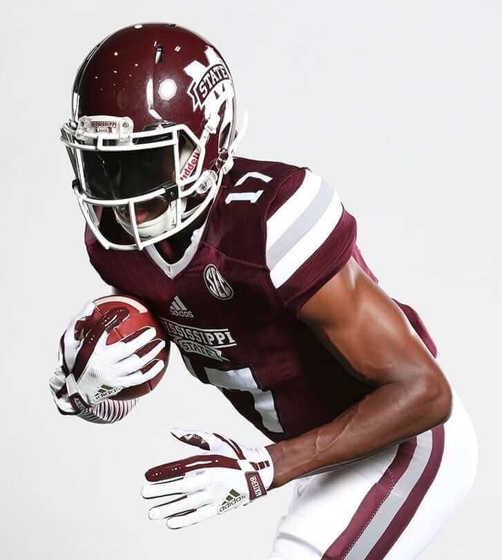
College football preview: Paul here, letting you know that my annual Uni Watch College Football Season Preview column, featuring news from over 100 FBS schools (including Mississippi State, whose new jersey, shown above, has gray sleeve striping to match the pants striping), is up now on ESPN.com.
This marks the beginning of my “busy season” on ESPN. Next up will be the NFL preview on Sept. 5, followed later this fall by the NHL, NBA, and college hoops previews. Never a dull moment!

End of an era: Paul here (again). During the winter of 1998-99, I had the idea to create a sports column about uniform design — an unheard of concept at the time. I spent months shopping it around to various places, but none of the editors I contacted were interested. (Well, except for one guy at Sports Illustrated — he was interested, but it didn’t work out.) So I decided to approach The Village Voice, an alt-weekly here in NYC. They had a small, very eccentric sports section buried in the back of the paper, next to the phone sex ads. The content included a bi-weekly column about hockey fights, baseball articles based on advanced statistical metrics that nobody else was talking about at the time, and Yankees TV broadcaster Phil Rizzuto’s bizarre ramblings set to verse (which was later compiled into a book), so I figured a uniform column might not be too weird for them. I was right. The sports editor, a guy named Miles Seligman, liked the idea, and the first edition of my new column, called “Uni Watch,” appeared on May 26, 1999. That’s the debut installment shown above (click to enlarge). The column continued to run in the Voice up through October of 2003, when the sports section was scrapped.
I mention all of this because the Voice has announced that it will be shuttering its print edition. This isn’t particularly surprising (the internet has been utterly ruinous for the alt-weekly business model), nor is it a particularly great loss for humanity (the Voice’s print edition has been reduced in recent years to the level of a glorified Pennysaver), but it still feels sad — not only because of my personal history with the Voice, but because of what the Voice used to represent to New York. It’s hard to describe if you didn’t live here prior to about 2000, and/or if you’re not old enough to have experienced how the weekly rhythm of a print publication could shape the local culture, but the Voice was a major force in New York life. When the new issue came out each Wednesday, it always felt like a bit of an event.
Growing up on Long Island in the late ’70s and early ’80s, I’d read copies of the Voice that my older brothers often had floating around the house. The paper felt like a hub of really smart, really interesting people writing really provocative, creative stuff. It was journalism, but to a certain degree it also felt like art. My brothers would tell me, “Nah, it kinda sucks now. Years ago — that’s when it was good.” Maybe so, but I’d still imagine what the writers must be like and think to myself, “That’s who I wanna be when I grow up.” (Ironically, when I eventually became a writer in the mid-1990s, it was as a columnist for a competing alt-weekly, New York Press, whose mission at the time was basically to take down the Voice.)
The Voice was never perfect, even in its glory years. Hell, most people can’t agree on when its “glory years” even were. But the Voice took a lot of chances. It published some seriously groundbreaking investigative reporting and some seriously important cultural criticism (a rare dual achievement). And at various points, it annoyed all the right people. That’s about all you can ask from an alt-weekly. RIP to their print edition.
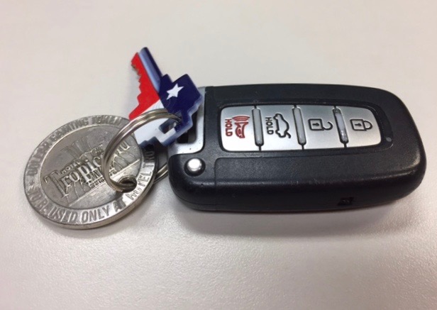
KRC update: Paul here (still). The latest Key Ring Chronicles entry is about a Las Vegas casino token. Check it out here.

Too Good…
for the Ticker
Got an e-mail yesterday from Tyler Maun on some “USA Baseball” unis (which are arguably better than the official USA Baseball unis, but not nearly as good as some of the jerseys submitted for the redesign the USA Baseball team contest).
Here’s Tyler with more:
Hey Phil,
Hope you’re doing well, man! Stumbled across something I thought you may find interesting. I’m going to Canada next month to broadcast games for the 2017 U-18 Baseball World Cup through the World Baseball Softball Confederation (think baseball/softball’s FIFA) and was doing some research today for that and got swept down a rabbit hole looking at other international baseball stuff. The Summer Universiade Games are currently going on in Taipei, Taiwan, and I saw that a US team was on one of the schedules.
Since they’re all university-level teams competing, I wondered if it was the official USA Baseball Collegiate National Team in that tournament, but it’s not. Apparently the University of Iowa baseball team is the US’s representative (which was evidently announced back in June), so it’s not a team comprised of players from around the country as you might expect for an international competition. I’m not even sure who the governing body of this competition would be for the US, but it was announced by the International University Sport Federation, so it’s I guess outside the scope of the IOC/WBSC jurisdiction. (Sorry, I’m nerding out here).
Anyway, they’re over there in some unique US uniforms from Nike (attached some pictures from @UIBaseball) since they’re not a sanctioned official USA Baseball team. (Side note, didn’t think it was possible for US uniforms to get more bland than the current USA Baseball set, but apparently I was wrong). One cool thing is that while they’ve got USA on the jerseys, they’ve got a Hawkeye-logo patch on the sleeve and a stars-and-stripes Iowa “I” on the caps and helmets.
Just thought it was cool! Take care, and great work as always on the site, man.
Tyler Maun
Editorial Producer, MiLB.com
Thanks, Tyler! Below are some photos of the unis:


OK. Now, on to the ticker…
The Ticker
By Mike Chamernik

Baseball News: The ESPN broadcast team had jerseys with their nicknames for the MLB Little League Classic on Sunday night (from Kevin Wilson). … MLB commissioner Rob Manfred said that the baseball world will “survive” a few days without traditional Yankees pinstripes during the upcoming Players Weekend (from Phil). … Speaking of that, the Yahoo Sports staff ranked the MLB Players Weekend unis from 1 to 30 (from Phil). … The York Revolution will be called the Pretzels for Friday’s game (from Phil). … The Mets presented a few of their ace pitchers with 4-foot garden gnomes of themselves (from Phil). … At 6-foot-3, 250 lb., Brewers first baseman Jesus Aguilar is a pretty bulky guy. His pants are big enough that two of his smaller teammates can fit into each leg, together (from Phil).

Pro Football News: The Titans will wear white at home for Sunday’s preseason game against the Bears. … The Dolphins will wear their aqua throwbacks for their final two home games this season. … I dig this old CFL helmet sundae display (from @Super70sSports).
College Football News: As Paul alluded to a little while back, Missouri will have new white uniforms. Here’s what they wore last year (from Jonathan Karberg). … Clarke University of the NAIA revealed the helmets for the school’s new football program (from Adam Gardner). … The former St. Petersburg Bowl has a ridiculous new corporate name (from Wayne Koehler).

Hockey News: Here are a list of the best teams that can be assembled with players that share a jersey number. It’s actually a complex thought experiment, given that goalies don’t wear many common numbers, including 4 and 9. … New unis for the Erie Otters of the OHL. … The Everett Silvertips have a bear logo pattern in their red line. A silvertip is another word for grizzly bear (from Dave Sizer).

NBA News: Kyrie Irving will wear No. 11 with the Celtics. He wore No. 2 with the Cavs, but he had No. 11 in high school. Boston retired No. 2 for Red Auerbach in 1985, with the reasoning that he is the second-most important Celtic ever, with No. 1 retired for team founder Walter Brown. … Here’s a look at the Pistons’ new floor design (from Aaron Brandt). … A shoe industry writer ranked all of Kobe Bryant’s signature sneakers. I’ve always enjoyed the absurdity of the Adidas Kobe II.

Grab Bag: Here are the liveries for this weekend’s IndyCar race (from Tim Dunn). … Bunch of new rugby kits: Sale Sharks of the Aviva Premiership, Cardiff Blues of the Guinness Pro14, Italian Pro14 side Bennetton, and Welsh Pro14 club Dragons. Plus, here’s every jersey in France’s Top 14 league (from Eric Bangeman). … East Carolina University is in the process of being renamed just ECU (from Jon Chichwak). … New logo for the Ontario International Airport in Southern California.
Re Village Voice section: “October of 1993”?
Guessing that was meant to be 2003?
Proofreading… I think you meant 2003?
“The column continued to run in the Voice up through October of 1993”
Purdue has a similar thing to Iowa going on right now. They are the USA basketball team for the World University Games, wearing Team USA jerseys, but with a Purdue P where the name would typically go: link
And Maryland is the US Women’s Basketball team. In 2015, the men’s team was Kansas.
I guess it’s kind of like the Little League World Series, where first they refer to the teams by what state they’re from, then whoever wins the region is referred to by the region name. So the North State Little League team from Greenville, NC was referred to as “North Carolina” until they won the Southeast Regional Tournament. Now they are called “Southeast” as they compete in the U.S. bracket.
Paul’s NCAA FB Column is now up on ESPN.
It still surprises me that Michigan, not North Carolina (MJ’s alma mater), was the first school to put the Jumpman logo on its football gear. But, at least UNC’s caught up now.
“MLB commissioner Rob Manfred said that the baseball world will “survive” a few days without traditional Yankees pinstripes during the upcoming Players Weekend.”
He’s a money-loving prick. Sure, the Yankees will survive, but that’s not the point. The point is that they shouldn’t have to survive for a few days. Look, I hate the Yankees, but I also respect their tradition and history and what they’ve meant to MLB and American sports. Why should they have to abandon their tradition at gunpoint for a few days just for a blatant cash grab by their league?
It would be awesome if the Yankees flipped a middle finger to Rob Money-fred this weekend and just came out in their regular uniforms this weekend.
If George Steinbrenner were still in charge, that might happen!
I think Hal and Jennifer Steinbrenner, and whoever else is running the team now, seem like they’re more open to these alternate jersey promotions just for the revenue and buzz. Remember when the Yankees wore the batting practice hats at Citi Field for a subway series game a few years ago (New Era wanted teams to) and again at home “to raise cancer awareness?” As well as their participating in the optional Mother’s Day, Father’s Day, Memorial Day, and July 4 jersey promotions?
The Yankees respect the pinstripes and Majestic does too (no makers mark on jerseys, no side mesh panels on home) but they’re much more willing to play along with promotional events.
Also something I realized: as much as the Yankees value their pinstripes, they only wear them once in spring training, and wear spring training tops for the rest of the preseason; meanwhile some other teams like the Tigers wear their usual uniforms for almost all of spring training.
The Yankees respect the pinstripes and Majestic does too (no makers mark on jerseys, no side mesh panels on home)
It’s not so much that Majestic respects them, it’s that the Yankees pay a fee to keep the Majestic logo off of their uniforms. This option will not be available to the Yankees with Under Armour.
Baseball will also “survive” if Rob Manfred is no longer the commissioner tomorrow, but I’m sure he doesn’t want THAT to happen. All of these jerseys being worn this weekend are garbage, and players should be embarrassed to wear them in championship season competitions.
I’m not sure that East Carolina University is actually renaming itself, but it is widely reported that the school is undergoing a rebranding to ECU. But why? Are they planning to go beyond their presumed mission and start providing non-academic products and services?
This reminds me of what happens when a company goes beyond selling its original product and tries to branch out. Remember KFC, MTV, etc.?
Not enamored of cryptic initials as a fundamental identity. HSBC, for instance, is my bank and they are very cagey about what it stands for. It reminds me of one of my favorite Dilbert comics:
Pointy-haired Boss: I’m putting you in charge of the TTP Project.
Dilbert: What does TTP stand for?
PhB: It stands for The TTP Project.
Isn’t that the Honk Kong and Shanghai Banking Corporation?
HONG Kong. Jebus, man, wake up.
ECU probably didn’t wanna be simply regional in scope. Broadening its scope will only help on a national scale. Remember that there’s somehow still a stigma against “directional” institutions.
Not only is the bear logo appearing in the red line for the Everett Silvertips, it does look like it will also make an appearance in the white pants stripe in the new uniforms for this year.
He is a promo photo of how the new uniforms will look on the ice:
link
That is a plus-plus piece of small detailing. Well done.
I’m waiting for my “I STILL CALL IT EAST CAROLINA” T-shirt in glorious Pirate Purple. Your move, Paul…
There are some strong entries in the contest, but I feel a few are missing the mark from a design perspective. I thought it was to create a jersey design that the team may have actually worn in the 80’s. Some just threw in gimmick 80’s typefaces or patterns to conjure 80’s pop culture nostalgia. A team would not have actually worn them in the 80’s. A hair band would.
Guess we’ll see tomorrow if the team brass feels the same.
Yeah, I noted this a couple of days ago, one could argue at least one is an unoriginal design (adapting van halen’s logo), and a lot use design elements that weren’t used in the 80’s. A quick search of 80s NHL jerseys reveals most are simply designs, solid colors a few stripes with team colors and the team logo. I’d say maybe 3 or 4 entries meet the spirit of the fauxback (or what I think are designs we would see in the 80s) so I’ll be interested to see which is selected.
The flip side to this argument though is if 80’s designs aren’t much different from today’s (logos, not jersey cut) then how the heck can you tell 80’s from today? Unless the team MOVED, all the NHL logos are virtually the same now as then.
DO I NEED TO MAKE A LIST?
Some thought that its a simple 80’s promotion thing.
But the contest wasn’t for a simple 80’s promo, and the challenge isn’t to make a 80’s logo – it was to make a 80’s jersey the team would have worn. 80’s jerseys, like Phil P noted are generally VERY basic in design. They had contrasting shoulder yokes and bold color stripes.
You are focusing too much on the logo and not the jersey design itself. The logo was usually just plopped on there as a crest and not thought about as a design element of the jersey.
I know that a crest was needed for the contest, so that means creating one that would have actually been created in the 80’s by a sports team. Not using gimmick font’s and elements that invoke 80’s pop culture. A team wouldn’t have done that.
In the ESPN preview it states, “Letters and numbers on all NC State jerseys will be screen-printed, rather than sewn.”
I believe these are actually heat applied letters and numbers. I’m not sure if any major school screen prints them when they are not sewn anymore.
Well, now that we’re down to 12 designs, I feel like I can give a reasonable critique on each of them. This one’s a long one, though (and will probably be queued at first – hi, Phil! XD)
Roarke Boes – Not bad for a general 80s Theme Night jersey, but it’s definitely not something that would’ve actually been worn by a hockey team in the 80s.
Adam Cain – Not a fan of the reversed G. With a bit of adjusting, it seems to me like the Gs could be made distinct and still fit within the theme. I do feel that the logo is a bit too reminiscent of the Van Halen logo, though, and I’m somewhat surprised that it didn’t at least raise some eyebrows.
John Elbertson – This is a nice fauxback design. I really like this one, though I’m not completely convinced about the number font. I also feel that this particular design shouldn’t be limited to the team’s current colors; it just feels like it would be helped by a splash of a couple of additional colors (blue was a Griffins team color going back to their IHL days, and athletic gold was far more prominent in 80s hockey than metallic shades).
Kurt Gorecki – The base pattern definitely feels very 80s-appropriate. However, the logo feels a bit bubbly – the wing design, to me, seems more like popsicle sticks than a feather pattern. The numbers are reminiscent of the Blue Jays, but look squished, and that makes them feel really off.
Zach Grantham – This one is very nice in its simplicity. Some might say too simple, but I think it works. Those old-school Cowboys-esque serifed numbers, while not something you usually see in hockey, actually work pretty well here. While I could see adding another color in (black or gold on the center stripe and outlines, maybe), I think it would also be just fine as-is.
Dylan Gray – Not bad, but it seems like it would work better for a 70s fauxback night, since I get some serious WHA vibes from this. The logo is particularly reminiscent of the Oilers and Jets, and the waist stripes remind me of the short-lived Baltimore Blades.
Jason Mildren – Fascinating, and I certainly appreciate the op art influence, but this just doesn’t feel very 80s to me, and moreover, it doesn’t seem like it’d be workable to make into a jersey.
Clark Rasmussen – The wordmark on the logo feels a little more 1990s-2000s than 1980s to me, but otherwise this is a very 80s design. I like this one a lot!
Jordan Santalucia – I really want to like this design, but I feel the color placement is a bit off. A bit of shuffling around of the colors would help this one a bit. I do like the crew collar – it feels like a nice nod to the parent club’s history. The Red Wings were the last NHL team to wear a crew collar, all the way up to 1982.
Ryan Schnabel – Another one I really want to like, if not for three particular items. The lace-up collar isn’t period-appropriate, the bottom of the sleeve numbers going over the stripes looks weird and unnecessary given the amount of available real estate above the stripes, and the lack of waist stripes hurts it for me. It would be a great alternate, but to me, just not a great 80s alternate.
Will Sinnott – THIS is very much a fitting design! It just feels right on so many levels, and looks like something that would’ve been introduced between 1978 and 1984. The Futura numbers are an interesting choice, to be sure (I think I would’ve stuck with tradtional 80s CCM block numbers), but it seems like it would be doable.
Ryan Tinnerman – That is one awesome logo, and would look great as a new primary logo for the Griffins, or at least on an alternate… but it feels too modern for the 80s. The contrasting side panels with the color-swapped stripes also just looks wonky.
Solid critique! If I were to rank the top three, I’d probably go with 1) Dylan (I would change the sleeve stripes a bit to be more consistent with the bottom of the jersey, I think 80s jerseys used the same striping patterns) 2) Will (like you I’d stick with the 80s block numbers) and 3) Clark (would just use a uniform black number outline vs the drop shadow look). Regardless, all are better than what I could have done!
This is EXACTLY how I feel about them! I think the designs should be vetted by uniwatch HQ for actually meeting the challenge criteria before being posted. Some nice options, but not many that would have been worn in the 80’s.
Appreciate the time and effort you put into your citiques…. was a fun comp and critiquing is the nature of this site! Look I think at the end of day without being able to show research, inspiration and being able to write a “rationale” – this comp is literally a bit of fun! I designed the “op art” jersey as you described it. Now I could show you pages and pages of research of geometricly based 80s jersey designs ( think cannucks flying “V” for example) if you like – and I’m more than sure other entrants could also justify their designs given the opportunity but the reality is: 1 single image :) Whilst I’m on that point , (and this isn’t directed at you rob!) I also think that’s a fair point for jersey deigns and critiques in general – it is so very easy to critique designs (I do it all the time! ) – but we all have to remember how many factors come in to play in the real world of design – time, decision by commitee, budget etc. it’s not always as cut n dry as we sometimes make it! I’m an avid uni watcher designer and critic – but I think that point is something that needs to be remembered from time to time…. Anyway! Sorry Blabbered on there a bit. Congrats to all the finalists and the winner! Look forward to the next one….
Tyler Maun
Not often at all I can say this but you’ll be come to my home city of Thunder Bay.
Not sure how long you’ll be here but if you want any advice on anything Thunder Bay related (sports/uniform history, places to shop, eat, etc.) I’ll do what I can.
contact info (email) on my mostly abandoned blog.
None of them scream 1980’s to me. They all look like they could be worn today… a couple look like 1970’s WHA stuff, but alas, that’s also NOT 80’s.
Oh well.
As people screamed, it’s just a flippin contest and NO BIG DEAL to anyone.
Dan, I strongly disagree.
As a design professional who aspires to work in sports (and dreams to have a team wear a uniform I designed), this contest offered a great opportunity. I took my submission very seriously, and researched and sketched just as I would for any other project I undertake. I, like you, am disappointed with the results (admittedly biased since mine didn’t make the final vote).
Are you Charles Norenberg? If so, it stinks that you didn’t make it through to the final 12. I’d have to say yours (his) design was truly the only one I could actually see being worn by a team in the 80s.
Agreed. I voted for that one as well, and was sad that one didn’t quite make it.
I am not a Yankee fan. However, I am a person with intense attention to detail and maybe one of the first uni watchers. I must point out the current Yankee home uniform has only been around since 1973. That’s when they went to polyester and IMO made the mistake of going with raglan sleeves which look bad with pinstripes. That ship has sailed and I don’t see them ever going back. Since 1973, they have also been very consistent on number font…Wilson Varsity, though I believe the numbers have gotten slightly larger since the 70s. Prior to that, they were mainly block numbers, but not as consistent. One thing I noticed also, though don’t care enough to fully document, is that in the mid 90s, the home color was almost black, if not fully black as opposed to very dark navy it is usually. I always notice it in 1996 WS highlights or on Seinfeld.
All that said, Manfred is right in that it’s only a few days and the world will go on without pinstripes. The only part that bugs me a bit is having the NOB. Many teams have worn pinstripes, but only one, for their own reasons, has eschewed NOBs. Perhaps the majority of players want the names…but the Yankees will never gain be able to say they have never had NOBs and that is a shame.
Life-long Yankees fan here, and this is no big deal, and the Yanks do not have a choice in the matter anyway. The weekend was collectively bargained in the latest agreement. Expressing any displeasure or somehow pressuring players to not go along with it would result in a grievance that they’d lose in about five seconds.
Great work Phil, and all the contest entrants, and congratulations to the final twelve!
I would have a hard time choosing, if I were the Griffins. There are three entries that I would want to make a permanent part of the team’s uniform, or even adopt as a primary look. And there are four that I think really captured the feel of a 1980s fauxback. (As much as anything other than just having every player wear link over his sweater really captures the feel of a 1980s fauxback.) But only one jersey appears on both of my two lists. It’s not quite my favorite all-around hockey uniform design, and it’s not quite my favorite 1980s fauxback interpretation, but the fact that it’s high on both lists would probably lead me to choose it as the winner, if it were up to me. Still, the variety and overall quality will make this a difficult choice to make. I don’t envy the people who have to choose a winner!
In that Yahoo ranking of the MLB Players Weekend uniforms, all 5 teams with the yellow hats were in the top 8, while 5 of the 7 teams with light blue hats were in the bottom 9. I agree that the yellow hats pop out and look sharp, while the light blue hats just look out of place. It probably has something to do with the fact that the shade of blue doesn’t usually match the jerseys, or the teams’ usual colors.
Off-topic and only relevant to NY readers – the new Mario Cuomo Bridge… I’M STILL CALLING IT THE TAPPAN ZEE!!!!
-Jet
… and as a Chicagoan, I still call it the Sears Tower (not the Willis Tower).
I still call it the Sears Tower, and I’m a Detroiter!
Though, by the time we get far enough along that the Sears name has faded from use, the naming rights to 233 South Wacker Drive will probably have changed hands yet again. And probably more than once!
I’m from West Virginia and I still call it Sears tower!
I am always going over that bridge and my thoughts exactly.
It would have been hilarious if today’s Tigers-Yankees triple-brawl game had come wearing the Players’ Weekend unis.
I’m assuming the Peter Griffin Griffin’s jersey was eliminated because it either a) didn’t get enough votes (it was leading when I voted for it) or b) was dismissed out of hand due to issues surrounding copyright and/or taste.
#readingishard
I want to second Paul’s comments on the Village Voice. I started reading it in the late 60s when my uncle became a writer there. While it had NY’s smallest sports section, it was by far the most entertaining. I was a fan of Uni Watch since its inception and only recently found my way to the UW website (I am what marketing folks call a “late adoptor”). It’s impact on music was incredible and was a must buy to see who was playing at CBGB and Max’s. While the real Voice is long gone, not seeing it in print brings a tear to my eye.
Oregon has won plenty of times with no green in the uniform – they were 2-0 last year in the yellow/black splatter jerseys with black helmets and black or yellow pants (link), they’ve also won a good number of games in the all black with yellow trim uniforms, similar to link