
Click to enlarge
[Editor’s Note: Paul is on his annual August break from site. Deputy editor Phil Hecken is in charge from now through Aug. 25, although Paul is still on the clock over at ESPN and may be popping up here occasionally.]
By Phil Hecken
Follow @PhilHecken
The latest team to unveil new white and color uniforms in the NBA were the Denver Nuggets, who broke out their new duds yesterday. As you can see from the splash photo, the big change for the team is the change in color from powder blue to navy blue for the dark uniform. But there are a few changes to the uniforms from last season.
Let’s do the model turning around gif first:
🔥🔥🔥#MileHighBasketball pic.twitter.com/yvee9aB7qG
— Denver Nuggets (@nuggets) August 8, 2017
And then the quick “backstage” video:
Backstage and ready to show these uniforms off!#MileHighBasketball pic.twitter.com/Yisq0f02pB
— Denver Nuggets (@nuggets) August 8, 2017
UPDATE – New Video
WATCH: An up close look at the @nuggets new Nike Association & Icon jerseys.#Nuggets @UniWatch pic.twitter.com/WGCuJuUowl
— 5280 Sports Network (@5280SportsNet) August 9, 2017
Now then, let’s start with the new navy uniform first (for all images below you can click to enlarge):

You’ll notice immediately the swoosh and the Western Union ad, but after that, it’s pretty nice. The collar is gold and white, and unlike many of the new uniforms we’ve seen so far, there is only slight white piping on the armholes. It’s a solid navy, and the wordmark (“DENVER”) is rendered in gold with white and powder blue outlines — so the powder blue which made up the base of the previous dark uniform isn’t completely gone, but it’s no longer the dominant color. The font seems to be the same as the one from the previous set, though perhaps thicker, and it’s pretty nice.

The front number is solid white, with a gold outline. You can see white side panels with a powder blue and gold stripe. The pants are solid blue, with the striping pattern continued town the sides. A “pickaxe” logo (keeping up Nike’s preference for adding logos to the waistband) is present, and the Nuggets logo is situated on the pants stripe.


The back of the jersey features the NBA logo atop a radially arched NOB rendered in white letters. The number on the back is the same style (white with gold outline) as on the front. Simple. Nice.

So how does this one compare to the prior set?
Side-by-side comparison of Nuggets' old and new blue uniforms. pic.twitter.com/DHWj43iIis
— Paul Lukas (@UniWatch) August 8, 2017
The white uniform mirrors the navy one in almost every way — except that it says “NUGGETS” rather than “DENVER.” The collar has a navy and gold stripe, and the shoulder loops have thin navy blue stripes around the armholes. “NUGGETS” is rendered in gold, with a navy and powder blue outline. The number is navy blue, with a gold outline.

Side panels are navy with a powder and gold stripe, which is repeated on the shorts.


The back of the jersey features the NBA logo atop a radially arched NOB in solid navy. Rear numbers are navy blue with a gold outline.

And how does the 2017-18 white uniform compare to its predecessor? It’s almost identical, with the navy elements replacing the powder ones for the most part.
Side-by-side comparison of Nuggets' old and new white uniforms. pic.twitter.com/W8ON5jd4Fk
— Paul Lukas (@UniWatch) August 8, 2017
The bonus Easter Egg? The jersey’s jock tag will feature a small wordmark with the number “5280” (indicating Denver’s altitude above sea level).

That’s of course, just the first two (of four) new uniforms. While I’m a fan of powder blue (and Denver kinda owned it), I think I like the new navy uniform even more (and who knows, they may have a powder blue option that has yet to be revealed). Even though navy is overused throughout sports, it seems pretty solid here (and Denver does have a history of navy blue).

I’ve now lost track of who has unveiled and who has yet to unveil. Nike and the NBA are really squeezing this for all it’s worth (and we’re obliging by keeping them in the news every day). Is anyone unveiling today? I’m not sure — I know the Spurs are up soon, and I’m pretty sure the Suns and Timberwolves are set for Thursday unveils. The hits just keep on coming.
Anyway, while the new Nuggets uniforms didn’t have many drastic changes (other than the switch from powder to navy), I like them. If you’re interested in some reactions to the new unis, click here.
Your thoughts?


Classic Ballpark Scoreboards
Our scoreboard creator Gary Chanko, after a long hiatus, has returned to grace us with “Series IV” in the set of Classic Ballpark Scoreboards. This feature usually appears on weekends, but it’s getting a rare weekday viewing since I’m running the weekday show for this month.
Here’s Gary (click on image to enlarge):
Classic Ballpark Scoreboards – Series IV
by Gary Chanko
In this edition of Classic Scoreboards we return to Brooklyn. It’s opening day of the 1915 season for the only major league team named for a bakery product.

Washington Park (III)
Baseball Home of: Federal League Brooklyn Tip-Tops (aka Brook-Feds), 1914-15; National League Brooklyn Superbas (later Robins, Dodgers), 1898-1912; AA & NL Brooklyn Bridegrooms, 1884-1890
Opened: 1883 (Washington Park I); destroyed by fire May, 1889.
Rebuilt: Washington Park II (1898-1913)
Demolished and Reconstructed: Washington Park III (1914-1915)
For a brief two seasons (1914-15) Washington Park served as the home of the upstart Federal League’s Brooklyn franchise. Washington Park III is the third generation of this historic Brooklyn ballpark built and rebuilt on two different, but adjacent locations. The interesting and complex history of Washington Park is documented here. Another great source for Washington Park history is this well researched article.
And yes, the ballpark was named in honor George. It turns out that General Washington ’s headquarters during the Battle of Long Island (which didn’t end well for the good guys) was Gowanus House located on the site of Washington Park I. Called the Old Stone House, it also served as the first clubhouse for the team that became the Brooklyn Dodgers.
Tip-Tops or BrookFeds?
The Federal League Brooklyn team was owned by Robert B. Ward and his brothers who were also proprietors of the Tip-Top Bakery in Brooklyn, the source for the team name. But for many sports writers and fans the team was also known as the Brooklyn Feds or BrookFeds.
This 1915 article from Baseball Magazine provides an in-depth look at the Ward Brothers and their Federal League baseball involvement both as a business investment and hobby. In the article Robert disclaims any responsibility for promoting his bread product as the team name. Rather it was the sports writers that coined the Tip-Top nickname.
Okay, enough historical details. Just want the Cliff’s Notes version? Watch the short video.
The Scoreboard
The illustration depicts the completion of the mid-afternoon opening day ceremonies on April 11, 1915. The game was scheduled to start at 3p. It lasted over three hours – an unusually long duration for the era. The newspaper account of the game was critical of the lengthy game duration.
The basic layout of the scoreboard was typical for the time period: list of Federal League games and scores by inning, the corresponding Pitchers and Catchers, the current BATTER, the two UMPIRES, and the WINNING NUMBERS that hopefully are printed on your scorecard.
At the bottom was a posting for a Yankees and Dodgers matchup because these teams played an exhibition game that day.
The B.V.D. Billboard
The right field brick wall featured several billboard ads; all clothing related. The illustration includes a classic B.V.D. advertisement proclaiming the product’s loose fitting comfort!
The exact wording along the bottom remains a mystery. From photos the words “Short Stops”, “Hear,” and “Discomfort” are clear. Piecing these together into a meaningful sentence was a problem. Nothing seemed to make sense. So I made a best guess at the wording, but it still seems awkward. Maybe the correct wording will be discovered someday and the illustrated can be corrected.
A Few Things to Know
• The scoreboard and bottom support structure were in play. Outfielders had to navigate these supports to retrieve balls landing beneath the scoreboard.
• The Tip-Tops built five 75-foot light towers for Washington Park and planned to play night games in 1916.
• C.B. Comstock was the engineer and architect for Washington Park III. Comstock was principally a designer of general manufacturing plants, such as the Ward Brothers’ bakeries. So the firm consulted with architect Zachary Taylor Davis of Weeghman Park (later Wrigley Field) fame. This accounts for the many similarities between Wrigley Field and Washington Park III.
• The 200-foot plus flag pole in center field was repurposed from a racing yacht.
If anyone is interested in purchasing a digital copy of these posters, Gary is working on an online purchase option. In the interim you can contact him directly at Classicscoreboards@gmail.com.
Two quick reminders from Paul: Hi there. Please remember that I’m currently accepting submissions for an ESPN contest to redesign the Tennessee Titans. Details here.
Also, today is the third-to-last day to order our latest limited-edition Uni Watch Artist’s Series T-shirt, designed by the great Rob Ullman. Here’s the base design, followed by a few of the many color options we’re offering (click to enlarge):
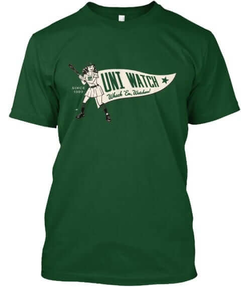
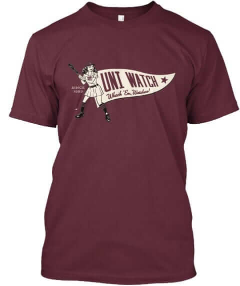
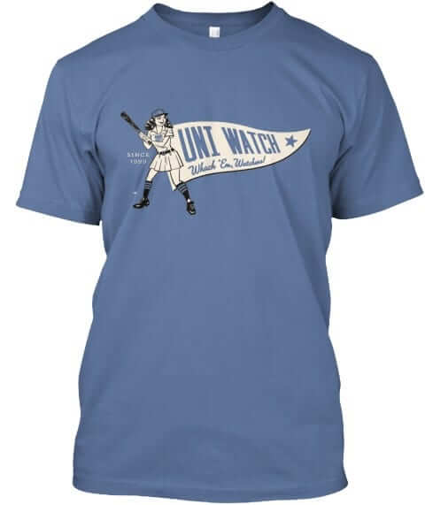
It’s available through the end of Friday. Full details here, or just go straight to the ordering page. It’s also available in women’s sizes. My thanks, as always, for your consideration.
Griffins Jersey Contest Reminder

In case you missed it, I’m again hosting a jersey design contest in conjunction with the Grand Rapids Griffins (an AHL affiliate of the Detroit Red Wings). All the details are contained in this post.
The deadline for getting your submission in to me is August 15 (at 6:00 pm Eastern Time), and we’ll have reader voting on the concept jerseys beginning on August 17th! Last year we had 85 entries and I’d expect we’ll equal or surpass that this year. Prizes include a custom jersey based on your design and tickets to the game that the Griffins will be playing in the jerseys you designed!
The Ticker
By Alex Hider

Baseball News: The A’s will wear this patch on their jerseys and caps next season in honor of their 50th season in Oakland (also their 50th season in the Coliseum). … The Rockies honored former manager Don Baylor by hanging his jersey in the dugout last night. Baylor died on Monday (from Mike). … This blog compared all 30 MLB teams to beers ”” and used some old logos in the process (from Nick Lineback). … The Vancouver Canadians will wear Expos-inspired jerseys on Tim Raines Night on Aug. 22 (from Johnny Stewart). … New bat knob decal for Astros’ prospect Kristian Trompiz (from Super Monicaco”). … The AA Tulsa Drillers will wear Star Wars jerseys on Friday (from Mike Iles). … Bridgeport, Connecticut is turning its minor league baseball stadium into an outdoor concert venue, leaving the Bridgeport Bluefish without a home (from Jon Rose). … Not sure if we’ve brought this up before, but the Binghamton Rumble Ponies wear sleeve numbers like the Phillies (from Nick Lineback). … Navy-on-navy in a Cape Cod League matchup between Bourne and Wareham last night (from Ryder). … There was some red-on-red action in a Little League World Series matchup last night (from Emily Scherer). … Lots of good shots in this story about the New York Islanders charity softball team (from Garrett McGrath).

NFL News: Yesterday, it was reported that the Patriots would be the first team to own its own airplane ”” and of course, it would be decked out with Flying Elvis (from Mike). … Looks like the Cardinal logo on Bruce Arians shirt in this photo is missing an eye (from Joe Farris). … Old Navy is selling a line of NFL shirts, all of which have a geographical identifier and the team name ”” except the Raiders, who’s geographical identifier will be outdated in just a few seasons (from Mike Stevens). … Here’s another round of NFL helmet concepts.
College Football News: Miami teased their new Adidas threads again on Monday (from Adam Apatoff). … Could these be Cal’s new Under Armour unis? Aaron Friedman spotted those at Cal’s bookstore. … Looks like UAB has some pretty wild helmets lined up for their first season back (from Phil). … Graduates from MAC schools will wear this patch this season (from Clint Richardson). … According to this newspaper clipping, the Youngstown State Penguins’ logo was designed by a member of the soccer team in 1979.

Hockey News: Great work by Jeff Hoose who (with the help of his daughters), painted the players on his Stiga table hockey game into Vegas Golden Knights players. … Artemi Panarin wore No. 72 with the Chicago Blackhawks, but the number is taken on his new team, Columbus. So, he’ll wear No. 9: 7 +2 (thanks Mike). … ICYMI from the baseball section: Lots of good shots in this story about the Islanders charity softball team (from Garrett McGrath). … New logos on the ice at Ohio University’s Bird Arena (from Trevor Wilson Patton). … The Kalamazoo Wings have selected this design as the winner of their fan-designed jersey contest (from David Barringer).

NBA News: It appears that the Suns will be getting a full redesign as part of the Nike onboarding (from Phil). … Lots of video game leaks yesterday. We got some looks at potential new Timberwolves designs (from Tony Lombardo and Brian Garanich), Pelicans Jazz, Mavs, Nets and Knicks ”” none of which reveal any significant changes. … Speaking of video games, Cole points out that NBA 2K18 coverboy Kyrie Irving is wearing the the Cavs’ new jerseys in the video game trailer, while he’s wearing the team’s old unis on the game’s Twitter account. … There’s rumors the Warriors may wear a jersey that looks like this for their “Community” design (from Conrad Burry). … Not sure what jersey Kristaps Porzingis is wearing in this photo, but they made sure to include the accent mark under the “N” in his NOB (from Dan Gartland). … Check this out: During the 1992 Olympics, Angola wore NOF ”” name on front (!) ”” jerseys against the Dream Team (from K Dawg).

Grab Bag: ESPN U and ESPN 3 dressed up as ESPN 8: The Ocho yesterday, bringing a joke from the 2004 movie “Dodgeball” yesterday (from Max Wagner). … I think we can all agree that Paul would love this letterhead (from Matthew Eng). … Here are the flags of 40 towns and communities in Ohio (from Jason Hillyer). … Not sure if the North Carolina tennis team will take up this suggestion wear 1912 throwbacks, but one can hope (from James Gilbert). … New uniforms for Rice volleyball.
The Clippers will unveil their jerseys on friday.
Surely they can’t be made any worse.
Never underestimate the Swooshketeers.
Not a fan of the Nuggets new jerseys. Now they just look like a plainer version of the Pacers. They had a unique identity with the powder blue, and just threw it out the door.
Naw, they’re fine. The powder blue juju was squandered when they switched away from the ice-sheen fabric to adopt the blah lightweight performance uniforms. But I could be a lot kinder if I saw some vertical arching. (There’s a Little League team from Long Island in contention for a LLWS bracket, and they vertically arched the player names. You can’t believe how much that gladdened me!)
“The powder blue juju was squandered when they switched away from the ice-sheen fabric to adopt the blah lightweight performance uniforms.”
I’d wager the average viewer never noticed the difference.
I do like powder blue on baseball Unis! I also like it in general
I’m normally a fan of combining navy and light blue. A big fan. And yet, in my opinion the Nuggets have never gotten it right. This version, while an improvement, is OK at best.
If anything the last 15 years have given me a real sense of appreciation for what immediately followed the rainbow skyline unis.
link
Same with what immediately preceded the skylines.
link
This franchise either needs to go full throwback or…have we done a Redesign the Nuggets contest? If not we should.
Links that work would be nice…
link
link
Trying that again.
Before skylines:
link
After skylines:
link
Oh, just google 1981 and 1995 Nuggets. I’m done.
Here let me help you out with that.
Gracias, mon ami.
Oh, I don’t know. Put me down as a fan of the first iteration of the powder blue, and the first version of the rainbow/skyline. Perhaps that indicates more about my taste than the classicism (or lack thereof) of Denver basketball.
I also prefer rainbow skyline 1.0 to 2.0, but just slightly. Since 2003, the only thing I’ve liked from Denver has been the not as rainbow-y skyline 3.0.
It’s too bad the Washington Park right field wall was nowhere near the scoreboard. According to link there was a sign there that read: “Base Ball Players are all human, and therefore love applause. If you want a winning team, root for them, speak well of them to your friends, and while we are here let us all be clean of speech — so that the ladies may find it pleasant to come often.”
Odd, there’s an link in the page you linked that’s almost exactly like Gary’s recreation.
So for clarification, the above quote occupied a portion of the right field wall beginning about at the foul line. Most of the quote is visible in the photo link above.
Actually the correct photo link is : link
Typo: “BINGHAMTON Rumble Ponies wear sleeve numbers like the Phillies.”
Watched “ESPN8 The Ocho” yesterday morning (8/8); featured coverage of kabbadi, darts, cornhole and ultimate frisbee, but no dodgeball. And, also yesterday, NBA TV featured multiple showings of “The Dream Team” for the 25th anniversary of their victory in Barcelona.
Typo: “ANGOLA wore NOF – name on front (!) – jerseys against the Dream Team.”
Fixed.
The Pacers called, they want their jerseys back Denver… No seriously, they want them back because the new Pacers uniforms are ridiculously awful.
Wow. I actually think the Pacers new jerseys are like top 5 in the league now. IMO, I’d actually rank them prob no 1. I absolutely LOVE them.
Where do you live, Rich?
I live essentially in Cleveland (about 10 mins outside of city lines). Any particular reason you ask?
Just was wondering if you lived in or near Indianapolis.
Funny how Gary Harris, an Indianapolis area native is modeling the Nuggets Pacers-esque uniforms. The irony!
The text on that ad patch is obnoxiously huge, but at least the background of the patch matches the base of the jersey, unlike some other ad patches.
Porzingis is probably wearing a Latvian national team jersey. Practice jerseys tend to have ads while game jerseys don’t
In re: the Denver unis, two of four, huh?
One of those best be a skyline jersey.
Didn’t they use a rainbow skyline jersey for a recent contract signing? I wouldn’t be surprised if that is one of their alternates.
In the Grab Bag item on UNC tennis, “one can help” should be “one can hope.”
Fixed
Next season will actually be Athletics’ 51st in Oakland. The patch is to commemorate the 50th anniversary of their first season.
It’ll be the 50th anniversary of the Athletics’ arrival in Oakland next year. This is their 50th season right now, since 1968 was season #1.
Another great “Classic Ballpark Scoreboard”- Nice work Gary!
link
Capital One Arena. Not Center.
BOO! HISS!
Keeps people from calling it the COC.
Old joke now but they should change the name to Capital Loss Arena in May.
Well, we know the link of the building, anyway. ;)
I’m Calling It The Cap Centre anyway.
That’s a different building altogether…although it would have been appropriate for the US Airways Arena period.
ed
That would be “I STILL Call It The Cap Centre”
It’s taken me forever, but I think I’m getting a handle on the difference between “I’m Calling It…” vs “I Still Call It…”
I’m still calling it the phone booth
I think the Nuggets’ new unis are FANTASTIC. The yellow, baby blue and Navy blue are such a fantastic combo. And relegating baby blue to a trim color was a great move, IMO.
Anyone notice that on the University of Miami uniform teaser video, the two hashtags are #ItsAllAboutTheU and #teamadidas?
Seems like a direct contradiction.
Well done, UAB. So dire a financial situation you cut football. A couple years later you bring it back…spending how much to make sure you have numerous fancy helmets?
Priorities.
The UAB helmets will not be worn. They were only designed to sit on Coach Clark’s desk. Marty Smith should have done a better journalistic job before tweeting those out. There’s so much wrong with them, especially considering that the helmets aren’t even complete. The green doesn’t have all the bolts screwed in for the facemask!
RE: Patriots plane….
If this mock up is accurate (it also includes logos on the engines), I will go apoplectic! The Elvi should face FORWARD, no matter what!
link
I’m guessing they want to keep congruity with link. They don’t have a version with Elvis facing the other way, and it would link with the engine logo being so close.
Piss on the wordmark. I’ve hated that wordmark ever since it was introduced.
“They don’t have” a wordmark with the helmet facing the other way? What, and it would be impossible to make one?
NFL concept helmets….
Yep. Just as expected. Oversized logos running amok.
WTH is the Ravens (?) helmet supposed to be??
Actually *some* are kinds cool. Most are not.
Falcons is a big improvement (but that’s the lowest of bars). Steelers and Redskins look ok. Don’t care for any of the others.
I thought the Bills one was ok.
It’s incongruous to think that a large city such as Vancouver has only a short-season single-A baseball team. If Vancouver ever gets a major league team, they should call it Vancouver BC (for Vancouver Baseball Club, of course). And the team could do worse than adopt the “vcb” logo that the Canadians will wear on those special uniforms. Suitably modified, of course.
Between the bright yellow and the baby blue and white outlining, the DENVER wordmark on the navy jersey is difficult to read. Not that it matters much (we obviously know who they are), but it bugs me.
Agreed. It’s damn near illegible.
link, a user changed the white outline to navy, and the result is link.
Much better!
Maybe they should have switched the white and pastel blue layers.
I like the Nuggets new navy blue uniforms, but I loved their powder blue. One reason light blue is so great is that you can wear them so often in color-on-color games.
Looks like Porzingis is wearing Latvia’s national team uniforms
Art Director:
“Can we make DENVER harder to read? It’s just too legible.”
Designer:
“Hold my LaCroix.”
Aaaaaaand we have a winner folks! Comment of the month. Laughed out loud at “LaCroix.”
link
Cal released their uniforms in June.
The Pistons were the first team to own their own plane in 1987. The state of journalism today is pathetic. Also, UAB will not be wearing those helmets on the field. SMDH. Not blaming Phil but the sources.
First NFL team.
The Dodgers would like a word with you.
And blame me all you want, but I didn’t compile the ticker today.
And what, has everyone forgotten link?
Yeah, only used when the jet way wasn’t working.
Idk if there were any stewardesses- or pilots
The Pats are the first NFL team to own a plane.
According to the ESPN piece, NFL teams usually charter flights with major airlines. They don’t need their own planes because they only travel for about 10 games a year (compared to 41+ for NBA/NHL, and however many road trips MLB teams take for their 81 away games).
Kind of a “what other story can we publish about the Patriots or Kaepernick” discussion for the NFL.
Ad patches: Soccer AND SOCCER ONLY! Don’t want em in baseball, hockey, or Lax
Nuggets unis look like a Nike stole the San Diego…er…Los Angeles Chargers uniform
Also, why are asking “Are these the new Cal uniforms?” when Cal has already revealed their uniforms?
Thank you! I was hoping I wasn’t going to be the first to point that out, at 8:05 pm eastern.
The Rumble Ponies only have the sleeve numbers on their Alternates; their standard unis do not have them.
I find it funny (damning?) that so many people look at the new Nuggets unis and think “Pacers.” Anyone else immediately think Grizzlies? Is that an indication of how poor an identity the Grizz have? Do we think they end up with powder as their primary colored unis?
I don’t think Grizzlies because their unis are awesome. Pacers and Nuggets are both meh.
You spelled “awful” wrong.
The black Grizzlies uniforms they wore while in Vancouver are better than the present ones:
link
Better logo and I liked the colour scheme. Then again, maybe that is my biased opinion. I could never like a later Grizzlies uniform again after they stomped on our hearts in Van City and left. Doesn’t even look like the same team now.
Another great Classic Ballpark Scoreboard, Gary. I am always a sucker for historical stuff like this, but this one even more so. My boy played his Pony ball at the current Washington Park much like the little guys in the photo above. I knew some of the history of the park/battle sight, but it was great to get more information to fill in my blanks. Thanks for the post.
Tom Brady was wearing his jersey inside-out at training camp on Tuesday.
link
Again? His inside-out bit was in the Ticker on Monday.
I’m sure we’ll get full coverage tomorrow, but with MLB rolling out its Players’ Weekend unis, I have to say, first impression? Not impressed at all. Same pullover template plus the same generic single-color block numbers for all teams equals coming off as being really cheap-ass. Plus, the color combinations in some cases are just horrible.
Agree, a third rate effort at best. Why did they even bother.
They’re shitty.
Who thought this was a good idea????
Agreed, they definitely rank up there with a lot of the recent shitty MLB designs, totally piss poor
Editing note: “…except the Raiders, who’s geographical identifier…”. Should be “whose”.
I think the “baseball teams as beers” article is using old logos because it’s old #content. I feel like I’ve seen that thing before and the fact that the Giants entry takes a dig at Brian Wilson tells me it’s something someone pulled off the internet recycling pile and republished.
And says the #1 Astros are not a real baseball team.
“Looks like the Cardinal logo on Bruce Arians shirt in this photo is missing an eye.”
It’s just sleeping.
The Players Weekend unis look like a bad softball league uni to me.
link
Save your venom for tomorrow ;).
They’re supposed to resemble Little League uniforms. Meh.
Matt Harvey is NOT going with PLs Frat Boy nickname
Yankees to wear NOB for first time
link
How about those new Rice VB units??