
Click to enlarge
[Editor’s Note: Paul is on his annual August break from site. Deputy editor Phil Hecken is in charge from now through Aug. 25, although Paul is still on the clock over at ESPN and may be popping up here occasionally.]
By Phil Hecken
Follow @PhilHecken
The NBA jersey unveiling parade marched on yesterday with the Cleveland Cavaliers releasing two new uniforms: a white and a red (wine) set. These uniforms mark more of a departure from what the Cavs had been wearing from their previous set — a much bigger difference than most of the new uniforms we’ve seen so far. These had been the subject of many a leak, and they basically are exactly as the leaks had indicated.
To whet your whistle, the Cavs unveiled a hype video for these (and supplemented it with well over 100 photos — I’ll include a link to the set at the end of this). But first, the video:
The Shield.
The Swoosh.
The Wingfoot.
Introducing our new coat of armor → https://t.co/iuYLihcVwT #AllForOne pic.twitter.com/QjqpaYQmxb— Cleveland Cavaliers (@cavs) August 7, 2017
We’ll begin the overview with white uniform. First — how the team described it:
Association (white) → traditional color to pay homage to our @NBA roots#AllForOne pic.twitter.com/e53P8DpzXR
— Cleveland Cavaliers (@cavs) August 7, 2017
Quite a lot of new stuff to take in there. Let’s start at the top of the front of the jersey:

There is new collar and sleeve piping, in burgundy wine, with a gold accent on the collar. The wine stripe under the arm is truncated at the base. “CAVS” is now on the front (as opposed to the full name) in a brand new, custom font face. CAVS is in wine, outlined in gold, and the font face has a marked beveling effect. The swoosh and a Goodyear ad patch balance out the top of the uniform. Letters are direct sewn onto the uni.


Moving down, the numbers are likewise in a custom font and are wine-colored, but they do not suffer the same beveling effect as the wordmark:


Moving down, the pants feature a wine-colored waistband with a “CLE” (if you’re going to shorten Cavaliers to “CAVS” then you should be consistent in shortening CLEVELAND to “CLE” — check) logo in the center. The pants also have an NBA logo and a swoosh on the front.


On the side of the uniform, there is a gold “stripe” (more like a rapier cut) on both the jersey and the pants. The Cleveland Cavaliers logo rests at the bottom of both sides of the pants.


The back of the jersey features wine and gold stripes, with the typical truncated shoulder striping we’re seeing on all the new Nike uniforms, the neckline is a solid wine stripe, notched with the small shoulder patch signifying the number of NBA titles the team has. The NBA logo is beneath that, followed by a radially arched, direct sewn NOB in solid wine.


Beneath the NOB are wine numbers, outlined in gold, in the same custom font as the front:


There’s also some mumbo-jumbo about the new shield being worked into the uniform:

Finally, here’s how the official release described the white uniform:
White Association Edition Uniform
The white Association edition uniform features CAVS across the chest in wine accented by a gold outline. The front and back player numbers are wine with a gold outline. The lettering (last name) on the back of the uniform is wine, as is the trim on the collar and shoulders of the jersey. The wine waistband on the shorts showcases the word “CLE” front and center.
And how much different is this from the previous uniform? Notable differences.
Old/new comparison of Cavs' white uniform. pic.twitter.com/YI3SeZ4RlR
— Paul Lukas (@UniWatch) August 7, 2017
And the wine uniform? Here’s how the team went about showing it:
Icon (wine) → primary color to represent our unique identity + rich heritage#AllForOne pic.twitter.com/7zu4ZjkJIB
— Cleveland Cavaliers (@cavs) August 7, 2017
The wine uniform is similar to the white, but it’s not a “mirror” copy. There are several important distinctions. The wine uniform uses navy blue for collar and shoulder striping (though the gold accents are identical on both), and the wordmark reads “CLEVELAND” in the same custom font as the new white uniform. The letters are rendered in gold with blue outline. The numbers, rather than following the same pattern, are blue, with a gold outline. How difficult these will be to read on court remains to be seen, but this incongruity doesn’t seem logical (nor does it look good). The “CLEVELAND” is also beveled like it is on the homes, but because it’s in gold, it’s not as noticeable.


The back of the jersey follows the same patterns as the white, stylistically, and it too has blue numbers outlined in gold.


The wine pants have a blue waistband, except where the white pants said “CLE,” the red ones read “CAVS.” Striping patterns, as noted above, are identical.


Finally, here’s how the official release described the new wine uniform:
Wine Icon Edition Uniform
The wine Icon edition uniform features CLEVELAND across the chest in gold accented by a navy outline. The front and back player numbers are navy with a gold outline. The trim on the collar and shoulders of the jersey is navy, while the lettering (last name) on the back of the jersey is gold. The navy waistband on the shorts showcases the word “CAVS” front and center.
And how do the new red unis differ from the previous set?
Old/new comparison of Cavs' wine uniform. pic.twitter.com/alA6cBSEUk
— Paul Lukas (@UniWatch) August 7, 2017
Like it does on a number of football uniforms, and other sports as well, Nike loves to put a “slogan” on the uniform that won’t be seen on the field (or court). This uniform is no exception — if you scroll back up to the splash photo, you’ll notice the Cavs have a Three Musketeers “All For One and One For All” thing going. It’s on the hidden folds on the back of the pants (on both sides)…


… and also on the jock tag (which will be tucked into the pants)


I’m not a huge fan of the red and white unis (remember, there are still unis yet to be revealed), and I especially don’t like the blue elements on the wine jersey. There is a pretty good chance that in poor lighting the numbers will almost appear ghosted.
When will Nike learn that dark colored numbers on a dark colored jersey doesn't work? pic.twitter.com/i0HxuN7cu8
— Robert Hayes🧠(@GuitaristRobDog) August 7, 2017
One thing I hadn’t noticed, but others picked up on is the fact that while this appears to be a unique font face, it does bear a striking similarity to another uniform Nike designers had a hand in revamping (and not in a good way) a couple years ago:
Did #Cavs rip off #Bucs' font for their new script logo🤔? Sure looks like it. Blame Nike.@PhilHecken @UniWatch @sportslogosnet @conradburry pic.twitter.com/BSUw5cOzXZ
— John Sabol (@John_Sabol) August 7, 2017
Obviously it’s not the same (you can notice the differences between the “C” and “S” above). But it’s got that same “sharp edged” feel. I guess the designers are going for a “sword” type of look, since (in theory) Buccaneers would fight with sabers or knives, and Cavaliers would engage in some sort of Three Musketeers-type dueling as well.
Others were amused by the Nike-speak:
Here's a bunch of words: https://t.co/b63a2SNPem
— mswanson3000 (@mswanson3000) August 7, 2017
You really should click on that to get the full I just threw up in my mouth a little bit marketing department working overtime.
Finally, big-time Cavs fan Jimmer Vilk had this to say, which sums up the feelings of many, I’m sure:
The Cavs are now the Denver Broncos of the NBA: bridesmaids for years, then when they put on their worst outfits ever they become the brides pic.twitter.com/cgpZS8hiDN
— Jim Vilk (@JimVilk) August 7, 2017
So why is half the shield blue? They're not Wine Gold & Blue United… pic.twitter.com/lVfHhFJ0ek
— Jim Vilk (@JimVilk) August 7, 2017
The uniform unveiling parade continues today with the Denver Nuggets unveiling their uniforms late this afternoon
Nuggets to Unveil 2017-18 Nike Uniform https://t.co/4iun4TB4rW
— Phil Hecken (@PhilHecken) August 7, 2017
On Thursday, the Minnesota Timberwolves will be ‘on the clock’ as it were. And who knows what the NBA has in store for Wednesday.
If you’d like to read Paul’s ESPN take on the Cavs unveil, click here. If you want to read the Cavs/Nike version click here And, if you want to see LOTS more pictures, click here. And if you want a breakdown of all the unis the Cavs have worn over the years, click here.
Well — what do you guys think?


Collector’s Corner
By Brinke Guthrie
Great logo artwork on this 1974 NHL All Star Game poster. January 29, 1974 at the now-defunct Chicago Stadium. The poster art also includes the now-defunct Flames, Golden Seals, and North Stars. Now for the rest of the week:
• In terms of retro NFL coolness, it just doesn’t get much better than this All-Pro Football Helmet Kit. OK, so the league and their marketing department weren’t quite on top of the branding yet. And who put the Rams sticker on backwards for the cover photo? And how did the Baltimore Colts end up in the “NFL West?”
• Keep your hair styled with this 1970s Oakland A’s comb. “For baseball fans of all ages!”
• Excellent vintage logo on this 1950s Chicago White Sox mini beer stein.
• Dolphin fans, if you’re still longing for your old style dolphin logo, you’ll find it on this 1960s helmet/bottle cap opener.
• Another helmet item for you, this time a Cincinnati Bengals helmet bank from the 1970s. This one says “Hunter Savings” on the base, and I had this very item- I recall us opening accounts there at their Kenwood office after moving from Dallas in 1972 (where I also got a helmet bank, and still have that one right here.)
• Here’s a 1970s (pre-Tequila Sunrise) Astros switchplate cover.
• Speaking of the Tequila Sunrise ‘Stros, I don’t think they got the neck on this bobblehead quite right.
• Terrific vintage San Francisco 49ers post right here.
• Packer fans will be all over this 1960s Packers championship glass. It has flags up through the 1963 season.
• It seems Roger Staubach had his own endorsement deal with Russell in the 1970s- here he is on the hang tag of this navy/silver sweatshirt. No NFL branding, though.
• Check out this Philadelphia Flyers lined jacket– it’s called a “FlyerJak.” Looks like it was “made exclusively for J.C. Penney.”
Two quick reminders from Paul: Hi there. Please remember that I’m currently accepting submissions for an ESPN contest to redesign the Tennessee Titans. Details here.
Also, there are just a few days left to order our latest limited-edition Uni Watch Artist’s Series T-shirt, designed by the great Rob Ullman. Here’s the base design, followed by a few of the many color options we’re offering (click to enlarge):
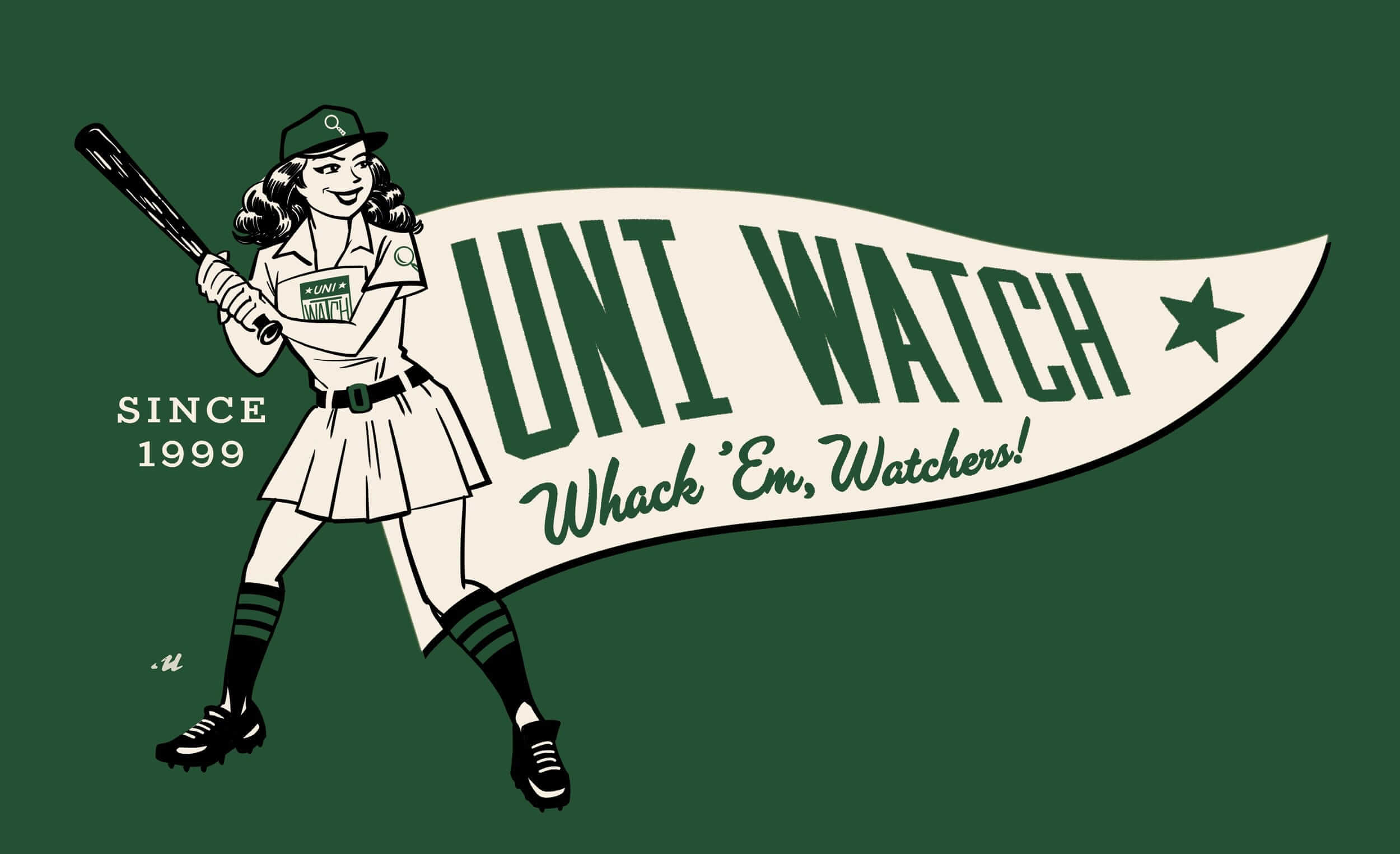
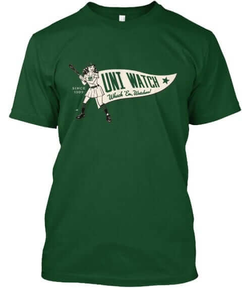
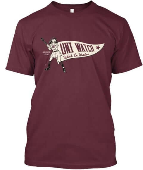
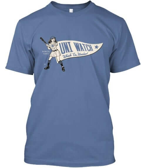
It’s available through the end of Friday. Full details here, or just go straight to the ordering page. It’s also available in women’s sizes.
That’s it for today. Oh, except for this: Phil is doing a seriously kick-ass job so far this month, is he not? Please join me in giving him a standing O. Thanks, Phil!
Griffins Jersey Contest Reminder

In case you missed it, I’m again hosting a jersey design contest in conjunction with the Grand Rapids Griffins (an AHL affiliate of the Detroit Red Wings). All the details are contained in this post.
The deadline for getting your submission in to me is August 15 (at 6:00 pm Eastern Time), and we’ll have reader voting on the concept jerseys beginning on August 17th! Last year we had 85 entries and I’d expect we’ll equal or surpass that this year. Prizes include a custom jersey based on your design and tickets to the game that the Griffins will be playing in the jerseys you designed!

Too Good…
for the Ticker
Got an e-mail yesterday from reader (and sometimes-featured artist) Gene Sanny yesterday — not a lot of text, but it’s just too good for the ticker (you can click the images below to enlarge).
Here’s something I did over the weekend… Ernie Nevers, Duluth Eskimos in the 1920’s. Sculpted the helmet, sleeves, and extended waist of the pants.
Gene Sanny


Thanks Gene! You always do a tremendous job with figurines, and this time you’ve outdone yourself!
OK. Now, on to the ticker…
The Ticker
By Mike Chamernik

Baseball News: Marlins 2B Dee Gordon was missing the New Era logo on his hat last night (from @TheSteroidEra). … On Saturday night, the Charleston RiverDogs wore jerseys that synthesized all of their previous promotions from this season into one (from Nate Kurant). … A club softball team in Nebraska wears the names of fallen soldiers from the state on their jerseys (from David Westfall). … Fox News recently suspended studio host Eric Bolling over sexual harassment claims. One colleague says that Bolling had a particular fondess for doing business in his baseball jersey-covered office (from Phil). … Metallica performed the national anthem before last night’s Cubs-Giants game with Giants-themed guitars (from @BackAftaThis, via Phil). … On a related note, this shirt is perfect for San Diego-based Metallica fans. … The Reading Fightin Phils changed their name to the Reading Whoopies, in honor of the regional snack cake, for yesterday’s game. Here’s another look at what they wore.

Pro Football News: Texans D-lineman Vince Wilfork announced his retirement with a Twitter ad for Kingford Charcoal, a company with whom he has an endorsement deal. … Here’s a wild story from this spring: A Florida couple bilked investors out of $700,000 through a scheme that involved a fake football league, called the North American Football League. The ringleader of the scam even created a phony website and Facebook page for the NAFL, along with logos and identities for the eight teams (thanks, John Dlugosz). … A lineman on the Toronto Argonauts back in 1973 wore a two Dungard facemasks. I couldn’t find a roster, so I’m not sure who that player is. Does anyone know more? (From Johnny Garfield).
College Football News: Jordan Brand has taken over as the apparel and uniform manufacturer for North Carolina’s football program. Part of the deal includes new helmets with Jumpman logos on them, which will be worn in practice, but not games. Back in 2000, NC State’s student newspaper published a satirical news story about how Nike bought UNC and installed Michael Jordan as chancellor (from several readers, including Andrew Cosentino and James Gilbert). … Auburn will have a 3D nose bumper this season. … The avatar for the Georgia State equipment’s Twitter account is a photo of a helmet with a center stripe. The Panthers didn’t have a stripe last year, and there weren’t stripes on the helmets earlier this summer, either (from Brady Weiler). … Last season Kentucky paired its white helmets with blue facemasks, but so far in practice this year, the Wildcats have been using white facemasks (from Shawn Bridwell). … Maryland unveiled a logo for the 125th anniversary of its football program (from Matt Shevin). … A Houston high school will wear commemorative matte black helmets for NASA Appreciation Night on September 1. The school is only a few miles away from the Johnson Space Center (from Eric Youngdahl).

Hockey News: The Maple Leafs will celebrate their 100th anniversary by wearing blue 1917 Toronto Arenas throwbacks on December 19. … Will Scheibler says his dad’s team wore Lightning-inspired jerseys for the Snoopy’s Senior World Hockey Tournament, which was held in Santa Rosa, Calif., last month. The team was awarded this trophy for winning its age group.

Basketball News: If it were up to John Wall, he would make the stars-and-stripes alternates the Wizards’ primary home uniforms (from @BoyGeniusLA). … New court design for Virginia Tech (from Andrew Cosentino).

Soccer News: Though No. 10 is a common number for some of the world’s top soccer players (including Pelé and Lionel Messi) as it is, Carli Lloyd of the U.S. Women’s Team wears the number in honor of Darren Daulton, who died Sunday. Lloyd grew up in Southern New Jersey during Daulton’s best years with the Phillies (from Mike Engle). … The Seattle Sounders hired the talent firm WME-IMG for their search to find a new uniform advertiser (from Dustin Jensen).

Grab Bag: New home kit for England rugby (from Josh Gardner). … The British cycling brand Rapha sold a majority interest to an investment company headed by Wal-Mart heirs (from Robert Purvis). … Steve Johnson and Gael Monfils wore the same Asics tennis outfit, only with opposite colors, for their match against each other at the Rogers Cup yesterday (from Max Wagner). … New logo and motto for Round Lake Park, a northern Chicago suburb. … New uniforms for Youngstown State University volleyball (from Robert Hayes).
The Phx Suns will also unveil their new Jerseys on Thursday.
link
Loved the Cavs previous set, and I loathe this one. That is all.
Leave it to the “designers” at Nike to achieve our already unbelievably low expectations. Remarkable for showing no restraint, no elegance, no proportionally, no logic, no originality and very little overall taste. Remarkable they stay employed. I guess they have no worries about the competition taking their jobs, though, right?
Agree. They are. Awful.
I can’t believe I’m saying this, but one of the best things about this uniform is the ad patch.
Oof, the number font on the new Cavs jerseys is rough.
If you take away the beveling, the blue numbers, and that horrendous number font – these aren’t half bad.
Other than that, how was the play Mrs. Lincoln?
Huge Cavs fan here, so I am going to try to focus on the good aspects of the uniform and ignore what I can’t freaking stand.
The Good: (white uni) the shorts look good, I like the minimal shenanigans going on with just the simple stripes on the side, and the waistband is simple enough. I like the wine colored piping along the sleeves, am ambivalent to the little bit of gold at the top of the collar.
The Bad: The word mark is too big for the jersey. Dominates the space. The swoosh looks lame, and I am not a jersey ad fan at all. (will give Cavs credit though, the Goodyear logo is actually a pretty cool logo). The font isn’t as shitty as I think everyone thinks it is. Also, would prefer the full “Cavaliers” treatment across the front like on the previous set. I like the gold numbers outlined in wine…really pops. Overall, I think that the white unis are a slight upgrade over the previous ones.
(The previous white jerseys were crisp, clean, yet a little boring and plain. The font was so basic, the stripes on the collar and waistband felt dated, and the shorts needed something else to go with just the logo on the bottom. I didn’t hate the set, but I didn’t love it)
Wine Uniforms, The Good:
Again, I like the shorts on these unis as much as the white shorts. I’d actually buy them. I like how CLEVELAND really pops across the front. I like in the back you see the wine/gold/navy and it reminds me of the first LeBron era road jerseys.
THE BAD: the freaking numbers! WHY WHY WHY WHY WHY aren’t they in gold? It’s so damn obvious you stay consistent and go GOLD wordmark and GOLD NUMBERS!
Also, navy just doesn’t belong in this uni at all. Doesn’t fit, doesn’t mesh, just plain old doesn’t look good. To me it takes away from any gold element and it drags the color scheme down. Keep it simple like the previous wine set with the gold wordmark/numbers.
I anticipate a black uniform to be rolled out, and I am assuming some sort of “hardwood classic” with whatever bullshit name Nike is going to give them (probably something dumb for uniforms like “heroes”) I would grade the previous uniforms as about a even with the new ones …ONLY because the old ones were so plain and I couldn’t stomach the navy or gold unis..and overall I am not disappointed or trying to sell myself on liking them like I had to do with the Browns. I’d also like to reserve the right to change my opinion once I see them on the floor.
I don’t completely hate the Cavs new set. On the plus side I think it is rather simple, which is nice. The fonts aren’t great, and they really should ditch the navy. With minor tweaks it could be a good set. But lots of typical Nike-ism that ruin it.
Sad thing is the most notable part of the uniform is the ad patch, and that for ad patches it isn’t awful since the corporate logo is nice looking and has an athletic feel. Not good when the highlight of the new uniform is that sellout portion is less repulsive than other teams.
The problem with the Cavs new set is the same problem that everyone identified when they unveiled the new logos – you can’t have navy and black in the same color scheme. It’s too sloppy.
I think “sloppy” is being generous. Sloppy is an oversight on something you might not notice right away. But black and navy not going together is just common sense.
If they really think celebrating the black uniforms from their championship is that critical to their identity, then just go ahead and drop navy.
Yeah you’re right. Wine and gold with black would be totally fine. It’s not the best, but if it’s part of their identity now then just use that instead of navy.
“Metallica performed … with Giants-themed guitars ”
And amps!
I’ve never liked team nickname wordmarks on jerseys. I know the Cavs have done it before but it just seems way too informal.
The (Seventy) Sixers, (Trail) Blazers, (Timber) Wolves and (Super) Sonics (RIP) disagree with you.
Yeah, depends on the team. But certainly the Cavs and all of the ones you have mentioned are far more acceptable than putting DBag… I mean DBacks on your uniform.
Not to get overly narrow, but I see those examples as being a little different. They’re truncated versions of long team names that leave out one word. “Cavs” chops up the team name itself.
…well, there’s always the A’s.
The Mavericks had that green jersey that said “Mavs”.
I have mixed feelings about abbreviated nicknames on jerseys. But in the case, the generally poor quality of the uniform designs almost makes “Cavs” feel right to me. An informal nickname for a mediocre uniform. I’d mind the “Cavs” thing a lot more if it was the worst part of a good uniform instead of an average part of a middling uniform.
And for whatever reason, Philly’s “Sixers” jerseys don’t bug me as much as Cleveland’s “Cavs” jerseys. But purely in terms of nicknames, they’re the same jersey, so any principled opinion about the one should apply equally to the other. Not sure why the one rubs me the wrong way but the other does not.
When the Gund brothers bought the team from Ted Stepien, they were considering making “Cavs” the official name. Glad they didn’t, but I also don’t mind seeing it on a jersey.
Oh Lord, I’d completely forgotten about that.
The satirical article about Nike buying the University of North Carolina appeared in that university’s student newspaper, “The Daily Tar Heel.” NC State University’s student newspaper is named “The Technician.”
Scratch that…I didn’t catch that the “Technician” changed the name to the “Daily Tar Hell.”
It was a NC State spoof, according to this tweet: link
Huge congratulations to Mr. Sanny for the great work on that Eskimos electric figure. Beautiful. And deep thanks for sharing the pictures with us!
I know, right? He keeps outdoing himself!
I don’t know how he does it, but man, he does it!
Does he ever! Outstanding!
Thanks guys! I’m doing a figure from the 60s, 70s, 80s, and today to follow up this 1920s one…. just showing what can be done with sculpting, sleeves etc. I’ll send pics as I complete them.
Closed circuit to Brooke: The Colts were in the NFL West before the merger. That’s because they were the replacement for the old Dallas Texans of 1950 who folded, and Baltimore got the franchise. In the mid-60s, the Colts and Packers was probably the best competitive rivalry in the league, with some classic games including an OT game in the playoffs in 1965.
Fun trivia history: The Texans’ quarterback was Y. A. Tittle – it was a career stop between San Francisco and the Giants. Also on the roster were Colts HoFers Art Donovan and Gino Marchetti.
Like it does on a number of football uniforms, and other sports as well, Nike loves to put a “slogan” on the uniform
*As* it does
Paul: “It’s not nit picking at all. I want the site to look as professional and error-free as possible.”
Phil: “When I become emperor, my first act will be to exile all cppy editors.”
I hate the trend of the font for the number 4. I think the 4 should look like the way it does here: 4. When you have the top part of the 4 “open” like the new Cavs unis do, I think it looks awful and it’s spreading across sports. I blame Nike for that.
I hate the new Cavs unis. There was nothing wrong with their old ones. Classic, simple, and had nice colors and fonts.
I say blame digital clocks instead.
I have actually never liked closed 4s. I have never written them like that, and when you do a lot of math it can get confusing what is a 4 and what’s a 9. But I can understand that others may disagree.
To Brinke and Mr. Barrington: true about the Colts in the NFL West (or the “Coastal Division” of the NFL West). The mini-helmets look to be ca. 1968-69; according to Gridiron Uniform Database, the Falcons had the gold-white-black-white-gold helmet stripe from 1966-1969, and the Lions had switched from blue-silver-blue to blue-white-blue striped helmets in 1968. The set has the old pre-wishbone double-upright goal posts that I remember when I was a wee tyke.
Re: no. 79 of the Argos: that’s CFL HOFer Jim Corrigall, a defensive lineman (info from cflapedia.com and cfl-scrapbook.no-ip.org/Corrigall.Jim.php). Online images of him feature the standard Dungard lineman mask earlier in his career; in his later career he and the Argos wore a standard Riddell or Schutt mask. I don’t know why he had the double Dungard in today’s photo.
As to Gene Sanny: you rock! I love your EF figurines. Ernie Nevers never looked more ready to play 29 games in a season (1926) or score 40 points in one game (1929, with the Cards). Terrific!
Thanks :) yeah he was pretty incredible
I’m not adverse to the navy blue with the wine, except of course the numbers. However when a team has navy blue as one of their colors, I really don’t like having a black alternate uniform like the Cavs have had and will probably continue. Actually I’m not a fan of having a black uniform when black isn’t one of the official colors, but I’m really against it when that team has navy blue. Can you imagine Michigan or the NY Giants having a black alternate uniform?
So, let’s see. Over the last 40 years, Cleveland has worn:
White
Gold
Wine
Orange
Powder Blue
Royal Blue
Navy Blue
Black
Yeah, it’s quite a list. (Added that link to the main article as well).
That’s quite a list. Never understood why teams change their colors and history. I know there’s an aversion on this site to purple, but the Diamondbacks switching colors made no sense to me since they won a World Series with their old colors. I hated those uniforms, but they could have simplified them, and maybe drop a color, or two, or three, out of their official list of purple, teal, black, copper. Maybe just go with black and purple or black and teal/turquoise.
Impressively near the top of the list for number on colours through the life a a team.
Still a ways to go to beat the multiple colour champions. I am thinking the Vancouver Canucks are holding the title. Unfortunately, seems to be the only championship the Canucks can win.
The CAVS across the front of the white jersey looks awfully close to Iowa State’s “I” on their logo.
Holy crap, how awesome is Gene Sanny?! Ernie Freakin’ Nevers?!?! BRILLIANT!!! Thanks, Gene!
Wow, thanks Marc :)
“One colleague says that Bolling had a particular fondness for doing business in his baseball jersey-covered office (from Phil).”
This could use a NSFW warning.
A bit late to the party. I don’t know if it just me, but looking at the “wine” jerseys, it seems like they have an inconsistent distance between the Cleveland wordmark and the number. Specifically, that gap on the #2 Irving jersey appears to be significantly smaller than the gap on the other jerseys next to it. In turn, the gap distance on the #46 jersey in the before/after picture appears to be the same as the #2 jersey, rather than the same as the other jerseys.
Wow that fake NAFL site is wild – I wonder if the merchandise is still available? I certainly don’t want to order it to find out.
Interestingly enough, only one team displays, with only 3 shirt styles. When you poke around the site a bit, you uncover some questionable, unfinished areas.
On the surface, it’s an impressive hoax.
UNC grad here…Jordan Brand’s “new” (basically the same) UNC football jerseys look great, especially an upgrade that they went away from BFBS and returned to the navy alternate.
However, the helmets with the Jumpman logo are a bit much, even if they are just worn in practice.
Which makes one wonder: why separate helmets are needed for practice anyway? Didn’t the NFL find it was safer for players to use the same helmet shell for the whole season?
The NFL is full of shit.
Nah. I mean they are all about player safety. You know, with those great Thursday night games that all the players love and feel completely ready for on gameday……
I’m a bit puzzled as to why the Cavs keep pushing the “we wore black in that epic game 6” narrative. Y’all got blown out in game 2 of the Finals when you intentionally chose to wear black in an effort to spook the Warriors. And, of course, game 5 didn’t exactly go as hoped, either.
Yes. Thank you. Amen.
It’s long been a uniform double standard. You wear a bright/outrageous uniform and lose just once and it’s “jinxed.” You wear black or some other dark/”tough” color and lose…”We ran out of time but we didn’t run out of toughness. We’ll get them next game. Or the next one.”
Regarding the Maple Leafs, I thought the NHL wasn’t allowing alternate jerseys to be worn next season.
Cavs are the first big miss by Nike doing the NBA. Not as bad as they could be, but not good.
I’m hoping the Suns uniforms aren’t a big miss, like some of the “leaks” appear to be.
It seems an allergic reaction to Paul’s words of praise. His commending their home uniform could have been the kiss of death.
You guys need to add tank tops that say “I still call it a home jersey” (in white) and “I still call it an away jersey” (in various colors) to your “I still call it…” line of tees.
Is it me or is the kerning between the C and A on the Cavs’ white jersey not quite right?
What the hell, is half the NBA getting new uniforms this year? BTW, those unreadable black numbers on the Cav away jerseys are an abomination.