[Editor’s Note: Today we have a fascinating guest entry from Jon from TheGoalNet.com, who’s going to tell us how high-res digital printing is transforming goalie pad design. ”” PL]
By Jon from TheGoalNet.com
I am goalie, and it’s in my DNA. Identifying goaltenders’ equipment is sort of my uni-watching superpower. If you show me five goalies from 1990 to the present, I can probably tell you the make, model, and color of what four of them are wearing.
I’ve been playing the position since I was a child have seen major changes in goalie gear during that time. I’ve lived through brown leather, synthetic leather colored pads, custom graphics, deer hair-stuffed pads, foam-stuffed, solid molded foam core pads, specifically engineered leather-like materials, and now high-resolution digital printing technology.
Goalies whose currently have their own signature graphic, like Jaro Halak or Scott Darling, have the graphics generated by the old cut-and-sew method. The manufacturer will design the graphic on a computer, print a template, have pieces of synthetic leather cut based on the template, and then finally sew everything together onto the pad to complete the graphic. This time- and labor-intensive process is why custom graphics are so costly, and why the lead times are long. Pads will fully bespoke graphics from one of the major brands can take 12 to 14 weeks to get at the retail level and are a $200+ upcharge. It’s why the average goalie drools over custom-designed gear graphics but cannot obtain it.
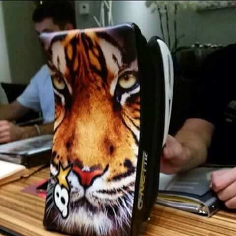
But that is now changing, thanks to high-res graphics that are printed instead of being cut and sewn. It’s a topic I became interested in a few years ago, when I saw teaser photos of this blocker from the manufacturer Brian’s:
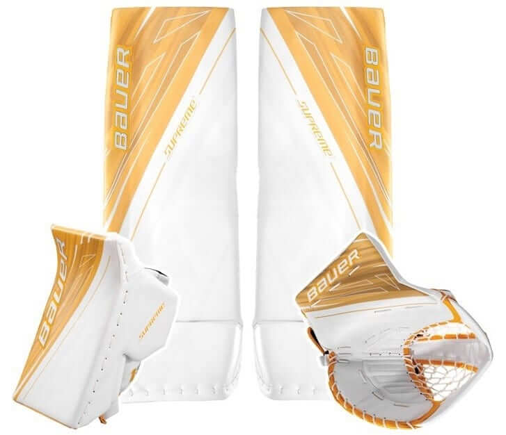
Then came the retail release of the Bauer Supreme 1S OD1N line of equipment. Frankly, I found the graphic on these pads boring, but it’s another example of high-res printed graphics:
I believe this kind of printing is going to revolutionize what we see on pads, how graphics are applied, and even the where graphics are applied. It’s just a matter of time until the floodgates of creativity and personalization explode. The benefits are far-reaching and the design possibilities are endless.
Aside from design freedom, high-res printing on goalie gear will allow a new level of customization, supply chain streamlining, and manufacturing efficiency. This will also completely democratize pad graphics and, eventually, pad artwork. In the future, any kid with a Photoshop-like iPhone app will be able to design his pads with the same level of detail as an NHL mask with ghosted logos. He will then email the CAD file to the equipment manufacturer and get his completely customized pads in a couple of weeks. Heck, for NHL mask painters, like the world-famous Daveart, the next area for expansion is probably pad art.
There are currently two ways to for custom pad graphics to be applied. The first method entails printing graphics directly onto the pad itself by the pad manufacturer during the manufacturing process. The second form is done with an aftermarket sheet fabric made by Pad Skinz and applied by an equipment manager, a retail store, or a DIYer.
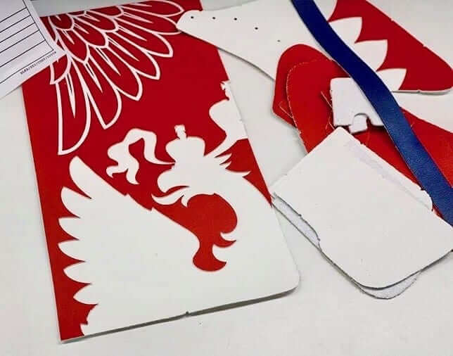
Let’s start with the first method. The interesting thing about fully printed pad graphics by the equipment OEMs is that they have major implications for the surface of the pads. To see what I mean, let’s look at traditional pad graphics, which are typically applied by sewing together many pieces of cut synthetic leather to create an image or geometric design:
This method creates many different levels of materials, tight surfaces, and seams on pads. If you want to customize your pads, there’s the previously mentioned aftermarket product called Pad Skinz, which allows you to apply a durable adhesive fabric over top of your pads’ stock graphics and color, but you have to cut multiple pieces of the fabric to size and fit them into small spaces on top of the seams, laces, and stitching, so the results often look bumpy.
But retail pads that already come from the manufacturer with fully printed pad graphics give the pads a perfectly flat surface, which opens the possibility for better home-customization and graphics changeover. This will be awesome for kids who keep gear for more than a single season and change teams or a want to quickly customize their gear to match a special one-off jersey.
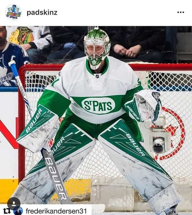
As for the other method: The latest version of Pad Skinz allows for graphics to be printed onto the “skin” material before it’s applied to the pad. Some great examples of this are Toronto Maple Leafs goalie Frederik Andersen’s set of St. Pats throwback pads, or YouTube star Trav4’s Felix Potvin theme.
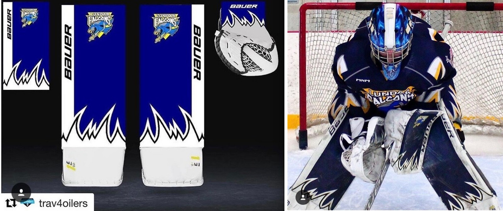
These are the highest-quality applications of Pad Skinz to date, and they show how good the graphics can look when one large piece is applied to a smooth surface. This is a huge improvement compared to the cut-and-sew method.
Once more manufacturers go this route, companies could manufacture all their gear in white, with a smooth seamless pad face, and then ship it to stores. Stores could then use Photoshop or some other graphics program to design bespoke customer-specific graphics, use a large in-house printer to print them on a blank sheet of Pad Skinz, and apply them. This should improve the manufacturability of equipment because the pads shipped from the factory can all be white. There will always be a market for pads customized by the equipment maker, because they are perceived as higher quality, but the continued evolution of Pad Skinz combined with digital printing will make DIY gear customizing a lot more affordable, higher quality, and more fun.
But as cs cool as the Pad Skinz technology is for the common goalie, it will not be widely adapted at the NHL level. It will only be used in temporary circumstances to make existing equipment match special one-off jerseys, like Andersen’s St. Pats setup, or for use immediately after a trade until the goalie’s new team-colored pads are available.
In the NHL, all the graphics will be eventually be digitally printed directly on the pad. This will occur during the manufacturing process by the equipment maker. Unfortunately, it’s going to be awhile before we get there. Henrik Lundqvist is the only person in the NHL using his own signature printed graphic right now. Only Bauer is offering the technology in a stock graphic to pros or a retail product line.
One reason this technology hasn’t yet been more widely adopted is consumer perception. For the past 20 years, low-end retail models have had screen-printed graphics while the high-end NHL-quality pads had cut-and-sew graphics. The latter method requires the work of true craftsmen, which adds perceived value to the product. Screen-printing the graphics on the pads is generally perceived to be a lower-quality cost-cutting maneuver. But the new high-resolution digital printers will eventually make the difference and change this perception.
The second issue delaying adaption is the color quality. Rhe current printing technology tends to lead to more washed-out colors. Until the colors are properly dialed in, it will continue to alienate retail customers and that will stop manufacturers from putting their pros in printed graphics. When these two issues are taken together, I think it will be at least seven to ten years before this technology fully takes over.
When I think about the future of graphics of themselves, there is only one reason I can see for stock graphics (as opposed to custom designs) to exist in the future, and that is brand marketing. Companies will still want that brand recognition, and stock graphics make it much easier to identify who’s wearing what. Beyond the brand-recognition marketing benefit, I see no reason why each goalie won’t have his own custom graphic with the same level of detail he has on his mask. As the marketing people within gear companies are pushed to generate more buzz via social media platforms and attention-getting press releases, that will drive them to loosen up on the idea of stock graphics.
The average NHL goaltender goes thru two to three mask paint jobs per season. Some goalies get the same imagery every time, but most of them mix it up. They also go through two to three sets of pads and gloves per season, and it makes sense for each new set of gear to have a customized graphic to match the paint job theme. It fits perfectly with the hype-driven 24-hour news cycle that now dominates so much sports coverage.
Black to the drawing board: Paul here. Last week, when the Cavs announced that they’d wear blue for Game 1 of the NBA Finals, they said they’d save their sleeved black uniforms “for the right moment.” That turned out to be last night, as they wore the black T-shirts for Game 2. It wasn’t much of a good luck charm, as they lost by almost as great a margin as in Game 1.
Game 3 is scheduled for Wednesday night in Cleveland.
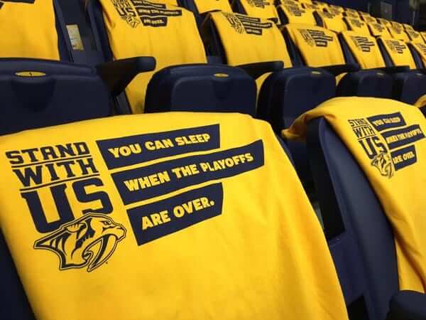
Yellow: It isn’t just for the players: Last week I had an ESPN piece about how all four teams in the NBA and NHL finals wear a lot of gold yellow. Now The New York Times has written a really good piece about how all that yellow is affecting the worlds of giveaway T-shirts and rally towels. For example, is it a good move to have your fans wearing your team color if it’s also the opponent’s team color? And what happens when shirt and towel suppliers run low on yellow inventory? Good stuff — check it out here.
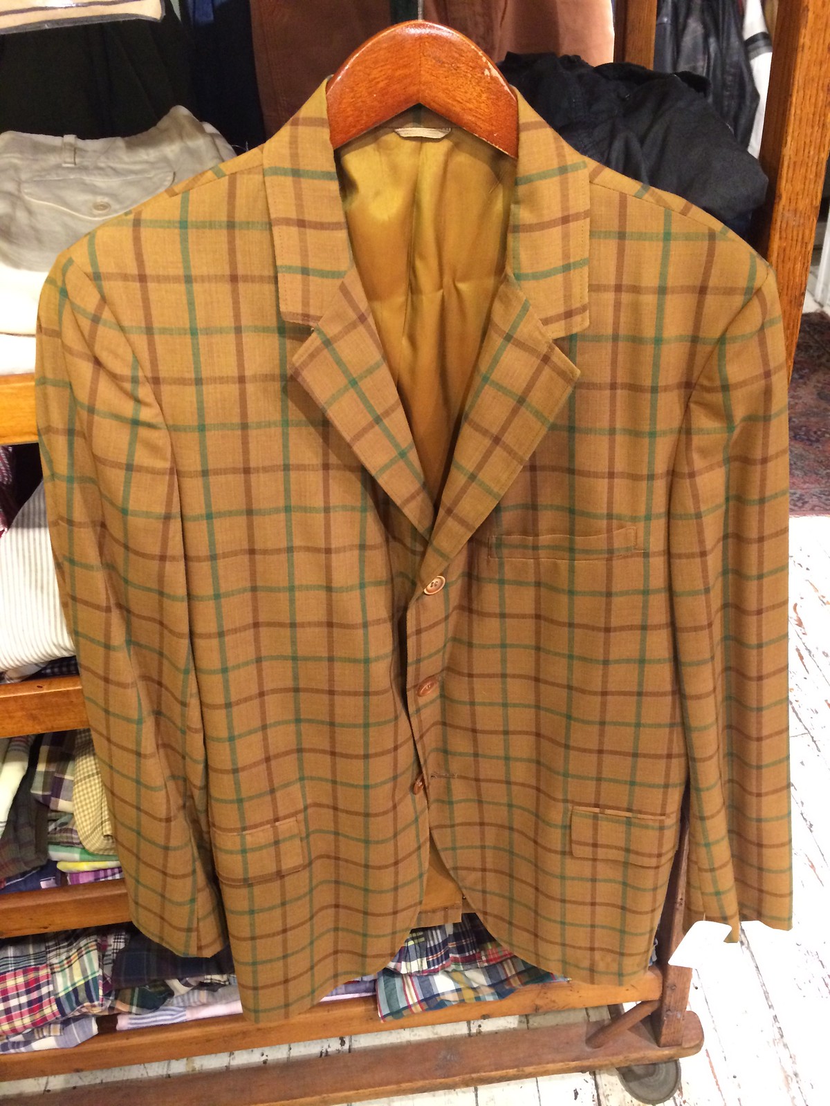
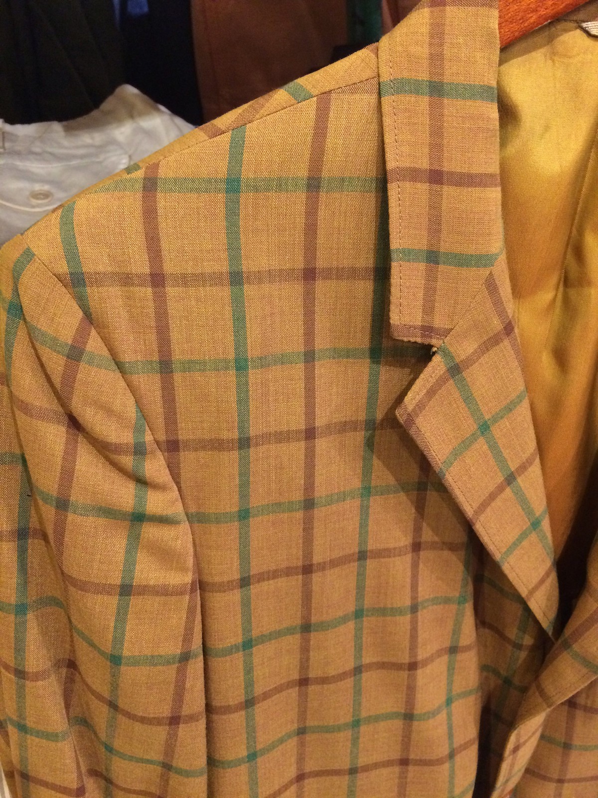
A very Uni Watch garment: I was shopping at one of my favorite vintage shops the other day when I came across the item shown above. Check out those colors — it could easily serve as the official Uni Watch blazer!
It fit me like a glove, too. I thought about buying it but ultimately put it back on the rack, because (a) it cost a bit more than I wanted to pay, and (b) I don’t have that many occasions to wear blazers, and I already have more of them than I need.
Still, it sure is a beauty. Maybe I’ll go back and visit it later this week. You know, just to make sure it’s still okay.
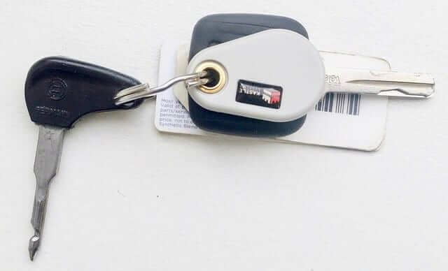
KRC update: The latest installment of Key Ring Chronicles is about an unusual key that worked in a whole series of buses. Get the full story here.
The Ticker
By Alex Hider

Baseball News: For two games this weekend, the Dodgers wore their gray pants without piping with their “Los Angeles” script road jerseys. The sans-piping pants are usually reserved for the “Dodgers” script road jerseys (from Allen and Owen Hill). … Couple of color-on-color games in the MLB yesterday in A’s/Nats and Reds/Braves. … Ubaldo Jimenez’s NOB looked to be a bit off-center when he pitched on Saturday (from Burrill Strong”). … A Mets fan wearing a “Fire Terry Collins” shirt was ejected from Citi Field twice last week (from Brinke). … Calvin Mallow spotted a Robin Yount frankenjersey at the Brewers/Dodgers game in Milwaukee yesterday. … A Target in the Philly area has put up this Phillies-themed soda display (from MJ). … The Louisville Bats wore Muhammad Ali jerseys yesterday to honor the anniversary of The Greatest’s death. More photos here. (from Barrett Lindsey). … Pablo Reyes, a shortstop for the Altoona Curve, wore his sunglasses upside down for a significant portion of warmups yesterday (from Malcolm MacMillan). … Rice Coach Wayne Graham was wearing the cap from his team’s 2016 trip to Cuba during a recent College World Series game against LSU (from Chris Mycoskie). … Deer Park High School in Texas has been sporting tequila sunrise jerseys (from Clark Haptonstall”). …

Pro Football News: Check out this story in a 1969 edition of The Pittsburgh Post Gazette, which describes how much tape the Steelers use. The trainer estimated the team used 14 miles worth of tape before the season even began (from Jerry Wolper). … Miles Filbert sent along some photos from his extensive collection of Canadian Football League memorabilia.

Soccer News: Real Madrid wore purple kits during the Champions League Final but switched to white jerseys during the postgame celebration (from Venomous Snake) … New away and third kits for Arsenal next season (from Patrick Thomas). … Dortmund will wear these jerseys during Champions League play next season (also from Patrick Thomas).

Grab Bag: NASCAR driver Jimmie Johnson honored former driver Cale Yarborough on his helmet at Bristol Motor Speedway this weekend. Johnson is one win away from tying Yarborough on the all-time wins list. … Rapper Kanye West reportedly wants to design the athletic uniforms for Calabasas High School in California (from Chris Faulkner). … Here’s a mini-doc on wrestler Sarath Ton, the guy who makes much of the clothes worn by WWE wrestlers (from Anthony Nuccio).
Paul, can’t you trade in some of your excess blazers for that lovely Uni-Watch one?
Yeah, how much was that thing? I’m imagining that it might be $3 at a yard sale and ten times that much at a Brooklyn hipster thrift shop.
Significantly more than that.
That blazer is sweet. It’s calling you.
Agreed. Buy that and make it your signature blazer to wear to every UW-related appearance. Sew on one of your patches to make it official.
If only Teespring could make a Uni Watch Blazer t-shirt. I’d wear that.
Jimmy Johnson won at Dover yesterday. Bristol was a few weeks ago.
I would wear that blazer to every UW gathering. If I were you, of course.
Does anyone else not this customization of goalie equipment in hockey? I’m not a goal tender, so I do not have their perspective, but it seems like this type of thing alienates them from the team. The forwards and defensemen don’t have personalized helmets. They dont get to pick the patterns on visible parts of their equipment. Maybe it’s a perk of having 100+mph pucks shot at you, but I think the equipment should be considered part of the uniform. Team color Mask/helmets for all. Pads for the most part are fine, but this new graphic technology could lead to the pads as the new canvas equal to the mask.
You’re not alone. I don’t care for it, either. A small portion of it is, as you pointed out, because it appears to be a “look at me” type gesture to someone (like me) who is not a goaltender and knows nothing about it. It stands out (usually not in a good way) from the uniform the team is wearing. Pads, to me, should be decorated like the pant shell; solid color with the obligatory manufacturer logo in a contrasting team color if you must.
Truth be told, though, I also prefer the look of solid color equipment. It looks much more professional to me, like you take your job as the goaltender of the team seriously. That’s how I generally feel about uniform elements in team sports. If you’re a golfer, surfer, climber, skateboarder, marathon runner, etc., then go wild and do you. However, if you’re a part of a team, you should look it, in my opinion.
I loved it when the Flames’ goaltender wore a plain black helmet in the playoffs a few years back. Looked fantastic.
Allow this cranky old goaltender and signmaker to weigh in.
I hate what digital graphics has done to the sign industry. And I hate to see it being employed on goalie equipment now.
Sorry but I much prefer the low-tech look of equipment in the 70’s — hand-painted masks, often done by the goalie himself, no heavily-detailed airbrushed artwork. Brown leather pads and gloves. In the same way I prefer the character and uniqueness of hand-painted lettering on a sign…
Similarly, today’s goalies are hardly unique – all seem to be cookie cutters of each other, all playing the same butterfly style of “drop to your knees and fill up the net with your massive equipment”… goalies back in the day had personality and unique playing styles that differed them from each other. Cranky old goalie rant over…
-Jet
Not a goalie, but as a fan of hand-printed signs I’ll co-sign your rant.
I am a goaltender, and I’m torn on this. I love the look of leather on pads and gloves, but only when the pad itself doesn’t look like a sheet of plywood (which encompasses about 98% of the pads out there these days). By the same token, a little creativity and individuality isn’t a bad thing. When it became available in the late 80s, I started ordering my pads and gloves with a healthy dose of white, in tandem with the tan leather and black nylon. No special cuts or graphics involved; just parts that would have normally been cut from tan leather was cut from white instead, usually the shin and thigh rise. The front of the trapper (catching glove for non-hockey watchers) would be the same tan and black or brown, but the backside would be mostly white.
Masks are somewhat the same, to me: a little individuality is a good thing, and nothing stands out like Dryden’s bulls-eye, Brodeur’s devil, or Richter’s Statue of Liberty mask. Today’s masks are something altogether different, with 87 different things to notice, and minute details that can only be seen up close and in person, are dumb. I defy most people to tell me what’s on Murray’s or Rinne’s masks, and they usually can’t, because the masks are way too complex.
The masks
I agree – its all starting to feel a little like 1970s van customizations.
Baseball (thankfully) put a stop to this when catchers started wearing goalie masks.
Goaltender here. Plain white is absolutely boring and is a basically a blank canvas. I’ve never had the funds to buy myself customized gear but I would absolutely love to have them. It’s not so much a look at me thing but more of a just wanting to look cool thing. Plus, at least in my mind, customized gear has an intimidation factor. A bad goalie isn’t going to go out and get customized pads because it will just make him look like a clown. And to add to the right to wear point, goalies spend twice maybe three times as much on equipment whether it’s personalized or not than skaters do. So if we’re dropping a couple grand on a new set of pads, might as well pay for some color and personality
I’ll agree with plain white being boring, but the farthest I’d go is a graphic across the front of the pad that matches the sock stripe, so at least there’s some attempt at uniformity with the rest of the team.
Look at the picture on this page;
link
the goalie on the right side of the pic is wearing essentially what the last four sets of pads that I’ve ordered custom have looked like. It’s different, but not garish, and they go with just about everything; nothing worse than being the goalie wearing green and yellow on a team wearing red and black.
I feel like this blazer was made for you.
Re: Gold and the conundrum of wearing the same color as the opponent. As a Penn State alum, this is why I never understood the White Out phenomenon. A stadium with 100,000+ people wearing white looks great, until you realize that your team is wearing blue and the visiting team is (generally) wearing white.
Wow, looks like the Lundar Falcons completely ripped off the Springfield Falcons logo. Springfield moved to Arizona last year.
Yes. link
“Rice Coach Wayne Graham was wearing the cap from his team’s 2016 trip to Cuba during a recent College World Series game against LSU”
The recent College World Series game was actually an NCAA regional game. The regionals are two rounds before the College World Series so that would be like calling the MLB Division Series a World Series game.
“Re: Gold and the conundrum of wearing the same color as the opponent. As a Penn State alum, this is why I never understood the White Out phenomenon. A stadium with 100,000+ people wearing white looks great, until you realize that your team is wearing blue and the visiting team is (generally) wearing white.”
Another reason (insert color)-Outs are stupid. Wear what you want to wear, and if it just so happens you’re wearing the same color as 100,000 other people, then it’s generically cool. Otherwise, it’s contrived, tired and lame.
I meant “organically cool,” not “generically cool.” My brain isn’t functioning well this morning.
Get the blazer already!
If Ralph Cramden ran Uni-Watch he’d DEFINITELY would have picked up that blazer.
(btw, what’s the difference between a blazer and a sportcoat?)
what’s the difference between a blazer and a sportcoat?
Hmmmm, if only there were a simple tool we could use, perhaps on the internet, that could quickly and easily provide an answer to such vexing questions. Ah well, perhaps sometime in the distant future…. ;)
There is. It’s called askpaullukasandfriends.com. but it always brings me here.
:^)
Don’t know that Ralph would have picked up that blazer, but Norton would’ve worn that blazer to the Hong Kong Gardens any day of the week!
I. Am. An. Idiot.
I meant Ed Norton.
eeesh on me.
Pablo Reyes, a shortstop for the Altoona Curve, wore his sunglasses upside down for a significant portion of warmups yesterday.
Perhaps he’s screwing around, but I’d guess he’s doing it to block the bottom part of his vision, so he has to properly look the ball into the glove while fielding practice grounders.
In high school, us infielders would sometimes have to take our hats off and bite the bill, so the hat would block our vision while taking grounders during practice. And in 7th grade basketball, we spent the whole year wearing link.
Since signing with Puma, Arsenal have gotten some terrible jerseys. Good thing we get three terrible designs each year.
That blue one screams practice top.
It’s the crap kit any Kroenke-owned team deserves.
To me, that looks much more like a sportcoat than a blazer. A blazer typically resembles a suit jacket (solid color) and has gold-colored buttons on the sleeves.
Regardless, whatever you call it, that jacket is killer!
I intentionally avoided using “sportscoat” or “sportsjacket” (even though I agree that that’s what it is) because this is a website about sports, so I didn’t want there to be any confusion. Probably overcautious on my part.
The blazer looks like something Jim Brockmire would wear
Or link.
Proofreading:
“Johnson is one win away from tying Yarborough on the all-time wins list.”
– Johnson won yesterday, so he is now tied with Yarborough
It sure looks like that blazer has faint purple stripes along with the green ones. I’m betting that is the real reason it is not currently hanging in Paul’s closet. :)
There is no purple. Just
goldyellow, green, and deep red.You definitely need to head back and get that blazer. You were meant to be its next owner.
Those striped Bauer pads look very deceptive. The white padding on ice is like camoflauge in front of an empty net
That Blazer deserves a Uni Watch Hall of Fame patch
An intriguing idea — except that there is no such thing as a Uni Watch Hall of Fame patch.
There *is* such a thing as a Uni Watch 15th-anniversary patch, and a Uni Watch T-Shirt Club All-Star patch. But I’m not sure I’d want to put those on a vintage garment. But maybe!
I’ll be back in the neighborhood of that same vintage shop on Saturday. If the jacket is still there, perhaps I’ll take the plunge.
There is no Hall of Fame Patch *yet.* I smell a design contest.
I entered Citi Field in a “Madoff” (in Mets script) t-shirt three years ago and I was required to turn it inside out to stay in the building.
Small quibble, but NASCAR was at Dover not Bristol. Johnson’s last win was at Bristol
I love when the old Pittsburgh sports pages are posted. Thanks Jerry Wolper.
Paul, did you notice the ad for bowling shirts (five for $35)?
You’re welcome. I’m glad you enjoy them.
The Cavs wore those sleeved jerseys last year later in the Finals, and that was when they turned it around. However, that didn’t work yesterday.