Click to enlarge
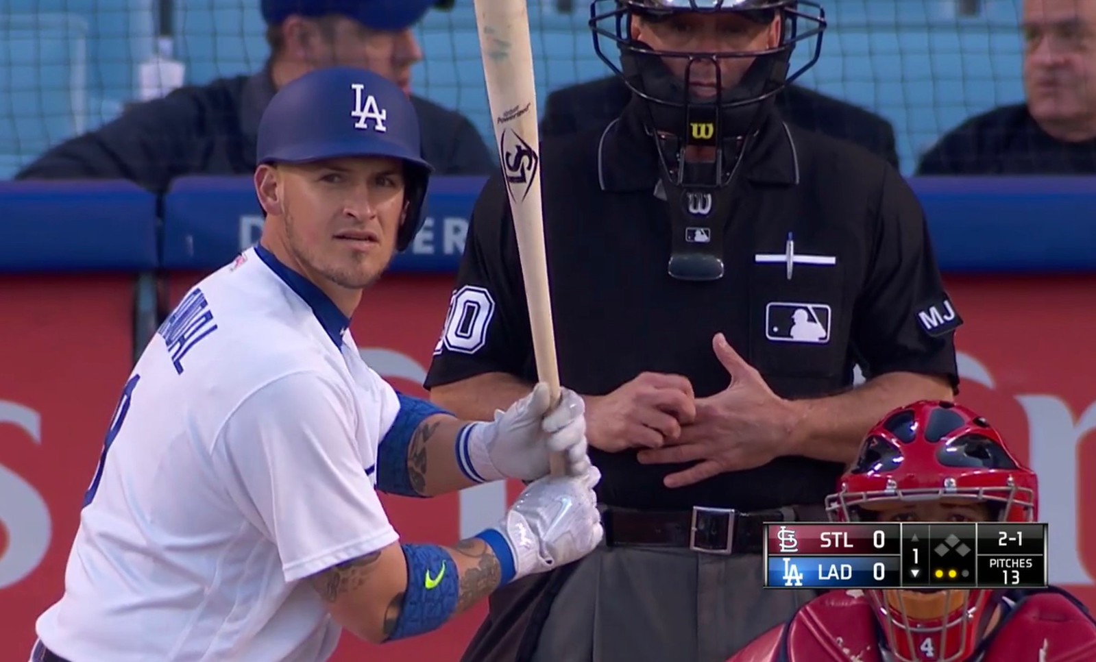
Funny moment in last night’s Cardinals/Dodgers game, as L.A. catcher Yasmani Grandal stepped into the left-handed batter’s box during the bottom of the first while wearing a right-handed helmet.
Grandal is a switch-hitter, so he has two helmets. We’ve seen switch-hitters accidentally wear the wrong lid a few other times over the years, but this is the first instance I’m aware of from this season. Of course, one way to avoid this problem is to wear a double-flapped helmet, but there are very few double-flappers in the bigs these days. (By rule, all minor leaguers are double-flapped, but that’s another story for another day.)
Grandal grounded out to end the inning, and neither team’s broadcast crew noticed the helmet glitch while he was batting. But after the Dodgers came back from commercial, their play-by-play man — Joe Davis, I think — had this:
Yasmani Grandal accidentally wore the wrong helmet during his first at-bat 😂😂😂 pic.twitter.com/oxtT0stY7I
— TheRenderMLB (@TheRenderMLB) May 25, 2017
During Grandal’s next plate appearance, in the bottom of the fourth, Davis noted, “Yasmani’s got the right helmet this time!” and then moved on.
No mention of the incident from the Cardinals’ broadcasters. But hey, if the umpires didn’t notice, you can’t blame the broadcasters for missing it as well.
(My thanks to Ty Murphy, Tim Di Martino, and @The_Maddin for their contributions to this one.)
Click to enlarge
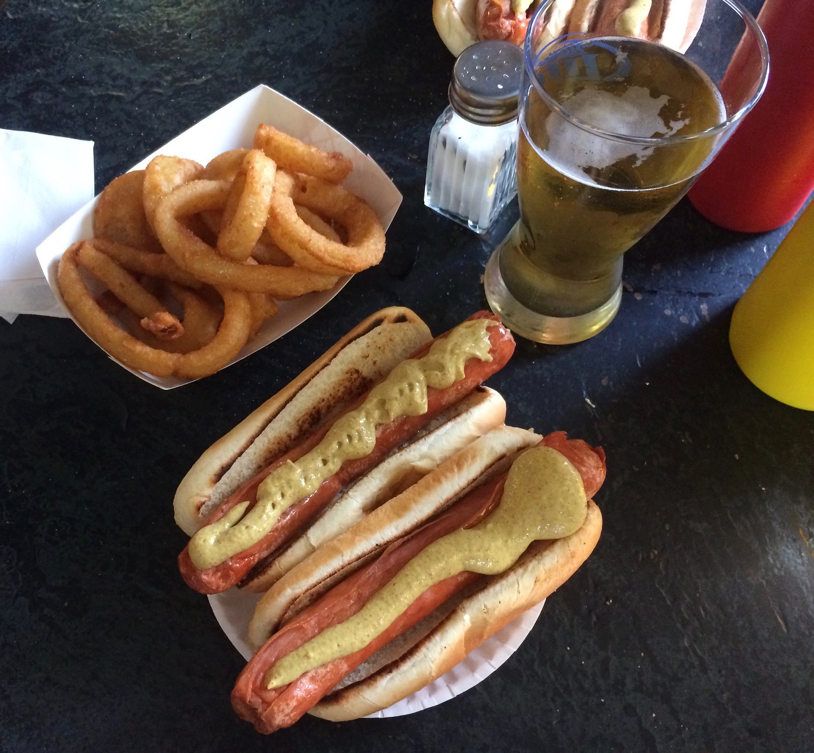
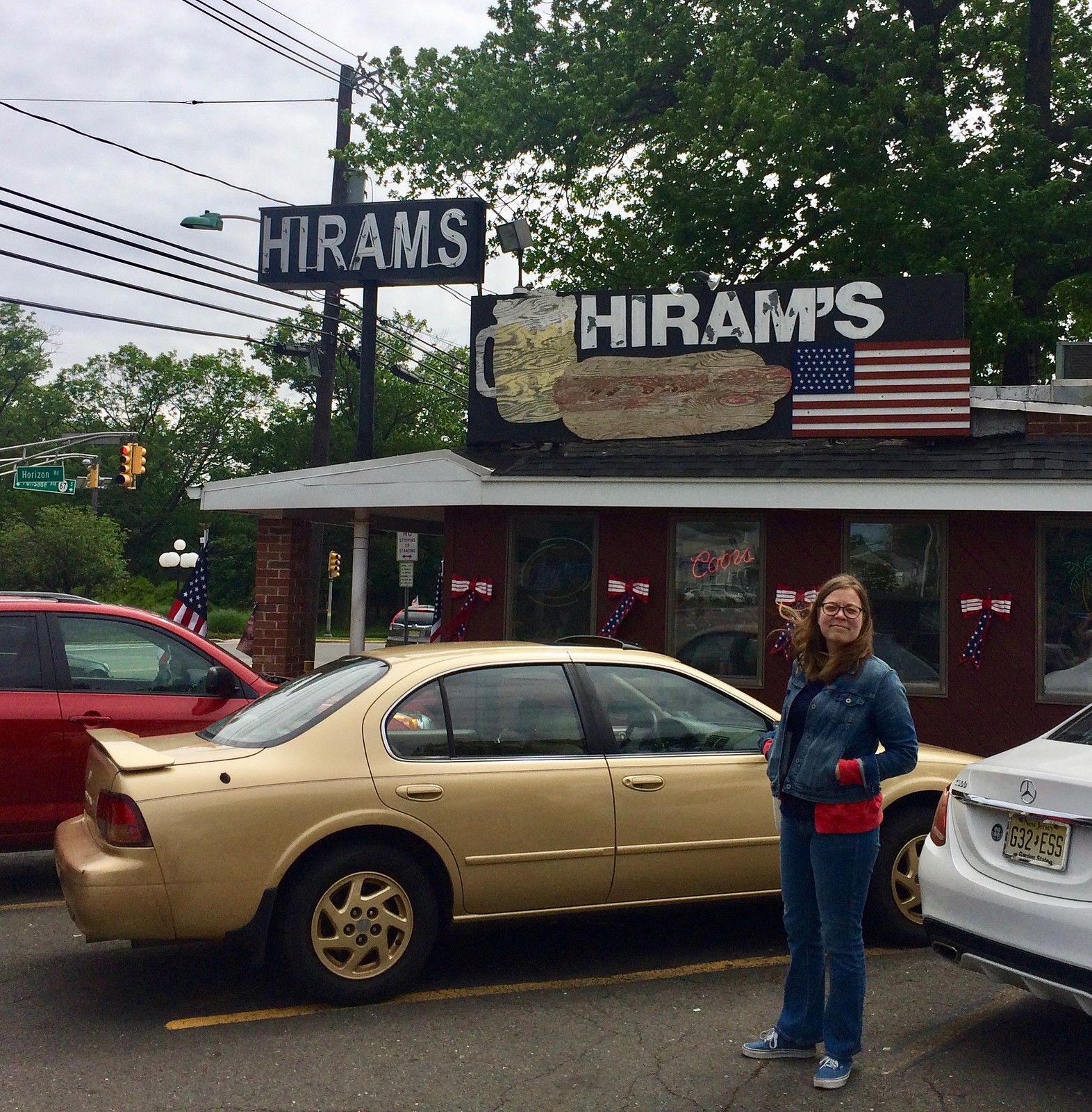
Rather ripped: I had some business to attend to yesterday in New Jersey, and along the way I stopped at Hiram’s Roadstand, a hot dog joint that I’d driven past many times over the years but had never stopped at. As you can see above, they delivered the goods, and then some.
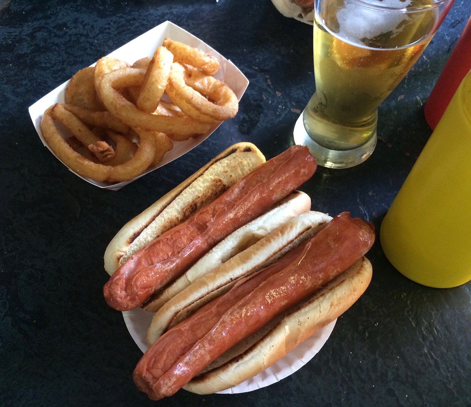
The franks at Hiram’s, like those at many doggeries in New Jersey and Connecticut, are deep-fried. In northern New Jersey this type of hot dog is known as a “ripper,” because the frank rips apart in the hot oil. You can see this more clearly in this photo that I took before I added the mustard:
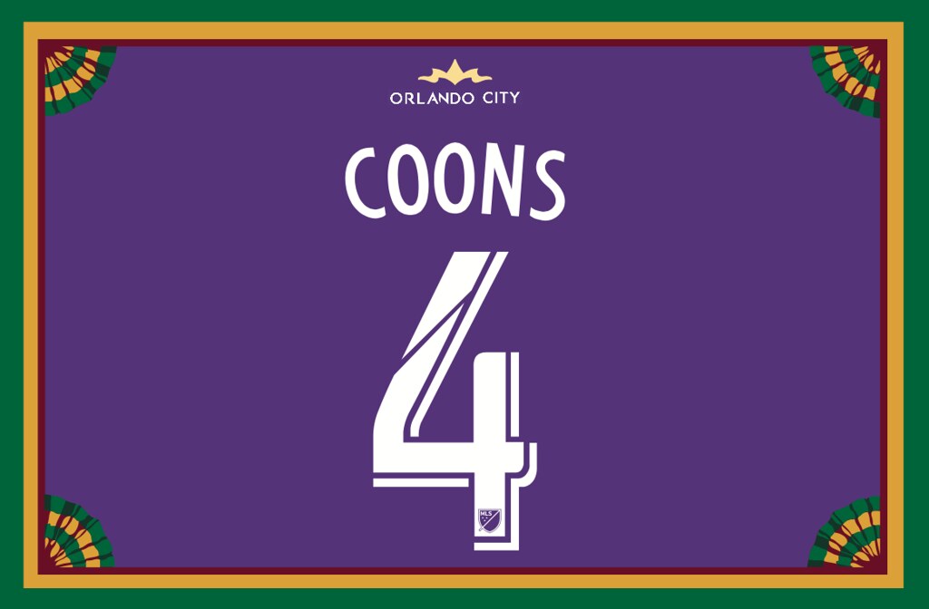
Membership update: Seven new designs — all nauseatingly purple — have been added to the membership card gallery (including Kyle Coons’s Orlando City SC treatment, shown at right; click to enlarge if you want to see the fine details). The printed/laminated versions of those designs will mail out shortly. We’ll continue to plow our way through all the Purple Amnesty Day orders over the next week or so.
Thanks to these latest additions, the membership gallery now has over 1,800 designs. Amazing.
Remember, a Uni Watch membership card now entitles you to 15% off of any of the merchandise in our Teespring shop (if you’re an existing member and would like to have the discount code, email me). As always, you can sign up for your own custom-designed card here, you can see all the cards we’ve designed so far here, and you can see how we produce the cards here.
The Ticker
By Mike Chamernik

Baseball News: Indians OF Daniel Robertson normally wears high-cuffed pants, but yesterday he added stirrups to his look (from Robert Hayes). … New uniforms for Boise State (from Evan Olson). … The Biloxi Shuckers will wear pink jerseys on June 2 (from Zachary Loesl). … Florida State and Notre Dame went garnet-vs.-green yesterday in the ACC Tournament opener (from Josh Sandin). … Todd Bohnenkamp has a preschooler-sized MLB logo cap that he’s had since he was a kid. The hat is from the mid-1970s, and all the logos are rendered in blue and red. … Willie Stargell’s children are unhappy with his widow’s decision to sell off his memorabilia (from Jerry Wolper).

![]()
Pro and College Football News: New white helmets for the Toronto Argonauts (from Phil). … Eagles QB Carson Wentz is one of the first NFL players to wear a Vicis Zero1 helmet, which is designed to reduce head trauma. The league approved the helmets for this season (from Chris Cruz). … The Omaha Beef of the Champions Indoor Football pretty much wear the wildest uniforms imaginable. … Jon Solomonson spotted a bizarre Falcons logo on an old gumball helmet on eBay. … Bartell Drugs had excellent NFL posters 45 years ago. … Wisconsin’s Camp Randall Stadium turns 100 this year, so each Badgers home game will have its own retro-themed ticket design (from Dave Balke).

Hockey News: Here’s what the Stanley Cup Final patch looks like on the Predators’ jerseys. … Yesterday we noted that Jack Lynch of the Capitals wore a lacrosse helmet back in 1975. David Holland found another photo. By the way, I didn’t know that Louisville Slugger used to make hockey sticks.

NBA News: The Cavs still need one more win to defeat Boston, but Dick’s Sporting Goods jumped the gun and started advertising Cavaliers Eastern Conference champions and NBA Finals gear (from Chris Spisak). … Here’s a ranking of the five best Suns uniforms of all time (from Phil). … A graphic designer created a Charlotte Hornets football uniform concept. The honeycomb pattern stripes are a nice touch (from Andrew Cosentino).

Grab Bag: Here’s a look at the Seattle Sounders’ MLS Cup rings (from @pleatedfront). … All the cars in this weekend’s Indy 500 IndyCar race and Coca Cola 600 NASCAR race will have a #CheckIt4Andretti decal, meant to raise awareness for colonoscopies after racing legend John Andretti was recently diagnosed with stage 4 colon cancer (from Kevin Tamosaitis). … New uniforms for USA Rugby (from Tim Dunn). … The upcoming Indigenous Round in Aussie rules football celebrates the contributions of Aboriginal and Torres Strait Island people to the sport. This year is the 50th anniversary of a 1967 referendum where Australians largely voted in favor of changes to the constitution, which up until then had discriminated against Aboriginal people. Teams will wear uniforms designed by indigenous artists, and 10 players will change their uni numbers to either 50 or 67 (from James MacNeil and Chris Bamford). … Sports memorabilia collector Joel Platt is looking to sell his one million-piece collection, which may be worth as much as $250 million. Among the items in the set are Jim Brown’s NFL retirement letter, Cassius Clay’s Olympic jacket, and the beanball that killed Ray Chapman (from Cary O’Reilly). … Irish boxer Mick Conlan has been training in a Republic of Ireland soccer jersey (from @teddyice13). … Henry County, Va., has a new logo for the 70th year of Martinsville Speedway. … New logo for the Little Italy Historic District in Rochester, N.Y. … New volleyball uniforms for the Serbian women’s team, the Japanese men’s team, and Corinthians São Paulo. Also, the Estonian volleyball mascot has a FIVB volleyball as his nose (all that from Jeremy Brahm).
When l was a kid and lived up in north Jersey, my dad used to take me to Callahan’s in Fort Lee…those were awesome deep fried hot dogs. I can remember Callahan’s had a store in Toms River about 20 years ago…but they just didn’t taste the same when l was a kid…unlike White Castle hamburgers…
Walter’s in Mamaroneck, NY. But it is not named after me, in spite of what my parents told me.
A bit late to the party, but came to say the same thing re: Callahan’s (and its superiority to Hiram’s, though I suppose since one no longer exists my assessment may be incorrect). My dad had season tickets to Seton Hall basketball when they played up at the “I Still Call It The Brendan Byrne” Arena, and we would drive from our house in Hunterdon County past the arena up to Fort Lee to hit Callahan’s before every game. (My father grew up in Jersey City.) We went up for years and I have many fond memories of having those dogs with a Yoohoo.
Last September a switch-hitter wore the wrong helmet.
link
Ah, good one. I’ll adjust the text accordingly.
Regarding Boise State, I’m about to ask a very stupid (maybe it should be called a rhetorical) question and my alma mater (LSU) is also a prime offender of this. And the reason I think it’s stupid (or rhetorical) is because I think the answer is “Because they can.” But why in the hell does a team need more than one version of a uniform in the same color? I don’t understand the need for a solid white uniform and a version of pinstripes. And I really don’t understand the need for a cream set because cream is so close to white.
This rant is not to solely pick on Boise State. As I said, my alma mater wears a set of pinstriped uniforms just for midweek games, which I think is overkill. And a lot of schools do this. I think a gray set, white set, and a couple of colored tops is plenty for a season that lasts roughly 60 games, give or take a few for postseason play. If you want to throw back, then just throw back permanently. Throw in the fact that there are probably 25 schools at most (and that may be a generous estimate) that make money off college baseball, and it seems even more absurd.
Yeah, it seems that a lot of teams (especially college and minor league) can’t decide which look they like best, so they go with 5 or 6 different ones. “Do we want pinstripes, headspoon piping, or nothing? White or cream for the standard home? Blue or orange for the alternate? Block lettering, script, or arched wordmark? Which color cap do we want? Oh, I can’t decide! Let’s wear them all!”
Just pick a look! You can’t be all the teams. Just be you!
I’m guessing suppliers to these teams are pretty happy with the additional unis. And enough money is made to keep the practice going. Not getting my $$$.
By the way, did anyone else notice that the pinstripe pants have some dumb panel sewn in behind the knee… that interrupts the pinstripe pattern. I would say ‘way to go, Nike’, but it appears that nary a single company is capable or willing to produce a good baseball uniform these days.
I attend a lot of the University of Houston’s games and I don’t think I’ve seen the same uni combo twice. I like some of them well enough but it just strikes me as dumb.
On the bright side…a lot of the UH players favor stirrups.
I was packing for a trip overseas last night, and one of my usual chores is making a travel wallet, transferring essential stuff to a slim wallet and leaving unnecessary stuff like all those discount cards with two stamps behind in the overstuffed wallet I normally carry. Pretty easy exercise: ID, credit card, cash, medical cards make the switch; anything that won’t help me in an emergency stays home. (Library card stays behind, even though a Chicago library card did get me, absurdly, out of a bureaucratic jam once.) Anyway, there at the back of the stack of non-essential cards and photos and folded clippings were my Uni Watch membership cards. First one, from 2007, listed “Membership Level” on the front (“Wool Flannel,” which seems about right); the subsequent cards list “Member Since” in that spot. I couldn’t help but toss my most recent UW membership card – 2016 Purple Amnesty Day 2001 D-Backs home – into the travel wallet. You just never know who you’ll meet wandering the earth, and there are some bona fides a person needs to be prepared to prove.
I like this idea of a “travel wallet” — I’ll start doing that myself!
And of course I like what you’ve chosen to carry in your travel wallet even more. Thanks, Scott. Travel safe!
I question your definition of “non-essential” ;)
True story: Every couple of years, I get embarrassed by how stereotypically middle-aged-guy-thick my wallet has become with random crap stuffed inside, and I sort through and throw out most of what’s crammed in to the rear bill-pocket portion. (Design question: Why do so many wallets have two divided pockets for currency? The only time I’ve ever found it useful to divide my notes is when traveling with foreign and American currency, and most foreign notes don’t really fit into wallets designed for American bills anyway.) Mostly half-completed shop discount cards, newspaper clippings I’ve forgotten the reason for saving, clever fortune-cookie fortunes, and so forth. Used to be, the only survivors from the periodic purge that would make it back into my wallet were my DC Metro card and my Uni Watch membership cards. Next time I purge, the survivors will be the Uni Watch membership cards and my curling club entry keycard.
You know, the important stuff.
FWIW, I liked having two compartments in my wallet to divide “my money” and “not my money,” as in “I owe my friend a 20.”
Kind of moot now, with Venmo.
I have a travel wallet myself, since we take regular trips to the UK. It’s slightly taller, since UK currency doesn’t fit in my American wallet, and keep things like my London Oyster card and National Rail card. Never considered having one for the US, but it’s a great idea.
re: NBA finals… i was at Disney World yesterday and they had an ABC ad for NBA finals add that featured Lebron and Steph Curry.. so DSG is not the only one jumping the gun on this
Those ads were printed back in November.
That exterior shot of Hiram’s shows a painted flag on the sign with an arrangement of 50 stars I’ve never before seen in the canton: 6 rows of 7 stars, each offset left or right from the row above or below it, above 1 row of 8 stars. (The normal arrangement is 5 rows of 6 stars alternating with 4 rows of 5 stars.) I’d love to know what went into the choice to paint the flag that way. Presumably it involved a desire to get all 50 stars on there, but did not involve familiarity with, or the chance to look at, a normal flag at the time the sign was painted. In any event, the odd, almost accidental-looking flag, gives the sign terrific character. I’d stop for a dog just on account of appreciating the flag alone!
Is it possible that the sign was originally painted in the year (July ’59-July ’60) that there was a 49-star flag? And that upon Hawaii’s addition, rather than starting over with the new configuration, they just added a star to the bottom right corner? Looks like that to me.
(Good catch, btw.)
Possible – the left/right alternation matches the official 49-star pattern, except for the bottom line with the eighth star. A couple of factors make me doubt this hypothesis: The bottom line appears cramped to me, as though all eight stars were squeezed in, not as if one extra star was added later. And the 49-star flag is basically an American urban myth. Although it was technically the official national flag for a year, it was never flown by most government institutions; very few were manufactured; and of those manufactured, very few were sold outside of Alaska. The union had 50 states for eleven of the twelve months that the 49-star flag was technically official, and so most Americans and government institutions switched straight from the 8×6 48-star flag to the offset 9-row 50-star flag. If the sign was painted in 1959 to show 49 stars, it would be a rare and valuable vexilological artifact!
Cool! As a Canadian born in the 1970s it’s well outside my area of expertise. Just noticed the similarity to the 49-star, but with an “extra.” But your points make a lot of sense. Thanks for the further background!
Anyone who doesn’t know Louisville Slugger used to make hockey sticks hasn’t watched “Slap Shot” closely enough. Goalie Denis Lemieux wields a Louisville Slugger goal stick that has “Slugger” in big letters along the paddle.
Louisville Slugger made hockey sticks for years, just over the Michigan/Ontario border in Wallaceburg, ON. They parlayed that business into a complete line of hockey equipment, notably goalie gear. When they started branding everything but the Slugger wood bats as Tournament Players Series, or TPS, the hockey equipment was included.
Eventually Louisville spun it off to their factory management, who sold it to Sher-Wood a few years back.
The Toronto Argonauts would benefit from making their logo on their white helmets the same size as the logo on their primary dark blue helmets.
link
With the logo being a circle, it is a slight bit too large on the white helmets to have it centered properly.
The farther back placement of the logo on this type of helmet model reminds me of other Canadian football teams in the past which had strangely placed logos on the helmet. Such as the 1980s Hamilton Tiger-Cats with the leaping tiger hovering just over the earhole:
link
Or the University of Ottawa Gee-Gees with the horse head logo placed far back:
link
Holy mackerel…I have never seen a shot of the Ti-Cats with the helmet decal sitting so low. Thanks for sharing!
Also, are the Argos only wearing their new white lids with the white away unis, or as their full time helmet?
I would think this would remain as the primary away helmet like it was last year. However, they have not provided details. Can’t see them ditching the blue helmet as the primary home. We will wait and see.
Yikes, I can’t believe I live that close to such a terrible uniform…. omaha beef… I’m gonna hop in the car and go put a stop to this….
Todd Bohnenkamp’s cap might be the best thing ever!
It’s neat to see the old logos, but can’t understand why some are missing. Obviously, it was sold between 1971 and 1976 (the Rangers began play in 71, and there’s no Jays or Mariners logos), but they’re missing three of the four 1969 expansion teams (Brewers, Expos, and Padres).
LOVE Hirams – my boss introduced me to that joint on a road trip to visit a customer right down the road (we’re in CT) and the dogs are excellent.
on the same note – being from CT Ive driven by Blackies a number of times without ever realizing it was a hot dog stand. I will now make it a point to stop in next time I am remotely close to it, so thanks!
You made me homesick with the Hiram’s pics. I always went to Callahan’s which was next store. Palisades Amusement Park was right around the bend. And just a little bit beyond that was Manny’s Baseball Land.
I’ve heard many good things about Callahan’s. Wish I could have tried it when it was still operating.
We were a Callahan’s family, we never went to Hiram’s even though they were 100 ft from each other on 9W. Local scuttlebutt about it’s demise suggested the owner wanted to retire and none of his kids wanted to take over the business so he sold the locations to real estate developers.
A family member has revived it though, now in Norwood, NJ, as well as a food truck. Had a chance to sample when visiting home, tasted like childhood to me.
link
Here’s an interesting tidbit from an interview with Mark Greczmiel, who produced the recent documentary on the defunct NHL California Golden Seals (my team!):
“One of Finley’s other innovations was to put the players names on the backs of their jerseys. He received push back from some NHL owners, who feared that would cut into their ticket sales, and they wouldn’t let the Seals wear those jerseys at their arenas so the team had to travel with two sets uniforms — one with the names, and one without.”
Full interview here:
link
-Jet
My understanding was not that it would cut into ticket sales, but program sales; don’t need a program if the players’ names are right there for all to see, amirite?
Wow. Whoever ranked those Suns jersey couldn’t have been more wrong with just about every choice. Any black Suns jersey is not a good Suns jersey. Same with gray with sleeves.
The set of uniforms with the orbit around the front player number was potentially the ugliest uniform in the history of the NBA. Dull purple and grey suits are not befitting a team called the Suns. I like their new uniforms, but not as much as the expansion year suits, or the Paul Westphal uniforms.
Seems like the Suns have had an innumerable variety of uniforms since their inception.
It would be interesting to see a list of NBA teams ranked by the number of different uniforms worn.
Is it called a “right-handed helmet”? That doesn’t look/sound correct.
Noticed last night, Nori Aoki of the Astros wears a double-flapped helmet. Kind of odd to see in an MLB game.
A history of the MLB double-flapper might be interesting, as well as the reasons for its current rarity. I recall when the ’90s Braves had two line-up regulars who favored that helmet style (Terry Pendleton and Mark Lemke).
Willie McGee and Vince Coleman of the 80s Cardinals wore double-flappers.
Didn’t Otis Nixon rock the double-flap too?
Noticed that all the faces were blurred out in the Notre Dame FSU screenshot. Is that per NCAA rules now concerning player likenesses?
Thought of another shirt in the “I’m calling it” series because I’m old.
“I’m still calling it a pound sign.”
Can I ask about hot dogs? I’ve never been north of Denver or east of Pensacola. The hot dog places in Texas are few and far between. You’ll see food trucks that pretty much taste like store bought and frankly, who is gonna get a hot dog from a truck when there is a burrito truck.
So my question is, for someone who’s had dogs here and there is what’s the difference?
What’s the difference between what and what?
If you’re asking about regional hot dog styles, there are so many. The differences can include:
– What kind of meat the hot dog is made from (beef, pork, a mix, etc.), and what sorts of spices are added to the grind.
– Skinless vs. natural casing.
– How the hot dog is cooked (grilled, griddled, deep-fried, steamed, etc).
– The length of the hot dog (they’re shorter in Rhode Island, for example, so people tend to order more of them in one sitting).
– Toppings (a near-endless array of options, depending on the regional scene).
– The kind of bun (top-split, side-split, poppyseed, etc).
And so on. The sky’s the limit!
Also, they are not a sandwich. :)
I ALMOST said that but I didn’t want to get into a whole “thing”. I guess I was just mainly wanting to know about the dog itself. Maybe the quality is better for y’all? I guess like Paul said maybe it’s in the spices. The pictures look awesome and not like anything I can get here. Thanks y’all.
I still haven’t quite figured out “Texas Hots”…which they don’t have in Texas.
It’s crazy seeing/reading about all these hot dog joints out east. Here in Wisconsin, you find people pounding a brat before a dog.
I really do like the new USA Rugby Kit. Back to a much more traditional look.
“This year is the 50th anniversary of a 1967 referendum where Australians largely voted in favor of changes to the constitution which discriminated against Aboriginal people.”
Did the changes cause the discrimination or undo it?
Good spot. Text now adjusted.
Check out this pic of two Bruins in the late 50’s with make-shift helmets/facemasks to protect their broken jaws!!
link
-Jet
Sorry for not identifying the players above, they are Doug Mohns and Bronco Horvath of the Boston Bruins…
-Jet
13 NHL teams are making uniform changes for 2017-18. Thankfully the Flames are on the list, the original version of their current uniforms looked okay when they were introduced in 2003-04, but the Reebok change made them and absolute mess. It would be nice if they just went back to their 80’s uniforms for both white and red permanently.
link
Easy there. If you read the piece, it says most of the changes are likely to be minor, and some of the “changes” may simply involve an alternate jersey being redesignated as a primary.
Yes, most of the uniform changes will be minor, such as the Oilers moving to orange at home (and apparently changing royal blue to navy), and teams like Boston and Florida already have decent uniforms and will likely be making minor changes. However, as a Flames fan I’m very hopeful that this will be a major overhaul, the current uniforms are a massive mess. From the striping to the shoulder flags (the story incorrectly identifies when and why the Flames introduced the flag patches) the uniform needs a major update.
And there’s one other reason why this is likely to big a big overhaul for the Flames (hopefully) when you watch a Flames’ home game the building is full of the current jersey. A new uniform set would equal more money for the team in merchandise sales. So greed may finally right the wrong that the Flames current uniforms are.
when you watch a Flames’ home game the building is full of the current jersey.
But isn’t that the case with, you know, just about every other team as well?
18 of 30 teams have made significant uniform changes since Reebok was introduced in 07-08, of the remaining 12 you have a majority that have iconic jerseys that will never really change (I include New Jersey in this because their uniforms have remained consistent for their entire existence outside of switching green to black). The Flames have had a bad uniform set that has been unchanged since then, and aside from the adventures in striping and flags, hasn’t changed much since 03-04. So they’re due for a major overhaul. And having a jersey filled with the current bad design indicates that the market is probably tapped on the current set, and will lead to very good revenue on a new set. But I’m guessing you don’t care about that, you just wanted to be snarky.
I’m guessing you don’t care about that, you just wanted to be snarky.
I wasn’t being snarky at all.
You suggested a specific reason for why the Flames might be getting a makeover.
I pointed out that your specific reason could actually apply to every single team, not just to the Flames, which means it isn’t a very strong argument. I phrased it as a question because I was wondering if I was missing something. Turns out I wasn’t.
I agree with you that they could really use a makeover. And hey, maybe they’ll get one. Or maybe not. You’re clearly *hoping* for a makeover, which is fine, but you can’t reverse-engineer a reason for a makeover by saying, “Everyone in the arena has already bought the current jerseys, so that’ll make them change.” If it was that simple, *every* team would be getting a makeover.
Personally, I hope you get your wish! But I also hope to maintain a high standard of rational debate on this website. When something is posted here that doesn’t hold up to rational scrutiny, it’s not uncommon for someone (often me) to say, “Wait a second, that doesn’t hold up to rational scrutiny.” That’s all. Carry on!
Damn, I want a dog with mustard on it now… but I prefer Plochman’s Mild Yellow.