Click to enlarge
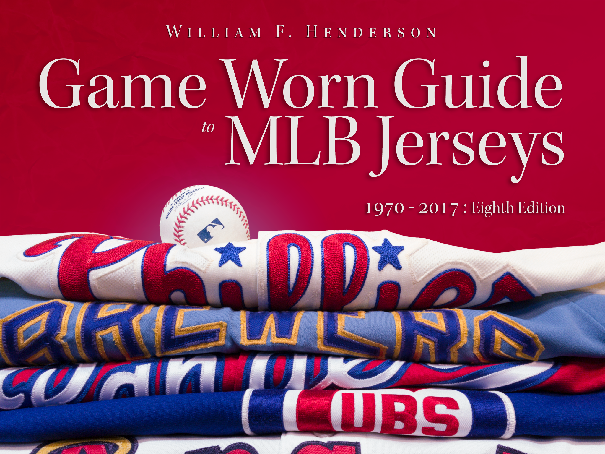
It’s always a great day when Bill Henderson unleashes a new edition of his awesome MLB jersey guide. Today is one of those days.
I’ll have more to say about the new edition of Bill’s guide soon — probably next week. For now, I’ll just say this: If you care about MLB uniforms, the guide is absolutely essential. I refer to it almost daily — not just for work, but because it’s fun and fascinating. It isn’t perfect (only covers the polyester era, no coverage of caps/pants/socks), but it’s absolutely encyclopedic in its coverage of post-1970 jerseys, with detailed information on patches, NOB styles, makers’ marks, jock tags, throwbacks, one-off designs, prototypes, and lot more. Although Bill conceived of it as a guide for collectors, it’s really an invaluable reference for anyone who cares about MLB uniforms.
The guide comes as a downloadable PDF, so you can start using it right away. Even better, Bill is generously offering a 25% discount to Uni Watch readers — use the code “LogoCreep” at checkout, which knocks the price down to $30. Trust me, that’s a bargain. Get it here.
Click to enlarge
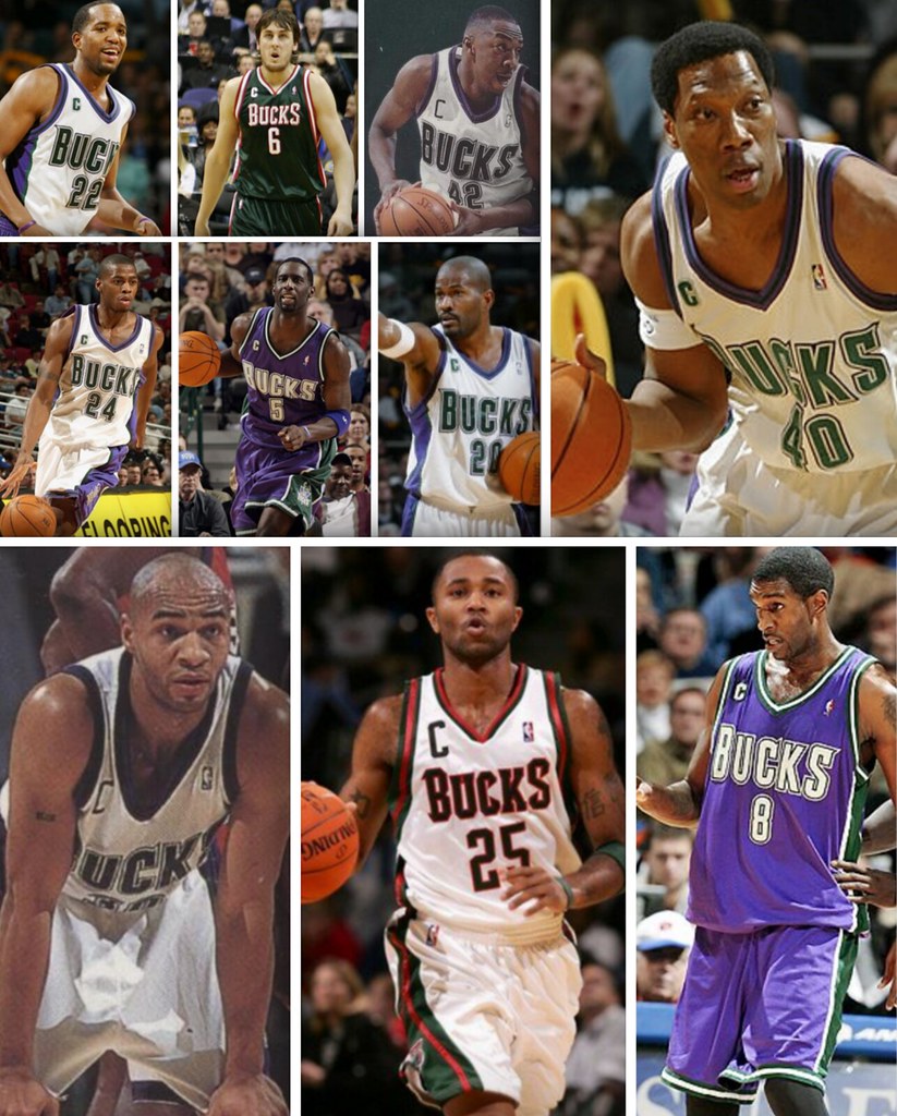
Friday Flashback: I have a Friday Flashback piece today that looks back at NBA players who’ve worn the captain’s “C” (including the 10 players who’ve done so for the Bucks, by far the most of any team). Check it out here.
Click to enlarge
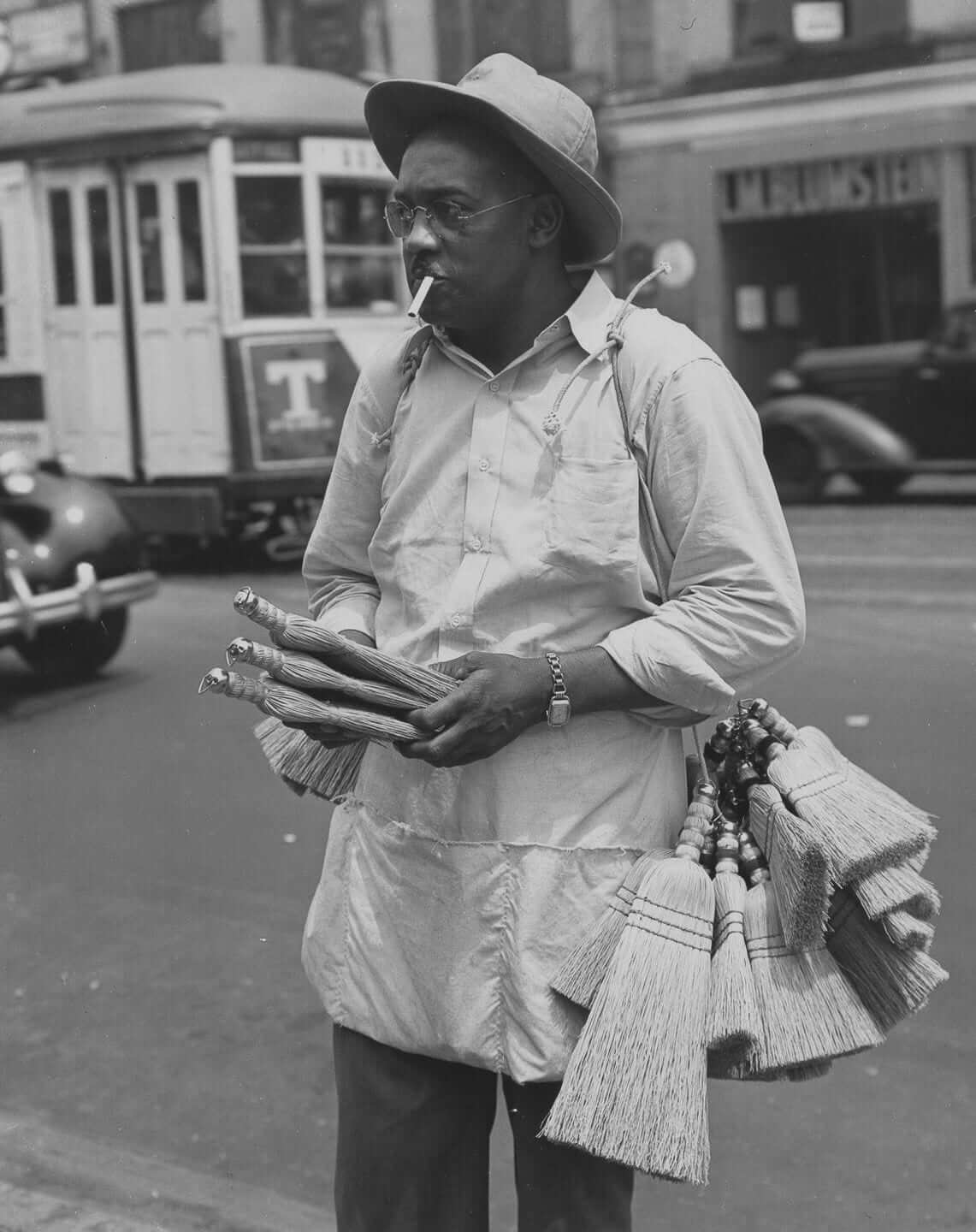
Best click you’ll make all day: There are dozens of “photos of old New York” slideshows out there, but I’ve rarely seen any as good as this one, featuring lots of spectacularly good shots taken by photographer Todd Webb in the 1940s (including the shot of a whisk broom peddler shown above). Sooooo much great stuff, including beautiful business storefronts, a peanut vendor, a “fat men’s shop” advertisement, a window sign that says, “Tailor is dead, but business will be carried on as usual by son,” and a lot more.
If you like these shots and are in the NYC area, there’s a new exhibit of Webb’s work at the Museum of the City of New York. I plan to check it out soon.
(Big thanks to Patrick O’Neill for the tip.)

Culinary Corner: Tomorrow is the first Saturday of May, which means it’s time for the Kentucky Derby. And that means I’ll be making the dish I always make for the Derby: a derby pie.
Technically speaking, you’re not supposed to use the term “derby pie,” because that’s a registered trademark of some annoying people in Kentucky who insist that they own the name and love to send their lawyers after anyone who thinks otherwise. (They even sued their own chocolate chip supplier, Nestlé, for printing a “Tollhouse Derby Pie” recipe on the chip package.) So you’ll often see wink-wink names like Triple Crown pie, race day pie, winner’s circle pie, and so on. But screw all of that — derby pie belongs to the people. It’s also really easy to make. Here’s how to do it:
If you know how to make pie crust, make some dough and use it to line a 9-inch pie pan; if you don’t know how or just can’t be bothered, get yourself a frozen 9-inch pie shell.
Set your oven to 350 degrees. While it’s heating up, get a big mixing bowl and beat together four eggs, a cup of light corn syrup, 3/4 cup of light brown sugar, and 1/3 cup of melted butter. Then add 3 tablespoons of decent bourbon (or maybe a smidge more than that, if you’re so inclined), a tablespoon of vanilla extract, a tablespoon of flour, 6 ounces of chocolate chips, and a cup of chopped walnuts.
Mix all of that together, pour it into the pie dough or frozen shell, and pop it into the oven for an hour. It’ll puff up high like a soufflé, but it’ll settle back down while it cools, which you should allow it to do for at least another hour.
It’s standard to serve each slice with a dollop of whipped cream, although I frankly think that’s unnecessary — the pie is rich enough on its own. Less traditional and even less necessary, but nonetheless delicious: this bourbon sauce, which is pretty much the bomb.
I assure you there won’t be any leftovers.
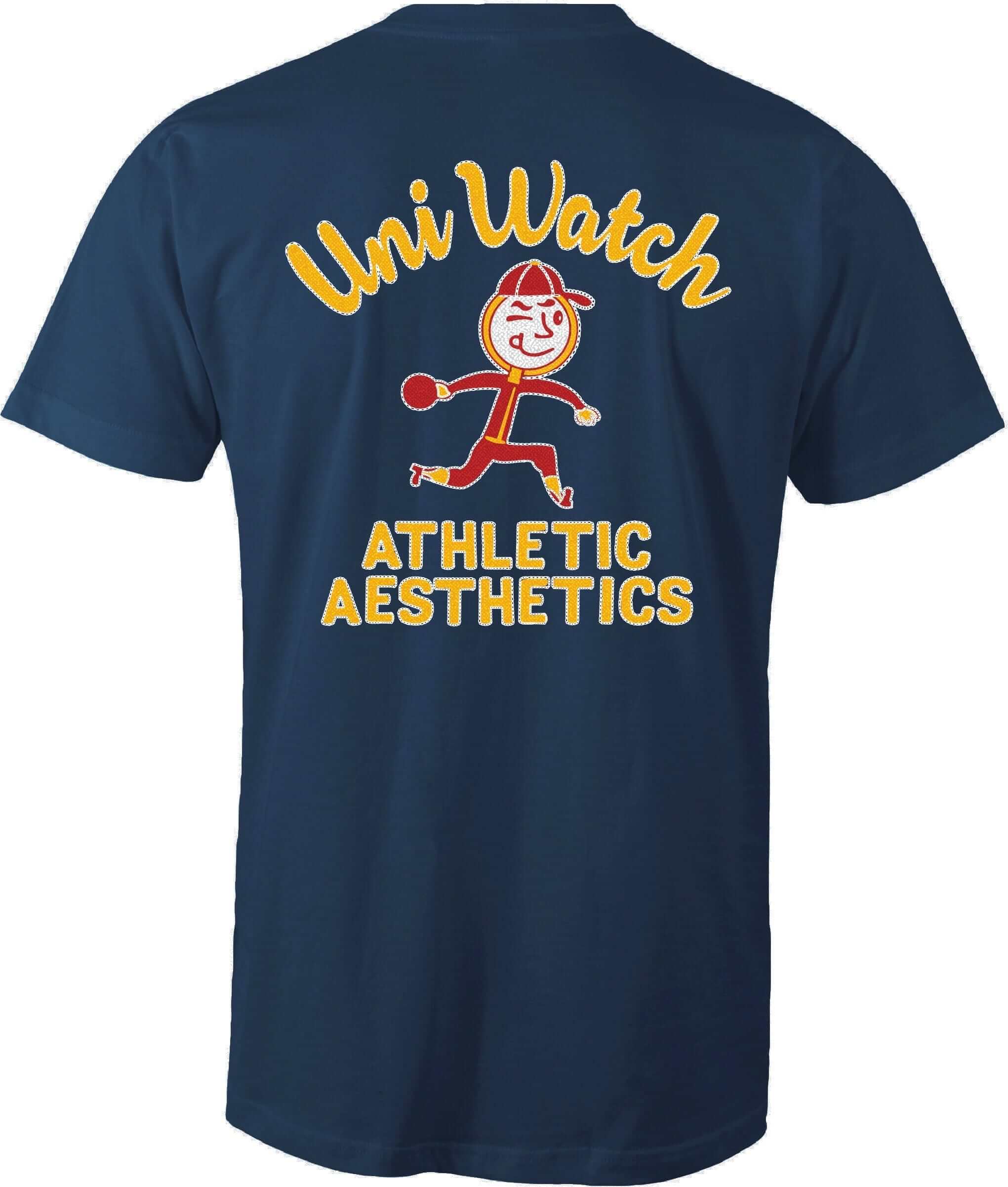
Merch update: My thanks to everyone who ordered the bowling shirt tee. We sold 97 of them, the highest total for any of our Artist’s Series designs so far. They should start shipping next week.
Meanwhile:
• Designer Bryan Molloy and I have something very special planned for Purple Amnesty Day, which is coming up on May 17. I hope to be able to give you a sneak peek before then. As always, the shirt we’re offering will only be available for 24 hours. More details soon.
• Yesterday I saw samples of our next set of StripeRite sock designs, and they look really good. We’re at the mercy of the mill regarding the time frame, but we hope to have this batch available by the end of June. We will not be doing pre-orders this time — we’ll just take orders when the socks are in stock. I’ll provide a sneak peek soon (probably next week) and keep you posted. Meanwhile, the first two batches are still available here and here.
• In case you missed it earlier this week, a bunch of our old T-shirt designs, along with some cool coffee mugs and other items, are now available in this online shop. Most of the shirts come in a range of colors and styles (long-sleeved, hoodies, etc.), and almost all of the mugs come with a lot of color options, so don’t be fooled by the thumbnail photos ”” click around and explore to see the full range of possibilities.
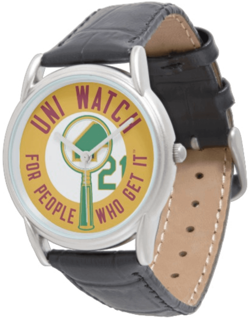
• I had previously made a Uni Watch wristwatch available (mainly because I think it’s fun to say, “Uni Watch watch”), but the hands on the watch face were kind of stubby and over-stylized. I’m happy to report that there’s now a new version with more conventional hands, and you can also get it with our caricature logo.
My thanks, as always, for your consideration.
The Ticker
By Paul

’Skins Watch: Back in the 1920s, there was a high school in Renton, Wash., whose basketball team included a Native American player named Henry Moses. Rival schools teased the team and derisively called them the Indians — so the school, in a show of support for Henry, officially adopted that name for its teams. The team name has become increasingly loaded over the years, especially as the school has used various cartoon mascots. At one point, back in the 1970s, there was some talk of changing the team name, but Henry’s widow requested that they keep it. It’s a really interesting, complicated story, nicely told in this radio report (big thanks to Markus Kamp).

Baseball News: Looks like Yankees P CC Sabathia was wearing no-show socks two nights ago (good spot by Scott Morell). … I already have a copy of the 2001 MLB Style Guide. But if you want one, there’s a copy available for sale on eBay. The same seller also has a 1997 World Series style guide (don’t have, don’t want), a 1996 spring training style guide (don’t have, don’t want), and, most intriguingly, a 1999 MLB mascot style guide, which I’d totally buy if the price were more reasonable. Here’s hoping these all end up in the hands of Uni Watch readers (thanks to @DisMagicBands for the tip). … The Yankees will be retiring Derek Jeter’s number on Mother’s Day, which means they’ll be wearing a pink-trimmed cap with a Jeter side patch (from Steven Hom). … Yesterday’s Ticker included a mention of the Yankees using little uni-number stickers on their underbrims. That prompted commenter “Random Reader” to say that the Mets had been doing the same thing. I expressed surprise, because I watch a lot of Mets games and hadn’t noticed this, but sure enough, it looks like they are (big thanks to Steve Dodell and Paul Deaver).

NFL News: A wrestling club in Georgia has adopted the Patriots’ Flying Elvis logo (from Austin Gillis). … Dog bites man: Nike’s latest football cleat features neon trim and an embarrassing name. … Here are the uni number assignments for the Bears’ and Ravens’ draftees (from Rahul Chatterjee and Will Shoken, respectively). … You can see some of the Pats’ new numbers, too (from Robert Hayes).
College Football News: A long time ago — maybe in the ’60s? — a Florida State player created a makeshift helmet by bolting a facemask to his motorcycle helmet, which he spray-painted gold (rare non-UNC item from James Gilbert).

Hockey News: Buried within this article is the following story: ” When [the Devils’ colors] went from red and green to red and black, in July, on the cement floor at the Meadowlands, Lou Lamoriello put the prototype jerseys on some of the office staff and some of his lieutenants went up on the second tier. He had them walk around on the cement floor. He wanted to see whether they could read them” (from Jerry Wolper). … If you heard any rumors about the Norfolk Admirals changing their name, those rumors are false (thanks, Mike). … Check out Rangers C Oscar Lindberg wearing a postgame cap with his number, 24, inside the outline of the Stanley Cup (from Alan Kreit).

College Hoops News: Pieces of the old New Mexico State parquet court are being auctioned off tomorrow, with proceeds going to benefit the school’s men’s basketball and volleyball teams (from Kenny Ocker).

Soccer News: The Champions League could end up with two teams with Red Bull-advertised jerseys. … New uniforms for Celtic FC (from Ed Å»elaski”).

Grab Bag: Here’s an interview with a photographer who’s been documenting old drive-in movie theaters — some active, some abandoned. Great stuff. … One of the all-time great style guides, the 1977 EPA Graphic Standards Manual, is being reissued. … Did you know there’s a website devoted to tracking player injuries in the various sports? There is! … Clickbait: Here’s a TV station’s list of the 10 worst uniforms in Arizona sports history (from Mark Firkus). … Some amazing posters and graphics from the Russian revolution in this blog post. Don’t miss the little slideshow at the bottom — tremendous stuff. … Here’s a look at McDonald’s uniforms through the years (from Bud Hardcastle). … “Fernando Alonso, McLaren’s F1 driver who will be running this year in the Indy 500, changed his helmet for his Indy test on Wednesday, from this to this,” says Omar Jalife. … New logo for the upcoming Aquaman movie. … The World Trade Organization has upheld Australia’s right to mandate that tobacco products be packaged without any logos or branding. … Adidas shares hit a record high yesterday (thanks, Brinke). … Football Canada — that’s the country’s national governing body of amateur football — has a new logo. … The Arizona Board of Regents is suing a company that makes Arizona State-bashing apparel. … Caps without the New Era logo creep continue to appear here and there in various dugouts (from Ryan Wetstein). … South Korean political rallies feature dancing teens wearing varsity jackets. Sure sounds better than our political scene! (From @GKG_77.)
Happy Cinco de Mayo to all who are celebrating today.
Dancing teens wearing varsity jackets look great; not titillating at all! Perhaps this is something the American political scene needs to get younger voters involved. That Knockoff Smurf though.
As for the Derek Jeter number retirement ceremony I think I can shine some light on it. I have it on good authority that Jeter was given several different dates from the Yankees to choose from for his ceremony. Obviously he chose May 14th which is Mother’s Day this year. Now I have no idea if Jeter was even aware or cares that the Yankees will be wearing pink accented uniforms on that day. We can speculate as to why Jeter chose May 14th. Jeter is close with his parents so maybe he wanted to his moms day to coincide with his special day? His wife is pregnant so she may not want to travel later in the year? He has a full personal calendar and this was the best day for him? We may never know but like Paul I find it interesting that whenever we look back at his ceremony we’ll be seeing Yankees wearing pink.
Im really hoping that the Yanks dont wear pink for this ceremony.
On the two Red Bull teams, the newsworthy note is not that two teams with the same shirt sponsor might make the same competition, it’s that both clubs are owned by Red Bull, and the complications that stem from that.
Teams with the same shirt sponsor regularly compete in the Champions League, (e.g. PSG, Real Madrid, Arsenal all advertise Emirates airlines).
(a different Greg BTW)
There used to be a rule where two teams couldn’t have the same sponsor in the same game, about 10 years ago when Arsenal and Hamburg met in the Champions League while sponsored by Fly Emirates, the away team wore Dubai instead
link
link
There have been other examples (usually involving Opel)
You should go by “A Different Greg.” Hilarity may ensue.
I remember a post on this site a while back about that exact thing. Paul could you maybe link that in the comments?
The Friday Flashback is up:
link
Dude, it’s *Big* Baller Brand.
Actually, why did I even bother putting that in the Ticker? Now removed.
So is it the guide that is game worn or the jerseys?
Shhhhhhh. I’ve managed to avoid pointing that out to Bill for years now.
Proofreading:
“Here are the uni number assignments Bears’” missing a ‘for’
Fixed.
If you go to the Celtic online shop you can pre-order the new kit both with and without sponsor logo. Interesting
I wonder if it has to do with the nature of the sponsor (Dafabet)? I feel like I’ve heard in the past teams playing in European competition couldn’t wear their regular advertising due to a certain country’s ban on gambling-related advertising. I presume that would extend to fans wearing those jerseys there, as well?
Not to mention that some people may oppose the nature of the sponsor on moral grounds or whatever.
I know that Celtic sold a sponsor-free junior jersey when they were sponsored by a brewery. I’m making assumptions here, but that could be like what you’re saying. I’m curious as to the reasoning behind it, though I love that they do it. Wish I had a spare $100 sitting around to order one…
I think Celtic FC has offered shirts both with and without the sponsor for quite some time now. Not sure of the exact reason but they’re about the only team I’ve seen that does that.
Do old Bill Henderson Book customers get the update for free? Or is there an extra fee?
(Congrats, it’s clearly a labor of love…one day you’ll have a new Expos jersey to catalog…please no Nationals jokes.)
Bill’s site includes the following note:
Purchased an earlier edition?
You are entitled to an upgrade discount!
If you have not received an upgrade code via email, please email us at link.
Supply your name and the email address you likely used when you purchased your copy. We will find you in our database and reply with information on how to get the new edition.
Nice! Thanks for the heads-up. I bought the previous version, and I can get the new one for $19.99.
The visual of CC Sabathia cannot be undone.
Man, I thought that that 1997 Wrold Series guide was the 1990s-est thing ever…until I saw the 1996 Spring Training guide!
Big recommendation for Bill’s Jersey Guide…it’s just so fantastic and a total joy to page through.
Huh. I could have sworn CC Sabathia was wearing no field socks the other night.
I’m pretty sure today is Bill Henderson’s birthday too. So, if you’re reading this … Happy Birthday Bill!
Oh, wow — really? I’ve been emailing with him yesterday and today and didn’t even realize that!
That Fat Men’s shop is at 52nd and 3rd. I’m guessing that’s a block away from where Dee Dee Ramona “hung out”.
Like!
Oopsies.
Ramone not Ramona
Or dare I say… Dee Dee King.
Hip hop!
Speaking of NBA uniforms, some thought watching this year’s playoffs:
-The Utah Jazz uniforms are uncomfortably playing tricks on my mind. I have been told their uniforms are navy blue. With the green and yellow trim, they look like a dark purple to me. It must be the association with the original colour scheme which make me think they look like they are purple.
-The Houston Rockets should leave their BFBS at home during the playoffs. Red uniforms on the road only please. They do not look like the Houston Rockets to me wearing those black uniforms.
I just watched some Jazz video on ESPN. They look purple to me as well.
Re: Jeter and the pink uniforms. I wonder if there’s anyway the current Yankees (or at least involved in the ceremony) will wear regular pinstripes for the ceremony and change prior to the game.
Although not a Jeter or Yankees fan, I am a baseball enthusiast. That being said, the discussion about pink for Jeter’s number being retired brings a question to my mind. Does anyone out there really remember anything about number retirement days/ceremonies? While the number will be displayed at the ballpark for all to see, the day itself seems like something that will quickly be forgotten.
While your right that number retirement ceremonies aren’t well remembered, they are still a part of that team and that players lore and history. The Mickey Mantle number retirement ceremony is one that come to mind. Mickey being driven in a golf cart etc. I was at Don Mattinglys ceremony and remember it well. So yes, the actual ceremony isn’t always well remembered, it’s not like those days are forgotten. When we see a Jeter highlight reel years from now I bet we get a clip from the number retirement ceremony.
I’ll never forget Phil Rizzuto’s number retirement. They gave him a cow (or maybe just rented one for the event, I don’t recall), because of his “Holy cow!” catchphrase, and the cow kind of head-butted him and knocked him over!
There was a huge crowd — not just for Rizzuto, but because Tom Seaver was starting for the White Sox and was going for his 300th career win, so there were lots of Mets fans in attendance. (This was 1985, when the Mets were taking over the city.) Rizzuto even referenced Seaver in his pregame speech. I watched all of this on TV upstate, where I was between semesters at college.
Seaver threw a complete game and got his 300th win.
And Seaver would needle Scooter in the broadcast booth about that day for many years to come.
Now, what is this “complete game” of which you speak?
Oh, come on; the 1984 Arizona Wranglers uniforms were freakin’ awesome.
Thanks Paul, and to all who have sent me messages (and ordered too) today.
A quick story: When I was very small, my dad told me a story about a man who began cataloging snowflakes, photographing them by the thousands to prove that no two were alike. The thought of this task made my mind reel. Who on earth would devote their life to such a endless, hopeless, task?
Fast forward to 2017, and I am weekly spending hours scouring every baseball news photo I see wondering, “did they change the thickness of that neck trim this year? Is that patch slightly different than in 2016? What was the first date the Brewers started to wear that memorial patch? I must get photos of every special Mother’s Day Jersey!”
I have become the snowflake guy.
Two things I do everyday: check in to Uni Watch and Bill Henderson’s sites. When the two collide its a great day!
If not for the various vehicles on the street, that photo of the dude selling whisk brooms looks like it could have been taken last week.
Well, and also if not for the fact that nobody sells whisk brooms on the street.
I associate whisk brooms almost exclusively with baseball home plate umpires. Funny to think that people would just buy them from a street peddler.
Have a hunch that when woolen suits were standard dress of business men everywhere, lint and dirt were more troublesome than on today’s business-casual styles. Just a hunch.
Ah heck… here’s some additional minutia on the history of brooms. Did not know they were not always flat? link
Whisk brooms are the perfect size to leave on your coworker’s desk after their team has just been swept.
The Glenn Robinson/Ray Allen BUCKS jerseys are still a favorite. Would have loved to see the dominant color in the hunter green with less emphasis on purple.
The Bucks did look good in purple and green. Their 3rd jerseys back then had green as the dominant colour with purple as a trim colour:
link
My favourite all-time Bucks colour scheme is still the double green worn in the 80s. Forest green uniforms with lime green trim.
The announcer in CSN for the Cubs-Yankees game just said the Yankees have the highest road uniform numbers, meaning they sit the highest on the jersey. Is this a known fact or did he just assume since they don’t have NOB?
Maybe an assumption but from anecdotal evidence, just from watching games, and owning jerseys, the numbers do seem like they sit slightly higher up on the back than they would otherwise. There’s no space to squeeze in a name, as there is no need to.
Paul, why do you use walnuts rather than pecans in your derby pie?
Wonderful images by Todd Webb. Thank you.
The Athletic Aesthetics shirt is my first Uni Watch purchase. I’m quite excited for it. Think I might need to expand my collection. Go Mets!
Always happy to see F1 / motorsports liveries on Uni-Watch, especially helmet designs. Not sure about Alonso’s Indy helmet, though. I was looking forward to seeing his familiar lid (or even his pre-2006 design) zooming around the Brickyard.