Click to enlarge
Hectic afternoon yesterday, as MLB unveiled all of its holiday and All-Star uniforms. Here’s the short version:
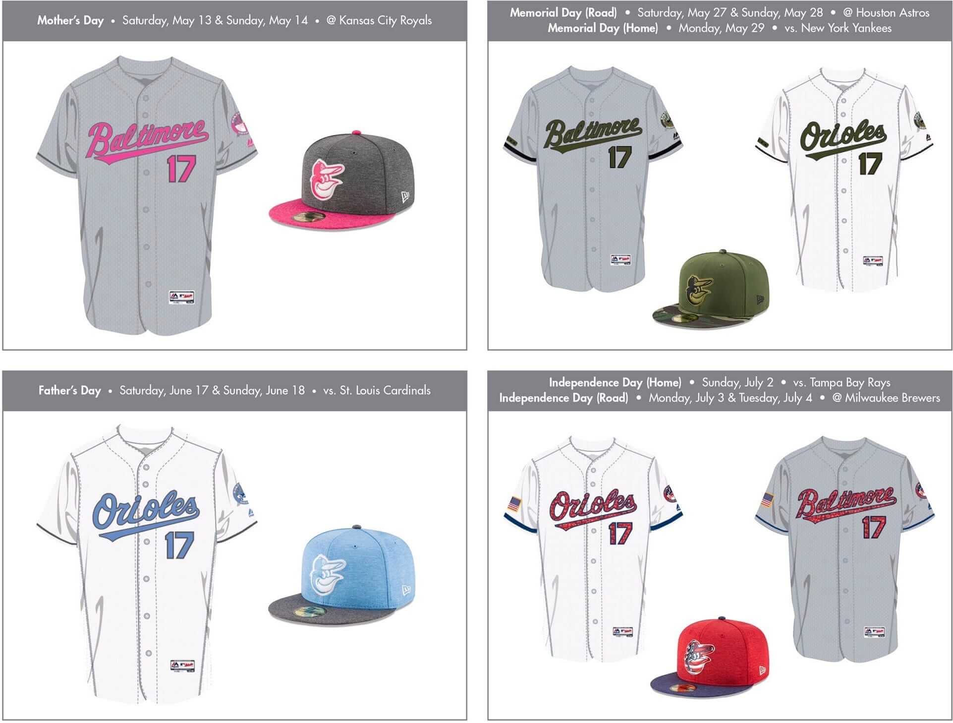
• The holiday unis will be worn for the full two-, three-, and four-day weekends of their respective holidays. That means two days of pink, two days of blue, three days of olive (but very little camouflage this year, thankfully), and a whopping four days of stars and stripes.
• The Mother’s and Father’s Day uniforms are very similar to last year’s. Independence Day is fairly similar as well, although the caps have high-tech chrome logos. As noted above, they’ve dialed back the camo for Memorial Day.
• All-Star jerseys will now include a sleeve patch indicating how many times the player has been an All-Star. The caps have very nice heathered crowns.
• This year’s Home Run Derby jerseys (or All-Star BP jerseys, or whatever you prefer to call them) are pretty nice, and the caps are made from some sort of newfangled lightweight material. Sorry, I just can’t bring myself to care about that.
• Lots of new sock designs to go with all of these uniforms. Let’s just say that none of them were designed to fade into the background.
If you want to know more — and you probably do — I strongly recommend checking out this SportsLogos.net piece, which has excellent info and visuals. Chris had an exclusive on this one, so he had lots of time to prepare everything in advance, and he really hit it out of the park. In terms of basic information, I don’t think there’s anything I can add that he hasn’t covered there.
As for my opinions on all this:
• Extending the designs over multiple days is, obviously, ridiculous. Fits in with MLB’s (or the sports world’s, or America’s) basic credo that anything worth doing is worth overdoing. And these uniforms weren’t really worth doing in the first place. But this is clearly where MLB is headed in the Rob Manfred era, and that’s that.
• Not much to say about the Ma’s/Pa’s Day uniforms that wasn’t said last year. Minor changes, but nothing significant. Oh, but there’s this: The Yankees will be retiring Derek Jeter’s number on Ma’s Day. Seems very odd that they’ll be wearing pink-trimmed unis on that day of all days, no?
• Nice to see them pulling back on the camouflage. And this year’s Memorial Day jerseys and caps include five black stars — why, you’d almost get the idea that they think this holiday is for mourning the fallen instead of glorifying the active! I’d still prefer to see just a simple black armband, but this year’s design counts as progress, even if it’s only baby steps.
• Not a fan of the chrome Independence Day cap logos. Seems like a given that some team(s) will be chosen as the guinea pig(s) to try this style as a regular season alternate cap in the near future. Here’s hoping that team isn’t the one I root for.
• This year’s All-Star Game caps are easily the best they’ve done since they started creating new cap designs for the event. If I were the kind of person who bought MLB caps — well, I still wouldn’t buy one of these, because I don’t like the star-shaped grommets, but you get the idea.
• The “Look how many All-Star Games I’ve been in!” patch seems like something that would be better on the BP jerseys, not the game jerseys, but whatever — not a big deal either way. (The bigger question is how long they’ll wait before coming out with dedicated All-Star Game uniforms like the other leagues, which seems inevitable in the current climate.)
• Last year all of the teams’ sleeve patches changed colors depending on the holiday, except for Wahoo, who stayed red, for obvious reasons. This year they’re avoiding that problem altogether by giving the Cleveland holiday uniforms a block-C sleeve patch. This is the latest in a series of exceptions that have been carved out for Wahoo. All the other teams’ fans can dress up as the team mascot or paint their faces — except Cleveland fans. Every other team’s sleeve patch can get a stars/stripes treatment — except Cleveland’s sleeve patch. And so on. When you keep having to carve out these kinds of exceptions for a logo — or, to put it another way, when your words keep saying that the logo is okay but your actions keep saying otherwise — it’s a sign that the logo has outlived its usefulness and needs to go.
That about covers it. Again, for more info, SportsLogos.net has the goods on this one.
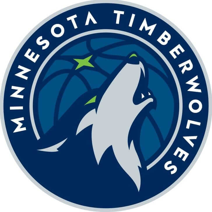
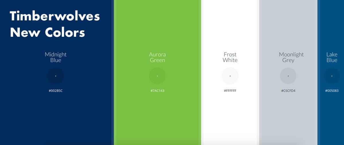
Storytime: The Timberwolves unveiled their new logo last night (shown at right; click to enlarge). As you may recall, yesterday we were promised that the design would be full of “stories.” And sure enough, now that we’ve seen the logo, there are many stories at work here. For example:
Story No. 1: Once upon a time, there was a team that wanted a new logo. There was a lot of hype and buildup, which got people thinking that maybe the team would give itself a serious makeover. But in the end the team decided that all it needed was an update to its secondary logo:
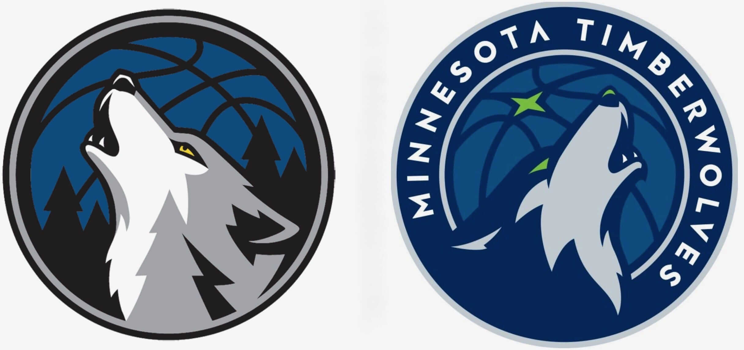
Story No. 2: Once upon a time there was a basketball team that decided to update its logo. But due to some wondrous sorcery, the basketball team ended up with a design very similar to one that’s already used by a hockey team:
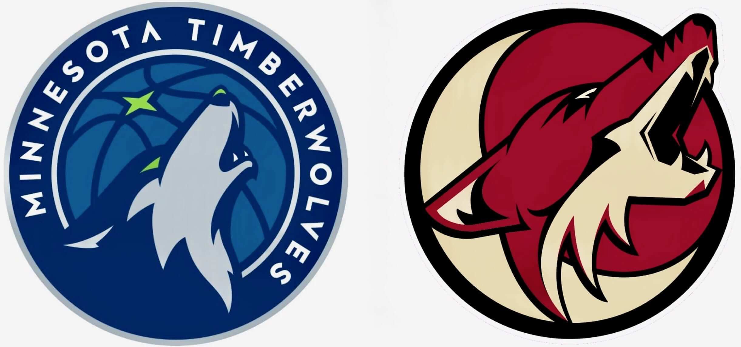
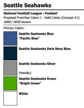
Story No. 3: Once upon a time there was a basketball team that decided to update its team colors. In yet another feat of sorcery — surely the work of a wizard! — the basketball team’s new colors ended up being very close to the colors used by a football team:
But everyone attending last night’s game was given a free T-shirt with the new logo, so they all lived happily ever after.
———
And so on. Given how ho-hum the logo is, the overhyped press release sounds even sillier than usual. Key quote:
The logo includes a wolf head shown howling, the act of which is the glue that keeps wolf packs together. A wolf howl is used to warn outsiders to stay away, to communicate with the pack, or as a rally cry to reinforce bonds with family.
”¨And there’s more:
The open mouth with the teeth showing represents the fierce energy of not just one Wolf, but a collective unit. To show aggression and fearlessness to the future.
The green of the eyes is a nod to the green that surrounds the state whether that be through Northern Lights, reflection of ice crystals in the winter or the flourishing of buds of trees in the spring.
Uh, right. Because none of the other 49 states have tree buds (or grass, or any other green vegetation). On the plus side, the Timberwolves have created a nifty interactive page to introduce the new look. These snappy web packages have become a standard thing for NBA teams with new logos and/or uniforms, and they’re really terrific. Good for the league, and here’s hoping the other leagues take notice and follow suit.
New uniforms and a new court design will follow this summer.
Raffle reminder: I’m currently raffling off a free varsity-style satin jacket from Stewart & Strauss. Full details here.
Merch reminder: In case you missed it earlier this week, the Uni Watch social media avatar (shown at right, click to enlarge), designed by the great Larry Torrez, is now available on a variety of shirts, sweatshirts, coffee mugs, tote bags, and stickers. They’re all available here.
The Ticker
By Alex Hider

Baseball News: The Blue Jays debuted new batting helmets with a white front panel last night. They’re reminiscent of what the team used to wear in the ’80s and ’90s, however, the panel isn’t tapered to the visor like the old ones. … The Indians’ stated plan to wear the red block-C cap with their navy jersey at home this season didn’t even last one game. Shortly before yesterday’s home opener, they announced that they’d be wearing the block-C cap — and then promptly took the field wearing their Wahoo caps. Not surprising that they went with Wahoo (players received AL Championship rings yesterday, and the team wore Wahoo caps with navy jerseys throughout the playoffs), but strange they would tweet the wrong combo. … The Cardinals are auctioning off that ball that got stuck to Yadier Molina’s chest protector last week (from Mike). … Yoenis Céspedes became the first Met to wear the team’s new skyline sock design last night. And given that he hit three home runs, expect to see more of that look. … Speaking of the Mets, they usually let the starter pick the team’s jersey combo for the day. Matt Harvey has been known to prefer blue alts, but the Mets wore grey during his start last night (from Tezza). … Spotted in Chicago: a White Sox street sweeper (from Anthony Nuccio). … Here’s a video about the #PonleAcento movement that has resulted in a number of Latin players adding accent marks to their NOBs (from Mauricio Davila). … North Carolina has added 3D batting helmet logos (from James Gilbert). … Speaking of the Heels, they went color-on-color against South Carolina last night (also from James Gilbert). … A fan at last night’s Mets/Phils game was wearing an interesting Phillies/Flyers mash-up T-shirt (from John M).

Football News: Here’s some more evidence that the Saints will be ditching the collar horns next season (from Pipes Guice). …University of Phoenix Stadium, home of the Cardinals, will likely be getting a new name soon (from Brinke). … Mark Sanchez will wear No. 6 for the Bears ”” the number previously worn by Jay Cutler (thanks Mike). … That Steeler’s poster Brinke featured in yesterday’s installment of Collector’s Corner featured logos on both sides of the helmet (from Brice Wallace). … New field design for Colorado State (from James Gilbert). … New logos for Rice. They’ll also continue to use the Old English R. … New lids for Indiana Wesleyan, an NAIA school (from friend of the site Seth Austin).

Hockey News: The “Montreal” sign on the city’s Trudeau Airport has been rendered in Canadiens colors for the playoffs (thanks Mike). … The Rangers have an official “locker room T-shirt” for the playoffs. Note the signature block shadow (from The Goal Net).

NBA News: Tony Romo made a visit to the Dallas Mavericks yesterday ”” in full uniform. That led to an amusing Rondo/Romo situation. … Steph Curry’s jersey is the NBA’s top-seller for the second straight season (from Phil). … The site of the original Ben’s Chili Bowl in DC has been given a Wizards-themed makeover. Note that the mural shows the Wizards players wearing their stars/stripes uniforms, which the team will be wearing throughout the playoffs.

Soccer News: Interesting bit of history sent along by Denis Hurley: Throughout 1986 World Cup qualifying, players for the Republic of Ireland ended up wearing nine different jerseys in eight games. Irish players wore more than one style of jersey in at least one match.

Grab Bag: Quinnipiac University now has its own pattern of plaid. It’s even been added to the Scottish Register of Tartans, which tracks patterns of plaid (from Steven Tommasini). … Good feature on the staff at Washington’s Verizon Center, which is currently juggling four teams and three playing surfaces (from Tommy Turner). … Architecture firms in Cincinnati have erected sculptures made out of canned goods in support of local charities. More info here (from David Sonny). … Wayne Jones spotted a guy in Pittsburgh who has a Nike tattoo but is wearing Adidas shoes. … New helmets for Syracuse lacrosse (from Travis Holland). … The Saskatchewan Rush of the National Lacrosse League will wear special jerseys celebrating Canada’s 150th anniversary (from Nelson Hackewich). … Sun Country Airlines, which is based in Minnesota, says it will name each of its planes after one of the state’s lakes (from Mike Menner).
“If I were the kind of person who bought MLB caps”
Not even a standard Mets cap?
Nope. I’m as big a Mets fan as anyone, but wearing caps/jerseys doesn’t interest me.
That’s interesting Paul. I’ve long known your stance on expensive polyester shirts, but not about hats. I agree with you when it comes to the jerseys, but I have taken a liking to the period appropriate hats Ebbets Field Flannels makes and I wear those often.
I wouldn’t say I have a *stance* regarding caps. Like, I’m not specifically boycotting them or declaring them to be evil (although I do think the uni-verse would be better off if they’d never been made available for sale) — they just don’t interest me. Never have. I grew up in the pre-team merch era, and buying this stuff just doesn’t click for me. That’s all.
“I grew up in the pre-team merch era, and buying this stuff just doesn’t click for me.”
It’d be really interesting to see a study on team merch opinions. I’m guessing the younger the respondent, the more favorable they’ll be to it. I just had another thought, whether education plays a factor. I’m curious if level of education plays a part, because college graduates seem like they were “wearing merch” in a sense for a long-time before it became commercialized.
college graduates seem like they were “wearing merch” in a sense for a long-time before it became commercialized.
College graduates are more likely to be able to AFFORD team merch.
In any event, team merch isn’t a big issue here at Uni Watch, where we try to stay focused on what the players wear, not what fans buy.
“I grew up in the pre-team merch era, and buying this stuff just doesn’t click for me. That’s all.”
Would you wear a ballcap casually if it were “plain” or wasn’t promoting something?
I prefer cadet caps, which have shorter brims and a boxier shape (and are blank). I have several of those — different colors, different weights — and wear them all the time.
link..0l10.173.1300.0.1530.10.10.0.0.0.0.96.642.9.9.0….0…1ac.1.64.img..1.9.641.0..35i39k1.kEbbI85ROyA
The caps look like they’re made of sweatpants material. Barf.
I’ve linked a tweet which includes the video, narrated by Twin Cities based hip hop group Atmosphere, that the Timberwolves played in the arena last night to officially introduce the new logo. Whatever one might think of the logo or the silly hype and backstory that came with it, the video was very well produced. It and the live performance on the court by Atmosphere got over tremendously with the live crowd.
The Timberwolves played the linked video, narrated by Twin Cities based hip hop act Atmosphere, in the arena last night at halftime to officially introduce the new logo. Whatever one thinks of the new logo or the silly hype and backstory about it, this video was very well produced and got over great with the live crowd, as did the live performance on the court afterwards by Atmosphere.
link
In the football section, Indiana Wesleyan is NAIA, not DII.
Fixed.
As a goalie, I’m deeply (no, not really) offended by the Rangers’ “official locker room shirt.” “Skatin’, Passin’, Shootin’?” Umm…how about “Savin’?” Is that important too? Yeah, I think so! “Defense wins (sorry, W.I.N.S.) championships.”
What is even better than the Yankees wearing pink on Mother’s Day/Derek Jeter Day- is a Sunday night game. I love it. The Yankees and MLB outdid themselves on this on. Enjoy Yankee fans.
I think the T-Wolves hit a homerun with this. Logo, colors… I’m a big fan. I especially like the star detail in the basketball.
The similarity to the Coyotes doesn’t bother me though. If your team is called the Wolves, of course you’re going to want a howling wolf on your logo. And theirs is rendered a lot nicer than Arizona’s.
Overall, definitely a top 5 look in the NBA.
Agreed. Not the most original logo out there – for some reason NBA teams feel compelled to include a basketball in their logo – but the design looks nice and the colors are great. The old logo was one of the worst in the NBA, it reminded me of a child’s drawing of a spooky werewolf.
I think I remember reading that NBA teams are required by the NBA to include a basketball in their logo. I could be wrong, though.
Not required, but strongly encouraged.
I’d say a single or a double rather than a homerun. There are so many cool markings, especially under the eyes, on a wolf’s face that I think should have been used. A howling wolf wont show that. I’d also rather have my wolf snarling at you straight on, challenging you, than howling to some ambivalent thing in space. Did you see how cool those St Louis Blues throwbacks looked? One main reason was because they got rid of the 2 blues. Hate 2 blues. Pick one. I think it’d have looked better to have a green moon than a 2nd blue. It would’ve made the wolf pop more. Not happy about the similarities to the Coyote, Seattle’s colors or it being just a modified secondary logo. Not happy about the type not being balanced and rotated too far. I envisioned something a heck of a lot cooler and more dramatic. Was so much here to work with. Glen Taylor spent way too much for this. Just because there is some design team who did the last 5-6 logos doesn’t mean you have to use them too. There are many other great designers out there. Heck I see better stuff on Pinterest, Behance, etc.
-I like the new primary T-Wolves logo better than the present primary.
-Love that the Blue Jays have kept the front white panel hats around as an alternate and will wear the front white panel helmets too. A nod to the classic Blue Jays look I remember as a kid. The white front panel hats were signature looks for the Canadian teams (Jays and Expos). They were able to make this look work for them.
-Never a fan of the Saskatchewan Rush logo. Needs an overhaul. However, compared to the present crest, I prefer the crest on the special jersey for Canada’s 150th. Single “R” looks better than the complete wordmark.
Speaking of #PonleAccento, Yandy Diaz in Cleveland has an oversized accento…
link
ed
Zach Lowe has more info on the Timberwolves redesign.
link
I found it interesting that the designers use the same buzzwords when talking as they do in the press release. So I wonder, do they know that the “story” stuff is nonsense, or have they drank their own Kool Aid?
Minor editing glitch.. the “This is the latest in a series of exceptions” paragraph is a link with nowhere to click to.
And for what it’s worth, I think that wahoo can’t go away fast enough. As a Cleveland fan, I refuse to wear anything with the horrible logo. Honestly, I would love to see the team rebrand as the Spiders, but I know I’m in a very small minorty
I fixed it.
Thanks, Mike!
Did you like the winning Spiders design the The Scene had? :)
Who do these holiday MLB uniforms appeal to?
I’m far from the baseball uniform conservative/traditionalist camp, but I intensely dislike all the holiday uniforms.
Are there any that normally consider themselves traditionalist that like any of these holiday uniforms?
If so, I am honestly curious as to what about any of them appeals to you (or anyone)?
I was thinking this too. I would love to see the sales data on these designs because I have never seen any of them in the wild. I am sure they appeal to someone, but I just don’t see it.
The same goes for the color rush unis. Are they actually selling?
Just speaking for myself, I don’t buy jerseys but I sometimes buy the Stars & Stripes and Memorial Day caps, although I’d much rather see the camo on Armed Forces Day and have a poppy or a patriotic shield patch for Memorial Day.
In my case, it’s simply because I enjoy wearing them. I’m a cap guy.
I suspect the Mother’s and Father’s day caps have the same appeal as those silicone bracelets, letting people know how much you care about the cause.
These are awful across the board. Like Will I’ve never seen these among the fans outside of a random Stars/Stripes cap and maybe a stray All Star BP or Homerun Derby jersey. And those I could count on one hand. Obviously someone is buying them or they would have quit with this silliness already.
I’d like to see the whole thing dropped but the genie left that bottle long ago and he ain’t going back in any time soon I’m afraid.
Obviously someone is buying them…
MLB’s social media posts about the new merch yesterday was heavy on terms like “sick,” “fire,” and “fresh,” which should give you a hint regarding who those someones might be.
My buddy Gordon is a huge cap collector. He has stars-and-stripes caps for a wide variety of teams and some camo caps. He wears them too. Wouldn’t surprise me if he bought every one of the stars-and-stripes. I don’t know of him ever getting pink or blue specials though.
He gets a pass from me for camo caps given his (past) and his son’s (current) military service.
Does anyone know if the skyline socks reflect each MLB team’s actual home skyline? NYC has a fairly well-known skyline but I couldn’t pick out Houston’s without some help.
NYC’s skyline is much more iconic, but it is also part of their logo, so it makes sense.
The only thing I know about Houston’s skyline is that Connor Barwin has it tattooed on his arm.
link
Pretty sure he has a Detroit skyline tattoo. Not Houston. He grew up in Detroit.
I could probably pick out some skylines – NYC, Chicago, SF, STL, Philadelphia, Seattle – by the silhouette but I would need color picks for a lot of others – and many of them are somewhat nondescript.
you’re right. Since he signed with the Eagles, I always thought it was the Houston skyline.
I own two pairs of the Chicago skyline style and I think they reflect the skyline pretty well.
I could pick out the Houston skyline fairly easily. The Bank of America Center building is easy to identify, as is the Heritage Plaza.
PL: the Mets wore traditional road grays during a Matt Harvey start and they won in a rout. Is this the result the Mets needed to minimize the softball tops? And they sell that Philadelphia graphic T-shirt to represent all 4 teams.
They didn’t wear the blue alts much last year, home or away. Fingers crossed for a repeat.
That’s because Harvey didn’t pitch after July 4.
Actually, Harvey wore non-blue jerseys for many of his starts last year before they pulled the plug on his season.
The #PonleAccento seems like an odd trend to run with. I’m not a native Hispanophone … but isn’t omitting the acute accent from capital letters a common habit, even in Spanish-speaking countries?
I have heard that all Spanish-origin names are assumed to be pronounced with the stress on the second syllable, so therefore only the unusual name with a different syllable accented actually need the mark. So Martinez, Rodriguez, etc. don’t need accents when they are pronounced in the usual way.
No idea if my source on this was right though.
Doesn’t seem to work with Gomez or Sanchez.
Which is why it is spelled Sánchez and Gómez in the Spanish-speaking world. SanCHEZ and GoMEZ are awkward; thus the accent.
That’s more/less correct, but I meant that even letters that would ordinarily take an accent when in lowercase seem to habitually go unaccented when capitalized: e.g., “Sánchez”/”SANCHEZ,” or (frequently) “Avila” instead of “Ãvila.”
From what I can tell, this seems to happen even in Spanish-language contexts, which makes the #PonleAccento movement seem a little odd–given that it insists on something that even a Spanish or Latin-American sports league might not insist on!
I thought it was interesting that Chris Creamer calls the “squatchee” the “pill”.
The pink/blue for mom’s day and dad’s day gets old.
It’s only the second year they’re doing it!
I mean, I don’t care for it myself. But it’s hard to claim that it’s getting “old,” no?
They have done pink and blue bats, pink and blue sweatbands, pink and blue bases, pink and blue ribbons, and I’m sure there are other pink and blue accoutrements that I’m missing. Yeah, it’s played out IMHO.
Just because it’s new in the context doesn’t mean it’s not already old. It’s low-hanging fruit marketing (pink! blue!) that doesn’t need to be expanded.
I’m not someone that’s really formed a strong opinion on the Washington NFL Team/Cleveland MLB Team logo/mascot/nickname debate. I tend to be someone who thinks political correctness has run amok. Your point on Chief Wahoo is VERY powerful though. I never looked at it that way and it may have just swayed me to one side of the entire debate…
Proofreading:
This year they’re avoiding that problem altogether by giving the Cleveland holiday uniforms have a block-C sleeve patch.
– Drop the “have” after uniforms.
Fixed.
So they’re phasing out wahoo but surprisingly bringing him back at the same time.
The whole waffling on Chief Wahoo is representative of Manfred’s approach. He’s probably collecting data from various focus groups and then deciding to what degree he has to satisfy each group to keep relative peace. Hell, he probably has algorithms that change by the millisecond.
He’s horrible. For all the talk about “fixing baseball,” the best fix would be to oust him.
Actually, Manfred has been pretty consistent on this issue, at least during the past 6 mos or so. It’s the *team* that’s been waffling for years now.
Lots of developments since you posted this. Seems I took my stand on him at exactly the wrong time!
Question for the masses:
If the Indians removed Chief Wahoo, would it be done there? Or is the name a “must” remove too?
If the Indians removed Wahoo, and used a stylized feather or something as a logo, would that also be considered “cultural appropriation”
Just curious.
Considering that people have issues with things like tomahawks and arrowheads, I doubt a stylized feather would fly.
The Braves still use a tomahawk, Chiefs use an arrow. Don’t hear much about that though. Just curious,though. Appreciate the response.
Gut feeling​: on a scale of 1 to 10, where 1 is “slightly uncomfortable anachronistic use of a culture’s language/iconography” and 10 is “blatantly and obviously offensive,” Wahoo is a 6-7 and the Indians name is a 2. I’d view a Wahoo retirement as a good move whose time has come, while the Indians name could continue to exist in a more respectful manner. (Note: I am not a Native American, so take my opinion as just some anonymous guy on the internet.)
Thanks, appreciate the response.
After more thought, Wahoo is problematic on its own, but the logo makes the name a bigger problem than it would otherwise be. You really can’t separate the two while Wahoo remains. Absent a grotesque characature that evokes a long history of treating native people as less-than-equals, the name Indians falls into a similar category as Braves and Chiefs: not names you’d choose for a new team today, but not blatantly offensive on the surface.
But the logo continues to exist long after its natural expiration date, so I can’t consider the team name to fall on the less-offensive end of the spectrum. The name right now is infused with the backwards-ass depiction of Native Americans in the logo. So on my stupid scale of 1 to 10, the name is a 6-7 until Wahoo is retired.
All those MLB uniforms are tough to stomach. The socks are the worst part.
The black honeycomb mesh on the AS cap is interesting. Heather caps too, but not for on field IMO.
The only thing I like out of there is the 4th of July baseball stitching.
I’m glad SF puts their foot down on at least one part of it.
Stance is really trashing up the MLB.
Those socks are bad enough to make one suspect their actual purpose is to encourage players to go low-cuffed.
In Story No. 1, “But in the end the team decided that all it needed was a update to its secondary logo”. Should be “an” update.
Thanks. Fixed.
Story No. 3: Because of the cold, harsh winters up here in the tundra, we didn’t finish the A in MINNESOTA. We had to run inside to get warm, then forgot about it when we got feeling back in our fingers and finished the wording.
The Mother’s Day caps uses pink on white-only emblems (Phillies, Royals, Yankees, etc) and the 2-color Twins, but the Rays, Reds and Rangers would have been “better” if they were pink with white trim.
On the Memorial Day caps, those three emblems are primarily dark with the lighter trim.
As for the “pre-team merch era” I remember store caps in the 1960s had a square patch sewn onto the caps. In the 70s, the stitched logos were glued on.
There was a good article yesterday (4/11/17) in the Elyria (Ohio) Chronicle Telegram with the now 87 year old non-racist artist who created Chief Wahoo when he was in high school. Might be worth an interview.
link
I reiterate my previous stated position that there was no ill or harmful intent behind the logo, there is no majority Native American opinion that it should be changed, and that it has existed well beyond long enough to be beloved by Cleveland Indians’ fans like myself.
“…there is no majority Native American opinion that it should be changed…”
And for good reason, they have real issues to contend with, e.g., 13% of homes on reservations do not have safe drinking water or sanitary sewage disposal (2009 Federal Govt. statistics).
link
If MSM would drop, what amounts to by comparison, “reporting” on minutiae and give this real issue as much press (until the situation is rectified) as they did for the Flint water crisis, or even as much press as they waste on Wahoo protesters, this 2009 figure of 13% would be much, much lower.
Priorities are sadly lacking. How many UWers who are opposed to Wahoo know/care about the much larger issue of Native Americans being poisoned in their own homes? Honestly, which issue deserves attention? On UW, a uniform info website, some discussion of Wahoo is not irrelevant (though trivial compared to real life issues), but for MSM on the whole, ignoring real life issues for such trivialities is completely irresponsible and that’s why, if you are reading this, you likely know all about the opinions of people (the overwhelming majority of whom are not even Native Americans) regarding Wahoo but probably knew nothing about the lack of safe drinking water and sanitary sewage disposal.
Well said 1vox.
You have hit the nail on the proverbial head with a hammer of Truthiness (apologies to Colbert). We gots bigger fish to fry than worry about than mascot malapropisms.
How many UWers who are opposed to Wahoo know/care about the much larger issue of Native Americans being poisoned in their own homes? Honestly, which issue deserves attention?
You present it as if it’s a binary choice. That is false. You assume nobody in the anti-Wahoo camp has engaged with other Native American issues. That too is false.
Nobody is suggesting that Native Americans don’t face other problems besides Wahoo. But incredibly enough, it’s possible to fight cancer *and* try to find a cure for the common cold. On this website, we’re treating the cold, because logos are what we discuss here. And we’ll continue to do so.
Here’s a good comparison: African-Americans obviously faced lots of bigger problems than the name of the Sambo’s restaurant chain. But that didn’t make the name of the restaurant chain OK.
This binary either/or argument is a tired trope that we’ve been thru dozens of times. Let’s please move on. Thanks.
I wasn’t hammering UW and in fact stated, “On UW, a uniform info website, some discussion of Wahoo is not irrelevant (though trivial compared to real life issues)…” I see nothing wrong with that statement.
And I didn’t say that lack of clean water was the only problem they face (making it an either/or, or “binary”, situation when combined with your fight against Wahoo). I said this was *an example* (“they have real *issues* to contend with, *e.g.*…”) and that the real problems (like this, that lead to a substantial reduction in quality of life and that can and likely do, in some instances kill) should be a priority in the media. What is wrong with saying that?
To compare this to a cancer/cold analogy seems odd, though. Nevertheless, addressing your comparison, if the media harped on colds constantly and rarely covered cancer in the news, that would be inexcusable and a skewing of priorities, don’t you think?
I can live without respect from others and it will never kill me. Start a team called the Crackers or Honkies, it wouldn’t bother me in the least. Wahoo has never killed anyone, nor will he. And if Sambo’s ever killed anyone, it was with the food, not the name. But it would be very unfair for MSM to deal with treating colds constantly but rarely bring attention to cancer issues and that was my point. Yes, both can be addressed, yet rarely are the real problems facing Native Americans given the same priority as Wahoo or the Redskins name. Changing a logo or a name won’t solve real problems and the lives of people who try and survive with those real, and sometimes deadly, issues, and not just one or two. Wahoo falls far down that list in terms of real life importance to people who deal with much bigger issues on a daily basis, and that was my point. I don’t see it as “a tired trope” nor will I refer to your issue with Wahoo, which is a much less serious concern in terms of safety and quality of life, in such terms. You are welcome to choose your fights in life, and I, mine.
Perhaps I was a bit harsh regarding people not being concerned about bigger issues, but honestly, how often do people who complain about Wahoo all the time complain about Native American water rights (or other NA issues) in forums? I doubt many do. And if they are reprimanded for doing so as you did to me, it’s no wonder.
If “it’s possible to fight cancer *and* try to find a cure for the common cold’, then (borrowing your phrase) “incredibly enough,” it’s also possible to deal with real safety and quality-of-life issues *and* Wahoo or the Redskins, and that’s what I was doing: prioritizing and bringing attention to bigger problems because MSM does not. I did not state UW *should* nor make a “binary” argument (I used an issue as an example) nor did I deserve to be called out for making a statement about priorities while plainly stating, “On UW, a uniform info website, some discussion of Wahoo is not irrelevant (though trivial compared to real life issues)” then going on the address the larger problem.
I can live without respect from others and it will never kill me. Start a team called the Crackers or Honkies, it wouldn’t bother me in the least.
Wow, that’s really big of you. You’re (I’m assuming) a middle-class straight white male, which means the world is basically configured to function well for you and provide you with positive reinforcement. Congratulations on being able to handle a team called the Crackers — you’re clearly a tower of strength.
The smarmy salesman faction seems to have taken over MLB. For a second I though the Memorial day fiascos – I mean uniforms – were done in black. You know: memorial, dead soldiers and all. But it’s olive green. That’ll sell. And every year the Giants are the only team whose lettering retains their team color of orange on Father’s day. Some things in life are just a mystery.
No mystery regarding the Giants: They don’t want to wear blue because it’d look too much like the Dodgers.
In light of this fact that the Giants want to avoid looking like the Dodgers, so they are the only team to not render their name in blue for Father’s Day, I can’t understand why they are wearing a cap with a blue crown for Independence Day when other teams are wearing caps with a red crown. In one case, they are the only exception, but then in the other case, half the league is wearing red caps and the Giants are in blue. Makes no sense to me.
“When you keep having to carve out these kinds of exceptions for a logo – or, to put it another way, when your words keep saying that the logo is okay but your actions keep saying otherwise – it’s a sign that the logo has outlived its usefulness and needs to go.”
Or its a sign that the program of changing the logos for these days is stupid and needs to go, and Cleveland of all places has it right.
I think Cleveland uses it as a metaphor….
Only no one told them it does not mean what they think it means.
So if the squatchees and accent colors are pink/blue/olive, why aren’t the obligatory New Era logos stitched in that same color? Would be a better blend with the theme than a huge white blob on the side of the cap.
Has it occurred to you that New Era doesn’t *want* their logo to blend in?
It seems like MLB has a deal, at least this first year, where the New Era logo must be rendered in a color on the team’s cap logo, and New Era is free to go with the color that stands out the most. Stinks for the Red Sox (fans), where the tiny white outline on their “B” leads to an especially garish white New Era advert on the side of the cap. Fans of the Mets or the Pirates benefit from having no white in their cap logos, so in some pathetic way the New Era logo at least feels subordinate to the team’s own branding.
Saw something interesting in the Sportslogo.net piece…they had a link, where it looks like the Mets wordmark is properly centered, unlike the patches they link I brought this to the attention of the official patch company a few months ago, though they never admitted I was correct. Maybe they have fixed their Mets patch template.
The White Sox street sweeper is made by the Elgin Sweeper Company based in Elgin, Illinois, a Chicago suburb. My great-grandfather, grandfather, and father all worked for the company, so I spent a good portion of my childhood around the company. They’ve painted different versions for the 5 major teams in Chicago, starting with 5 red Bulls sweepers during the 90’s championship years, each with a different star player’s uniform number. If you Google “(team name here) street sweeper” there’s tons of images.
Well done, Paul. You ripped the T-Wolves apart for doing what is done. Now what would you have done? What would you have BUILT?
“for doing what is done”?